Buy your Tesla at closing time: For 15 years, these stocks have been mildly fluctuating during the day and shooting up overnight.

Bruce Knuteson shares the above plot and writes:

Look at the strikingly suspicious overnight and intraday returns to Tesla’s stock noted by the Financial Times (cf. my rejoinder) and Forbes.

This suspicious return pattern in TSLA is easy to reproduce [data]. Nobody has articulated a plausible innocuous explanation for it. The only explanation that fits the facts is the market manipulation we have discussed. That has been the only explanation for nearly a decade now. Tesla’s stock is the source of much of Elon Musk’s wealth. The public still doesn’t know about this suspicious return pattern in the source of much of Elon Musk’s wealth because nobody has told them.

This has come up before, and it’s not just Tesla. Here’s a a graph that Knuteson sent me a couple years ago as evidence of market manipulation:

As I said at the time, I absolutely have no idea about this sort of thing. I ran into someone yesterday who used to work in financial markets and he was saying there was some class of high-volume traders who never like to hold onto assets overnight. And various theories came up in the comments to our previous post.

It’s an interesting statistical puzzles, in part because from my perspective it’s essentially impossible to understand without lots of subject-matter knowledge. And, unlike some other statistical puzzles (for example, the one discussed here) it’s a live issue.

One question that came up before is how this pattern looks for other financial assets. Knuteson shows a bunch of the relevant plots in this paper, for example:

Again, I entirely defer to others in trying to understand this one.

P.S. Knuteson also has this comment regarding the graphical displays:

You can learn a lot from a simple simulation (example of experimental design with unequal variances for treatment and control data)

We were talking about blocking in experiments in class today, and a student asked, “When should we have unequal numbers of units in the treatment and control groups?”

I replied that the simplest example is when the treatment is expensive. You could have 10,000 people in your population but only enough budget to apply the treatment to 100 people, so 99% will be in the control group. In other settings, the treatment might be disruptive, and, again, you’d only apply it to a small fraction of the available units.

But even if cost isn’t a concern, and you just want to maximize statistical efficiency, it could make sense to assign different numbers of units to the two groups.

For example, I started to say, suppose that your outcomes are much more variable under the treatment than the control. Then to minimize the basic estimate of the treatment effect—the average outcome in the treatment group, minus the average among the controls—you’ll want more treatment observations, to account for the higher variance.

But then I paused. I was struck by confusion.

There are two intuitions here, and they go in opposite directions:

(1) Treatment observations are more variable than controls. So you need more treatment measurements, so as to get a precise enough estimate for the treatment group.

(2) Treatment observations are more variable than controls. So treatment observations are crappier, and you should devote more of your budget to the high-quality control measurements.

I had a feeling that the correct reasoning was (1), not (2), but I wasn’t sure.

So how did I solve the problem?

Brute force.

Here’s the R:

n <- 100
expt_sim <- function(n, p=0.5, s_c=1, s_t=2){
  n_c <- round((1-p)*n)
  n_t <- round(p*n)
  se_dif <- sqrt(s_c^2/n_c + s_t^2/n_t)
  se_dif
}
curve(expt_sim(100, x), from=.01, to=.99,
  xlab="Proportion of data in the treatment group",
  ylab="se of estimated treatment effect",
  main="Assuming sd of measurements is\ntwice as high for treated as for controls",
  bty="l")

And here's the result:

Oh, shoot, I really don't like how the y-axis doesn't go all the way to zero. It makes the variance reduction look more dramatic than it really is. Zero is in the neighborhood, so let's invite it in:

curve(expt_sim(100, x), from=.01, to=.99,
  xlab="Proportion of data in the treatment group",
  ylab="se of estimated treatment effect",
  main="Assuming sd of measurements is\ntwice as high for treated as for controls", 
  bty="l",
  xlim=c(0, 1), ylim=c(0, 2), xaxs="i", yaxs="i")

And we can see the answer: if there's twice as much variation in the treatment group as in the control group, then you should take twice as many measurements in the treatment group. The curve is minimized at x=2/3 (which we could check without plotting anything, but the graph provides some intuition and a sanity check). Argument (1) above is correct.

On the other hand, the standard error from the optimal design isn't much lower than the simple 50/50 design, as can be seen by computing the ratio:

print(expt_sim(100, 1/2) / expt_sim(100, 2/3))

which yields 0.95.

Thus, the better design yields a 5% reduction in standard error--that is, a 10% efficiency gain. Not nothing, but not huge.

Anyway, the main point of this post is you can learn a lot from simulation. Of course in this case the problem can be solved analytically---just differentiate (s_c^2/(1-p) + s_t^2/p) with respect to p and set the derivative to zero, and you get s_c^2/(1-p)^2 - s_t^2/p^2 = 0, thus s_c^2/(1-p)^2 = s_t^2/p^2, so p/(1-p) = s_t/s_c. That's all fine, but I like the brute-force solution.

The answer to the how-many-significant-digits problem is the same as the answer to the what-to-graph problem: The click-through solution

We sometimes have discussions on the blog warning people against displaying too many significant digits. For example, back in 2012 I asked, “Is it meaningful to talk about a probability of “65.7%” that Obama will win the election?”, and I answered, No, it is not. That last digit being displayed is essentially pure noise, and fluctuations in that digit tell us nothing at all.

For another example, I was once discussing a paper that reported, “Of the 914 sexual minorities in our sample, 134 (14.66%) were dead by 2008,” to which I replied that it’s poor practice to call this 14.66% rather than 15%—it would be kinda like saying that Steph Curry is 6 feet 2.133 inches tall—but this is not important for the paper, it’s only an indirect sign of concern as it indicates a level of innumeracy on the authors’ part to have let this slip in.

But then a colleague pointed me to this post entitled, “Please show lots of digits,” arguing that “this is how you catch frauds.”

Good point! This came up in the recent Venezuelan election. First the vote counts as reported:

And then with a bunch of extra decimal places:

Those extra digits would serve no useful value—if we believed the numbers were correct. But the weirdness of the result is strong evidence that those exact vote totals are wrong, that they were reverse-engineered from the rounded values.

Here’s how Dean Eckles put it:

In some cases, reporting many digits can indeed be a costly signal — in that if they aren’t based on the stated calculations, it may be possible to figure out that they are impossible (e.g., via a granularity-related inconsistency of means aka GRIM test). This is perhaps one argument for at least reporting excess digits in tables (though not abstracts and press releases certainly!). Perhaps this argument is somewhat outdated if data and analysis code are provided in addition to results in a paper or report itself, though this remains not always the case.

The dilemma

On one hand, spew out a zillion digits every time and you’ll make your papers unreadable and even misleading. The author of that linked post refers to this as a “petty writing style opinion” and a “silly non-issue,” but . . . communication is important, and calling it “style” or “silly” doesn’t change that!

One way I explain this to students is by saying: Just as, when writing an article, you shouldn’t include a paragraph you don’t want people to read, you also shouldn’t include a table full of numbers you don’t want people to look at. People’s attention is limited, and that’s how it should be.

On the other hand . . . yeah, there can be gold in them thar decimal places. This came up in our recent description of election forecasts, where I praised The Economist for rounding their forecasts (I can’t remember their exact phrasing, but it was something like “even odds,” “3 out of 5 chance” “2 out of 3 chance,” etc., essentially presenting win probabilities rounded to the nearest of 50%, 60%, 66.6%, etc.), and a commenter responded that, sure, it’s good to not be misleading, but then there’s this awkward moment when the odds suddenly jump from approximately even to approximately 50% to approximately 60%, and that apparent discrete jump can itself be misleading. Also, as discussed in that linked post, extra decimal places can reveal problems in the analysis pipeline.

For another such example, check out this amusing story from James Heathers: “The data are on a 1-5 scale, the mean is 4.61, and the standard deviation is 1.64 . . . What’s so wrong about that??”

What to do, then?

My recommendation is what we’ve called the click-through solution: Start with an accessible summary that brings the reader in. Then click for statistical graphs that allow more direct visual comparisons. Then click again to get a spreadsheet with all the numbers and a list of sources.

In the context of a published article, step 1 would be the article itself, with appropriately rounded numbers (or, even better, graphs), step 2 is the supplementary information with full tables with additional decimal places, if that’s how you roll, and step 3 are the files with data and code. Do it all.

Talks Feb 11 (Princeton) and Feb 18 (Stanford) on benchmarking human decisions from predictions

This is Jessica. I’m giving talks this Tuesday and next Tuesday on decision theoretic approaches for combining human domain knowledge with statistical models. I’ll discuss various joint projects with Ziyang Guo, Yifan Wu, and Jason Hartline. Come by if you’re around Princeton or Stanford campuses!

Benchmarking decisions from visualizations and predictions
Tues Feb 11, 12pm
Seminar in Advanced Research Methods, Princeton Department of Psychology

How well does a particular information display support decision-making? This question comes up when studying human behavior under different strategies for presenting information (e.g., forecast displays, data visualizations, displays or explanations of model predictions) and in our own research when we must decide how to plot our results or report effects. Understanding how helpful a visualization or other presentation is for judgment and decision-making is difficult because the observed performance in an experiment is confounded with aspects of the study design, such as how useful the information that is provided is for the task. Typical approaches to designing such studies make it difficult to assess how well study participants did relative to the best attainable performance on the task, and to diagnose sources of error in the results. I will discuss how decision-theoretic frameworks that conceive of the performance of a Bayesian rational agent can transform how we design and evaluate visualizations and other decision-support interfaces, such as explanations of model predictions.

The value of information in model-assisted decision-making
Tues Feb 18, 4:30 pm
Statistics Seminar, Stanford Department of Statistics

The widespread adoption of AI and machine learning models in society has brought increased attention to how model predictions impact decision processes in a variety of domains. I will describe tools that apply statistical decision theory and information economics to address pressing question at the human-AI interface. These include: how to evaluate when a decision-maker appropriately relies on model predictions, when a human or AI agent could better exploit available contextual information, and how to evaluate (and design) prediction explanations. I will also discuss some cases where statistical theory falls short of providing insight into how people may use predictions for decisions.

Graphical display of election forecast uncertainty

Josh Goldstein, author of The Formal Demography of Peak Population and other things, writes:

What do you think about this kind of graphical display in today’s NYT?

The margins of error are hugely overlapping, but, if I did my calculation correctly, the SE on the difference of 3% is only about 1.4% or so, and so the difference itself is > 2SEs from 0. If we want to know if “Harris is really ahead”, should you believe this picture and say that it’s too uncertain to say? Or, should you believe the SE of difference approach and say that it appears very likely that she’s ahead, at least by a little?

More generally, it makes me think that when we do coefficient plots with the intention of visually trying to figure out if there are important differences between coefficients that it might be better to plot +/- 1 SE and not +/- 2.

I replied that Harris is currently ahead in the popular vote, as estimated from the polls. But the polls have nonsampling error, so maybe she’s not really ahead, or maybe she’s ahead by less or more than the polls indicate. Our rough calculation is to double the standard error to account for nonsampling error. Also, it’s expected that Harris needs something like 51% or 52% of the national two-party vote in order to win the electoral vote this year (an effect that has varied over time), so being ahead in the popular vote isn’t enough.

Goldstein adds:

On separate topic, also kind of interesting that we seem as a society to be post-election-forecasting. Maybe I’m just projecting my own feelings, but it seems that this time, everyone is just willing to wait and not screaming about the polls/forecasts etc. Maybe we’re just worn out!

I dunno, I think it’s just that the forecasts are so close. If the election were decided by national popular vote, or if it wasn’t expected that there will be an electoral/popular vote mismatch, then I think there’d be a lot of discussion of whether Harris’s win probability is 60% or 70% or 80% or 90% or whatever. But since there’s so much uncertainty in the electoral vote, we just can’t say much. Some poll aggregators can try to construct news out of nothing by reporting win probabilities to the nearest fraction of a percentage point, but, as we’ve discussed before, that’s pretty meaningless.

Where should we publish our paper, “Statistical graphics and comics: Parallel histories of visual storytelling”?

Hey! Susan Kruglinski and I wrote this article I really like, Statistical graphics and comics: Parallel histories of visual storytelling:

What do data visualization and cartoons have in common? One of these is used to communicate in science and journalism, and the other appears in arts and entertainment, but both convey complex messages in economical, intuitive, and visually appealing ways. And both these graphic forms are relatively new, having made rapid progress only in the past few centuries, despite requiring little in the way of raw material to produce. We connect this history to a combination of abstraction and accessibility that is common to both these forms of visual expression: comic strips and scatterplots both now seem intuitive but represent the development of abstract conventions. We also discuss differences between these two methods of visual storytelling in their goals and in how they are experienced by the reader.

Read the whole thing. It has a message I think is important.

But my message to you is: Where should we publish this article? We sent it to the journal American Statistician, which didn’t seem quite right; in any case they agreed with that assessment and told us it would be better to publish somewhere else. But we’re not sure where.

There’s no need for the paper to appear in a statistics journal, or in a “journal” at all–it’s not like we’re getting “publish or perish” credit for it! Lots of non-statistician “civilians” are interested in dataviz and comics, and I’d like to reach some audience beyond whoever’s reading this post right now.

If you have any thoughts on where to publish this article–or, of course, any thoughts on the substance of the article itself–you can just let us know right here in the comments section. Otherwise, just enjoy the article.

Make a hypothesis about what you expect to see, every step of the way. A manifesto:

We learn from surprise.

Surprise is when something unexpected happens.

The unexpected is defined relative to the expected.

To learn from surprise, it is good practice to specify the expected in as detailed a form as possible.

OK, here it is again, from a slightly different angle:

“The greatest value of a picture is when it forces us to notice what we never expected to see.” — John Tukey, from his classic book, Exploratory Data Analysis.

We will be most prepared to learn from the unexpected if we think clearly about what we are expecting.

Nathan Yau offers a good take:

Data exploration with visualization is good, but when someone describes their project as an exploration tool, it often means it lacks focus or direction. Instead it looks like generic graphs that don’t answer anything particular and leave all interpretation to the reader.

In doing research I find it useful to pause frequently before getting results to predict what I expect to see. In that way, I learn much more than if I just fumble forward, seeing what comes up. Research is a much more active process if I put in the work to formulate my expectations.

Similarly, when conducting a computer demonstration in class, I’ll pause before hitting Return and ask the students to discuss in pairs what they expect the output to be. Making that commitment is a valuable step toward learning.

All this is related to the idea that when you do applied statistics, you’re acting like a scientist. It also came up in the comment thread on statistical practice as scientific exploration.

One good thing about NIH research proposals is that they typically include statements of hypotheses: not “null hypotheses,” which I hate, but scientific hypotheses representing theories and expectations of what might happen. I think that’s much better than just jumping in and gathering data. Your hypotheses might well be wrong—we learn from our mistakes, we learn from the unexpected. But, again, this is all so much more effective when we write down these expectations, as explicitly as possible.

Instability of win probability in election forecasts (with a little bit of R)

Recently we’ve been talking a lot about election forecasting:

Election prediction markets: What happens next?

Why are we making probabilistic election forecasts? (and why don’t we put so much effort into them?)

What’s gonna happen between now and November 5?

Polling averages and political forecasts and what do you really think is gonna happen in November?

The election is coming: What forecasts should we trust?

One thing that comes up in communicating election forecasts is that people confuse probability of winning with predicted vote share. Not always—when the win probability is 90%, nobody’s thinking a candidate will get 90% of the vote—but it’s an issue in settings like the current election, where both numbers are close to 50%. If Harris is predicted to have a 60% chance of winning the electoral college, this does not imply that she’s predicted to win 60% of the electoral vote or 60% of the popular vote.

There are different ways to think about this. You could draw an S curve showing Pr(win) as a function of expected vote share. Once your expected share of the two-party vote goes below 40% or above 60%, your probability of winning becomes essentially 0 or 1. Indeed, if you get 54% of the two-party vote, this will in practice guarantee you an electoral college victory; however, an expected 54% will not translate into 100% win probability, because there’s uncertainty about the election outcome: if that forecast is 54% with a standard deviation of 2%, then there’s a chance you could actually lose.

A few years ago we did some calculations based on the assumption that the national popular vote can be forecast to within a standard deviation of 1.5 percentage point with a normally-distributed uncertainty. So if Harris is currently predicted to get 52% of the two-party vote, let’s say the forecast is that there’s a two-thirds chance she’ll get between 50.5% and 53.5% of the vote and a 95% chance she’ll get between 49% and 55% of the vote. This isn’t quite right but you could change the numbers around and get the same general picture. This forecast gives her a 90% chance of winning the popular vote (in R, the calculation is 1 – pnorm(0.5, 0.52, 0.015) = 0.91) but something like a 60% chance of winning in the electoral college—it’s only 60% and not more because the configuration of the votes in the states is such that she’ll probably need slightly more than a majority of the national vote to gain a majority of the electoral votes. As a rough calculation, we can then say she needs something like 51.6% of the two-party vote to have a 50-50 chance of winning in the electoral college (in R, the calculation is qnorm(0.4, 0.52, 0.015) = 0.516).

Now what happens if the prediction shifts? Increase Harris’s expected vote share by 0.1% (from 52% to 52.1%) and her win probability goes up by 2.5 percentage points (in R, this is pnorm(0.516, 0.52, 0.015) – pnorm(0.516, 0.521, 0.015) = 0.025).

Increase (or decrease) Harris’s expected vote share by 0.4% and her win probability goes up (or down) by 10 percentage points. The other way you can change her win probability—bringing it toward 50%—is to increase the uncertainty in your forecast.

So one reason I don’t believe in reporting win probabilities to high precision is that these win probabilities in a close election are highly sensitive to small changes in the inputs. These small changes can be important—in a close election, a 0.4% vote swing could be decisive—but that’s kind of the point: it’s the very fact that it would be likely to be decisive which makes the win probability strongly dependent on it.

One thing I like about the Economist’s display (see image at the top of this post) is that they report the probability as “3 in 5.” This is good because it’s rounded—it’s 60%, not 58.3% or whatever. Also, I like that they say “3 in 5” rather than “60%,” because it seems less likely that this would be confused with a predicted vote share.

P.S. This is all relevant to Jessica’s recent post, partly because we coauthored a paper a few years ago (with Chris Wlezien and Elliott Morris) on information, incentives, and goals in election forecasts, and more specifically because binary predictions are hard to empirically evaluate (see here) so this is a real-world example of the common scientific problem of having to make a choice that can’t be evaluated on a purely empirical or statistical basis.

Getting a pass on evaluating ways to improve science

This is Jessica. I was thinking recently about how doing research on certain topics related to helping people improve their statistical practice (like data visualization, or open science) can seem to earn researchers a free pass where we might otherwise expect to see rigorous evaluation. For example, I’m sometimes surprised when I see researchers from outside the field getting excited about studies on visualization that I personally wouldn’t trust. It’s like there’s a rosy glow effect when they realize that there is actually research being done on such topics. Then there is open science research, which proposes interventions like preregistration or registered reports, but has been criticized for failing to rigorously motivate and evaluate its claims.

Some of it is undoubtedly selective attention, where we’re less inclined to get critical when the goals of the research align with something we want to believe. Maybe there’s also an implicit tendency to trust that if researchers are working on improving data analysis practices and eliminating sources of bias, they must understand data and statistics well enough themselves not to make dumb mistakes. (Turns out this is not true). 

But on the more extreme end, there’s a belief that the goal of these procedures, whether its “improving science” in the open science case or “improving learning and decision-making from data” in the visualization case, are too hard to evaluate in the usual ways. In visualization research for example, this sometimes manifests as pushback to anything perceived as too logical positivist. Some argue that to really understand the impacts of the visualization or data analysis tools we’re developing, we need to use ethnographic methods like embedding ourselves in the domain as participant observers. 

Arguments against controlled evaluation also pop up in meta-science discussions. For example, Daniel Lakens recently published a blog post that argues that science reforms like preregistration are beyond empirical evidence, because running the sort of long-term randomized controlled experiments to produce causal evidence of their effect is prohibitive. He references Paul Meehl’s idea of cliometric meta-theory, the long term study of how theories affect scientific progress. 

Lakens however is not suggesting a more ethnographic or interpretivist approach to understand the implications of reforms like preregistration. He argues instead that rather than seeking empirical evidence, we should recognize the distinction between empirical and logical justification: 

An empirical justification requires evidence. A logical justification requires agreement with a principle. If we want to justify preregistration empirically, we need to provide evidence that it improved science. If you want to disagree with the claim that preregistration is a good idea, you need to disagree with the evidence. If we want to justify preregistration logically, we need to people to agree with the principle that researchers should be able to transparently evaluate how coherently their peers are acting (e.g., they are not saying they are making an error controlled claim, when in actuality they did not control their error rate).

In other words, if we think it’s important to evaluate the severity of published claims, then needing to preregister is a logical conclusion.

Logic is obviously an important part of rigor, and I can certainly relate to being annoyed with the undervaluing of logic in fields where evidence is conventionally empirical (I am often frustrated with this aspect of research on interfaces!) But the “if we think it’s important” is critical here, as it points to some buried assumptions. It’s worth noting that the argument that preregistration enables evaluating whether researchers are making error controlled claims depends on a specific philosophy of science based in Mayo’s view of severe testing. While Lakens may have chosen a philosophy of science to embrace as complete, this is not necessarily a universally agreed upon approach for how best to do science (see, e.g., discussions on the blog). And so, the simple logical argument Lakens appears to be going for depends on a much larger scaffold of logic, inferential goals, assumptions, epistemic commitments, values, beliefs, etc. 

All this points to a problem with trying to make a logical argument for preregistration, which is that ultimately it’s not really all about “logic.” One might find it useful to adopt in one’s own practice for various reasons, but when it comes to establishing its value for science writ broadly, we end up firmly rooted in the realm of values. Beyond your philosophy of scientific progress, it comes down to the extent to which you think that scientists owe it to others to “prove” that they followed the method they said they did. It’s about how much transparency (versus trust) we feel we owe our fellow scientists, not to mention how committed we are to the idea that lying or bad behavior on the part of scientists are the big limiter of scientific progress. As someone who considers themselves to be highly logical, I don’t expect logic alone to get me very far on these questions.

Overall Lakens’ post leaves me with more questions than answers. I find his argument unsatisfying because it’s not quite clear what exactly he is proposing. It reads a bit as if it’s a defense of preregistration, delivered with an assurance that this logical argument could not possibly be paralleled by empirical evidence: “A little bit of logic is worth more than two centuries of cliometric metatheory.” He argues that all rational individuals who agree with the premise (i.e., share his philosophical commitments) should accept the logical view, whereas empirical evidence has to be “strong enough” to convince and may still be critiqued. And so while he seems to start out by admitting that we’ll never know if science would be better if preregistration was ubiquitous, he ends up concluding that if one shares his views on science, it’s logically necessary to preregister for science to improve. I’m not sure what to do with this. For example, is the implication that logical justification should be enough for journals to require preregistration to publish, or that lack of preregistration should be valid ground for rejecting a paper that makes claims requiring error control?

Elsewhere in his post, Lakens also suggests that empirical evidence is sometimes worth pursuing: 

At this time, I do not believe there will ever be sufficiently conclusive empirical evidence for causal claims that a change in scientific practice makes science better. You might argue that my bar for evidence is too high. That conclusive empirical evidence in science is rarely possible, but that we can provide evidence from observational studies – perhaps by attempting to control for the most important confounds, measuring decent proxies of ‘better science’ on a shorter time scale. I think this work can be valuable, and it might convince some people, and it might even lead to a sufficient evidence base to warrant policy change by some organizations. After all, policies need to be set anyway, and the evidence base for most of the policies in science are based on weak evidence, at best.

It strikes me as contradictory to say that it is a flaw that “Psychologists are empirically inclined creatures, and to their detriment, they often trust empirical data more than logical arguments” while at the same time saying it’s ok to produce weak empirical evidence to convince some people. 

Reading this, I can’t help but think of the recent NHB paper, ‘High replicability of newly discovered social-behavioural findings is achievable’, which as we previously discussed on the blog, had some flaws including a missing preregistration. I bring it up here because one could question whether the paper’s titular claim really required an empirical study (and previous reviewers like Tal Yarkoni did bring this up). If we do high powered replications of high powered original studies, then of course we should be able to find some effects that replicate. Unless we are taking the extreme position that there are no real effects being studied in psychology. This seems like an example of a logical justification that is less tied to a particular philosophy of science than Lakens’ preregistration argument (though it still requires some consensus, e.g., on what we mean by replicate).   

I’m reminded in particular of a social media discussion between Tal Yarkoni and Brian Nosek after the criticism of the NHB paper surfaced, on the question of when it’s ok to produce empirical evidence to justify reforms. Yarkoni argued that it’s wrong to use empirical evidence to try to convince someone who doesn’t understand statistics well that a higher n study is more likely to replicate, while Nosek seemed to be arguing that sometimes it’s appropriate because we should be meeting people where they are at. My personal view aligns with the former: why would you set out to show something that you personally don’t believe is necessary to show? What happens to the “scientific long game” when scientists operate out of a perceived need to persuade with data? Anyway, Lakens has defended the NHB paper on social media, so maybe his post is related to his views on that case.

Awesome online graph guessing game. And scatterplot charades.

Julian Gerez points to this awesome time-series guessing game from Ari Jigarjian. The above image gives an example. Stare at the graph for awhile and figure out which is the correct option.

I don’t quite know how Jigarjian does this—where he gets the data and the different options in the multiple-choice set. Does he just start with a graph and then come up with a few alternative stories that could fit, or is there some more automatic procedure going on? In any case, it’s a fun game. A new one comes every day. Some are easy, some not so easy. I guess it depends primarily on how closely your background knowledge lines up with the day’s topic, but also, more interestingly, on how much you can work out the solution by thinking things through.

This graph guessing game reminds me of scatterplot charades, a game that we introduce in section 3.3 of Active Statistics:

Students do this activity in pairs. Each student should come to class with a scatterplot on some interesting topic printed on paper or visible on their computer or phone, and then reveal the plot to the other student in the pair, a bit at a time, starting with the dots only and then successively uncovering units, axes and titles. At each stage, the other student should try to guess what is being plotted, with the final graph being the reveal.

In the book we give four examples. Here are two of them:

The time-series guessing game is different than scatterplot charades in being less interactive, but fun in its own way. The interactivity of scatterplot charades makes for a good classroom demonstration; the non-interactivity of the time-series guessing game makes for a good online app.

“Alphabetical order of surnames may affect grading”

A Beatles fan points to this press release:

An analysis by University of Michigan researchers of more than 30 million grading records from U-M finds students with alphabetically lower-ranked names receive lower grades. This is due to sequential grading biases and the default order of students’ submissions in Canvas — the most widely used online learning management system — which is based on alphabetical rank of their surnames. . . .

The researchers collected available historical data of all programs, students and assignments on Canvas from the fall 2014 semester to the summer 2022 semester. They supplemented the Canvas data with university registrar data, which contains detailed information about students’ backgrounds, demographics and learning trajectories at the university. . . .

Their research uncovered a clear pattern of a decline in grading quality as graders evaluate more assignments. Wang said students whose surnames start with A, B, C, D or E received a 0.3-point higher grade out of 100 possible points than compared with when they were graded randomly. Likewise, students with later-in-the-alphabet surnames received a 0.3-point lower grade — creating a 0.6-point gap.

Wang noted that for a small group of graders (about 5%) that grade from Z to A, the grade gap flips as expected: A-E students are worse off, while W-Z students receive higher grades relative to what they would receive when graded randomly. . . .

Here’s the research article, by Zhihan (Helen) Wang, Jiaxin Pei, and Jun Li.

The result seems plausible to me.

What I’d really like to see is some graphs. To start with, a plot showing average grade on the y-axis vs. first letter of surname (from A to Z) on x-axis, with two sets of dots: red dots for the assignments graded in surname initial, black dots for the assignments graded in quasi-random order order, and blue dots for the one-third of assignments that were not graded in either of those orders. And then separate graphs for social science, humanities, engineering, science, and medicine. With 30 million observations, there should be more than enough data to make all these plots.

The regression analyses are fine, sure, whatever, but I wanna see the data. Also, I want to see all 26 letters. For some reason, in their they put the surnames into five bins. I guess the data are probably owned by the University of Michigan and not available for reanalysis.

Free Book of Stories, Activities, Computer Demonstrations, and Problems in Applied Regression and Causal Inference

This fun, readable book is here, and here’s the description:

This book provides statistics instructors and students with complete classroom material for a one- or two-semester course on applied regression and causal inference. It is built around 52 stories, 52 class-participation activities, 52 hands-on computer demonstrations, and 52 discussion problems that allow instructors and students to explore in a fun way the real-world complexity of the subject. The book fosters an engaging “flipped classroom” environment with a focus on visualization and understanding. The book provides instructors with frameworks for self-study or for structuring the course, along with tips for maintaining student engagement at all levels, and practice exam questions to help guide learning. Designed to accompany the authors’ previous textbook Regression and Other Stories, its modular nature and wealth of material allow this book to be adapted to different courses and texts or be used by learners as a hands-on workbook.

I really like this book, not just for teaching but just to read through, as it’s full of stories that are short enough to read in just one bite but with enough detail to give you insight into applied statistics in a way that you wouldn’t get from usual textbook examples.

And the class-participation activities . . . they work in class but they’re also fun just to read about.

As for the computer demonstrations: we recommend you type them in, line by line, on your own as a way to teach yourself applied regression in R.

And now the book is free—just click through and download it!

Age gaps between spouses in U.S., U.K., and India

A few months ago we answered the question, How often is the wife taller than the husband?.

This is a fun one because if you walk down the street you’ll see lots of direct streaming data on the topic!

Looking at the data, the answer in the U.S. seems to be that the woman is taller than the man in about 1 in 20 heterosexual married couples.

Here’s a related question. How often is the wife older than the husband? Or, more generally, what is the distribution of the age gap?

A couple years ago, we linked to a post by Philip Cohen, “Science says: Get married at age Whatever You Want (and these are the odds of divorce),” but this didn’t directly address the question of age differences.

I recently became aware of some work on marriage age gaps:

1. Visualization of the age gap in the U.S.: What to condition on?

Nathan Yau presents a fun visualization of the ages of married couples:

Excellent use of color. I could do without the staircase pattern—a simple 45-degree line would work just fine—but overall the graph is great. I love the annotations too. Interesting that 34% of husbands and wives were within one year of each other. My first guess would’ve been a lower percentage than that—but I guess this number makes sense, given that “within one year” represents three possibilities (y=x, y=x+1, y=x-1), so that will be something like 11% or 12% within each category. 1/8 or 1/9 of all couples being the same age, that sounds plausible.

Unfortunately, Yau’s blog doesn’t seem to allow comments. But I had something to add, so I’ll say it here. Yau writes:

I [Yau] thought for sure that greater age gaps would grow with age. After a certain age it would seem that age would matter less? But as shown in the [graph], the age of wife and husband stick pretty close to the equal line.

My comment is that it would be interesting to see data characterized not by current age of the survey respondents but by the age at which they were married. If two people marry at the age of 23 and stay married for sixty years, then, depending on when they’re included in the survey, the could show up on that graph at (23,23), (33,33), (38,39), (66,67), (75,75) . . . all sorts of possibilities. If your intuition is that age would matter less for older people, this would be people who married at an older age, right? Yau writes that he looked at second and third marriages. That makes sense too.

There will be another challenge when plotting the data based on age at marriage, in that then you’re mixing ages and cohorts. If we want to compare people of the same cohort who married at different ages, you’d need to combine data from surveys in different years.

2. Age differences at marriage and divorce in the U.K.

I guess there must be a big sociology literature on all this. . . . ummm, yeah, there is! A quick search yielded a 2008 report from the U.K. Office for National Statistics which includes an article, “Age differences at marriage and divorce,” by Ben Wilson and Steve Smallwood. Here are some relevant graphs:

Lots of good stuff here showing patterns by age and by time. I’d also like to see that big colored graph, but using age at marriage rather than current age.

3. How the graphs get made

In his above-linked post, Yau says, “The data comes from the 2022 five-year American Community Survey. I downloaded the data via IPUMS, analyzed and made the charts in R, and finished them up in Adobe Illustrator.” I don’t know Adobe Illustrator, but I should be able to do the rest, right? Well, maybe not! Data munging isn’t so easy for me. Somehow you have to line up the ages for the spouses in the data . . . I got stuck! The year of marriage is in the data, though, so it shouldn’t be hard for Yao to remake the graph in that way. I’d be curious to see how it turns out!

Also good to be reminded that being able to manipulate data is an important skill in itself.

4. Spousal Age Gap in India

Gaurav Sood writes:

Using the Indian electoral roll data, we estimate the age difference between the spouses. We also estimate how the age difference varies across states and by the age of the husband and the wife. In particular, we use data from nearly 70M couples from 31 states and union territories . . .

The average age gap between a (heterosexual) couple is 4.1 years (the median is three and the 25th percentile is two years), with husbands generally older than their wives. The gap is nearly 80% larger than the US, where the average gap is 2.3 (538, CPS data). Compared to the US, where the man is older 64% of the times, in India, the man is older nearly 90% of the times.

Lots of detail on the data and the analysis. Gaurav reports that the estimated gap varies by state (with the highest gap being in Assam) and by age, “with the age gap being larger for older husbands.” But that sounds like possible selection bias, no?

Good stuff, but . . . no graphs! Whassup with that? I want some graphs.

Free Textbook on Applied Regression and Causal Inference

It’s here, complete with examples and code.

The code is free as in free speech, the book is free as in free beer.

Here are the contents:

Part 1: Fundamentals
1. Overview
2. Data and measurement
3. Some basic methods in mathematics and probability
4. Statistical inference
5. Simulation

Part 2: Linear regression
6. Background on regression modeling
7. Linear regression with a single predictor
8. Fitting regression models
9. Prediction and Bayesian inference
10. Linear regression with multiple predictors
11. Assumptions, diagnostics, and model evaluation
12. Transformations and regression

Part 3: Generalized linear models
13. Logistic regression
14. Working with logistic regression
15. Other generalized linear models

Part 4: Before and after fitting a regression
16. Design and sample size decisions
17. Poststratification and missing-data imputation

Part 5: Causal inference
18. Causal inference and randomized experiments
19. Causal inference using regression on the treatment variable
20. Observational studies with all confounders assumed to be measured
21. Additional topics in causal inference

Part 6: What comes next?
22. Advanced regression and multilevel models

And here are the contents, rewritten in fun form:

• Part 1:
– Chapter 1: Prediction as a unifying theme in statistics and causal inference.
– Chapter 2: Data collection and visualization are important.
– Chapter 3: Here’s the math you actually need to know.
– Chapter 4: Time to unlearn what you thought you knew about statistics.
– Chapter 5: You don’t understand your model until you can simulate from it.
• Part 2:
– Chapter 6: Let’s think deeply about regression.
– Chapter 7: You can’t just do regression, you have to understand regression.
– Chapter 8: Least squares and all that.
– Chapter 9: Let’s be clear about our uncertainty and about our prior knowledge.
– Chapter 10: You don’t just fit models, you build models.
– Chapter 11: Can you convince me to trust your model?
– Chapter 12: Only fools work on the raw scale.
• Part 3:
– Chapter 13: Modeling probabilities.
– Chapter 14: Logistic regression pro tips.
– Chapter 15: Building models from the inside out.
• Part 4:
– Chapter 16: To understand the past, you must first know the future.
– Chapter 17: Enough about your data. Tell me about the population.
• Part 5:
– Chapter 18: How can flipping a coin help you estimate causal effects?
– Chapter 19: Using correlation and assumptions to infer causation.
– Chapter 20: Causal inference is just a kind of prediction.
– Chapter 21: More assumptions, more problems.
• Part 6:
– Chapter 22: Who’s got next?

There’s just tons of stuff here. Lots of examples, lots of code, lots of graphs, lots of explanation. Regression is a lot more interesting than you might have thought!

And all of this is free.

You might also be interested in this free book on Bayesian data analysis and this free software for Bayesian modeling and inference.

Put multiple graphs on a page: that’s what Nathan Yau says, and I agree.

Nathan Yau puts it well:

No single chart type can show every angle of every dataset all the time. Every chart type has its trade-offs. So instead of trying to show everything at once, use multiple views to show things separate.

As I said in an earlier discussion, one thing that bothers me about the famous Napoleon-in-Russia graph is that it’s led people to suppose that it’s generally a good idea to convey a complex multidimensional story in a single plot. I think lots of data stories are just better told in multiple graphs. Someone could be the greatest designer in the world but it doesn’t mean that they can best display a set of information in a single plot.

Anyway, it’s good to see this message coming from other sources. Once you become open to the idea of using multiple graphs, all sorts of wonderful things become possible. Indeed, it can be useful to explain a model through a series of graphs, even if what you’re graphing doesn’t involve any data at all!

A guide to detecting AI-generated images, informed by experiments on people’s ability to detect them

This is Jessica. Here’s something a little different: Can you tell which of the images in the below grid are AI-generated, and explain why?

grid of images that may be real or fake

This grid comes from a guide to detecting AI-generated images authored by Negar Kamali, Karyn Nakamura, Angelos Chatzimparmpas, me, and Matt Groh. The guide lays out different categories of artifacts that tend to appear in these images, like anatomical, functional, and sociocultural implausibilities and different types of stylistic artifacts (waxy skin, cinematic feel, overly wispy hair, etc.).

Negar and Karyn spent many hours prompting to create some of the examples. Their results give a sense of what’s possible in terms of realism and expressiveness. For example, Karyn generated the spectrum of styles below by mixing models and re-generating later steps in Stable Diffusion from one prompt and seed, using pose control nets to maintain consistency. You can control a fair amount if you know what you’re doing.

grid of ai-generated images of a guy eating pizza in a park, with varying styles
One unique aspect of this particular guide is that it was informed by the results of large-scale experiments on people’s ability to detect AI-generated images across various dimensions, which have been running on Matt’s website here. The ultimate goal of all this is to create new interventions and interactive tools that help people identify deepfakes in the wild. 

There are some interesting vision science-y questions that come up in all this, for example what kinds of visual signatures make real images seem real to people. Having come into this collaboration with little knowledge of what to look for, I’ve gotten a better sense of how the flawlessness and uniformity you find in stock photo stores on the web can lead to model outputs that appear too composed or neat, even if it’s hard to point to specific artifacts.

Interactive and Automated Data Analysis: thoughts from Di Cook, Hadley Wickham, Jessica Hullman, and others

As discussed last week, I recently participated in a workshop at the Turing Institute in London with Jessica and others on the topic of interactive and automated data analysis, organized by Cagatay Turkay and Roger Beecham.

One of the products of that workshop was a series of short papers:

Some risks and opportunities of automated data analysis, by Daniel Archambault, Roger Beecham, Andrew Gelman, Jessica Hullman, and Edwin Pos

Navigating the Foggy Garden of Forking Paths, by Benjamin Bach, Hadley Wickham, Jo Wood, Kai Xu

Humans all the way down: statistical reflection and self-critique for interactive data analysis, by Di Cook, Rachel Franklin, Cagatay Turkay, Mari-Cruz Villa-Uriol, Levi Wolf

Forking paths and workflow in statistical practice and communication, by Andrew Gelman

Enjoy.

Forking paths in LLMs for data analysis

This is Jessica. I spent last week at a workshop where we were asked to prepare a short provocation related to interactive data analysis (same workshop Andrew mentioned already).  In thinking about what could be said about the future of data analysis on the way there, I decided one can’t really consider the future of data analysis, including how to address issues of forking paths and replicability, without considering LLMs. 

This seemed like the right direction given that they asked for a provocation. After all, what better way to put people on edge these days than the cliche and annoying move of changing the topic of what is meant to be a serious academic conversation to focus on LLMs? 

But I was also being sincere. After I started thinking about it, the thought of spending a week thinking and talking about the future of interactive data analysis without engaging at all with language models seemed irresponsible in light of the current moment. 

For one, LLMs are already being used for scientific purposes beyond just writing and coding suggestions. Summarization and qualitative analysis of text corpora, simulating outcomes of large social systems, generating digital twins for individuals to estimate individual-level counterfactuals in medical trials, and so on. And so naturally researchers are exploring their use as general purpose tools for data-driven analysis and visualization. Wrapper systems that take a high level analysis goal like “analyze last year’s sales data” and interface with an LLM (and access to other statistical tools, e.g., for fitting the models) for the user are being developed. 

And some people are already doing exploratory forms of data analysis with them. For instance, OpenAI has a page on their site dedicated to their expanding features for ChatGPT-supported data analysis, with quotes like this:

ChatGPT is part of my toolkit for analyzing customer data, which has become too large and complex for Excel. It helps me sift through massive datasets, allowing me to conduct more data exploration on my own and reduce the time it takes to reach valuable insights.

Or this:

ChatGPT walks me through data analysis and helps me better understand insights. It makes my job more fulfilling, helps me learn, and frees up my time to focus on more strategic parts of my job.

To many people who care a lot about data analysis this may seem horrifying. But increasing the level of automation in data analysis workflows has been happening for years. It’s often our goal in our own personal practice to automate the tedious steps of modeling workflow and identify patterns and protocols to guide us through the harder decisions. So I find it interesting to reflect on why we might react especially negatively to the idea of incorporating greater levels of assistance and automation via LLMs. 

As a thinking prompt, imagine yourself before you knew much about stats. You have some data to analyze and can get help from either:

  1. A rule-driven assistant that has you answer some multiple choice questions about your goals and data spec and then recommends a modeling approach or test
  2. A (human) statistics consultant with an advanced stats degree who has a conversation with you then makes recommendations and is available to provide review as you complete your analysis.
  3. An LLM that attempts to perform the same role as the human consultant. 

What makes these options seem different, and do any of these differences lead us to believe one is much better than the others? 

One difference would seem to be that two of these things are blackboxes, which we might expect to be more unpredictable in output than the other. It seems easier to evaluate how #1 could fail. Its specification is more concise and interpretable. We would expect #2 and #3 to produce output for a much wider range of inputs, and the outputs might vary a bit depending on how you approach them, when you ask them, etc., making evaluation harder. Comparing the human consultant to the LLM, we would expect the LLM to have ingested a lot more examples, good and bad, and a lot more statistics texts. There’s potentially a huge amount of signal and a huge amount of noise in all this, and we don’t understand fully how it’s getting combined. The human’s training data and synthesis process is also hard to delineate. But maybe still more debuggable in that we might expect them to respond based on some smaller set of principles or protocols or heuristics that they refer to to organize their behavior. 

There are many other dimensions we could compare them along – learning rate, awareness of conventions across different domains, etc. Are any of the dimensions on which they vary enough to make one of them seem necessarily better? Do we believe that whatever level of machine assistance we are using now is the optimal level, and that an LLM couldn’t improve upon it? I don’t necessarily have answers or even strong opinions, but I find it interesting to think about.

I suspect some of the resistance to LLMs as analysis assistants stems from fears of further ratcheting up mindlessness in data analysis. We know that regardless of our noble attempts as researchers to educate on what good modeling practice looks like, many people seem to prefer a ritualized approach where statistical analysis is a black box that takes in data and spits out answers. LLMs are threatening because they would seem to make this kind of approach easier. For example, dealing with data formatting issues remains a major time-sink in analysis, especially for users who are not programmers, but ChatGPT at least superficially seems tolerant of whatever you want to paste in. This isn’t to say it won’t err to different extents with different formats, prompts etc., just that the interface is more opaque, which can give a sense of troubles being alleviated.

There’s also fear of “lowest common denominator” analyses, where the user pastes in their data and question and the model recommends or runs whatever is most popular. And of “poisoning the well” when people publish AI-assisted analysis results that exemplify this “data analysis for the masses” vibe which get pumped back into the model as training data.

Compared to code suggestions, which is where they are most likely to be used in modeling workflows today, looking to them for data analysis seems closer to letting them tell us what to believe (since learning from data is often about updating our beliefs). 

I wonder though how much the hesitance to consider AI-driven data analysis is the knee-jerk reaction that somehow human domain knowledge needs to be unrestricted and its application left open-ended, that anything iterative and interactive must be left to human control. As if even if we can better attain our stated scientific goals with AI, it will ultimately somehow still be worse.  I sense this attitude in fields like human-computer interaction and data visualization, where people sometimes resist the thought of formalizing the goals of some human-computer interaction, as if that automatically equates to taking agency from the human. When it comes to topics like visual data analysis it’s like we would prefer to just trust that the human knows what they are doing and will apply their domain knowledge in the most appropriate ways. 

This ignores that when we leave things fully to the human at the highest level, that is also a design choice, one that usually makes problems harder to find because we’re less clear on what we’re looking for. So I tend to think that when the thought of formalizing or automating some task makes us prickly, it’s probably something we could learn from thinking more about. If nothing else, the exercise of trying to imagine a data analysis assistant that optimally pairs human domain knowledge with AI-driven suggestions forces us to reflect a little harder on what exactly we think the human is doing/adding at each step, which is why I find it generative for thinking about the future of data analysis tools.  

I recall Andrew saying something during the workshop along the lines of ‘When it comes to data analysis we all like to think that our particular combination of flexibility and rigor is somehow the right balance.’ Which implies that we don’t think it’s obvious how to combine domain knowledge with methods, and we don’t necessarily trust others to figure it out. Why would we want to add another agent we don’t fully understand into the mix? Perhaps it’s natural to hesitate a bit when we sense boundaries in our knowledge, because we don’t want to make mistakes.

Ultimately, I’m not advocating for everyone working on data analysis tools to start thinking about LLMs. But I also don’t think we should let our knee-jerk resistance keep us from considering the bigger picture. Presumably there are also many ways in which they could help human analysts overcome limitations. For example, lately I’ve been thinking about how a paradox of learning from data is that you can’t do it without a good imagination. Many of the human errors we point out in data analysis can be attributed to a lack of ability to entertain multiple possibilities. We like to suppress and reduce uncertainty, not maintain it as we go. We don’t do sensitivity analyses as much as we should, nor take the results as seriously as we should. We don’t engage deeply with many of the assumptions behind standard choices. We regularly ignore forms of multiplicity, from the fact that the same ATE can be consistent with very different patterns of heterogeneity at the individual level to the way a machine learning pipeline can return a set of seemingly equivalently performing models. 

Part of the problem is that analysis is cognitive demanding, and there’s only so much we can keep in mind at once. Remaining aware of how different assumptions made along the way subtly impact the interpretation of results might be too high a bar for a person. Maybe designing LLM-based assistants with the express goal of helping us keep track of and critique assumptions, uncertainties, multiplicity, etc., and interrupt us with them at the right times could help curb overinterpretation of results.

It could also be interesting to think about how multiple agents who perform different roles (and get different access to different parts of the problem, including the data) could be combined to get around the various problems of leakage or data conditioning that we see in practice. The challenge is not boxing ourselves in by assuming overly strict designs, but that’s been true for all attempts to integrate more automation in data analysis.

Of course, simulating nuanced use of imagination to drive analysis will require learning what it looks like from somewhere. Ultimately factors like the availability of good prior analyses and our lack of sufficient control in how models are fine-tuned may be major challenges. I’m curious what else.

P.S. It occurs to me this post is partly about how different people react when they see something in their domain of expertise that could be a train wreck starting to occur. Do you jump in and try to redirect it, or avoid the situation altogether? I guess in this case I’m advocating that at least some of the experts jump in.

Forking paths and workflow in statistical practice and communication

I recently participated in a workshop on theoretical foundations for interactive data analysis in data-driven science with the theme, “Navigating the garden of forking paths.” The issue here was not the impact of forking paths on p-values but rather how to better understand the open-ended nature of exploratory analysis and discovery, a topic that we’ve also been thinking about regarding statistical modeling workflow.

As a contribution to this workshop (see also Jessica’s contribution here), I have compiled here some thoughts (pdf version is here), which I’ve divided into two categories: statistical practice and communication. “Statistical practice” includes graphical exploration as well as more traditional model-based inference, and “communication” includes the sociological processes of science.

A recurring theme here is the connection between research goals, scientific discovery, and mathematical/computational tools.

Some thoughts on forking paths in statistical practice:

Statistical practice as scientific exploration. When you do applied statistics (more generally, “interactive data analysis”), you’re acting like a scientist. You form hypotheses, gather data, run experiments, modify your theories, etc. Here, we’re not talking about hypotheses of the form “theta = 0” or whatever; we’re talking about hypotheses such as, “N = 200 will be enough for this study” or “A parallel coordinates plot might reveal an unexpected pattern in these data” or “Instrumental variables should work on this problem” or “We can safely use the normal approximation here” or “We really need to include a measurement-error model here” or “The research question of interest is unanswerable from the data we have here; what we really need to do is . . .”, etc. Existing treatments of statistical practice and workflow (including in our own textbooks) do not fully capture the way that the steps of statistical design, data collection, analysis, and decision making feel like science.

The trail of breadcrumbs. To understand and trust such an analysis it is helpful to have a “trail of breadcrumbs” connecting data, theory, and conclusions. Here’s a story to illustrate this point. Gartzke (2007) performed an analysis to distinguish between two theories in international relations: the “democratic peace” (which postulates that democratic countries do not go to war) and the “capitalist peace” (under which the key factor is trade, not political deliberation). As Gartzke puts it, “both democracies and capitalist dyads appear never to fight wars. Still, determining more about these relationships, and their relative impact on war, requires that we move beyond cross tabs.” Based on his regression analysis, he concludes that the evidence suggests that “capitalism, and not democracy, leads to peace.” The question then arises: Where in the data can this distinction be made? In regression analysis predicting war (more generally, “militarized interstate disputes”) from numerical measures of democracy, capitalism, and various other characteristic dyads of countries over time. Capitalism and democracy are highly correlated in the data, so for the regression to untangle their predictive effects, there should be some warring dyads that were democratic but not capitalistic. The decisive data perhaps come from the wars in 1990s in the former Yugoslavia, when Serbia, Bosnia, and Croatia were democracies but did not yet have capitalist economic systems. The point of this story for our purposes here is that when a data-driven analysis leads to a discovery, the logical next step is to open the black box and understand what in the data led to this conclusion. Some analysis and visualization tools are well-suited to this process; with other methods, such as regression analysis, this opening-up process is not so easy, and this represents an important path for future research.

Moving beyond the push-a-button, take-a-pill model of science. There is a replication crisis in much of science, and the resulting discussion has focused on issues of procedure (preregistration, publication incentives, and so forth) and statistical concepts such as p-values and statistical significance. But what about the scientific theories that were propped up by these unreplicable findings—what can we say about them? Many of these theories correspond to a simplistic view of the world, with push-button interventions that are summarized by their “treatment effects.” Real-world effects vary among people and over time, and estimates of localized effects will typically be very noisy. As a consequence, it’s unrealistic to expect theory-free inference to yield stable estimates. Statistical significance and forking paths are the least of our problems here. Instead we recommend considering mechanistic or process-based modeling, where possible measuring and modeling intermediate outcomes. A simple example is to model tumor sizes in a cancer drug rather than just looking at a binary success/failure outcome.

Exploratory data analysis and implicit models. Data visualization and exploratory analysis have often been thought to be unrelated to or in competition with statistical modeling. When thought of in terms of workflow, though, exploration and modeling can be seen as closely related. Start with the idea that exploratory analysis is for discovering unexpected patterns in data: as Tukey (1972) put it, “graphs intended to let us see what may be happening over and above what we have already described.” Lurking behind the unexpected is the expected, and indeed the better we can model our data, the more we can learn from our data graphics. Models guide our explanations; conversely, exploratory discoveries can be viewed as model checks (Gelman, 2004, Hullman and Gelman, 2021).

Here’s a standard paradigm of data analysis, which we do not like because we prefer to think of all data analysis as exploratory:
– Step 1: “Exploratory data analysis.” Some plots of raw data, possibly used to determine a transformation.
– Step 2: The “main analysis”—maybe model-based, maybe non-parametric, whatever. It is typically focused, not always recognized as exploratory.
– Step 3: That’s it.
We can do better than Step 3 by integrating Steps 1 and 2. A good model can make exploratory data analysis much more effective and, conversely, we’ll understand and trust a model a lot more after seeing it displayed graphically along with data.

The fractal nature of scientific revolutions. Scientific progress is self-similar (that is, fractal): each level of abstraction, from local problem solving to big-picture science, features progress of the “normal science” type, punctuated by occasional revolutions. The revolutions themselves have a fractal time scale, with small revolutions occurring fairly frequently (every few minutes for an exam-type problem, up to every few years or decades for a major scientific consensus). At the largest level, human inquiry has perhaps moved from a magical to a scientific paradigm. Within science, the dominant paradigm has moved from Newtonian billiard balls, to quantum, to evolution and population genetics, to neural computation. Within, say, psychology, the paradigm has moved from behaviorism to cognitive psychology. On smaller scales, too, we see paradigm shifts. For example, in working on an applied problem, we typically will start in a certain direction, then suddenly realize we were thinking about it wrong, then move forward, etc etc. In a consulting setting, this reevaluation can happen several times in a couple of hours. At a slightly longer time scale, we might reassess our approach to an applied problem after a few months, realizing there was some key feature we were misunderstanding. This normal-science and revolution pattern ties into a Bayesian workflow cycling between model building, inference, and model checking.

The multiverse. The point of the “forking paths” metaphor in statistics is that multiple comparisons can be a problem, even when there is no “fishing expedition” or “p-hacking” and the research hypothesis was posited ahead of time. Indeed, often we can look at existing literature or even a single published article containing multiple studies to get a sense of the “multiverse” spanned by possible choices of data coding and analysis. Steegen et al. (2016) give an example of a literature in evolutionary psychology in which fertility was assessed in five different ways, menstrual onset was defined in three different ways, relationships were categorized in three different ways, and so forth, leading to 168 different options.

Forking paths are a good thing. It is good to analyze data in different ways! The mistake is to choose just one. Rather than reporting the best result and then adjusting the analysis for multiple comparisons, we recommend performing all of some set of comparisons of interest and then using multilevel modeling to learn from the ensemble. This is what we mean when we say that we usually don’t have to worry about multiple comparisons (Gelman, Hill, and Yajima, 2012). “Forking paths” can be taken as a criticism of naive interpretations of p-values; it is not a criticism of flexible data analysis and exploration in science.

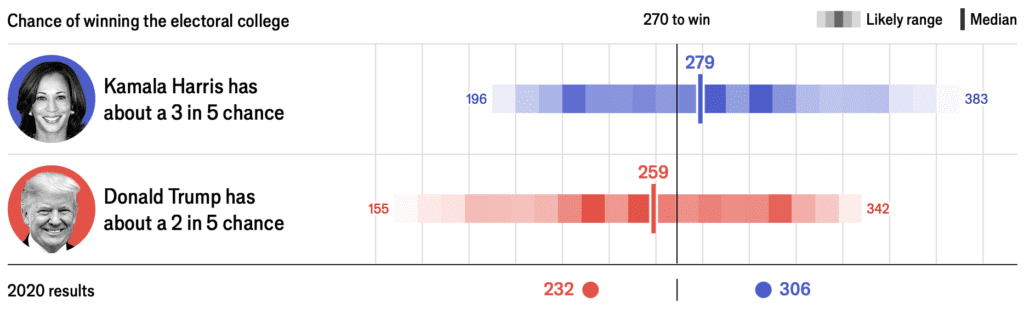
Visualization of uncertainty. Just as the individual beliefs and behaviors are best understood in a social context, probabilities are best understood in relation to the probabilities of other events. For example, in the 2020 U.S. election, Joe Biden was far ahead in national and state polls, but the probabilistic forecast needed to account for the possibility of systematic polling error. These graphs, which show probabilistic forecasts of Biden’s electoral vote conditional on polling error, are more informative than unconditional distributions.

In the event, the polling error was about 2.5 percentage points, and the final election was close.

Variation. Often what we learn from interactive data analysis are patterns of variation: a treatment that works in some settings but not others, geographic variation, behavioral differences between young and old people, and so forth. This is not about “forking paths” in the sense of different approaches to a single problem, but rather that data-driven science can lead us to see complexity, and this can be facilitated by modern workflows. To the extent that data graphics is automated and systematized (as with the grammar of graphics and the tidyverse in R), analysts can make graphs with less friction and will be more able to discover interesting and important variation.

Statistics as the science of defaults. Applied statistics is sometimes concerned with one-of-a-kind problems, but statistical methods are typically intended to be used in routine practice. This is recognized in classical theory (where statistical properties are evaluated based on their long-run frequency distributions) and in Bayesian statistics (averaging over the prior distribution). In computer science, machine learning algorithms are compared using cross-validation on benchmark corpuses, which is another sort of reference distribution.

Statisticians have standard estimates for all sorts of models, books of statistical tests, and default settings for everything. Statistical software has default settings, and even the choice of package to be used could be considered a default. More generally, much of the job of statisticians is to devise, evaluate, and codify methods that will be used by others in routine practice.

Automatic behavior is not a bad thing! When we make things automatic, users can think at the next level of abstraction. For example, push-button linear regression allows researchers to focus on the model rather than on how to solve a matrix equation, and it can even take them to the next level of abstraction and think about prediction without even thinking about the model. As teachers and users of research, we then are (rightly) concerned that lack of understanding can be a problem, but it’s hard to go back. We might as well complain that the vast majority of people drive their cars with no understanding of how those little explosions inside the engine make the car go round.

Dense data and sparse model, or sparse data and dense model. Tibshirani (2014) writes of the “bet on sparsity” principle: “The l1 methods assume that the truth is sparse, in some basis. If the assumption holds true, then the parameters can be efficiently estimated using l1 penalties. If the assumption does not hold—so that the truth is dense—then no method will be able to recover the underlying model without a large amount of data per parameter.” This reasoning applies to a world in which data are dense and underlying reality is sparse, a setting that arises in many areas of science and engineering. For example, a surveillance video has a huge amount of information which can be summarized in very few dimensions as the motion of a few people over time; or a long gene sequence can be studied with the goal of classifying people into a small number of disease-risk categories.

In other applications, data are sparse and the underlying reality is dense. In social and environmental sciences, pretty much no effects being studied are zero—but many of these effects will be lost in the noise if we attempt to learn them from data. For such problems, we do not want to assume or bet on sparsity; rather, we should accept complexity and variation while recognizing the limitations of our data and models. If we do use regularization techniques that induce sparsity when working in social science and policy, we should not kid ourselves that we have discovered fundamental sparse structures. It is helpful here to consider the thought experiment, “What would happen if we got tons and tons more data?” In that case we would surely discover further structure in the world. At its best, data-driven science tells us what we can learn right now, not what can be discovered in the future.

Simulation-based experimentation. Data analysis can be expensive in time and effort, and this can lead to us thinking that if a project took a lot of work then it has to be good. To state that belief is to mock it, yet it persists.

How can we avoid what might be called the “fallacy of effort”? We recommend simulation-based experimentation, which requires the following steps: (1) create a fake world, (2) simulate parameters and data from this world, (3) analyze the simulated data and get inference for the underlying parameters, (4) compare those inferences to the parameter values simulated in step 2. This can be done systematically in a Bayesian context (Modrák et al., 2024) but in practice informal checking can work just fine, in that problems will often show up in a simple simulation.

Creating a fake world is not easy—if analyzing a dataset is like playing Sim City, simulating fake data is like writing Sim City—but this effort can be well worth it, not just for the benefit of uncovering problems and the increased confidence arising from successful recovery, but also because constructing a simulation experiment is a way to clarify our thinking. Indeed, we often recommend simulating fake data before embarking on any real-world data collection process, to get a sense of what can realistically be learned from a proposed design.

Some thoughts on forking paths in communication:

Your most important collaborator. Your most important collaborator is you, six months ago—and she doesn’t answer email. One implication of this principle is that presentation graphics should not be so different from exploratory research graphics. When graphing data just for yourself, you want to make the patterns as clear as possible, which is also what you want for other audiences. A clear message and purpose, a crisp and transparent design, readability—these things are important for you too.

More generally, the collaboration principle points to the value of understanding the paths of our interactive data analyses: this includes keeping some record of what is being done, along with the development of software that facilitates a workflow with parallel analyses.

What is the purpose of the methods section? A frustrating aspect of science papers is that the methods section doesn’t fully describe what was actually done. It can take a lot of sleuthing to figure out how to reconstruct published results—and that doesn’t even get into all the things that got tried that didn’t get written up! Even when you include any published supplementary information, you still typically don’t see key details such as the wording and ordering of survey questions. Even if you set aside the possibility of scientific misconduct, people have difficulty writing up exactly what they did. With masters or doctoral thesis, you’ll often find that the bulk of the thesis is review material: students are writing up the book they wish they’d been given to read at the outset of the project. Then when you get to the parts of the thesis that describe the new material, you won’t see the data you need.

Why is it that researchers have such difficulty writing up exactly what they did? Setting aside fraud, writing up what you did should be the easiest thing to do! We have a couple of theories on this: (1) Students are used to reading textbooks and other materials written in general terms. It’s natural for them to imitate that style when they start to write for publication; (2) The ultimate goal of science writing is to increase collective understanding, but the immediate goal is acceptance (by the journal editors, the thesis committee, the boss, or whoever decides whether the report goes forward). And, for various reasons, it doesn’t seem that this acceptance requires or is even facilitated by a full and clear description of what you actually did.

Preregistration as a floor, not a ceiling. There is a concern that preregistration stifles innovation: if Fleming had preregistered his study, he never would’ve noticed the penicillin mold, etc. Our response is that preregistration is a floor, not a ceiling. Preregistration is a list of things you plan to do, that’s all; it does not stop you from doing more. If Fleming had followed a pre-analysis protocol, that would’ve been fine: there would have been nothing stopping him from continuing to look at his bacterial cultures. It can be really valuable to preregister, to formulate hypotheses and simulate fake data before gathering any real data. To do this requires assumptions—it takes work!—and we think it’s work that’s well spent. And then, when the data arrive, do everything you’d planned to do, along with whatever else you want to do.

Honesty and transparency are not enough. Reproducibility is great, but if a study is too noisy (with the bias and variance of measurements being large compared to any persistent underlying effects), that making it reproducible won’t solve those problems. Reproducibility (or, more generally, “honesty and transparency”) has been oversold, and we don’t want researchers to think that, just because they drink the reproducibility elixir, that their studies will then be good. Reproducibility makes it harder to fool yourself and others, but it does not turn a hopelessly noisy study into good science. We want to be able to say that a particular project is hopeless without implying that the researchers involved are being dishonest. Lots of people do research that’s honest, transparent, and useless! That’s one reason we prefer to speak of “forking paths” rather than “p-hacking”: it’s less of an accusation and more of a description.

“Rigor” as a slogan and the Chestertonian principle. Extreme skepticism is a form of credulity. This principle arises in politics, as with conspiracy theorists, and also in scientific method, where concerns of rigor can lead to a conceptual vacuum that is filled by something closer to pure speculation. Statistics textbooks will sometimes imply that causal inference is impossible without randomized experimentation and that population inference is impossible without random sampling—a position that is ridiculous given that real-world surveys of humans are almost never random samples or even close to that.

Rigor is important, though! Rigorous reasoning connects our analyses and conclusions to our theories (the trail of breadcrumbs mentioned earlier in this document). Understanding how our samples are not random is the first step toward adjusting for biases and quantifying possible errors. We should not think of rigor as being opposed to interactive data analysis.

Feeling disrespected. Those of us who work in data visualization and data-analysis workflow have long felt disrespected by theoreticians and proponents of often-spurious rigor. This can be annoying. For example, a theoretical statistician once wrote, “The particle physicists have left a trail of such confidence intervals in their wake. Many of these parameters will eventually be known (that is, measured to great precision). Someday we can count how many of their intervals trapped the true parameter values and assess the coverage. The 95 percent frequentist intervals will live up to their advertised coverage claims.” Maybe not! Based on the historical record, physicists’ intervals have not lived up to their advertised coverage (see Wasserman, 2008, and Gelman, 2008). Conversely, theorists can feel dissed by practitioners who don’t recognize the ways in which applied work has benefited from theoretical understanding. The relevance to the present discussion is that when considering communication we need to consider some of the social background context of specific scholarly disputes. There is a sort of Escher stairway, in which visualization experts feel disrespected by theorists, and theorists feel disrespected by applied practitioners.

The conditions leading to the replication crisis in psychology and other fields. Just as it is said that our modern megafires arise from having forests full of trees, all ready to ignite and preserved in that kindling-like state by firefighting policies that have favored preservation of existing trees over all else, so has the replication crisis been fueled by a decades-long supply of highly vulnerable research articles, kept in their pristine state through an active effort of leaders of the academic psychology establishment to suppress criticism of any published work. We are not claiming that psychology is worse than other fields; rather, psychology has lots of experiments which are easy to replicate (unlike in fundamentally observational fields such as economics and political science) and which are inexpensive in time, money, and lives (unlike in medicine or education research). Other fields also have woods that are ready to burst into flames, but the matches have not yet been struck in sufficient quantity.

Goals/audience, solutions, self-criticism. It is easy when working on a problem to jump in the middle. In our workflow we should remember to step back and consider our ultimate and proximate goals. The ultimate goal might be to make some policy decision or to crack some scientific problem; the proximate goal might be to bring a project to a conclusion—maybe better to say a stable intermediate state—so that it is publishable. And that is not a cynical goal: if research is worth doing, it’s worth sharing. Also relevant is the audience. When writing, you should choose your target audience, while realizing that others may read your document too. And you should also criticize the solutions you are offering. Even in a purely positive presentation, criticisms can take the form of delineating the boundaries outside of which your solutions will not work.

The politics of the science reform movement. The core of the science reform movement (the Open Science Framework, etc.) has had to make all sorts of compromises with conservative forces in the science establishment in order to keep them on board. Within academic psychology, the science reform movement arose from a coalition between radical reformers (who viewed replications as a way to definitely debunk prominent work in social psychology they believed to be fatally flawed) and conservatives (who viewed replications as a way to definitively confirm findings that they considered to have been unfairly questioned on methodological grounds). As often in politics, this alliance was unstable and has in turn led to “science reform reform” movements from the “left” (viewing current reform proposals as too focused on method and procedure rather than scientific substance) and from the “right” (arguing that the balance has tipped too far in favor of skepticism).

The importance of stories. Storytelling is central to science, not just as a tool for broadcasting scientific findings to the outside world, but also as a way that we as scientists understand and evaluate theories. For this purpose, a story should be anomalous and immutable; that is, it should be surprising, representing some aspect of reality that is not well explained by existing models of the world, and have details that stand up to scrutiny.

This raises a paradox: learning from anomalies seems to contradict usual principles of science and statistics where we seek representative or unbiased samples. We resolve this paradox by placing learning-within-stories into a hypothetico-deductive (Popperian) framework, in which storytelling is a form of exploration of the implications of a hypothesis. This back-and forth connects to the above-discussed idea of the fractal nature of scientific revolutions and, more generally, to the forking paths of interactive data exploration.

The foxhole fallacy and the pluralist’s dilemma. In an article entitled, “No Bayesians in foxholes,” the statistician Leo Breiman (1997) made the confident and false statement that, “when big, real, tough problems need to be solved, there are no Bayesians.” It would be more accurate to say that Breiman was not aware of any such examples and indeed seemed to put in some effort to avoid finding them. What’s funny is that he couldn’t just say that he had made great contributions to statistics, and others had made important contributions to applied problems using Bayesian methods. He had to go beyond his expertise and exhibit the “foxhole fallacy,” whereby someone does not seem to be able to believe that other people can legitimately hold views different from theirs. Related to this is the pluralist’s dilemma: how to recognize that our approach is just one among many, that our own embrace of this approach is contingent on many things beyond our control, while still expressing the reasons why we prefer our approach to the alternatives (at least for the problems we work on). When considering scientific exploration and communication, we keep returning to this issue.

Taking political attitudes seriously. A challenge in science communication is when people have preconceived notions and are not open to following the data or willing to accept empirical results. This is related to the “law of small numbers” fallacy identified by Tversky and Kahneman (1971), that there is an expectation that all evidence on a topic should go in the same direction.

When it comes to policy analysis, there are two ways to resolve this problem. From one direction, we want to develop tools for better communication of research results so that strong findings can be persuasive to skeptics (while continuing the work of science reform that is focused on assuring that weak evidence is not overstated). From the other direction, we have to accept that some stakeholders are not about to change their policy positions, perhaps because of legitimate external reasons. For example, a study could be performed estimating the economic effects of some social policy, but a policy maker might already favor (or oppose) the policy because of concerns of cost, ethics, or other outcomes. Even in a pure science context, a researcher might have a prior commitment to a line of research that is too strong to be shaken by any single study.

What to do when working with people who are expected to hold a fixed position? We propose to avoid the usual frustrations by accepting this position and flipping it around, asking the question: Given that this larger policy or theoretical position is fixed, how would these people incorporate new evidence into their understanding? The point is to avoid painting people into a corner. For example, suppose someone is committing to thinking that a certain drug treatment is a good idea, and then data come in showing no effect. Allow the believer to say something like, “Even if this drug does not work in this particular setting, I believe it works elsewhere,” or “Even if this drug is ineffective, I support that a general policy of approving more treatments will on average lead to improvements by encouraging innovation,” or whatever. There is no need to agree with such a position; the point is that this kind of exchange moves the discussion forward, rather than everything getting stalled on a refusal to accept new evidence or a refusal to discount a discredited evidential claim.

References

Leo Brieman (1997). No Bayesians in foxholes. IEEE Expert 12 (6), 21-24.

Erik Gartzke (2007). The capitalist peace. American Political Science Review 51, 166-191.

Andrew Gelman (2004). Exploratory data analysis for complex models (with discussion). Journal of Computational and Graphical Statistics 13, 755-779.

Andrew Gelman (2008). Objections to Bayesian statistics (with discussion and rejoinder). Bayesian Analysis 3, 445-477.

Andrew Gelman, Jennifer Hill, and Masanao Yajima (2012). Why we (usually) don’t have to worry about multiple comparisons. Journal of Research on Educational Effectiveness 5, 189-211.

Andrew Gelman and Eric Loken (2013). The garden of forking paths: Why multiple comparisons can be a problem, even when there is no “fishing expedition” or “p-hacking” and the research hypothesis was posited ahead of time. https://stat.columbia.edu/~gelman/research/unpublished/forking.pdf

Andrew Gelman, Aki Vehtari, Daniel Simpson, Charles C. Margossian, Bob Carpenter, Yuling Yao, Paul-Christian Bürkner, Lauren Kennedy, Jonah Gabry, and Martin Modrák (2020). Bayesian workflow. https://stat.columbia.edu/~gelman/research/unpublished/Bayesian_Workflow_article.pdf

Jessica Hullman and Andrew Gelman (2021). Designing for interactive exploratory data analysis requires theories of graphical inference (with discussion). Harvard Data Science Review 3 (3).

Martin Modrák, Angie H. Moon, Shinyoung Kim, Paul Bürkner, Niko Huurre, Kateřina Faltejsková, Andrew Gelman, and Aki Vehtari (2024). Simulation-based calibration checking for Bayesian computation: The choice of test quantities shapes sensitivity. Bayesian Analysis.

Robert Tibshirani (2014). In praise of sparsity and convexity. In Past, Present, and Future of Statistical Science, ed. Xihong Lin, Christian Genest, David Banks, Geert Molenberghs, David Scott, and Jane-Ling Wang. CRC Press.

John W. Tukey (1972). Some graphic and semigraphic displays. In Statistical Papers in Honor of George W. Snedecor, ed. T. A. Bancroft. Iowa State University Press.

Amos Tversky and Daniel Kahneman (1971). Belief in the law of small numbers. Psychological Bulletin 76, 105-110.

Larry Wasserman (2008). Comment on “Objections to Bayesian statistics,” by Andrew Gelman. Bayesian Analysis 3, 463-465.

Some fun basketball graphs

Aki pointed me to these graphs from Kirk Goldsberry. A few years old now, but still fun:

The above graph would be good one for my communications class. Some good features:

1. Clear title and labeling: That’s important. It helps for readers to get the point right away.

2. Juxtaposition of multiple small plots. I’d actually prefer a series of three plots—1997, 2009, 2019—as that would make the trajectory even clearer. Also, are the data available to go back in time before 1997? That would be interesting too. In general I would like time series to be longer.

I don’t think the color scheme is ideal. You can kind of figure it out because the patterns are locally monotonic, so you can see which areas have higher rates, but my general feeling about this kind of sharp color change is that it can create visual artifacts and distort our understanding of the data. I still love this graph; I just think that there’s some room for improvement. Here’s another where I think the color scheme gets in the way.

Here’s another great graph:

Super-clean, super-clear, makes the point very well. It reminds me of a general point in statistics, that the best thing is not to have an amazing method but to ask a good question and get good data.

And here are a couple of possible improvements:

– If the data are available, extend the line earlier in time.

– Add another line for when Jordan was playing, showing his own percentage of this sort of shot. The graph says it’s his favorite shot; let’s see the data.

– Include other lines or plots showing other shots. Why not?

Again, it’s no criticism of these graphs to say that they maybe could be improved. That’s how we can appreciate art: not just by staring at it and saying how great it is, but thinking about how it could be different.

P.S. Goldsberry has a webpage that links to a bunch of cool basketball-related images. Unfortunately (from my perspective), he seems to have moved away from statistical visualizations and gone more in the direction of infographics, for example here:

This is fine—who am I to say how he should best reach his audience?—it’s just not focused a bit less on communicating patterns in the data and a bit more on creating a visual impression. I’m guessing that Goldsberry makes lots of statistical graphics on the way to constructing each of these visualizations. His webpage features lots of amusing basketball cartoons with a distinctive visual style, so I can kinda see where he’s going here.