Survey Statistics: structured MRP to smooth survey weights

Last week, Raphael K shared a concern: adjusting for lots of variables can lead to very large weights. So today let’s dive into Si et al. 2020, who saw this in constructing survey weights for the NYC Longitudinal Study of Wellbeing.

To adjust for lots of variables, Si et al. 2020 turned to MRP (Multilevel Regression and Poststratification) and equivalent weights based on these models (see “struggles with equivalent weights”continued struggles, and “equivalent models, equivalent weights (locally)”).

In a simulation study they compare:

  • Ind-P: MRP with commonly-used Independent Normal priors
  • Str-P: MRP with a structured prior, see below.
  • Ind-W: equivalent weights version of Ind-P
  • Str-W: equivalent weights version of Str-P
  • Rake-W: classical raking weights, a type of calibrated weights
  • PS-W: classical poststratification weights, another type of calibrated weights
  • IP-W: inverse probability of selection weights

They cover the “3 flavors of survey weights”: equivalent weights, calibrated weights, IP-W.

I won’t bury the lead, they found MRP performed best, then equivalent weights, then classical weights (calibrated or IP-W). See their Figure 4.1 for the simulation scenario without terribly many empty poststratification cells:

With many empty poststratification cells, Str-P outperforms Ind-P. (They don’t redo Figure 4.1 for this scenario, which confused me a bit.) So what is this structure that helps ?

In “improving with structure” we saw that Gao et al. 2021 found it helpful to use the ordinal structure of variables like age. Si et al. 2020 use the interaction structure:

We induce structured prior distributions to be able to handle deep interactions and account for their hierarchy structure, where the high-order interaction terms will be excluded if one of the corresponding main effects is not selected.

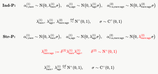
I asked about sparse priors for MRP back in “Sparsified MRP”. I didn’t remember that Si et al. 2020 had worked on this ! Ok so they write their structure more generally but I find it easier to read with a specific example. Consider just 2 variables from their motivating NYC Longitudinal Study of Wellbeing: age (5 categories) and race (5 categories). Here’s how their Ind-P prior differs from the Str-P:

(I had Claude type up my hand-drawn notes, though I still share Brendan Leonard’s preference for hand-drawn materials.)

Si et al. 2020 say these are similar to the Horseshoe prior. It differs in two ways, I think ? First, Si et al. 2020 have the selection at the batch level (e.g. age or race). The usual Horseshoe would have local scale lambdas for each age and race category. Second, the usual Horseshoe would use a half-Cauchy rather than half-Normal prior on these local scales.

Ok let’s get back to the original concern: adjusting for lots of variables can lead to very large weights. Si et al. 2020 show in Figure 5.1 that the equivalent weights based on this structured prior model look much less variable than calibration weights (I don’t see the IP-W weights in the figure itself):


Adjusting for nonrepresentativeness in continuous norming using multilevel regression and poststratification.

Klazien de Vries, Marieke E. Timmerman, Anja F. Ernst, and Casper J. Albers write:

In psychological test norming, nonrepresentativeness in background variables in the normative sample can lead to bias in the normed score estimates. Because representativeness is difficult to establish in practice, adjustment methods are needed to combat this bias. As a candidate adjustment method, we investigated generalized additive models for location, scale, and shape with multilevel regression and poststratification (GAMLSS + MRP), the combination of MRP and continuous norming with GAMLSS. This adjustment method was then compared to current adjustment methods in continuous norming using weighted regression: GAMLSS + P (with poststratification) and cNORM + R (with raking). The results of our simulation showed that GAMLSS + MRP was generally more efficient than GAMLSS + P and cNORM + R. Furthermore, GAMLSS + MRP was better than the current methods at reducing bias in samples where the nonrepresentativeness was age-dependent. We argue that GAMLSS + MRP is a valid adjustment method in continuous norming and recommend this adjustment method to mitigate bias in nonrepresentative normative samples. To facilitate the use of GAMLSS + MRP in practice, we provide a step-wise approach for the implementation of GAMLSS + MRP. We illustrate this approach by deriving normed scores from the normative data of the third Schlichting language test.

I don’t recall how I came across this paper, and I haven’t actually read it, but I wanted to share it with you, just because it’s cool to see the different ways that multilevel regression and poststratification (MRP) can be used.

Ultimately, MRP is the inevitable consequence of three things:

1. We are interested in generalizing to populations of interest.

2. Available data are typically unrepresentative of the population. This is the case even with simple random sampling–Hello, random variation! Hello, small-area estimation!–and is even more so with selected samples, nonresponse, dropout, etc. In some settings such as medical experimentation there’s not even an attempt to get a representative sample: you’re directly aiming to include in the study the groups of people who might get the greatest benefit from the treatment.

3. When adjusting for differences between sample and population, many variables can be relevant–for example, demographic and geographical variables in a survey of people–and so simple adjustments such as raw poststratification or non-multilevel regression adjustment won’t do the job.

Put this together and you’ll want to do MRP (or, more generally, RPP). It’s not just for survey research. It comes up everywhere in statistics and machine learning, whenever there is a concern with population prediction, or generalization, or transportability, or whatever you want to call it.

It can seem like a hassle that to do this you need to know (or estimate, or postulate) a distribution of predictors in your population, but (a) this is often work that’s well worth the effort, if you really care about the population, (b) dependence of the result on the choice of population is important, and where this dependence is strong you should be aware of it, and (c) if you want to take the easy way out you can always bootstrap to get inference for the hypothetical population of which your data are considered to be a random sample.

What is the relation between interactions in a regression model and correlations among the predictors?

I’ve often seen confusion between interactions in a regression model and correlations among the predictors. To keep it simple, consider the model y = b0 + b1*x1 + b2*x2 + b3*x1*x2 + error, and assume the predictors have been signed so that both b1 and b2 are positive. Then b3 represents the interaction. This has nothing to do with the joint distribution of x1 and x2 in the data, or in the population. (For simplicity, assume the data to which the model are being fit is a random sample from the population of interest.)

The interaction depends on the model of y given x1 and x2, while the correlation depends on the model for x1 and x2. These are two completely different parts of the model. And yet, they often seem connected.

I have the general impression that I’d be more likely to expect a positive interaction of x1 and x2 when predicting y, if x1 and x2 are positively correlated in the population.

For example, when predicting income from height and sex, being taller and being male both predict higher income, also they interact–the coefficient for height is higher for men than for women–and of course the two predictors, height and male, are positively correlated in the population.

I’m not sure how to think about this connection or even whether it’s a real pattern! But there might be something there so I wanted to share it with you.

The issue of interactions comes up in the context of the concept of intersectionality, which is a form of interaction that comes up in sociology. It started for me with this email from Elin Waring:

I’ve been working on data on intersectionality and retention of students in STEM majors. My little group is specifically looking at data from Lehman College and trying to model graduation with a STEM degree. There are a lot of details, but basically we have come to the conclusion that the right way to describe this is with a discrete time competing risk model (the competing risks being graduation with a STEM degree and graduation with a non-STEM degree). I won’t go into all the details. We have data for between 1 and 20 semesters enrolled for students starting as freshman. For us, intersectional identity is defined by 5 variables that yield 32 distinct combinations or strata as used in the next articles.

In trying to think about how to account for intersectional identities we came across the “MAIHDA Method.” I was wondering if you had seen this discussion before or have any thoughts about it.

Evans, Clare R., George Leckie, and Juan Merlo. 2020. “Multilevel versus Single-Level Regression for the Analysis of Multilevel Information: The Case of Quantitative Intersectional Analysis.” Social Science & Medicine (1982) 245:112499. doi:10.1016/j.socscimed.2019.112499.

They essentially argue for treating the strata as random effects in a multilevel model where with the individual components of the combinations introduced as fixed effects describing the combinations.

The next article criticizes that approach and argues for fixed effects all around.

Wilkes, Rima, and Aryan Karimi. 2024. “What Does the MAIHDA Method Explain?” Social Science & Medicine 345:116495. doi:10.1016/j.socscimed.2023.116495.

Responded to here:

Evans, Clare R., Luisa N. Borrell, Andrew Bell, Daniel Holman, S. V. Subramanian, and George Leckie. 2024. “Clarifications on the Intersectional MAIHDA Approach: A Conceptual Guide and Response to Wilkes and Karimi (2024).” Social Science & Medicine 350:116898. doi:10.1016/j.socscimed.2024.116898.

I was wondering if you have any thoughts about this? For me, intersectionality as a theoretical approach does mean that it makes sense to look at the strata rather than thinking of the strata as just the most complex level of creating statistical models of the intersection of the variables. But then it seems as though treating this a random effect more or less undermines its centrality to the theory. And is treating both the strata and the individual characteristics as variables at the same level basically a way to decompose?

In the end, I feel like the pro-MAIHDA people retreat to “we are just descriptive” in a way that isn’t very helpful. That said, they are right that this seems to have some traction in the world of health disparity research.

I replied that I’d never heard of any of this method before. I couldn’t actually muster the energy to read the above articles, as all this debate seems to be missing the key issues. I don’t really care if something is called a fixed effect or a random effect (see here); my current preferred way of thinking of these problems is by framing as a generative model.

Regarding intersectionality, the natural way I would see it is that this would show up as an interaction term, the idea that the interaction is more than the sum of its parts? For a simple example, if there are 5 binary variables and each has the same effect on its own (which they wouldn’t, this is just a simple hypothetical example), then you could create a variable which is the total number of identities, thus a number from 0 to 5, and “intersectionality” would show up as a super-linear or convex relation between the outcome and this total predictor?

Waring responded:

Sure, but the idea you suggested about intersectionality itself isn’t right. You can’t just sum the number of identities, everyone has identities and the idea is that it is not just about concentrated disadvantage of having all or some specific identities. If we have 5 dichtomous identity/group variables everyone has 5 dimensions of identity. Intersectionality is about the idea that something like “white, native born. woman, high income” shapes what happens because of how those come together to shape (in the case of my analysis) whether, as an undergraduate, you persist in STEM fields.

I replied as follows:

Yes, I was actually thinking this when I wrote that! I was imagining that each of the 5 factors has an “off” and “on” setting, and intersectionality kicks in when there are multiple “on” settings, where “on” represents the group that faces more difficulty (nonwhite, non-native born, female, low income, gender nonconformist, etc.). Once you allow arbitrary possibilities for intersectionality, then my simple superadditive model wouldn’t fit. On the other hand, if you were to allow all 32 possibilities to take on any value, then realistically you would not be able to estimate anything much at all: this is the usual problem in sociology of approximating a complex social structure by a simple model that explains most of the variance. For predicting persistence in STEM (or any academic field), one possible factor that could enter in a complicated way is conservative political ideology, in that for many attitudes and behavior its predictive effect goes in the opposite of the “on” categories listed above, but grad students, in STEM and other fields are predominantly politically on the left. I could well imagine that conservative political ideology, like the other “on” categories, is predictive of not persisting in STEM but that this could interact in unexpected ways with those other categories.

From a statistical perspective, my main message is to choose such a model based on its explanatory power and recognizing that it’s an approximation, rather than using methods such as statistical significance or Bayes factors which in different ways are driven by sample size, as we discussed in this 1995 paper.

Another interesting statistical feature of this and similar discussions is that it’s natural for the discussion to go back and forth between the correlation between two predictors in the data (or the population) and the interaction between their predictive effects, as discussed at the top of this post.

I’m not sure if this interaction thing is a general pattern that has some statistical explanation, or just a faulty intuition of mine based on just a couple of special cases. But I have noticed a general confusion that when people talk about interactions, often they seem to be talking about correlation between the predictors.

MrPlew: Locally Equivalent Weights for Multilevel Regression and Poststratification

Ryan Giordano, Alice Cima, Jared Murray, Erin Hartman, and Avi Feller write:

Multilevel regression and poststratification (MrP) has become a workhorse method for estimating population quantities from non-probability surveys, and is the primary model-based alternative to traditional survey calibration weighting methods, such as raking. For simple linear regression models, MrP methods admit “equivalent weights”, allowing for direct comparisons between MrP and traditional calibration weighting. Such weights, however, have been unavailable for the most widely used MrP models, such as logistic regression. In this paper, we develop a natural generalization, “MrP locally equivalent weights” (MrPlew), which represent MrP as a weighting-style estimator that is locally equivalent to calibration weights near the observed responses.

Cool! This goes beyond my 2007 paper, Struggles with survey weighting and regression modeling (“for logistic regression, the poststratified estimate is no longer a weighted average of the data, even after controlling for the variance parameters in the model. However, we suspect that the model could be linearized, yielding approximate weights”) and our 2004 paper on dilution assays, in particular Section 5.2, “Equivalent weights for nonlinear models.” The funny thing is that I forgot about that 2004 paper when working on equivalent weights for MRP in the 2007 paper. Also, the 2004 method won’t work as is, because it’s designed to estimate sensitivity to individual data points, not to produce good weighted averages.

I say this not to try to claim credit for the method of Giordano et al., but rather the opposite, to emphasize that even though I’ve been thinking about equivalent weights in MRP for a long time, I haven’t yet succeeded in getting them to work in practice, so I’m very happy to see developments in this area.

One thing that came up with equivalent weights when we tried to apply them in practice is that sometimes the weights can be negative.

Negative weights can sometimes make statistical sense. The idea is that, depending on how the data line up in the regression model, sometimes if you pull one data point upward, it will cause the slope of the fitted line to change in such a way as to reduce the predicted mean value. This doesn’t sound right at first, but it can easily occur with poststratification when the population distribution of the predictors differs from the sample. Even if the negative weights can make sense in the estimation context, it still would seem kind of awkward to pass them along to the user.

The other thing that’s tricky is: What are the weights going to be used for? In the 2007 paper, the equivalent weights are set up to get the right answer for the estimate of the population mean, but presumably they’d be used for large subgroups too (for example, the average among men or women in the population). For more complicated estimates such as arise in small-area estimation or regression, you might want to use MRPW. Which is fine, but whatever it would take to get good weights for one of these purposes might not work best for the others.

Still, I remain interested in MRP locally equivalent weights of some sort, for two reasons:

1. We’re often doing MRP (or, more generally, RPP) anyway, so why not provide weights for other users of the survey that we’re analyzing?

2. Sometimes we’re called upon to provide weights for a public-facing survey, and the way we end up doing this is through an awkward and unsatisfying sequence of adjustment and smoothing steps (the “struggles” in “Struggles with survey weighting and regression modeling”). If we can do this using modeling and MRP, that could be a much more effective workflow, providing weights that are more stable and yield more accurate estimates of population quantities while also being more scientifically defensible and requiring fewer arbitrary choices.

Model-based weights will depend on some set of predictors X, variables that are observed in the sample and in the population (or, as necessary or appropriate, estimated from the population). One funny thing is that the weights will be mathematically a function of X, but the function itself will depend not just on sampling design, and not just on the distributions of X in the sample and population, but also on the outcome y that is being modeled. Different outcome variables will yield different sets of weights. At first this might seem disturbing, but upon reflection I think this dependence is a good thing. When it comes to weighting, the relative importance of the different variables in X will indeed depend on the outcome. Different variables are important for predicting public health risk factors than predicting how you will vote. That said, if you want some sort of omnibus weights, which you probably will want for a public survey, you can compute equivalent weights for each of a battery of outcomes and then average these weights to get a single set. That seems reasonable enough.

OK, back to Giordano et al., who continue:

This enables a suite of standard weighting diagnostics, including frequentist sampling variability, covariate balance, and subgroup contribution. We formally justify the use of MrPlew in these cases: we prove the MrPlew-based variance estimator is asymptotically equivalent to the infinitesimal jackknife for common exponential family models, and we introduce a novel class of model checks based on invariance to data perturbations that generalize covariate balance and subgroup contribution to nonlinear models. We further show that MrPlew can be computed easily using existing MCMC samples and provide open-source software to compute MrPlew using the output of standard software. We illustrate our approach for several canonical studies that use MrP, including via a logistic regression outcome model, showing that implied covariate balance can sometimes be worse for MrP than for raking. Given the ease of computing, we recommend making MrPlew a standard part of the MrP model interrogation workflow.

It makes sense that implied covariate balance can sometimes be worse for MRP than for raking. MRP is a smoothed version of raking, and unsmoothed raking can overfit. Or, in practice, you might rake on fewer variables so as to avoid overfitting. Multilevel regression gives you the freedom to include more predictors and interactions, secure in the understanding that the model will smooth the estimate and there will be less possibility for overfitting. In short, multilevel modeling–or, more generally, regularization–is a sort of safety net that can give us the security to construct better models, in the same way that a social safety net can give people the security to try new jobs, or for that matter in the same way that an actual safety net can give acrobats the security to perform more elaborate routines.

Where I want to go next is to be able to use these methods to construct weights for public surveys. I’m still not sure about all the steps that will take us there, but I continue to think it’s possible.

The new Giordano et al. paper is thoughtful and readable as well as having lots of math, statistical modeling, and real-data examples. I recommend you read it.

Jonah’s seminar tomorrow: “Bayesian Workflow and the Software That Shapes It”

This is Leo. Jonah Gabry (Stan developer, Andrew’s collaborator, etc.) is spending the whole month of May as a visiting professor here with us at the University of Trieste in Italy. Tomorrow, May 19th, in the De Finetti room at the University of Trieste, at  9 am NYC time (GMT-4), Jonah will give the following talk:

“Bayesian Workflow and the Software That Shapes It”

based on the upcoming book:  “Bayesian Workflow”.

For anyone local, you are welcome to come in person. Anyone else can join on Microsoft Teams (available here).

Should French pollsters be using Mister P?

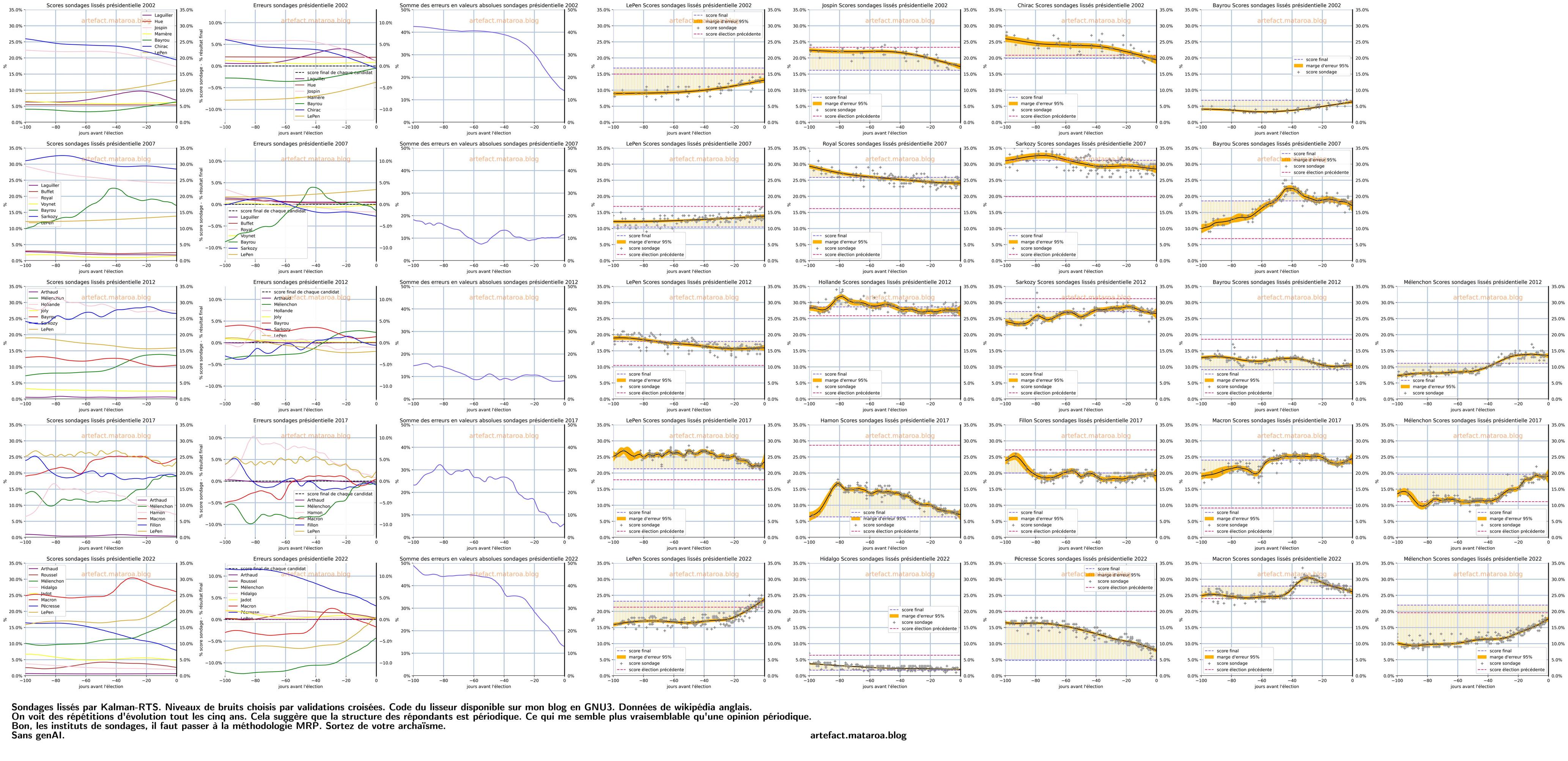
An anonymous statistics student from France sends in the above plots (click twice to see big versions) and writes:

I’m trying to push French pollsters to start doing MRP.

I made a poll agregator and applied it to the last 100 days of the last five french presidential elections.

I did some smoothing using an algorithm from a paper of Aki Vehtari. It is Kalman-RTS with cross-validated levels of noises.

I tested it on some simulated data to confirm it is fitting properly.

I put the data and the code on my blog.

What I shared as “the data” is the smoothed result. I fitted it on the wikipedia pages of the french polls.

On the plots, the same parties (with changed names or fusions) are on the same position horizontally to allow comparisons.

I see some periodic movements in opinion that I think may be coming from a periodic non-response.
Also, the movements seem far too large to me. I can believe 10% increase for a candidate in five years, but not in less than 100 days.

The French polling industry is in profound need of reform. A fun fact: They allow themselves to change the final result by plus or minus one point based on the feelings of the person in charge of the poll. They call that the “pifomètre” or nosemeter. I heard about this in an interview with sociologist Hugo Touzet on his book, “Produire l’Opinion: Une Enquête Sur Le Travail Des Sondeurs.” I trust his descriptions of their methods since he has interviewed their workers.

I think MRP would allow the pollsters to do predictions for the legislative elections and municipal elections, which have been largely ignored because they are too difficult and expensive with quota sampling.

I know next to nothing about French polling, but, yeah, I do think they should be using Mister P (multilevel regression and poststratification; MRP).

P.S. Here’s a fun cranky post from this student.

My talk at Stanford later this month: “What to do when your estimate is 1 standard error away from 0?”

Tuesday 28 Apr 2026, 4pm in CoDa E160:

What to do when your estimate is 1 standard error away from 0?

Andrew Gelman, Department of Statistics and Department of Political Science, Columbia University

We provide a new answer to this simple yet very important question. Thinking clearly about this problem leads us to bring in many ideas in statistical analysis and computing, including causal identification, meta-analysis, Mister P, expectation propagation, decision analysis, experimental design, and the fundamental unity of Bayesian and frequentist statistics. We demonstrate our approach in examples from many applications, including medicine, social science, business, sports, and public policy.

This work is joint with Witold Więcek and Erik van Zwet.

In addition to all the above, I’ll probably drift into some related general topics such as the role of experimentation in science and engineering and the limitations of thinking about policy analysis in terms of causal inference.

Survey Statistics: design-based cross validation (dCV)

Last week we saw how cross-validation noise can swamp important model differences (Wang & Gelman 2014). The comments raised another challenge: how to split into train and test sets with structured data ?

Aki explains options here:

Thomas Lumley’s blog post and coauthored paper Iparragirre et al. (2023) explore CV using “replicate weights” ideas:

Replicate weight methods split the sample into partially independent subsamples, and modify the weights so that each subsample replicates the original sample. They are usually used for variance estimation, but Iparragirre et al. (2023) consider them for out-of-sample error estimation.

Although I was rooting for BRR (Balanced Repeated Replication) because I work at Blue Rose Research, a better method seems to be design-based cross validation (dCV), depicted in their Figure 1(d):

Each dot is a PSU (primary sampling unit), which can be an individual but is often a group/cluster of individuals. Each color is a stratum. dCV is the usual K-fold CV but:

  1. keep PSUs together within a fold
  2. reject a split if a whole stratum falls into one fold
  3. modify the weights so that each subsample replicates the original sample

The first mirrors Aki’s LOGO (leave-one-group-out) CV above. The third is an idea from replicate weights.

The first two seem useful for nonprobability samples as well ? Suppose there is structure in the data and our predictive task is to predict for new schools (PSU-like) but existing states (strata-like). Is there a good reference for this ?

These are the three ways of attacking a statistical problem (illustrated with the NFL example)

The following question came up the other day:

What's the most common four game start to an NFL season?
W W W W
W W L L
L L W W
W L W L
L W L W
L L L L

I replied:

Logic and math suggest that it’s either the first one or the last one. I think that extremely shitty teams are more prevalent than extremely good teams, so I’m guessing the last option.

There was a bunch of discussion in comments and so I thought I’d elaborate by describing three different ways of attacking this problem. The various ideas discussed in the comments to my earlier post can be thought of as approximations to these three approaches.

1. Probability calculation

Just to flesh out my intuitive reasoning above, let’s go with classic item response theory (a class of models that was originally developed around the time of the founding of the NFL, actually, but for different purposes!) and model the probability that team i beats team j as:

Pr(team i beats team j) = invlogit(a_i – a_j + b*home_ij),

where a_i and a_j are the ability parameters for teams i and j, and home_ij is a home-field measure, equal to 1 if i is the home team, -1 if j is the home team, and 0 if they’re playing on a neutral field. I’ll keep things simple by excluding the possibility of a tie game.

And now some numbers. First, what’s the home-field advantage? It says here that home teams win about 55% of their games, and if we assume this 55% roughly applies to two equally-matched teams, then b = logit(0.55) = 0.2.

Next come the team abilities. Let’s start with a normal distribution: a_i ~ normal(0, sigma_a). What’s a good value for sigma_a? Well, let’s compare a team that’s 1 sd better than average to a team that’s 1 sd worse than average. These are the 84th and 16th percentiles, which for a 32-team league would be roughly the 5th and 27th best teams. The probability that the 5th best team beats the 27th best team on a neutral field will be invlogit(2*sigma_a). What is that probability? Let’s say 90%? In that case, sigma_a = logit(0.9)/2 = 1.1. Or if the probability is 80%, then logit(0.8)/2 = 0.7. I don’t know . . . let’s say sigma_a = 1.

Now we can do some math . . . ummm, let’s just simulate a million games:

n_sim <- 1e6
b <- 0.2
sigma_a <- 1.0
a_i <- rnorm(n_sim, 0, sigma_a)
y <- rep(0, n_sim)
for (k in 1:4){
  a_j <- rnorm(n_sim, 0, sigma_a)
  home_ij <- rbinom(n_sim, 1, 0.5)
  y <- y + 10^(4-k) * rbinom(n_sim, 1, invlogit(a_i - a_j + b*home_ij))
}
output <- table(y)
names(output) <- sprintf("%04d", as.numeric(names(output)))
print(output)

Kind of hacky . . . this is how I learned how to code back in the 1970s!

Anyway, here's the result:

  0000   0001   0010   0011   0100   0101   0110   0111   1000   1001   1010   1011   1100   1101   1110   1111 
102992  56795  56726  48753  56499  48423  48170  63246  56738  48173  48075  63398  48344  62814  63208 127646 

Hey, that's wack! As predicted, more at the extremes, but more 1111's than 0000's! I'd've expected they'd be equal, given that I've simulated the sigma_a's from a symmetric distribution.

Let's try again with a new set of random numbers:

  0000   0001   0010   0011   0100   0101   0110   0111   1000   1001   1010   1011   1100   1101   1110   1111 
102759  56663  56887  48353  56695  48292  48581  63118  56562  48748  48057  63443  48541  62860  62885 127556 

Again, lots more 1111's!

I guess it has something to do with the home-field advantage . . . oh, I see, I have a bug in my code! I'd assigned home_ij as equally likely to be 0 or 1, but what I should be doing is having it equally likely to be -1 and 1. So I'll swap out the line

  home_ij <- rbinom(n_sim, 1, 0.5)

with:

  home_ij <- sample(c(-1,1), n_sim, replace=TRUE)

And now I'll run the corrected code. Here's what we get:

  0000   0001   0010   0011   0100   0101   0110   0111   1000   1001   1010   1011   1100   1101   1110   1111 
114165  60279  60102  48707  59340  48413  48431  59904  59922  48644  48859  59741  48284  60178  60115 114916 

Ahhhh, much better.

But maybe those numbers are too extreme . . . does a good team really have a 90% chance of beating a bad team? Remember the saying, "any given Sunday"! So let's try again with sigma_a = 0.7. Here's what a million simulations gets us:

 0000  0001  0010  0011  0100  0101  0110  0111  1000  1001  1010  1011  1100  1101  1110  1111 
94877 61211 61547 53396 61252 53336 52875 61609 61432 53280 52924 61390 53079 61498 61484 94810 

So, even then, lots more 4-game losing streaks and 4-game winning streaks than anything else.

Some commenters said that the NFL does schedule balancing so that good teams are more likely to play good teams and bad teams are more likely to play bad teams. This would reduce the counts at the extremes. We could model that too but I'm kinda lazy so I won't do it here. As the textbook writers say, I'll leave it as an exercise for the reader.

But what about that other thing, that there are more extremely shitty teams than extremely good teams? We can use some skewed distribution . . . ummmm, I don't know much about these! There's something called the noncentral t . . . I'd like to do something with some intuition, something I understand. OK, for now I'll just hack it, replacing the normal(0,1) distribution by a normal(0,0.7) on the positive side and normal(0,1.0) on the negative.

So, in the above code I'll add the function:

rnorm_split <- function(n_sim, mu, sigma_neg, sigma_pos) {
  z <- rnorm(n_sim, 0, 1)
  ifelse(z < 0, mu + sigma_neg*z, mu + sigma_pos*z)
}

and then change the two instances of

rnorm(n_sim, 0, sigma_a)

to

rnorm_split(n_sim, 0, 1.0, 0.7)

And here we have it:

  0000   0001   0010   0011   0100   0101   0110   0111   1000   1001   1010   1011   1100   1101   1110   1111 
106711  59807  59534  50637  59860  50934  50615  61828  59241  50613  50626  62066  50725  61784  61985 103034 

To check uncertainties, we do it again:

  0000   0001   0010   0011   0100   0101   0110   0111   1000   1001   1010   1011   1100   1101   1110   1111 
107451  59519  59545  50471  59237  50756  51172  62029  59726  50706  50685  61763  50829  61576  61785 102750 

So, yeah, slightly more 0000's than 1111's, but not a lot, so who's to say what will happen after piping it through the scheduling thing where better teams play each other more often. I still think the general pattern will hold, but it might not show up in a small dataset. We'll get back to that point in a bit.

2. Purely empirical solution

According to wikipedia, "The NFL was formed in 1920 as the American Professional Football Association (APFA) before renaming itself the National Football League for the 1922 season." So let's start in 1920. Back in the day they had a lot of ties, so I'll make the decision to exclude ties; thus the above question will be interpreted as, "What's the most common four game start to an NFL season, excluding ties?"
Somebody who knows how to scrape should be able to could scrape the data from all the NFL seasons and just count up what happened.

OK, that's the planned data analysis. Next comes the design analysis: our expectation of what we might see.

The NFL used to have about 15 to 20 teams and now it has 32; just as a rough calculation I'll go with 25 teams per season x 100 seasons = 2500 teams, with 16 possible outcomes for the first 4 games of the season. 2500/16 is approximately 150, and if the games were all decided by coin flips (which they're not), then we'd expect approximately 150 +/ sqrt(150), that is 150 +/- 12 in each category.

But the games aren't decided by coin flips. See section 1 above. Our best guess is that there will be more cases on the extremes. Let's take the above numbers, which are based on a million teams playing 4 games each, and scale them down to 2500. That is, I'll simply take the numbers above and divide them by 400:

print(output*2500/1e6)

This yields:

    0000     0001     0010     0011     0100     0101     0110     0111     1000     1001     1010     1011     1100     1101     1110     1111 
268.6275 148.7975 148.8625 126.1775 148.0925 126.8900 127.9300 155.0725 149.3150 126.7650 126.7125 154.4075 127.0725 153.9400 154.4625 256.8750 

Ugly! Let's try again:

print(round(output*2500/1e6))

Which yields:

0000 0001 0010 0011 0100 0101 0110 0111 1000 1001 1010 1011 1100 1101 1110 1111 
 269  149  149  126  148  127  128  155  149  127  127  154  127  154  154  257 

The counts at the extreme have approximate standard errors of sqrt(260) = 16, so, yeah, we should be able to detect this from all 106 NFL seasons. But the bit about 0000 being more common than 1111? That's kind of lost in the noise.

What about just the past 10 seasons (320 teams)?

print(round(output*320/1e6))

The result:

0000 0001 0010 0011 0100 0101 0110 0111 1000 1001 1010 1011 1100 1101 1110 1111 
  34   19   19   16   19   16   16   20   19   16   16   20   16   20   20   33 

sqrt(34) = 6, so this should still be detectable, but there is a chance that the results could look weird. And you can forget about getting any useful information comparing 0000 to 1111.

One way to see this is to do a couple simulations with n_sim = 320. Here's one:

0000 0001 0010 0011 0100 0101 0110 0111 1000 1001 1010 1011 1100 1101 1110 1111 
  31   19   21   17   15   21   22   26   20   15   20   19   13   17   16   28 

And here's another:

0000 0001 0010 0011 0100 0101 0110 0111 1000 1001 1010 1011 1100 1101 1110 1111 
  40   10   16   21   14   13   20   25   24   20   17   17   22   15   18   28 

And another:

0000 0001 0010 0011 0100 0101 0110 0111 1000 1001 1010 1011 1100 1101 1110 1111 
  29   20   18   20   22   16   16   20   21   17   11   24   16   11   18   41 

If you want to do it from one season, you'd run the simulation with n_sim = 32 . . . forget about it! Here's an example:

0000 0001 0010 0011 0100 0101 0110 0111 1000 1001 1010 1011 1101 1111 
   2    2    1    2    1    1    1    4    3    1    3    4    4    3 

You'll need data from multiple seasons to detect any patterns here.

3. Statistical modeling

A completely different approach is to fit a model to data. Let's assume that our helpful scrapers have done their job and supplied us with a clean dataset of all the games since 1920.

We could fit the above item-response model to the wins and losses (keeping things simple by excluding tie games).

Teams change from season to season, so I'd recommend fitting this model separately for each season, but pooling b (the home-field advantage parameter) and sigma_a (the sd of team abilities), maybe fitting a separate hierarchical model fore each decade.

But we can do better than that. Once we have the game scores, we can model them directly. Don’t model the probability of win, model the expected score differential. Something like this:

score differential ~ normal(a_i - a_j + b*home_ij, sigma_y).

The parameters a and b have slightly different interpretations now--they're on the scale of points rather than logit probabilities--but that's fine. A hierarchical model should be easy to fit. Again I'd fit a different model to each decade, or you can get more sophisticated with some sort of time series model allowing team abilities to change over the season and to have some stability between season. There's no end to the amount of modeling you can do here, if you have interest in the problem.

Once we have this model, we can simulate games and get a model-based estimate of the probability of each of the possible four-game outcomes in each season. Indeed we can do it with the actual matchups and then compare to what would happen in expectation under random matchups. The difference will give us some sense of the effect of the NFL schedule imbalances.

Once more about the z-curve method

This is Erik: I recently wrote 2 posts about my concerns about the z-curve method and some more concerns about the z-curve method. I’m sorry if this is getting repetitive, but I hope that even if you’re not interested in the z-curve per se, my criticism and especially the comments I’ve received are still interesting in light of the recent discussion about the level of rigor of meta-scientific work.

I’ll briefly summarize the z-curve method to make this post self-contained. The z-value (or z-score or z-statistic) is the estimated effect divided by the standard error, and the signal-to-noise ratio (SNR) is the true effect divided by the standard error. It is often reasonable to assume that the z-value has the normal distribution with mean SNR and variance 1.  Now suppose that we observe the z-values of a collection of studies. The z-curve method is based on the assumption that the SNRs have a discrete distribution over 0,1,2,…,6 which implies that the distribution of the z-values is a mixture of normal distribution with means 0,1,2,…,6 and unit variances. The goal is to estimate the vector of mixture weights p=(p0,p1,…,p6) and various related quantities.

The z-curve method aims to circumvent publication bias, so instead of maximizing the likelihood of the observed z-values, it maximizes the conditional likelihood of the z-values given |z|>1.96. In other words, it tries to estimate the full distribution of the z-values by using only those that exceed 1.96. The main quantity of interest is the Expected Discovery Rate (EDR) which is P(|z|>1.96) in my notation. The R function zcurve::zcurve() provides an estimate of the EDR and uses the parametric bootstrap to provide a confidence interval.

In my previous posts, I gave some examples to illustrate two concerns:

  1. The bootstrap fails as the confidence interval around p0=P(SNR=0) often collapses to the zero-length interval [0,0].
  2. z-curve can be very sensitive to slight (practically undetectable) model misspecification.

Ulrich Schimmack, who is the main author of the method, made it clear that he is unimpressed because my examples are “unrealistic” and therefore — in his opinion — irrelevant. He insists that to be realistic there should be sufficient heterogeneity among the studies, and the density of the z-values should be decreasing at 1.96. So, I did one more simulation which meets both requirements. The distribution of the z-values is the following mixture:

0.5 × N(0,1) + 0.2× N(1,1) + 0.2 × N(2,1) + 0.1× N(3,1).

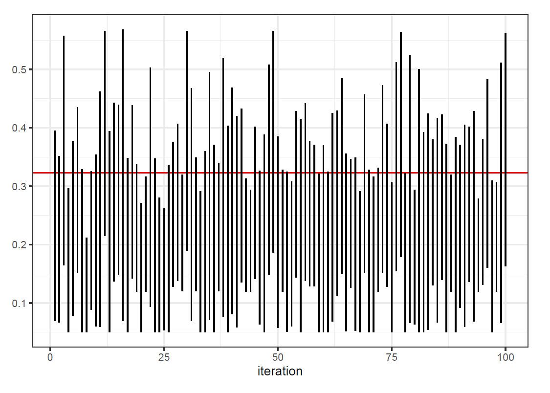
The true EDR is 0.25. The coverage of the 95% (“robustified”) confidence interval across 100 simulations is 89% (CI: 81%-94%). Moreover, the estimated EDR is very biased. The average across the simulations is 0.35 (CI: 0.32-0.39). Below, I show the 100 confidence intervals. The horizontal red line is the true EDR and the blue dots are the maximum likelihood estimates (MLEs). The red confidence intervals are the cases where the confidence interval of p0 collapsed to [0,0]. It’s clear that they are an important part of the problem.

So, why is this happening? Note that the conditional likelihood of the observed z-values given |z|>1.96 has very little information about p0=P(SNR=0). That means that even if p0 is quite large, the MLE of p0 can hit the boundary, i.e. p0 is estimated at zero. If that happens, then the parametric bootstrap will create datasets without SNRs at zero. In those cases, it will be very likely that p0 will be estimated at zero. If that happens in 95% or more of the bootstrap samples, then the confidence interval collapses to [0,0].

It is actually well known in the statistical literature that the MLE can be quite biased and that the bootstrap can fail when the estimate can hit the boundary of the parameter space. See for example this paper which has a simple example.

Finally, I want to emphasize that it is not my intention to “shoot down” the z-curve method. However, I do think more work is needed before it can be used reliably. First, the problem with the collapsing confidence intervals must be fixed. Second, the limits of applicability of the method should be established and stated clearly. Third, I think z-curve is a case where the data are so weak that it’s necessary to do some regularization either with a strong prior on the mixture weights or some restrictions on them (smoothness or some shape constraint). That might be possible as several commenters on the blog seem to be very clear on what “realistic scenarios” are!

PS January 22, 2026 Frantisek Bartos uploaded zcurve version 2.4.6 to CRAN. If there are fewer than 300 z-values exceeding 1.96, the function zcurve() issues a warning:

Warning: The z-curve method is meant for large samples of test statistics. 
It might produce undercoverage and biased estimates of EDR in small sample 
sizes.


More concerns about the z-curve method

This is Erik: A few days ago, I wrote about my concerns about the z-curve method. I demonstrated that under certain circumstances, the coverage of the confidence interval of the expected discovery rate (EDR) is far below nominal.

Ulrich Schimmack, who is the main author of the method, posted many comments in response. I think it is fair to say that these comments are generally quite defensive and sometimes even accusatory (“Erik doesn’t want to conclude that z-curve works”). Schimmack argued that my demonstration is unrealistic and therefore not relevant. He also proposed a patch: Do not use the confidence interval for the EDR if the z-curve has an upward slope at |z|=1.96 or if the lower bound of the confidence interval of the expected replicability rate (ERR) exceeds 0.9.

Nobody likes to receive criticism, but I still find Schimmack’s reaction disappointing. If he had seriously looked at my analysis report (which I linked to in the post and shared with him and his co-authors well before the post), then he would have been able to see the main cause of the undercoverage. In 40 out of 100 simulations the confidence interval for P(SNR=0) collapses to the zero-length interval [0,0]. That’s plainly wrong. There is in fact great uncertainty about P(SNR=0).

The collapse doesn’t happen only in the “unrealistic” bimodal case which I considered in my simulation. For example, it also happens (although less frequently) when we generate samples of size n=200 from the normal distribution with mean 1 and unit variance. The interested reader can easily modify my simulation to check this and other cases.

I believe Schimmack and co-authors would do well to find out why this happens, and address the root cause of the problem. Maybe it’s just a bug in the R code. And who knows, fixing it might even make it unnecessary to “robustify” the bootstrap confidence interval of the EDR by adding ±5 percent points.

I think there’s an important general point here. If you notice a problem, or even just something weird, you should not ignore it or put a patch over it. Instead, you should try to figure out what’s causing it. In many cases, you’ll end up finding some mistake.

While I’m on the topic of the z-curve method, I would like to discuss another issue.

Confidence intervals represent sampling uncertainty – they do not take model uncertainty into account. Depending on the model, that can be a concern. The main assumption of the z-curve method is that the signal-to-noise ratio (SNR) has a discrete distribution on 0,1,2,…,6 which means that the power (probability of reaching statistical significance) has a discrete distribution on 0.05, 0.17, 0.52, 0.85, 0.98, and 1. This assumption is clearly a matter of statistical convenience. That’s fine, but it should not be expected to hold in practice. So, it’s important to see what happens when the assumption does not quite hold.

If the SNR has a discrete distribution on 1,2,…,6 then the distribution of the z-statistic is a mixture of normal distributions with means 0,1,2,…,6 and unit variances. I’ve simulated 100 samples of size n=500 of z-statistics which have a normal distribution with mean 1.5 and unit variance. Note that I’m violating the assumption of the z-curve method, but in a way that would be difficult to detect from limited data.

My report of this new simulation is here. In this case, the true EDR is 0.32. Unfortunately, the z-curve estimate of the EDR is very biased. The average of the estimates of the EDR across 100 simulations is 0.22 (CI: 0.21 to 0.23). The coverage of the “robust” 95% confidence interval is 79% (CI: 70% to 87%). Here “robust” means that ±5 percent points have been added to the bootstrap interval. The 100 (robust) confidence intervals are below; the red line indicates the true EDR.

Concerns about the z-curve method

This is Erik: A few weeks ago, Andrew blogged about a paper by Richard Morey and Clint Davis-Stober entitled “On the poor statistical properties of the P-curve meta-analytic procedure”. Andrew quoted Morey:

We make the point that many of these techniques were never vetted by experts, and often are just “verified” by a few simulations. For tests, this is not good enough, but nevertheless these methods can get popular because (in my opinion) they tell people what they want to hear.

I believe that another meta-analytic method called z-curve (Brunner and Schimmack (2020), Bartos and Schimmack (2022), Schimmack and Bartos (2023)) has similar problems.

Recall that the signal-to-noise ratio (SNR) in statistics is the ratio of the true effect to the standard error of its estimator. If we make the “usual assumptions” then the z-statistic (the estimator divided by its standard error) has the normal distribution with mean SNR and standard deviation 1.

If we have a collection of studies, then the distribution of the z-statistics is the convolution (sum) of the distribution of the SNRs of the studies and the standard normal distribution. If we’ve estimated the distribution of the z-statistics, we can get the distribution of the SNRs by deconvolution. Deconvolution is known to be very unstable. That means that we need very many data points (studies) or very strong assumptions – preferably both – to get an accurate result.

The z-curve method is based on the assumption that the absolute values of the SNRs have a discrete distribution supported on 0,1,2,…, 6. Note that SNR=0 corresponds to “null effects”. To circumvent the effects of selection on statistical significance, z-curve uses only the absolute values of the z-statistics which exceed 1.96 in magnitude to estimate the 7 probabilities. Deconvolution is bad enough, but it gets much worse if only such a small part of the data is used. This makes uncertainty quantification especially important.

The z-curve method as implemented in the R package zcurve provides (among other things) estimates and confidence intervals of the expected discovery rate (EDR) and the expected replicability rate (ERR). I believe these are defined in my terminology as

  • EDR=P(|z|>1.96)
  • ERR=P(|z_repl| > 1.96 and z_repl × z > 0 | |z|>1.96)

The zcurve package also provides an estimate of “Soric’s FDR” but that is just a simple (monotone) transformation of the EDR.

It should be clear that z-curve’s estimate of P(SNR=0) (i.e. the proportion of “null effects”) will be especially noisy because studies with SNR=0 contribute relatively little to the significant z-statistics. Consequently, the estimate of the EDR will be very noisy too. To quantify this uncertainty, the authors use the bootstrap. By default, the zcurve function provides “robust” intervals by adding  5 percentage points to the confidence interval of the EDR and 3 percentage points to the confidence interval of the ERR. This approach is “verified” by a few simulations. Unfortunately, even the adjusted intervals do not provide correct coverage.

To illustrate the problem, I’ve done a small simulation. I generate samples of size n=100 from the two-component mixture 0.25×N(0,1) + 0.75×N(4,1). In 40 out of 100 simulations, the null component is missed entirely. In other words, P(SNR=0) is estimated to be zero. The problem is easy to see from a typical example (see the figure below). The null component is essentially “invisible”  from the observations that exceed 1.96.

The consequence is that across 100 simulations, the coverage of the 95% “robust” confidence intervals is incorrect. In particular,

  • The coverage of the EDR is 65% (CI: 55%-74%).
  • The coverage of the ERR is 100% (CI: 96%-100%)

I shared my concerns with the authors Ulrich Schimmack, Jerry Brenner and Frantisek Bartos. Bartos responded that he generally agrees with the simulation, but notes that the coverage does come close to nominal when the sample size is increased from n=100 to n=1000. I responded that the zcurve function accepts as few as 10 significant z-statistics, and that most meta-analyses don’t have 1000 studies. Bartos wrote:

To be fair, I agree that we should’ve been explicit about the recommended sample size in the original article (and probably add a warning to the method if used with less than XXX estimates). I didn’t anticipate that people would apply z-curve to small meta-analyses. In my mind, the purpose of the tool (including our examples) is larger-scale meta-epidemiological projects.

Bartos also noted:

With respect to the simulations – although apparently imperfect – I still think that we did actually a much better job than most published methods. (…) The commonly used alternatives for the same purpose at the time were p-curve (for ERR and EDR) and Jager and Leek’s mixture model (for FDR) which both have much worse properties in my opinion. As such, I view this development as a step forward.

In my opinion, statistical methods should be reliable when their assumptions are met. I don’t think unreliable methods should be used because no better methods are available.

The stories behind our published research from last year

It’s January so time to look back on what we’ve done in the past year.  I thought this time I’d give a little story of background on each of our published papers.

First, here’s the list of recently published papers:

Also we completed some new work that’s not yet been published:

We have a lot on deck for 2026, including two new books (Bayesian Workflow and the second edition of the edited Handbook of Monte Carlo) and a bunch of research articles on different topics in statistical modeling, causal inference, and social science.

And you can expect another 600 or so blog posts.

The stories behind the papers

It’s hard for me to pick my favorites among all the recently published papers, so let me just say something about each of them, in the same order they were listed above (roughly inverse chronological order of publication):

  • Adaptive sequential Monte Carlo for structured cross validation in Bayesian hierarchical models:  GH took a couple of my classes and had ideas for a couple of papers, including this one.  This is his idea that I just helped on a small amount.
  • Reanalysis of “Competition and innovation: An inverted-U relationship”:  This was originally a blog post.  The editor of the Journal of Robustness Reports asked me to submit it to them.  It took a couple rounds–the reviewers made some good points!–and fun thing about this journal is you can go to the link and see the entire review process.
  • The ladder of abstraction in statistical graphics:  I absolutely love this paper.  It originated in a talk I gave to Ron Yurko’s statistical graphics class at CMU.  I sent it to the journal and they had some good suggestions for improvement that my friend and colleague Kaiser Fung was able to do.
  • Statistical workflow:  As many of youall know, we’ve been writing a book on Bayesian Workflow–it will appear very soon!  I felt that the workflow concept would be useful in non-Bayesian statistics too, so my colleagues and I organized a special issue of a journal, where we solicited a bunch of articles from theoretical and applied researchers, mostly not Bayesian, to get different perspectives on workflow.  The journal issue is looking good–I guess it will be out soon–and we wrote this short article to lead off that issue.  It’s a short paper and I recommend you take a look!
  • Adjusting for underreporting of child protective services involvement in the Future of Families and Child Wellbeing Study and assessing its empirical implications through illustrative analyses of young adult disconnection:  OK, I don’t have much to say about this one.  It’s by my colleagues at the school of social work at Columbia; I was involved in the survey weighting for the study.
  • A multilevel Bayesian approach to climate-fueled migration and conflict:  Hey, I don’t remember much about this at all!  But, yeah, multilevel modeling, I guess I did something useful here!
  • Artificial intelligence and aesthetic judgment:  This one’s mostly by Jessica and Ari, but I made some contributions throughout, which might be recognized from earlier appearances of some of these ideas on the blog.  It’s published in Sankhya because I think they asked me to submit something for a special issue, and we had this cool paper that we couldn’t figure out what to do with.
  • Discussion of “Statistical exploration of the manifold hypothesis”:  This journal sometimes runs papers with discussions (they did a couple of mine in the past decade), and sometimes I contributed something.  Here I saw a good opportunity to remind people of my thoughts on Tibshirani’s “bet on sparsity” principle and where it can go wrong.
  • Meta-analysis with a single study:  What can I say?  This paper has an awesome title.  Erik, Witold, and I have been meeting weekly and will be coming out with more articles soon on science and meta-science.
  • Normative scientific conflict is unavoidable and should be welcomed:  I can’t remember how, but I came across an announcement of a special issue of the journal Theory and Society on the topic of normative scientific conflict.  I had some things to say on the topic, and this seemed like a good outlet.  I like this paper!  You should read it.
  • Russian roulette:  The need for stochastic potential outcomes when utilities depend on counterfactuals:  This paper has a funny story behind it.  I was contacted by economist Amanda Kowalski about a paper she and her colleagues had written about causal inference.  That paper got me thinking about stochastic potential outcomes and asymmetric utility functions, and I had this idea of demonstrating these ideas in a simple example of Russian roulette.  Jonas joined as a collaborator and clarified a bunch of issues that I’d been sloppy with.  We asked Amanda if she wanted to join in, but she was too busy on her own stuff.  Anyway, the final paper is cool–it’s really clean, and it’s timely because lots of people are interested in going beyond the stable unit treatment value assumption.
  • Multilevel regression and poststratification using margins of poststratifiers:  Improving inference for HIV health outcomes during the COVID-19 pandemic:  Qixuan has been taking the lead on a bunch of papers we’ve been doing, generalizing MRP in various ways.  I think we’re gradually moving toward a bright future of generalizing from sample to population.
  • Statistical graphics and comics:  Parallel histories of visual storytelling:  This is an idea that I’ve had for a while.  I mentioned it in class offhandedly one day, and one of the students told me she was interested in the topic too, so we wrote this article.  It was a true collaboration.  It’s kind of a specialized topic, but I think it should have a potentially wide audience, because lots of people love comics and lots of people love statistical graphics.  We focus on the fascinating question of how it is that these two modes of communication have developed only in the past few centuries, even though they could have been invented much earlier.  This is a sister paper to the “ladder of abstraction” paper mentioned above.
  • Letter to the editor:  Long story here.   Back in 2017, a bigshot professor lied about me in a published article in the journal, Perspectives on Psychological Science.  It was the kind of crap article that should never have been accepted, but at the time that journal was run by a corrupt cabal and they were publishing their friends’ articles essentially without peer review.  At the time I complained to the journal but only got rude responses from the cabal.  But things change.  The journal is now run by civilized people and they published my letter.  Better 8 years late than never at all.  And, no, the people who wrote and published the lies never apologized.  Of course not!  Apologies are for losers, not for members of the prestigious National Academy of Sciences.
  • Rethinking approaches to analysis of global randomised controlled trials:  Epidemiologist Jay Brophy wrote this one.  I had some minor contribution, I can’t remember what.
  • Simulation-based calibration checking for Bayesian computation:  The choice of test quantities shapes sensitivity:  This is the latest version of a long series of papers on SBC, starting with Samantha Cook’s Ph.D. thesis, which we turned into a paper that was published twenty years earlier.  I continue to be interested in the idea of accompanying inferences with simulations that check the computations.
  • Visualizing distributions of covariance matrices:  This paper is nearly 20 years old!  At the time we had difficulty getting it published and we moved on to other things.  Then a couple years ago a journal asked me for an article and I sent them this one.  Unfortunately it was a so-called predatory journal, and one of my coauthors didn’t want our article appearing there.  Fair enough!  But then we thought we might as well get it published, so we sent it off.  I like the paper, and I also like that it’s on the relatively understudied topic of visualizing models (as opposed to visualizing data).
  • Interrogating the “cargo cult science” metaphor:  This topic had been bugging me for a while, and Megan and I wrote this paper which got rejected by a couple of places.  Neither of us really knows how to communicate with researchers in the field of science studies, so it was a hard paper to place, even though it makes a clean point.  Then I happened to hear about the journal Theory and Society, which seemed like the perfect place.  I don’t know if anyone read our article, but I’d like to think that, in the future, people will think twice before talking about cargo cult science.
  • A calibrated BISG for inferring race from surname and geolocation:  This is Philip’s project.  I did help out a bit, but I remain frustrated in that we haven’t been able to frame this in a fully Bayesian or generative way.  We’re continuing to work on the problem, and we have a new method, supercaliBISG, which does even better than caliiBISG, which is an improvement on BISG, which itself has the word “improved” in its title (and also calls itself Bayesian, but it’s not fully so).
  • Hierarchical Bayesian models to mitigate systematic disparities in prediction with proxy outcomes:  I can’t remember exactly where his paper came from, but it was somehow associated with some conversations we had with Sharad Goel and others on statistical measures of disparity.  As is often the case, I think much is gained by framing the problem within a generative model.
  • The piranha problem:  Large effects swimming in a small pond:  This one’s important!  The basic idea–there are probabilistic or statistical constraints regarding patterns of dependence in high dimensions, and this has implications for our understanding of patterns in complex structures–was mine, but the coauthors did most of the rest, to collect some relevant mathematical results.  As I like to say, I think there’s more to be said in this area, maybe some connections to random matrix theory.  Also, the paper has an unusual publication story.  What happened was that a student from the statistics club at San Diego State University asked me to do a remote meeting with them.  I did so–it was a fun conversation–and it turned out that their faculty adviser, Richard Levine, was editor of the Notices of the American Mathematical Society, and was looking for general-interest math papers with applied or statistical relevance.  So I sent him the piranha paper.  Articles in this journal have a strict limit of no more than 10 pages and no more than 20 references.  It was hard for me to keep the references under 20 while demonstrating the applied relevance of the topic, so I cheated and wrote a blog post entitled, “Here are just some of the factors that have been published in the social priming and related literatures as having large effects on behavior,” so that just counted as 1 reference in our paper.  Kind of like if the genie gives you 3 wishes and you spend one of them on more wishes.
  • For how many iterations should we run Markov chain Monte Carlo?:  This is an update of my paper with Kenny Shirley for the new edition of the MCMC handbook.  Charles took the lead on this chapter.

Pinning the group-level variance parameters to speed computation for hierarchical models

In case you don’t know about the Stan Forums, let me just tell you that it’s a great online space for discussions about applied statistics and computing. All sorts of things come up.

Today we had a discussion about challenges of fitting big hierarchical models, where I wrote:

1. I often recommend pinning the group-level variance parameter or covariance matrix to a pre-chosen value based on subject-matter information. Often the inference isn’t super-sensitive to this group-level variance, as long as it’s not so small that it causes all the estimates to disappear to zero and not so large that the estimates are wildly noisy.

I’ve toyed with the idea of making this a more formal procedure, for example drawing 10 values of the set of variance parameters from a prior, then using these to run 10 fast inferences (could be MCMC or even just plain old optimization and Laplace approx), then averaging over them using stacking. I think this could work, but I’ve never actually tried it, let alone evaluated the idea. It’s a research idea!

2. Sometimes we do use gamma priors for group-level variance parameters. The gamma prior with 1 or more degrees of freedom has the pleasant property of being zero-avoiding, which is especially helpful when doing marginal maximum likelihood, as we discuss in our 2013 paper: https://sites.stat.columbia.edu/gelman/research/published/chung_etal_Pmetrika2013.pdf or for covariance matrices (using the Wishart, _not_ inverse-Wishart) prior for cov matrix in our 2014 paper: https://sites.stat.columbia.edu/gelman/research/published/chung_cov_matrices.pdf

3. Another thing that’s worked well for me is to use Pathfinder to get starting values. It varies, but sometimes Pathfinder runs very fast and then we can jointly estimate all the parameters and not worry so much about the funnel.

I’m sharing this here partly because it might be useful to some of you and partly because it includes a research idea.

Postdoc opportunity at Stanford and Chicago on Bayesian hierarchical modeling and partial pooling for improving the accuracy and equity of property tax assessments

Evelyn Smith writes:

I’m reaching out because Stanford RegLab and the Mansueto Institute at the University of Chicago are beginning a search for a postdoctoral scholar, and I wanted to ask whether you might recommend any strong PhD students or recent graduates.

We’re seeking candidates with expertise in Bayesian hierarchical modeling, partial pooling, geostatistics, or related areas for applied work using fine-grained geographic data to improve the accuracy and equity of property tax assessments. The role would be a joint position between Stanford and U Chicago.

Because we hope to hire by early spring (March/April), any referrals you may have would be greatly appreciated. Please feel free to share this note with anyone who might know promising candidates. I’m happy to speak directly ([email protected]) with anyone who’d like to learn more about the project or role.

This looks interesting, also it’s an important topic. And I’ll add this: if you’re doing statistics or social science, it’s super important to work on real problems–not just “real data” but what I call “live problems” where stakeholders really care about the answers, not just to get publications or whatever but because there are policy implications. This seems to be the case here, also of course it’s a good sign that they’re already interested in Bayesian hierarchical modeling and partial pooling.

From one perspective, “property tax assessments” could sound kinda boring. But it’s a big deal in this country. So go at it!

“Re-examination of the 3/4-law of metabolism” and “Toward a metabolic theory of ecology”

The above graphs are from Regression and Other Stories, as a demonstration of the log-log transformation, but there are some questions of where this 0.74 slope comes from. Simple geometry would suggest a slope of 2/3 (if animals are spheres of constant temperature, they will radiate heat in proportion to their surface area), but there’s this idea that larger animals are more sphere-like and run colder, compared to smaller animals.

Dodds, Rothman, and Weitz look into some of this in a paper from 2001, “Re-examination of the 3/4-law of metabolism”:

I don’t like the whole “null hypothesis” thing at all–but the data and models are interesting, and overall I like the paper. It would be an interesting example for someone to go back and analyze the data more directly using hierarchical modeling.

Related is this paper from 2004 by Brown, Gillooly, Allen, Savage, and West:

Metabolism provides a basis for using first principles of physics, chemistry, and biology to link the biology of individual organisms to the ecology of populations, communities, and ecosystems. Metabolic rate, the rate at which organisms take up, transform, and expend energy and materials, is the most fundamental biological rate. We have developed a quantitative theory for how metabolic rate varies with body size and temperature. Metabolic theory predicts how metabolic rate, by setting the rates of resource uptake from the environment and resource allocation to survival, growth, and reproduction, controls ecological processes at all levels of organization from individuals to the biosphere. Examples include: (1) life history attributes, including development rate, mortality rate, age at maturity, life span, and population growth rate; (2) population interactions, including carrying capacity, rates of competition and predation, and patterns of species diversity; and (3) ecosystem processes, including rates of biomass production and respiration and patterns of trophic dynamics.

They talk a lot about that 3/4 power too:

And Eric Charnov points to this relevant paper by Gilloly et al., “Effects of size and temperature on metabolic rate,” which includes this figure:

Interesting stuff! I guess there must be more research on this topic in the past twenty years, too.

Combining a high-quality probability sample with data from larger online panels

Yajuan Si, James Wagner, and Ron Kessler write:

The traditional use of high-quality probability samples to carry out psychiatric epidemiological surveys of the household population is facing increasing financial and operational challenges. Surveys from nonprobability and probability-based online panels have emerged as cost-effective alternatives with the additional advantage of rapid turnaround time, albeit with biases that can in some cases be substantial.

We recommend a middle ground of integrating surveys from online panels with small parallel high-quality probability samples . . . The key features of such “hybrid designs” are as follows: use of a high-quality probability sample as a population surrogate to provide information about the distributions of otherwise unavailable variables that differentiate participants in online panels from the larger household population, inclusion in both surveys of measures that are both strongly associated with the outcomes of interest and strongly predictive of membership in the online panel, and use of best-practice statistical methods that blend results across the 2 samples.

Such a hybrid design should be the minimally acceptable design for psychiatric epidemiological surveys of the household population given the biases known to exist in online panels. However, we also comment on several other designs that might be used for more rapid and less expensive exploratory analyses.

This is interesting, to think of multi-frame, multi-mode sampling as best practice in itself rather than as an awkward problem to be dealt with only if absolutely necessary.

Yajuan offers some background on the project:

This is my first time writing a paper without any equations or data modeling but having to rely on solid statistical knowledge, understanding the extensive literature, and gathering lots of data. And Ron Kesser is a phenomenal collaborator. I learned a lot from working with him.

Anyway, here is the idea of the paper: We propose a hybrid data collection of large-scale nonprobability samples and small parallel high-quality probability samples as common practice for population-based research. For MRP applications, we often struggle with the availability of population information of X. We propose to estimate the population distribution of X in a small probability sample, after we identify the list of highly predictive covariates X for the outcome Y. We can also collect Y in the probability sample. We propose the sequential weighting adjustment by first weighting the probability sample to the census data (this should be based a small list of adjustment factors, say only demographics, assuming the probability sample design is well controlled and nonresponse bias is small) and then weighting the nonprobability sample to the initially weighted probability sample (the list of adjustment factors could be large, even including the outcome). After the sequential weighting, the combined samples can give us enough power for small area estimates. I use weighting adjustment here for simplicity, but we can also use MRP for the adjustment if we have an outcome of interest.

Basically, I’m trying to push the MRP adjustment from post-collection inference to inform study design and modify data collection adaptively, releasing the burden or strong assumptions on analysis by improving the study design from the starting point.

This is interesting and potentially important for several reasons:

1. Data quality of survey responses is becoming more and more of an issue, and it makes sense to try to reach potential respondents in more comfortable places than the traditional survey interview.

2. We should be thinking more systematically about how to integrate data from multiple sources.

3. MRP can be adapted to more general data structures.

4. As Yajuan says, we should be aware of all these data collection and analysis issues in the design stage.

“We conclude that apparent effects of growth mindset interventions on academic achievement are likely attributable to inadequate study design, reporting flaws, and bias.”

Joshua Brooks points us to this research article by Brooke Macnamara and Alexander Burgoyne, “Do growth mindset interventions impact students’ academic achievement? A systematic review and meta-analysis with recommendations for best practices,” which states:

According to mindset theory, students who believe their personal characteristics can change–that is, those who hold a growth mindset–will achieve more than students who believe their characteristics are fixed. Proponents of the theory have developed interventions to influence students’ mindsets, claiming that these interventions lead to large gains in academic achievement. Despite their popularity, the evidence for growth mindset intervention benefits has not been systematically evaluated considering both the quantity and quality of the evidence. Here, we provide such a review by (a) evaluating empirical studies’ adherence to a set of best practices essential for drawing causal conclusions and (b) conducting three meta-analyses. When examining all studies (63 studies, N = 97,672), we found major shortcomings in study design, analysis, and reporting, and suggestions of researcher and publication bias: Authors with a financial incentive to report positive findings published significantly larger effects than authors without this incentive. Across all studies, we observed a small overall effect . . . which was nonsignificant after correcting for potential publication bias. No theoretically meaningful moderators were significant. When examining only studies demonstrating the intervention influenced students’ mindsets as intended . . . the effect was nonsignificant . . . When examining the highest-quality evidence . . . the effect was nonsignificant . . . We conclude that apparent effects of growth mindset interventions on academic achievement are likely attributable to inadequate study design, reporting flaws, and bias.

I haven’t read the paper, let alone the 63 cited studies, but I thought I’d do my part by getting this into the discussion.

We talked about earlier critical work by Mcnamara on growth mindset back in 2018, where I discussed how to think about effect sizes for such interventions.

My main message was that, if mindset interventions work, we’d still expect small average effects, because they won’t work for all students. As I wrote, “it’s a small effect in the context of any student, and of course it’s a small effect. It’s hard to get good grades, and there’s no magic way to get there!”

In one sense, my conclusion is negative on mindset interventions in that I’m saying we shouldn’t expect to see large effects, and any large effects that do show up are likely to be huge overestimates.

In another sense, my conclusion is positive on mindset interventions in that, given that any average effects will be small, the lack of statistically significant average effects in small or even moderately-large studies does not have to imply that mindset interventions don’t work; it just says that they only work in some settings, and individual effects will mostly be small.

Also relevant is this discussion we had a few years ago on mindset interventions with contributions from Russell Warne and David Yeager. Lots to chew on here, also this example helped form my thinking on varying treatment effects, leading to our causal quartets paper and some future lines of research.

Problems with the so-called gender equality paradox

A few years ago I wrote something on what’s been called the gender equality paradox, a result found in some cross-national studies that “as gender equality increases, so do gender differences.”

My post discussed a particular paper published in that area. It was in the comments section that I laid out my larger concerns with this research:

I do think there’s some incoherence in the arguments I’ve seen presented in this area. Roughly speaking, there are five sorts of country-level variables to look at:

1. Policies and customs: These could include laws on women’s equality, abortion, child support, etc., as well as the prevalence of woman-friendly private-sector policies such as maternity leave and laws that restrict the clothing women can wear in public, etc. Also some measure of the left-right position of the government (although that could go in item 4 below, depending on whether we’re thinking of the government’s political stance as affecting policy or as a measure of the country’s political culture).

2. Health outcomes: Life expectancy is tricky, though. Is equality in life expectancy a sign of equality, or a sign that things are really bad for women, if they don’t have their usual several years advantage compared to men?

3. Sociological and economic outcomes: Labor force participation for men and women, proportions of women going on to higher education, courses of study at university, etc.

4. Social and political attitudes: Opinions of men and women from surveys on attitudes regarding women’s equality, gay rights, abortion, the role of women in the workplace and in politics, etc. There are two ways to summarize this: First, how much do the people in the country support ideals of equality between the sexes; Second, how much do attitudes of men and women differ?

5. Personality surveys: Examples would be the personality inventories used in the study discussed in the above-linked post.

Adding to the mess is that countries change over time, and there are also variables such as the wealth of the country, its geographical location, and its ethnic composition, all of which seem relevant but are not directly captured in any of the measures above.

In any case, if all five of the above sorts of measures were positively correlated, all would be clear: Countries with policies favoring women’s equality have more liberal politics, better health outcomes for women, more social and economic equality in economic outcomes, more support for women’s equality, and smaller differences between men and women in issue attitudes and personality measurements.

But, to the extent these have been studied, it appears that the relevant cross-country correlations are not uniformly positive. For example, the statement provided by Nick in that comment thread, “most nurses are women even in very egalitarian places like Scandinavia,” sounds like evidence in favor of a zero or negative correlation between items 1 and 3 in my list. The statement here that “the countries that minted the most female college graduates in fields like science, engineering, or math were also some of the least gender-equal countries” represents a negative correlation between items 3 and 4, or perhaps within different categories of item 3.

The challenge here is that the five items above can’t all be highly negatively correlated with each other–and, in any case, we wouldn’t expect them to be. Rather, there will be lots of the expected positive correlations, with occasional negative correlations that are newsworthy.

Any negative correlations among the five items above can be taken as a gender-equality paradox.

Even beyond issues of data and measurement, there is a problem of interpretation.

This occurs with just about any study of disparities. From a leftist or liberal perspective, any gender differences can be interpreted as signs of unfairness or discrimination. From a rightist or conservative perspective, any gender differences can be interpreted as reflections of the state of nature.

The same issue arises with cross-national correlations. If gender differences are higher in more gender-equal societies, this can support a leftist view that even the supposedly enlightened western societies still have a ways to go, or it can support a rightist view that in richer societies women have more freedom and so we can see their revealed preference for traditional gender roles. Conversely, if gender differences are lower in more gender-equal societies, this supports a leftist view that more equality leads to progress but also a rightist view that gender equality is an artificial condition arising in the decadent West.

Complicating the matter is that there are several different ways of measuring gender equality and gender differences.

I’m not saying these things shouldn’t be studied; I just think we need to be careful about glib political interpretations of these cross-national comparisons. For example, I don’t trust the argument in this paper:

We found that sex differences in personality, verbal abilities, episodic memory, and negative emotions are more pronounced in countries with higher living conditions. In contrast, sex differences in sexual behavior, partner preferences, and math are smaller in countries with higher living conditions. We also observed that economic indicators of living conditions, such as gross domestic product, are most sensitive in predicting the magnitude of sex differences. Taken together, results indicate that more sex differences are larger, rather than smaller, in countries with higher living conditions. It should therefore be expected that the magnitude of most psychological sex differences will remain unchanged or become more pronounced with improvements in living conditions, such as economy, gender equality, and education.

It just seems like they’re trawling through correlations and then jumping to predictive conclusions about the future.

For awhile I’ve wanted to write more on this topic–basically, something like my above comment with the 5 items etc., but with data.

In the meantime, though, I heard from psychology researcher Mathias Berggren, who seems to have done something about it:

In case you remain interested in the larger subject of the so-called “gender-equality paradox” (GEP); that several measures suggest gender differences are larger in “more gender-equal countries” (Western countries); we have now published a preprint that re-examines multiple previous such results. I think it contains several methodological aspects that could be interesting for further discussion (summarized below).

1. The GEP appears to be an example of how methodologically confounded results have become imbued with meaning over time. Not because these methodological confounds have been overcome (we show they are massive), but because a more intriguing explanation for the results has materialized: the evolutionary idea that more gender-equal societies enable people to follow their innate (gender-specific) preferences.

2. I [Berggren] began looking into this as I found the whole premise of the GEP strange. Basically, it seems to be employed as follows: (a) Researchers think that some gender differences found in the West reflect innate and universal gender differences. (b) They find smaller such differences outside of the West. (c) This is taken as proof that the differences in the West are the truest revelation of such innate and universal gender differences.

3. Indeed, as we show, the predictors that have come to be employed appear to provide nothing beyond just generally pointing towards the West. For example, a simple Western indicator has higher cross-country correlations. As it was already known that gender differences on the most employed measures were larger in the West, these variables thus appear to provide nothing on their own. In the manuscript, we show how easy it is to push some favored theoretical perspective when we know that differences are larger in the West, and just correlate them with some other variables we know have higher scores in the West. Thus, we show that the pattern of gender differences is just as well “explained” by a medical conspiracy, by people’s fear of death, and by novel reading rotting peoples’ brains, as it is explained by the evolutionary interpretation (described in more detail in the supplementary information).

4. The confounds include massive cross-cultural correlations with data quality. This was already shown in the early studies, but the association appears to have become unexamined after more intriguing predictors have been identified. However, we show that it is very strong in all the self-assessment studies we reassess – typically notably stronger than the correlation with gender equality. For an illustration, see Figure 3 in the manuscript.
That figure also contains a barplot of answers to a patience staircase item – with the largest floor effects I’ve ever seen. That item originates from an article published in Science, but whose open-source data only included scale scores rather than item scores – which we needed to assess scale reliability. Reaching out about this also did not result in sharing of the item scores. Thus, we had to separate item scores ourselves where we could do so. The method we employed is described the supplementary information. Some special factors made it possible in this case, but the method might be of interest to data miners who want to reassess results where item scores are not directly available.

I replied that yes, I remain interested in the topic, not so much because I think there’s a GEP but because it’s interesting to me that so many people seem to want the GEP to be true.

Berggren responded:

I think there are three reasons why the GEP has become popular:

1. It seems to provide proof for essentialist views of men and women.

2. It provides cover for any gender differences in the West. By the logic of the GEP, when the West has largest (measured) gender differences on some dimension, this is proof that those differences develop freely and naturally. Thus, either differences are larger elsewhere, and then the West has come further in adressing such unfair cultural norms; or differences are largest in the West, and then they are just natural and inevitable.

3. It provides cover for cultural/methdological confounds in cross-cultural comparisons, and gives the sense that “all is well” with the data, and that nothing needs to be adressed. If there is a theoretical explanation for the results, then one can just lean into that explanation and keep working as usual. But if results are are due to confounds, then one has to think further about how to adress those issues. As we note in the preprint, there were multiple considerations of confounds in the early studies. However, after the introduction of the evolutionary interpretation of the GEP, the focus appears to have shifted.

How is it that this problem, with its 21 data points, is so much easier to handle with 1 predictor than with 16 predictors?

Here’s a story that appears on pages 309-310 of Active Statistics:

Many years ago we taught a course in statistical consulting. The consulting was done by graduate students in pairs: each pair had open office hours once a week, clients would come in to discuss their problems and then were told to return in a week, then each week we would have a meeting with all the students where we would go over the consulting problems that had come in, which would prepare them for their followup meetings.

Lots of interesting problems would come in. One week, a pair of students reported that someone had shown up who was studying the efficiency of industrial plants. The researcher had data on 21 factories, and for each of them she had a measure of efficiency and 16 predictors—different variables that might be predictive of that outcome. She wanted to use these data to see which of these factors was most important. We’re sorry, but we have no records from this class, so many details are missing—we’re reconstructing this from memory.

But one thing we do remember are the numbers: 21 data points, 16 predictors.

The first problem here is to ask what can be done with these data. It’s not an easy question. Indeed, it might seem ridiculous to suppose that you could tease out a regression relationship among so many predictors with so few observations. And this is without even getting into potential interactions (16*15/2 two-way interactions and so forth) or the difficulties of causal identification from observational data. If students cannot come up with any ideas, the instructor should push them in another way, by asking what decisions they might make based on these data, if they were designing this sort of industrial plant.

When this example came up in our consulting class years ago, one of the other students said that he remembered that researcher from the previous semester: she’d come by with 15 data points and 16 predictors, and he and his partner had told her that, with fewer data points than predictors, they couldn’t help her. In the meantime this researcher had gathered data from 6 more plants and was emboldened to return.

Fine. Laugh all you want. But . . . there are things that can be done even using this small dataset. Think about it this way: suppose the researcher had come in with 21 factories and just one predictor. Then you could do something, right? You can make a scatterplot of the outcome vs. the predictor, you could run a regression predicting the outcome from this one variable. You can potentially learn a lot from 21 data points, or even from 15. Even if all you learn is that none of the 16 available predictors is by itself a strong indicator of the outcome, that still is relevant information.

This is a problem with a large number of predictors compared to the number of data points, which is a setting where classical least-squares regression will not work, and some sort of regularization would be necessary, as is done in various Bayesian or machine learning approaches to statistics. It is an example where if we think carefully about our inferential goals, we realize we can learn something useful from our data—just not the “statistically significant” comparison that we’re used to looking for.

Here, though, I want to look at the problem in a slightly different way. Instead of considering how to analyze these data, let’s ask the following question.

How is it that this problem, with its 21 data points, is so much easier to handle with 1 predictor than with 16 predictors?

Sure, 21 data points and 1 predictor is a cleaner problem than 21 data points and 16 predictors. But more data should be better, no? A 21 x 16 matrix of predictors has a lot more information than vector of length 21—especially given that those 21 numbers exist as a column within that larger matrix.

So, as a statistician, my usual answer to this question is that the dataset with 16 predictors contains more information, and we just have to move beyond simple least-squares and use more advanced methods to analyze the data.

But then I was thinking more about the problem, and I realized something.

Suppose we think of the 16 predictors as ordered, so that the two options are: (a) predictor #1, or (b) predictors #1,2,…,16. In that case, option (b) is clearly better: it includes additional information, and in a regression context you can get as close to any model based on option (a) by simply putting very strong zero-centered priors on the coefficients for predictors #2,…,16.

But now suppose the 16 predictors are unordered. In this case option (b) could be better than option (a)—or it could be worse! Option (b) contains the additional information from the 15 other predictors, so in that way it’s better. But, in this unordered-predictor scenario, option (b) excludes an important piece of information compared to option (a), which is the label of which is the one predictor that was included in that simpler scenario.

We don’t usually think of the order of predictors as containing information, because our usual models for regression are invariant to the indexes of the predictors. That is, standard methods are exchangeable—that’s the term for models or procedures that are invariant to indexing, as discussed in chapters 5 and 8 of Bayesian Data Analysis.

In real life, though, we often assemble information sequentially, and in a setting with 16 predictors there might well bean ordering, not strictly from most to least important, but something like that. It makes sense to include this implicit ordering information into our statistical procedures and models, and it’s a flaw in our default procedures (including in my own textbooks!) that we don’t.

P.S. My argument is that the dataset with just one predictor contains additional information not in the dataset with 16 predictors! The additional information is an implicit ordering of predictors. The 1 predictor is not randomly chosen from the 16.

A way to bridge between the two scenarios is to consider another variable, which is a list of importance or a ranking of importance of the 16 predictors. Label the complete data as:
y: the outcome, a vector of length 21
X: the matrix of 16 predictors, a 21 x 16 matrix
x: the single predictor, a vector of length 21, which is one of the 16 columns of X.
v: the importance (“value”) of the predictors, a vector of length 16, where predictor x has the highest value of v.

Then the first dataset is (y, x) and the second dataset is (y, X). But now consider the complete dataset, (y, X, x, v). Because of the special nature of x (it’s the predictor with the highest value of v), we can consider x to be a function of X and v–I’ll write it as x(X, v)–and thus the complete dataset can be written as (y, X, v).

From this perspective, you can see that the first dataset (y, x(X,v)) and the second dataset (y, X) are two non-overlapping subsets of the complete data, (y, X, v). And so it makes sense that, depending on what else is known, the second dataset is not necessarily more informative than the first.

In practice, I’d argue that if someone gives you the first dataset and the second dataset, then they should be able to construct some reasonable vector v of values of predictors, and then you’ll have the complete dataset and you can include v in the model.