
We sometimes have discussions on the blog warning people against displaying too many significant digits. For example, back in 2012 I asked, “Is it meaningful to talk about a probability of “65.7%” that Obama will win the election?”, and I answered, No, it is not. That last digit being displayed is essentially pure noise, and fluctuations in that digit tell us nothing at all.
For another example, I was once discussing a paper that reported, “Of the 914 sexual minorities in our sample, 134 (14.66%) were dead by 2008,” to which I replied that it’s poor practice to call this 14.66% rather than 15%—it would be kinda like saying that Steph Curry is 6 feet 2.133 inches tall—but this is not important for the paper, it’s only an indirect sign of concern as it indicates a level of innumeracy on the authors’ part to have let this slip in.
But then a colleague pointed me to this post entitled, “Please show lots of digits,” arguing that “this is how you catch frauds.”
Good point! This came up in the recent Venezuelan election. First the vote counts as reported:

And then with a bunch of extra decimal places:
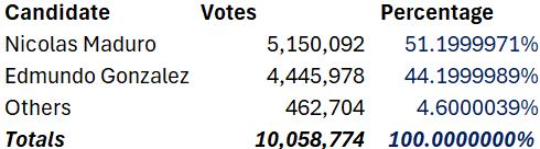
Those extra digits would serve no useful value—if we believed the numbers were correct. But the weirdness of the result is strong evidence that those exact vote totals are wrong, that they were reverse-engineered from the rounded values.
Here’s how Dean Eckles put it:
In some cases, reporting many digits can indeed be a costly signal — in that if they aren’t based on the stated calculations, it may be possible to figure out that they are impossible (e.g., via a granularity-related inconsistency of means aka GRIM test). This is perhaps one argument for at least reporting excess digits in tables (though not abstracts and press releases certainly!). Perhaps this argument is somewhat outdated if data and analysis code are provided in addition to results in a paper or report itself, though this remains not always the case.
The dilemma
On one hand, spew out a zillion digits every time and you’ll make your papers unreadable and even misleading. The author of that linked post refers to this as a “petty writing style opinion” and a “silly non-issue,” but . . . communication is important, and calling it “style” or “silly” doesn’t change that!
One way I explain this to students is by saying: Just as, when writing an article, you shouldn’t include a paragraph you don’t want people to read, you also shouldn’t include a table full of numbers you don’t want people to look at. People’s attention is limited, and that’s how it should be.
On the other hand . . . yeah, there can be gold in them thar decimal places. This came up in our recent description of election forecasts, where I praised The Economist for rounding their forecasts (I can’t remember their exact phrasing, but it was something like “even odds,” “3 out of 5 chance” “2 out of 3 chance,” etc., essentially presenting win probabilities rounded to the nearest of 50%, 60%, 66.6%, etc.), and a commenter responded that, sure, it’s good to not be misleading, but then there’s this awkward moment when the odds suddenly jump from approximately even to approximately 50% to approximately 60%, and that apparent discrete jump can itself be misleading. Also, as discussed in that linked post, extra decimal places can reveal problems in the analysis pipeline.
For another such example, check out this amusing story from James Heathers: “The data are on a 1-5 scale, the mean is 4.61, and the standard deviation is 1.64 . . . What’s so wrong about that??”
What to do, then?
My recommendation is what we’ve called the click-through solution: Start with an accessible summary that brings the reader in. Then click for statistical graphs that allow more direct visual comparisons. Then click again to get a spreadsheet with all the numbers and a list of sources.
In the context of a published article, step 1 would be the article itself, with appropriately rounded numbers (or, even better, graphs), step 2 is the supplementary information with full tables with additional decimal places, if that’s how you roll, and step 3 are the files with data and code. Do it all.
I think another thing to consider is whether the value been displayed is an estimate or an actual (finite) population parameter. I don’t think it makes sense to display more significant digits than the precision of the estimate. For example, if the standard error of an estimated percentage is 1% or higher, displaying any significant digits may give an impression to the reader of a level of precision that doesn’t exist. On the other hand, when dealing with an actual population value (like in the Venezuelan example), you would be kind of free to use as many significant digits as possible, within reason.
This is slightly off-topic. Was asked (long ago) how to distinguish between an adult and a computer, online. I told them that it was the way that humans add and computers do. Computers, specifically, add using floating point arithmetic. So, ask a human to add .1 + .2. Most (non-Trump supporting humans) would respond .3. Now, open your Python interpreter (or the equivalent) and type .1 + .2. The answer is: 0.30000000000000004.
This is not really off topic. I worked on a project which included a shortest-path problem. I noted to the team that the algorithm in many cases was preferring paths that were shorter than other paths by differences in the 5th decimal place or higher but the spatial coordinate data we started with were given only to two decimal places. The python calculations of the path distances show more than 10 decimal places. Are those higher decimal places signal or noise? The team had a heated debate, and I think we all learned something from it.
Today’s stuff is really interesting and informative, but I wonder whether it is self-defeating. I am speculating that the famous Benford’s Law having to do with leading digits
https://en.wikipedia.org/wiki/Benford%27s_law
is now part of the armory of those who would cheat. Publicizing the GRIM Test might turn out to be counterproductive. So to speak, once criminals know that fingerprints can lead to a conviction, they start wearing gloves.
I conduct many GOTV field experiments, where the treatment effect tends to be 0.5% to ~3%, with a median closer to ~1%.
My question is whether the suggestion to round up to the nearest integer is helpful in this case. Let’s say I conduct a large text message GOTV test, with two treatments. Each treatment group has a sample size of 1 million, so the results are going to be precise (assuming I set up everything correctly). If the average treatment effects for Treatment A is 0.5% and for Treatment B its 1%, is the suggest to report both as 1%?
Presumably your treatment effect has some standard error. Let’s say before rounding it’s 1.046 +- 0.27 and 0.503 +- 0.13
I personally would recommend reporting as 1.0 +- 0.3 and 0.5 +- 0.13
When the first significant figure is 1 I report the second as well, hence 0.13 but basically your main effect you don’t report more digits than would be affected by the stderr
Steve B:
Don’t know anything about your field. So, this is just a guess. Take your error and express it in the form: a x 10^n, where a is the error expressed in real numbers. Then apply:
log(a) + n,
We then have 1 <= log(a) <= 10. This, then, means the inequality can be formed:
n <= log(a) + n < n+1.
Then, you can select the significant digit of n that's more accurate to rounding. (If this isn't clear, I can demonstrate through an example.)
The post Andrew links to suggesting that the digits be reported identifies a real problem, but offers the wrong solution. It talks about the difficulties obtaining the data used in studies – I can personally attest to such difficulties. But substituting extra digits (for their potential use in reverse engineering) for having the data be available is a poor trade. Data availability will not solve all problems – but it is far better than the negative effects of excessive use of “significant” digits – poor communication and misrepresentation of accuracy. Provide the data – or don’t expect me to believe the analysis.
But I’ll offer a bit of backtracking (seems to be a popular political tactic these days). Last night in my class I went over the assignment I gave students to analyze a bunch of mortality data (100 years by age and sex of deaths and population in the US). While going over it in class, I realized that the deaths and population figures had 2 decimal places and were not integers. I had previously thought they were the number of deaths and people and had calculated the death rate per 100 thousand people – but now I wondered if the deaths were provided in terms of thousands of people rather than number of people (so the fractions would no mean fractional people). So I went back to the source and discovered that the fractions were due to missing age data for some deaths and some population levels – so the unrecorded ages were spread proportionally across the other ages (that were available). So, in fact, the scale of measurement was numbers of deaths and people as I first thought. But without seeing those decimals, I would not have realized that there was the allocation of people without age data. So, that is a case where the extra digits performed a useful function.
As pi day is coming up (assuredly March 14 when you do the appropriate rounding down), it reminds me of the long ago contest we had in high school as to who could memorize the longest numbers of pi. I think I got up to 15 or so but this was also in the pre-historic slide rule days and the wonder Dietzgen decitrig slide rule that made it easy to do calculation with pi. What was nice was the total lack of concern about how many digits were significant as the slide rule limited the possibilities. I’m also old enough to have bad memories of using five place log tables to do calculations in my analytical chemistry class (the first hand held calculators were five years away)
We at Microsoft Research wrote a paper on how much rounding people prefer
https://dangoldstein.com/papers/Nguyen_Hofman_Goldstein_rounding_numbers_CHI_2022_preprint.pdf
It also shows negative cognitive effects of not rounding