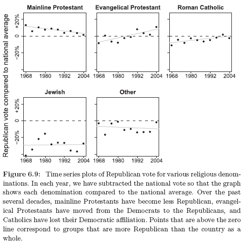
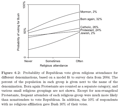
People sometimes talk about “the Jewish vote,” but what’s relevant is not really the Jewish vote or Jewish public opinion; it’s really about campaign contributions and the news media. Also similar with Mormons.

rel1.png

rel2.png

At the end of the second world war, Jews were a bit over 3% of the U.S. population, voted at a high rate, and were concentrated in the swing state of New York. Jews had two big issues–Israel and political liberalism, and the Jewish vote was a thing. Not the biggest thing in politics, but a powerful voting bloc in a swing state, that’s something.

Nowadays, Jews are about 2% of the population, and New York is no longer a swing state. When it comes to national politics, the Jewish vote doesn’t really matter. As I wrote nearly twenty years ago:

The underlying question, though, is why should we care about a voting bloc that represents only 2% of the population (and even if Jews turn out at a 50% higher rate than others, that would still be only 3% of the voters), most of whom are in non-battleground states such as New York, California, and New Jersey? Even in Florida, Jews are less than 4% of the population. I think a lot of this has to be about campaign contributions and news media influence. But, if so, the relevant questions have to do with intensity of opinions among elite Jews rather than aggregates.

The reason this comes up is that sometimes Jewish-related issues come up in politics and people will point to some poll or another of Jewish opinion. But Jewish public opinion doesn’t matter. When it comes to Jews in politics, what matters are the opinions and actions of campaign contributors and media executives.

Here’s the thing. Twenty years ago, it’s my impression that rich Jewish political donors and elite Jews in the news media were mostly politically aligned with average American Jews. Not exactly–I’m guessing the rich donors were not as far to the left on economic issues as random Jews in the country–but pretty much politically liberal and pro-Israel. Since then, things have changed: American Jews are split on Israel and remain strongly Democratic, but now there are many prominent Jewish donors and media executives on the right, both with regard to Israeli and American politics.

So, when a Jewish lobbying group taking some conservative position, and people point out that this is not the majority opinion of American Jews, my take on it is that, from a political perspective, the majority opinion of American Jews doesn’t really matter; to the extent that national politicians would think about Jewish issues, it’s the big donors and media executives that are the most relevant.

Similar issues arise with any ethnic group. The average voter will disagree on key issues with donors and influencers. It’s just particularly clear with Jewish Americans because the direct relevance of the voters has declined so much over the years, but people are still often in the habit of framing ethnic politics in terms of voters.

Mormons as the conservative counterpart to Jews

Indeed, you could say something similar about Mormons, who, like Jews, are a minority religion in the United States, with a strong ethnic identity, adherents concentrated in a few states, many rich people, strong political views, and lots of political involvement.

A few years ago we looked at political attitudes among rich and poor among different groups:

Jews mostly were voting for Democrats, Mormons for Republicans. No surprise.

More interesting was the difference between rich and poor. Rich Jews and poor Jews had similar voting patters–ok, actually, we’re comparing the upper third of income to the lower third here, so we’re not really talking about rich people here, we’re just using data from the higher- or lower-income people in national surveys. Rich Mormons and poor Mormons voted much more differently, with rich members of that religion being much more likely to vote for Republicans.

Since 2004, things have changed, and now there might be a divergence between rich Jews, who seem to be very pro-Israel and moving toward the Republicans (at least from what we hear about big campaign contributors), and the general mass of Jews in the country who are more divided on Israel and mostly remain supportive of the Democrats.

Similarly with Mormons: I guess the rich Mormons remain staunch Republicans, but lower-income Mormons may well have moved along with other lower-income white people toward the Republicans too. So the rich-poor voting gap among Mormons might not be so much larger than among Jews anymore.

How generic language shapes the development of social thought

Recently in the sister blog:

Generic language, that is, language that refers to a category as an abstract whole (e.g., ‘Girls like pink’) rather than specific individuals (e.g., ‘This girl likes pink’), is a common means by which children learn about social kinds. Here, we propose that children interpret generics as signaling that their referenced categories are natural, objective, and have distinctive features, and, thus, in the social domain, that such language affects children’s beliefs about the social world in ways that extend far beyond the content they explicitly communicate. On this account, even generics expressing uncontentious content (e.g., ‘Girls are great at math’) can lead children to think of categories as defining fundamentally distinct kinds of people and contribute to the development of stereotypes and other problematic social phenomena.

Here’s the full article.

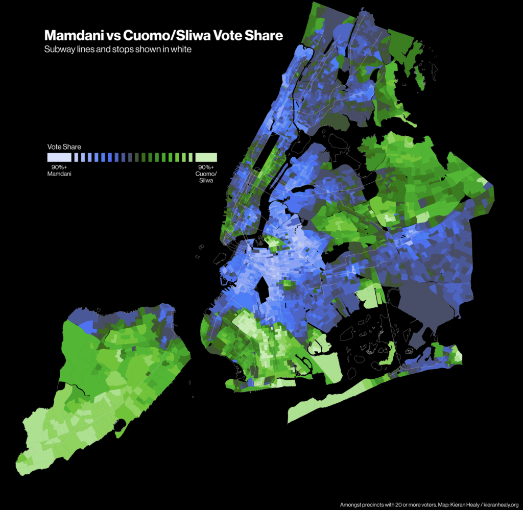
Pretty maps of the NY mayoral election vote. (The meta-point here is that people have a (false) intuition that any complicated piece of information can be conveyed in a single plot.)

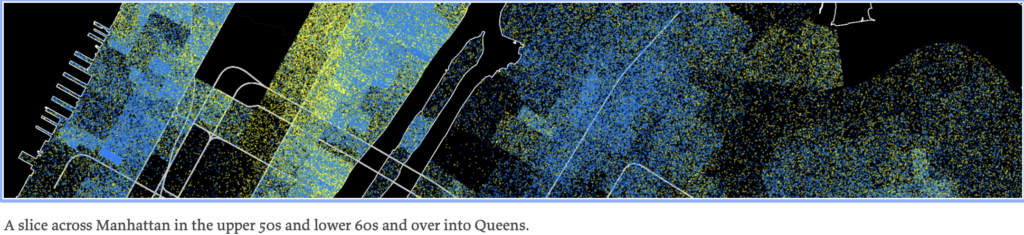
In reaction to my recent post, If Cuomo had been able to run against Mamdani head-to-head, would he have won?, sociologist Kieran Healy posted a pair of maps showing precinct-level results from the recent New York mayoral election. One of them is above, and below is a detail from the other.

The top map uses a bidirectional color scheme of the sort that I like, except that usually I’d see the darker colors at the extremes, fading to white in the middle, so it was surprising for me to see this go the other way.

In his post, Healy shares a lot of detail, not just on his choices for what the maps should look like, but also on the data processing and all the steps along the way.

Following up, Healy writes:

The overall effect of a dot-density plot is sensitive to the choice of colors, particularly when there is more than one kind of dot being displayed. This in turn is heavily related to relative brightness, which in practice itself depends not only on the values encoded on the plot but on the sort of monitor or screen it’s being displayed or projected on, how much ambient light there is, etc, etc.

Again–also as noted in the post–while dot-density plots do better than choropleths in overcoming the “Land Doesn’t Vote” problem (in this case, “Precincts aren’t real”), at the end of the day any spatial representation of something like individual voting data is going to be caught out by this issue one way or another. So overall you just have to show multiple representations of the data, many or most of which will be better off not being maps at all. (Cartograms, whether based on grids or some sort of sphere-packing methods, are another solution, and of course create their own problems.) There’s no one beats-all-comers method, and I don’t present the dot-density map as one. I use stuff like this in my own classes precisely because you end up with a lot of choices to make on how to view the data, and it’s good to encourage students to work through the choices and their consequences.

It’s also good for getting across to students how those choices, and the tradeoffs associated with them, can’t really be effectively communicated in the graph or map itself, because they’ve already been made. And hopefully the students end up recognizing (as with any sort of method or tool) the importance of some working community of researchers providing the context in which these things get made, interpreted, and trusted. Images, graphs, and maps are a pointed case of the general issue, just because it’s so easy for them to escape that context when they circulate. (I have a recent general-audience talk about this.)

I agree with Healy’s points. Phil and I once wrote a paper, All Maps of Parameter Estimates are Misleading.

The meta-point here is that people have a (false) intuition that any complicated piece of information can be conveyed in a single plot. One reason I hate the famous Napoleon-in-Russia graph is that it has encouraged this sort of thinking. When trying to make or read a graph, it can be helpful to start by stepping back and acknowledging hat, in general, one single plot (or even two plots) won’t do it all.

He “washed his hands in a can of tetraethyl lead at a press conference, claiming he was ‘not taking any chance whatever’. He knew this to be a lie, having already succumbed to a bout of lead poisoning.”

OK, this is absolutely horrifying:

The ill effects of ingested lead and other heavy metals had been known since the 1920s, when employees at TEL [tetraethyl lead]-refining plants began hallucinating butterflies and going into convulsions of violent insanity (at least ten died). ‘Smelter nose’, a finger-sized hole in the septum, was an occupational hazard at plants. Horses near the Bunker Hill stack dropped dead; children were hospitalised with kidney damage, forced to undergo excruciating chelation therapy. By the 1970s scientists were beginning to link lead emissions with surging delinquency and crime rates.

The industry’s response was to deny everything or, at best, occasionally raise the height of its smokestacks. Company quacks put out statements asserting that high levels of lead in human bodies were not only harmless but ‘natural’. Thomas Midgley Jr, a General Motors engineer with the diabolic distinction of having invented both leaded gasoline and chlorofluorocarbons, washed his hands in a can of TEL at a press conference, claiming he was ‘not taking any chance whatever’. He knew this to be a lie, having already succumbed to a bout of lead poisoning. (Years later, paralysed with what was said to be polio, he strangled himself in the ropes of a contraption designed to hoist him out of bed.)

In the 1970s, my dad worked for the EPA in their mobile source enforcement division: their job was to stop people from illegally selling leaded gasoline and to adjudicate petitions from mom-and-pop refineries that, for various reasons, wanted exemptions from the new rules on unleaded gasoline.

But that story about Thomas Midgley, Jr.: Wow. What an evil guy. The linked article (a review by James Lasdun of a book by Caroline Fraser) is just full of horrible stories.

I guess that the world is full of evil people and always will be. The challenge is to avoid putting them in positions where they can do a lot of harm.

Survey Statistics: poststratification without population level information

Poststratification uses population data on X to estimate E(Y) via E(E(Y | X, R = 1)), where R = 1 are survey respondents who provide Y and X. When the inner expectation “E” is estimated via Multilevel Regression, this is called MRP. The outer “E” needs p(X), population data on X.

Sometimes we have to estimate the population distributions. We’ve seen a few examples:

  1. “2 flavors of calibration”: Say we have p(X), but we also need p(Z | X), the population distribution of another variable Z. We can estimate p(Z | X, R = 1) using survey data, but nonresponse could make this unreliable. Say we have population data on aggregates p(Z) (e.g. from census tables), then we can logit-shift to anchor to the population aggregate. See Kuriwaki et al. 2024.
  2. “MRPW”: Say we have p(X), but we also need p(W | X), the population distribution of the survey weights W. We can estimate p(W | X, R = 1) using survey data. Then because we assume survey weights are proportional to inverse probability of response 1/p(R = 1 | W, X), we can get what we need by Bayes Rule.
  3. “weights and MRP for voters”: Say we have p(X), but here we need p(X | V = 1), the distribution of X among the population of voters. By Bayes Rule we can get this via p(X) and p(V = 1 | X). The latter can be estimated from population turnout history and vote intent among survey takers.

In all cases, we have some anchor to the population, e.g. via aggregate totals, survey weights, or turnout history. This brings me to Andrew’s post asking 2016 pollsters to poststratify on party ID. We don’t have population aggregates to logit-shift to. But Andrew comments:

party ID is changing much more slowly than the distribution of vote preference, which itself is changing much more slowly than differential nonresponse.

So in our sample party ID (Z) is changing over time quickly, but mostly due to differential nonresponse:

p(Z | t, R = 1) = p(R = 1| Z, t)/p(R =1 | t) * p(Z | t) = differential nonresponse at t * party ID at t

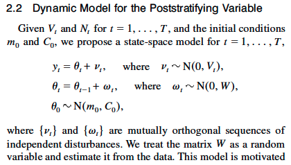
Andrew cites his coauthored paper Reilly et al. 2001, which fits a model to smooth the poststratifying variable Z over time. This won’t help with the component of differential nonresponse that is constant or slowly changing over time, but it prevents the polls from jumping around with every swing in differential nonresponse.

Andrew also cites his coauthored paper The Mythical Swing Voter, which uses 2008 exit poll data on Z to adjust polls from 2012. This also relies on the assumption that Z changes slowly over time, our anchor in the absence of population data.

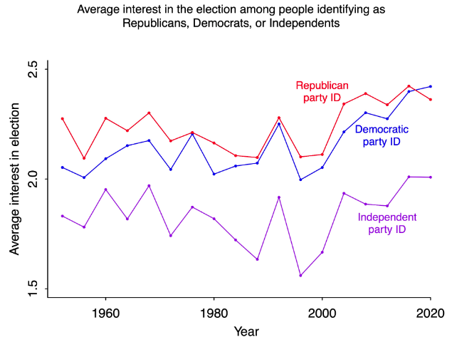
We’ve been talking about adjusting for party ID. Another variable we might want to adjust for is interest in politics. In “adjusting for interest in politics” we cite Andrew and Gustavo‘s Challenges in Adjusting a Survey That Overrepresents People Interested in Politics. They see an increase over time in interest in politics, which they say could be nonresponse bias (people more interested in politics taking surveys) and/or a change in the population due to increased political polarization.

Was this USDA survey really “redundant, costly, politicized, and extraneous”?

Joshua Brooks writes:

I know you’ve posted on the topic more generally but don’t recall if you’ve discussed this in particular. Given the timing in relation to cuts in food assistance, It seems a particularly egregious example of the politicization of data.

The news article, published in late 2025 by an organization called Food Tank (“The Think Tank for Food”) is titled, USDA Ends Key Food Security Report, Leaving Advocates in the Dark, and it begins:

The U.S. Department of Agriculture (USDA) recently announced it will terminate its long-running Household Food Security annual report. The resource is one of the country’s most comprehensive tools for measuring hunger and food insecurity.

The USDA justified the decision as a cost-saving measure, claiming in a statement that the survey is “redundant, costly, politicized, and extraneous.” . . .

Produced for the past three decades by the USDA’s Economic Research Service (ERS), the report offers insights used by researchers, policymakers, and advocates working to reduce food insecurity in the U.S. Anti-hunger advocates argue the move will make it far more difficult to track the impacts of policy changes, including recent cuts to the Supplemental Nutrition Assistance Program (SNAP). . . .

Although advocates are looking for options to fill the research gap, Karen Perry Stillerman, Deputy Director of the Union of Concerned Scientists argues that there are no options that match the scope. “How are the data redundant?” she asks. “The USDA survey serves as the official data source of national food insecurity statistics.”

I followed the link [here’s a version from the Internet Archive] and here’s the USDA’s official statement:

Ummmm, what is this? The Ministry of Propaganda?? Imagine what’s it’s like if you’re a normal person working for the USDA, you just want to do your job, but this is the kind of crap you have to deal with.

But I have a serious question here. The USDA claims that the survey is “redundant, costly, politicized, and extraneous.” Just to go through these:
– I guess the study could be “costly”; to assess whether it’s too costly to be worth it, I guess you’d have to talk about its benefits.
– The study could be “politicized,” but nowadays just about everything is politicized, so that seems kind of irrelevant.
– I can’t see why they are saying the study is “extraneous”; it seems very relevant to USDA-related issues.

But the thing I wanted to focus on here is the claim of redundancy. The USDA says the study is redundant, while the advocates say, no, the data aren’t redundant.

One way for the USDA to address this is to give users help on how to get the equivalent of these data from other sources. I did a quick google and found this page on the USDA’s website:

This seems more serious. I assume the people who are in charge of this webpage have no connection to whoever is the hack who wrote that earlier press release.

So here’s my question. Do the data described on that linked page provide the equivalent information to the now-canceled Household Food Security annual report? Actually, both the Food Tank news article and the USDA press release leave me confused, as they refer both to a “Food Insecurity Survey” and to “Household Food Security Reports.” Does that mean they’re canceling a survey and also canceling a report?

If it’s the survey that’s expensive and redundant, then they could still do the report, no?

The obvious conclusion to be drawn from the ridiculous press release is that the government is canceling the survey and the reports for purely political reasons, some combination of wanting to avoid bad news coming out and ideological opposition to aid to the poor. But it would be good to know if they’re correct in saying this survey is irrelevant.

Maybe I’ll contact Karen Perry Stillerman of the Union of Concerned Scientists and ask what is the basis of her claim that the data are not redundant. Also I can contact the USDA economists on this page. The USDA economists have direct emails; Stillerman doesn’t, but there’s an email given for her media contact, who I guess can connect me to whoever is data-knowledgeable at that organization.

I’ll report back to you!

It’s all about the Super Pacs: How the New York Times completely misreported campaign contributions in the Maine Senate race

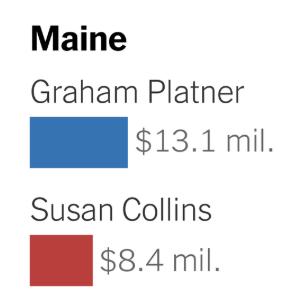
Tom Ferguson came across this news article, Who Really Has the 2026 Midterms Cash Edge?, and was disappointed to see this completely wrong graph:

The problem here is not the inclusion of no-longer-candidate Platner, as that’s noted in a footnote. Rather, as Ferguson says,

The Times shows Platner outraising Collins; whereas she is millions and millions of dollars ahead, as our charts show.

Here’s the chart that Ferguson shared with us the other day:

If Collins raised $39 million, why did the Times say that Collins only raised $8 million? (They also understated Platner’s total, but by a lot less, counting $13 million instead of $16 million.)

I asked Ferguson how this happened–how did the Times screw up so badly? He replied:

Probably they just used the campaign fund of the candidates. The Super Pacs report elsewhere. You have to look them up. This is normal; we’re clear about that when we did Platner. Republican candidates like Collins are really operating with a pack of funds. That’s the famous coordination discussion, BTW. Now rendered even legally moot by the Supreme Court decision.

Collins has many different vehicles supporting her. Easy to find and not new.
The Times reporters are just lazy; they know about the Super Pacs, but can’t bring themselves to do work. That’s the kind interpretation.

Dayum.

Ultimately, the problem here is no so much with the New York Times–large as they are, they’re just one news organization, and they’re trying to do their best–but with the hollowing-out of the news media more generally.

To put it another way, the problem is not New York Times is not the problem. The problem is that the New York Times is one of the few large independent news organizations out there. If there were lots of other orgs reporting these things, we wouldn’t have to rely on the Times not screwing up.

Ferguson continues:

Contrast the endless articles about Democrats talking in Maine deliberations. The billionaire-tasked Times guy should do some work on Collins.

Cf. our discussion of sources in the first post:

We have used data from the Federal Election Commission to construct similar figures for the much-discussed Maine Senate race. Incumbent Senator Susan Collins is running on the Republican ticket, while Graham Platner is her Democratic challenger. Our totals reckon in contributions from Super Pacs and other outside organizations spending on behalf of either candidates or against one (which we count as spending for the candidate’s opponent).

The note’s a killer, so I’ll copy it here:

Federal Election Commission bulk data downloads are not updated at lightning speed. There is a time lag before individual electronic filings are incorporated into those files. In this case, the bulk data downloads are missing the 12-day Pre Primary Report (12P) (filed before the June 9 primary) and contain contributions to the principal campaign committee up to and including May 20, 2026. The bulk downloads are also missing the independent expenditures spent through election day. We obtained the electronic filings of the candidates’ principal campaign committee and the independent expenditures to fill the gap in the bulk data downloads. We downloaded these electronic filings June 12-14. Collins uses multiple committees to raise and spend money, and these committees have different filing deadlines. The Pine Tree Results PAC filed a 12P and reports contributions up to and including May 20. The Lead Maine Committee has contributions until April 28. The Stronger Maine Super PAC has contributions until March 31, The Collins Victory Committee is March 31, and the Susan Collins for Maine JFC is March 31. Collins also raises money for her principal campaign and leadership committees via joint fundraising committees (JFCs). These are shared accounts that allow several candidates or party committees to raise money together. A single donor writes a “parent” check to the JFC, which then is divided among the participating committees. When Collins is the clear beneficiary of such arrangements, such as with the Collins Victory Committee, we count the full parent check as part of her donor distribution. When Collins is merely one of several candidates involved in the JFC, such as with One Team Senate Majority, we count only the subdivided portion given directly to Collins as part of her donor distribution and not the full parent check. Counting the parent check for committees she controls but only the subdivided check for committees she merely joins lets us credit each donor’s true contribution to Collins exactly once without double-counting the same dollars or absorbing money raised on behalf of other candidates.

So, yeah, they had to do some work.

The above-linked New York Times article sucks for two reasons:

1. It got things way wrong, completely missing the story of the Republican candidate’s massive fundraising edge.

2. It was written in an overconfident style with no indication to the reader that the news story was actually missing more than half of the campaign cash out there.

I’ll forward this to my colleagues at the Times. Maybe they’ll run a correction?

A ranked-choice election in Maine: Using voting data to understand preferences

Evan Rosenman writes:

The implosion of Graham Platner’s Senate campaign in Maine has upended a marquee Senate race, leaving the state Democratic party just a few weeks to choose a substitute nominee. A planned nominating convention on July 25th has drawn considerable candidate interest. But the mathematical properties of ranked choice voting add a strange wrinkle to these deliberations.

The Maine Democratic Gubernatorial Primary

Three of the top contenders to replace Platner are former gubernatorial candidates: Nirav Shah, former director of the Maine Center for Disease Control and Prevention; Troy Jackson, former Maine State Senate president; and Shenna Bellows, Maine’s secretary of state. All three ran for the Democratic nomination for Governor, losing the primary to Hannah Pingree, former speaker of the Maine State House.

June’s primary results are given below. (Data from Wikipedia.) Maine uses ranked choice voting (RCV) in primaries and federal elections, so voters could rank up to six choices for Governor. Using the instant runoff algorithm, candidates were sequentially dropped based on who had the fewest first-choice votes, and ballots were reallocated to each voter’s next-ranked choice. Jackson, Shah, Bellows, and Pingree were highly competitive, each receiving between 20% and 27% of first-choice votes. Of the four, Bellows was eliminated first, then Jackson. Shah fell to Pingree in the final tabulation round.

Candidate Round 1 Round 2 Round 3 Round 4
Pingree 50,552 (23%) 55,360 (26%) 75,671 (36%) 111,750 (56%)
Shah 58,606 (27%) 62,860 (30%) 72,681 (35%) 86,950 (44%)
Jackson 45,959 (21%) 47,597 (22%) 60,010 (29%) Eliminated
Bellows 44,770 (21%) 47,049 (22%) Eliminated
King III 17,860 (8%) Eliminated
Exhausted ballots 4,881 (2%) 9,385 (4%) 19,047 (9%)
Continuing ballots 217,747 212,866 208,362 198,700

These results have taken on extra significance as the state party seeks democratic buy-in for the selection of a substitute Senate nominee. Media outlets, for example, have routinely referred to Shah as the “runner-up” in the Governor primary. But analyses of the individual ballots cast in the primary reveal a surprising mathematical fact: though she was eliminated before them, Bellows would have defeated either Shah  or Jackson in one-on-one elections.

Mathematical Details

This unintuitive fact is a generalization of a well-known feature of ranked choice voting elections: it does not satisfy the Condorcet winner criterion.

First, some definitions. Suppose we have an election with a set of candidates C:

  • A “Condorcet winner” is a candidate in C who would defeat all the other candidates in a head-to-head election. A Condorcet winner need not exist for any given C; think of rock-paper-scissors, where each option wins against one alternative and loses against the other. But Condorcet winners exist in many standard election settings.
  • The Condorcet criterion is a feature of electoral methods: a method satisfies the criterion if it always selects a Condorcet winner when one exists.

Standard plurality elections – in which voters make one selection, and whomever gets the most votes wins – do not obey the Condorcet criterion. This is well-understood due to the “spoiler effect.” For example, a Libertarian candidate may attract voters who would otherwise prefer a Republican to a Democrat, siphoning enough voters such that a Democrat obtains the most votes.

Because voters express richer preferences in RCV elections, the method is considered better at identifying Condorcet winners. But it can easily be shown that RCV also does not satisfy the Condorcet criterion. This is not purely hypothetical. In a 2022 U.S. House special election in Alaska, Democrat Mary Peltola was elected against two Republican opponents: Sarah Palin and Nick Begich III. An analysis of the underlying ballot data revealed that Begich was a Condorcet winner. But he was eliminated in the first round because he received slightly fewer first-choice votes than Palin, allowing Palin to advance and lose to Peltola.

As RCV does not obey the Condorcet criterion, it stands to reason that the order of elimination need not correspond to who would win head-to-head elections. This is indeed true. A candidate eliminated in an earlier round may well have defeated one eliminated in a later round in a head-to-head election.

Results in Maine

We can understand the electorate’s preferences in Maine because the state releases its cast vote record: the anonymized set of rankings for every ballot cast. These data are available online and have also been analyzed extensively by the election advocacy group FairVote.

To assess how two candidates A and B would fare in a head-to-head election, we look at the set of ballots that rank at least one of them. Any ballot in which A appears before B, or A is ranked and B is not, represents a voter who prefers A to B; any ballot in which B appears before A, or B is ranked and A is not, represents a voter who prefers B to A.

In the table below, we summarize all the head-to-head matchups among the top four candidates. Note that if the final column is positive, then A defeats B; if it is negative, B defeats A.

Candidate A Candidate B % of Ballots
Listing Neither
% Who Prefer A % Who Prefer B A vs. B Margin
Bellows Pingree 14% 41% 44% –3%
Bellows Jackson 19% 48% 33% 15%
Bellows Shah 12% 45% 43% 3%
Shah Pingree 10% 39% 50% –11%
Shah Jackson 13% 50% 37% 12%
Jackson Pingree 14% 33% 52% –19%

Pingree wins all three of her matchups, indicating she was indeed the Condorcet winner. But notably, Bellows wins every matchup except the one against Pingree. She was preferred to Jackson on 48% of ballots while he was preferred on 33%, with the remaining ballots listing neither candidate. Bellows had a narrower margin against Shah, but she was preferred on 45% of ballots to his 43%.

These results reflect the strengths and pitfalls of RCV. Because voters’ ranked choices are recorded, we can better assess the electorate’s head-to-head preferences among many candidates. But elimination orders under instant runoff needn’t reflect these preferences. In closely contested elections like the Maine Democratic gubernatorial primary, this can yield unintuitive results – with big implications for the next big question: whom to choose as a substitute Senate nominee.

Following up on Rosenman’s analysis, I have a few points to raise:

  1. Why should I care who would win in a head-to-head race? I’m not trying to ask this in an aggressive way; it’s just not clear to me why this should be the question to ask, or why we should care about a Condorcet winner. Another way to say this is that intensity of preference could matter too.
  2. A related issue is that there are lots of people who could potentially be qualified to be the senator from Maine–after all, a senator doesn’t really have to do much, their staff does all the work, right? Just ask Senator Grassley from Iowa! My point here is not to trivialize the election–people live or die based on who is elected to Congress–just that the steps of choosing a candidate involve a winnowing from many many possible choices. The Condorcet winner criterion and other similar rules apply only after drastically limiting the number of options.  From that perspective, I’d be more inclined to rate candidates based on a summing of pluses and minuses for various attributes, rather than head-to-head comparisons. I get that the general election is a head-to-head race so you need to think about such things, but from a political theory perspective, or from a which candidate-to-choose perspective, I see this Condorcet thing as a blind alley.
  3. Who you’d want to run for governor isn’t necessarily the same as who you’d want to run for senator.  I say this for two reasons.  First, they’re different jobs:  what it takes to run the executive branch of a state is different than what it takes to be a member of the national legislature.  Second, the main goal of a political party is to win the election, and it could take different things to win in the two races in Maine this year.  I don’t know how important this is, as I have no sense of politics in that state. I’m just raising the issue.

Survey Statistics: quantifying uncertainty in ranked choice voting polls

We’ve talked about uncertainty in polls (see Margin of Error, Total Margin of Error, Total Margin of Error II) and we’ve talked about ranked data (see exploded logit !). A new paper, Rosenman & Liang 2026, looks at uncertainty in ranked choice voting (RCV) polls.

Recall the multinomial logit model that Train (2009) Chapter 7 calls the exploded logit:

P[ranking Other then Left then Right] = exp(f_Other) / sum_c’ exp(f_c’)   *   exp(f_Left) / (exp(f_Left) + exp(f_Right))

Without covariates, it has only 3 parameters: f_Other, f_Left, f_Right. It makes the independence from irrelevant alternatives (IIA) assumption to go from these 3 parameters to rank probabilities.

In contrast, the multinomial model in Rosenman & Liang 2026 does not make the IIA assumption and has 14 parameters, one for each of 15 possible rankings minus one so they sum to 1:

P[ranking Other then Left then Right] = pi_{Other, Left, Right}

Rosenman & Liang 2026 note that in RCV the election outcome is not expressable as one parameter. Instead, the winner is determined by instant runoff:

  1. If a candidate wins >50% of first choice votes, they win.
  2. Otherwise, the candidate with the least first choice votes is eliminated, and each ballot counts for its top remaining choice. Return to step 1.

Say you use polling data to estimate rank probabilities pi_j for each ranking j. These estimates differ from the true probabilities due to many sources of error (see our favorite Figure 2.5 from Groves et al. shown in quantity vs quality and is a mismeasured X better than none at all ?). Rosenman & Liang 2026 focus on sampling error.

How can we propagate uncertainty about the rank probabilities pi_j to uncertainty about the RCV winner ? If you have draws from the posterior of pi_j, you can do instant runoff on each to get a winner for that draw. This gives win probabilities according to your model and data.

To see the importance of uncertainty in RCV, let’s look at their 2022 Alaska House special election example. With 3 candidates, RCV is determined by 5 margins (see their Lemma 1). Most of these margins are well-identified by the data, but 2 were quite close: Palin vs Begich first choice margin and Peltola vs Palin pairwise margin. They plot these 2 margins in the right panel of Figure 1. The true outcome is the black dot, with sampling uncertainty shown as ellipses around it. For small sample sizes (the biggest ellipse), we see that a plurality of the mass falls into green, where point estimates would declare that Begich wins. Uncertainty quantification would help put this in context, giving all candidates win probabilities around 20-40%, showing the race is difficult to call with such small data.

For details, see Rosenman & Liang 2026.


It’s all about the nonlinearity: An interesting statistical example of flaws in a voter impact index

The following came in the email the other day:

I’m reaching out to introduce the Voter Impact Index, a new data tool from PowerMoves that assigns every U.S. zip code a voter impact score based on the recent competitiveness of six federal and state elections tied to that location.

The Index may be useful in your teaching or research in a few concrete ways:

— Classroom discussions on political geography, voter mobilization, and the relationship between where people live and how much their votes matter
— Research applications exploring electoral competitiveness, voter sorting, and the civic behavior of movers (we estimate 15 million registered voters relocate annually)
— Student projects analyzing zip-code-level electoral data across districts

The underlying data, code, and methodology are fully open and accessible via GitHub through our website at PowerMoves.Vote — making it straightforward to build on or replicate.

PowerMoves is a nonpartisan project. The Index draws from trusted nonpartisan sources and assigns scores regardless of party affiliation.

I was curious so I looked up my own zip code, and here’s what came up:

A “medium” voter impact of 44/100. Are you kidding? Yes, you can get lower impact scores (just try typing in 02139), but something close to the midpoint on a 0-100 scale doesn’t sound right to me. We almost never have close elections. New York is not a swing state, and even our local elections are never close.

OK, the 2022 governor’s election in NY was pretty close, I’ll grant them that, and the 1994 race was even closer, as were 1982 and 1978 . . . but that’s going back pretty far, and they’re only weighting the governor races at 15% (go here and scroll to the bottom), so I was puzzled as to how voters in our district can be judged to an impact of 44 on a 0-100 scale. Even if you count the governor’s election as close (and it wasn’t that close), that would still only you to 18.

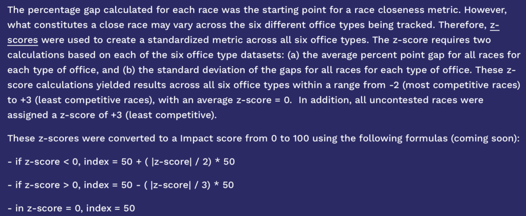
If you read through that document carefully, you can figure out what’s going on:

OK, there’s this weird bit about dividing by 2 or 3, but that’s not the key issue. The big problem, I think, is linearity. For example, in the 2024 presidential race, Kamala Harris won the two-party in New York by a 13-point margin. Not close at all! Really not close, considering that, had the state election been close, there’s no way that New York’s electoral votes would’ve been decisive. My voter impact for this election was approximately zero (see some calculations here, albeit from an earlier year). If you want to get technical about it, the probability my vote is decisive is something like 1/100 of the probability that a swing state’s voter will be decisive.

So if the “presidential election” contribution to this index is 100 for Wisconsin, Michigan, and Pennsylvania, and something like 50 in a state like North Carolina or Georgia, then it should be approximately 1 in New York. Or maybe 0.1. Or maybe 2. In any case, some tiny number. Even the governor’s race, which Hochul won by 6 percentage points . . . ok, that’s close, but, again, there are closer races for governor. I went online and looked it up, and there were a couple races decided by less than 1 percentage point of the vote. If those tossups count as a voter impact as 100, then maybe the New York race would be a 50? or maybe something less than that?

So if you add all up all these voter impact score and weight them, you might get something like a 10 for my district, if you’re being generous. Not 44.

It’s an interesting example. At first, doing this linear scaling could seem to make sense. But not if your goal is to measure voter impact.

To put it another way, their measure is underestimating the value of voting in a swing state or a swing district. The linear mapping smooths out the signal.

P.S. I replied to the above email to share my concern with the creators of this index. We had a cordial email exchange but ultimately they didn’t seem convinced by my argument and so they left the index as it is. Too bad. But, hey, they’re doing the work, it’s their call: if they want to categorize my zip code as having “median” voter impact . . . well, it’s a free country!

“Archaeology can’t give social scientists population or GDP, but here are some things we can measure that might be useful for social science.”

Apropos of our recent discussion on the estimation of historical population sizes, Sean Manning writes:

Some archaeologists have measured house sizes for Gini-coefficient-style studies aside from studying human remains to measure nutrition and rates of illness. I think that was what Michael E. Smith meant when he talked about hypothetical data: “archaeology can’t give social scientists population or GDP, but here are some things we can measure that might be useful for social science.”

I asked Manning where the quote came from, and he replied:

I think I got the idea from this response by Smith to a published paper:

This model of inequality in the Aztec Empire is not based on empirical data. While there is nothing wrong with hypothetical models per se, the paper is phrased as if it presents empirical findings. … There are simply not enough data available to do the kind of analysis presented in this paper. The tweaking of data and methods do not produce results that satisfy me as being reasonable estimates of the level of inequality in the Aztec Empire. Perhaps this is just an epistemological difference between our approaches to science and knowledge. Economists might look at this paper as a fine analysis, whereas archaeologists and historians will probably look at it as a study based on hypothetical data, and therefore divorced from the Aztec reality that we study.

Smith has a book that talks about the archaeology of inequality in Aztec Mexico: Timothy A. Kohler and Michael E. Smith, editors, Ten Thousand Years of Inequality: The Archaeology of Wealth Differences (University of Arizona Press, 2019).

Often in social science there is tension between what we can measure and what we would like to know.

Survey Statistics: toy example for energy balancing weights

Last week we talked about The Big Changes Coming to the Times/Siena Poll:

  1. New weighting variable: support score = E(2024 vote | other X variables).
  2. New weighting method: energy balancing (Huling & Mak, 2024)

Ben Schneider helpfully blogged about energy balancing as well:

Raking and similar calibration methods are based on balancing means or totals for specific variables…The energy balancing method does something different: it calibrates based on an entire multivariate distribution, as measured by an empirical cumulative distribution function (ECDF).

Jared Huling (of Huling & Mak, 2024) helpfully answered questions in the comments. I’m still puzzling over how energy balancing handles empty cells (unsampled regions of the joint covariate space). I need a toy example.

Consider 2 binary variables, so 4 population cells, with known population shares:

       k=0    k=1    total
j=0    .4     .2     .6
j=1    .2     .2     .4
total  .6     .4

Say the sample is missing folks in cell 11:

       k=0    k=1    total
j=0    .5     .3     .8
j=1    .2     0      .2
total  .7     .3

Consider 4 methods:

1. Classical Poststratification: not defined because of division by 0.

2. Raking: match only the margins. Correct when Y | X1, X2 is additive.

       k=0    k=1    total
j=0    .2     .4     .6
j=1    .4     0      .4
total  .6     .4

3. Energy balancing: minimize the Energy-Distance(F_w, F_pop) between the weighted sample distribution of X1, X2 and the population distribution. Correct when Y | X1, X2 is such that nearby cells have similar means.

Say X1 = young/old, X2 = man/woman, Y = percent Democrats, and no old women are sampled.

Raking is correct when additivity holds: old women = young women + (old men − young men)

Energy balancing is correct approximately when: old women = (old men + young women)/2 ?

library(WeightIt)

pop  <- data.frame(X1 = rep(c(0, 0, 1, 1), c(40, 20, 20, 20)),
                   X2 = rep(c(0, 1, 0, 1), c(40, 20, 20, 20)))

samp <- data.frame(X1 = rep(c(0, 0, 1), c(50, 30, 20)),
                   X2 = rep(c(0, 1, 0), c(50, 30, 20)))

dat <- rbind(cbind(pop,  A = 1),
             cbind(samp, A = 0))

W <- weightit(A ~ X1 + X2, data = dat, method = "energy",
              estimand = "ATT", focal = "1",
              dist.mat = as.matrix(dist(dat[, c("X1", "X2")])))

w <- W$weights[dat$A == 0]
tapply(w, interaction(samp$X1, samp$X2), sum) / sum(w)
       k=0    k=1    total
j=0    .381   .309   .69
j=1    .309   0      .309
total  .69    .309

4. MRP: fit a model for Y | X1, X2. The interaction term’s posterior equals its prior, propagating uncertainty around additivity.

Am I understanding this correctly ?

Guess who’s getting the big-money donations in the Maine U.S. Senate race?

Just in time for July 4th, Tom Ferguson, Paul Jorgensen, Matthias Lalisse, and Jie Chen share the above graph and write:

What can one Senate race reveal about the hidden machinery of American politics? In Maine, donor patterns expose how campaign finance can shape party competition, political narratives, and the choices voters are asked to make long before ballots are counted. . . .

Platner is strongly supported by Senator Bernie Sanders and other progressives, while many establishment Democrats dislike him. Major media keep printing articles questioning his character. By contrast, Collins’ somewhat contradictory legislative history attracts less coverage. . . .

Our tabulations of the race show that Collins is much closer to a typical Republican pattern (or, to be fair, those of the Old Guard Democratic leaders [Nancy Pelosi and Chuck Schumer, along with Paul Ryan and Mitch McConnell]) in a key respect: the size profile of her donors. . . .

The Republican Senator from Maine is hugely dependent on very large donors. By contrast, Platner strikingly resembles Sanders: he attracts essentially no big money. Recently the numbers of billionaires supporting the candidates has emerged as an issue. A very few have supported Platner with small sums. Almost a hundred (counting spouses) have made contributions of varying sizes to Collins. The overall configuration is as shown [above] and is perfectly obvious.

They also report:

If you put aside contributions that are below the $200 threshold for disclosure, the percentage of money received from Maine donors differs sharply between the candidates. Senate elections have been nationalized for a long time. Contributions from Maine itself make up approximately 20% of all money for Platner; by contrast, Collins’ rate is slightly under 3%. (Not a misprint.) Her biggest contributors include a Who’s Who of prominent financiers in private equity and hedge funds, including Steve Schwarzman of BlackRock, Ken Griffin of Citadel, along with other well known Republican donors, including Larry Ellison of Oracle.

And they give an example of how this works:

A day after a Super Pac backing her received a $2 million dollar contribution from a private equity magnate who, according to press reports, stood to gain munificently from President Trump’s One Big Beautiful Bill, [Collins] provided a crucial vote to spring the bill out of committee. Then she loudly voted against it on the floor.

Another way of looking at this is to ask, why a person living outside of Maine give $100,000+ to Susan Collins? Roughly speaking, the following conditions are needed:
1. The donor has to be rich enough to be able to spare $100,000 as loose change.
2. It has to be legally possible to give this amount of money, or the perceived consequences of violating the law have to be minimal.
3. The donor has to consider Republican Party control of the U.S. Senate has to be important enough to be worth spending $100,000 to make a small change in the probability of this happening.
4. It has to be easy to write the check; that is, the donor does not need to get the agreement of many other people to release the money.
5. Any negative political, social, and economic consequences of revealing oneself to be a strong partisan have to be mild, compared to the perceived benefits of making the donation.

And in recent years these five conditions have increasingly been present:
1. There are more and more super-rich people who can spend $100,000 without blinking an eye.
2. The Supreme Court keeps liberalizing campaign finance laws, also the government has become much more encouraging and tolerant of corruption. On the rare occasions where people are prosecuted, they get off, and even on the rare occasions are imprisoned for corruption, they get pardoned.
3. With political polarization, the two parties are further apart than ever, and party-line voting in Congress has become the norm.
4. The money is being given by individuals, or by companies controlled by single individuals. It’s not like the old days, where, if General Motors made a campaign contribution, they’d need the coordination of some board of directors.
5. This last one is the most interesting. A flip side of partisan polarization is that, if you give a lot of money to the Republicans, it will piss off a lot of Democrats, and vice versa. Political independents might not be so happy either. One way out is that it’s becoming easier and easier to skirt the regulations and campaign in secret. Beyond this, I guess these donors have decided that the Republican business sphere is large enough that they can afford to alienate Democrats and independents. And Black Rock, Citadel, and Oracle are not primarily customer-facing businesses.

Survey Statistics: Big Changes in the Times/Siena Poll

Yesterday Nate Cohn wrote about The Big Changes Coming to the Times/Siena Poll, with
more details in their poll of Maine.

Say we want to estimate average Platner support in Maine’s likely electorate, E(Y). But we only have survey respondents, R = 1.

The NYT uses survey weights to weight respondents, E(YW | R = 1). In contrast, some pollsters use MRP, fitting a Multilevel Regression model for Platner support, then applying it to the population, E(E_model(Y | X, R = 1)).

Nate discusses 2 Big Changes to how they construct the weights W.

(The polar bear has not yet hiked in ME, but he is training for it. This above is in TN.)

Big Change 1: Support score

A few weeks ago we saw the NYT started weighting on “synthetic 2024 vote”, which is recalled 2024 vote that is validated with the voter file and imputed if needed.

Now they’re also weighting on support score = E(2024 vote | other X variables). Nate explains the motivation:

While a poll can’t weight on dozens of variables, the support score lets us pile a lot of information into a single measure.

This reminded me of the causal inference context, where D’Amour and Franks (2021) “see especially strong performance for propensity weights computed with respect to the prognostic score”, where the prognostic score is E(Y | X, control). In our survey context, this would be a model for Platner support Y. Instead, the NYT use 2024 vote, perhaps for applicability across multiple outcomes Y ?

Big Change 2: Energy balancing

Beyond adding new weighting variables, they’re also changing how they calculate the weights. Nate notes the challenge of weighting on many variables and interactions with typical sample sizes. So they are turning to the R package WeightIt, which implements the energy balancing method from Huling & Mak (2024):

This article introduces a new weighting method, called energy balancing, which instead aims to balance weighted covariate distributions. By directly targeting distributional imbalance, the proposed weighting strategy can be flexibly utilized in a wide variety of causal analyses without the need for careful model or moment specification.

The energy balancing weights do not use outcome Y, but the paper notes that estimates can be improved with a model for Y.

How do energy balancing weights handle the challenge of jointly weighting on many variables with typical sample sizes “without the need for model specification” ?

“Springer Nature has removed two studies by Max Planck.”

Jim Moody points to this news article, “Why have papers by one of history’s most famous physicists been retracted? Springer Nature has removed two studies by Max Planck. A bot may be to blame.”

If you’re gonna retract something from Max Planck, I’d suggest starting here, with the notorious Manifesto of the Ninety-Three German Intellectuals defending Kaiser Wilhelm’s invasion of Belgium. Here are a couple of retractable passages:

It is not true that the life and property of a single Belgian citizen was injured by our soldiers without the bitterest self-defense having made it necessary.

It is not true that our troops treated Louvain brutally. Furious inhabitants having treacherously fallen upon them in their quarters, our troops with aching hearts were obliged to fire a part of the town as a punishment.

I guess they were the world’s most moral army. “Aching hearts” . . . that must have absolutely sucked. Really mean of those Belgians for defending themselves.

Just to be clear, I’m not saying that Planck should be “canceled.”

Who among us hadn’t retroactively disgraced ourselves with a lachrymose defense of military aggression?

I’m just saying, if you have to retract a paper by Max Planck, I’d retract that one.

P.S. The funny thing is that the above-linked article describes the famous physicist as “almost as widely revered for his character as his physics. In 1933, for example, he bravely confronted Adolf Hitler over Nazi Germany’s discriminatory laws against Jews.” I’ve never read anything about Planck’s life so I don’t know what changed with him between 1914 and 1933. Maybe the loss of the war in 1918 soured him on armed adventures.

Getting justice can require a lot of effort, and usually at some point we’ll just give up, which is what the cheaters rely on.

I just read this compelling op-ed by Brendan Ballou, “One Man Stole $660 Million. He’ll Never Pay It Back,” which tells the story of several brazen white-collar criminals who avoided prosecution for federal crimes by the simple expedient of bribing the president of the United States. Ballou argues, though, that there could still be ways of catching these guys:

In a world where the Department of Justice and the president are either indifferent to or actively support rich criminals, what can be done? Fortunately, there is a range of legal tools that ordinary citizens can use to pursue civilly the sort of corruption that would ordinarily be prosecuted criminally.

The shareholders potentially cheated by Mr. Wiederhorn could sue the Trump inaugural committee under the federal civil RICO law — written to destroy the Mafia — for seemingly helping to secure Mr. Wiederhorn’s freedom. Companies that follow the law can sue rivals, like Binance, that do not, under California’s Unfair Competition Law. And investors scammed by Mr. Milton can sue the political committees he donated to if they were “unjustly enriched” by his scheme. . . .

When regular citizens can’t act themselves, they can pressure their local prosecutors to do so. Recall Mr. Homan’s $50,000 in cash from undercover F.B.I. agents. This Justice Department may not continue the investigation. But Mr. Homan’s personal business is headquartered in Virginia, and it would be awfully interesting to find out whether Mr. Homan reported that money on his state tax returns. If he didn’t, he may well have committed a crime. . . .

He concludes:

Criminals and government officials are barely hiding their schemes, and their brazenness is meant to make us feel helpless, to think that nothing can be done. That is false. We already have the legal tools to fight corruption. We just need to use them.

This is inspirational and I hope someone does all of this.

My point in the present post is that getting justice can require a lot of effort.

Here’s an example. The other day I was talking with someone about research fraud, and he characterized the Michael Lacour story as the biggest scandal ever in political science. I disagreed. It was my impression that Lacour had been forgotten (here’s some background), but what about the time that the American Political Science Association gave an award to a plagiarized book? Here’s the story. I’d never heard of any of the people involved in that episode, but it incensed me that APSA had done this.

I wasn’t the only angry person. Indeed, I’d heard about the Frank Fischer case from Alan Sokal, who’d emailed an academic official at Rutgers University, where the plagiarist worked, but there was no useful response. So I decided to take a whack at it. I sent off this email to the people on the committee that had given that award:

Dear APSA Public Policy Section:

I learned recently that you gave your 2017 Aaron Wildavsky Enduring Contribution Award to Frank Fischer for his 2003 book Reframing Public Policy. I was surprised to hear this, given that the book appears to have plagiarized material. For background, see this document by Krešimir Petković and Alan Sokal:
https://chronicle-assets.s3.amazonaws.com/5/items/biz/pdf/plagiarism_fischer.pdf
and this note by Petković:
https://chronicle-assets.s3.amazonaws.com/5/items/biz/pdf/Petkovic_Experiment_with_CPS.pdf
and this news article for further background:
https://www.chronicle.com/article/alan-sokal-takes-aim-at-an/124969

Petković, a political science graduate student in Croatia, found places in Fischer’s 2003 book where he had used materials from previously published work by others without giving full attribution. In addition to copying without attribution (as Petković writes, Fischer mentions the book he copied from, but nowhere near the copied passage), Fischer also makes mistakes such as misspelling authors’ names and reproduces errors that arose in the original sources.

Two of the works from which Fischer copied in his 2003 book without appropriate attribution are:

Majone, Giandomenico, 1989. Evidence, Argument, and Persuasion in the Policy Process. New Haven: Yale University Press.

Walsh, David, 1972. Sociology and the Social World. In: Filmer, Paul, Phillipson, Michael, Silverman, David and Walsh, David, New Directions in Sociological Theory. London, Collier-Macmillan: 15-35. [Also published by MIT Press, Cambridge, Mass., 1973.]

I am not an expert in this area and have no intention of pursuing any formal process here. Indeed, I am not even a member of APSA. However, I am a political scientist and, as such, am distressed to see APSA promoting plagiarism.

My recommendation is that you retract the award. If that is too difficult, one thing you could do is retroactively also give this award to Majone (1989) and Walsh (1972). It does not seem fair that they did the work and someone else gets the award, no? I do not know Prof. Fischer and am making no judgment regarding the quality of his writing. It may be that it is indeed an enduring contribution to the field; if so, all authors of this enduring contribution should be recognized.

Yours,

Andrew Gelman
Professor, Department of Statistics
Professor, Department of Political Science
Columbia University, New York

P.S. I have also cc-ed the members of APSA’s Committee on Professional Ethics, Rights, and Freedoms.

From APSA’s guide to professional ethics:

“7. Political scientists, like all scholars, are expected to practice intellectual honesty and to uphold the scholarly standards of their discipline.

7.1 Plagiarism, the deliberate appropriation of the work of others represented as one’s own, not only may constitute a violation of the civil law but represents a serious breach of professional ethics.

7.2 Departments of political science should make it clear to both faculty and students that such misconduct will lead to disciplinary action and, in the case of serious offenses, may result in dismissal.”

A few months later I followed up:

Hi all. I was just wondering what happened with this. As I wrote last year to **, I am not submitting a formal grievance or complaint. I just wanted to let the committee be aware of this situation so that they can have the opportunity to fix it.
So I was interested to find out how things have progressed, as it seems to be an embarrassment to APSA to have given a major award for a book with plagiarized material!
Andy

After several months I hadn’t heard back from the committee so I pinged them in June. A couple weeks later they got back to me and said they couldn’t do anything because it had not been submitted as a formal complaint.

Fair enough. I didn’t think it would be right for me to file the complaint myself, given that I’m not at all knowledgeable about this area of political science.

Meanwhile, the books that had been plagiarized, Majone (1989) and Walsh (1972), never got that award. Doesn’t seem fair to me!

Anyway, my point is that it takes work to pursue these things, and it’s more my inclination to point out the problem than to go through the political and administrative steps needed to rectify the problem.

I’m not dissing “the political and administrative steps”–I have a lot of respect for people who can do these things!–it’s just not something that I’m good at.

Here’s another example. I once had a colleague who plagiarized my work. When I realized what was going on, I was stunned. But then, looking back, I realize that I’d been warned of this behavior years earlier, indeed my memory flashed back to a time that I’d seen something else he’d plagiarized from me, and I’d just kind of filed that image in my mind and forgotten it. My collaborator and I had a good thing going, and, hey, nobody’s perfect, so it was easier to look away. When I confronted him about the plagiarism–this was a long time ago–he kind of wriggled around, saying that he didn’t want to share credit with me on the project I’d been working on with him–at one point I was dictating formulas to him over the phone–but we could jointly write a separate article on the topic. This just pissed me off, but, ultimately, he won, in the sense that he correctly calculated that I was rational enough not to want to get involved in a major scandal early in my career. Yes, he’s the one who would’ve looked bad had I raised a formal complaint, but it wouldn’t have done my reputation any favors to be seen as a complainer. Also, though, I won, in that I stopped my involvement in this project and I moved on to better collaborators.

The episode bothered me (which is why I keep talking about it), but my cost-benefit analysis led to the decision to not file a formal complaint. That’s the decision-theory analysis. The game-theory analysis is that my colleague could see ahead to the next move: he know I was rational and that it would be a net loss to me to make a fuss about his actions, and I expect that this minimax analysis led him to the conclusion that he’d be safe in plagiarizing me. Yes, he was taking a risk to his reputation in doing so, but it was a calculated risk, in his mind less than the expected benefit to his reputation of taking full credit for this part of our joint research.

What should be done?

I’m not sure. In academic scandals, maybe it’s best just to move on. So what if some obscure political scientist got some award that he didn’t deserve? So what if some researcher publishes substandard work because he decides to not credit a collaborator? Worse things happen every day in academia. Indeed, if you want to talk about the worst scandal in modern political science, I might give the nod to Samuel Huntington’s book, The Clash of Civilizations and the Remaking of World Order, not because of plagiarism or anything like that, but just because arguably it’s had a large and malign influence in the world. Given all the problems in social science, plagiarism is the least of our concerns. So, although it annoys me, ultimately I think the appropriate strategy is to just let it happen, to talk about it but not to worry about seeking justice.

When it comes to business and government corruption, though, I agree with Ballou that something should be done. Legislatures should be writing laws, local and state governments should be prosecuting, lawyers should be suing, etc. These guys are stealing, giving and taking bribes . . . this is the kind of thing that degrades the entire economic and political system.

So, again, I hope some people make some of the moves that Ballou recommends. They should just be aware that it will take a lot of effort and persistence.

“Howard Lutnick gives top Cantor Fitzgerald jobs to his sons Brandon and Kyle” is a very clean example of meritocracy.

In a post about possible corruption in the government and finance sector, Paul Campos points to a news article entitled, “Howard Lutnick gives top Cantor Fitzgerald jobs to his sons Brandon and Kyle,” that features an adorable photo of the three Lutnicks standing next to a fashion model.

Campos labels this as, “The Meritocracy!”, and clearly he’s being ironic: his point is that it seems unlikely that these two twenty-somethings are really the people with the most merit needed to run this zillion-dollar company. All things are possible, but it would be an amazing coincidence if, among all the possible financial executives out there, that these two would happen to be the best.

And, sure, I get that.

But now I want to point to my old post on the topic, Meritocracy won’t happen: The problem’s with the “ocracy.”

The short version is that the news item, “Howard Lutnick gives top Cantor Fitzgerald jobs to his sons Brandon and Kyle,” is a very clean example of meritocracy. Lutnick Sr. had the merit (in whatever sense) that took him to the top of the heap, and he used that merit to get jobs for his kids: that’s the “ocracy” part.

If all that merit did was get you top jobs and lots of money, that’s not meritocracy, that’s just merit-based employment and pay. What makes it “meritocracy” that the people with the merit don’t just get nice jobs, they also get to be in charge of everything (”ocracy”). And one thing you do when you’re in charge is take care of your kids!

As Mark Palko discussed over ten years ago, our society seems to have become more tolerant of nepotism. Or maybe the point is that nepotism has always been a thing, but in recent years there’s been more of an effort by rich people and the news media to portray nepotistic hires as having special merit of their own. This is not to say that children of the successful cannot make great contributions themselves—John Quincy Adams comes to mind, also Julian Lennon had that cool song a few decades ago where he sounded just like his dad, so that’s something too. And then there was Oliver Wendell Holmes, Jr., who surpassed his famous father in achievements. And Alexander of Macedon didn’t do so bad either.

Anyway, “meritocracy” implies that the people with merit rule society, and they’ll use their power to help their kids.

Nepo babies aren’t a counterexample to meritocracy, they’re a central part of it.

Survey Statistics: using MRP in later analyses (pride edition)

Happy pride !

One way I celebrated was by reading Lax & Phillips 2009, Gay Rights in the States: Public Opinion and Policy Responsiveness. It’s on-theme, an example in the MrPlew paper (which I also still need to digest), and I wanted examples of using MRP in later analyses.

Lax & Phillips 2009 studied the relationship between state-level public opinion and state adoption of policies affecting gays and lesbians. Andrew blogged about this work in Nov 2008Jan 2009, and June 2009 when he wrote:

Fancy statistical analysis can indeed lead to better understanding. Jeff Lax and Justin Phillips used the method of multilevel regression and poststratification (“Mister P”…

The paper’s appendix includes a NYT article and an almost-rainbow-colored plot:

Lax & Phillips 2009 used MRP to estimate state-level public opinion E(y | s). Let

  • y_i = 1 if person i supports laws to protect against discrimination in job opportunities (for example), = 0 otherwise
  • s[i] = state where person i lives, e.g. NY
  • L_s = 1 if state s has laws to protect against discrimination in job opportunities, = 0 otherwise

Their Multilevel Regression (“MR” of MRP) model had race, gender, age, education, state, and poll effects:

They modeled the state effect with state-level predictors (% religious conservatives, % Democratic voters in 2004):

Then they Poststratified (“P” of MRP) to the population:

Then they used the MRP estimate of public opinion as a predictor of whether the state adopts the policy:
Pr(L_s = 1) = logit^-1(a + b * y_s^pred)

From their Figure 1:

Questions:

  1. (How) did Lax & Phillips 2009 incorporate uncertainty in the MRP estimate of public opinion y_s^pred in their later analysis of its effect on policy adoption L_s ?
    Footnote 7 says they incorporated uncertainty for non-MRP estimates:

    if we use an opinion index based on disaggregation instead of MRP estimates, correcting for reliability using an error-in-variables approach (eivreg in Stata)…

  2. Are results sensitive to whether policy adoption L_s is a state-level predictor in the MRP model ?

The New York Knicks and the martingale property of calibrated probability forecasts (with some simulation and R code)

This long post covers four topics:

1. The Knicks’ stunning series of come-from-behind victories to win the NBA title in 5 games;

2. The martingale property of probability forecasts;

3. An example of learning from simulation;

4. How we (sometimes) do research in probability and statistics.

I don’t know enough about this blog’s audience to know which of the four topics will appeal to most of you. For the internet as a whole, it’s #1; for most of you, it might be #3.

I’m interested in all four, which is why I’m writing this all up right now. I’m embarrassed to say that it took several hours to do this. I was originally planning to post this Sunday morning after the game but it took time for me to get to the task. Most of the effort came from writing the code, not from writing the text. And there’s actually not much code, as you can see if you scroll to the end of this post. The main effort was not figuring out the syntax or even debugging (although there was some of that) but in working out what I wanted to be coding in the first place.

On the plus side, this is research I’ve been wanting to do for awhile, so (a) I don’t think this effort is wasted, even beyond whatever educational and entertainment value if has for you, and (b) I learned a bit from this already. Looking at data is always good; experimenting with simulation is always good.

Ok, here goes.

The NBA finals

Hey, remember this, from game 4 of the recent NBA finals:

Or the trajectory of the game that came after:

Just for completeness, here are the traces for games 3, 2, and 1, also courtesy of ESPN:

In game 4, the Spurs at one point were estimated to have a 99.6% chance of winning. But, as you might have heard, they lost.

Extreme win probabilities

Were those stated win probabilities too extreme?

On one hand, sure, unusual events happen on occasion. If you have a 0.4% chance of losing, that’s something that should happen 1 in 250 times, and there were a lot more than 250 basketball games just in this past season. On the other hand, very unusual event are supposed to happen only very rarely, and there was a point in the third quarter of game 4 where ESPN’s algorithm gave the Spurs a 97.1% chance of winning, a point in game 1 where the Spurs were given a 94.1% chance. There was a moment in game 2 where the Knicks were assigned a 98.2% chance of winning, and, sure, they did win that one, but given that the final score was 105-104, after being tied 97-97 and 104-104, it seems in retrospect that this 98.2% was a bit overconfident.

Should we be suspicious of these probabilities? One way to ask this question is to check calibration: if we collect all game situations where a team has a 99.6% of winning, are they winning 99.6% of the time?

On the other hand, I’m picking the most extreme values of these win probabilities. You should get calibration of win probabilities at any time, and it’s ok to condition on them, but only to condition on what came before.

That is, if we look at win probabilities at the end of the first quarter, or at the end of the first half, or at the end of the third quarter, they should be calibrated. And if you look only at win probabilities only when they’re greater than 99%, they should be calibrated. And if you look only at win probabilities when they are the maximum for the game so far, they should be calibrated. But it’s not clear to me that you should expect calibration for win probabilities selected to be the maximum for the entire game, because if the win probability at time t is p(t), and you condition on the event p(t) < p(t_0) for t > t_0, that could provide information. It’s tricky.

The martingale property of probability forecasts

We wrote about this in section 1.6 of our 2020 article, Information, incentives, and goals in election forecasts:


And it also came up in some blog posts:

from 2020: Do we really believe the Democrats have an 88% chance of winning the presidential election?

from 2020: More on martingale property of probabilistic forecasts and some other issues with our election model

from 2024: “Unusual Betting Patterns With Several Temple Games”: It’s martingale time, baby!

also from 2024: It’s martingale time, baby! How to evaluate probabilistic forecasts before the event happens? Rajiv Sethi has an idea. (Hint: it involves time series.)

I’d expect ESPN’s win probabilities to be closer to calibrated than prediction-market odds or model-based election forecasts. Prediction markets depend on the bettors and there’s no reason to expect calibration, at least not until the market is fully mature in some way. Model-based election forecasts are based on approximate models that have known pathologies (for example here), so they won’t be universally calibrated. ESPN’s probabilities won’t be calibrated either–they too are based on an imperfect model–but I assume it’s model has been trained on tons of data so I don’t think it should be far off.

If someone could send me the moment-by-moment estimated win probabilities from some large database of basketball games, we could take a look.

In the meantime we can get some intuition by simulating from a mathematical model where we can compute win probabilities exactly.

Simulating the process

Assume a simple Brownian motion with drift, where the score differential y(t) starts at y(0) = 0 and then takes a continuous random walk so that y(t) ~ normal(delta*t, sigma*sqrt(t)). We’ll scale t to be in minutes, so the game goes from t=0 to t=48, with the winner being determined by y(48). The drift is then delta=point_spread/48, because this is the expected final score differential before the game has started. And we’ll set sigma=2, which seems reasonable: 2*sqrt(48)=13.8, so that the sd of the final score differential is approximately 14 points.

One cool thing about this model is that the win probability can be trivially computed given the score differential at any point in the game.

How wrong can you be?

To demonstrate, I’ll show the results–the score and the win probability during the game–for 18 independently simulated games. For simplicity I’ll assume the point spread is 0, so the two teams are always assumed to be evenly matched. And I’ll step through the game 10 times per minute, thus approximating the game as a sum of 480 independent increments.

The code is below; here are the results:

I don’t know enough about basketball to have a sense of how plausible these are as game outcomes (setting aside the lack of discreteness in the score; we used a continuous model so that we could more easily compute the relevant probabilities analytically). They don’t look too much like the Knicks-Spurs game except for that one simulation near the lower left of the plot, where the “Spurs” led by 10 points into the third quarter, maxing out with a win probability of 95.6% before eventually losing.

To get a broader picture, I simulated 10,000 games. (Just as a reference point, there are 30 NBA teams, so there are 82*30/2=1230 regular season games each year.)

For each game, I computed “max_p_wrong”: the highest win probability assigned to the game’s eventual loser. In my simulation, every game starts with a 50/50 probability–remember, for simplicity I’m always assuming a point spread of 0–so max_p_wrong must be somewhere between 0.5 and 1. Here’s what comes out:

So, extreme wrong probabilities are not unheard of. How common are they? Out of these 10,000 games, 61 had max_p_wrong greater than 99%. That is, in 0.6% of games, the eventually-losing team exceeds the threshold of 99% win probability during some point in the game.

This result should go up if we move to continuous updating. But we’re already updating 10 times a minute. Increasing this schedule to 50 times a minute increases Pr(max_p_wrong > 0.99) to 0.0075, and increasing to 100 times a minute takes it to 0.0076, so my guess is that this is roughly the continuous limit.

OK, just to check, I’ll simulate 100,000 games, and now Pr(max_p_wrong > 0.99) is 0.0072 with 10 updates a minute, or 0.0084 with 50 updates per minute. So I’ll go out on a limb and say that if we were to compute the exact probability under continuous updating, we’d get 0.0085.

This was a surprise. Before doing this simulation, I was assuming that the probability of p_win exceeding 99% in for the eventual loser at any time in the game would be more than 1% because of selection. I guess my intuition was wrong. Maybe it has to do with the fact that I’m conditioning on which team wins. (Of course, if you go the other way, the probability of p_win exceeding 99% for the eventual winner is 100% in the continuous limit, because with epsilon of a second left in the game the winner will almost certainly be known.)

So, yeah, the above graph is kind of interesting. Under our model, most games won’t stray too far into retrospectively-embarrassing probability estimates, but it can happen sometimes.

It would be interesting to compare the above graph with what you’d get from a database of game-odds data from ESPN or whatever.

Just to be clear: there’s no reason to think that the above graph represents any sort of universal property of martingales. It’s a very specific model! But you have to start somewhere. Also, the existence of various central limit theorems makes me hold out the hope that this could be a general result under some appropriately restricted class of continuous martingale processes. It’s a research question!

A surprising uniform distribution

To get some further understanding of the process, I gathered the win probabilities after the end of each of the three quarters for the 10,000 simulated games. Below are histograms of these probabilities and calibration plots:

Unsurprisingly, the calibration is fine. After all, the probabilities are computed from the same model that the data are drawn from. Indeed, even the apparent anomaly in the lower-left plot is just a small-sample artifact which disappears when we up the number of simulations to 100,000.

More interesting are the histograms. It makes sense that, as the game goes on, the distribution of win probabilities starts at 0.5, then gradually bunches up at 0 and 1. Indeed, at the end of the fourth quarter the win probabilities are exactly 0 and 1.

But it’s funny how the distribution of win probabilities is exactly uniform at halftime. There must be a direct mathematical argument giving intuition for that result; it’s too perfect to just be an accident.

Lots more research to be done here:

– Generalizing beyond the continuous model to allow discrete scoring changes.

– Generalizing beyond the random walk; there’s no reason the model needs to be Markovian.

– Are there general statements that can be made about these distributions of win probabilities under arbitrary martingale processes? I’m guessing there are some results. At least, there should be some inequalities and limit theorems.

– Looking at real data from basketball, other sports, and other realms, including election forecasts and prediction markets.

Our ultimate aim here is to come up with a general measure of departure from the martingale property of probability forecasts. We want something that can be applied to any dataset, obviously with more precision as the series get longer, more finely-spaced in time, and when replications are available (as in those thousands of basketball games).

P.S. Here’s the R code to make the above simulations and graphs:
Continue reading

Ph.D. student opening in Sweden on Earth Observation, Data Science, and AI for poverty estimation

Adel Daoud writes:

I’m writing to ask for your help circulating a PhD opening in my group at Chalmers, the AI and Global Development Lab (www.aidevlab.org). The position is in Earth Observation, Data Science, and AI for poverty estimation, the Data Science and AI division (Department of Computer Science and Engineering). We are looking for candidates with a strong grounding in data science, computer science, deep learning, statistics, or similar— remote sensing experience and causal inference are welcome bonus.

Ad and application portal: https://www.chalmers.se/en/about-chalmers/work-with-us/vacancies/?rmpage=job&rmjob=14818&rmlang=UK
Deadline: 20 June 2026.

Here’s the description of their center:

The AI & Global Development Lab fuses AI with Earth Observation to illuminate the causes and consequences of human development across time and space.

Our interdisciplinary team, comprising data scientists, computer scientists, and social scientists, develops methods to better understand the multi-scale dynamics of pressing global issues, including poverty, conflict, sustainability, and the effectiveness of policy interventions.

By analyzing satellite imagery from 1984 to the present, AI search agent swarms for large-scale knowledge discovery, and other planetary-scale sources, we are reconstructing historical and geographical development trajectories at a level of detail never before possible, working to offer new insights into the changing face of development worldwide.

We also invite you to visit PlanetaryCausalInference.org for more information about the causal arm of our project.

They call it “Planetary causal inference,” which seems to fit the themes of this blog.