Postdoc hiring season at Flatiron

Every year, in the Center for Computational Mathematics at Flatiron Institute, we hire 7 to 10 postdocs to keep up our steady state of roughly 20 postdocs (more and more of them are leaving after 1–2 years to go to industry). Here’s the job ad for this year, with applications due on the absurdly early date of November 15, 2026 (we’re still playing catch-up with plans that make postdoc offers early December):

The 12-month salary is US$95K plus a US$10K research budget, way better compute resources than most universities have (e.g., hundreds of H100 GPUs which you can actually use), and exceptional benefits (not only free lunch and breakfast, but also great medical care and retirement plans, which has extreme variance among employers in the US). The positions are three years (technically two, with a one year renewal, but nobody has ever been denied a renewal in the 6 years I’ve been here).

Our center is split into three primary research areas, each of which has a web page describing the people and research areas:

I’m here, as are Steve Bronder and Brian Ward, two software engineers who spend a lot of their time working on Stan, along with other great software engineers (like Jeff Soules and Jeremy Magland who built the Stan Playground with Brian and also MCMCMonitor), and perhaps most importantly, a really engaged and lively group of postdocs working on inference (largely from a diffusion or normalizing flow perspective). This place is great for collaboration both internally and externally.

The postdocs are really fellowships—it’s not like American academia where I get a grant and hire you to work on the grant. You can really work on whatever you want that’s on mission as a postdoc here. So let me recall our mission, which actually matches what we do:


The mission of the Flatiron Institute is to advance scientific research through computational methods, including data analysis, theory, modeling and simulation.

Of all the places I’ve worked over the last 40 years, Flatiron is by far the best. There’s not even a close second. And I’ve been lucky in having great jobs with top notch colleagues (prof at CMU, researcher at Bell Labs, industrial researcher and software engineer writing production code, research scientist at Columbia, then here).

We’re also in a great location—the Flatiron neighborhood of New York City, which is a 10 minute walk to NYU, 10 minute walk to Google and Meta, and 20 minute subway ride to Columbia. Baruch College, the CUNY graduate center, and Fordham’s Manhattan campus are all nearby, and Yale, Rutgers, and Princeton are all in day-trip distance with lots of collaboration.

We’ve had great postdocs, so perhaps not surprising they’ve gotten good jobs: industrial ML jobs at Anthropic, OpenAI, Nvidia, and DataBricks, and stats faculty jobs at Duke University, Johns Hopkins University, the University of Texas, and the University of British Columbia. And that’s just the ML/stats side of our postdocs.

If you want pretty pictures of our setting, check out my job ad from 2021.

If you’re going to be applying in the area of Bayesian modeling or inference, please contact me directly so I don’t miss your application (we got nearly 300 applications for postdocs last year!): [email protected].

Survey Statistics: Fat Bear Week 2026

Happy Fat Bear Week to all who celebrate. In 2024 I made a cartoon called Basu’s Bears, adapted from Basu’s (1971) elephants example, a lesson on the use of auxiliary information in survey statistics. For Fat Bear Week 2025, I wrote accompanying R code.

Gaurav’s post points out:

What makes the estimator wobble is not HT’s algebra but the sampling plan.
…
If a proxy x can be measured …. use probability‑proportional‑to‑size (PPS)
…
A complementary route…is to model y | x

As we saw in “equivalent models, equivalent weights (locally)”, Little 2004 linked these complementary routes, showing under which outcome model Horvitz-Thompson does well:

When is outcome model (8) correct ? When bear size y is proportional to probability we choose to measure them pi plus noise. If we follow Gaurav’s good advice and use PPS sampling, pi is proportional to auxiliary data x. So the outcome model is correct when bear size y is proportional to auxiliary data x plus noise. If x is bears before feasting, this means their expansion ratios thru salmon consumption are constant plus noise.

But what goes wrong in Basu’s (1971) example ? Instead of PPS, the compromise design is to set pi = 99/100 for Sambo and = 1/4900 for all other bears. So the outcome model is only correct when Sambo eats all other bears except for crumbs. If we can anticipate this, then HT even in this sampling plan will do just fine.


Charting the Agentic Garden of Forking Paths

Arjun Balaji, Batuhan Duru Yeltekin, and Tian Zheng write:

Even with a fixed dataset and research question, data analysis involves many defensible decisions. Understanding how these choices influence the results is scientifically important but remains challenging. Crowdsourcing and agentic AI can generate hundreds of end-to-end analyses, but scaling generation alone can create a processing bottleneck and an analytic “black hole.” A common workaround is to impose a shared fixed decision taxonomy, which can limit insight and understate uncertainty. We present ForkSCOPE, a human-AI collaboration framework that induces structure bottom-up from the code corpus of end-to-end analyses, without a taxonomy fixed before or after generation, so the organization and evaluation of the garden can scale with the corpus. ForkSCOPE surfaces the charted garden of forking paths through a human-AI collaboration pipeline and an evidence-linked interactive viewer for steering and verification: it spotlights organically identified forks and structures and produces a derived taxonomy and decision map compatible with existing multiverse tools.

I don’t know enough about chatbots to understand what’s going on here, but it’s an interesting idea to study forking paths in this way. Here’s a copy of the viewer in HTML, also there are some links here. Tian says her favorite functionality is the filter by keywords.

Survey Statistics: ANOVA

Andrew recently answered “Why did ANOVA fall out of fashion?”:

Anova is still important; it’s just been subsumed by hierarchical models.

The link is to my 2005 paper, Analysis of variance: Why it is more important than ever

Folks discussed whether ANalysis Of VAriance refers to 1) testing the null hypothesis that group means are equal, 2) fitting a regression model with categorical predictors, or 3) “an add-on to regression analysis, in which the predictors are structured and we estimate the variances of batches of coefficients.”

How does ANOVA relate to Survey Statistics ?

Andrew’s 2005 ANOVA paper‘s example in Section 7.2 is the Multilevel Regression (MR) of MRP. They made a new graphical display of the standard deviations of each batch of effects to replace the classical ANOVA table:

This is useful to assess the relative importance of different sources of variation, which can guide which interactions to add into the model.

In his discussion of Andrew’s paper, Alan Zaslavsky (the inspiration for this series) gave another example: a survey of members of Medicare managed care health plans. They modeled the data with variance components for geographical units (region, state, Metropolitan Statistical Area or MSA) and for the health plans. They found that for ratings of doctors, the majority of the variance was explained by geography, not the health plans. This suggested that improving quality of care might need to be directed towards low-performing areas rather than low-performing health plans.

This is how we do modern frequentist statistics: Using fake-data simulation to understand what can happen in a study

In a famous (to readers of this blog) example of statistical error, a researcher reported that beautiful parents were 36% more likely to have girl babies. The saps at Freakonomics fell for this one hook, line, and sinker, but I was suspicious, being a bit familiar with the sex ratio literature, which has found that the proportion of girl births is very stable at around 48.5%-49% in various subpopulations (whites and blacks, younger and older mothers, etc.).

The published analysis compared the sex ratio of children of the “very attractive” parents to all others, and the difference was 8 percentage points—not the “36 percent” mistakenly reported in the journal article and credulously repeated by Freakonomics, but still about 100 times larger than any plausible effect.

But here are the data, which look kind of convincing:

This comes from a survey of 3000 people and, as you can see, the percentage really is highest in that “most attractive” category; indeed, the comparison has a p-value of less than 0.05, hence the result being published.

OK, the result has no scientific plausibility given the vast literature on the topic (large effects of this sort are only found with studies with small samples), also the statistical significance is entirely explainable by forking paths—the odd choice of comparing category 5 with 1 through 4, rather than comparing 4 and 5 with 1 through 3, or just running a regression:

That slope estimate is not statistically significant; in any case the estimate is too noisy to be useful, given the range of realistically possible effect size. It’s the kangaroo problem.

But let’s set all that aside. Let’s forget all our subject-matter understanding and statistical expertise.

Here’s my question. Is there a way that a researcher without that specialized knowledge could see the problem with this study?

The answer, I think, is Yes. And the method is fake-data simulation. Which we could also call simulated-data experimentation. Or bootstrapping. With the only difference that, conventionally, the bootstrap is used as a way to get a bias correction or uncertainty estimate for an interval, and here we’re using it to develop intuition about a statistical data-collection process.

We would like to understand the statistical properties of the beauty-and-sex-ratio study by simulating hypothetical replications. In this case, the data came from 2792 participants who had at least one biological child in Wave III of the National Longitudinal Study of Adolescent to Adult Health. The full sample had 4877 respondents, of whom 2% were characterized as “very unattractive,” 5% as “unattractive,” 45% as “about average,” 37% as “attractive,” and 11% as “very attractive.”

We simulate replications under a null model. Assuming the probability of a girl birth is 0.488, independent of parental attractiveness, we simulate the results of 2792 births with proportions in the five attractiveness categories as given above.

Here are 20 simulated datasets, with for convenience the fitted least squares line displayed for each:

We see patterns just as dramatic as that of the observed data shown earlier, indicating that those data should not be taken as evidence against the null model.

Now here’s the point. The wonderful thing about these simulation experiments is that they can reveal problems with a naive design, even if you didn’t anticipate any difficulties ahead of time. The original author of that paper could have saved all of us a lot of trouble by simulating 1000 replications of those survey data on the computer, either before or after he performed his data analysis. No math required, no subject-matter knowledge required.

It’s too late for him, but it’s not too late for you to do this for your next modeling and analysis problem and avoid the embarrassment.

This is, in a very real sense, frequentism. To me, “frequentism” is not about unbiased estimators or long-term coverage or whatever; it’s about thinking of the data you see as one draw from a distribution of possible realizations of the data. It’s about looking at this distribution, both to see how your data and inferences could fluctuate in the future, and to interpret the data you do see.

Why don’t people do this all the time?

One reason, I think, is that they have a naive understanding of statistical theory and think that if you act like statistical significance = truth then you’ll be ok 95% of the time. They don’t check because they think there’s nothing to check, or maybe it’s more accurate to say they think that the experts have already checked for them. They don’t check their statistical analysis any more than I check the cables every time I get on an elevator; I assume the fundamental questions of elevator safety have all been settled already.

The other reason is that simulations is that they take effort. A simulation experiment requires a fully generative model—a rule for defining the truth and simulating data from some specified random process—followed by analysis of the simulated data, all nested within a loop and ending with comparison of inferences to truth. This involves additional work compared to that required to conduct an experiment, first because it requires an automatic procedure for data analysis and second because it requires a generative model. We have found that this additional effort involved in constructing a generative model and automating the data-analysis process is itself helpful for thinking through the experimental process. Indeed, it has similarities to the steps of preregistration.

This example and discussion are in Section 10.5, “Simulated-data experimentation as virtual replication,” of our Bayesian Workflow book. But I’ve never published it as a standalone article or blog post before, and the message is so clear that I wanted to share it here with you.

When people (including me!) get things wrong, it’s salutary not just to figure out where they went wrong and how it happened, but also to step back and see if there’s some more general process they could’ve followed that would have flagged the problem. And here we can do so.

What’s happening with the models of the Atlantic Meridional Overturning Circulation?

John “not Towering Inferno” Williams points to this new research article by Valentin Portmann et al., which states:

Climate models show considerable discrepancies in their future projections around the Atlantic, mainly due to uncertainties in the fate of the Atlantic Meridional Overturning Circulation (AMOC). Climate models suggest a reduction in AMOC strength of 32 ± 37% by 2100 (90% probability) . . . To refine this estimate and reduce its uncertainty, we use four different observational constraint methods. The best one, which provides the lowest leave-one-out error, integrates a large set of observable variables . . . It gives an estimate of the AMOC slowdown of 51 ± 8% (90% probability) . . .

Without knowing any of the details, this looks wrong to me. There’s a lot of uncertainty about AMOC, right? So how to you get to a slowdown of 51 +/- 8%? That just seems unrealistically precise.

The abstract continues:

This refinement mainly results from correcting a bias in South Atlantic surface salinity, consistent with recent studies emphasizing its role in the proximity to an AMOC tipping point.

OK, that’s fine, but then the key issue is not the statistical method for model averaging, it’s this particular model correction.

The paper’s kind of hard for me to read, paradoxically because it’s all about statistics. I’m reminded of something I heard back when I was a Ph.D. student, which is that the best statistical methods are invisible: the ideal is for applied researchers to be talking about the science, not about the statistics. That’s one good thing about Bayesian methods. Rather than arguing about the estimator, you’re arguing about the generative model (the data model and the prior distribution), which puts you in the realm of the science. I’d much rather have researchers talking about plausible values for parameters and predictions than talking about significance thresholds and rejection rates.

That said, the most important thing about a statistical method is not what it does with the data but rather what data it uses. So if the methods promoted in the paper under discussion allow the incorporation of additional information, that’s good.

According to the article:

Methods called emergent or observational constraint (OC) have been developed to reduce the model uncertainty of a future climate variable of interest, hereafter called projected variable. These methods constrain the estimate and model uncertainty of the projected variable using the real-world observations of one or more observable variables. This results in a constrained model uncertainty that is smaller than unconstrained one.

I see this and I’m like, Huh? They weren’t doing this already? If you have “real-world observations of one or more observable variables” that are relevant to your predictions, then, yeah, you should use this information.

Although I’m not really clear on what is meant by “real-world observations of one or more observable variables.” Isn’t that just the same as “observations”? If you’ve observed something, it’s in the real world, right? And anything you’ve observed is, by definition, an “observable variable,” right? As Bob would say, there are some difficulties of communication here.

As I said, I don’t know anything about the models or the data here. As a human, I’m concerned about the potential catastrophic effects of the decline of AMOC, and I guess that I’d go with the consensus forecasts and uncertainties. If it’s really true that there are important observational data not included in the standard approach, then I hope someone can write a paper explaining that directly.

Survey Statistics: Pew Research finds “No Easy Fix for Bogus Respondents in Online Opt-In Polls”

I just read the Pew Research Center’s new report “No Easy Fix for Bogus Respondents in Online Opt-In Polls”. It begins:

One of the most urgent problems in online opt-in polling is bogus (or fraudulent) respondents. These are survey-takers who make no effort to answer questions truthfully and instead are just looking to finish surveys quickly and collect rewards.

To address this, they try 3 screening methods: 1) trap questions, 2) prescreening, and 3) voterfile matching. There is no direct way to know how many bogus respondents are removed with each method. So instead they compare them with 3 data quality measures: 1) “yea-saying”, 2) quality of open-end responses, and 3) response order effects.

The “yea-saying” data quality measure is the % who say “yes” to at least 10 of 15 questions. Without screening, this was 7%. At first this seemed fine to me and I was confused why this is even a data quality measure. But a probability sample estimates only 1% of people say “yes” to this many of these questions. Screening with trap questions helped the opt-in sample match the probability sample. One of their trap questions was asking if folks use a made-up social media platform called Fizzypress.

They made a separate set of calibration weights (see “3 flavors of survey weights”) for the unscreened sample and for the 3 screening method subsamples, calibrating to ACS along these dimensions:

How does screening for bogus respondents affect results for Harris-vs-Trump 2024 vote choice ?

Say we want E(Y), Harris vote choice in the population. But we only observe the opt-in sample, so we have nonresponse error (beyond Pew’s weighting adjustment): E(Y | R_opt_in = 1) – E(Y). Also, we only observe Y* != Y due to measurement error from bogus responses.

Say everyone we screen-in has no measurement error. Then the error with screening is nonresponse: E(Y | R_opt_in = 1, screened_in) – E(Y). This may be bigger than nonresponse error without screening: E(Y | R_opt_in = 1) – E(Y), but this isn’t knowable. We only know overall error including measurement error: E(Y* | R_opt_in = 1) – E(Y). Pew found that overall error was less without screening, screened-in folks overrepresented Harris.

How do opt-in samples compare to probability samples ?

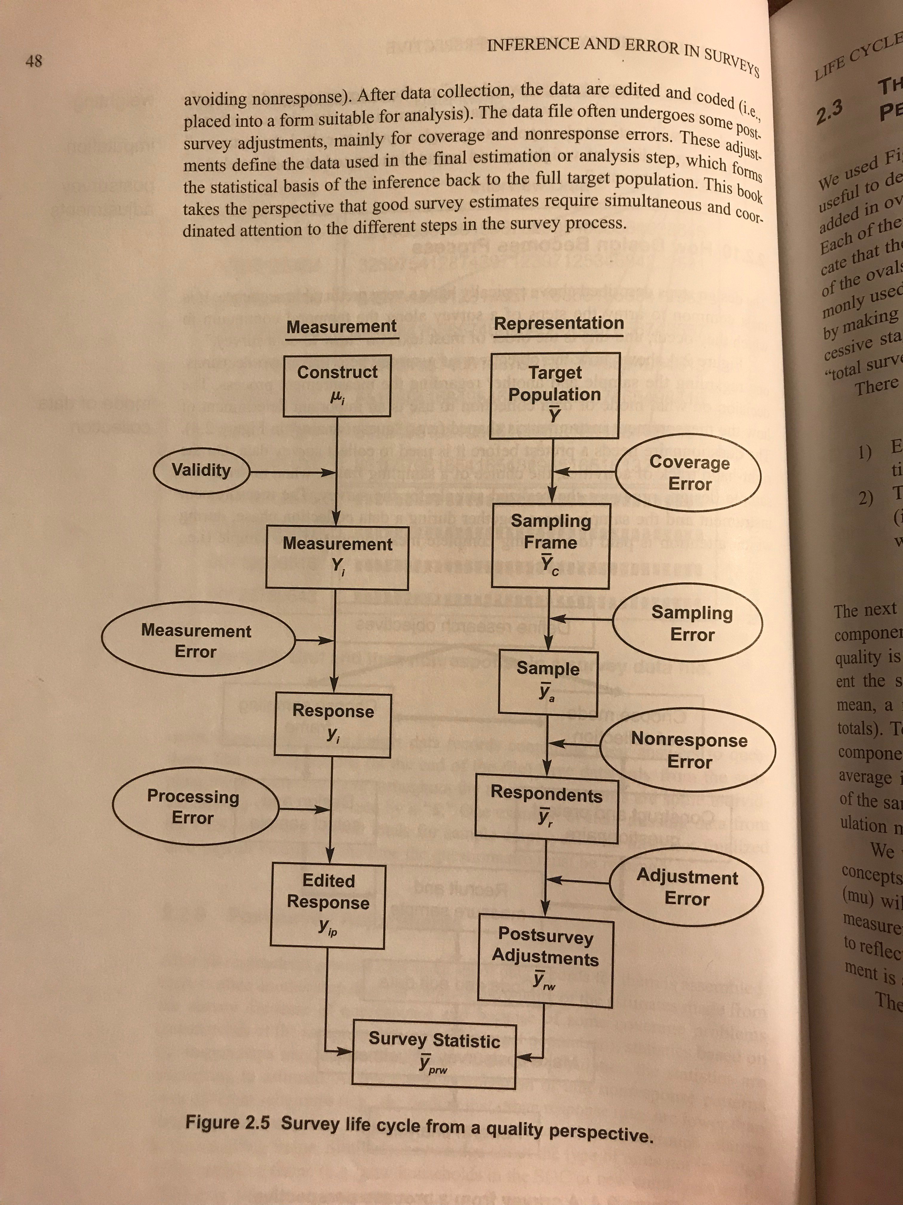
Pew writes that there is “no way for potential bad actors to self-select into probability-based samples.” Of course, a randomly selected person can still give bogus responses (responding with Y* instead of their true Y). But the rate of measurement error in probability samples would match the population: P[Y != Y* | R_probability_sample = 1] = P[Y != Y*]. Whereas the rate of measurement error in opt-in samples is presumably higher due to folks selecting into the survey to earn rewards: P[Y != Y* | R_opt_in = 1] > P[Y != Y*]. In other words, the rate of measurement error is subject to nonresponse error, a mixing of the two sides of the Groves et al. figure below.

Image

In this Survey Statistics series we’ve seen measurement error in an adjustment variable X, e.g. recalled vote: see “is a mismeasured X better than none at all ?”, “more adventures in mismeasured X”, “more on recalled vote”, “it is (still) the people”. We saw that the NYT used to drop adjustment for recalled vote due to its measurement error, which could worsen nonresponse error. Pew is studying the effect of screening out people with a lot of measurement error, which could worsen nonresponse error.

In this series we’ve also seen measurement error in the outcome variable Y, e.g. disease status, see “wanting workflow”. This example modeled the measurement error, rather than screen out mismeasurements.

Also relevant is Andrew’s post “She wants to know what are best practices on flagging bad responses and cleaning survey data and detecting bad responses. Any suggestions from the tidyverse or crunch.io?”.

Updike and statistical writing; more on honesty and precision

So, yeah, I’ve been reading more of these Updike stories. They’re really good, and there’s something extra you get from reading a lot of them at once. The different stories have a sameness of themes, settings, and tone, but that’s part of the interest too, to see the same life investigated from so many very slightly different angles—it gives you the full three-dimensional perspective in a way that you wouldn’t get from any single story or even any few stories. And the development over time—50 years!—adds a fourth dimension of time. The ultimate effect is a sort of gradually moving hologram.

Updike has a sort of precision in his writing; I think he could’ve been a scientist or even a statistician. And, when I was a kid I wanted to be a writer when I grew up. I have indeed become a writer, but not of the sort I’d imagined way back then: “writer” to me meant “writer of fiction” or, more precisely, “writer of stories.”

I’m happy I didn’t try to have a career as a creative writer or even as a journalist—I appreciate the job security I have, also in this job I can write whatever I want to write whenever, anyway—, but, could I have become an Updike-style writer of stories had I tried? I don’t think so. I say this not (just) because I strongly doubt I’d have the ability to write his sort of compelling prose, but also because, to write this sort of story, you need to kinda peel off your skin. You need a ruthless honesty and also a sort of precision: a willingness to describe exactly how you feel, and how you felt, and what you see and hear, and what you saw and heard, along with the ability to put it accurately in words, without all those words getting in the way. Avoiding cliches is part of it but only part of it. Updike is mocked for his careful phrasing, but I see his beautiful style not as a frill (perhaps covering up an emptiness of content) but rather what is for him an absolute necessity to get at the truth, which he can only do through unique language. He is a painter with words, not a collagist.

Anyway, no way I could do this. Again, I’m not talking about the perfect sentences (but, sure, I can’t do that either); rather, I don’t have the ability or the willingness to peel off my skin, maybe not even to myself but certainly not to the world.

But, when it comes to statistics . . . that’s another story! I can be both open and precise, and I think that the 10 books and 1000 articles and 10,000 blog posts are presenting that four-dimensional hologram.

One thing I’ve noticed is that it can be hard for researchers to write directly what they’ve done, or to write directly what they’ve thought. I’m not saying it can never be done, but . . . consider this paper, for example: Criticism as asynchronous collaboration: An example from social science research. This is not a complicated paper, and lots of people could’ve written it, but it’s not the sort of paper that you’ll usually see. As with Updike, part of this is that I’ve trained myself to write fluently in a reader-friendly style, and part of it is that I feel the freedom to write how I want to write–but that’s not the whole thing. I do think this combination of honesty and precision is difficult to carry out, in part because, in their research, a lot of people aren’t ready to peel off their skin in that way. They’re committed to their findings, or to their professional relationships, or to their view of the scientific process . . . with openness comes vulnerability. I wouldn’t write about my personal life in that way, so I can see how others wouldn’t want to write professionally in that way.

And then, again, to write honestly and precisely in a way that’s readable and relevant to your intended audience, that can require lots of effort and lots of practice. It’s not like you can just turn on a switch and do it.

And it doesn’t always work. For every John Updike there are ten boastful blowhards who write about their fantasies and call it reality, and in science and technology, too, it can be all to easy to bloviate, to make strong statements in that authoritative in-your-face style that I associate with a certain style of internet writing, whether it comes from the left, right, or center.

So I’m not saying this will work for everyone. Indeed, as I said, I don’t apply Updikean honesty and precision to the writing about my personal life; it just doesn’t seem appropriate to me, and, indeed, Updike himself had what seems to me a very sad life—or, at the very least, a life that I would not have wanted to have. I understand that my approach of writing in an open, precise way—peeling off the skin in my professional writing—may have cost me some career points, but I don’t care. Or, at least, I’m happy with the tradeoff and I think I’m contributing the most I can to the world, which is something I’ve always felt the duty to do. Updike may well have contributed the most he could to the world with his writing; unfortunately that came not at a professional cost but at a personal cost, one that I would not have wanted to pay.

The other thing I haven’t brought in is collaboration. Most of my work is collaborative—indeed, even the above-linked article, which I wrote all by myself and for which I did all the work—is a sort of asynchronous collaboration with others, as indeed is indicated in its title. Most of the time I prefer to collaborate in the research, the structuring of the problem, and the writing too. It just makes it better work.

But Updike wrote all on his own. He had editors—not just editors, but New Yorker editors, they were the best—but it was his writing. An editor is great but it’s not the same as a collaborator. But Updike did have collaborators in the source material—that is, in his life. So I do see some collaboration there, in that the events he describes are all very social.

Updike’s books aren’t about character, and they’re certainly not about plot. They’re about observation, which is coming from Updike alone, but, even more, they’re about relationships and how they develop in four dimensions. (Remember, time is a dimension.) It sounds kinda funny to say that Updike can characterize relationships in four dimensions even though he can’t portray characters even in three, but I actually think that’s correct. He is somehow more sensitive to the changing connections between people, the pulls and pushes and connections and broken connections, than to the people themselves. You can especially see this in his writing about children (remember, Updike, like Roth, is always a son, never much of a father): they’re running around underfoot, and their relationships with each other and with the adults in Updike’s circle are important, but you never get a clear view of any individual child. Each person in an Updike story, child or adult, is defined by their places in the social network more than by their own characteristics.

When describing relationships, Updike works with a rich palette; when describing individuals, he’s a cartoonist, using physical features such as floppy hair or a stooping posture to stand in for deeper observation. You could argue that he’s just reflecting the perspective of his self-obsessed of his narrators, who only see others in relation to themselves, but I don’t think it’s that. Or I don’t think it’s just that. I think Updike is genuinely more interested in the shimmering patterns of interpersonal connections than in the individuals. He’s not gonna write a story about a man on a desert island. Or, if he does, the man will be spending the entire story reflecting on his childhood.

And this brings us back to statistics. Not the desert island thing, but the idea that connections are paramount. And here I’m not talking about links among researchers, important as these are, but rather the idea that a probability isn’t just a number; it’s part of a network of conditional statements. Arguably, statistics—data science!—is fundamentally about connections. Conditional probabilities, the relation between existing data and new data, the links between science and process models, the data models that connect measurements to underlying constructs of interest, the sampling and selection processes that mediate between sample and population . . . the whole thing.

So maybe Updike can be viewed as a sort of statistician of his own life. And remember the idea that the development of a story is a working-out of possibilities, which we’ve likened to posterior predictive checking. Thomas Basbøll and I have expounded on the virtues of true stories which, by being constrained by reality, allow us to learn. The surprises in a true story—what Basbøll and I call “anomalies”—can force us to re-evaluate our perspective, if we’re open to the possibility. But fictional stories have their own virtues, not just as entertainment (valuable as that is), but also because the open-endedness of fiction allows us to work out possibilities, as long as the fiction writing is done with rigor—or, one might say, honesty and precision—which can reveal the implications of our assumptions, our implicit models of the world.

Metascience corner: What can we learn from 12 million empirical research results?

He approves

This is Witold and today we are building a bear.

In our recent paper with Erik van Zwet and Andrew, A statistical case for qualified scientific optimism, we fit metascientific models that use hundreds of thousands of z-values from empirical research. We will be blogging about this paper in the coming months, but the data that we needed for this paper seemed so interesting, that they spun off into a whole separate resource, Benchmarks of Empirical Accuracy in Research. I think readers interested in metascience will find it useful.

BEAR is an open-source compilation of 26 (and counting!) documented metascience datasets. Sometimes it just re-uses data from publications, like Kevin Lang’s work on false positives in economics—and dozen more. (I can’t stress this enough, huge thanks to the legion of researchers who created/maintain these datasets.) For some others I do much more myself, like processing outcomes from tens of thousands trials from clinicaltrials.gov.

And you can access all of that, 12.5 mln results in total, with a few clicks. Just go to https://witold.xyz/BEAR/. BEAR has bespoke datasets from medicine, neuroscience, psychology, ecology, education, economics, political science and more—all standardised and ready to use. Some sets have only z-values, but some have much richer structure: study types, subcategories, effect sizes, type of measures, meta-analytic groupings, etc. Of course quality varies, but I hope the documentation/standardisation will help people pick the right dataset for their research question.

Why does this exist? As I say on the website:

Quantitative metascience drives important debates about research standards. Most of its crucial contributions have been based on analysing individual datasets, often painstakingly constructed by researchers. Thanks to their work we now have better understanding of replicability, publication bias, p-hacking, reporting practices, pre-registration, significance rates, and more. But many canonical findings of metascience are based on individual datasets, each constructed in a specific way. How generalisable are these findings?

In other words, metascience itself can suffer from one of the crucial metascientific concerns: external validity. As someone who works on evidence synthesis I am very concerned with this. To give one example, Erik blogged about the virality of the scary publication bias histogram in biomedical journals. But different metascientific sets give completely different pictures of selection:

I am NOT particularly interested in selection in this post. We could talk about any other metascientific property, e.g. p-hacking, low power. I am also not trying to explain what drives these differences or say that these sets are comparable. (We get into that a little bit in the paper and if people are interested in that particular question, I can write a follow-up post.) The point is that we can learn much, much more when we go beyond one data point. OK, that’s pretty trivial thing to say, but Erik’s example clearly shows that it’s one that hasn’t fully sunk in. So I just hope that BEAR will make it easy to compare metascientific corpora and give people a better picture of the limits of generalisability of various claims. Or generally make metascientific research easier.

For completeness, the GitHub repo also includes the model that Erik, Andrew and I use in the paper I linked earlier. You can use it yourself to e.g. estimate (idealised) expected replication rates, but the model is optional and separate from BEAR data. Big kudos to Erik who got this process started and hunted down many of these sources for the paper. But most importantly the credit goes to teams of researchers who generated and maintain the linked sets.

I also have no doubt that in putting this together I made many mistakes. Even with automated checks, it’s not easy to work with so many data sources in parallel, so I’d be grateful for any corrections!

Survey Statistics: logit shift and raking

We’ve been discussing how to use population margin information about poststratification variables (see Modeling Complex Contingency Tables and SynthMargins & Bayes-Raking). I want to connect two terms for this we’ve mentioned a lot in this series: the logit shift and raking.

In June 2025 we discussed 2 flavors of calibration, including the logit shift: calibrate p(z | x, survey) to match known aggregates p(z).

In June 2025 we discussed 3 flavors of survey weights, including calibrated weights: find weights w such that weighted survey E(wx | survey) matches known totals E(x). When we have at least 2 variables, say x and z, we can calibrate their cross-classification, or one margin at a time. The latter is called raking.

We can think of raking as finding weights w(x,z) or equivalently finding population probabilities p^(x,z) = w(x,z) p(x,z | survey) that match known totals. In the logit shift we want to find the population conditional probability p^(z | x) that matches a known total. These seem really similar ! Let’s compare.

Here’s my setup:

  • 2 variables: binary z, categorical x
  • Have p(x,z | survey), and p(x), p(z) population margins
  • Want p^(x,z) = argmin_q KL(q, seed) that matches known margins
    For raking: seed = p(x,z | survey)
    For logit shift: seed = p(z | x, survey) p(x)

So here’s some homework: show that Lagrange multipliers gives p^(x,z) = seed(x,z) exp(- 1 – d_x – d_z). And so the solution p^ will have the same odds ratio as the seed (which is the same for raking as the logit shift).

We can substitute these solutions into the constraints, and for either seed we get:

sum_x p(x) logit^-1( logit p(z=1 | x, survey) – d_z ) = p(z=1)

This is one equation with one unknown shift d_z. In other words, logit shift and raking give the same solution. This can be solved with a root-find, as Andrew commented that Lei et al 2017 did in this code.

More generally, if z is multinomial, we can’t get such a closed form equation with one unknown, so we can use Iterative Proportional Fitting (IPF), as we discussed in 2nd helpings of the logit shift.

“Why did ANOVA fall out of fashion?”

A student asks the above question.

My response: Anova is still important; it’s just been subsumed by hierarchical models.

The link is to my 2005 paper, Analysis of variance: Why it is more important than ever, which begins:

Analysis of variance (ANOVA) is an extremely important method in exploratory and confirmatory data analysis. Unfortunately, in complex problems (e.g., split-plot designs), it is not always easy to set up an appropriate ANOVA. We propose a hierarchical analysis that automatically gives the correct ANOVA comparisons even in complex scenarios. The inferences for all means and variances are performed under a model with a separate batch of effects for each row of the ANOVA table.

We connect to classical ANOVA by working with finite-sample variance components: fixed and random effects models are characterized by inferences about existing levels of a factor and new levels, respectively. We also introduce a new graphical display showing inferences about the standard deviations of each batch of effects.

We illustrate with two examples from our applied data analysis, first illustrating the usefulness of our hierarchical computations and displays, and second showing how the ideas of ANOVA are helpful in understanding a previously fit hierarchical model.

This is the paper that discusses the five different definitions of fixed and random effects from the literature; scroll down to page 20.

I guess the problem is that Anova got associated with clever-but-ultimately-bad ideas of null hypotheses and F tests. Hierarchical modeling remains very important; I think it’s an underrated topic in statistics.

This University of Chicago business school professor has authored 258 academic papers in 2026 (so far).

Jeremy Horpedahl tells the story:

Nicholas Polson has, by my count using his SSRN page, already written 258 working papers in 2026 alone. He’s already written (or at least published to SSRN), six papers today, August 26, 2026.

OK, but who am I to talk?—I’ve written over 200 blog posts this year. But wait:

These aren’t just short notes. Most of the papers are of normal academic length: 32 pages, 27 pages, 58 pages. . . . Obviously the research productivity of Polson and his co-author Sokolov is aided by AI. . . . I have seen any academic, at least not in economics, that has really pushed it to the limit.

Horpedahl writes:

Read any single paper, and it feels like just a normal academic paper, the kind of thing that an academic might work on for a few months.

I wanted to see if I shared that judgment so I clicked through to the list of Polson’s papers on SSRN and looked for something interesting . . . ok, here’s something. It’s called Theories of Human Connection, and . . . ulp! It’s 80 pages long. The paper’s subtitle is “An Interdisciplinary Synthesis Across Economics, Psychology, Biology, Philosophy, Game Theory, and Spiritual Tradition.”

But let’s take a look. The abstract on SSRN starts like this:

Human connection is the most studied and least integrated phenomenon in the social sciences. Every discipline that examines intimate relationships captures something real that the others miss, yet no existing framework holds all dimensions in simultaneous view. This book synthesises fourteen thinkers across biology, psychology, economics, game theory, communication theory, existential philosophy, and spiritual tradition into a unified account. Morris established that the need for physical touch is an evolutionary drive as fundamental as hunger, with a biologically ordered sequence of escalating vulnerability whose disruption produces intensity without depth. Bowlby showed how early caregiving creates invisible templates governing adult intimacy, encoded in the nervous system before language exists. Becker revealed that partnerships generate value neither partner could produce alone, but assumed partners are interchangeable — an assumption Frankl demolishes by showing that the meaning generated by shared life cannot be transferred, and that meaning multiplies rather than adds to life satisfaction, explaining widespread disconnection in the wealthiest societies in history. Von Neumann’s game theory explains how mutual self-protective withdrawal, individually rational for each partner, produces the disconnection neither intended. Bateson identifies the communication structure that accelerates this collapse: contradictory demands that make any response wrong. Gottman’s laboratory models predict separation with over ninety percent accuracy from the ratio of positive to negative interactions. The Hindu philosophical tradition adds the final dimension: partnership as a laboratory in which selfishness and fear are progressively revealed and surrendered.

We argue that most relationship failures are not failures in one dimension but misidentifications of which dimension is actually in play, and that effective intervention requires the multi-dimensional map this synthesis provides.

From the preface:

The thinkers assembled here — Becker, Bateson, Von Neumann, Schelling, Keynes, Morris, Vaughan, Frankl, Maslow, Gottman, Yogananda, Vivekananda, Maharaj, Polson, Thomas, and Paltrow — did not, for the most part, know each other’s work. They worked in different centuries, different countries, different intellectual traditions. What unites them is that each identified a dimension of human connection that the others left in shadow.

Gottman, huh? The name rings a bell . . . He’s the guy who conned Malcolm Gladwell and various media outlets—maybe he conned himself too—into believing that he could predict divorces with 94% accuracy.

I searched for Gottman in the document and found a whole chapter on that bullshit! You can click through for yourself, it’s chapter 10. Here’s a key bit:

I wonder what prompts were used by Polson and his coauthor to write this article. I guess the prompts did not include, “Evaluate implausible claims skeptically.”

They bring it all together in Chapter 13, “The Cumulative Model: A Unified Theory of Human Connection”:


But let’s not forget “The Master Equation” on page 75:

Jesus Christ. I’ve heard that Cambridge University has an open position in their school of education . . . this kind of thing would fit in very well there, no?

In all seriousness, no, I don’t think this “feels like just a normal academic paper, the kind of thing that an academic might work on for a few months.” At least, not the sort of thing a non-bullshitting academic might write.

I know Nick Polson—he’s a statistician, and he’s done lots of solid work over the years! What happened here?

Here are a few possibilities:

1. It’s an experiment or a joke. But if it were a joke I’d think there’d be some internal clues, no? It’s hard to imagine playing the whole thing straight. And if it were an experiment, I’d expect they’d all read like straight-up statistics papers, nothing so obviously bogus as “Theories of Human Connection.”

2. Someone else is impersonating Polson. Seems unlikely, but it’s possible. It might not even be personal. Maybe all this is an experiment, not by Nick but by someone else who programmed a chatbot to choose the name of a successful academic and then spew the internet with papers attributed to him. If so, how horrible.

3. “Intellectual squatting.” That’s the conjecture of Michael Makowsky, who writes:

The nice version is it’s putting out a series of half-baked papers in the hopes of establishing a property right to the underlying ideas at an earlier stage of the research process than previously possible. The less generous interpretation is it’s dumping a series of haystacks on the plains and laying claim to the needles probabilistically within each.

I guess . . . but what does Nick ultimately get out of it? Invitations to speak at more conferences?? I don’t get it.

Makowsky writes:

Imagine you are a person who has highly esoteric, potentially important ideas every day. Many of those ideas you suspect, based on some combination of experience and ego, are new in at least one dimension. You would like to get credit for that newness. For being first. What’s the problem?

The problem is that scholarship remains more perspiration than inspiration. Having a new idea is great, but it takes years to work through the nuance in sufficient detail that you can convince your peers of the coherence and originality of the contribution. During the minutes each day you are not working on this singular project you have the inspiration for other ideas, sometimes multiple within a single day. How frustrating is the proposition that someone else gets credit for the originality of contribution just because they had time to reveal it to the world while you were embroiled in your investigation of what is only one of your many score ideas!?

Ah, but meta-level inspiration has struck you! What if you took each one of those ideas, spent an hour curating a series of prompts around it, and then let Chat GPT (or another LLM) fabricate an entire research paper around it? . . .

But . . . that’s what blogging’s all about! Often when I have an idea or a reaction, I blog it. No need to pipe it through a chatbot; I’ll just save the cycles and post it right here.

To return to the 256 working papers, I can think of one more motivation:

4. Education. This seems like the most plausible explanation to me. Polson has had an active research and teaching career, and he’d like to share his insights with a broader audience than the readers of his published papers and the students at the University of Chicago business school. And one way to reach people is . . . econ preprints! So Nick picks 258 interesting topics, writes some prompts for each, and produces the articles. I guess he’s programmed a bot to do this. He just feeds it the prompts and the bot writes the paper and posts it directly to SSRN.

That could explain the mystery of how that ridiculous 80-page article with “The Cumulative Model: A Unified Theory of Human Connection” (shades of Stephen Wolfram!) ended up there. Not only can’t you expect an author to write 258 articles of that length in less than a year, you can’t expect him to read all of them too. The content of that bizarre article could be as much a surprise to Polson as it was to me.

This then raises a question: setting aside the motivations of Polson (or his impersonator), do these 258 papers have any value?

It’s hard for me to answer this question, given that I’ve only looked at one of them. My guess is that the net value of the papers is negative, in that the amount of time that people (including me) have wasted going through them outweighs any positive contributions that might have been there.

My suggestion

Here’s what Nick could do on this, which could have value: Take these 258 prompts and write an article (himself, not using the chatbot) explaining why he thinks these ideas are important. Aki and I wrote a paper a few years ago, What are the most important statistical ideas of the past 50 years?. Nick could write something similar: What are the 258 most important things in statistics to learn today? Or something like that. I’m not saying it would be easy—it would take more effort than programming a chatbot to spam SSRN—but valuable products often take work to produce. Nick has tenure and could set aside the time to do it.

Also I’d recommend withdrawing all those papers from SSRN. Withdrawing 258 papers seems like a lot of work, but I’m sure he could easily program a bot to do the job.

P.S. There’s a further twist: there are two accounts for Nicholas or Nick Polson at the University of Chicago business school; see this comment thread. This would seem to be consistent with the “social experiment” hypothesis (if Nick decided to set up a separate account to play around with) or the “impersonation” hypothesis (if the bot that wrote and posted these papers was not created by Nick at all). The whole thing remains a mystery to me.

P.P.S. OK, I did a bit more nosing around.

SSRN allows you to list the papers in time order. If you go to Nick’s SSRN page linked from his website, you’ll see 16 papers, with the first (“The Impact of Jumps in Volatility and Returns”) being posted on 1 Jan 2001, then others through the next two decades, with the most recent being “Deep Learning in Characteristics-Sorted Factor Models,” posted on 23 Sep 2018 and last revised 26 Jun 2023.

If you go to the SSRN page with all the fake papers, it starts with “Kramnik vs Nakamura or Bayes vs p-value,” posted 7 Dec 2023. It’s a badly written paper—I’m guessing not AI, just text by a non-English-speaking author that was not ever checked by native speakers before posting. This rings a bell . . . I actually have a blog post on this paper, scheduled to appear next year. Next on the list is a 25-page paper, “AI and Vivekananda,” posted 5 Mar 2024, then a gap of two years until another AI-related paper appeared on 9 Mar 2026, then on 11 Mar 2026 came the aforementioned “Theories of Human Connection.”

So, yes, Polson has two SSRN pages, but they have no overlap in time. He also has papers on Arxiv, including the intriguingly-titled “Bayes with No Shame: Admissibility Geometries of Predictive Inference,” dated 24 Aug 2026 . . . Hey, that’s just 3 days ago! Oddly enough, I can’t find this one on SSRN.

But what about the article itself? I don’t have the patience to read it, but I did catch that it mentions the martingale property, which is one of my current interests—that’s cool. But, just flipping through, it looks much more substantive—much more like a real scientific paper—than that horrible “Theories of Human Connection” thing. This could be a tribute to the power of modern chatbots to create something so convincing.

P.P.P.S. Update here: The incredible shrinking SSRN page.

P.P.P.P.S. Vadim Sokolov, coauthor of several of the chatbot-assisted papers, comments here. Assuming this comment itself is legitimate, those 258 papers were not an experiment or a hoax, nor was there any impersonator, nor was it intellectual squatting. Rather, Polson and his coauthors just had 258 different things to say, and they felt the best way to do so was using a chatbot to write tens of thousands of words on these topics.

Also, according to Sokolov, they did not program a bot to do this. He reports that at least one of the papers went through multiple rounds of review, so even if a chatbot was involved in that one, the human contribution was much more than inserting a prompt. He says that some of the papers “are much newer and were developed with much more extensive AI assistance. Modern AI made it possible to develop and complete this material at a speed that would previously have been impossible.”

The fallacy in this statement by Sokolov is the idea that using a chatbot to turn a few hundred words of prompts into ten thousand words of text is a way to “complete this material.” Nothing’s being “completed” here in any intellectual sense; the process just adds pages and pages of froth. I think that Josh’s analogy of this to the Sorcerer’s Apprentice is apt.

P.P.P.P.P.S. Polson appears to think he’s proved the Riemann hypothesis (see comments here and here). I would think this would cause some concern among his collaborators.

Survey Statistics: more on SynthMargins and Bayes-Raking

Last week we discussed SynthMargins, a method from the poster Modeling Complex Contingency Tables that uses partial information (margins) about poststratification variables. On theme for this series (“it is the people”), the authors commented thanking Andrew for introducing them, folks from different fields with a shared goal: Max Goplerud, Shiro Kuriwaki, Jens Wiederspohn, Adam Conner-Sax, and Philip Greengard.

Bob Carpenter shared a Stan example to get a flat prior over tables that match specified margins. I think this prior would imply a prior on what the authors call alpha0, the covariance coefficients for the target geography. The method as described in the Modeling Complex Contingency Tables poster seems to focus on point estimates:

In other news, Shiro responded on Twitter to one of my questions about their Application 1 (ACS): “the density plot shown there is an empirical density of 1700+ TREs, where each error is for a non-Southern county.”

I have 2 remaining questions:

  1. What are the covariates w in this ACS example ?
  2. Suppose you also have survey data in Palo Alto. Would this be added to the training tables ?

Their Application 2 asks if lower postratification table reconstruction error improves the downstream MRP:

In the comments last week, Shiro cited related work by Si and Zhou (2021) who propose a method called Bayes-Raking to incorporate known margins into modeling. They found Bayes-Raking was similar to raking in the overall mean but outperformed raking for subgroups:

It would be interesting to directly compare Bayes-Raking to the poster’s SynthMargins !

Update on a regression discontinuity dispute: some asynchronous collaboration

Anjali Thomas writes:

I am writing to share a paper which is a re-examination of my 2018 AJPS article entitled “Targeting Ordinary Voters or Political Elites”  which was previously discussed on this blog here.

The paper, written in the spirit of Gelman (2022), conducts a thorough re-analysis of my earlier work in light of recent developments in regression discontinuity designs (RDD). It also directly addresses specific critiques of the article raised both in subsequent academic literature and in previous comments on this blog.

A full response to each critique raised on this blog appears in Section A.3 on page 48 of the paper. Among other things, the blog critiqued the use of the global fourth order polynomial, and commenters highlighted that it appeared to be picking up noise in the data rather than a true relationship. While the original article did present results in the SI showing robustness to a local-linear specification with alternative bandwidths, the currentpaper significantly extends these checks and presents new results showing:
  • Polynomial & Bandwidth Robustness: Shows stability across lower-order polynomials, alternative bandwidths, kernel choices, and a donut-hole approach.

  • Noise Reduction via Aggregation: Aggregates data to the level of the running variable to reduce noise, presenting new scatter plots where the visual discontinuity persists at this level of aggregation.

  • Spatial Structure: Demonstrates that reported balance/placebo issues in recent re-analyses stem from ignoring within-constituency clustering and predictive controls.

A link to the paper is here (https://papers.ssrn.com/sol3/papers.cfm?abstract_id=7272598) and the abstract is below:

This note reexamines Thomas (2018), which advances and tests the ‘elite cooperation logic’ whereby national politicians target resources along partisan lines to win over the cooperation of co-partisan state legislators in implementing development projects. Consistent with this logic, a close election regression discontinuity design (RDD) uses project-level data to show that national legislators in North India allocate systematically higher public works expenditures to constituencies of co-partisan state legislators in the period after a state election. Responding to critiques in subsequent literature of the RDD approach used, this note shows that both the evidence of covariate imbalance reported in Bicalho et al. (2026) and the high proportion of significant placebo estimates reported in Albada (2025) are artefacts of ignoring within-constituency clustering and omitting predictive controls. Meanwhile, this note presents re-analyses confirming that the core findings in Thomas (2018) are robust to covariate inclusion using either constituency-level clustering or constituency-level aggregation. Acknowledging the problems related to global fourth order polynomials (Gelman and Imbens, 2019; Albada, 2025), the results in Thomas (2018) are also shown to be robust to lower-order polynomials, alternative bandwidths, alternative kernel choices, the donut hole approach, and an inference procedure that adjusts for worst-case bias (Stommes et al., 2023). The note re-establishes the credibility of the substantive findings in Thomas (2018) and highlights the importance of accounting for spatial clustering in both estimation and diagnostic checks in RDDs.

Anjali took my Bayesian statistics class back in 2006! It’s great to see what former students are doing, and I love seeing this sort of asynchronous collaboration.

Regarding the regression discontinuity issues, I do not think it makes sense to fit unrelated curves on the two sides of the cutoff. So I prefer the versions that fit a single curve plus discontinuity, not two curves.

The other thing I always recommend (see this recent paper with Imbens is that regressions include not just the forcing variable but also other pre-treatment predictors. This should help with both bias and efficiency.

All the discussion of bandwidth, functional forms, etc., can be wasted if the fitted model makes no sense or if it’s a distraction from including additional pre-treatment predictors.

In any case, it’s great to see this sort of open exploration.

Survey Statistics: Modeling Complex Contingency Tables

Andrew looped me into an email thread with folks working on poststratification with partial population information. (He knew I’d be interested, see “poststratification without population level information”.)

They pointed to work by Max Goplerud, Shiro Kuriwaki, Jens Wiederspohn, Adam Conner-Sax, and Philip Greengard, which was recently presented as poster at polmeth: Modeling Complex Contingency Tables.

I wish I got to attend, this is cool ! I’ve got questions about Application 1 (ACS):

  1. What are the covariates w?
  2. Suppose you also have survey data in Palo Alto. Would this be added to the training tables ?
  3. How is the table reconstruction error random ? (I see a density plot.)

The poster gives an answer to Andrew’s question in “Mister P when you don’t have the full poststratification table, you only have margins” and “The continuing challenge of poststratification when we don’t have full joint data on the population”:

I’d recommend first imputing a full poststrat table … But then the question is how to do this.

In Application 2, they ask if a better poststratification table reduces error in estimating the outcome using Multilevel Regression and Poststratification (MRP). Presumably this depends on the distribution of the outcome given the poststratification variables. In “toy example for energy balancing weights” I wrote that raking does well “when Y | X1, X2 is additive”.

I’m excited to read the paper and learn more !

The improvement in political analysis in the past 25 years, as demonstrated by excellent demonstrations of statistical workflow from Elliott Morris, Nate Silver, and Eli Mckown-Dawson

As with baseball, football, and basketball (and I’m sure other sports too), the standard of political analytics is just so much higher than it was, decades ago.

I was talking with Gustavo just the other day about Red State Blue State, and how that work was motivated by confusion following the 2000 election emanating from pundits of the left, right, and center. Back then I felt the compulsion to write a whole damn book to explain what was really going on. I even came up with an entirely new (to the best of my knowledge) concept, “second-order availability bias,” to explain how the journalists could’ve gotten things so wrong.

The concept of “second-order availability bias” never caught on, to say the least: it appears only once in the easily-accessed published literature:

So maybe it’s not such a useful psychological concept. What’s relevant here, though, is that the pundits were getting it so wrong, and with such a consensus, that I felt the need to refute them.

Nowadays, things are different. There aren’t so many all-purpose pundits like David Brooks—people who know essentially nothing and have no real interest in learning but present themselves as infallible experts—, and those who remain don’t have such a platform. Also, with partisan polarization, commentary has become fragmented, and we rarely see much of a consensus among pundits across the political polarization. It’s just not on the table.

Meanwhile, political analytics has become more and more impressive, with important contributions being made by academics, journalists, and political professionals. There’s still disagreement (as here) and some difficulties of communication (as here), but in the past two decades the level has gone up so much: the best analytics has become much more impressive, and what might be called replacement-level analytics has become much better too. I don’t think my own sophistication has increased much at all, and that’s one reason why I’m now less likely to crunch the numbers myself (as I did in the early morning hours of 5 Nov 2008) and more likely to just link to the analyses of others (as with Yair’s report on 2024).

Just today I came across two excellent examples online from journalist colleagues of mine.

Elliott Morris, “I re-analyzed the raw data from Wisconsin’s primary polls. Here’s what actually went wrong,” which features this split-the-difference summary that warms my Bayesian heart:
• Most of the miss in polls in Wisconsin is attributable to faulty demographic targets (too many young people). This inflated Hong’s vote margin by somewhere between 5 and 10 points.
• My best guess is that the race moved 6-10 points toward Crowley after pollsters released their final surveys.
• Non-ignorable non-response within demographic categories likely further inflated Hong’s vote margin by 2-5 points.
Morris goes through lots of details too. I haven’t tried to check any of this, but it seems reasonable. We’ve been saying for a long time that primary elections are hard to predict, but some polls are off by much worse than others, and it’s instructive to look into exactly how this can happen.

Beyond the details and the direct interest of this post to political organizations and pollsters, I appreciate Elliott’s work here because he goes beyond statistical generalities (“regression to the mean,” “sometimes you get a draw from the tail of the distribution,” etc.). This is an important statistical point: the “error term” is only an error term until you drill down, look at more data, and figure out what is going on. It’s so common for researchers to just take their numbers and not think about where they came from (as here)—and, indeed, academics and pundits alike can be rewarded for that sort of asinine don’t-look-carefully-at-the-data attitude. So it’s good to see Elliott demonstrating how it’s possible to do better—if you’re willing to put in the work.

Nate Silver and Eli Mckown-Dawson, “FLIPR 2026 midterm election forecast,” which leads Nate to summarize that “[Michigan Senate candidate] El-Sayed would be an underdog in an election held today and is an underdog in our “Lite” (polls-only) version. The fancy versions look at the fundamentals and are more convinced he’ll come back.”

What I really like about this is how “workflow” it feels. What I’m talking about here is how they fit two different models that are doing two different things, they learn something from the comparison, and then they track this back to their data. This sort of thing isn’t in the textbooks (well, it wasn’t until now) but it’s so important to good applied statistical work. So I love to see it here.

The point about these two posts, one by Morris and one by Silver and Mckown-Dawson, is not that they’re so amazing. I mean, yeah, they’re great, but the real point is how professional they are.

I remember Bill James once wrote, in reaction to the unexpected playoff heroics of Bucky Dent or Ray Knight or somebody like that, that, sure, it’s cool when someone steps up and does the unexpected, but what’s more impressive are those Eddie Murray types who can consistently deliver the expected. Because then you can design a game plan around them and not just have to hope for a miracle.

Morris, Silver, Mckown-Dawson, and others doing what’s now expected, doing it well, and demonstrating modern principles of statistical workflow . . . That’s impressive.

Frequentism for Bayesians: He wants to teach frequentist methods to engineering students with a strong Bayesian background

Beyond the teaching question, this is an interesting topic on its own: thinking about classical statistical ideas of point estimation, hypothesis testing, and uncertainty quantification, but taking Bayesian methods as a starting point.

The idea is that, instead of structuring this based on the methods of maximum likelihood estimation, null hypothesis significance testing, and confidence intervals, you start with the goals of estimating parameters, making predictions, comparing and evaluating models (i.e., alternative explanations of the world), and summarizing and working with uncertainty.

If you’re interested in using Bayesian methods, we have two books (Bayesian Data Analysis and Bayesian Workflow) on the topic. But with these methods under our belt, we can now go back to the motivating questions–the more general statistical goals, which exist without reference to any particular models or any particular Bayesian or frequentist methods–and consider them from scratch.

This seems important.

My discussion here is motivated by this question sent in by Opher Donchin:

Here’s one for your blog (although I’m happy to have your take as well).

I’m transitioning our undergrad biomedical engineering course this year from a standard frequentist syllabus to a Bayesian approach. We are mostly following the first 6 chapter of Bayesian Analysis with Python by Osvaldo Martin. In order to get the department to agree to this, I had to promise to teach basic frequentist methods.

Thus, I need to teach frequentist methods to students with a strong Bayesian background. There doesn’t seem to be much available on this. There is of course material comparing the two approaches, but I mean specific material designed to explain the frequentist approach to someone who knows the Bayesian approach.

I’d love to know if anyone knows of resources or has experience of insight or advice.

I replied that I’ll see what the blog commenters suggest, but in the meantime, I recommend chapter 4 of Bayesian Data Analysis as a start.

Donchin responded:

Yes. Chapter 4 is very good on the principles involved. Much of it addresses the Bayesian alternatives to frequentist procedures or the Bayesian perspective on them.

I’m wondering about something more concrete, aimed at a less sophisticated audience. That is, my students will know how to build models, how to interpret the posterior samples, the basics of Bayesian workflow and also model comparison. On the other hand, they will have no knowledge of confidence intervals, maximum likelihood estimates, hypothesis testing, or multiple comparison procedures. Reasonably, my department demands that they be able to read the biomedical literature where such terms are widespread.

I want to give them an understanding of frequentist procedures without getting bogged down in frequentist justifications.

To take an example, I want to explain what an F test calculates when understood within a Bayesian framework. To that end, I can show students a Bayesian model of a normal distribution of group means and a normal likelihood within each group. Then, I can work through what a Bayesian would need to calculate on that model to produce an F statistic and an F test. It has something to do with summaries of posterior distributions of ratios of variances.

What I’m hoping for is somewhere where such questions are worked through in detail so that it could be used for developing lectures.

Of course, chapter 4 of BDA is 10 years old at this point. I imagine some of the ideas may have developed since then.

Ahhh, good point! Chapter 4 of BDA is for statisticians who already know the classical methods and want to understand how these can be understood in light of Bayesian principles and adapted within a Bayesian workflow. But it’s really a completely different task to explain classical methods to students who haven’t already learned them. The idea would be to retcon ideas of classical statistics from a Bayesian angle.

This would be worth doing.

In the meantime, I recommend . . . chapter 4 of Regression and Other Stories, where we go through basic principles of point estimation, hypothesis testing, and uncertainty quantification from an applied perspectives. Also, if you flip through that book, you’ll see other places where we discuss classical procedures from first principles. We don’t have any F tests or multiple comparisons adjustments because I can’t bring myself to care about those things, but a lot else is there, so you might be able to put together much of what you need from that book.

In response to that recommendation, Donchin wrote:

I agree that Chapter 4 of Regression and Other Stories touches on many of the important points, but it is not sufficient for my needs.
I am trying to teach a Bayesian-first undergraduate statistics course to biomedical engineers that also gives a background in frequentist approaches allowing  them to function effectively in environments that require them to use or understand frequentist stats.
This means that the frequentist-realted topics we cover include:
  • Estimation: MLE, standard errors, confidence intervals
  • Hypothesis testing: p-values, Type I/II errors, power
  • Proportion tests and t-tests (independent and paired)
  • Effect sizes; multiple comparisons (briefly)
  • Linear and multiple regression: least squares, coefficient tests, R2, F-tests
  • ANOVA: categorical predictors, interactions, sums of squares, effect sizes
  • Pearson correlation and inference
  • Repeated-measures and mixed-effects models
  • Model comparison: AIC and cross-validation
  • Replication crisis / open science / pre-registration (not exactly frequentist, but still)
You can see the syllabus and the lectures in the student-facing version of the course repo at:https://github.com/opherdonchin/StatisticsCourse_36714361
Any further thoughts you might have would be great to hear.
Also, I would be happy to get this some visibility, in hopes that other people would be interested in providing feedback, using some of the material, or just doing it better.

I don’t think I could bring myself to teach a lot of the above topics, except in an “inoculation” sort of way, but I recognize that many students will need it, so if anyone has some good suggestions for Donchin, just leave them here in the comments!

Answering some questions about statistics from a high school student

This came in the mail:

My name is ** and I am a junior at ** High School. I am writing to you as a part of a summer assignment for my upcoming research class where I had to choose an expert in the math field to contact. I chose you considering your work and investment in the statistics field and how you have used statistics in the political landscape. I found it very interesting and I was wondering a few things,
• What got you into math and statistics?
• What advice would you give to students interested in statistics?
• What is the biggest challenge when working with statistics?
• What is a common mistake people make when looking at statistics?
• Where would be good resources to learn more?
I appreciate your time and I hope to hear from you soon.

Here were my responses:

• What got you into math and statistics?
See here: https://statmodeling.stat.columbia.edu/2010/11/02/fragment_of_sta/

• What advice would you give to students interested in statistics?
In addition to statistics, you should have some applied field you are interested in. This could be biology, economics, sociology, medicine, business, communications, history, . . . just about anything. Then when you learn statistical ideas, consider how they apply to this field, and work on a project applying statistics in that way.

• What is the biggest challenge when working with statistics?
Measurement; see here: https://statmodeling.stat.columbia.edu/2015/04/28/whats-important-thing-statistics-thats-not-textbooks/

• What is a common mistake people make when looking at statistics?
Looking at the numbers and not checking where they came from. For example, see here: https://statmodeling.stat.columbia.edu/2017/01/02/bogus-north-korea/

• Where would be good resources to learn more?
I recommend our blog: https://statmodeling.stat.columbia.edu/ and our book, Active Statistics, which is full of stories: https://sites.stat.columbia.edu/gelman/active-statistics/
Also I like Frederick Mosteller’s classic book from 1965, Fifty Challenging Problems in Probability. I was a teaching assistant for Mosteller for the last course he ever taught!

Since I was answering the questions anyway, I thought I’d post it all here as others might be interested too. I think that all of this is reasonable advice.

Survey Statistics: wanting workflow

Last week Andrew commented that we need a more transparent workflow for survey statistics. So I looked in the new Bayesian Workflow book:

Chapter 19 “Building up to a hierarchical model: Coronavirus testing” is a case study about a 2020 survey that tested n = 3330 residents of Santa Clara County, California for SARS-CoV-2 antibodies (Bendavid et al. 2020a, 2020b). y = 50 people tested positive.

To estimate population prevalence, they want to account for measurement error in the test (“Measurement“) and differences between sample and population (“Representation“), both sides of Groves et al. Figure 2.5:

Image

The measurement error model includes specificity gamma = P[test negative | no disease] and sensitivity delta = P[test positive | disease], which take population prevalence pi to test positivity rate p:

Bendavid et al. (2020a) analyzed their data using gamma = 0.995 and delta = 0.80. But these aren’t known exactly, so Gelman and Carpenter 2020 recommended using priors from previous studies to reflect uncertainty:

They extend these priors to account for multiple studies. They look at sensitivity to these priors (overloaded term here: “sensitivity”). Cool stuff !

In this Survey Statistics series we hadn’t yet talked about models for measurement error in the outcome variable y. We’ve seen measurement error in an adjustment variable X, e.g. recalled vote (“is a mismeasured X better than none at all ?”, “more adventures in mismeasured X”, “more on recalled vote”, “it is (still) the people”).

On the “Representation” side, Bendavid et al. (2020a, 2020b) adjusted for differences between sample and population using weights and encountered the difficulty we saw last week: adjusting for lots of variables can lead to very large weights. Maybe modeling can help (see last week’s “structured MRP to smooth survey weights”).

So Gelman and Carpenter 2020 proposed replacing (19.2) above with

y_i ~ bernoulli(p_i)
p_i = (1-gamma) (1 - pi_i) + delta pi_i

and using Multilevel Regression and Poststratification (MRP):

I thought this story sounded familiar and remembered Andrew talked about it at his Birthday workshop‘s closing talk (this part on YouTube, minute 2 to minute 8).

Andrew said that when his friend tried the method from Gelman and Carpenter 2020 it “crashed and burned” ! There is a new paper about this: Kuh, Kennedy, Chen, and Gelman 2026. They present “a statistical workflow for diagnosing unexpected results in complex models”. These authors have researched a lot about evaluating MRP models (see “should MRP workflow include LOCO-CV ?”). We will have to revisit their new paper later in this series.

I recommend this book on Applied Regression and Causal Inference

This post offers two recommendations and a story.

First, the recommendations.

• Here’s the book referred to in the title of the post. I highly recommend it! My only regret is that we didn’t call it Applied Regression and Causal Inference, cos that’s what it’s about.

• I also recommend our book, Active Statistics, which has literally hundreds of stories, class-participation activities, computer demonstrations, and discussion problems. A great teaching resource and also just a good read. Really!

Now, the story.

This came in the email one day:

Dear Professor Andrew Gelman,

I hope this message finds you well. I’m part of the Cambridge University Press sales support team and I work with your local Cambridge Sales Representative ** **@cambridge.org

We wanted to follow up regarding your course(s) for Fall 2025 and ensure you’ve had a chance to review Regression and Other Stories, 1 ed by Andrew Gelman/Jennifer Hill/Aki Vehtari as a potential option for your course materials.

If you’ve decided to adopt this title, I’d be happy to provide access to any available instructor resources. If you’ve chosen a different title or are still considering your options, I’d appreciate a quick update so I can ensure our records are accurate.

Also, please don’t forget to check with your bookstore about any Equitable or Inclusive Access programs that may be available. These programs can provide your students with more affordable digital access to their course materials.

I am sincerely grateful for your attention to this matter; I look forward to the opportunity to hear from you at your earliest convenience.

Cordially,

**
Sales Support Assistant
Higher Education Sales, Americas
**

On one hand, hey, I’m thrilled that they’re promoting our book. On the other hand, it seems like they’re kinda flying blind if they’re sending this promotional message to the author of the book.