Tom Ferguson came across this news article, Who Really Has the 2026 Midterms Cash Edge?, and was disappointed to see this completely wrong graph:
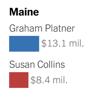
The problem here is not the inclusion of no-longer-candidate Platner, as that’s noted in a footnote. Rather, as Ferguson says,
The Times shows Platner outraising Collins; whereas she is millions and millions of dollars ahead, as our charts show.
Here’s the chart that Ferguson shared with us the other day:

If Collins raised $39 million, why did the Times say that Collins only raised $8 million? (They also understated Platner’s total, but by a lot less, counting $13 million instead of $16 million.)
I asked Ferguson how this happened–how did the Times screw up so badly? He replied:
Probably they just used the campaign fund of the candidates. The Super Pacs report elsewhere. You have to look them up. This is normal; we’re clear about that when we did Platner. Republican candidates like Collins are really operating with a pack of funds. That’s the famous coordination discussion, BTW. Now rendered even legally moot by the Supreme Court decision.
Collins has many different vehicles supporting her. Easy to find and not new.
The Times reporters are just lazy; they know about the Super Pacs, but can’t bring themselves to do work. That’s the kind interpretation.
Dayum.
Ultimately, the problem here is no so much with the New York Times–large as they are, they’re just one news organization, and they’re trying to do their best–but with the hollowing-out of the news media more generally.
To put it another way, the problem is not New York Times is not the problem. The problem is that the New York Times is one of the few large independent news organizations out there. If there were lots of other orgs reporting these things, we wouldn’t have to rely on the Times not screwing up.
Ferguson continues:
Contrast the endless articles about Democrats talking in Maine deliberations. The billionaire-tasked Times guy should do some work on Collins.
Cf. our discussion of sources in the first post:
We have used data from the Federal Election Commission to construct similar figures for the much-discussed Maine Senate race. Incumbent Senator Susan Collins is running on the Republican ticket, while Graham Platner is her Democratic challenger. Our totals reckon in contributions from Super Pacs and other outside organizations spending on behalf of either candidates or against one (which we count as spending for the candidate’s opponent).
The note’s a killer, so I’ll copy it here:
Federal Election Commission bulk data downloads are not updated at lightning speed. There is a time lag before individual electronic filings are incorporated into those files. In this case, the bulk data downloads are missing the 12-day Pre Primary Report (12P) (filed before the June 9 primary) and contain contributions to the principal campaign committee up to and including May 20, 2026. The bulk downloads are also missing the independent expenditures spent through election day. We obtained the electronic filings of the candidates’ principal campaign committee and the independent expenditures to fill the gap in the bulk data downloads. We downloaded these electronic filings June 12-14. Collins uses multiple committees to raise and spend money, and these committees have different filing deadlines. The Pine Tree Results PAC filed a 12P and reports contributions up to and including May 20. The Lead Maine Committee has contributions until April 28. The Stronger Maine Super PAC has contributions until March 31, The Collins Victory Committee is March 31, and the Susan Collins for Maine JFC is March 31. Collins also raises money for her principal campaign and leadership committees via joint fundraising committees (JFCs). These are shared accounts that allow several candidates or party committees to raise money together. A single donor writes a “parent” check to the JFC, which then is divided among the participating committees. When Collins is the clear beneficiary of such arrangements, such as with the Collins Victory Committee, we count the full parent check as part of her donor distribution. When Collins is merely one of several candidates involved in the JFC, such as with One Team Senate Majority, we count only the subdivided portion given directly to Collins as part of her donor distribution and not the full parent check. Counting the parent check for committees she controls but only the subdivided check for committees she merely joins lets us credit each donor’s true contribution to Collins exactly once without double-counting the same dollars or absorbing money raised on behalf of other candidates.
So, yeah, they had to do some work.
The above-linked New York Times article sucks for two reasons:
1. It got things way wrong, completely missing the story of the Republican candidate’s massive fundraising edge.
2. It was written in an overconfident style with no indication to the reader that the news story was actually missing more than half of the campaign cash out there.
I’ll forward this to my colleagues at the Times. Maybe they’ll run a correction?
Uh, if you read the article, it’s entirely about how the top of the line fundraising is deceptive and there’s all this Super PAC money floating around.
“But candidate fund-raising is only part of the story — and the real race for cash is a lot tighter than it might seem. To explain more, I asked my colleague Teddy Schleifer, who was up well past midnight on Wednesday combing through fund-raising filings, to pull a few numbers.
Republicans, he told me, have two major advantages, both of which have to do with their spending from outside groups. “One is that their super PACs are better funded than those of the Democrats,” he said. “The second is that their national party committees are, as well, and the recent Supreme Court decision is going to make it a lot easier for candidates to tap into that cash.”
And then it goes on to investigate that money. Did you read the article?
Total:
Yes, I read the article. Did you see the graph? It seems to be presenting false information.
Wow, bud. It was presenting one data point to immediately undercut it with the whole article. They were literally making the point you were. Mwhy are you being dishonest about that?
The article goes on to list a couple of numbers for the how much total money the party committees have, how much money the party super PACs have, and how much money MAGA has. That’s not an “investigation”. They did not take the basic step of figuring out how much money goes to which candidate and putting that in the graph.
Andrew’s article is correct. I’m not holding my breath for the NYT to run a correction.
Anon:
I sent an email to 4 people I know at the NYT asking them to clarify. No response yet, but if I do hear something, I’ll post on it.
The Times reporters LITERALLY then pointed out Andrew’s argument. They were doing it deliberately to make a point and Andrew is DISHONESTLY acting like they believed it. This is embarrassing.
Embarrassing for who? I only see one person being hysterical and embarrassing in this thread and that’s you.
By the way, the NYT knows that very few people read the actual articles. People mostly skim the headlines. NYT deliberately writes clickbait headlines and then contradicts those headlines in the article quite often. They know what they’re doing. It’s called “lying”. This article specifically is just stupid.
“By the way, the NYT knows that very few people read the actual articles. People mostly skim the headlines. NYT deliberately writes clickbait headlines and then contradicts those headlines in the article quite often. They know what they’re doing. It’s called “lying”. This article specifically is just stupid”
I was going to say that Andrew was being embarrassing but you’ve now elevated past him
The visuals matter, on their own, you can never assume people read. That is data visualization 101. It’s why you need good captions, labels, sub titles etc. But most of all you must always as yourself what a reader will take away if they only look at the graph, headline or image. The NYT headlines are often even worse on this count than the graphs.
Andrew, I think Total is largely right.
The main point of the article is that the numbers in the graphic are misleading because the graphic does not include money from the “super PACs”, which have enormous amounts of money: hundreds of millions of dollars on both sides, but much more on the Republican side than the Democratic side.
But:
Total, I think Andrew is largely right. The graphic purports to show “Fundraising in key Senate races so far in 2026.” I don’t see a description of what that is supposed to mean, exactly: Is this intended to include _only_ funds that were contributed in calendar year 2026, or is intended to include funds that were contributed in earlier years for use in the 2026 races. The former interpretation seems odd and I don’t think most readers would assume that is what is being shown, so I think we are talking about how much each candidate has raised for their race. And according to https://mainemorningstar.com/2026/07/16/latest-filings-show-susan-collins-widened-cash-advantage-against-democrats/ Collins had raised much more than is shown on the graph. I haven’t checked other candidates.
So: the graphic does seem to be wrong — by quite a bit, in the case of Maine which is the only one I’ve checked. That is not good. Total might argue that since the numbers would be misleading even if they were right and that’s the point of the article, who cares that the numbers are wrong? Well, I do. Don’t present bogus numbers as if they’re real, can’t we all agree that that’s a good rule to follow?
But I agree somewhat with Total. The main point of the article is that those numbers (even if they were correct) paint a very misleading picture.
My main complaint with the article is that it’s very badly written. For one thing, Gelman and Ferguson both apparently missed the point of it! And they’re far more sophisticated than most readers.
Total is also foolishly wrong when (s)he repeats that Andrew was “dishonest.” And we could put anonymous in the same category when (s)he says the NYT is “lying.”
Joshua:
Yes, indeed.
“Total is also foolishly wrong when (s)he repeats that Andrew was “dishonest.”
Given that he’s doubling down on his mistake (and oh so like the scholars he criticizes here), I’ll stay with dishonest, thanks.
“graphic does seem to be wrong”
The *entire* point of the article is how the graphic is incorrect and that people relying on the top of the line money reports will be misled. Andrew is criticizing them for not doing what they are, in fact, doing.
Total:
The title of the article is wrong. The title of the graph is wrong. The graph is wrong. That’s kinda bad. I agree there are some good things in the article. I’d hope the Times could do better than to run an article with some good things, two incorrect titles, and an incorrect graph.
Ultimately I guess it depends where we draw the line. From my perspective, two incorrect titles and an incorrect graph are enough to characterize the article as having “completely misreported” the campaign contributions. You think my perspective is “dishonest.” I think we have a difference of opinion, or different standards when it comes to news reporting.
That said, I appreciate your commenting on the blog. It’s good to be aware of other perspectives.
Maybe in addition to the misleading graph, they should add a better and non-misleading graph then, including the correct total numbers for each candidate. Why is that difficult for them? It would make the point much better.
Meese:
But it would be more difficult to create the better graph! As Tom Ferguson explained, it takes some effort to gather the data required to obtain the more accurate numbers.
Andrew:
I guess my question can be rephrased as: why are they unwilling to put in that effort to get to the truth?
Anon:
I think it’s a mix of a little bit of lazy and a big bit of busy. Journalists are always thinking about the next story. Which is probably one reason why the 4 NYT reporters I emailed about this didn’t reply to me.
Oops, I forgot to write my name in the last comment.
Re: lazy/busy, they could have also asked the relevant experts, including Tom Ferguson, right? They don’t have to replicate the analysis.
If that is the main point of the article, the image should support that point.
They could add a connected separate image that shows the more accurate figures, again pointing out the limitations.
To continue on this thread: the above-linked New York Times article is titled, “Who Really Has the 2026 Midterms Cash Edge? The fund-raising race is tighter than it seems,” and it leads with a graph titled, “Fund-raising in key Senate races so far in 2026,” which shows graphs for nine states, including the erroneous (I think) information for Maine.
I think we can all agree that the title of the article is wrong. It is the Republican candidate, not the Democratic candidate, who has the 2026 midterm cash edge. The title of the graph is wrong too, as the graph for Maine does not actually show fund-raising in key Senate races so far in 2026. It is missing nearly 80% of the Republican candidate’s funds!
I agree that the rest of the article–the bit below the graph–is informative. It’s just bad news when the title of the article, the title of the graph, and the graph itself, are all wrong.
“I agree that the rest of the article–the bit below the graph–is informative. It’s just bad news when the title of the article, the title of the graph, and the graph itself, are all wrong”
You’re getting a bit better but still badly missing the point.
Total, you are missing the point even more!
The point of the article is that if you just look at “contributions to each candidate’s campaign” you get a misleading picture because there’s a ton of money that isn’t contributed in a way that shows up as campaign contributions. The article makes this point by showing what is _supposedly_ the reported contribution to each candidate’s campaign, and then discussing the additional hundreds of millions of dollars that don’t show up on the plots. But the article does NOT in fact show the reported contribution to each candidate’s campaign. Even if it did, the plots would be misleading! We get that! But it’s not showing the right numbers. Why show the plots at all, if you’re going to plot the wrong numbers?
Exactly.
As an ex-journo, eons ago, I’d like to add that it’s generally the editor, not the reporter, who writes the headline. And even the labeling of the graphic could be an editorial decision. Now, it may be that Times byliners have more clout than your average scribbler — my experience ended before that stage.
I don’t know about the Times, but these days it is often AI that proposes the headlines (usually a few options) for the layout people to pick from. Do the layout people carefully read the actual article? Doubtful.