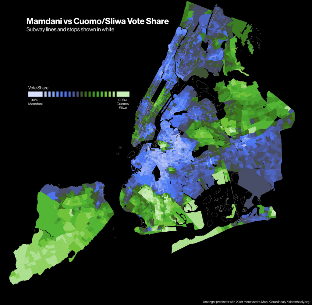
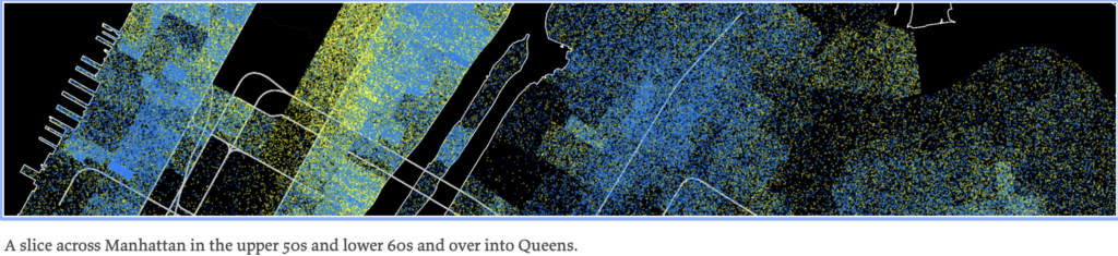
In reaction to my recent post, If Cuomo had been able to run against Mamdani head-to-head, would he have won?, sociologist Kieran Healy posted a pair of maps showing precinct-level results from the recent New York mayoral election. One of them is above, and below is a detail from the other.
The top map uses a bidirectional color scheme of the sort that I like, except that usually I’d see the darker colors at the extremes, fading to white in the middle, so it was surprising for me to see this go the other way.
In his post, Healy shares a lot of detail, not just on his choices for what the maps should look like, but also on the data processing and all the steps along the way.
Following up, Healy writes:
The overall effect of a dot-density plot is sensitive to the choice of colors, particularly when there is more than one kind of dot being displayed. This in turn is heavily related to relative brightness, which in practice itself depends not only on the values encoded on the plot but on the sort of monitor or screen it’s being displayed or projected on, how much ambient light there is, etc, etc.
Again–also as noted in the post–while dot-density plots do better than choropleths in overcoming the “Land Doesn’t Vote” problem (in this case, “Precincts aren’t real”), at the end of the day any spatial representation of something like individual voting data is going to be caught out by this issue one way or another. So overall you just have to show multiple representations of the data, many or most of which will be better off not being maps at all. (Cartograms, whether based on grids or some sort of sphere-packing methods, are another solution, and of course create their own problems.) There’s no one beats-all-comers method, and I don’t present the dot-density map as one. I use stuff like this in my own classes precisely because you end up with a lot of choices to make on how to view the data, and it’s good to encourage students to work through the choices and their consequences.
It’s also good for getting across to students how those choices, and the tradeoffs associated with them, can’t really be effectively communicated in the graph or map itself, because they’ve already been made. And hopefully the students end up recognizing (as with any sort of method or tool) the importance of some working community of researchers providing the context in which these things get made, interpreted, and trusted. Images, graphs, and maps are a pointed case of the general issue, just because it’s so easy for them to escape that context when they circulate. (I have a recent general-audience talk about this.)
I agree with Healy’s points. Phil and I once wrote a paper, All Maps of Parameter Estimates are Misleading.
The meta-point here is that people have a (false) intuition that any complicated piece of information can be conveyed in a single plot. One reason I hate the famous Napoleon-in-Russia graph is that it has encouraged this sort of thinking. When trying to make or read a graph, it can be helpful to start by stepping back and acknowledging hat, in general, one single plot (or even two plots) won’t do it all.
‘The top map uses a bidirectional color scheme of the sort that I like, except that usually I’d see the darker colors at the extremes, fading to white in the middle…’
I have a question. Why do you prefer a bidirectional colour scheme? Why not have a monotonous gradient (e.g. red to blue)?
Andrew –
FYI – your hyperlink to the previous post links back to this post.
Link fixed; thanks.
> in general, one single plot (or even two plots) won’t do it all
I think this speaks to a general point, not just in presenting data but also in analyzing it. That is, any analysis or visualization should be chosen intentionally to support one or more points that the presenter/analyst wants to convey, while at the same time avoiding the possibility of conveying misleading or distracting points. Striking that balance will often result in either simpler analyses/visualizations or a set of such, each of which makes an independent contribution to the whole presentation/analysis.
This is something that I think students in particular have a hard time appreciating. I think that’s particularly true now, given how easy it is to produce extremely complex figures with relatively little effort (particularly when using a chatbot) or to throw a bunch of variables into a regression without regard to their relevance.