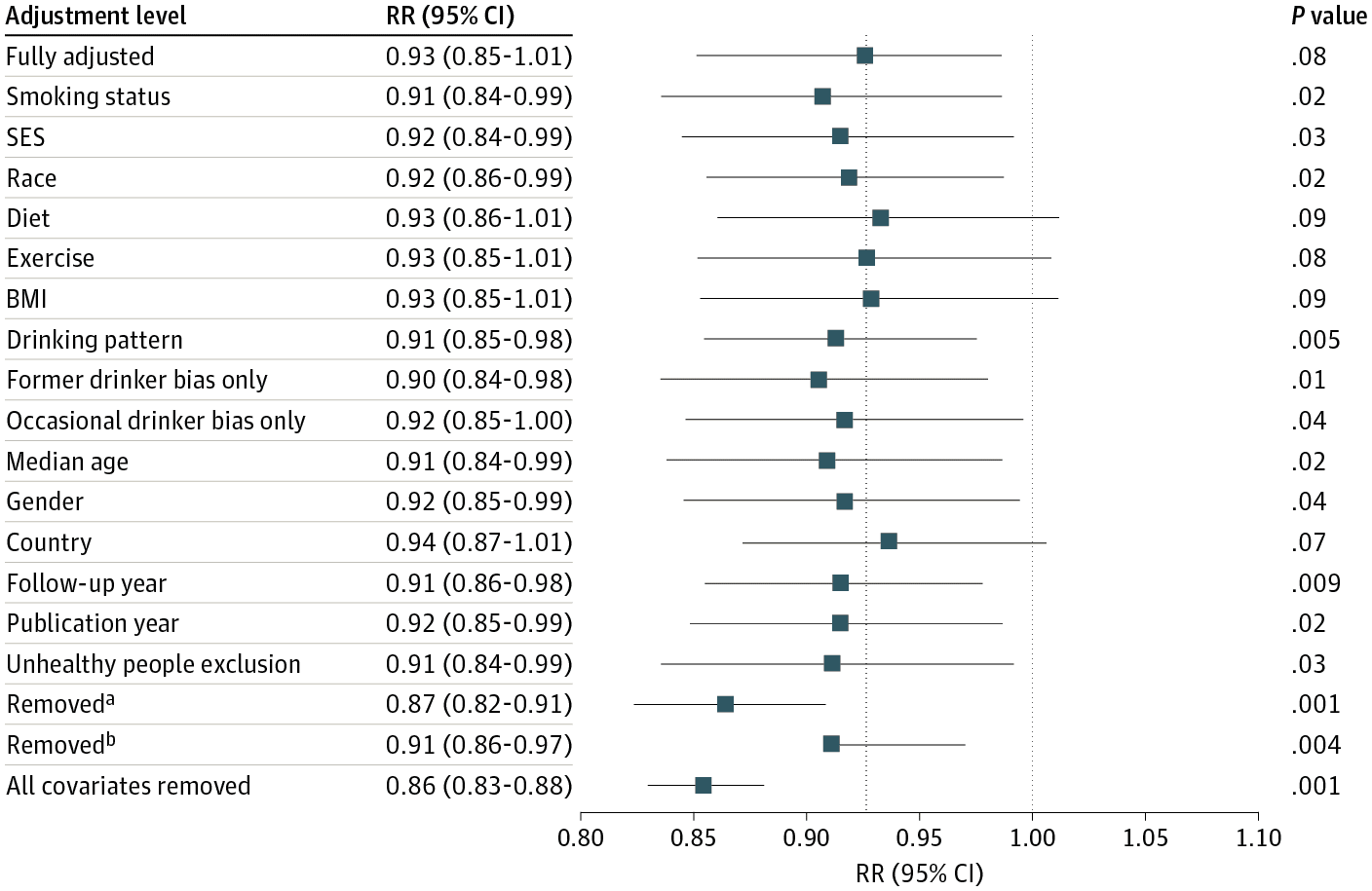
This empirical paper has been cited 1616 times but I don’t find it convincing. There’s no single fatal flaw, but the evidence does not seem so clear. How to think about this sort of thing? What to do? First, accept that evidence might not all go in one direction. Second, make lots of graphs. Also, an amusing story about how this paper is getting cited nowadays.

1. When can we trust? How can we navigate social science with skepticism?

2. Why I’m not convinced by that Quebec child-care study

3. 20 years on

1. When can we trust? How can we navigate social science with skepticism?

The other day I happened to run across a post from 2016 that I think is still worth sharing.

Here’s the background. Someone pointed me to a paper making the claim that “Canada’s universal childcare hurt children and families. . . . the evidence suggests that children are worse off by measures ranging from aggression to motor and social skills to illness. We also uncover evidence that the new child care program led to more hostile, less consistent parenting, worse parental health, and lower‐quality parental relationships.”

I looked at the paper carefully and wasn’t convinced. In short, the evidence went in all sorts of different directions, and I felt that the authors had been trying too hard to fit it all into a consistent story. It’s not that the paper had fatal flaws—it was not at all in the category of horror classics such as the beauty-and-sex-ratio paper, the ESP paper, the himmicanes paper, the air-rage paper, the pizzagate papers, the ovulation-and-voting paper, the air-pollution-in-China paper, etc etc etc.—it just didn’t really add up to me.

The question then is, if a paper can appear in a top journal, have no single killer flaw but still not be convincing, can we trust anything at all in the social sciences? At what point does skepticism become nihilism? Must I invoke the Chestertonian principle on myself?

I don’t know.

What I do think is that the first step is to carefully assess the connection between published claims, the analysis that led to these claims, and the data used in the analysis. The above-discussed paper has a problem that I’ve seen a lot, which is an implicit assumption that all the evidence should go in the same direction, a compression of complexity which I think is related to the cognitive illusion that Tversky and Kahneman called “the law of small numbers.” The first step in climbing out of this sort of hole is to look at lots of things at once, rather than treating empirical results as a sort of big bowl of fruit where the researcher can just pick out the the juiciest items and leave the rest behind.

2. Why I’m not convinced by that Quebec child-care study

Here’s what I wrote on that paper back in 2006:

Yesterday we discussed the difficulties of learning from a small, noisy experiment, in the context of a longitudinal study conducted in Jamaica where researchers reported that an early-childhood intervention program caused a 42%, or 25%, gain in later earnings. I expressed skepticism.

Today I want to talk about a paper making an opposite claim: “Canada’s universal childcare hurt children and families.”

I’m skeptical of this one too.

Here’s the background. I happened to mention the problems with the Jamaica study in a talk I gave recently at Google, and afterward Hal Varian pointed me to this summary by Les Picker of a recent research article:

In Universal Childcare, Maternal Labor Supply, and Family Well-Being (NBER Working Paper No. 11832), authors Michael Baker, Jonathan Gruber, and Kevin Milligan measure the implications of universal childcare by studying the effects of the Quebec Family Policy. Beginning in 1997, the Canadian province of Quebec extended full-time kindergarten to all 5-year olds and included the provision of childcare at an out-of-pocket price of $5 per day to all 4-year olds. This $5 per day policy was extended to all 3-year olds in 1998, all 2-year olds in 1999, and finally to all children younger than 2 years old in 2000.

(Nearly) free child care: that’s a big deal. And the gradual rollout gives researchers a chance to estimate the effects of the program by comparing children at each age, those who were and were not eligible for this program.

The summary continues:

The authors first find that there was an enormous rise in childcare use in response to these subsidies: childcare use rose by one-third over just a few years. About a third of this shift appears to arise from women who previously had informal arrangements moving into the formal (subsidized) sector, and there were also equally large shifts from family and friend-based child care to paid care. Correspondingly, there was a large rise in the labor supply of married women when this program was introduced.

That makes sense. As usual, we expect elasticities to be between 0 and 1.

But what about the kids?

Disturbingly, the authors report that children’s outcomes have worsened since the program was introduced along a variety of behavioral and health dimensions. The NLSCY contains a host of measures of child well being developed by social scientists, ranging from aggression and hyperactivity, to motor-social skills, to illness. Along virtually every one of these dimensions, children in Quebec see their outcomes deteriorate relative to children in the rest of the nation over this time period.

More specifically:

Their results imply that this policy resulted in a rise of anxiety of children exposed to this new program of between 60 percent and 150 percent, and a decline in motor/social skills of between 8 percent and 20 percent. These findings represent a sharp break from previous trends in Quebec and the rest of the nation, and there are no such effects found for older children who were not subject to this policy change.

Also:

The authors also find that families became more strained with the introduction of the program, as manifested in more hostile, less consistent parenting, worse adult mental health, and lower relationship satisfaction for mothers.

I just find all this hard to believe. A doubling of anxiety? A decline in motor/social skills? Are these day care centers really that horrible? I guess it’s possible that the kids are ruining their health by giving each other colds (“There is a significant negative effect on the odds of being in excellent health of 5.3 percentage points.”)—but of course I’ve also heard the opposite, that it’s better to give your immune system a workout than to be preserved in a bubble. They also report “a policy effect on the treated of 155.8% to 394.6%” in the rate of nose/throat infection.

OK, hre’s the research article.

The authors seem to be considering three situations: “childcare,” “informal childcare,” and “no childcare.” But I don’t understand how these are defined. Every child is cared for in some way, right? It’s not like the kid’s just sitting out on the street. So I’d assume that “no childcare” is actually informal childcare: mostly care by mom, dad, sibs, grandparents, etc. But then what do they mean by the category “informal childcare”? If parents are trading off taking care of the kid, does this count as informal childcare or no childcare? I find it hard to follow exactly what is going on in the paper, starting with the descriptive statistics, because I’m not quite sure what they’re talking about.

I think what’s needed here is some more comprehensive organization of the results. For example, consider this paragraph:

The results for 6-11 year olds, who were less affected by this policy change (but not unaffected due to the subsidization of after-school care) are in the third column of Table 4. They are largely consistent with a causal interpretation of the estimates. For three of the six measures for which data on 6-11 year olds is available (hyperactivity, aggressiveness and injury) the estimates are wrong-signed, and the estimate for injuries is statistically significant. For excellent health, there is also a negative effect on 6-11 year olds, but it is much smaller than the effect on 0-4 year olds. For anxiety, however, there is a significant and large effect on 6-11 year olds which is of similar magnitude as the result for 0-4 year olds.

The first sentence of the above excerpt has a cover-all-bases kind of feeling: if results are similar for 6-11 year olds as for 2-4 year olds, you can go with “but not unaffected”; if they differ, you can go with “less effective.” Various things are pulled out based on whether they are statistically significant, and they never return to the result for anxiety, which would seem to contradict their story. Instead they write, “the lack of consistent findings for 6-11 year olds confirm that this is a causal impact of the policy change.” “Confirm” seems a bit strong to me.

The authors also suggest:

For example, higher exposure to childcare could lead to increased reports of bad outcomes with no real underlying deterioration in child behaviour, if childcare providers identify negative behaviours not noticed (or previously acknowledged) by parents.

This seems like a reasonable guess to me! But the authors immediately dismiss this idea:

While we can’t rule out these alternatives, they seem unlikely given the consistency of our findings both across a broad spectrum of indices, and across the categories that make up each index (as shown in Appendix C). In particular, these alternatives would not suggest such strong findings for health-based measures, or for the more objective evaluations that underlie the motor-social skills index (such as counting to ten, or speaking a sentence of three words or more).

Health, sure: as noted above, I can well believe that these kids are catching colds from each other.

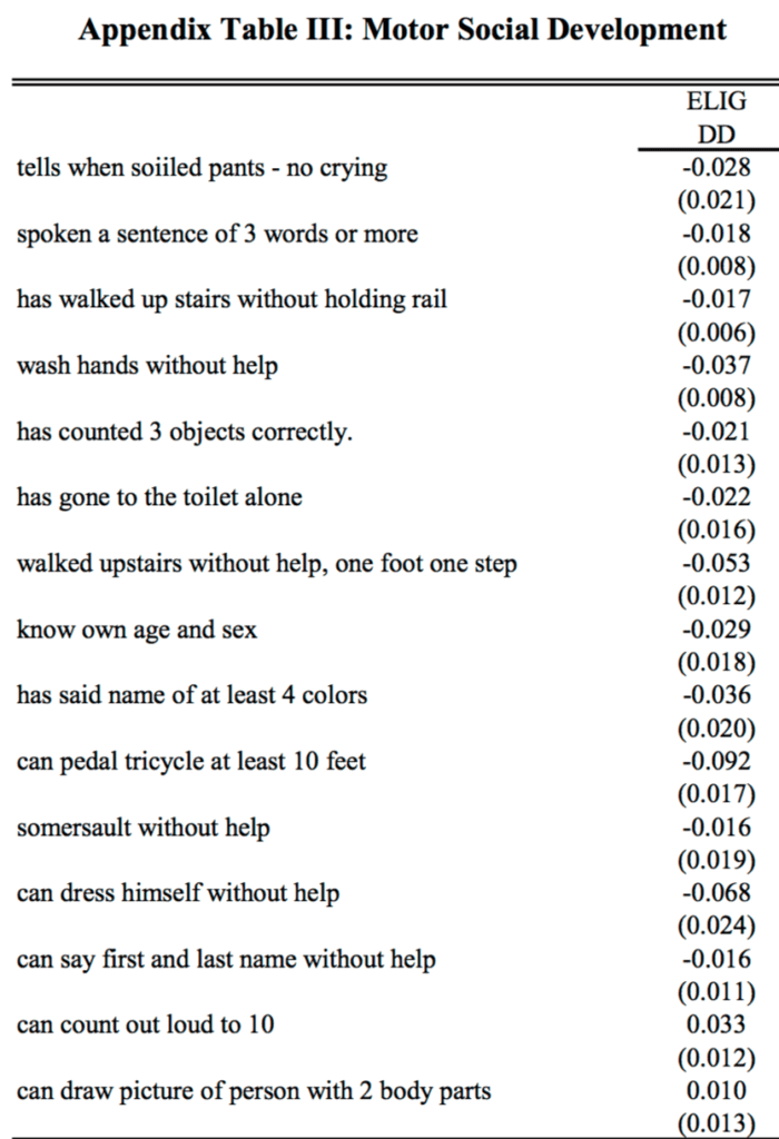
But what about that motor-skills index? Here are their results from the appendix:

Screen Shot 2016-06-22 at 1.56.04 PM

I’m not quite sure whether + or – is desirable here, but I do notice that the coefficients for “can count out loud to 10” and “spoken a sentence of 3 words or more” (the two examples cited in the paragraph above) go in opposite directions. That’s fine—the data are the data—but it doesn’t quite fit their story of consistency.

More generally, the data are addressed in an scattershot manner. For example:

We have estimated our models separately for those with and without siblings, finding no consistent evidence of a stronger effect on one group or another. While not ruling out the socialization story, this finding is not consistent with it.

This appears to be the classic error of interpretation of a non-rejection of a null hypothesis.

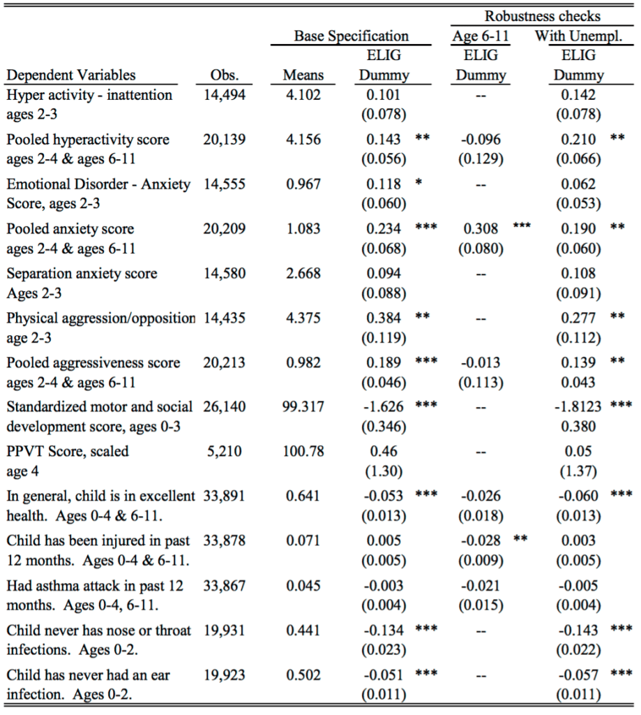
And here’s their table of key results:

Screen Shot 2016-06-22 at 1.59.53 PM

As quantitative social scientists we need to think harder about how to summarize complicated data with multiple outcomes and many different comparisons.

I see the current standard ways to summarize this sort of data are:

(a) Focus on a particular outcome and a particular comparison (choosing these ideally, though not usually, using preregistration), present that as the main finding and then tag all else as speculation.

Or, (b) Construct a story that seems consistent with the general pattern in the data, and then extract statistically significant or nonsignificant comparisons to support your case.

Plan (b) was what was done again, and I think it has problems: lots of stories can fit the data, and there’s a real push toward sweeping any anomalies aside.

For example, how do you think about that coefficient of 0.308 with standard error 0.080 for anxiety among the 6-11-year-olds? You can say it’s just bad luck with the data, or that the standard error calculation is only approximate and the real standard error should be higher, or that it’s some real effect caused by what was happening in Quebec in these years—but the trouble is that any of these explanations could be used just as well to explain the 0.234 with standard error 0.068 for 2-4-year-olds, which directly maps to one of their main findings.

Once you start explaining away anomalies, there’s just a huge selection effect in which data patterns you choose to take at face value and which you try to dismiss.

So maybe approach (a) is better—just pick one major outcome and go with it? But then you’re throwing away lots of data, that can’t be right.

I am unconvinced by the claims of Baker et al., but it’s not like I’m saying their paper is terrible. They have an identification strategy, and clean data, and some reasonable hypotheses. I just think their statistical analysis approach is not working. One trouble is that statistics textbooks tend to focus on stand-alone analyses—getting the p-value right, or getting the posterior distribution, or whatever, and not on how these conclusions fit into the big picture. And of course there’s lots of talk about exploratory data analysis, and that’s great, but EDA is typically not plugged into issues of modeling, data collection, and inference.

What to do?

OK, then. Let’s forget about the strengths and the weaknesses of the Baker et al. paper and instead ask, how should one evaluate a program like Quebec’s nearly-free preschool? I’m not sure. I’d start from the perspective of trying to learn what we can from what might well be ambiguous evidence, rather than trying to make a case in one direction or another. And lots of graphs, which would allow us to see more in one place, that’s much better than tables and asterisks. But, exactly what to do, I’m not sure. I don’t know whether the policy analysis literature features any good examples of this sort of exploration. I’d like to see something, for this particular example and more generally as a template for program evaluation.

3. Nearly 20 years on

So here’s the story. I heard about this work in 2016, from a press release issued in 2006, the article was published in a top economics journal in 2008, it appeared in preprint form in 2005, and it was based on data collected in the late 1990s. And here we are discussing it again in 2023.

It’s kind of beating a dead horse to discuss a 20-year-old piece of research, but you know what they say about dead horses. Also, according to Google Scholar, the article has 1616 citations, including 120 citations in 2023 alone, so, yeah, still worth discussing.

That said, not all the references refer to the substance of the paper. For example, the very first paper on Google Scholar’s list of citers is a review article, Explaining the Decline in the US Employment-to-Population Ratio, and when I searched to see what they said about this Canada paper (Baker, Gruber, and Milligan 2008), here’s what was there:

Additional evidence on the effects of publicly provided childcare comes from the province of Quebec in Canada, where a comprehensive reform adopted in 1997 called for regulated childcare spaces to be provided to all children from birth to age five at a price of $5 per day. Studies of that reform conclude that it had significant and long-lasting effects on mothers’ labor force participation (Baker, Gruber, and Milligan 2008; Lefebvre and Merrigan 2008; Haeck, Lefebvre, and Merrigan 2015). An important feature of the Quebec reform was its universal nature; once fully implemented, it made very low-cost childcare available for all children in the province. Nollenberger and Rodriguez-Planas (2015) find similarly positive effects on mothers’ employment associated with the introduction of universal preschool for three-year-olds in Spain.

They didn’t mention the bit about “the evidence suggests that children are worse off” at all! Indeed, they’re just kinda lumping this in with positive studies on “the effects of publicly provided childcare.” Yes, it’s true that this new article specifically refers to “similarly positive effects on mothers’ employment,” and that earlier paper, while negative about the effect of universal child care on kids, did say, “Maternal labor supply increases significantly.” Still, when it comes to sentiment analysis, that 2008 paper just got thrown into the positivity blender.

I don’t know how to think about this.

On one hand, I feel bad for Baker et al.: they did this big research project, they achieved the academic dream of publishing it in a top journal, it’s received over 1616 citations and remains relevant today—but, when it got cited, its negative message was completely lost! I guess they should’ve given their paper a more direct title. Instead of “Universal Child Care, Maternal Labor Supply, and Family Well‐Being,” they should’ve called it something like: “Universal Child Care: Good for Mothers’ Employment, Bad for Kids.”

On the other hand, for the reasons discussed above, I don’t actually believe their strong claims about the child care being bad for kids, so I’m kinda relieved that, even though the paper is being cited, some of its message has been lost. You win some, you lose some.
Of course its preregistered. Just give me a sec

This is Jessica. I was going to post something on Bak-Coleman and Devezer’s response to the Protzko et al. paper on the replicability of research that uses rigor-enhancing practices like large samples, preregistration, confirmatory tests, and methodological transparency, but Andrew beat me to it. But since his post didn’t get into one of the surprising aspects of their analysis (beyond the paper making causal claim without a study design capable of assessing causality), I’ll blog on it anyway.

Bak-Coleman and Devezer describe three ways in which the measure of replicability that Protzko et al. use to argue that the 16 effects they study are more replicable than effects in prior studies deviates from prior definitions of replicability:

  1. Protzko et al. define replicability as the chance that any replication achieves significance in the hypothesized direction as opposed to whether the results of the confirmation study and the replication were consistent 
  2. They include self-replications in calculating the rate
  3. They include repeated replications of the same effect and replications across different effects in calculating the rate

Could these deviations in how replicability is defined have been decided post-hoc, so that the authors could present positive evidence for their hypothesis that rigor-enhancing practices work? If they preregistered their definition of replicability, we would not be so concerned about this possibility.  Luckily, the authors report that “All confirmatory tests, replications and analyses were preregistered both in the individual studies (Supplementary Information section 3 and Supplementary Table 2) and for this meta-project (https://osf.io/6t9vm).”

But wait – according to Bak-Coleman and Devezer:

the analysis on which the titular claim depends was not preregistered. There is no mention of examining the relationship between replicability and rigor-improving methods, nor even how replicability would be operationalized despite extensive descriptions of the calculations of other quantities. With nothing indicating this comparison or metric it rests on were planned a priori, it is hard to distinguish the core claim in this paper from selective reporting and hypothesizing after the results are known. 

Uh-oh, that’s not good. At this point, some OSF sleuthing was needed. I poked around the link above, and the associated project containing analysis code. There are a couple analysis plans: Proposed Overarching Analyses for Decline Effect final.docx, from 2018, and Decline Effect Exploratory analyses and secondary data projects P4.docx, from 2019. However, these do not appear to describe the primary analysis of replicability in the paper (the first describes an analysis that ends up in the Appendix, and the second a bunch of exploratory analyses that don’t appear in the paper). About a year later, the analysis notebooks with the results they present in the main body of the paper were added. 

According to Bak-Coleman on X/Twitter: 

We emailed the authors a week ago. They’ve been responsive but as of now, they can’t say one way or another if the analyses correspond to a preregistration. They think they may be in some documentation.

In the best case scenario where the missing preregistration is soon found, this example suggests that there are still many readers and reviewers for whom some signal of rigor suffices even when the evidence of it is lacking. In this case, maybe the reputation of authors like Nosek reduced the perceived need on the part of the reviewers to track down the actual preregistration. But of course, even those who invented rigor-enhancing practices can still make mistakes!

In the alternative scenario where the preregistration is not found soon, what is the correct course of action? Surely at least a correction is in order? Otherwise we might all feel compelled to try our luck at signaling preregistration without having to inconvenience ourselves by actually doing.

More optimistically, perhaps there are exciting new research directions that could come out of this. Like, wearable preregistration, since we know from centuries of research and practice that it’s harder to lose something when it’s sewn to your person. Or, we could submit our preregistrations to OpenAI, I mean Microsoft, who could make a ChatGPT-enabled Preregistration Buddy who not only trained on your preregistration, but also knows how to please a human judge who wants to ask questions about what it said.

Hey! Here are some amazing articles by George Box from around 1990. Also there’s some mysterious controversy regarding his center at the University of Wisconsin.

The webpage is maintained by John Hunter, son of Box’s collaborator William Hunter, and I came across it because I was searching for background on the paper-helicopter example that we use in our classes to teach principles of experimental design and data analysis.

There’s a lot to say about the helicopter example and I’ll save that for another post.

Here I just want to talk about how much I enjoyed reading these thirty-year-old Box articles.

A Box Set from 1990

Many of the themes in those articles continue to resonate today. For example:

• The process of learning. Here’s Box from his 1995 article, “Total Quality: Its Origins and its Future”:

Scientific method accelerated that process in at least three ways:

1. By experience in the deduction of the logical consequences of the group of facts each of which was individually known but had not previously been brought together.

2. By the passive observation of systems already in operation and the analysis of data coming from such systems.

3. By experimentation – the deliberate staging of artificial experiences which often might ordinarily never occur.

A misconception is that discovery is a “one shot” affair. This idea dies hard. . . .

• Variation over time. Here’s Box from his 1989 article, “Must We Randomize Our Experiment?”:

We all live in a non-stationary world; a world in which external factors never stay still. Indeed the idea of stationarity – of a stable world in which, without our intervention, things stay put over time – is a purely conceptual one. The concept of stationarity is useful only as a background against which the real non-stationary world can be judge. For example, the manufacture of parts is an operation involving machines and people. But the parts of a machine are not fixed entities. They are wearing out, changing their dimensions, and losing their adjustment. The behavior of the people who run the machines is not fixed either. A single operator forgets things over time and alters what he does. When a number of operators are involved, the opportunities for change because of failures to communicate are further multiplied. Thus, if left to itself any process will drift away from its initial state. . . .

Stationarity, and hence the uniformity of everything depending on it, is an unnatural state that requires a great deal of effort to achieve. That is why good quality control takes so much effort and is so important. All of this is true, not only for manufacturing processes, but for any operation that we would like to be done consistently, such as the taking of blood pressures in a hospital or the performing of chemical analyses in a laboratory. Having found the best way to do it, we would like it to be done that way consistently, but experience shows that very careful planning, checking, recalibration and sometimes appropriate intervention, is needed to ensure that this happens.

Here an example, from Box’s 1992 article, “How to Get Lucky”:

For illustration Figure 1(a) shows a set of data designed so seek out the source of unacceptably large variability which, it was suspected, might be due to small differences in five, supposedly identical, heads on a machine. To test this idea, the engineer arranged that material from each of the five heads was sampled at roughly equal intervals of time in each of six successive eight-hour periods. . . . the same analysis strongly suggested that real differences in means occurred between the six eight-hour periods of time during which the experiment was conducted. . . .

• Workflow. Here’s Box from his 1999 article, “Statistics as a Catalyst to Learning by Scientific Method Part II-Discussion”:

Most of the principles of design originally developed for agricultural experimentation would be of great value in industry, but the most industry experimentation differed from agricultural experimentation in two major respects. These I will call immediacy and sequentially.

What I mean by immediacy is that for most of our investigations the results were available, if not within hours, then certainly within days and in rare cases, even within minutes. This was true whether the investigation was conducted in a laboratory, a pilot plant or on the full scale. Furthermore, because the experimental runs were usually made in sequence, the information obtained from each run, or small group of runs, was known and could be acted upon quickly and used to plan the next set of runs. I concluded that the chief quarrel that our experimenters had with using “statistics” was that they thought it would mean giving up the enormous advantages offered by immediacy and sequentially. Quite rightly, they were not prepared to make these sacrifices. The need was to find ways of using statistics to catalyze a process of investigation that was not static, but dynamic.

There’s lots more. It’s funny to read these things that Box wrote back then, that I and others have been saying over and over again in various informal contexts, decades later. It’s a problem with our statistical education (including my own textbooks) that these important ideas are buried.

More Box

A bunch of articles by Box, with some overlap but not complete overlap with the above collection, is at the site of the University of Wisconsin, where he worked for many years. Enjoy.

Some kinda feud is going on

John Hunter’s page also has this:

The Center for Quality and Productivity Improvement was created by George Box and Bill Hunter at the University of Wisconsin-Madison in 1985.

In the first few years reports were published by leading international experts including: W. Edwards Deming, Kaoru Ishikawa, Peter Scholtes, Brian Joiner, William Hunter and George Box. William Hunter died in 1986. Subsequently excellent reports continued to be published by George Box and others including: Gipsie Ranney, Soren Bisgaard, Ron Snee and Bill Hill.

These reports were all available on the Center’s web site. After George Box’s death the reports were removed. . . .

It is a sad situation that the Center abandonded the ideas of George Box and Bill Hunter. I take what has been done to the Center as a personal insult to their memory. . . .

When diagonoised with cancer my father dedicated his remaining time to creating this center with George to promote the ideas George and he had worked on throughout their lives: because it was that important to him to do what he could. They did great work and their work provided great benefits for long after Dad’s death with the leadership of Bill Hill and Soren Bisgaard but then it deteriorated. And when George died the last restraint was eliminated and the deterioration was complete.

Wow. I wonder what the story was. I asked someone I know who works at the University of Wisconsin and he had no idea. Box died in 2013 so it’s not so long ago; there must be some people who know what happened here.

Experimental reasoning in social science

As a statistician, I was trained to think of randomized experimentation as representing the gold standard of knowledge in the social sciences, and, despite having seen occasional arguments to the contrary, I still hold that view, expressed pithily by Box, Hunter, and Hunter that “To find out what happens when you change something, it is necessary to change it.”

At the same time, in my capacity as a social scientist, I’ve published many applied research papers, almost none of which have used experimental data.

In the present article, I’ll address the following questions:

1. Why do I agree with the consensus characterization of randomized experimentation as a gold standard?

2. Given point 1 above, why does almost all my research use observational data?

. . .

For the rest, you can read the article, written in question is from 2010, ultimately published in a book in 2014, and still relevant today, I think! For more on this perspective you can see chapters 18-21, the causal inference chapters of Regression and Other Stories.

Also relevant is the idea that mathematical and statistical reasoning are themselves experimental, as discussed in this article on Lakatos and in this talk, “When You do Applied Statistics, You’re Acting Like a Scientist. Why Does this matter?”

Discovering what mattered: Answering reverse causal questions using change-point models

Felix Pretis writes:

I came across your 2013 paper with Guido Imbens, “Why ask why? Forward causal inference and reverse causal questionson reverse causal questions,” and found it to be extremely useful for a closely-related project my co-author Moritz Schwarz and I have been working on.

We introduce a formal approach to answer “reverse causal questions” by expanding on the idea mentioned in your paper that reverse causal questions involve “searching for new variables.” We place the concept of reverse causal questions into the domain of variable and model selection. Specifically, we focus on detecting and estimating treatment effects when both treatment assignment and timing is unknown. The setting of unknown treatment reflects the problem often faced by policy makers: rather than trying to understand whether a particular intervention caused an outcome to change, they might be concerned with the broader question of what affected the outcome in general, but they might be unsure what treatment interventions took place. For example, rather than asking whether carbon pricing reduced CO2 emissions, a policy maker might be interested in what reduces CO2 emissions in general?

We show that such unknown treatment can be detected as structural breaks in panels by using machine learning methods to remove all but relevant treatment interaction terms that capture heterogeneous treatment effects. We demonstrate the feasibility of this approach by detecting the impact of ETA terrorism on Spanish regional GDP per capita without prior knowledge of its occurrence.

Predis and Schwartz describe their general idea in a paper, “Discovering what mattered: Answering reverse causal questions by detecting unknown treatment assignment and timing as breaks in panel models,” and they published an application of the approach in a paper, “Attributing agnostically detected large reductions in road CO2 emissions to policy mixes.”

It’s so cool to see this sort of work being done, transferring general concepts about causal inference to methods that can be used in real applications.

Springboards to overconfidence: How can we avoid . . .? (following up on our discussion of synthetic controls analysis)

Following up on our recent discussion of synthetic control analysis for causal inference, Alberto Abadie points to this article from 2021, Using Synthetic Controls: Feasibility, Data Requirements, and Methodological Aspects.

Abadie’s paper is very helpful in that it lays out the key assumptions and decision points, which can help us have a better understanding of what went so wrong in the paper on Philadelphia crime rates that we discussed in my earlier post.

I think it’s a general concern in methods papers–mine included!—that we tend to focus more on examples where the method works well, than on examples where it doesn’t. Abadie’s paper has an advantage over mine in that he gives conditions under which a method will work, and it’s not his fault that researchers then use the methods and get bad answers.

Regarding the specific methods issue, of course there are limits to what can be learned from N=1 treated units, whether analyzed using synthetic control or any other approach. It seems that researchers sometimes lose track of that point in their desire to make strong statements. On a very technical level, I suspect that, if researchers are using a weighted average as a comparison, that they’d do better using some regularization rather than just averaging over a very small number of other cases. But I don’t think that would help much in that particular application that we were discussing on the blog.

The deeper problem

The question is, when scholars such as Abadie write such clear descriptions of a method, including all its assumptions, how is it that applied researchers such as the authors of that Philadelphia article make such a mess of things? The problem is not unique to synthetic control analysis; it also arises with other “identification strategies” such as regression discontinuity, instrumental variables, linear regression, and plain old randomized experimentation. In all these cases, researchers often seem to end up using the identification strategy not as a tool for learning from data but rather as a sort of springboard to overconfidence. Beyond causal inference, there are all the well-known misapplications of Bayesian inference and classical p-values. No method is safe.

So, again, nothing special about synthetic control analysis. But what did happen in the example that got this discussion started? To quote from the original article:

The research question here is whether the application of a de-prosecution policy has an effect on the number of homicides for large cities in the United States. Philadelphia presents a natural experiment to examine this question. During 2010–2014, the Philadelphia District Attorney’s Office maintained a consistent and robust number of prosecutions and sentencings. During 2015–2019, the office engaged in a systematic policy of de-prosecution for both felony and misdemeanor cases. . . . Philadelphia experienced a concurrent and historically large increase in homicides.

After looking at the time series, here’s my quick summary: Philadelphia’s homicide rate went up since 2014 during the same period that it decreased prosecutions, and this was part of a national trend of increased homicides—but there’s no easy way given the directly available information to compare to other cities with and without that policy.

I’ll refer you to my earlier post and its comment thread for more on the details.

At this point, the authors of the original article used a synthetic controls analysis, following the general approach described in the Abadie paper. the comparisons they make are to that weighted average of Detroit, New Orleans, and New York. The trouble is . . . that’s just 3 cities, and homicide rates can vary a lot from city to city. There’s no good reason to think that an average of three cities that give you numbers comparable to Philadelphia’s for the homicide rates or counts in the five previous years will give you a reasonable counterfactual for trends in the next five years. Beyond this, some outside researchers pointed out many forking paths in the published analysis. Forking paths are not in themselves a problem—my open applied work is full of un-preregistered data coding and analysis decisions—; the relevance here is that they help explain how it’s possible for researchers to get apparently “statistically significant” results from noisy data.

So what went wrong? Abadie’s paper discusses a mathematical problem: if you want to compare Philadelphia to some weighted average of the other 96 cities, and if you want these weights to be positive and sum to 1 and be estimated using an otherwise unregularized procedure, then there are certain statistical properties associated with using a procedure which, in this case, if various decisions are made, will lead to choosing a particular average of Detroit, New Orleans, and New York. There’s nothing wrong with doing this, but, ultimately, all you have is a comparison of 1 city to 3 cities, and it’s completely legit from an applied perspective to look at these cities and recognize how different they all are.

It’s not the fault of the synthetic control analysis if you have N=1 in the treatment group. It’s just the way things go. The error is to use that analysis to make strong claims, and the further error is to think that the use of this particular method—or any particular method—should insulate the analysis from concerns about reasonableness. If you want to compare one city to 96 others, then your analysis will rely on assumptions about comparability of the different cities, and not just on one particular summary such as the homicide counts during a five-year period.

You can say that this general concern arises with linear regression as well—you’re only adjusting for whatever pre-treatment variables that are included in the model. For example, when we estimated the incumbency advantage in congressional elections by comparing elections with incumbents running for reelection to elections in open seats, adjusting for previous vote share and party control, it would be a fair criticism to say that maybe the treatment and control cases differed in other important ways not included in the analysis. And we looked at that! I’m not saying our analysis was perfect; indeed, a decade and a half later we reanalyzed the data with a measurement-error model and got what we thing were improved results. It was a big help that we had replication: many years, and many open-seat and incumbent elections in each year. This Philadelphia analysis is different because it’s N=1. If we tried to do linear regression with N=1, we’d have all sorts of problems. Unfortunately, the synthetic control analysis did not resolve the N=1 problem—it’s not supposed to!—but it did seem to lead the authors into a some strong claims that did not make a lot of sense.

P.S. I sent the above to Abadie, who added:

I would like to share a couple of thoughts about N=1 and whether it is good or bad to have a small number of units in the comparison group.

Synthetic controls were originally proposed to address the N=1 (or low N) setting in cases with aggregate and relatively noiseless data and strong co-movement across units. I agree with you that they do not mechanically solve the N=1 problem in general (and that nothing does!). They have to be applied with care and there will be settings where they do not produce credible estimates (e.g., noisy series, short pre-intervention windows, poor pre-intervention fit, poor prediction in hold-out pre-intervention windows, etc). There are checks (e.g., predictive power in hold-out pre-intervention windows) that help assess the credibility of synthetic control estimates in applied settings.

Whether a few controls or many controls are better depends on the context of the investigation and on what one is trying to attain. Precision may call for using many comparisons. But there is a trade-off. The more units we use as comparisons, the less similar those may be relative to the treated unit. And the use of a small number of units allows us to evaluate / correct for potential biases created by idiosyncratic shocks and / or interference effects on the comparison units. If the aggregate series are “noiseless enough” like in the synthetic control setting, one might care more about reducing bias than about attaining additional precision.

Getting the first stage wrong

Sometimes when you conduct (or read) a study you learn you’re wrong in interesting ways. Other times, maybe you’re wrong for less interesting reasons.

Being wrong about the “first stage” can be an example of the latter. Maybe you thought you had a neat natural experiment. Or you tried a randomized encouragement to an endogenous behavior of interest, but things didn’t go as you expected. I think there are some simple, uncontroversial cases here of being wrong in uninteresting ways, but also some trickier ones.

Not enough compliers

Perhaps the standard way to be wrong about the first stage is to think there is one when there more or less isn’t — when the thing that’s supposed to produce some random or as-good-as-random variation in a “treatment” (considered broadly) doesn’t actually do much of that.

Here’s an example from my own work. Some collaborators and I were interested in how setting fitness goals might affect physical activity and perhaps interact with other factors (e.g., social influence). We were working with a fitness tracker app, and we ran a randomized experiment where we sent new notifications to randomly assigned existing users’ phones encouraging them to set a goal. If you tapped the notification, it would take you to the flow for creating a goal.

One problem: Not many people interacted with the notifications and so there weren’t many “compliers” — people who created a goal when they wouldn’t have otherwise. So we were going to have a hopelessly weak first stage. (Note that this wasn’t necessarily weak in the sense of the “weak instruments” literature, which is generally concerned about a high-variance first stage producing bias and resulting inference problems. Rather, even if we knew exactly who the compliers were — compliers are a latent stratum, it was a small enough set of people that we’d have very low power for any of the plausible second-stage effects.)

So we dropped this project direction. Maybe there would have been a better way to encourage people to set goals, but we didn’t readily have one. Now this “file drawer” might mislead people about how much you can get people to act on push notifications, or the total effect of push notifications on our planned outcomes (e.g., fitness activities logged). But it isn’t really so misleading about the effect of goal setting on our planned outcomes. We just quit because we’d been wrong about the first stage — which, to a large extent, was a nuisance parameter here, and perhaps of interests to a smaller (or at least different, less academic) set of people.

We were wrong in a not-super-interesting way. Here’s another example from James Druckman:

A collaborator and I hoped to causally assess whether animus toward the other party affects issue opinions; we sought to do so by manipulating participants’ levels of contempt for the other party (e.g., making Democrats dislike Republicans more) to see if increased contempt led partisans to follow party cues more on issues. We piloted nine treatments we thought could prime out-party animus and every one failed (perhaps due to a ceiling effect). We concluded an experiment would not work for this test and instead kept searching for other possibilities…

Similarly, here the idea is that the randomized treatments weren’t themselves of primary interest, but were necessary for the experiment to be informative.

Now, I should note that, at least with a single instrument and a single endogenous variable, pre-testing for instrument strength in the same sample that would be used for estimation introduces bias. But it is also hard to imagine how empirical researchers are supposed to allocate their efforts if they don’t give up when there’s really not much of a first stage. (And some of these cases here are cases where the pre-testing is happening on a separate pilot sample. And, again, the relevant pre-testing here is not necessarily a test for bias due to “weak instruments”.)

Forecasting reduced form results vs. effect ratios

This summer I tried to forecast the results of the newly published randomized experiments conducted on Facebook and Instagram during the 2020 elections. One of these interventions, which I’ll focus on here, replaced the status quo ranking of content in users’ feeds with chronological ranking. I stated my forecasts for a kind of “reduced form” or intent-to-treat analysis. For example, I guessed what the effect of this ranking change would be on a survey measure of news knowledge. I said the effect would be to reduce Facebook respondents’ news knowledge by 0.02 standard deviations. The experiment ended up yielding a 95% CI of [-0.061, -0.008] SDs. Good for me.

On the other hand, I also predicted that dropping the optimized feed for a chronological one would substantially reduce Facebook use. I guessed it would reduce time spent by 8%. Here I was wrong, the reduction was more than double that, with what I roughly calculate to be a [-23%, -19%] CI.

OK, so you win some you lose some, right? I could even self-servingly say, hey, the more important questions here were about news knowledge, polarization etc., not exactly how much time people spend on Facebook.

It is a bit more complex than that because these two predictions were linked in my head: one was a kind of “first stage” for the other, and it was the first stage I got wrong.

Part of how I made that prediction for news knowledge was by reasoning that we have some existing evidence that using Facebook increases people’s news knowledge. For example, Allcott, Braghieri, Eichmeyer & Gentzkow (2020) paid people to deactivate Facebook for four weeks before the 2018 midterms. They estimate a somewhat noisy local average treatment effect of -0.12 SDs (SE: 0.05) on news knowledge. Then I figured my predicted 8% reduction probably especially “consumption” time (rather than time posting and interacting around one’s own posts), would translate into a much smaller 0.02 SD effect. I made some various informal adjustments, such as a bit of “Bayesian-ish” shrinkage towards zero.

So while maybe I got the ITT right, perhaps this is partially because I seemingly got something else wrong: the effect ratio of news knowledge over time spent (some people might call this an elasticity or semi-elasticity). Now I think it turns out here that the CI for news knowledge is pretty wide (especially if one adjusts for multiple comparisons), so even if, given the “first stage” effect, I should have predicted an effect over twice as large, the CI includes that too.

Effect ratios, without all the IV assumptions

Over a decade ago, Andrew wrote about “how to think about instrumental variables when you get confused”. I think there is some wisdom here. One of the key ideas is to focus on the first stage (FS) and what sometimes is called the reduced form or the ITT: the regression of the outcome on the instrument. This sidelines the ratio of the two, ITT/FS — the ratio that is the most basic IV estimator (i.e. the Wald estimator).

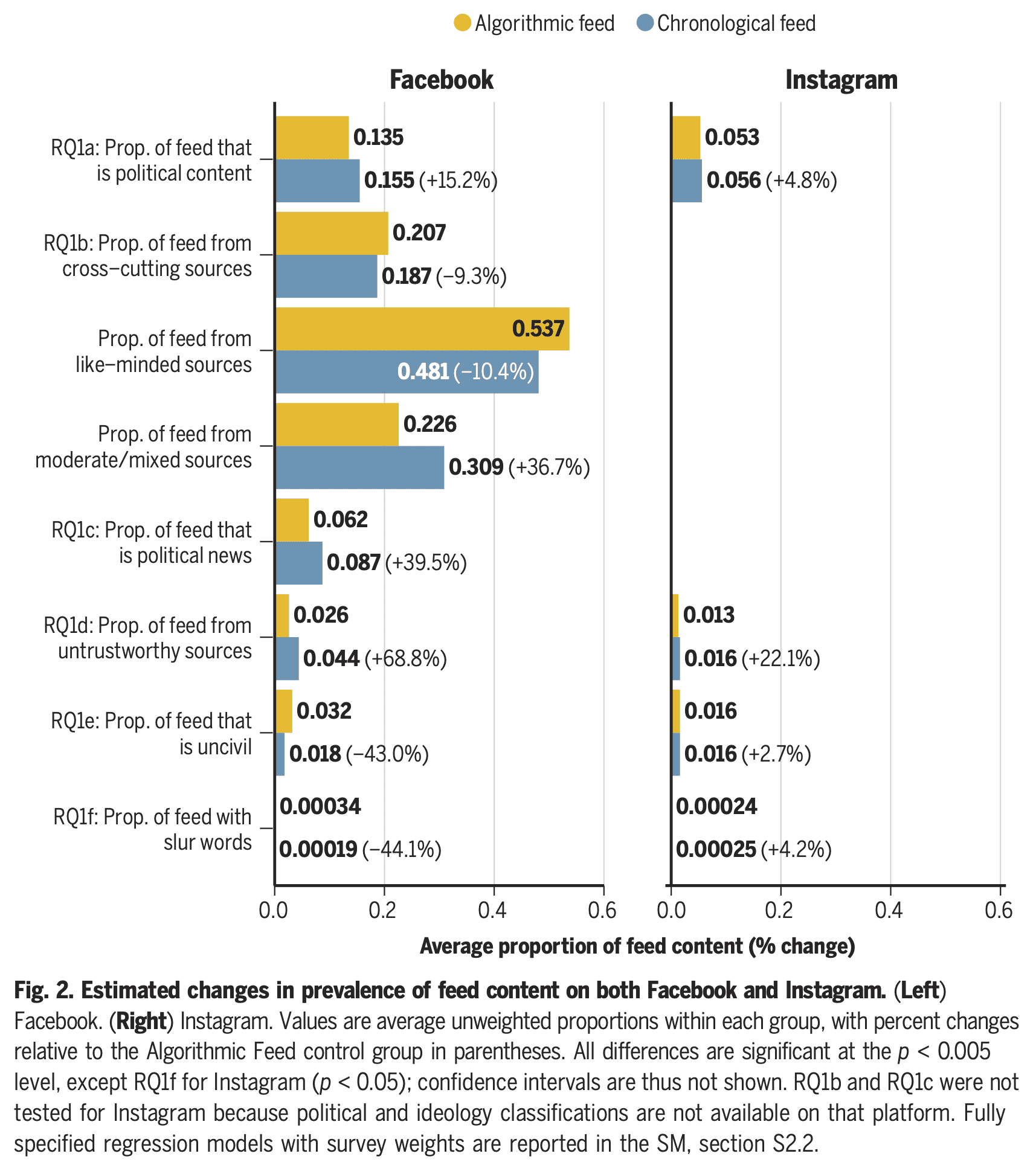
So why am I suggesting thinking about the effect ratio, aka the IV estimand? And I’m suggesting thinking about it in a setting where the exclusion restriction (i.e. complete mediation, whereby the randomized intervention only affects the outcome via the endogenous variable) is pretty implausible. In the example above, it is implausible that the only affect of changing feed ranking is to reduce time spent on Facebook, as if that was a homogenous bundle. Other results show that the switch to a chronological feed increased, for example, the fraction of subjects’ feeds that was political content, political news, and untrustworthy sources:

Figure 2 of Guess et al. showing effects on feed composition

Without those assumptions, this ratio can’t be interpreted as the effect of the endogenous exposure (assuming homogeneous effects) or a local average treatment effect. It’s just a ratio of two different effects of the random assignment. Sometimes in the causal inference literature there is discussion of this more agnostic parameter, labeled an “effect ratio” as I have done.

Does it make sense to focus on the effect ratio even when the exclusion restriction isn’t true?

Well in the case above, perhaps it makes sense because I used something like this ratio to produce my predictions. (But maybe this was or was not a sensible way to make predictions.)

Second, even if the exclusion restriction isn’t true, it can be that the effect ratio is more stable across the relevant interventions. It might be that the types of interventions being tried work via two intermediate exposures (A and B). If the interventions often affect them to somewhat similar degrees (perhaps we think about the differences among interventions being described by a first principal component that is approximately “strength”), then the ratio of the effect on the outcome and the effect on A can still be much more stable across interventions than the total effect on Y (which should vary a lot with that first principal component). A related idea is explored in the work on invariant prediction and anchor regression by Peter Bühlmann, Nicolai Meinshausen, Jonas Peters, and Dominik Rothenhäusler. That work encourages us to think about the goal of predicting outcomes under interventions somewhat like those we already have data on. This can be a reason to look at these effect ratios, even when we don’t believe we have complete mediation.

[This post is by Dean Eckles. Because this post touches on research on social media, I want to note that I have previously worked for Facebook and Twitter and received funding for research on COVID-19 and misinformation from Facebook/Meta. See my full disclosures here.]

Debate over effect of reduced prosecutions on urban homicides; also larger questions about synthetic control methods in causal inference.

Andy Wheeler writes:

I think this back and forth may be of interest to you and your readers.

There was a published paper attributing very large increases in homicides in Philadelphia to the policies by progressive prosecutor Larry Krasner (+70 homicides a year!). A group of researchers then published a thorough critique, going through different potential variants of data and models, showing that quite a few reasonable variants estimate reduced homicides (with standard errors often covering 0):

Hogan original paper,
Kaplan et al critique
Hogan response
my writeup

I know those posts are a lot of weeds to dig into, but they touch on quite a few topics that are recurring themes for your blog—many researcher degrees of freedom in synthetic control designs, published papers getting more deference (the Kaplan critique was rejected by the same journal), a researcher not sharing data/code and using that obfuscation as a shield in response to critics (e.g. your replication data is bad so your critique is invalid).

I took a look, and . . . I think this use of synthetic control analysis is not good. I pretty much agree with Wheeler, except that I’d go further than he does in my criticism. He says the synthetic control analysis in the study in question has data issues and problems with forking paths; I’d say that even without any issues of data and forking paths (for example, had the analysis been preregistered), I still would not like it.

Overview

Before getting to the statistical details, let’s review the substantive context. From the original article by Hogan:

De-prosecution is a policy not to prosecute certain criminal offenses, regardless of whether the crimes were committed. The research question here is whether the application of a de-prosecution policy has an effect on the number of homicides for large cities in the United States. Philadelphia presents a natural experiment to examine this question. During 2010–2014, the Philadelphia District Attorney’s Office maintained a consistent and robust number of prosecutions and sentencings. During 2015–2019, the office engaged in a systematic policy of de-prosecution for both felony and misdemeanor cases. . . . Philadelphia experienced a concurrent and historically large increase in homicides.

I would phrase this slightly differently. Rather than saying, “Here’s a general research question, and we have a natural experiment to learn about it,” I’d prefer the formulation, “Here’s something interesting that happened, and let’s try to understand it.”

It’s tricky. On one hand, yes, one of the major reasons for arguing about the effect of Philadelphia’s policy on Philadelphia is to get a sense of the effect of similar policies there and elsewhere in the future. On the other hand, Hogan’s paper is very much focused on Philadelphia between 2015 and 2019. It’s not constructed as an observational study of any general question about policies. Yes, he pulls out some other cities that he characterizes as having different general policies, but there’s no attempt to fully involve those other cities in the analysis; they’re just used as comparisons to Philadelphia. So ultimately it’s an N=1 analysis—a quantitative case study—and I think the title of the paper should respect that.

Following our “Why ask why” framework, the Philadelphia story is an interesting data point motivating a more systematic study of the effect of prosecution policies and crime. For now we have this comparison of the treatment case of Philadelphia to the control of 100 other U.S. cities.

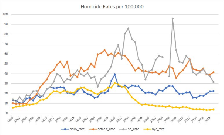
Here are some of the data. From Wheeler (2023), here’s a comparison of trends in homicide rates in Philadelphia to three other cities:

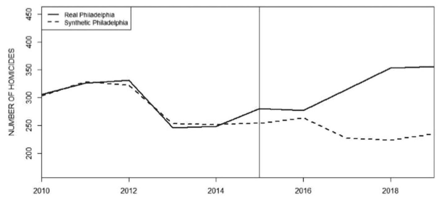
Wheeler chooses these particular three comparison cities because they were the ones that were picked by the algorithm used by Hogan (2022). Hogan’s analysis compares Philadelphia from 2015-2019 to a weighted average of Detroit, New Orleans, and New York during those years, with those cities chosen because their weighted average lined up to that of Philadelphia during the years 2010-2014. From Hogan:

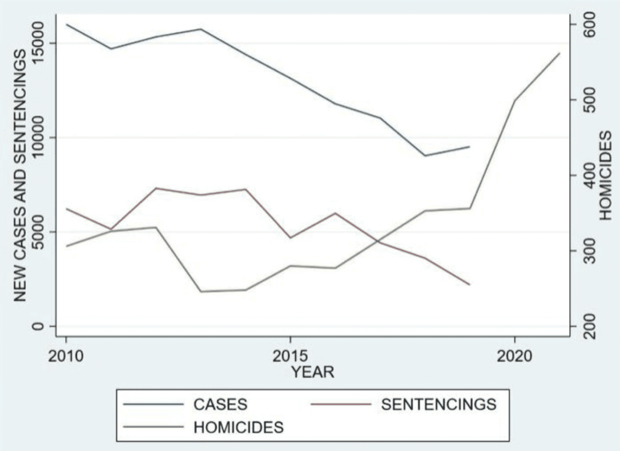
As Wheeler says, it’s kinda goofy for Hogan to line these up using homicide count rather than homicide rates . . . I’ll have more to say in a bit regarding this use of synthetic control analysis. For now, let me just note that the general pattern in Wheeler’s longer time series graph is consistent with Hogan’s story: Philadelphia’s homicide rate moved up and down over the decades, in vaguely similar ways to the other cities (increasing throughout the 1960s, slightly declining in the mid-1970s, rising again in the late-1980s, then gradually declining since 1990), but then steadily increasing from 2014 onward. I’d like to see more cities on this graph (natural comparisons to Philadelphia would be other Rust Belt cities such as Baltimore and Cleveland. Also, hey, why not show a mix of other large cities such as LA, Chicago, Houston, Miami, etc.) but this is what I’ve got here. Also it’s annoying that the above graphs stop in 2019. Hogan does have this graph just for Philadelphia that goes to 2021, though:

As you can see, the increase in homicides in Philadelphia continued, which is again consistent with Hogan’s story. Why only use data up to 2019 in the analyses? Hogan writes:

The years 2020–2021 have been intentionally excluded from the analysis for two reasons. First, the AOPC and Sentencing Commission data for 2020 and 2021 were not yet available as of the writing of this article. Second, the 2020–2021 data may be viewed as aberrational because of the coronavirus pandemic and civil unrest related to the murder of George Floyd in Minnesota.

I’d still like to see the analysis including 2020 and 2021. The main analysis is the comparison of time series of homicide rates, and, for that, the AOPC and Sentencing Commission data would not be needed, right?

In any case, based on the graphs above, my overview is that, yeah, homicides went up a lot in Philadelphia since 2014, an increase that coincided with reduced prosecutions and which didn’t seem to be happening in other cities during this period. At least, so I think. I’d like to see the time series for the rates in the other 96 cities in the data as well, going from, say, 2000, all the way to 2021 (or to 2022 if homicide data from that year are now available).

I don’t have those 96 cities, but I did find this graph going up to 2000 from a different Wheeler post:

Ignore the shaded intervals; what I care about here is the data. (And, yeah, the graph should include zero, since it’s in the neighborhood.) There has been a national increase in homicides since 2014. Unfortunately, from this national trend line alone I can’t separate out Philadelphia and any other cities that might have instituted a de-prosecution strategy during this period.

So, my summary, based on reading all the articles and discussions linked above, is . . . I just can’t say! Philadelphia’s homicide rate went up since 2014 during the same period that it decreased prosecutions, and this was part of a national trend of increased homicides—but there’s no easy way given the directly available information to compare to other cities with and without that policy. This is not to say that Hogan is wrong about the policy impacts, just that I don’t see any clear comparisons here.

The synthetic controls analysis

Hogan and the others make comparisons, but the comparisons they make are to that weighted average of Detroit, New Orleans, and New York. The trouble is . . . that’s just 3 cities, and homicide rates can vary a lot from city to city. It just doesn’t make sense to throw away the other 96 cities in your data. The implied counterfactual is that if Philadelphia had continued post-2014 with its earlier sentencing policy, that its homicide rates would look like this weighted average of Detroit, New Orleans, and New York—but there’s no reason to expect that, as this averaging is chosen by lining up the homicide rates from 2010-2014 (actually the counts and populations, not the rates, but that doesn’t affect my general point so I’ll just talk about rates right now, as that’s what makes more sense).

And here’s the point: There’s no good reason to think that an average of three cities that give you numbers comparable to Philadelphia’s for the homicide rates in the five previous years will give you a reasonable counterfactual for trends in the next five years. To think there’s no mathematical reason we should expect the time series to work that way, nor do I see any substantive reason based on sociology or criminology or whatever to expect anything special from a weighted average of cities that is constructed to line up with Philadelphia’s numbers for those three years.

The other thing is that this weighted-average thing is not what I’d imagined when I first heard that this was a synthetic controls analysis.

My understanding of a synthetic controls analysis went like this. You want to compare Philadelphia to other cities, but there are no other cities that are just like Philadelphia, so you break up the city into neighborhoods and find comparable neighborhoods in other cities . . . and when you’re done you’ve created this composite “city,” using pieces of other cities, that functions as a pseudo-Philadelphia. In creating this composite, you use lots of neighborhood characteristics, not just matching on a single outcome variable. And then you do all of this with other cities in your treatment group (cities that followed a de-prosecution strategy).

The synthetic controls analysis here differed from what I was expecting in three ways:

1. It did not break up Philadelphia and the other cities into pieces, jigsaw-style. Instead, it formed a pseudo-Philadelphia by taking a weighted average of other cities. This is a much more limited approach, using much less information, and I don’t see it as creating a pseudo-Philadelphia in the full synthetic-controls sense.

2. It only used that one variable to match the cities, leading to concerns about comparability that Wheeler discusses.

3. It was only done for Philadelphia; that’s the N=1 problem.

Researcher degrees of freedom, forking paths, and how to think about them here

Wheeler points out many forking paths in Hogan’s analysis, lots of data-dependent decision rules in the coding and analysis. (One thing that’s come up before in other settings: At this point, you might ask how do we know that Hogan’s decisions were data-dependent, as this is a counterfactual statement involving the analyses he would’ve had done had the data been different. And my answer, as in previous cases, is that, given that the analysis was not pre-registered, we can only assume it is data-dependent. I say this partly because every non-preregistered analysis I’ve ever done has been in the context of the data, also because if all the data coding and analysis decisions had been made ahead of time (which is what been required for these decisions to not be data-dependent), then why not preregister? Finally let me emphasize that researcher degrees of freedom and forking paths do not represent criticisms of flaws of a study; they’re just a description of what was done, and in general I don’t think they’re a bad thing at all; indeed, almost all the papers I’ve ever published include many many data-dependent coding and decision rules.)

Given all the forking paths, we should not take Hogan’s claims of statistical significance at face value, and indeed the critics find that various alternative analyses can change the results.

In their criticism, Kaplan et al. say that reasonable alternative specifications can lead to null or even opposite results compared to what Hogan reported. I don’t know if I completely buy this—given that Philadelphia’s homicide rate increased so much since 2014, it seems hard for me to see how a reasonable estimate would find that its policy rate reduced the homicide rate.

To me, the real concern is with comparing Philadelphia to just three other cities. Forking paths are real, but I’d have this concern even if the analysis were identical and it had been preregistered. Preregister it, whatever, you’re still only comparing to three cities, and I’d like to see more.

Not junk science, just difficult science

As Wheeler implicitly says in his discussion, Hogan’s paper is not junk science—it’s not like those papers on beauty and sex ratio, or ovulation and voting, or air rage, himmicanes, ages ending in 9, or the rest of our gallery of wasted effort. Hogan and the others are studying real issues. The problem is that the data are observational, the data are sparse and highly variable; that is, the problem is hard. And it doesn’t help when researchers are under the impression that these real difficulties can be easily resolved using canned statistical identification techniques. In that aspect, we can draw an analogy to the notorious air-pollution-in-China paper. But this one’s even harder, in the following sense: The air-pollution-in-China paper included a graph with two screaming problems: an estimated life expectancy of 91 and an out-of-control nonlinear fitted curve. In contrast, the graphs in the Philadelphia-analysis paper all look reasonable enough. There’s nothing obviously wrong with the analysis, and the problem is a more subtle issue of the analysis not fully accounting for variation in the data.

Difference-in-differences: What’s the difference?

After giving my talk last month, Better Than Difference in Differences, I had some thoughts about how diff-in-diff works—how the method operates in relation to its assumptions—and it struck me that there are two relevant ways to think about it.

From a methods standpoint the relevance here is that I will usually want to replace differencing with regression. Instead of taking (yT – yC) – (xT – xC), where T = Treatment and C = Control, I’d rather look at (yT – yC) – b*(xT – xC), where b is a coefficient estimated from the data, likely to be somewhere between 0 and 1. Difference-in-differences is the special case b=1, and in general you should be able to do better by estimating b. We discuss this with the Electric Company example in chapter 19 of Regression and Other Stories and with a medical trial in our paper in the American Heart Journal.

Given this, what’s the appeal of diff-in-diff? I think the appeal of the method comes from the following mathematical sequence:

Control units:
(a) Data at time 0 = Baseline + Error_a
(b) Data at time 1 = Baseline + Trend + Error_b

Treated units:
(c) Data at time 0 = Baseline + Error_c
(d) Data at time 1 = Baseline + Trend + Effect + Error_d

Now take a diff in diff:

((d) – (c)) – ((b) – (a)) = Effect + Error,

where that last Error is a difference in difference of errors, which is just fine under the reasonable-enough assumption that the four error terms are independent.

The above argument looks pretty compelling and can easily be elaborated to include nonlinear trends, multiple time points, interactions, and so forth. That’s the direction of the usual diff-in-diff discussions.

The message of my above-linked talk and our paper, though, was different. Our point was that, whatever differencing you take, it’s typically better to difference only some of the way. Or, to make the point more generally, it’s better to model the baseline and the trend as well as the effect.

Seductive equations

The above equations are seductive: with just some simple subtraction, you can cancel out Baseline and Trend, leaving just Effect and error. And the math is correct (conditional on the assumptions, which can be reasonable). The problem is that the resulting estimate can be super noisy; indeed, it’s basically never the right thing to do from a probabilistic (Bayesian) standpoint.

In our example it was pretty easy in retrospect to do the fully Bayesian analysis. It helped that we had 38 replications of similar experiments, so we could straightforwardly estimate all the hyperparameters in the model. If you only have one experiment, your inferences will depend on priors that can’t directly be estimated from local data. Still, I think the Bayesian approach is the way to go, in the sense of yielding effect-size estimates that are more reasonable and closer to the truth.

Next step is to work this out on some classic diff-in-diff examples.

No, this paper on strip clubs and sex crimes was never gonna get retracted. Also, a reminder of the importance of data quality, and a reflection on why researchers often think it’s just fine to publish papers using bad data under the mistaken belief that these analyses are “conservative” or “attenuated” or something like that.

Brandon Del Pozo writes:

Born in Bensonhurst, Brooklyn in the 1970’s, I came to public health research by way of 23 years as a police officer, including 19 years in the NYPD and four as a chief of police in Vermont. Even more tortuously, my doctoral training was in philosophy at the CUNY Graduate Center.

I am writing at the advice of colleagues because I remain extraordinarily vexed by a paper that came out in 2021. It purports to measure the effects of opening strip clubs on sex crimes in NYC at the precinct level, and finds substantial reductions within a week of opening each club. The problem is the paper is implausible from the outset because it uses completely inappropriate data that anyone familiar with the phenomena would find preposterous. My colleagues and I, who were custodians of the data and participants in the processes under study when we were police officers, wrote a very detailed critique of the paper and called for its retraction. Beyond our own assertions, we contacted state agencies who went on the record about the problems with the data as well.

For their part, the authors and editors have been remarkably dismissive of our concerns. They said, principally, that we are making too big a deal out of the measures being imprecise and a little noisy. But we are saying something different: the study has no construct validity because it is impossible to measure the actual phenomena under study using its data.

Here is our critique, which will soon be out in Police Practice and Research. Here is the letter from the journal editors, and here is a link to some coverage in Retraction Watch. I guess my main problem is the extent to which this type of problem was missed or ignored in the peer review process, and why it is being so casually dismissed now. It is a matter of economists circling their wagons?

My reply:

1. Your criticisms seem sensible to me. I also have further concerns with the data (or maybe you pointed these out in your article and I did not notice), in particular the distribution of data in Figure 1 of the original article. Most weeks there seem to be approximately 20 sex crime stops (which they misleadingly label as “sex crimes”), but then there’s one week with nearly 200? This makes me wonder what is going on with these data.

2. I see from the Retraction Watch article that one of the authors responded, “As far as I am concerned, a serious (scientifically sound) confutation of the original thesis has not been given yet.” This raises the interesting question of burden of proof. Before the article is accepted for publication, it is the authors’ job to convincingly justify their claim. After publication, the author is saying that the burden is on the critic (i.e., you). To put it another way: had your comment been in a pre-publication referee report, it should’ve been enough to make the editors reject the paper or at least require more from the authors. But post-publication is another story, at least according to current scientific conventions.

3. From a methodological standpoint, the authors follow the very standard approach of doing an analysis, finding something, then performing a bunch of auxiliary analyses–robustness checks–to rule out alternative explanations. I am skeptical of robustness checks; see also here. In some way, the situation is kind of hopeless, in that, as researchers, we are trained to respond to questions and criticism by trying our hardest to preserve our original conclusions.

4. One thing I’ve noticed in a lot of social science research is a casual attitude toward measurement. See here for the general point, and over the years we’ve discussed lots of examples, such as arm circumference being used as a proxy for upper-body strength (we call that the “fat arms” study) and a series of papers characterizing days 6-14 of the menstrual cycle as the days of peak fertility, even though the days of peak fertility vary a lot from woman to woman with a consensus summary being days 10-17. The short version of the problem here, especially in econometrics, is that there’s a general understanding that if you use bad measurements, it should attenuate (that is, pull toward zero) your estimated effect sizes; hence, if someone points out a measurement problem, a common reaction is to think that it’s no big deal because if the measurements are off, that just led to “conservative” estimates. Eric Loken and I wrote this article once to explain the point, but the message has mostly not been received.

5. Given all the above, I can see how the authors of the original paper would be annoyed. They’re following standard practice, their paper got accepted, and now all of a sudden they’re appearing in Retraction Watch!

6. Separate from all the above, there’s no way that paper was ever going to be retracted. The problem is that journals and scholars treat retraction as a punishment of the authors, not as a correction of the scholarly literature. It’s pretty much impossible to get an involuntary retraction without there being some belief that there has been wrongdoing. See discussion here. In practice, a fatal error in a paper is not enough to force retraction.

7. In summary, no, I don’t think it’s “economists circling their wagons.” I think this is a mix of several factors: a high bar for post-publication review, a general unconcern with measurement validity and reliability, a trust in robustness checks, and the fact that retraction was never a serious option. Given that the authors of the original paper were not going to issue a correction on their own, the best outcome for you was to either publish a response in the original journal (which would’ve been accompanied by a rebuttal from the original authors) or to publish in a different journal, which is what happened. Beyond all this, the discussion quickly gets technical. I’ve done some work on stop-and-frisk data myself and I have decades of experience reading social science papers, but even for me I was getting confused with all the moving parts, and indeed I could well imagine being convinced by someone on the other side that your critiques were irrelevant. The point is that the journal editors are not going to feel comfortable making that judgment, any more than I would be.

Del Pozo responded by clarifying some points:

Regarding the data with outliers in my point 1 above, Del Pozo writes, “My guess is that this was a week when there was an intense search for a wanted pattern rape suspect. Many people were stopped by police above the average of 20 per week, and at least 179 of them were innocent. We discuss this in our reply; non only do these reports not record crimes in nearly all cases, but several reports may reflect police stops of innocent people in the search for one wanted suspect. It is impossible to measure crime with stop reports.”

Regarding the issue of pre-publication and post-publication review in my point 2 above, Del Pozo writes, “We asked the journal to release the anonymized peer reviews to see if anyone had at least taken up this problem during review. We offered to retract all of our own work and issue a written apology if someone had done basic due diligence on the matter of measurement during peer review. They never acknowledged or responded to our request. We also wrote that it is not good science when reviewers miss glaring problems and then other researchers have to upend their own research agenda to spend time correcting the scholarly record in the face of stubborn resistance that seems more about pride than science. None of this will get us a good publication, a grant, or tenure, after all. I promise we were much more tactful and diplomatic than that, but that was the gist. We are police researchers, not the research police.”

To paraphrase Thomas Basbøll, they are not the research police because there is no such thing as the research police.

Regarding my point 3 on the lure of robustness checks and their problems, Del Pozo writes, “The first author of the publication was defensive and dismissive when we were all on a Zoom together. It was nothing personal, but an Italian living in Spain was telling four US police officers, three of whom were in the NYPD, that he, not us, better understood the use and limits of NYPD and NYC administrative data and the process of gaining the approvals to open a strip club. The robustness checks all still used opening dates based on registration dates, which do not associate with actual opening in even a remotely plausible way to allow for a study of effects within a week of registration. Any analysis with integrity would have to exclude all of the data for the independent variable.”

Regarding my point 4 on researchers’ seemingly-strong statistical justifications for going with bad measurements, Del Pozo writes, “Yes, the authors literally said that their measurement errors at T=0 weren’t a problem because the possibility of attenuation made it more likely that their rejection of the null was actually based on a conservative estimate. But this is the point: the data cannot possibly measure what they need it to, in seeking to reject the null. It measures changes in encounters with innocent people after someone has let New York State know that they plan to open a business in a few months, and purports to say that this shows sex crimes go down the week after a person opens a sex club. I would feel fraudulent if I knew this about my research and allowed people to cite it as knowledge.”

Regarding my point 6 that just about nothing ever gets involuntarily retracted without a finding of research misconduct, Del Pozo points to an “exception that proves the rule: a retraction for the inadvertent pooling of heterogeneous results in a meta analysis that was missed during peer review, and nothing more.”

Regarding my conclusions in point 7 above, Del Pozo writes, “I was thinking of submitting a formal replication to the journal that began with examining the model, determining there were fatal measurement errors, then excluding all inappropriate data, i.e., all the data for the independent variable and 96% of the data for the dependent variable, thereby yielding no results, and preventing rejection of the null. Voila, a replication. I would be so curious to see a reviewer in the position of having to defend the inclusion of inappropriate data in a replication. The problem of course is replications are normatively structured to assume the measurements are sound, and if anything you keep them all and introduce a previously omitted variable or something. I would be transgressing norms with such a replication. I presume it would be desk rejected.”

Yup, I think such a replication would be rejected for two reasons. First, journals want to publish new stuff, not replications. Second, they’d see it as a criticism of a paper they’d published, and journals usually don’t like that either.

Beneath every application of causal inference to ML lies a ridiculously hard social science problem

This is Jessica. Zach Lipton gave a talk at an event on human-centered AI at the University of Chicago the other day that resonated with me, in which he commented on the adoption of causal inference to solve machine learning problems. The premise was that there’s been considerable reflection lately on methods in machine learning, as it has become painfully obvious that accuracy on held-out IID data is often not a good predictor of model performance in a real-world deployment. So one computer scientist who reads the Book of Why at a time, researchers are adapting causal inference methods to make progress on problems that arise in predictive modeling.  

For example, Northwestern CS now regularly offers a causal machine learning course for undergrads. Estimating counterfactuals is common in approaches to fairness and algorithmic recourse (recommendations of the minimal intervention someone can take to change their predicted label), and in “explainable AI.” Work on feedback loops (e.g., performative prediction) is essentially about how to deal with causal effects of the predictions themselves on the outcomes. 

Jake Hofman et al. have used the term integrative modeling to refer to activities that attempt to predict as-yet unseen outcomes in terms of causal relationships. I have generally been a fan of research happening in this bucket, because I think there is value in making and attempting to test assertions about how we think data are generated. Often doing so lends some conceptual clarity, even if all you get is a better sense of what’s hard about the problem you’re trying to solve. However, it’s not necessarily easy to find great examples yet of integrative modeling. Lipton’s critique was that despite the conceptual elegance gained in bringing causal methods to bear on machine learning problems, their promise for actually solving the hard problems that come up in ML is somewhat illusory, because they inevitably require us to make assumptions that we can’t really back up in the kinds of high dimensional prediction problems on observational data that ML deals with. Hence the title of this post, that ultimately we’re often still left with some really hard social science problem. 

There is an example that this brings to mind which I’d meant to post on over a year ago, involving causal approaches to ML fairness. Counterfactuals are often used to estimate the causal effects of protected attributes like race in algorithmic auditing. However, some applications have been been met with criticism for not reflecting common sense expectations about the effects of race on a person’s life. For example, consider the well known 2004 AER paper by Bertrand and Mullainathan, “Are Emily and Greg More Employable Than Lakisha and Jamal? A Field Experiment on Labor Market Discrimination,” which attempts to measure race-based discrimination in callbacks on fake resumes by manipulating applicant names on the same resumes to imply different races. Lily Hu uses this example to critique approaches to algorithmic auditing based on direct effects estimation. Hu argues that assuming you can identify racial discrimination by imagining flipping race differently while holding all other qualifications or personal attributes of people constant is incoherent, because the idea that race can be switched on and off without impacting other covariates is incompatible with modern understanding of the effects of race. In this view, Pearl’s statement in Causality that “[t]he central question in any employment discrimination case is whether the employer would have taken the same action had the employee been of a different race… and everything else had been the same” exhibits a conceptual error, previously pointed out by Kohler-Haussman, where race is treated as phenotype or skin type alone, misrepresenting the actual socially constructed nature of race. Similar ideas have been discussed before on the blog around detecting racial bias in police behavior, such as use of force, e.g., here

Path-specific counterfactual fairness methods instead assume the causal graph is known, and hinge on identifying fair versus unfair pathways affecting the outcome of interest. For example, if you’re using matching to check for discrimination, you should be matching units only on path-specific effects of race that are considered fair. To judge if a decision to not call back a black junior in high school with a 3.7 GPA was fair, we need methods that allow us to ask whether he would have gotten the callback if he were his white counterpart. If both knowledge and race are expected to affect GPA, but only one of these is fair, we should adjust our matching procedure to eliminate what we expect the unfair effect of race on GPA to be, while leaving the fair pathway. If we do this we are likely to arrive at a white counterpart with a higher GPA than 3.7, assuming we think being black leads to a lower GPA due to obstacles not faced by the white counterpart, like boosts in grades due to preferential treatment.  

One of Hu’s conclusions is that while this all makes sense in theory, it becomes a very slippery thing to try to define in practice:

To determine whether an employment callback decision process was fair, causal approaches ask us to determine the white counterpart to Jamal, a Black male who is a junior with a 3.7 GPA at the predominantly Black Pomona High School. When we toggle Jamal’s race attribute from black to white and cascade the effect to all of his “downstream” attributes, he becomes white Greg. Who is this Greg? Is it Greg of the original audit study, a white male who is a junior at Pomona High School with a 3.7 GPA? Is it Greg1, a white male who is a junior at Pomona High School with a 3.9 GPA (adjusted for the average Black-White GPA gap at Pomona High School)? Or is it Greg2, a white male who is a junior at nearby Diamond Ranch High School—the predominantly white school in the area—with a 3.82 GPA (accounting for nationwide Black-White GPA gap)? Which counterfactual determines whether Jamal has been treated fairly? Will the real white Greg please stand up?

And so we’re left with the non-trivial task of getting experts to agree on the normative interpretation of which pathways are fair, and what the relevant populations are for estimating effects along the unfair pathways.

This reminds me a bit of the motivation behind writing this paper comparing concerns about ML reproducibility and generalizablity to perceived causes of the replication crisis in social science, and of my grad course on explanation and reproducibility in data-driven science. It’s easy to think that one can take methods from explanatory modeling to solve problems related to distribution shift, and on some level you can make some progress, but you better be ready to embrace some unresolvable uncertainty due to not knowing if your model specification was a good approximation. At any rate, there’s something kind of reassuring about listening to ML talks and being reminded of the crud factor.

In which we answer some questions about regression discontinuity designs

A researcher who wishes to remain anonymous writes:

I am writing with a question about your article with Imbens, Why High-Order Polynomials Should Not Be Used in Regression Discontinuity Designs. In it, you discourage the use of high-order polynomials of the forcing variable when fitting models. I have a few questions about this:

(1) What are your thoughts about the use of restricted cubic splines (RCS) that are linear in both tails?

(2) What are your thoughts on the use of a generalized additive model with local regression (rather than with splines)?

(3) What are your thoughts on the use of loess to fit the regression models?

I wonder if the use of restricted cubic splines would be less susceptible to the difficulties that you describe given that it is linear in the tails.

My quick reply is that I wouldn’t really trust any estimate that jumps around a lot. I’ve seen too many regression discontinuity analyses that give implausible answers because the jump at the discontinuity cancels a sharp jump in the other direction in the fitted curve. When you look at the regression discontinuity analyses that work (in the sense of giving answers that make sense), the fitted curve is smooth.

The first question above is addressing the tail-wagging-the-dog issue, and that’s a concern as well. I guess I’d like to see models where the underlying curve is smooth, and if that doesn’t fit the data, then I think the solution is to restrict the range of the data where the model is fit, not to try to solve the problem by fitting a curve that gets all jiggy.

My other general advice, really more important than what I just wrote above, is to think of regression discontinuity as a special case of an observational study. You have a treatment or exposure z, an outcome y, and pre-treatment variables x. In a discontinuity design, one of the x’s is a “forcing variable,” for which z_i = 1 for cases where x_i exceeds some threshold, and z_i = 0 for cases where x_i is lower than the threshold. This is a design with known treatment assignment and zero overlap, and, yeah, you’ll definitely want to adjust for imbalance in that x-variable. My inclination would be to fit a linear model for this adjustment, but sometimes a nonlinear model will make sense, as long as you keep it smooth.

But . . . the forcing variable is, in general, just one of your pre-treatment variables. What you have is an observational study! And you can have imbalance on other pre-treatment variable also. So my main recommendation is to adjust for other important pre-treatment variables as well.

For an example, see here, where I discuss a regression discontinuity analysis where the outcome variable was length of life remaining, and the published analysis did not include age as a predictor. You gotta adjust for age! The message is: a discontinuity analysis is an observational study. The forcing variable is important, but it’s not the only thing in town. The big mistakes seem to come from: (a) unregularized regression on the forcing variable which randomly give you wild jumpy curves that pollute the estimate of the discontinuity, (b) not adjusting for other important pre-treatment predictors, and (c) taking statistically significant estimates and treating them as meaningful, without looking at the model that’s been fit.

We discuss some of this in Section 21.3 of Regression and Other Stories.

A message to Parkinson’s Disease researchers: Design a study to distinguish between these two competing explanations of the fact that the incidence of Parkinson’s is lower among smokers

After reading our recent post, “How to quit smoking, and a challenge to currently-standard individualistic theories in social science,” Gur Huberman writes:

You may be aware that the incidence of Parkinson (PD) is lower in the smoking population than in the general population, and that negative relation is stronger for the heavier & longer duration smokers.

The reason for that is unknown. Some neurologists conjecture that there’s something in smoked tobacco which causes some immunity from PD. Other conjecture that whatever causes PD also helps people quit or avoid smoking. For instance, a neurologist told me that Dopamine (the material whose deficit causes PD) is associated with addiction not only to smoking but also to coffee drinking.

Your blog post made me think of a study that will try to distinguish between the two explanations for the negative relation between smoking and PD. Such a study will exploit variations (e.g., in geography & time) between the incidence of smoking and that of PD.

It will take a good deal of leg work to get the relevant data, and a good deal of brain work to set up a convincing statistical design. It will also be very satisfying to see convincing results one way or the other. More than satisfying, such a study could help develop medications to treat or prevent PD.

If this project makes sense perhaps you can bring it to the attention of relevant scholars.

OK, here it is. We’ll see if anyone wants to pick this one up.

I have some skepticism about Gur’s second hypothesis, that “whatever causes PD also helps people quit or avoid smoking.” I say this only because, from my perspective, and as discussed in the above-linked post, the decision to smoke seems like much more of a social attribute than an individual decision. But, sure, I could see how there could be correlations.

In any case, it’s an interesting statistical question as well as an important issue in medicine and public health, so worth thinking about.

Better Than Difference in Differences (my talk for the Online Causal Inference Seminar Tues 19 Sept)

Here’s the announcement, and here’s the video:

Better Than Difference in Differences

Andrew Gelman, Department of Statistics and Department of Political Science, Columbia University

It is not always clear how to adjust for control data in causal inference, balancing the goals of reducing bias and variance. We show how, in a setting with repeated experiments, Bayesian hierarchical modeling yields an adaptive procedure that uses the data to determine how much adjustment to perform. The result is a novel analysis with increased statistical efficiency compared with the default analysis based on difference estimates. The increased efficiency can have real-world consequences in terms of the conclusions that can be drawn from the experiments. An open question is how to apply these ideas in the context of a single experiment or observational study, in which case the optimal adjustment cannot be estimated from the data; still, the principle holds that difference-in-differences can be extremely wasteful of data.

The talk follows up on Andrew Gelman and Matthijs Vákár (2021), Slamming the sham: A Bayesian model for adaptive adjustment with noisy control data, Statistics in Medicine 40, 3403-3424, http://www.stat.columbia.edu/~gelman/research/published/chickens.pdf

Here’s the talk I gave in this seminar a few years ago:

100 Stories of Causal Inference

In social science we learn from stories. The best stories are anomalous and immutable (see http://www.stat.columbia.edu/~gelman/research/published/storytelling.pdf). We shall briefly discuss the theory of stories, the paradoxical nature of how we learn from them, and how this relates to forward and reverse causal inference. Then we will go through some stories of applied causal inference and see what lessons we can draw from them. We hope this talk will be useful as a model for how you can better learn from own experiences as participants and consumers of causal inference.

No overlap, I think.

A rational agent framework for improving visualization experiments

This is Jessica. In The Rational Agent Benchmark for Data Visualization, Yifan Wu, Ziyang Guo, Michalis Mamakos, Jason Hartline and I write: 

Understanding how helpful a visualization is from experimental results is difficult because the observed performance is confounded with aspects of the study design, such as how useful the information that is visualized is for the task. We develop a rational agent framework for designing and interpreting visualization experiments. Our framework conceives two experiments with the same setup: one with behavioral agents (human subjects), and the other one with a hypothetical rational agent. A visualization is evaluated by comparing the expected performance of behavioral agents to that of a rational agent under different assumptions. Using recent visualization decision studies from the literature, we demonstrate how the framework can be used to pre-experimentally evaluate the experiment design by bounding the expected improvement in performance from having access to visualizations, and post-experimentally to deconfound errors of information extraction from errors of optimization, among other analyses.

I like this paper. Part of the motivation behind it was my feeling that even when we do our best to rigorously define a decision or judgment task for studying visualizations,  there’s an inevitable dependence of the results on how we set up the experiment. In my lab we often put a lot of effort into making the results of experiments we run easier to interpret, like plotting model predictions back to data space to reason about magnitudes of effects, or comparing people’s performance on a task to simple baselines. But these steps don’t really resolve this dependence. And if we can’t even understand how surprising our results are in light of our own experiment design, then it seems even more futile to jump to speculating what our results imply for real world situations where people use visualizations. 

We could summarize the problem in terms of various sources of unresolved ambiguity when experiment results are presented. Experimenters make many decisions in design–some of which they themselves may not even be aware they are making–which influence the range of possible effects we might see in the results. When studying information displays in particular, we might wonder about things like:

  • The extent to which performance differences are likely to be driven by differences in the amount of relevant information displays convey for that task. For example, often different visualization strategies for showing distribution vary in how they summarize the data (e.g., means versus intervals vs density plots).
  • How instrumental the information display is to doing well on the task – if one understood the problem but answered without looking at the visualization, how well would we expect them to do? 
  • To what extent participants in the study could be expected to be incentivized to use the display. 
  • What part of the process of responding to the task – extracting the information from the display, or figuring out what to do with it once it was extracted – led to observed losses in performance among study participants. 
  • And so on.

The status quo approach to writing results sections seems to be to let the reader form their own opinions on these questions. But as readers we’re often not in a good position to understand what we are learning unless we take the time to analyze the decision problem of the experiment carefully ourselves, assuming the authors have even presented it in enough detail to make that possible. Few readers are going to be willing and/or able to do this. So what we take away from the results of empirical studies on visualizations is noisy to say the least.

An alternative which we explore in this paper is to construct benchmarks using the experiment design to make the results more interpretable. First, we take the decision problem used in a visualization study and formulate it in decision theoretic terms of a data-generating model over an uncertain state drawn from some state space, an action chosen from some action space, a visualization strategy, and a scoring rule. (At least in theory, we shouldn’t have trouble picking up a paper describing an evaluative experiment and identifying these components, though in practice in fields where many experimenters aren’t thinking very explicitly about things like scoring rules at all, it might not be so easy). We then conceive a rational agent who knows the data-generating model and understands how the visualizations (signals) are generated, and compare this agent’s performance under different assumptions in pre-experimental and post-experimental analyses. 

Pre-experimental analysis: One reason for analyzing the decision task pre-experimentally is to identify cases where we have designed an experiment to evaluate visualizations but we haven’t left a lot of room to observe differences between them, or we didn’t actually give participants an incentive to look at them. Oops! To define the value of information to the decision problem we look at the difference between the rational agent’s expected performance when they only have access to the prior versus when they know the prior and also see the signal (updating their beliefs and choosing the optimal action based on what they saw). 

The value of information captures how much having access to the visualization is expected to improve performance on the task in payoff space. When there are multiple visualization strategies being compared, we calculate it using the maximally informative strategy. Pre-experimentally, we can look at the size of the value of information unit relative to the range of possible scores given by the scoring rule. If the expected difference in score from making the decision after looking at the visualization versus from the prior only is a small fraction of the range of possible scores on a trial, then we don’t have a lot of “room” to observe gains in performance (in the case of studying a single visualization strategy) or (more commonly) in comparing several visualization strategies. 

We can also pre-experimentally compare the value of information to the baseline reward one expects to get for doing the experiment regardless of performance. Assuming we think people are motivated by payoffs (which is implied whenever we pay people for their participation), a value of information that is a small fraction of the expected baseline reward should make us question how likely participants are to put effort into the task.   

Post-experimental analysis: The value of information also comes in handy post-experimentally, when we are trying to make sense of why our human participants didn’t do as well as the rational agent benchmark. We can look at what fraction of the value of information unit human participants achieve with different visualizations. We can also differentiate sources of error by calibrating the human responses. The calibrated behavioral score is the expected score of a rational agent who knows the prior but instead of updating from the joint distribution over the signal and the state, they update from the joint distribution over the behavioral responses and the state. This distribution may contain information that the agents were unable to act on. Calibrating (at least in the case of non-binary decision tasks) helps us see how much. 

Specifically, calculating the difference between the calibrated score and the rational agent benchmark as a fraction of the value of information measures the extent to which participants couldn’t extract the task relevant information from the stimuli. Calculating the difference between the calibrated score and the expected score of human participants (e.g., as predicted by a model fit to the observed results) as a fraction of the value of information, measures the extent to which participants couldn’t choose the optimal action given the information they gained from the visualization.

There is an interesting complication to all of this: many behavioral experiments don’t endow participants with a prior for the decision problem, but the rational agent needs to know the prior. Technically the definitions of the losses above should allow for loss caused by not having the right prior. So I am simplifying slightly here.  

To demonstrate how all this formalization can be useful in practice, we chose a couple prior award-winning visualization research papers and applied the framework. Both are papers I’m an author on – why create new methods if you can’t learn things about your own work? In both cases, we discovered things that the original papers did not account for, such as weak incentives to consult the visualization assuming you understood the task, and a better explanation for a disparity in visualization strategy rankings by performance for a belief versus a decision task. These were the first two papers we tried to apply the framework to, not cherry-picked to be easy targets.  We’ve also already applied it in other experiments we’ve done, such as for benchmarking privacy budget allocation in visual analysis.

I continue to consider myself a very skeptical experimenter, since at the end of the day, decisions about whether to deploy some intervention in the world will always hinge on the (unknown) mapping between the world of your experiment and the real world context you’re trying to approximate. But I like the idea of making greater use of rational agent frameworks in visualization in that we can at least gain a better understanding of what our results mean in the context of the decision problem we are studying.

“Sources of bias in observational studies of covid-19 vaccine effectiveness”

Kaiser writes:

After over a year of navigating the peer-review system (a first for me!), my paper with Mark Jones and Peter Doshi on observational studies of Covid vaccines is published.

I believe this may be the first published paper that asks whether the estimates of vaccine effectiveness (80%, 90%, etc.) from observational studies have overestimated the real-world efficacy.

There is a connection to your causal quartets/interactions ideas. In all the Covid related studies I have read, the convention is always to throw a bunch of demographic variables (usually age, sex) into the logistic regression as main effects only, and then declare that they have cured biases associated with those variables. Would like to see interaction effects in these models!

Fung, Jones, and Doshi write:

In late 2020, messenger RNA (mRNA) covid-19 vaccines gained emergency authorisation on the back of clinical trials reporting vaccine efficacy of around 95%, kicking off mass vaccination campaigns around the world. Within 6 months, observational studies report[ed] vaccine effectiveness in the “real world” at above 90% . . . there has (with rare exception) been surprisingly little discussion of the limitations of the methodologies of these early observational studies. . . .

In this article, we focus on three major sources of bias for which there is sufficient data to verify their existence, and show how they could substantially affect vaccine effectiveness estimates using observational study designs—particularly retrospective studies of large population samples using administrative data wherein researchers link vaccinations and cases to demographics and medical history. . . .

Using the information on how cases were counted in observational studies, and published datasets on the dynamics and demographic breakdown of vaccine administration and background infections, we illustrate how three factors generate residual biases in observational studies large enough to render a hypothetical inefficacious vaccine (i.e., of 0% efficacy) as 50%–70% effective. To be clear, our findings should not be taken to imply that mRNA covid-19 vaccines have zero efficacy. Rather, we use the 0% case so as to avoid the need to make any arbitrary judgements of true vaccine efficacy across various levels of granularity (different subgroups, different time periods, etc.), which is unavoidable when analysing any non-zero level of efficacy. . . .

They discuss three sources of bias:

– Case-counting window bias: Investigators did not begin counting cases until participants were at least 14 days (7 days for Pfizer) past completion of the dosing regimen, a timepoint public health officials subsequently termed “fully vaccinated.” . . . In randomised trials, applying the “fully vaccinated” case counting window to both vaccine and placebo arms is easy. But in cohort studies, the case-counting window is only applied to the vaccinated group. Because unvaccinated people do not take placebo shots, counting 14 days after the second shot is simply inoperable. This asymmetry, in which the case-counting window nullifies cases in the vaccinated group but not in the unvaccinated group, biases estimates. . . .

– Age bias: Age is perhaps the most influential risk factor in medicine, affecting nearly every health outcome. Thus, great care must be taken in studies comparing vaccinated and unvaccinated to ensure that the groups are balanced by age. . . . In trials, randomisation helps ensure statistically identical age distributions in vaccinated and unvaccinated groups, so that the average vaccine efficacy estimate is unbiased . . . However, unlike trials, in real life, vaccination status is not randomly assigned. While vaccination rates are high in many countries, the vaccinated remain, on average, older and less healthy than the unvaccinated . . .

– Background infection rate bias: From December 2020, the speedy dissemination of vaccines, particularly in wealthier nations, coincided with a period of plunging infection rates. However, accurately determining the contribution of vaccines to this decline is far from straightforward. . . . The risk of virus exposure was considerably higher in January than in April. Thus exposure time was not balanced between unvaccinated and vaccinated individuals. Exposure time for the unvaccinated group was heavily weighted towards the early months of 2021 while the inverse pattern was observed in the vaccinated group. This imbalance is inescapable in the real world due to the timing of vaccination rollout. . . .

They summarize:

[To estimate the magnitude of these biases,] we would have needed additional information, such as (a) cases from first dose by vaccination status; (b) age distribution by vaccination status; (c) case rates by vaccination status by age group; (d) match rates between vaccinated and unvaccinated groups on key matching variables; (e) background infection rate by week of study; and (f) case rate by week of study by vaccination status. . . .

The pandemic offers a magnificent opportunity to recalibrate our expectations about both observational and randomised studies. “Real world” studies today are still published as one-off, point-in-time analyses. But much more value would come from having results posted to a website with live updates, as epidemiological and vaccination data accrue. Continuous reporting would allow researchers to demonstrate that their analytical methods not only explain what happened during the study period but also generalise beyond it.

I have not looked into their analyses so I have no comment on the details; you can look into it for yourself.

“Latest observational study shows moderate drinking associated with a very slightly lower mortality rate”

Daniel Lakeland writes:

This one deserves some visibility, because of just how awful it is. It goes along with the adage about incompetence indistinguishable from malice. It’s got everything..

1) Non-statistical significance taken as evidence of zero effect

2) A claim of non-significance where their own graph clearly shows statistical significance

3) The labels in the graph don’t even begin to agree with the graph itself

4) Their “multiverse” of different specifications ALL show a best estimate of about 92-93% relative risk for moderate drinkers compared to non-drinkers, with various confidence intervals most of which are “significant”

5) If you take their confidence intervals as approximating Bayesian intervals it’d be a correct statement that “there’s a ~98% chance that moderate drinking reduces all cause mortality risk”

and YET, their headline quote is: ” the meta-analysis of all 107 included studies found no significantly reduced risk of all-cause mortality among occasional (>0 to <1.3 g of ethanol per day; relative risk [RR], 0.96; 95% CI, 0.86-1.06; /P/ = .41) or low-volume drinkers (1.3-24.0 g per day; RR, 0.93; /P/ = .07) compared with lifetime nondrinkers." Above the take-home graph, figure 1. Take a look at the "Fully Adjusted" confidence interval in text... (0.85-1.01) now take a look at the graph... clearly doesn't cross 1.0 at the upper end. But that's not the only fishy thing, removed_b is just weird, and the vast majority of their different specifications show both a statistical significant risk reduction, and approximately the same magnitude point estimate ... 91-93% of the nondrinker risk. Who knows how to interpret this graph / chart. It wouldn't surprise me to find out that some of these numbers are just made up, but most likely they're some kind of cut-and-paste errors involved, and/or other forms of incompetence. But if you assume that the graph is made by computer software and therefore represents accurate output of their analysis (except for a missing left-bar on removed_b perhaps caused by accidentally hitting delete in a figure editing software?), then the correct statement would be something like "There is good evidence that low volume alcohol use is associated with lower all cause mortality after accounting for our various confounding factors." The news media reports this as approximately "Moderate drinking is bad for you after all."

I guess the big problem is not ignorance or malice but rather the expectation that they come up with a definitive conclusion.

Also, I think Lakeland is a bit unfair to the news media. There’s Yet Another Study Suggests Drinking Isn’t Good for Your Health from Time Magazine . . . ummm, I guess Time Magazine isn’t really a magazine or news organization anymore, maybe it’s more of a brand name? The New York Times has Moderate Drinking Has No Health Benefits, Analysis of Decades of Research Finds. I can’t find anything saying that moderate drinking is bad for you. (“No health benefits” != “bad.”) OK, there’s this from Fortune, Is moderate drinking good for your health? Science says no, which isn’t quite as extreme as Lakeland’s summary but is getting closer. But none of them led with, “Latest observational study shows moderate drinking associated with a very slightly lower mortality rate,” which would be a more accurate summary of the study.

In any case, it’s hard to learn much from this sort of small difference in an observational study. There are just too many other potential biases floating around.

I think the background here is that alcohol addiction causes all sorts of problems, and so public health authorities would like to discourage people from drinking. Even if moderate drinking is associated with a 7% lower mortality rate, there’s a concern that a public message that drinking is helpful will lead to more alcoholism and ruined lives. With the news media the issue is more complicated, because they’re torn between deference to the science establishment on one side, and the desire for splashy headlines on the other. “Big study finds that moderate drinking saves lives” is a better headline than “Big study finds that moderate drinking does not save lives.” The message that alcohol is good for you is counterintuitive and also crowd-pleasing, at least to the drinkers in the audience. So I’m kinda surprised that no journalistic outlets took this tack. I’m guessing that not too many journalists read past the abstract.

U.S. congressmember makes the fallacy of the one-sided bet.

Paul Alper writes:

You have written a few times to correct the oft-heard relationship between causation and correlation; but here is a Dana Milbank article in the Washington Post about congressmember Scott Perry’s unusual take:

There have been recent shortfalls in military recruitment, and research shows that economic and quality-of-life issues are to blame, as well as a declining percentage of young people who meet eligibility standards.

But Republicans argued that the real culprit is “woke” policies, though they offered no evidence of this.

“Just because you don’t have the data or we don’t have the data doesn’t mean there’s no correlation,” argued Rep. Scott Perry (R-Pa.).

At first Perry’s statement might sound ridiculous, but if you reflect upon it you’ll realize it’s true. He was making a claim about the correlation between two variables, X and Y. He did not have any data at hand on X or Y, but that should not be taken to imply that the correlation is zero.

Indeed, I can go further than Perry and say two things with confidence: (a) the correlation between X and Y is not zero, and (b) the correlation between X and Y changes over time, it is different in different places, and it varies by context. With continuous data, nothing is ever exactly zero. I guess it’s possible that some of these variables could be measured discretely, in which case I’ll modify my statements (a) and (b) to say that the correlation is almost certainly not zero, that it almost certainly changes over time, etc.

Setting aside all issues of correlation, the mistake that Perry made is what we’ve called the fallacy of the one-sided bet. Yes, he’s correct that, even though he has no data on X and Y, these two variables could be positively correlated. But they also could be negatively correlated! Perry is free to believe anything he wants, but he should just be aware that, in the absence of data, he’s just hypothesizing.

Why does education research have all these problems?

A few people pointed me to a recent news article by Stephanie Lee regarding another scandal at Stanford.

In this case the problem was an unstable mix of policy advocacy and education research. We’ve seen this sort of thing before at the University of Chicago.

The general problem

Why is education research particularly problematic? I have some speculations:

1. We all have lots of experience of education and lots of memories of education not working well. As a student, it was often clear to me that things were being taught wrong, and as a teacher I’ve often been uncomfortably aware of how badly I’ve been doing the job. There’s lots of room for improvement, even if the way to get there isn’t always so obvious. So when authorities make loud claims of “50% improvement in test scores,” this doesn’t seem impossible, even if we should know better than to trust them.

2. Education interventions are difficult and expensive to test formally but easy and cheap to test informally. A formal study requires collaboration from schools and teachers, and if the intervention is at the classroom level it requires many classes and thus a large number of students. Informally, though, we can come up with lots of ideas and try them out in our classes. Put these together and you get a long backlog of ideas waiting for formal study.

3. No matter how much you systematize teaching—through standardized tests, prepared lesson plans, mooks, or whatever—, the process of learning still occurs at the individual level, one student at a time. This suggests that effects of any interventions will depend strongly on context, which in turn implies that the average treatment effect, however defined, won’t be so relevant to real-world implementation.

4. Continuing on that last point, the big challenge of education is student motivation. Methods for teaching X can typically be framed as some mix of, Methods for motivating students to want to learn X, and Methods for keeping students motivated to practice X with awareness. These things are possible, but they’re challenging, in part because of the difficulty of pinning down “motivation.”

5. Education is an important topic, a lot of money is spent on it, and it’s enmeshed in the political process.

Put these together and you get a mess that is not well served by the traditional push-a-button, take-a-pill, look-for-statistical-significance model of quantitative social science. Education research is full of people who are convinced that their ideas are good, with lots of personal experience that seems to support their views, but with great difficulty in getting hard empirical evidence, for reasons explained in items 2 and 3 above. So you can see how policy advocates can get frustrated and overstate the evidence in favor of their positions.

The scandal at Stanford

As Kinsley famously put it, the scandal is isn’t what’s illegal, the scandal is what’s legal. It’s legal to respond to critics with some mixture of defensiveness and aggression that dodges the substance of the criticism. But to me it’s scandalous that such practices are so common in elite academia. The recent scandal involved the California Math Framework, a controversial new curriculum plan that has been promoted by Stanford professor Jo Boaler, who, has I learned in a comment thread, wrote a book called Mathematical Mindset that had some really bad stuff in it. As I wrote at the time, it was kind of horrible that this book by a Stanford education professor was making a false claim and backing it up with a bunch of word salad from some rando on the internet. If you can’t even be bothered to read the literature in your own field, what are doing at Stanford in the first place?? Why not just jump over the bay to Berkeley and write uninformed op-eds and hang out on NPR and Fox News? Advocacy is fine, just own that you’re doing it and don’t pretend to be writing about research.

In pointing out Lee’s article, Jonathan Falk writes:

Plenty of scary stuff, but the two lines I found scariest were:

Boaler came to view this victory as a lesson in how to deal with naysayers of all sorts: dismiss and double down.

Boaler said that she had not examined the numbers — but “I do question whether people who are motivated to show something to be inaccurate are the right people to be looking at data.”

I [Falk] geţ a little sensitive about this since I’ve spent 40 years in the belief that people who are motivated to show something to be inaccurate are the perfect people to be looking at the data, but I’m even more disturbed by her asymmetry here: if she’s right, then it must also be true that people who are motivated to show something to be accurate are also the wrong people to be looking at the data. And of course people with no motivations at all will probably never look at the data ever.

We’ve discussed this general issue in many different contexts. There are lots of true believers out there. Not just political activists, also many pure researchers who believe in their ideas, and then you get some people such as discussed above who are true believers both on the research and activism fronts. For these people, I don’t the problem is that they don’t look at the data; rather, they know what they’re looking for and so they find it. It’s the old “researcher degrees of freedom” problem. And it’s natural for researchers with this perspective to think that everyone operates this way, hence they don’t trust outsiders because they think outsiders who might come to different conclusions. I agree with Falk that this is very frustrating, a Gresham process similar to the way that propaganda media are used not just to spread lies and bury truths but also to degrade trust in legitimate news media.

The specific research claims in dispute

Education researcher David Dockterman writes:

I know some of the players. Many educators certainly want to believe, just as many elementary teachers want to believe they don’t have to teach phonics.

Popularity with customers makes it tough for middle ground folks to issue even friendly challenges. They need the eggs. Things get pushed to extremes.

He also points to this post from 2019 by two education researchers, who point to a magazine article coauthored by Boaler and write:

The backbone of their piece includes three points:

1. Science has a new understanding of brain plasticity (the ability of the brain to change in response to experience), and this new understanding shows that the current teaching methods for struggling students are bad. These methods include identifying learning disabilities, providing accommodations, and working to students’ strengths.

2. These new findings imply that “learning disabilities are no longer a barrier to mathematical achievement” because we now understand that the brain can be changed, if we intervene in the right way.

3. The authors have evidence that students who thought they were “not math people” can be high math achievers, given the right environment.

There are a number of problems in this piece.

First, we know of no evidence that conceptions of brain plasticity or (in prior decades) lack of plasticity, had much (if any) influence on educators’ thinking about how to help struggling students. . . . Second, Boaler and Lamar mischaracterize “traditional” approaches to specific learning disability. Yes, most educators advocate for appropriate accommodations, but that does not mean educators don’t try intensive and inventive methods of practice for skills that students find difficult. . . .

Third, Boaler and Lamar advocate for diversity of practice for typically developing students that we think would be unremarkable to most math educators: “making conjectures, problem-solving, communicating, reasoning, drawing, modeling, making connections, and using multiple representations.” . . .

Fourth, we think it’s inaccurate to suggest that “A number of different studies have shown that when students are given the freedom to think in ways that make sense to them, learning disabilities are no longer a barrier to . Yet many teachers have not been trained to teach in this way.” We have no desire to argue for student limitations and absolutely agree with Boaler and Lamar’s call for educators to applaud student achievement, to set high expectations, and to express (realistic) confidence that students can reach them. But it’s inaccurate to suggest that with the “right teaching” learning disabilities in math would greatly diminish or even vanish. . . .

Do some students struggle with math because of bad teaching? We’re sure some do, and we have no idea how frequently this occurs. To suggest, however, that it’s the principal reason students struggle ignores a vast literature on learning disability in mathematics. This formulation sets up teachers to shoulder the blame for “bad teaching” when students struggle.

They conclude:

As to the final point—that Boaler & Lamar have evidence from a mathematics camp showing that, given the right instruction, students who find math difficult can gain 2.7 years of achievement in the course of a summer—we’re excited! We look forward to seeing the peer-reviewed report detailing how it worked.

Indeed. Here’s the relevant paragraph from Boaler and Lamar:

We recently ran a summer mathematics camp for students at Stanford. Eighty-four students attended, and all shared with interviewers that they did not believe they were a “math person.” We worked to change those ideas and teach mathematics in an open way that recognizes and values all the ways of being mathematical: including making conjectures, problem-solving, communicating, reasoning, drawing, modeling, making connections, and using multiple representations. After eighteen lessons, the students improved their achievement on standardized tests by the equivalent of 2.7 years. When district leaders visited the camp and saw students identified as having learning disabilities solve complex problems and share their solutions with the whole class, they became teary. They said it was impossible to know who was in special education and who was not in the classes.

This sort of Ted-worthy anecdote can seem so persuasive! I kinda want to be persuaded too, but I’ve seen too many examples of studies that don’t replicate. There are just so many ways things go wrong.

P.S. Lee has reported on other science problems at Stanford and has afflicted the comfortable, enough that she was unfairly criticized for it.

thefacebook and mental health trends: Harvard and Suffolk County Community College

Multiple available measures indicate worsening mental health among US teenagers. Prominent researchers, commentators, and news sources have attributed this to effects of information and communication technologies (while not always being consistent on exactly which technologies or uses thereof). For example, John Burn-Murdoch at the Financial Times argues that the evidence “mounts” and he (or at least his headline writer) says that “evidence of the catastrophic effects of increased screen-time is now overwhelming”. I couldn’t help but be reminded of Andrew’s comments (e.g.) on how Daniel Kahneman once summarized the evidence about social priming in his book Thinking, Fast and Slow: “[D]isbelief is not an option. The results are not made up, nor are they statistical flukes. You have no choice but to accept that the major conclusions of these studies are true.”

Like the social priming literature, much of the evidence here is similarly weak, but mainly in different (perhaps more obvious?) ways. There is frequent use of plots of aggregate time series with a vertical line indicating when some technology was introduced (or maybe just became widely-enough used in some ad hoc sense). Much of the more quantitative evidence is cross-sectional analysis of surveys, with hopeless confounding and many forking paths.

Especially against the backdrop of the poor methodological quality of much of the headline-grabbing work in this area, there are a few studies that stand out as having research designs that may permit useful and causal inferences. These do indeed deserve our attention. One of these is the ambitiously-titled “Social media and mental health” by Luca Braghieri, Ro’ee Levy, and Alexey Makarin. Among other things, this paper was cited by the US Surgeon General’s advisory about social media and youth mental health.

Here “social media” is thefacebook (as Facebook was known until August 2006), a service for college students that had some familiar features of current social media (e.g., profiles, friending) but lacked many other familiar features (e.g., a feed of content, general photo sharing). The study cleverly links the rollout of thefacebook across college campuses in the US with data from a long running survey of college students (ACHA’s National College Health Assessment) that includes a number of questions related to mental health. One can then compare changes in survey respondents’ answers during the same period across schools where thefacebook is introduced at different times. Because thefacebook was rapidly adopted and initially only had within-school functionality, perhaps this study can address the challenging social spillovers ostensibly involved in effects of social media.

Staggered rollout and diff-in-diff

This is commonly called a differences-in-differences (diff-in-diff, DID) approach because in the simplest cases (with just two time periods) one is computing differences between units (those that get treated and those that don’t) in differences between time periods. Maybe staggered adoption (or staggered introduction or rollout) is a better term, as it describes the actual design (how units come to be treated), rather than a specific parametric analysis.

Diff-in-diff analyses are typically justified by assuming “parallel trends” — that the additive changes in the mean outcomes would have been the same across all groups defined by when they actually got treatment.

This is not an assumption about the design, though it could follow from one — such as the obviously very strong assumption that units are randomized to treatment timing — but rather directly about the outcomes. If the assumption is true for untransformed outcomes, it typically won’t be true for, say, log-transformed outcomes, or some dichotomization of the outcome. That is, we’ve assumed that the time-invariant unobservables enter additively (parallel trends). Paul Rosenbaum emphasizes this point when writing about these setups, describing them as uses of “non-equivalent controls” (consistent with a longer tradition, e.g., Cook & Campbell).

Consider the following different variations on the simple two-period case, where some units get treated in the second period:

Three stylized differences-in-differences scenarios

Assume for a moment that traditional standard errors are tiny. In which of these situations can we most credibly say the treatment caused an increase in the outcomes?

From the perspective of a DID analysis, they basically all look the same, since we assume we can subtract off baseline differences. But, with Rosenbaum, I think it is reasonable to think that credibility is decreasing from left to right, or at least the left panel is the most credible. There we have a control group that pre-rollout looks quite similar, at least in the mean outcome, to the group that goes on to be treated. We are precisely not leaning on the double differencing — not as obviously leaning on the additivity assumption. On the other hand, if the baseline levels of the outcome are quite different, it is perhaps more of leap to assume that we can account for this by simply subtracting off this difference. If the groups already look different, why should they change so similarly? Or maybe there is some sense in which they are changing similarly, but perhaps they are changing similarly in, e.g., a multiplicative rather than additive way. Ending up with a treatment effect estimate on the same order as the baseline difference should perhaps be humbling.

How does this relate to Braghieri, Levy & Makarin’s study of thefacebook?

Strategic rollout of thefacebook

The rollout of thefacebook started with Harvard and then moved to other Ivy League and elite universities. It continued with other colleges and eventually became available to students at numerous colleges and community colleges.

This rollout was strategic in multiple ways. First, why not launch everywhere at once? There was some school-specific work to be done. But perhaps more importantly, the leading social network service (Friendster), had spent much of the prior year being overwhelmed by traffic to the point of being unusable. Facebook co-founder Dustin Moskowitz said, “We were really worried we would be another Friendster.”

Second, the rollout worked through existing hierarchies and competitive strategy. The idea that campus facebooks (physical directories with photos distributed to students) should be digital was in the air in the Ivy League in 2003, so competition was likely to emerge, especially after thefacebook’s early success. My understanding is that thefacebook prioritized launching wherever they got wind of possible competition. Later, as this became routinized and after infusion of cash from Peter Thiel and others, thefacebook was able to launch at many more schools.

Let’s look at the dates of the introduction of thefacebook used in this study:

Here the colors indicate the different semesters used to distinguish the four “expansion groups” in the study. There are so many schools with simultaneous launches, especially later on, that I’ve only plotted every 12th school with a larger point and its name. While there is a lot of within-semester variation in the rollout timing, unfortunately the authors cannot use that because of school-level privacy concerns from ACHA. So the comparisons are based on comparing subsets of these four groups.

Reliance on comparisons of students at elite universities and community colleges

Do these four groups seem importantly different? Certainly they are very different institutions with quite different mixes of students. They differ in more than age, gender, race, and being an international student, which many of the analyses use regression to adjust for. Do the differences among these groups of students matter for assessing effects of thefacebook on mental health?

As the authors note, there are baseline differences between them (Table A.2), including in the key mental health index. The first expansion group in particular looks quite different, with already higher levels of poor mental health. This baseline difference is not small — it is around the same size as the authors’ preferred estimate of treatment effects:

Comparison of baseline differences between expansion groups and the preferred estimates of treatment effects

This plot compares the relative magnitude of the baseline differences (versus the last expansion group) to the estimated treatment effects (the authors’ preferred estimate of 0.085). The first-versus-fourth comparison in particular stands out. I don’t think this is post hoc data dredging on my part, knowing what we do about these institutions and this rollout: these are students we ex ante expect to be most different; these groups also differ on various characteristics besides the outcome. This comparison is particularly important because it should yield two semesters of data where one group has been treated and the other hasn’t, whereas, e.g., comparing groups 2 and 3 basically just gives you comparisons during fall 2004, during which there is also a bunch of measurement error in whether thefacebook has really rollout out yet or not. So much of the “clean” exposed vs. not yet comparisons rely on including these first and last groups.

It turns out that one needs both the first and the last (fourth) expansion groups in the analysis to find statistically significant estimates for effects on mental health. In Table A.13, the authors helpfully report their preferred analysis dropping one group at a time. Dropping either group 1 or 4 means the estimate does not reach conventional levels for statistical significance. Dropping group 1 lowers the point estimate to 0.059 (SE of 0.040), though my guess is that a Wu–Hausman-style analysis would retain the null that these two regressions estimate the same quantity (which the authors concurred on). (Here we’re all watching out for not presuming that the difference between stat. sig. and not is itself stat. sig.)

One way of putting this is that this study has to rely on comparisons between survey respondents at schools like Harvard and Duke, on the one hand, and a range of community colleges on the other — while maintaining the assumption that in the absence of thefacebook’s launch they would have the same additive changes in this mental health index over this period. Meanwhile, we know that the students at, e.g., Harvard and Duke have higher baseline levels of this index of poor mental health. This may reflect overall differences in baseline risks of mental illness, which then we would expect to continue to evolve in different ways (i.e., not necessarily in parallel, additively). We also can expect they were getting various other time-varying exposures, including greater adoption of other Internet services.

Summing up

I don’t find it implausible that thefacebook or present-day social media could affect mental health. But I am not particularly convinced that analyses discussed here provide strong evidence about the effects of thefacebook (or social media in general) on mental health. This is for the reasons I’ve given — they rely on pooling data from very different schools and students who substantially differ in the outcome already in 2000–2003 — and others that maybe I’ll return to.

However, this study represents a comparatively promising general approach to studying effects of social media, particularly in comparison to much of the broader literature. For example, by studying this rollout among dense groups of eventual adopters, it can account for spillovers of peers’ use in ways neglected in other studies.

I hope it is clear that I take this study seriously and think the authors have made some impressive efforts here. And my ability to offer some of these specific criticisms depends on the rich set of tables they have provided, even if I wish we got more plots of the raw trends broken out by expansion group and student demographics.

I also want to note there is another family of analyses in the paper (looking at students within the same schools who have been exposed to different numbers of semesters of thefacebook being present) that I haven’t addressed and which correspond to a somewhat different research design — which aims to avoid some of the threats to validity I’ve highlighted, though it has others. This is less typical research design, it is not featured prominently in the paper. Perhaps this will be worth returning to.

P.S. In response to a draft version of this post, Luca Braghieri, Ro’ee Levy, and Alexey Makarin noted that excluding the first expansion group could also lead to downward bias in estimation of average effects, as (a) some of their analysis suggests larger effects for students with demographic characteristics indicating higher baseline risk of mental illness and (b) if the effects are increasing with exposure duration (as some analyses suggest), which the first group gets more of. If the goal is estimating a particular, externally valid quantity, I could agree with this. But my concern is more over the internal validity of these causal inferences (really we would be happy with a credible estimate of the causal effects of pretty much any convenient subset of these schools). There if we think the first group has higher baseline risk, we should be more worried about the parallel trends assumption.

[This post is by Dean Eckles. Thanks to the authors (Luca Braghieri, Ro’ee Levy, and Alexey Makarin), Tom Cunningham, Andrey Fradkin, Solomon Messing, and Johan Ugander for their comments on a draft of this post. Thanks to Jonathan Roth for a comment that led me to edit “not [as obviously] leaning on the additivity assumption” above to clarify unit-level additivity assumptions may still be needed to justify diff-in-diff even when baseline means match. Because this post is about social media, I want to note that I have previously worked for Facebook and Twitter and received funding for research on COVID-19 and misinformation from Facebook/Meta. See my full disclosures here.]