Herman Chernoff

I recently learned from a blog comment that Herman Chernoff passed away last week at the age of 103. He was born the same year as my dad.

I first met Chernoff–it’s not like he was a particularly formal guy, but I can’t imagine calling him “Herman”–when I was a student at MIT. I’d taken a statistics course and really liked it, and I wanted to know what class to take next. The instructor, Stephan Morgenthaler, recommended I ask Chernoff, who in turn told me that MIT didn’t have much to offer in that area so I should take a course at Harvard. Which I did. Then a year later I enrolled in Harvard’s statistics program, and Chernoff had moved there too. That year I signed up for his theoretical statistics course. It pretty much covered what I’d already seen in earlier classes, and it was offered at some early morning hour (8:30, perhaps) so I don’t think I actually attended any lectures after the first week of classes. Chernoff was very mellow about this–he didn’t give me a hard time, and he told me that if I could do the final exam I’d pass the class, so it was no problem. Only in retrospect did I realize it was stupid of me to miss the classes. Chernoff had a penetrating mind, and even discussions of familiar topics–maybe, especially with familiar topics–would have been chances for interesting, open-ended explorations. So, my bad. I made good use of many of my intellectual opportunities at Harvard, but this one I wasted. I was following typical student reasoning, thinking about course requirements and syllabuses rather than of opportunities for deep exploration.

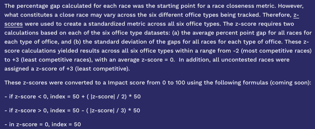
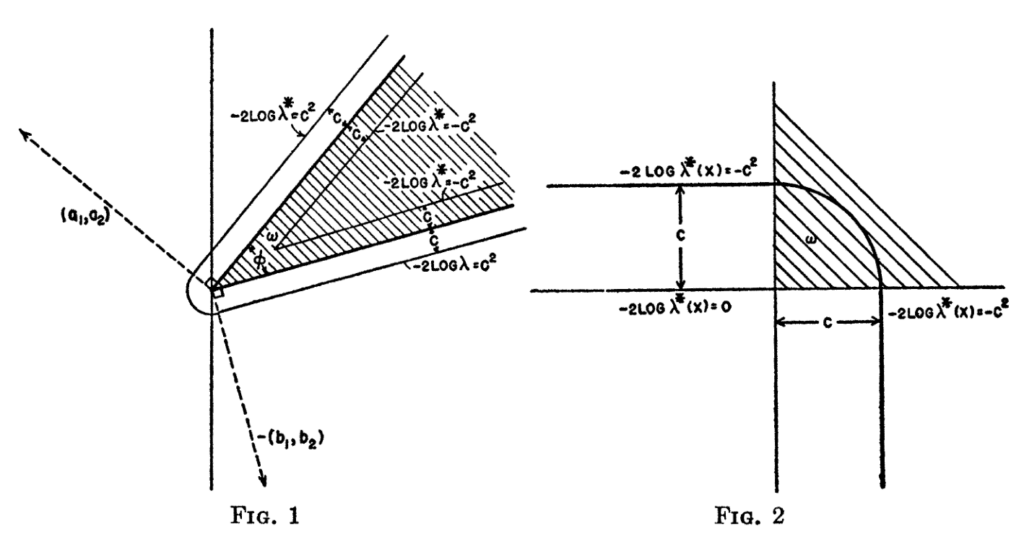
What else can I tell you about Chernoff? I think his most important contribution was his 1954 paper on the distribution of the likelihood ratio, from which the above images are drawn. I thought a lot about these pictures when working with a positivity-constrained model in my Ph.D. thesis:
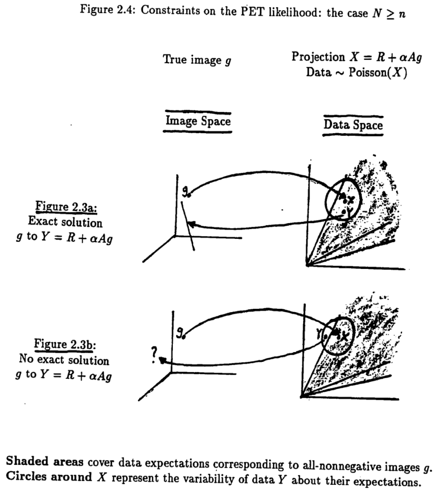
Related ideas motivated my work on posterior predictive checking, and this remains an area with challenging open questions.

What else? Somebody heard that, when he was a professor at Stanford, Chernoff had been known as “the Ax” because he was so harsh. But by the time he got to Harvard, he was in his sixties and had mellowed. Indeed, he was a nice guy, also a good person to talk to about statistical ideas. He would come to the statistics seminar every week–we would all attend all of them, we had a cohesive intellectual community in that small department. He’d sit in the front row, often he’d fall asleep in the middle, but then he’d invariably wake up at the end and ask a good question. It was cool to have someone around who could offer a thoughtful understanding of just about anything.

A couple decades after that, when I was considering a job at Harvard, Chernoff suggested we buy his house in Brookline–I guess that he and Judy were ready to move to some sort of assisted-care place. That would’ve been kinda cool to have that lineage. When Shaw-Hwa was at Columbia, he lived in what used to be Diana Trilling’s apartment. I guess that means it was Lionel Trilling’s apartment too, but to me Diana is the more interesting writer. Lionel’s always seemed like a sort of Reinhold Niebuhr figure: someone who was written about with a lot of respect in his time but whose writings now seem empty. Like Diana but not Lionel or Reinhold (in my opinion), Chernoff’s writings from the 1950s remain readable and interesting today. Also a banger is 1972 monograph of sequential analysis and optimal design. You wouldn’t go for it to find up-to-date methods, but read it from beginning to end and you’ll get a lot of clean insights.
Reviews of our Bayesian Workflow book from Bin Yu, David Spiegelhalter, Brad Efron, Christian Robert, Rohan Alexander, and Mine Doğucu!

Roughly speaking, Bayesian Workflow is to Bayesian Data Analysis in 2026 what Bayesian Data Analysis was to earlier Bayesian books in 1995: it builds upon everything that came before.

With Bayesian Data Analysis, the big steps forward were:

  • Going beyond Bayesian inference to also consider Bayesian model building (as a researcher, you construct the model, it isn’t just given to you as in a textbook), model checking (breaking through the absolutely horrible attitude, common to Bayesians in the early 1990s, that the model was “subjective” and thus should not be checked), and model improvement (continuous model expansion, not the misguided idea of assigning posterior probabilities).
  • Going beyond simple conjugate models. BDA had lots of hierarchical models, also lots of computational tools so that you could fit the models you want by putting them together from understandable components. And I like how we had a clear separation between modeling and computing. The model comes first, then you figure out how to compute it. Or you set up a model that works within your computational constraints.
  • A Bayesian approach to sampling and causal inference. This was Rubin’s framework in which unobserved units in the population and unobserved causal outcomes are treated as missing data and are part of a joint probability model. We worked this out in chapter 7 of BDA (which became chapter 8 in the third edition of the book).
  • Lots of live examples. Not just “real-data examples,” but problems we’d directly worked on. This motivated us and I think it gave our readers a sense of how Bayesian methods worked not just in theory but in applied problems.
  • A pragmatic view of probability as a measurable quantity. That’s right there in chapter 1. Bayesian methods are not the product of a philosophical stance; they’re a way to connect models and data using probability.

I could go on and on, but for that I can refer you to the Bayesian Data Analysis book.

And these are the key innovations of Bayesian Workflow:

  • Going beyond Bayesian data analysis (model building, inference, model checking, and model expansion) to consider the larger process of statistical modeling, including comparisons of multiple models fit to a single dataset.
  • A fuller use of informative priors. This is a big deal. In BDA we still had a bit of the Bayesian cringe going on. One reason we’ve moved toward stronger priors is that the replication crisis has taught us that the amount of prior information available in any given problem is often approximately the same as the information coming from an experiment (see here, for example). Informative priors also fit our increased focus on generative modeling, and we’re doing a lot more prior predictive checking to understand the implications of our models.
  • More integration between modeling, data analysis, and computing. One way to see this is that the Bayesian Workflow webpage has the code to run all our examples. We also have lots of code snippets in the text as a way of demonstrating the way in which coding is central to our statistical workflow.
  • Lots more live examples. It’s been 30 years since BDA first came out. One reason that Bayesian Workflow has 11 authors is that different collaborators worked on different examples (but the three principal authors read through the entire book, so the general approach should remain coherent).
  • Simulation-based experimentation. This is something my colleagues have been doing more and more over the years. At its most basic, simulation-based experimentation provides a best-case baseline for statistical methods: if you can’t recover your quantities of interest with sufficient accuracy under ideal conditions (when your data are simulated from the model you’re fitting), then you know you’re in trouble. And often this is the case! Beyond that, we can simulate from one model and fit another, and see what happens. Simulation experiments aren’t always so easy to construct, as they involve specifying the entire data-generation process. But we think this is effort worth expending, as it involves thinking about the problem you’re working on.

I could go on and on, but for that I can refer you to the Bayesian Workflow book.

And now for the reviews

But you don’t have to trust me on this! Just listen to some of the eminent statisticians and educators who’ve reviewed our book:

Bin Yu (University of California):

An outstanding, protocol-driven guide for Bayesian data analysis, Bayesian Workflow by Gelman, Vehtari, McElreath and co-authors delivers a practical and comprehensive framework for iterative modeling, emphasizing simulation, diagnostic checks, and rigorous empirical validation, and with a long and impressive list of case studies. By treating data analysis as a structured, verifiable workflow, it provides an indispensable toolkit for diagnosing model failures, refining priors, and building reliable data analysis systems for reproducible conclusions, useful for beginning and veteran data analysts alike.

David Spiegelhalter (Cambridge University):

This is not a typical methods textbook, but instead it guides the reader through the whole process of fitting, critiquing and adapting statistical models to real-world problems. It is full of the accumulated wisdom of skilled practitioners, teaching through demonstration rather than theory, with both basic and highly sophisticated examples. I strongly recommend this book to statisticians who really want to understand what they can learn from their data.

Brad Efron (Stanford University):

A bravura performance…Gelman, Vehtari, McElreath and friends develop in detail a practical Bayesian data analysis workflow, from acquisition to final report, including full computational guidance.

Christian Robert (University of Paris):

This original, thought-provoking, and transformative book is much much more than an implementation manual for Bayesian Data Analysis, even though it shares almost the same perspective. (The first sentence of the book states that the authors’ “conceptions of statistical practice, and of Bayesian statistics, have changed over the years”.) By providing a modus vivendi for undertaking Bayesian modelling from scratch in realistic settings where models are not magicked out of the blue, the authors explicit and rationalise the many steps required by such a bottom-up modelling protocol (“not a checklist, not a cookbook”, and not a flowchart!) in real situations. The contents read very well and very smoothly, with a seamless conjunction of intuition, modelling advices, computational details, and comparison tools. While unsurprisingly Bayesian, the perspective adopted therein remains both open and inclusive, with a welcome humility about the limitations and challenges of Bayesian workflows. This book should thus appeal to and profit a wide variety of readers, as providing guidance through an extensive collection of highly detailed examples, with shared code and exercises.

Rohan Alexander (University of Toronto):

Some statistics books show you how to beat an egg, others are recipe books: if this, then that style. This book teaches you how to cook. Written by authors who established so much of how we do Bayesian statistics, this new book is an indispensable guide for analyzing data in a trustworthy way. It walks you through the actual steps involved in building models to explore and understand datasets. Part 4 is particularly excellent – the authors provide many end-to-end case studies that will be useful for both practitioners and students. It highlights the value of their workflow-based approach. Filled with chatty asides, the book introduces the Bayesian workflow to a broad audience. It embraces the frustrations and complexities of actually doing Bayesian statistics and provides specific guidance throughout. Each chapter contains exercises and it could be the basis of an upper-year undergraduate course, or a first-year grad course, in applied statistics. It will be used for many years to come.

Mine Doğucu (Harvard University):

What makes Bayesian Workflow so exceptional is how it seamlessly pairs profound ideas about modeling with the adoption of modern computational practice. By centering the messy, iterative process of modeling through real-world case studies, the authors reject rigid cookbooks and checklists in favor of building deep situational awareness. Because the ideas are so clearly articulated and deeply applied, this book serves as an invaluable pedagogical resource. With its practical exercises, individual chapters or the text as a whole can easily be integrated into upper-level undergraduate or graduate courses, while also remaining accessible for self-guided readers. It is an indispensable read for anyone with foundational knowledge in Bayesian methods, regardless of whether they are applied practitioners, software developers, or methodologists.

You might also be interested in the journal issue on statistical workflow that we recently edited for the Philosophical Transactions of the Royal Society.

Again, here’s Bayesian Workflow on Amazon, here’s the publisher’s website, and here’s our website with data, code, and lots more.

Enjoy.

A ranked-choice election in Maine: Using voting data to understand preferences

Evan Rosenman writes:

The implosion of Graham Platner’s Senate campaign in Maine has upended a marquee Senate race, leaving the state Democratic party just a few weeks to choose a substitute nominee. A planned nominating convention on July 25th has drawn considerable candidate interest. But the mathematical properties of ranked choice voting add a strange wrinkle to these deliberations.

The Maine Democratic Gubernatorial Primary

Three of the top contenders to replace Platner are former gubernatorial candidates: Nirav Shah, former director of the Maine Center for Disease Control and Prevention; Troy Jackson, former Maine State Senate president; and Shenna Bellows, Maine’s secretary of state. All three ran for the Democratic nomination for Governor, losing the primary to Hannah Pingree, former speaker of the Maine State House.

June’s primary results are given below. (Data from Wikipedia.) Maine uses ranked choice voting (RCV) in primaries and federal elections, so voters could rank up to six choices for Governor. Using the instant runoff algorithm, candidates were sequentially dropped based on who had the fewest first-choice votes, and ballots were reallocated to each voter’s next-ranked choice. Jackson, Shah, Bellows, and Pingree were highly competitive, each receiving between 20% and 27% of first-choice votes. Of the four, Bellows was eliminated first, then Jackson. Shah fell to Pingree in the final tabulation round.

Candidate Round 1 Round 2 Round 3 Round 4
Pingree 50,552 (23%) 55,360 (26%) 75,671 (36%) 111,750 (56%)
Shah 58,606 (27%) 62,860 (30%) 72,681 (35%) 86,950 (44%)
Jackson 45,959 (21%) 47,597 (22%) 60,010 (29%) Eliminated
Bellows 44,770 (21%) 47,049 (22%) Eliminated
King III 17,860 (8%) Eliminated
Exhausted ballots 4,881 (2%) 9,385 (4%) 19,047 (9%)
Continuing ballots 217,747 212,866 208,362 198,700

These results have taken on extra significance as the state party seeks democratic buy-in for the selection of a substitute Senate nominee. Media outlets, for example, have routinely referred to Shah as the “runner-up” in the Governor primary. But analyses of the individual ballots cast in the primary reveal a surprising mathematical fact: though she was eliminated before them, Bellows would have defeated either Shah  or Jackson in one-on-one elections.

Mathematical Details

This unintuitive fact is a generalization of a well-known feature of ranked choice voting elections: it does not satisfy the Condorcet winner criterion.

First, some definitions. Suppose we have an election with a set of candidates C:

  • A “Condorcet winner” is a candidate in C who would defeat all the other candidates in a head-to-head election. A Condorcet winner need not exist for any given C; think of rock-paper-scissors, where each option wins against one alternative and loses against the other. But Condorcet winners exist in many standard election settings.
  • The Condorcet criterion is a feature of electoral methods: a method satisfies the criterion if it always selects a Condorcet winner when one exists.

Standard plurality elections – in which voters make one selection, and whomever gets the most votes wins – do not obey the Condorcet criterion. This is well-understood due to the “spoiler effect.” For example, a Libertarian candidate may attract voters who would otherwise prefer a Republican to a Democrat, siphoning enough voters such that a Democrat obtains the most votes.

Because voters express richer preferences in RCV elections, the method is considered better at identifying Condorcet winners. But it can easily be shown that RCV also does not satisfy the Condorcet criterion. This is not purely hypothetical. In a 2022 U.S. House special election in Alaska, Democrat Mary Peltola was elected against two Republican opponents: Sarah Palin and Nick Begich III. An analysis of the underlying ballot data revealed that Begich was a Condorcet winner. But he was eliminated in the first round because he received slightly fewer first-choice votes than Palin, allowing Palin to advance and lose to Peltola.

As RCV does not obey the Condorcet criterion, it stands to reason that the order of elimination need not correspond to who would win head-to-head elections. This is indeed true. A candidate eliminated in an earlier round may well have defeated one eliminated in a later round in a head-to-head election.

Results in Maine

We can understand the electorate’s preferences in Maine because the state releases its cast vote record: the anonymized set of rankings for every ballot cast. These data are available online and have also been analyzed extensively by the election advocacy group FairVote.

To assess how two candidates A and B would fare in a head-to-head election, we look at the set of ballots that rank at least one of them. Any ballot in which A appears before B, or A is ranked and B is not, represents a voter who prefers A to B; any ballot in which B appears before A, or B is ranked and A is not, represents a voter who prefers B to A.

In the table below, we summarize all the head-to-head matchups among the top four candidates. Note that if the final column is positive, then A defeats B; if it is negative, B defeats A.

Candidate A Candidate B % of Ballots
Listing Neither
% Who Prefer A % Who Prefer B A vs. B Margin
Bellows Pingree 14% 41% 44% –3%
Bellows Jackson 19% 48% 33% 15%
Bellows Shah 12% 45% 43% 3%
Shah Pingree 10% 39% 50% –11%
Shah Jackson 13% 50% 37% 12%
Jackson Pingree 14% 33% 52% –19%

Pingree wins all three of her matchups, indicating she was indeed the Condorcet winner. But notably, Bellows wins every matchup except the one against Pingree. She was preferred to Jackson on 48% of ballots while he was preferred on 33%, with the remaining ballots listing neither candidate. Bellows had a narrower margin against Shah, but she was preferred on 45% of ballots to his 43%.

These results reflect the strengths and pitfalls of RCV. Because voters’ ranked choices are recorded, we can better assess the electorate’s head-to-head preferences among many candidates. But elimination orders under instant runoff needn’t reflect these preferences. In closely contested elections like the Maine Democratic gubernatorial primary, this can yield unintuitive results – with big implications for the next big question: whom to choose as a substitute Senate nominee.

Following up on Rosenman’s analysis, I have a few points to raise:

  1. Why should I care who would win in a head-to-head race? I’m not trying to ask this in an aggressive way; it’s just not clear to me why this should be the question to ask, or why we should care about a Condorcet winner. Another way to say this is that intensity of preference could matter too.
  2. A related issue is that there are lots of people who could potentially be qualified to be the senator from Maine–after all, a senator doesn’t really have to do much, their staff does all the work, right? Just ask Senator Grassley from Iowa! My point here is not to trivialize the election–people live or die based on who is elected to Congress–just that the steps of choosing a candidate involve a winnowing from many many possible choices. The Condorcet winner criterion and other similar rules apply only after drastically limiting the number of options.  From that perspective, I’d be more inclined to rate candidates based on a summing of pluses and minuses for various attributes, rather than head-to-head comparisons. I get that the general election is a head-to-head race so you need to think about such things, but from a political theory perspective, or from a which candidate-to-choose perspective, I see this Condorcet thing as a blind alley.
  3. Who you’d want to run for governor isn’t necessarily the same as who you’d want to run for senator.  I say this for two reasons.  First, they’re different jobs:  what it takes to run the executive branch of a state is different than what it takes to be a member of the national legislature.  Second, the main goal of a political party is to win the election, and it could take different things to win in the two races in Maine this year.  I don’t know how important this is, as I have no sense of politics in that state. I’m just raising the issue.

Survey Statistics: quantifying uncertainty in ranked choice voting polls

We’ve talked about uncertainty in polls (see Margin of Error, Total Margin of Error, Total Margin of Error II) and we’ve talked about ranked data (see exploded logit !). A new paper, Rosenman & Liang 2026, looks at uncertainty in ranked choice voting (RCV) polls.

Recall the multinomial logit model that Train (2009) Chapter 7 calls the exploded logit:

P[ranking Other then Left then Right] = exp(f_Other) / sum_c’ exp(f_c’)   *   exp(f_Left) / (exp(f_Left) + exp(f_Right))

Without covariates, it has only 3 parameters: f_Other, f_Left, f_Right. It makes the independence from irrelevant alternatives (IIA) assumption to go from these 3 parameters to rank probabilities.

In contrast, the multinomial model in Rosenman & Liang 2026 does not make the IIA assumption and has 14 parameters, one for each of 15 possible rankings minus one so they sum to 1:

P[ranking Other then Left then Right] = pi_{Other, Left, Right}

Rosenman & Liang 2026 note that in RCV the election outcome is not expressable as one parameter. Instead, the winner is determined by instant runoff:

  1. If a candidate wins >50% of first choice votes, they win.
  2. Otherwise, the candidate with the least first choice votes is eliminated, and each ballot counts for its top remaining choice. Return to step 1.

Say you use polling data to estimate rank probabilities pi_j for each ranking j. These estimates differ from the true probabilities due to many sources of error (see our favorite Figure 2.5 from Groves et al. shown in quantity vs quality and is a mismeasured X better than none at all ?). Rosenman & Liang 2026 focus on sampling error.

How can we propagate uncertainty about the rank probabilities pi_j to uncertainty about the RCV winner ? If you have draws from the posterior of pi_j, you can do instant runoff on each to get a winner for that draw. This gives win probabilities according to your model and data.

To see the importance of uncertainty in RCV, let’s look at their 2022 Alaska House special election example. With 3 candidates, RCV is determined by 5 margins (see their Lemma 1). Most of these margins are well-identified by the data, but 2 were quite close: Palin vs Begich first choice margin and Peltola vs Palin pairwise margin. They plot these 2 margins in the right panel of Figure 1. The true outcome is the black dot, with sampling uncertainty shown as ellipses around it. For small sample sizes (the biggest ellipse), we see that a plurality of the mass falls into green, where point estimates would declare that Begich wins. Uncertainty quantification would help put this in context, giving all candidates win probabilities around 20-40%, showing the race is difficult to call with such small data.

For details, see Rosenman & Liang 2026.


“Making Statistics Work: Information Theory and Bayesian Inference”

I took a look at the above-titled book by economists Duncan Foley and Ellis Scharfenaker. It’s an interesting read, in many ways a throwback to the 1950s when a group of mathematicians brewed a heady mix of operations research, game theory, probability theory, and economics in an attempt to create a unified theory of social science, or to map the limitations of this effort. Important figures in this effort include John Maynard Keynes, John Von Neumann, Jimmie Savage, Milton Friedman, Duncan Luce, Howard Raiffa, Kenneth Arrow, Herbert Simon, Ed Jaynes, . . . a whole bunch of people who are still remembered today.

Back in the day, Bayes was seen alternately as Jesus or the Devil, and there were hopes of a grand synthesis of subjective probability and local information in markets, a connection between formal statistical inference and individual decision making.

In retrospect, the cognitive science of the 1950s wasn’t all there, and hierarchical modeling hadn’t been integrated into Bayesian inference. Also some key pieces such as posterior predictive checking and general-purpose Bayesian computing weren’t there. So any attempts at unification were premature. Not that it was a bad idea to try! Much is learned from incomplete efforts. It’s just clear in retrospect that any unified theories of the time were bound to fail.

From the perspective of seventy years later, we can see Bayesian inference as a useful part of the statistical toolkit, a way to place regularization (a central part of all modern machine learning) in the context of scientific modeling. Many problems that can be solved with an entirely Bayesian approach, and others can be viewed as approximate Bayes–or, to put it another way, Bayesian ideas can help with all sorts of statistical modeling problems, even when other inferential methods are used.

What I’m saying is, it’s a good idea for everyone doing statistics or machine learning to understand the basics of Bayesian inference and computation, prior and predictive checking, and Bayesian model expansion, for their own sake and also as a way to make sense of statistical learning.

“Making Statistics Work: Information Theory and Bayesian Inference” is one of the most unusual statistics books I’ve ever read. I don’t agree with much of it–for example, right on the second page they start talking about “prior beliefs,” which isn’t how I think of things at all (see here and here)–and it’s written in a mathematical style which seems old-fashioned to me but has a kind of charm. You could almost say that it’s the statistics book that William Feller would’ve written had he been converted to Bayesianism.

What I really like is that the book is what it is–an forthright attempt at a modern expression of the aimed 1950s synthesis of mathematical statistics, physics, and economics. It clocks in at a crisp 300 pages. It has zero overlap with Bayesian Data Analysis and Bayesian Workflow, and that’s just fine. As I said, I don’t really buy their synthesis myself, but I respect their attempt. You can judge it as you will.

It’s all about the nonlinearity: An interesting statistical example of flaws in a voter impact index

The following came in the email the other day:

I’m reaching out to introduce the Voter Impact Index, a new data tool from PowerMoves that assigns every U.S. zip code a voter impact score based on the recent competitiveness of six federal and state elections tied to that location.

The Index may be useful in your teaching or research in a few concrete ways:

— Classroom discussions on political geography, voter mobilization, and the relationship between where people live and how much their votes matter
— Research applications exploring electoral competitiveness, voter sorting, and the civic behavior of movers (we estimate 15 million registered voters relocate annually)
— Student projects analyzing zip-code-level electoral data across districts

The underlying data, code, and methodology are fully open and accessible via GitHub through our website at PowerMoves.Vote — making it straightforward to build on or replicate.

PowerMoves is a nonpartisan project. The Index draws from trusted nonpartisan sources and assigns scores regardless of party affiliation.

I was curious so I looked up my own zip code, and here’s what came up:

A “medium” voter impact of 44/100. Are you kidding? Yes, you can get lower impact scores (just try typing in 02139), but something close to the midpoint on a 0-100 scale doesn’t sound right to me. We almost never have close elections. New York is not a swing state, and even our local elections are never close.

OK, the 2022 governor’s election in NY was pretty close, I’ll grant them that, and the 1994 race was even closer, as were 1982 and 1978 . . . but that’s going back pretty far, and they’re only weighting the governor races at 15% (go here and scroll to the bottom), so I was puzzled as to how voters in our district can be judged to an impact of 44 on a 0-100 scale. Even if you count the governor’s election as close (and it wasn’t that close), that would still only you to 18.

If you read through that document carefully, you can figure out what’s going on:

OK, there’s this weird bit about dividing by 2 or 3, but that’s not the key issue. The big problem, I think, is linearity. For example, in the 2024 presidential race, Kamala Harris won the two-party in New York by a 13-point margin. Not close at all! Really not close, considering that, had the state election been close, there’s no way that New York’s electoral votes would’ve been decisive. My voter impact for this election was approximately zero (see some calculations here, albeit from an earlier year). If you want to get technical about it, the probability my vote is decisive is something like 1/100 of the probability that a swing state’s voter will be decisive.

So if the “presidential election” contribution to this index is 100 for Wisconsin, Michigan, and Pennsylvania, and something like 50 in a state like North Carolina or Georgia, then it should be approximately 1 in New York. Or maybe 0.1. Or maybe 2. In any case, some tiny number. Even the governor’s race, which Hochul won by 6 percentage points . . . ok, that’s close, but, again, there are closer races for governor. I went online and looked it up, and there were a couple races decided by less than 1 percentage point of the vote. If those tossups count as a voter impact as 100, then maybe the New York race would be a 50? or maybe something less than that?

So if you add all up all these voter impact score and weight them, you might get something like a 10 for my district, if you’re being generous. Not 44.

It’s an interesting example. At first, doing this linear scaling could seem to make sense. But not if your goal is to measure voter impact.

To put it another way, their measure is underestimating the value of voting in a swing state or a swing district. The linear mapping smooths out the signal.

P.S. I replied to the above email to share my concern with the creators of this index. We had a cordial email exchange but ultimately they didn’t seem convinced by my argument and so they left the index as it is. Too bad. But, hey, they’re doing the work, it’s their call: if they want to categorize my zip code as having “median” voter impact . . . well, it’s a free country!

“Archaeology can’t give social scientists population or GDP, but here are some things we can measure that might be useful for social science.”

Apropos of our recent discussion on the estimation of historical population sizes, Sean Manning writes:

Some archaeologists have measured house sizes for Gini-coefficient-style studies aside from studying human remains to measure nutrition and rates of illness. I think that was what Michael E. Smith meant when he talked about hypothetical data: “archaeology can’t give social scientists population or GDP, but here are some things we can measure that might be useful for social science.”

I asked Manning where the quote came from, and he replied:

I think I got the idea from this response by Smith to a published paper:

This model of inequality in the Aztec Empire is not based on empirical data. While there is nothing wrong with hypothetical models per se, the paper is phrased as if it presents empirical findings. … There are simply not enough data available to do the kind of analysis presented in this paper. The tweaking of data and methods do not produce results that satisfy me as being reasonable estimates of the level of inequality in the Aztec Empire. Perhaps this is just an epistemological difference between our approaches to science and knowledge. Economists might look at this paper as a fine analysis, whereas archaeologists and historians will probably look at it as a study based on hypothetical data, and therefore divorced from the Aztec reality that we study.

Smith has a book that talks about the archaeology of inequality in Aztec Mexico: Timothy A. Kohler and Michael E. Smith, editors, Ten Thousand Years of Inequality: The Archaeology of Wealth Differences (University of Arizona Press, 2019).

Often in social science there is tension between what we can measure and what we would like to know.

“More bad science from JAMA”

In an abstract entitled, “Statistical dust and sweeping claims about maternal warmth,” John Richters and Everett Waters write:

Alley and colleagues draw on mediation analyses of longitudinal data from Millennium Cohort Study to argue that their findings “highlight the critically important role that childhood maternal warmth plays in shaping mental and physical health into late adolescence” (p. 716), and “suggest public health interventions aimed at increasing maternal warmth “may be particularly effective in positively impacting adolescent health” (p. 714).

Although the article is dense with tabularized information about key study variables, readers will search in vain for evidence to justify the authors’ conclusions and recommendations related to maternal warmth. What they will find instead are minuscule direct and mediated path coefficients (betas) linking maternal warmth to adolescent outcomes that amount to uninterpretable and unactionable statistical dust. The authors tell us as much in their seductively (if unintentionally) misleading statement that “Social safety at 14 years of age mediated 20% to 100% of the effect of early maternal warmth on physical health, psychological distress, and psychiatric problems at 17 years of age (b = 0.01-0.15; P < .001 for all)” (p. 709). A more straightforward, precise, and informative description of this finding is that social safety at age 14 mediated 20% of maternal warmth’s .01 effect on physical health, 60% of its .01 effect on psychiatric problems, and 100% of its .15 effect on psychological distress at age 17, for a total indirect effect of maternal warmth on subsequent outcome measures of less than 1%. The interpretability of these findings is further compromised by the extreme distributional skew of the 3-item social safety schema latent variable, with the vast majority of adolescents reporting that they had family and friends who helped them feel safe, secure, and happy (86%), someone they could turn to with problems (79%), and someone to whom they felt close (89%). The maternal warmth and harsh parenting measures are also marked by extreme distributional skew, with trained observers reporting that 86% of the mothers exhibited all 5 maternal warmth behaviors and 91% exhibited no harsh parenting behavior during naturalistic play with their children.

The authors do themselves and the readership of JAMA Psychiatry a great disservice by slipping through the normative scientific membrane and conflating statistical with theoretical and practical significance. This is an especially troubling breach within the context of contemporary concerns and public skepticism about the reliability and credibility of social and behavioral sciences research.

References

1. Alley J, Tsomokos DI, Mengelkoch S, Slavich GM. Childhood maternal warmth, social safety schemas, and adolescent mental and physical health. JAMA Psychiatry.
2025;82(7):709-717. doi:10.1001/jamapsychiatry.2025.0815

2. Bogdan PC. One decade into the replication crisis, how have psychological results changed? Adv Methods Pract Psychol Sci. 2025;8(2):25152459251323480.
doi:10.1177/25152459251323480

3. Murray EJ, Swanson SA. Causal inference in observational psychiatry: What do we need to know? JAMA Psychiatry. 2023;80(6):539-540.
doi:10.1001/jamapsychiatry.2023.0343

4. Richters JE. Incredible utility: The lost causes and causal debris of psychological science. Basic Appl Soc Psychol. 2021;43(6):366-405.
doi:10.1080/01973533.2021.1994229

Ahhhh, JAMA!

P.S. JAMA’s not all bad. My colleagues and I recently published a short paper there! Just about all journals are a mix of good and bad.

18 Associate Editors resign from Statistics and Computing editorial board: Problems with commercial scholarly publishing, and what does this all mean?

I was cc-ed on a message sent by 18 members of the board of the journal Statistics and Computing, quitting their posts because the publisher (Springer) has announced a new policy whereby all authors will have to pay publication charges. The soon-to-be-former associate editors write, “Statistics and Computing will no longer publish the best science, both due to financial exclusion of those researchers who cannot afford to pay, and those community-minded researchers who refuse to pay on principle.”

I’ll put the full message, with its 18 signatories, below the fold.

My reaction to all this is that it would be great if the journal could move to an open and free system such as is done by the Journal of Machine Learning Research–a journal that I believe was founded by people who had resigned from the editorial board of a commercial journal.

Even commercial journals that begin with good intentions can develop fatal problems. For example, check out the sad story of the Berkeley Electronic Press, a set of commercial journals that was founded by a friend of mine. My friend’s an economist, and I guess he might say that it was the iron logic of capitalism that reduced a once-noble endeavor to a rent-seeking enterprise.

So, yeah, I’d recommend that Statistics and Computing follow the path of JMLR, really try to imitate its structure as closely as possible. Bayesian Analysis is another free journal that appears to run with minimal overhead.

It kind of bugs me, though. Profit-making companies have done great things in publishing and communication. A quick glance at our shelves reveals lots of wonderful books, almost all of which were published privately. As were Bayesian Data Analysis, Regression and Other Stories, Active Statistics, and the rest of my books. Lots of great movies are made for money too.

On the other hand, Arxiv is nonprofit, as is lots of the web, on which I post all my published and unpublished papers. Wikipedia is nonprofit, and this blog is written using WordPress, which appears to be another nonprofit organization. I teach at Columbia University, which is private but nonprofit, not run perfectly by any means but still going strong.

Scholarly publishing is a funny industry because it’s my vague impression that it started out as a low-budget noncommercial enterprise, and then some private rent-seekers moved in. I guess these companies were doing something special or they wouldn’t have been so successful at taking over, but now it seems to have gone too far. More sites like Arxiv, JMLR, and Bayesian Analysis would be a good thing. Right now we’re always having to figure out where to publish our papers; it’s just an absolute mess. These journal submission websites make the Department of Motor Vehicles office look like a lean machine by comparison.

P.S. Retraction Watch ran a story on this, where they quoted Robin Ryder as saying, “If the editors regroup elsewhere to form a new journal, they hope to publish with a society, Ryder told us, citing journals like Journal of the Royal Statistical Society and Annals of Statistics, ‘none of which force authors to pay APCs.'”

I think it would be a mistake for them to follow the Journal of the Royal Statistical Society and Annals of Statistics. Both these journals have arduous paperwork-laden submission processes and both charge for access.

If you’re going to start over, why not follow the model of JMLR and Bayesian Analysis and make it all free? Cut out the middleman entirely!

Continue reading

“A medical journal says the case reports it has published for 25 years are, in fact, fiction”

Retraction Watch reports:

A Canadian journal has issued corrections on 138 case reports it published over the last 25 years to add a disclaimer: The cases described are fictional.

Paediatrics & Child Health, the journal of the Canadian Paediatric Society, has published the cases since 2000 in articles for a series for its Canadian Paediatric Surveillance Program. The articles usually start with a case description followed by “learning points” that include statistics, clinical observations and data from CPSP. The peer-reviewed articles don’t state anywhere the cases described are fictional.

Wha???

Here’s how it came out:

The corrections come following a January article in New Yorker magazine that mentioned one of the reports — “Baby boy blue,” a case published in 2010 describing an infant who showed signs of opioid exposure via breast milk while his mother was taking acetaminophen with codeine. The New Yorker article made public an admission by one of the coauthors that the case was made up. . . .

The move came as a surprise to David Juurlink, professor of medicine and pediatrics at the University of Toronto, who has spent over a decade looking into the claim that infants can receive a meaningful or even lethal dose of opioids via breast milk when their mothers take acetaminophen with codeine. The first such case, published in the Lancet in 2006 by pharmacologist Gideon Koren, was the centerpiece of the New Yorker article. . . .

The Baby boy blue case is “the only such case study, aside from the Lancet case report and the two now-retracted descriptions of the same case in Canadian Family Physician and Canadian Pharmacists Journal,” Juurlink said. “It is the most compelling published description of neonatal opioid toxicity from breastfeeding. And it is wrong.”

And here’s some background:

While the instructions for authors for Paediatrics & Child Health has at times indicated the case reports are fictional, that disclosure has never appeared on the journal articles themselves. . . .

The versions on PubMed Central also do not bear any indication the case reports are fictional.

The surveillance highlights “are intended for paediatric health care providers or physicians in training, and include learning points that briefly translate and disseminate knowledge about the disease or condition,” Elizabeth Moreau, a spokesperson for the Canadian Paediatric Society, told us by email.

To protect confidentiality

The article continues:

The journal decided when it first started publishing the article type “that the cases should be fictional to protect patient confidentiality,” Robinson [editor-in-chief of Paediatrics & Child Health] told us. “Apart from the case that led to the recent New Yorker article, all or almost all were cases of very well recognized conditions (such as congenital syphilis, fetal alcohol syndrome, serious trauma from ATVs, hepatitis C infection) where a single case report would not generate any interest or ever be cited.”

But:

Neither the instructions for authors from 2010 — when Koren and his coauthor Michael Rieder would have written their article — nor the linked list of article types — state the cases are fictionalized, or fictional. A set of instructions dated 2015, and linked from the journal’s author guidelines, indicate the “clinical vignette” should “describe a fictional case.” . . .

In the case of Baby boy blue, “the article was structured as an authentic clinical case, indexed as such, and cited as an actual clinical observation. Readers had no way of knowing it was fictional,” [Juurlink] said. “A narrative that is fictional but published in the format of a genuine case report, without disclosure at the time of publication, is functionally indistinguishable from fabrication in the scientific record.”

I agree with Juurlink on this one. But I also want to make another point, something that Thomas Basbøll and I wrote about in another context.

Setting aside the moral questions involved in presenting fiction as if were fact, and setting aside the specific calamities that arose from the false and, it seems, medically implausible “Baby boy blue” story, I think there’s a bigger problem with these fabricated case studies–even if they are labeled as fictional.

The problem is that, if you make up a case study, you can make it fit your story. A real case study is constrained by reality–and that’s a good thing.

I think it’s a bad idea for the journal to use made-up stories. By using made-up stories, you’re losing a crucial opportunity to learn from clinical judgment.

If you want to change names or circumstances to preserve anonymity, fine. You can still be constrained by what happened in the real case. Making it up from scratch, though, that’s no good. It’s the equivalent of plotting the fitted model without showing any of the data.

Is fabricating data worse than fabricating results? Is failing to correct a known false report more or less serious than making the false report in the first place?

Andy King writes:

I have a question for you–and, if you think it worthwhile, for your readers.

A few weeks ago, I was deposed by Harvard’s lawyers in the lawsuit between Francesca Gino and Harvard. Much of the questioning focused on my replications of research by Harvard Business School professor George Serafeim and my allegations of research misconduct against him and his coauthors.

That experience has led to a lively online debate about two questions:
1. Is fabricating data worse than fabricating results?
2. Is failing to correct a known false report more or less serious than making the false report in the first place?

At the moment, my own thinking is this:
1. Both fabricating data and fabricating results mislead readers. They are simply different paths to the same outcome and thus similarly serious.
2. Failing to correct a false report–once the authors know it is false and material–may actually be more serious. It suggests a conscious decision to leave readers with a claim the authors know to be unsupported.

Your ladder of responses to criticism also seems relevant here, especially categories 6 and 7.

Interesting. This has come up in the past, discussing the moral culpability of researchers who make errors and then avoid acknowledging them. For example this guy at the London School of Economics and Political Science, or this guy at the University of Chicago, or, of course, this guy at the University of California. I don’t think that the first two of those people did any direct research misconduct, but they made major research errors that they never acknowledged–they keep pointing to their discredited work without any note of the problems–and, yeah, that seems like misconduct to me.

Here’s another story for ya. Years ago I had a colleague who showed me a paper he’d just written. It read the paper and realized it had a fatal flaw–not a calculation error, but a misapplication or misunderstanding of a statistical model. I won’t go into the details here; what’s relevant to the story right now is that the paper in question had been accepted by the journal but it had not yet been scheduled for publication. This was before the era of online anything, so the paper really was still in process. I told me colleague he was lucky: he could withdraw the paper and spare himself embarrassment. (The error in the analysis was central to the result in the paper; if you got rid of the error, there was nothing to salvage, so it’s not like he could just send in a corrected version.) To my dismay, my colleague replied, No, the paper is accepted, I don’t want to lose a publication. I asked, Doesn’t it bother you to have them publish something that’s wrong?, and he replied something about the literature being self-correcting. I don’t remember the details of this conversation from decades ago, but I do remember the horrible feeling. I thought about contacting the journal to tell them not to publish, but I figured that ultimately it was their problem for accepting it.

Survey Statistics: toy example for energy balancing weights

Last week we talked about The Big Changes Coming to the Times/Siena Poll:

  1. New weighting variable: support score = E(2024 vote | other X variables).
  2. New weighting method: energy balancing (Huling & Mak, 2024)

Ben Schneider helpfully blogged about energy balancing as well:

Raking and similar calibration methods are based on balancing means or totals for specific variables…The energy balancing method does something different: it calibrates based on an entire multivariate distribution, as measured by an empirical cumulative distribution function (ECDF).

Jared Huling (of Huling & Mak, 2024) helpfully answered questions in the comments. I’m still puzzling over how energy balancing handles empty cells (unsampled regions of the joint covariate space). I need a toy example.

Consider 2 binary variables, so 4 population cells, with known population shares:

       k=0    k=1    total
j=0    .4     .2     .6
j=1    .2     .2     .4
total  .6     .4

Say the sample is missing folks in cell 11:

       k=0    k=1    total
j=0    .5     .3     .8
j=1    .2     0      .2
total  .7     .3

Consider 4 methods:

1. Classical Poststratification: not defined because of division by 0.

2. Raking: match only the margins. Correct when Y | X1, X2 is additive.

       k=0    k=1    total
j=0    .2     .4     .6
j=1    .4     0      .4
total  .6     .4

3. Energy balancing: minimize the Energy-Distance(F_w, F_pop) between the weighted sample distribution of X1, X2 and the population distribution. Correct when Y | X1, X2 is such that nearby cells have similar means.

Say X1 = young/old, X2 = man/woman, Y = percent Democrats, and no old women are sampled.

Raking is correct when additivity holds: old women = young women + (old men − young men)

Energy balancing is correct approximately when: old women = (old men + young women)/2 ?

library(WeightIt)

pop  <- data.frame(X1 = rep(c(0, 0, 1, 1), c(40, 20, 20, 20)),
                   X2 = rep(c(0, 1, 0, 1), c(40, 20, 20, 20)))

samp <- data.frame(X1 = rep(c(0, 0, 1), c(50, 30, 20)),
                   X2 = rep(c(0, 1, 0), c(50, 30, 20)))

dat <- rbind(cbind(pop,  A = 1),
             cbind(samp, A = 0))

W <- weightit(A ~ X1 + X2, data = dat, method = "energy",
              estimand = "ATT", focal = "1",
              dist.mat = as.matrix(dist(dat[, c("X1", "X2")])))

w <- W$weights[dat$A == 0]
tapply(w, interaction(samp$X1, samp$X2), sum) / sum(w)
       k=0    k=1    total
j=0    .381   .309   .69
j=1    .309   0      .309
total  .69    .309

4. MRP: fit a model for Y | X1, X2. The interaction term’s posterior equals its prior, propagating uncertainty around additivity.

Am I understanding this correctly ?

Claude builds 3D Hamiltonian Monte Carlo animation in one shot with anaglyphs

This post is from Bob

The sausage

So as not to bury the lead (or “lede” if you want a mid-20th-century newspaper vibe), check out the this 3D HMC animation generator.

It can render regular animations or produce anaglyph 3D encoding (red/blue). Unless you have 3D glasses, unclick the “Anaglyph 3D” checkbox at the bottom of the upper left corner control box.

The app let you zoom in and rotate the visualization with obvious controls (explanation in the footer of the visualization). The app also lets you adjust the amount of correlation in the 3D normal distribution as well as step size, number of steps, and animation speed. Looking the long way down a highly correlated “cigar” shape is dramatic.

The 3D effect with glasses is strongest when you rotate the visualization (it’s the usual intuitive controls with instructions at the bottom of the web page) and zoom in a bit. I find that using low 3D depth looks the best. Don’t get your hopes up too much. This isn’t Dr. Strange creating buildings in 3D in a Marvel movie.

If you want to pop it up in an independent browser so you can go to full screen, here’s a link.

How the sausage was made

I continue to be amazed at the progress of the frontier LLMs. The demo above was the result of handing Claude Opus 4.8 (“hard” thinking mode) the following single prompt with no build up. As with the Galileo inclined plane case study I posted, which Opus one-shotted, I was expecting some back and forth and false starts.

I want to generate a 3D animation for red/blue glasses of the Hamiltonian Monte Carlo algorithm. There is a nice online visualizatuion by Chi Feng here, but it is not 3D https://chi-feng.github.io/mcmc-demo/app.html I just want the main animation—no need to calculate marginals, etc.

To start, we can use a 3D highly correlated (0.9) normal target with unit variance aligned at one end of the cigar (e.g., near (2, 2, 2) looking toward (-2, 2, 2), which will have things zoom over your shoulder and come back).

If you can generate it so that it’ll run in a web browser with controls on step size and number of steps that’d be great, but if not, choose a step size conservatively so it won’t be rejecting very often. I want it to continue multiple iterations in order to see the effect of random momentum on the trajectories. Leave balls behind wherever the sampler actually samples. When it rejects, make the ball bigger. The trajectory should be thick enough to be visible.

If it’s easier to have Python generate an animation that’s also fine. I just want to be able to render it on my desktop to show people during a talk. I just ordered 50 pairs of cardboard red/blue 3D glasses to hand out.

I was wrong. It did it in one shot. After about 10 minutes of cranking away, it produced what you are looking at. The output is a self-contained (i.e., encapsulated) HTML file of 627KB. There are some things I’d change in an iteration (smaller pipes, fewer of them lying around), but I think it’s worth sharing the output of such a simple prompt. Perhaps needless to say, a follow up prompt gave me the HTML I needed to embed the result in this page as an iframe.

I wrote all 692 words of the blog post myself (other than the html embedding), but I’m sure Claude could have done that, too. The LLMs have fewer rhetorical tics when writing technical and scientific material. But it wouldn’t have sounded like me.

Statistical visualization in the mid 2020s?

I wonder what Andrew’s statistics visualization class would look like in 2026 with LLM-powered visualizations this easy to make. Now that the LLMs can reliably one-shot something this complex, I’m finally starting to worry about the future of programmers. Undergraduate enrollments in CS are very volatile and already going back down as they did after the dot com bubble burst. There was huge growth (a factor of two to three) from after the mortgage market bubble burst around 2007 until it started to decline again due to AI.

A message for Carol Tavris

Dear Dr. Tavris:

I saw in a recent issue of the Times Literary Supplement that you have been critical of the “chambermaid” study which purported to show that people were losing weight without changing their diet or exercise. I agree that this study did not show what it claimed.

Along these lines, you might be interested in two articles I recently published with Nicholas Brown:
How statistical challenges and misreadings of the literature combineto produce unreplicable science: An example from psychology
This is the reason for external replication

Also I looked you up and saw that you were a scholar of feminism, so you might be interested in my post from a few years ago, How feminism has made me a better scientist. Any thoughts on that would be much appreciated.

I was not able to find your email online–for some reason, it’s often hard to find email contacts for people without current university affiliations–so I’m posting this here on the hope that someone who has your contact information can forward it to you.

Yours,

Andrew Gelman
Professor, Department of Statistics
Professor, Department of Political Science
Columbia University, New York

P.S. I blogged the above because I couldn’t find Tavris’s email. But then someone found her email for me. So I emailed her directly. I’ll keep the post up because it could be of interest to others!

P.P.S. The TLS took down Tavris’s review at her request. But it seems to be reprinted here with slight revision.

Turning chaotic sensitivity from a bug into a feature: Using physical modeling and deep learning to alter the paths of storms and mitigate extreme weather events

Qin Huang, Moyan Liu, and Upmanu Lall write:

Extreme weather events, e.g., droughts, floods, heatwaves, and freezes, are increasing in frequency and intensity, posing severe socio-economic impacts as growing populations heighten exposure to risks that conventional infrastructure cannot fully address. We propose supplementing disaster management with Weather Jiu-Jitsu: a strategy that exploits the chaotic sensitivity of mid-latitude atmospheric dynamics to redirect destructive weather trajectories through small, precisely timed perturbations guided by Finite-Time Lyapunov Exponent (FTLE) diagnostics and deep learning forecast models.

They continue:

Proof-of-concept experiments using the Aurora deep-learning Earth system model show that FTLE-guided nudges applied days before peak impact can shift a hurricane track to avoid landfall on a major city, weaken the peak intensity of a blocking-driven cold extreme, and reduce atmospheric river moisture transport under favorable upstream conditions. Control inputs remain below 2% of total system energy in idealized models, though real-world implementation will require advances in monitoring, attribution, and international governance.

There are some cool ideas here. The big ideas are:

1. Small interventions early on can shift the later progression of a storm, and

2. Chaotic unpredictability can be reduced using high-tech machine learning models.

Both these two things are necessary. The first step is needed to allow this to be done with reasonable cost; the second step is needed to give it a good chance of working.

The other cool thing involves cloud seeding. As I understand it, a big hope of the 1950s was idea of seeding clouds to get rain when you want it–but it didn’t really work, because you can’t get it to rain when the water isn’t there. (I’m sure I’m butchering the science here; sorry!) But this new plan is different because you’d be seeding the clouds over the ocean, and the point is not to get it to rain right there but rather to slightly shift where the rain falls.

I can also anticipate political challenges. For example, suppose a storm is headed toward a major city, but if it were diverted it would destroy a resort frequented by rich and powerful people. This is on top of the existing moral hazard by which owners of property near the water expect to be bailed out after natural disasters.

Here are the research papers backing up the idea:

Targeted adaptive chaos control of regimes and eddy strength in two Lorenz models, by Moyan Liu, Qin Huanga, and Upmanu Lall, Chaos, Solitons and Fractals (2026).

Regime identification and control of extremes in the nonautonomous Lorenz model with chaos and intransitivity, by Moyan Liu, Qin Huanga, and Upmanu Lall, Physical Review E (2026).

Upmanu is a water engineer with big ideas. A bunch of years ago he floated the plan to expand Manhattan’s west side by a few hundred meters by taking the silt that is continuously being dredged from the Hudson River and depositing it on the shore as landfill. That never happened but it still seems like a good idea to me. It’s kind of crazy how they’ll spend billions on a single bridge or remodeled train station or whatever but whiff on the big infrastructure projects.

The NIH wants to “Measure and Reward Scientific Impact and Replicable Research Practices.” Here’s my recommendation to the NIH director: you can start by no longer suppressing government reports whose conclusions happen to not be in accord with your ideological preferences.

This came in the email from the U.S. National Institutes of Health:

How Would You Measure and Reward Scientific Impact and Replicable Research Practices?

As NIH continues efforts to strengthen rigor, reproducibility, and public trust in science, we are seeking input from the research community on an important question: Are we measuring and rewarding the activities that matter most for advancing biomedical discovery? NIH wants to hear your perspectives on how scientific impact and rigorous research should be measured and rewarded (NOT-OD-26-087). Comments will be accepted electronically here through our Request for Information (RFI) by August 19, 2026.

My first step would be for the government to stop suppressing its own research. A visible example of this was a report from the Centers for Disease Control and Prevention that appears to have been un-published at the direct orders of the NIH director.

So, yeah, one way to “reward scientific impact and replicable research practices” is to let your own damn employees publish their work.

Beyond that, we have lots of ideas, some of which Erik, Witold, and I discuss in our recent paper, A statistical case for qualified scientific optimism.

P.S. I’m posting this right away, skipping the usual 6-month lag, because the NIH is looking for replies during the next two months.

2015-vintage replication-crisis-era junk science floats into the news

So, I came across this news article titled, “Riley Thinks Suits Make the Coach. Research Says He Might Be Right.”:

The suit had a classic name: the Clark Gable. Navy blue and cut just right, it was the creation of Giorgio Armani, the legendary Italian designer.

It was the piece that made Pat Riley, the legendary NBA coach and executive, believe in the power of style. . . .

“I think an audience wants to see somebody on the sidelines who looks like a leader, dresses like a leader, acts like a leader,” Riley said.

It sounded like a bold claim. Sure, a business suit is undoubtedly nicer than the casual “athleisure” look — team-issue polos and pullovers — that NBA coaches adopted during the COVID-19 pandemic. But can a coat and tie really make someone more of a leader?

“It’s a perfectly reasonable thing to think,” said Abe Rutchick, a professor of psychology at California State University, Northridge. “Which is the idea that the clothes we wear have psychological meaning. We put something on, it’s not just clothes. It means something.”

Uh oh, social psychology research . . .

The article continues:

In the early 2010s, during the rise of casual attire, Rutchick and his colleagues examined a similar question and found something intriguing: Wearing formal attire might actually make a person think and act like a leader.

The researchers, using a variety of cognitive tasks, found that wearing formal clothes caused participants to shift from a concrete mode of thinking to a more abstract mindset — they thought of the big picture and looked further into the future. In other words, they thought like someone who was in charge. . . .

The paper, published in 2015, came a few years after another group of researchers found that people who wore a doctor’s white lab coat — and understood its symbolic meaning — had an increased ability to focus and pay attention. . . .

This sounds pretty bad, no joke. The early 2010s were the high-water mark of junk social psychology. This sort of study was one of the main reasons that the replication crisis became a crisis.

I thought journalists had wised up on this sort of thing, but I guess it remains afloat in the business-inspirational world of leadership.

Don’t get me wrong–I have no problem with these “leadership” stories. It’s cool to read about Pat Riley, and I have no reason to doubt that suit-wearing worked well for him. Everyone has to develop their own personal style. My problem is just with the purported scientific claims.

I found the journal article and, yeah, it’s classic replication crisis fodder:

Study 1: N = 60, p = .03
Study 2: “conceptual replication,” N = 60, p = .05 with 18 people excluded because of missing data
Study 3: N = 34, p = .02
Study 4: N = 54, p = .03 after some data were excluded
Study 5: N = 150, a mix of significant and non-significant results, conclusions made based on whether various inferences reached a significance threshold.

This is pretty much textbook bad statistical analysis of the replication-crisis variety:
– Small sample sizes and noisy data so that there’s essentially no power to detect realistic effect sizes (the kangaroo problem);
– Many researcher degrees of freedom in data exclusion, coding, and analysis, the sort of flexibility that makes it possible to achieve statistically significant p-values even in the absence of any signal;
– A bunch of p-values all in the 0.01 to 0.05 range, which is not what you’d expect from a sampling model of independent experiments (or see here);
– Flexible theories that could explain results through many sorts of interactions (the piranha problem);
– No preregistered replications.

That’s just how they did things back in 2015 so I’m not trying to single out these particular researchers. We know better now. We know not to trust this sort of claims. We don’t need to find a Wansink- or Ariely-style smoking gun; nobody’s suggesting there’s fraud here; it’s just standard-issue junk science of the sort that, until recently, was regularly published in major psychology journals and was regularly featured uncritically in major news media.

The only notable thing to me is to see this sort of claim being pushed in the New York Times now, because I had the vague impression that journalists were now aware of the replication crisis. But I guess there’s still a reservoir of credulity for such claims for stories related to the fuzzy topic of business leadership. I’d hope that straight-up sports reporting would have higher standards for the reporting of research on human performance.

P.S. This is an appropriate post for July 4th now that junk science is ensconced in the U.S. government.

A new episode in the Francesca Gino case

Andy King writes:

𝗪𝗵𝘆 𝗛𝗮𝗿𝘃𝗮𝗿𝗱’𝘀 𝗹𝗮𝘄𝘆𝗲𝗿𝘀 𝘀𝘂𝗯𝗽𝗼𝗲𝗻𝗮𝗲𝗱 𝗺𝗲 𝗶𝗻 𝘁𝗵𝗲 𝗙𝗿𝗮𝗻𝗰𝗲𝘀𝗰𝗮 𝗚𝗶𝗻𝗼 𝗰𝗮𝘀𝗲

My wife called to me. A constable was at the door.

He handed me a subpoena to appear for a deposition in the case of Francesca Gino v. President and Fellows of Harvard College and Srikant Datar.

The subpoena puzzled us. I don’t believe I’ve ever met Francesca Gino, and I am certainly not an expert on her case. Why not call me or email me with any questions?

As directed, I arrived at the offices of Ropes & Gray, Harvard’s white-shoe law firm. I was seated in a conference room with a commanding view of Boston. Thick binders sat on the table. Video cameras were pointed at me, and a microphone clipped to my collar.

One of Harvard’s lawyers opened a binder and began the deposition. She asked about my career, publications, emails, opinions, and LinkedIn posts. Each item was examined, reviewed, noted, and filed away. Page by page. Hour by hour.

The reason for the subpoena became clear.

Harvard’s lawyers asked pointed questions about my allegations of research misconduct against HBS professor 𝗚𝗲𝗼𝗿𝗴𝗲 𝗦𝗲𝗿𝗮𝗳𝗲𝗶𝗺—and they seemed interested in how those allegations compared with the ones against Francesca Gino.

A lawyer later explained the logic. In a case like this, one side may try to show that similar situations have been treated differently.

Here, both Harvard Business School professors have been accused of research misconduct. Yet only Gino lost her tenure and her position at Harvard.

Why?

At the time of my deposition, I had not given that question much thought. But nothing focuses the mind like a deposition.

So, over the next few posts I will consider:

• Do the complaints satisfy Harvard’s standards for research misconduct?
• Is there evidence of a pattern?
• Are the allegations similarly serious?
• And any other questions that emerge.

We discussed King’s encounter with the work of George Serafeim in these two posts:

This paper in Management Science has been cited more than 6,000 times. Wall Street executives, top government officials, and even a former U.S. Vice President have all referenced it. It’s fatally flawed, and the scholarly community refuses to do anything about it.

False claims in a widely-cited paper. No corrections. No consequences. Welcome to the Business School.

I have no reason to think that Harvard is worse than other institutions. They just get all the publicity. When bad things happen at the University of Nevada or the University of California, you only hear about it on this blog. When it happens at Harvard or Stanford, the news goes around the world.

I also want to know: How does this subpoena thing work? Can the lawyers hold you against your will? Do they pay you for your time? The only time I’ve ever been deposed, it was for a consulting project and I was being paid. The questions were really stupid and they went on for hours, but it didn’t bother me because I could just keep my mind focused on the check.

P.S. See here for some background on the Gino case.

P.P.S. Commenter K points to further information here.

The high cost of split R-hat

This post is by Bob.

I’ve been thinking a lot lately about R-hat given that I’m using it for online converging monitoring in our new Walnuts implementation. In that setting, where I use Welford accumulators to update R-hat estimates every iteration, I can’t use split R-hat without way too much buffering. So I’ve been thinking about the effect of splitting, too, and whether we need it. I asked Andrew and he said Kenny Shirley once produced an example where split R-hat diagnosed non-convergence that regular R-hat didn’t, but that example is lost to time and we’ve never seen this kind of behavior with NUTS as far as I know (please give us an example in the comments or via email to Andrew if you have).

Relating R-hat and ESS

My intuition was that we could set a low enough R-hat threshold that it would ensure a high enough effective sample size (ESS) when we crossed it. The relation’s a little tighter than I thought, with

    Rhat^2 ≈ 1 + M / ESS,

where M is the number of chains and ESS is the effective sample size of all chains combined. There’s a multivariate proof in Vats and Knudson, 2021, Revisitng the Gelman-Rubin diagnostic, Statistical Science, page 2 and section 5 for details, but it’s pretty straightforward to get the intuition when you reduce R-hat^2 to (N-1)/N + var(chain-means) / man(chain-variances) as Charles Margossian did in his nested R-hat paper. Vats and Knudson disapprove of Andrew and Aki’s suggested threshold of 1.1 from BDA3, because it is satisfied with a combined ESS of 20 across Andrew’s default 4 chains.

Being me, I tried to validate my intuition with simulations rather than linear algebra. Also, I like to see that things work in practice that theory entails to make sure I’ve understood all the assumptions baked into the theory (one can’t prove anything without assumptions!). When asked to code a simulation using ArviZ, Claude inserted a (2 * M) in the numerator in place of the M. Where did that come from, I asked? It told me it needed the factor of 2 because ArviZ uses split Rhat. D’oh! Of course it does, because we’ve doubled M without increasing ESS.

A worked example

Suppose we have 4 chains with a combined ESS of 400. Then sqrt(1 + 4/400) ≈ 1.005 and sqrt(1 + (2 * 4) / 400) ≈ 1.01. We’ve effectively doubled the number after the 1 by splitting. Unlike Vats and Knudson, I usually don’t need an ESS >> 100, so the 400 required for split R-hat < 1.01 is perhaps a bit too conservative for my tastes. On the other hand, we face a practical problem estimating ESS reliably with fewer than 50 or so ESS per chain. Estimation is challenging because it relies on autocorrelation estimates from the chains themselves, which become much noisier when based on shorter chains. (Side question: Do we not combine autocorrelation estimates across chains to reduce standard error because some chains might not be mixing?) Also, we know this algebra wasn't a coincidence of 4 chains and 400 draws. The Taylor expansion of sqrt(1 + x) is the convergent sequence

    sqrt(1 + x) = 1 + x/2 - x^2 / 8 + x^3 / 16 + ...

When x < 0.1, the first-order approximation, sqrt(1 + x) = 1 + x / 2, is good.

The bottom line for practitioners

We need around twice as many draws to get below a fixed threshold with split R-hat than with the original R-hat.

Guess who’s getting the big-money donations in the Maine U.S. Senate race?

Just in time for July 4th, Tom Ferguson, Paul Jorgensen, Matthias Lalisse, and Jie Chen share the above graph and write:

What can one Senate race reveal about the hidden machinery of American politics? In Maine, donor patterns expose how campaign finance can shape party competition, political narratives, and the choices voters are asked to make long before ballots are counted. . . .

Platner is strongly supported by Senator Bernie Sanders and other progressives, while many establishment Democrats dislike him. Major media keep printing articles questioning his character. By contrast, Collins’ somewhat contradictory legislative history attracts less coverage. . . .

Our tabulations of the race show that Collins is much closer to a typical Republican pattern (or, to be fair, those of the Old Guard Democratic leaders [Nancy Pelosi and Chuck Schumer, along with Paul Ryan and Mitch McConnell]) in a key respect: the size profile of her donors. . . .

The Republican Senator from Maine is hugely dependent on very large donors. By contrast, Platner strikingly resembles Sanders: he attracts essentially no big money. Recently the numbers of billionaires supporting the candidates has emerged as an issue. A very few have supported Platner with small sums. Almost a hundred (counting spouses) have made contributions of varying sizes to Collins. The overall configuration is as shown [above] and is perfectly obvious.

They also report:

If you put aside contributions that are below the $200 threshold for disclosure, the percentage of money received from Maine donors differs sharply between the candidates. Senate elections have been nationalized for a long time. Contributions from Maine itself make up approximately 20% of all money for Platner; by contrast, Collins’ rate is slightly under 3%. (Not a misprint.) Her biggest contributors include a Who’s Who of prominent financiers in private equity and hedge funds, including Steve Schwarzman of BlackRock, Ken Griffin of Citadel, along with other well known Republican donors, including Larry Ellison of Oracle.

And they give an example of how this works:

A day after a Super Pac backing her received a $2 million dollar contribution from a private equity magnate who, according to press reports, stood to gain munificently from President Trump’s One Big Beautiful Bill, [Collins] provided a crucial vote to spring the bill out of committee. Then she loudly voted against it on the floor.

Another way of looking at this is to ask, why a person living outside of Maine give $100,000+ to Susan Collins? Roughly speaking, the following conditions are needed:
1. The donor has to be rich enough to be able to spare $100,000 as loose change.
2. It has to be legally possible to give this amount of money, or the perceived consequences of violating the law have to be minimal.
3. The donor has to consider Republican Party control of the U.S. Senate has to be important enough to be worth spending $100,000 to make a small change in the probability of this happening.
4. It has to be easy to write the check; that is, the donor does not need to get the agreement of many other people to release the money.
5. Any negative political, social, and economic consequences of revealing oneself to be a strong partisan have to be mild, compared to the perceived benefits of making the donation.

And in recent years these five conditions have increasingly been present:
1. There are more and more super-rich people who can spend $100,000 without blinking an eye.
2. The Supreme Court keeps liberalizing campaign finance laws, also the government has become much more encouraging and tolerant of corruption. On the rare occasions where people are prosecuted, they get off, and even on the rare occasions are imprisoned for corruption, they get pardoned.
3. With political polarization, the two parties are further apart than ever, and party-line voting in Congress has become the norm.
4. The money is being given by individuals, or by companies controlled by single individuals. It’s not like the old days, where, if General Motors made a campaign contribution, they’d need the coordination of some board of directors.
5. This last one is the most interesting. A flip side of partisan polarization is that, if you give a lot of money to the Republicans, it will piss off a lot of Democrats, and vice versa. Political independents might not be so happy either. One way out is that it’s becoming easier and easier to skirt the regulations and campaign in secret. Beyond this, I guess these donors have decided that the Republican business sphere is large enough that they can afford to alienate Democrats and independents. And Black Rock, Citadel, and Oracle are not primarily customer-facing businesses.