Bad stuff going down in biostat-land: Declaring null effect just cos p-value is more than 0.05, assuming proportional hazards where it makes no sense

Wesley Tansey writes:

This is no doubt something we both can agree is a sad and wrongheaded use of statistics, namely incredible reliance on null hypothesis significance testing. Here’s an example:

Phase III trial. Failed because their primary endpoint had a p-value of 0.053 instead of 0.05. Here’s the important actual outcome data though:

For the primary efficacy endpoint, INV-PFS, there was no significant difference in PFS between arms, with 243 (84%) of events having occurred (stratified HR, 0.77; 95% CI: 0.59, 1.00; P = 0.053; Fig. 2a and Table 2). The median PFS was 4.5 months (95% CI: 3.9, 5.6) for the atezolizumab arm and 4.3 months (95% CI: 4.2, 5.5) for the chemotherapy arm. The PFS rate was 24% (95% CI: 17, 31) in the atezolizumab arm versus 7% (95% CI: 2, 11; descriptive P < 0.0001) in the chemotherapy arm at 12 months and 14% (95% CI: 7, 21) versus 1% (95% CI: 0, 4; descriptive P = 0.0006), respectively, at 18 months (Fig. 2a). As the INV-PFS did not cross the 0.05 significance boundary, secondary endpoints were not formally tested.

The odds of atezolizumab being better than chemo are clearly high. Yet this entire article is being written as the treatment failing simply because the p-value was 0.003 too high.

He adds:

And these confidence intervals are based on proportional hazards assumptions. But this is an immunotherapy trial where we have good evidence that these trials violate the PH assumption. Basically, you get toxicity early on with immunotherapy, but patients that survive that have a much better outcome down the road. Same story here; see figure below. Early on the immunotherapy patients are doing a little worse than the chemo patients but the long-term survival is much better.

As usual, our recommended solution for the first problem is to acknowledge uncertainty and our recommended solution for the second problem is to expand the model, at the very least by adding an interaction.

Regarding acknowledging uncertainty: Yes, at some point decisions need to be made about choosing treatments for individual patients and making general clinical recommendations—but it’s a mistake to “prematurely collapse the wave function” here. This is a research paper on the effectiveness of the treatment, not a decision-making effort. Keep the uncertainty there; you’re not doing us any favors by acting as if you have certainty when you don’t.

Problems with a CDC report: Challenges of comparing estimates from different surveys. Also a problem with rounding error.

A few months ago we reported on an article from the Columbia Journalism Review that made a mistake by comparing numbers from two different sources.

The CJR article said, “Before the 2016 election, most Americans trusted the traditional media and the trend was positive, according to the Edelman Trust Barometer. . . . Today, the US media has the lowest credibility—26 percent—among forty-six nations, according to a 2022 study by the Reuters Institute for the Study of Journalism.” That sentence makes it look like there was a drop of at least 25 percentage points (from “most Americans” to “26 percent”) in trust in the media over a six-year period. Actually, though, as noticed by sociologist David Weakliem, the “most Americans” number from 2016 came from one survey and the “26%” from 2022 came from a different survey asking an entirely different question. When comparing comparable surveys, the drop in trust was about 5 percentage points.

This comes up a lot: when you compare data from different sources and you’re not careful, you can get really wrong answers. Indeed, this can even arise if you compare data from what seem to be the same source—consider these widely differing World Bank estimates of Russia’s GDP per capita.

It happened to the CDC

Another example came up recently, this time from the Centers for Disease Control and Prevention. The story is well told in this news article by Glenn Kessler. It started out with a news release from the CDC stating, “More than 1 in 10 [teenage girls] (14%) had ever been forced to have sex — up 27% since 2019 and the first increase since the CDC began monitoring this measure.” But, Kessler continues:

A CDC spokesman acknowledged that the rate of growth highlighted in the news release — 27 percent — was the result of rounding . . . The CDC’s public presentation reported that in 2019, 11 percent of teenage girls said that sometime in their life, they had been forced into sex. By 2021, the number had grown to 14 percent. . . . the more precise figures were 11.4 percent in 2019 and 13.5 percent in 2021. That represents an 18.4 percent increase — lower than the initial figure, 27 percent.

Rounding can be tricky. It seems reasonable to round 11.4% to 11% and 13.5% to 14%—indeed, that’s how I would report the numbers myself, as in a survey you’d never realistically have the precision to estimate a percentage to an accuracy of less than a percentage point. Even if the sample is huge (which it isn’t in this case), the underlying variability of the personal-recall measurement is such that reporting fractional percentage points would be inappropriate precision.

But, yeah, if you’re gonna compare the two numbers, you should compute the ratio based on the unrounded numbers, then round at the end.

This then logically brings us to the next step, which is that this “18.4% increase” can’t be taken so seriously either. It’s not that an 18.4% increase is correct and that a 27% increase is wrong: both are consistent with the data, along with lots of other possibilities.

The survey data as reported do show an increase (although there are questions about that too; see below), but the estimates from these surveys are just that—estimates. The proportion in 2019 could be a bit different than 11.4% and the proportion in 2021 could be a bit different than 13.5%. Even just considering sampling error alone, these data might be consistent with an increase of 5% from one year to the next, or 40%. (I didn’t do any formal calculations to get those numbers; this is just a rough sense of the range you might get, and I’m assuming the difference from one year to the other is “statistically significant,” so that the confidence interval for the change between the two surveys would exclude zero.)

There’s also nonsampling error, which gets back to the point that these are two different surveys, sure, conducted by the same organization but there will still be differences in nonresponse. Kessler discusses this too, linking to a blog by David Stein who looking into this issue. Given that the surveys are only two years apart, it does seem likely that any large increases in the rate could be explained by sampling and data-collection issues rather than representing large underlying changes. But I have not looked into all this in detail.

Show the time series, please!

The above sort of difficulty happens all the time when looking at changes in surveys. In general I recommend plotting the time series of estimates rather than just picking two years and making big claims from that. From the CDC page, “YRBSS Overview”:

What is the Youth Risk Behavior Surveillance System (YRBSS)?

The YRBSS was developed in 1990 to monitor health behaviors that contribute markedly to the leading causes of death, disability, and social problems among youth and adults in the United States. These behaviors, often established during childhood and early adolescence, include

– Behaviors that contribute to unintentional injuries and violence.
– Sexual behaviors related to unintended pregnancy and sexually transmitted infections, including HIV infection.
– Alcohol and other drug use.
– Tobacco use.
– Unhealthy dietary behaviors.
– Inadequate physical activity.

In addition, the YRBSS monitors the prevalence of obesity and asthma and other health-related behaviors plus sexual identity and sex of sexual contacts.

From 1991 through 2019, the YRBSS has collected data from more than 4.9 million high school students in more than 2,100 separate surveys.

So, setting aside everything else discussed above, I’d recommend showing time series plots from 1991 to the present and discussing recent changes in that context, rather than presenting a ratio of two numbers, whether that be 18% or 27% or whatever.

Plotting the time series doesn’t remove any concerns about data quality; it’s just an appropriate general way to look at the data that gets us less tangled in statistical significance and noisy comparisons.

Don’t trust people selling their methods: The importance of external validation. (Sepsis edition)

This one’s not about Gladwell; it’s about sepsis.

John Williams points to this article, “The Epic Sepsis Model Falls Short—The Importance of External Validation,” by Anand Habib, Anthony Lin, and Richard Grant, who report that a proprietary model used to predict sepsis in hospital patients doesn’t work very well.

That’s to be expected, I guess. But it’s worth the reminder, given all the prediction tools out there that people are selling.

Should drug companies be required to release data right away, not holding data secret until after regulatory approval?

Dale Lehman writes:

The attached article from the latest NEJM issue (study and appendix) caught my attention – particularly Table 1 which shows the randomized vaccine and control groups. The groups looked too similar compared with what I am used to seeing in RCTs. Table S4 provides various medical conditions in the two groups, and this looks a bit more like what I’d expect. However, I was still a bit disturbed, sort of like seeing the pattern HTHTHTHTHT in 10 flips of a coin. So, there is a potential substantive issue here – but more importantly a policy issue which I will get to shortly.

The Potential Substantive Issue

I have no reason to believe the study or data analysis was done poorly. Indeed, the vaccine appears to be quite effective, and my initial suspicions about the randomization seem less salient to me now. But, just to investigate it further, I looked at the confidence intervals and coverage if the assignment had been purely random. Out of 35 comparisons between the control and vaccine groups (some demographic and some medical – I made no adjustment for the fact that these comparisons are not independent), 17% fell outside of a 95% confidence interval and 40% outside of a 68% (one standard deviation) confidence interval. This did not reinforce my suspicions, as the large sample size made the similarities between the 2 groups less striking than I initially thought.

So, as a comparison, I looked at another recent RCT in the NEJM (“Comparative Effectiveness of Aspirin Dosing in Cardiovascular Disease, NEJM, May 27, 2021). Doing the same comparisons of the difference between the control and treatment groups in relation to the confidence intervals, 36% of the comparisons fell outside of a 95% confidence interval and 68% outside of the 68% confidence interval. This is closer to what I normally see – it is difficult to match control and treatment groups through random assignment, which is why I always try to do a multivariate analysis (and, I believe, why you always are asking for multilevel studies).

So, this particular vaccine study seems to have matched the 2 groups closer than the second study, but my initial suspicions were not heightened by my analysis. So, what I wanted to see was some cross tabulations to see if the two groups similarities continued at a more granular level. Which brings me to the more important policy issue.

Policy Issue

The data sharing arrangement here stated that the deidentified data would be made available upon publication. The instructions were to access it through the Yale Open Data Access Project site. This study was not listed there, but there is a provision to apply for access to data from studies not listed. So, I went back to the Johnson & Johnson data sharing policy to make sure I could request access – but that link was broken. So, I wrote to the first author of the study. He responded that the link was indeed broken, and

“However, our policy on data sharing is also provided there on the portal and data are made available AFTER full regulatory approval. So apologies for that misstatement in the article we are working to correct this with NEJM. For trials not listed, researchers are welcome to submit an inquiry and provide additional information for consideration by the YODA Project.”

I requested clarification regarding what “full regulatory approval” meant and the response was “specifically it means licensure in the US and EU.”

I completely understand Johnson & Johnson’s concern about releasing data prior to regulatory approval. Doing otherwise would seem like a poor business decision – and potentially one that would stand in the way of promoting public health. However, my concern is with the New England Journal of Medicine, and their role in this process. Making data available only after regulatory approval seems to offer little opportunity for post-publication (let alone, pre-publication) review that has much relevance. And, we know what happened with the Surgisphere episode earlier this year, so I would think that the Journal might have a heightened concern about data availability.

I don’t think the issue of availability of RCT data prior to regulatory approval is a simple one. There are certainly legitimate concerns on all sides of this issue. But I’d be interested if you want to weigh in on this. Somehow, the idea that a drug company seeking regulatory approval will only release the data after obtaining that approval – and using esteemed journals in this way – just feels bad to me. Surely there must be better arrangements? I have also attached the Johnson & Johnson official policy statement regarding data sharing and publication. It sounds good – and even involves the use of the Yale Open Data Access Project (an Ivy League institution, after all) – but it does specify that data availability follows regulatory approval.

I agree that it seems like a good idea to require data availability. I’m not so worried about confidentiality or whatever. At least, if I happened to have been in the study, I wouldn’t care if others had access to an anonymized dataset including my treatment and disease status, mixed with data on other patients. I’m much more concerned the other way, about problems with the research not being detected because there are no outside eyes on the data, along with incentives to do things wrong because the data are hidden and there’s a big motivation to get drug approval.

Count the living or the dead?

Martin Modrák writes:

Anders Huitfeldt et al. recently published a cool preprint that follows up on some quite old work and discusses when we should report/focus on ratio of odds for a death/event and when we should focus on ratios of survival/non-event odds.

The preprint is accompanied by a site providing a short description of the main ideas:

The key bit:

When an intervention reduces the risk of an outcome, the effect should be summarized using the standard risk ratio (which “counts the dead”, i.e. considers the relative probability of the outcome event), whereas when the intervention increases risk, the effect should instead be summarized using the survival ratio (which “counts the living”, i.e. considers the relative probability of the complement of the outcome event).

I took a look and was confused. I was not understanding the article so I went to the example on pages 15-16, and I don’t get that either. They’re saying there was an estimate of relative risk of 3.2, and they’re saying the relative risk for this patient should be 1.00027. Those numbers are so different! Does this really make sense. I get that the 3.2 is a multiplicative model and the 1.00027 is from an additive model, but they’re still so different.

There’s also the theoretical concern that you won’t always know ahead of time (or even after you see the data) if the treatment increases or decreases risk, and it seems strange to have these three different models floating around.

In response to my questions, Martin elaborated:

A motivating use case is in transferring effect estimates from a study to new patients/population: A study finds that a drug (while overall beneficial) has some adverse effects – let’s say that it in the control group 1% patients had thrombotic event (blood clot) and in the treatment group it was 2%. Now we are considering to give the drug to a patient we believe has already elevated baseline risk of thrombosis – say 5%. What is their risk of thrombosis if they take the drug? Here, the choice of effect summary will matter:

1) The risk ratio for thrombosis from the study is 2, so we could conclude that our patient will have 10% risk.

2) The risk ratio for _not_ having a thrombosis is 0.98/0.99 = 0.989899, so we could conclude that our patient will have 95% * 0.989899 ~= 94% risk of _not_ having a thrombosis and thus 6% risk of thrombosis.

3) The odds ratio for thrombosis is ~2.02, the baseline odds of our patient is ~0.053, so the predicted odds is ~0.106 and the predicted risk for thrombosis is 9.6%.

So at least cases 1) and 2) could lead to quite different clinical recommendations.

The question is: which effect summaries (or covariate-dependent effect summaries) are most likely to be stable across populations and thus allow us to easily apply the results to a new patient. The preprint
“Shall we count the living or the dead?” by Huitfeldt et al. argues that under assumptions that plausibly at least approximately hold in many cases where we study adverse effects the risk ratio of _not_ having the outcome (i.e. “counting the living”) requires few covariates to be stable. A similar line of argument then implies that at least in some scenarios where we study direct beneficial effects of a drug, the risk ratio of the outcome (i.e. “counting the dead”) is likely to be approximately stable with few covariates. The odds ratio is then stable only when we in fact condition on all covariates that cause the outcome – in this case all other effect summaries are also stable.

The authors frame the logic in terms of a fully deterministic model where we enumerate the proportion of patients having underlying conditions that either 100% cause the effect regardless of treatment, or 100% cause the effect only in presence/absence of treatment, so the risk is fully determined by the prevalence of various types of conditions in the population.

The assumptions when risk ratio of _not_ having an outcome (“counting the living”) is stable are:

1) There are no (or very rare) conditions that cause the outcome _only_ in the absence of the treatment (in our example: the drug has no mechanism which could prevent blood clots in people already susceptible to blood clots).

2) The presence of conditions that cause the outcome irrespective of treatment is independent of presence of conditions that cause the outcome only in the presence of treatment (in our example: if a specific genetic mutation interacts with the drug to cause blood clots, the presence of the mutation is independent of unhealthy lifestyle that could cause blood clots on its own). If I understand this correctly, this can only approximately hold if the outcome is rare – if a population that has high prevalence of independent causes, it has to have less treatment-dependent causes simply because the chance of the outcome cannot be more than 100%.

3) We have good predictors for all of the conditions that cause the outcome only when combined with treatments AND that differ between study population and target population and include those predictors in our model (in our example: variables that reflect blood coagulation are likely to need to be included as the drug may push high coagulation “over the edge” and coagulation is likely to differ between populations, OTOH if a specific genetic mutation interacts with the drug, we need to include it only if the genetic background of the target population differs from the study population)

The benefit then is that if we make those assumptions, we can avoid modeling a large chunk of the causal structure of the problem – if we can model the causal structure fully, it doesn’t really matter how we summarise the effects.

The assumptions are quite strong, but the authors IMHO reasonably claim, that they may approximately hold for real use cases (and can be at least sometimes empirically tested). One case they give is vaccination:

The Pfizer Covid vaccine has been reported to be associated with risk ratio of 3.2 for Myocarditis (a quite serious problem). So for a patient with 1% baseline risk of Myocarditis (this would be quite high), if risk ratio was stable, we could conclude that the patient would have 3.2% risk after vaccination. However, the risk ratio for not having Myocarditis is 0.999973 and assuming this is stable, it results in predicting a 1.0027% risk after vaccination. The argument is that the latter is more plausible as the assumptions for stability of risk ratio of not having the event could approximately hold.

Another intuition to thinking about this is that the reasons a person may be prone to Myocarditis (e.g. history of HIV) aren’t really made worse by vaccination – the vaccination only causes Myocarditis due to very rare underlying conditions that mostly don’t manifest otherwise, so people already at risk are not affected more than people at low baseline risk.

Complementarily, risk ratio of the outcome (counting the dead) is stable when:

1) There are no (or very rare) conditions that cause the outcome only in the presence of the treatment (i.e. the treatment does not directly harm anybody w.r.t the outcome).

2) The presence of conditions that _prevent_ the outcome regardless of treatment is indepedent of presence of conditions that prevent the outcome only in the presence of treatment.

3) We have good predictors for all of the conditions that prevent the outcome only when combined with the treatment AND that differ between study population and target population and include those predictors in our model.

This could plausibly be the case for drugs where we have a good idea how they prevent the specific outcome (say an antibiotic, that prevents infection unless the pathogen has resistance). Notably those assumptions are unlikely to hold for outcomes like “all-cause mortality”, so the title of the preprint might be a bit of a misnomer.

The preprint doesn’t really consider uncertainty, but in my reading, the reasoning should apply almost identically under uncertainty.

There’s also an interesting historical outlook as the idea can be traced back to a 1958 paper by Mindel C. Sheps which was ignored, but similar reasoning was then rediscovered on a bunch of occasions. For rare outcome the logic also maps to focusing on “relative benefits and absolute harms” as is often considered good practice in medicine.

One thing I also find interesting here is the connection between data summaries and modeling. In some abstract sense, the way you decide to summarize your data is a separate question from how you will model the data and underlying phenomenon of interest. But in practice they go together: different data summaries suggest different sorts of models.

Haemoglobin blogging

Gavin Band writes:

I wondered what you (or your readers) make of this. Some points that might be of interest:

– The effect we discover is massive (OR > 10).
– The number of data points supporting that estimate is not *that* large (Figure 2).
– it can be thought of as a sort of collider effect – (human and parasite genotypes affecting disease status, which we ascertain on) – though I haven’t figured whether it’s really useful to think of it that way.
– It makes use of Stan! (Albeit only in a relatively minor way in Figure 2).

All in all it’s a pretty striking signal and I wondered what a stats audience make of this – maybe it’s all convincing, or maybe there are things we’ve overlooked or could have done better? I’d certainly be interested in any thoughts…

The linked article is called “The protective effect of sickle cell haemoglobin against severe malaria depends on parasite genotype,” and I have nothing to say about it, as I’ve always found genetics to be very intimidating! But I’ll share with all of you.

“A complete, current, and granular picture of COVID-19 epidemic in the United States”

Bob Carpenter writes:

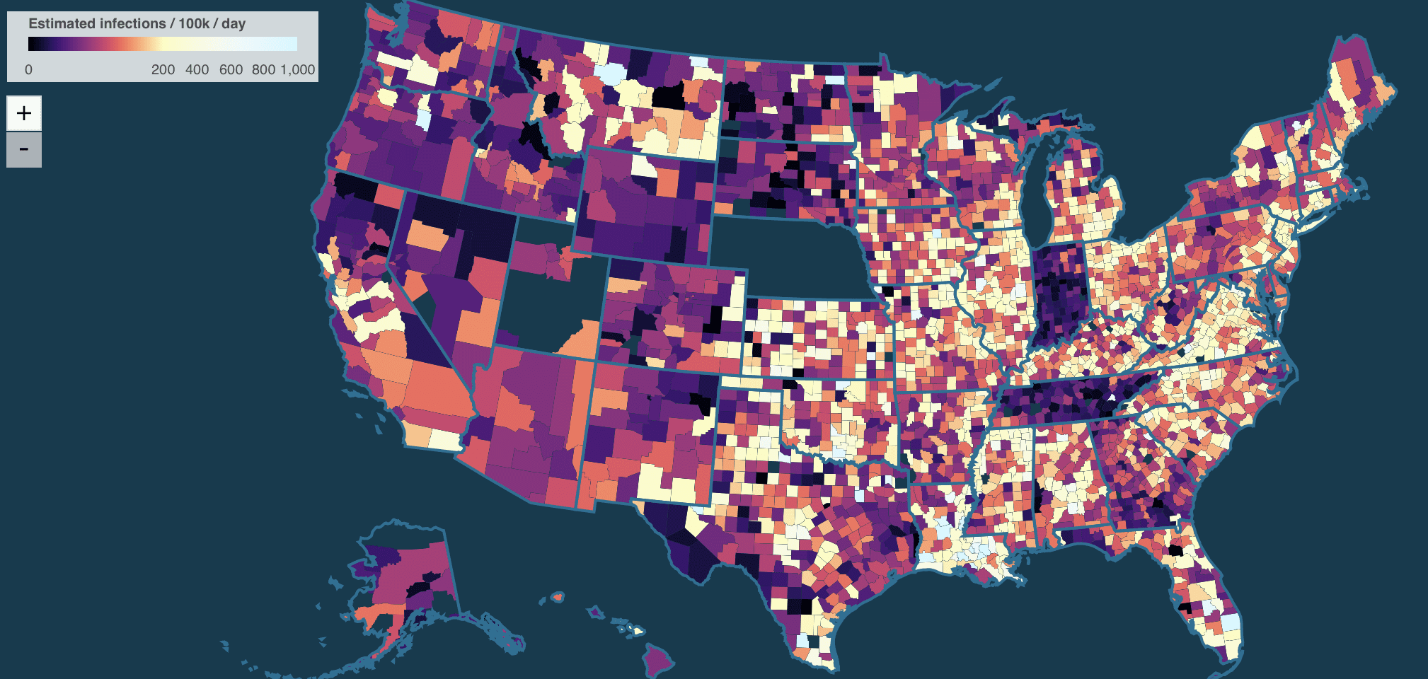
Here’s an app estimating county-level Covid for the US with the uncertainties. The methodology sounds very pragmatic in its combination of
optimization and sampling for hierarchical models.

I like it! And not just because they use Stan.

I just have a few criticisms regarding their displays:

1. I don’t like the color scheme of their map. This thing where they mix in hue changes with intensity changes is just a mess. Not as bad as the notorious rainbow color scheme but not good.

2. I wish they would not list states in alphabetical order: Alabama, Alaska, etc.

If you want a look-up table, that’s fine, but for the main display it’s better to show things that are telling the story.

3. All these graphs look kinda the same. Not identical, but similar. How bout showing the estimated national curve and then for each state showing it relative to the national average?

4. I don’t like this rate-per-100,000 thing. I get that this is standard for epidemiology, but for anyone else (including me), it’s a mess, involving lots of shifting of decimal places in my head. If you want to do the rate per X, why rate per million—this would be a bit easier to follow, no? Or go the other way and just give straight-up percentages. The y-axes for these graphs are labeled 0, 1k, 2k. That’s just 0, 1%, 2%. To me, “1%” is much more clear than “1k” with an implicit “per 100,000.”

5. The x-axes on these time series are a disaster. “12/8, 6/13, 12/22”? What’s that all about? Just give months and years, please! I don’t want to have to decode the damn axis. Baby steps here.

But these are minor comments. Overall it’s an impressive page, and great to see all the data and code there too.

“Risk without reward: The myth of wage compensation for hazardous work.” Also some thoughts of how this literature ended up to be so bad.

Peter Dorman writes:

Still interested in Viscusi and his value of statistical life after all these years? I can finally release this paper, since the launch just took place.

The article in question is called “Risk without reward: The myth of wage compensation for hazardous work,” by Peter Dorman and Les Boden, and goes as follows:

A small but dedicated group of economists, legal theorists, and political thinkers has promoted the argument that little if any labor market regulation is required to ensure the proper level of protection for occupational safety and health (OSH), because workers are fully compensated by higher wages for the risks they face on the job and that markets alone are sufficient to ensure this outcome. In this paper, we argue that such a sanguine perspective is at odds with the history of OSH regulation and the most plausible theories of how labor markets and employment relations actually function. . . .

In the English-speaking world, OSH regulation dates to the Middle Ages. Modern policy frameworks, such as the Occupational Safety and Health Act in the United States, are based on the presumption of employer responsibility, which in turn rests on the recognition that employers generally hold a preponderance of power vis-à-vis their workforce such that public intervention serves a countervailing purpose. Arrayed against this presumption, however, has been the classical liberal view that worker and employer self-interest, embodied in mutually agreed employment contracts, is a sufficient basis for setting wages and working conditions and ought not be overridden by public action—a position we dub the “freedom of contract” view. This position broadly corresponds to the Lochner-era stance of the U.S. Supreme Court and today characterizes a group of economists, led by W. Kip Viscusi, associated with the value-of-statistical-life (VSL) literature. . . .

Following Viscusi, such researchers employ regression models in which a worker’s wage, typically its natural logarithm, is a function of the worker’s demographic characteristics (age, education, experience, marital status, gender) and the risk of occupational fatality they face. Using census or similar surveys for nonrisk variables and average fatal accident rates by industry and occupation for risk, these researchers estimate the effect of the risk variable on wages, which they interpret as the money workers are willing to accept in return for a unit increase in risk. This exercise provides the basis for VSL calculations, and it is also used to argue that OSH regulation is unnecessary since workers are already compensated for differences in risk.

This methodology is highly unreliable, however, for a number of reasons . . . Given these issues, it is striking that hazardous working conditions are the only job characteristic for which there is a literature claiming to find wage compensation. . . .

This can be seen as an update of Dorman’s classic 1996 book, “Markets and Mortality: Economics, Dangerous Work, and the Value of Human Life.” It must be incredibly frustrating for Dorman to have shot down that literature so many years ago but still see it keep popping up. Kinda like how I feel about that horrible Banzhaf index or the claim that the probability of a decisive vote is 10^-92 or whatever, or those terrible regression discontinuity analyses, or . . .

Dorman adds some context:

The one inside story that may interest you is that, when the paper went out for review, every economist who looked at it said we had it backwards: the wage compensation for risk is underestimated by Viscusi and his confreres, because of missing explanatory variables on worker productivity. We have only limited information on workers’ personal attributes, they argued, so some of the wage difference between safe and dangerous jobs that should be recognized as compensatory is instead slurped up by lumping together lower- and higher-tiered employment. According to this, if we had more variables at the individual level we would find that workers get even more implicit hazard pay. Given what a stretch it is a priori to suspect that hazard pay is widespread and large—enough to motivate employers to make jobs safe on their own initiative—it’s remarkable that this is said to be the main bias.

Of course, as we point out in the paper, and as I think I had already demonstrated way back in the 90s, missing variables on the employer and industry side impose the opposite bias: wage differences are being assigned to risk that would otherwise be attributed to things like capital-labor ratios, concentration ratios (monopoly), etc. In the intervening years the evidence for these employer-level effects has only grown stronger, a major reason why antitrust is a hot topic for Biden after decades in the shadows.

Anyway, if you have time I’d be interested in your reactions. Can the value-of-statistical-life literature really be as shoddy as I think it is?

I don’t know enough about the literature to even try to answer that last question!

When I bring up the value of statistical life in class, I’ll point out that the most dangerous jobs pay very low, and high-paying jobs are usually very safe. Any regression of salary vs. risk will start with a strong negative coefficient, and the first job of any analysis will be to bring that coefficient positive. At that point, you have to decide what else to include in the model to get a coefficient that you want. Hard for me to see this working out.

This has a “workflow” or comparison-of-models angle, as the results can best be understood within a web of possible models that could be fit to the data, rather than focusing on a single fitted model, as is conventionally done in economics or statistics.

As to why the literature ended up so bad: it seems to be a perfect storm of economic/political motivations along with some standard misunderstandings about causal inference in econometrics.

Overestimated health effects of air pollution

Last year I wrote a post, “Why the New Pollution Literature is Credible” . . . but I’m still guessing that the effects are being overestimated:.

Since then, Vincent Bagilet and Léo Zabrocki-Hallak wrote an article, Why Some Acute Health Effects of Air Pollution Could Be Inflated, that begins:

Hundreds of studies show that air pollution affects health in the immediate short-run, and play a key role in setting air quality standards. Yet, estimated effect sizes vary widely across studies. Analyzing the results published in epidemiology and economics, we first find that a substantial share of estimates are likely to be inflated due publication bias and a lack of statistical power. Second, we run real data simulations to identify the design parameters causing these issues. We show that this exaggeration may be driven by the small number of exogenous shocks leveraged, by the limited strength of the instruments used or by sparse outcomes. These concerns likely extend to studies in other fields relying on comparable research designs. Our paper provides a principled workflow to evaluate and avoid the risk of exaggeration when conducting an observational study.

Their article also includes the above graph. It’s good to see this work being done and to see these type M results applied to different scientific fields.

P.S. I’m putting this in the Multilevel Modeling category because that’s what’s going on; they’re in essence partially pooling information across multiple studies, and individual researchers could do better by partially pooling within their studies, rather than selecting the biggest results.

The placebo effect as selection bias?

I sent Howard Wainer the causal quartets paper and he wrote that it reminded him of a theory he had about placebos:

I have always believed (without supporting evidence) that often a substantial amount of what is called a placebo effect is merely the result of nonresponse.

That is, there is a treatment and a control—the effect of the treatment is, say, on average positive, whereas the effect in the control condition is, on average, zero, but with a distribution around zero. Those in the control group who have a positive effect may believe they are getting the treatment and stay in the study, whereas those who feel no change or are feeling worse, are more likely to drop out. Thus when you average over just those who stay in the experiment there is a positive placebo effect.

I assume this idea is not original with me. Do you know of some source that goes into it in more detail with perhaps some supporting data?

I have no idea. I’ve always struggled to understand the placebo effect; here are some old posts:
Placebos Have Side Effects Too
The placebo effect in pharma
A potential big problem with placebo tests in econometrics: they’re subject to the “difference between significant and non-significant is not itself statistically significant” issue
Self-experimentation, placebo testing, and the great Linus Pauling conspiracy
Lady in the Mirror
Acupuncture paradox update

Anyway, there’s something about this topic that always gets me confused. So I won’t try to answer Howard’s question; I’ll just post it here as it might interest some of you.

Lancet finally publishes letters shooting down erroneous excess mortality estimates.

Ariel Karlinsky writes:

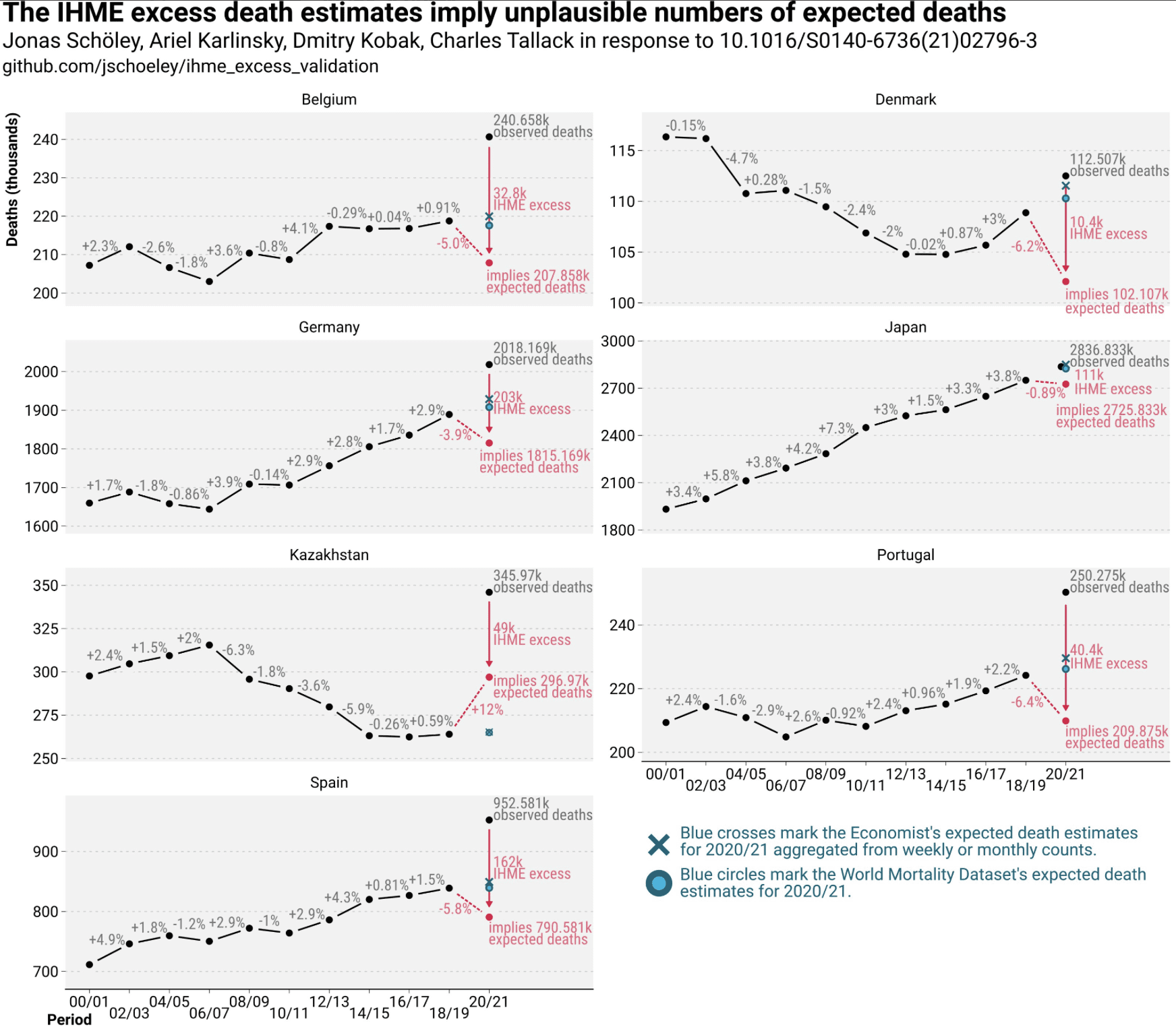
See here for our (along with 4 other letters) critique of IHME/Lancet covid excess mortality estimates which Lancet has published after first dragging their feet for almost a year, then rejecting it and then accepting it.

Our letter and this tweet with the above graph shows the issue best than the letter itself, and should be right up your alley as it plots the raw data and doesn’t hide it behind regression coefficients, model averaging etc.

I wonder if there was some politics involved? I say this because when Lancet screws up there often seems to be some some political angle.

On the plus side, it took them less than a year to publish the critique, which is slower than they were with Surgisphere but much faster than with that Andrew Wakefield article.

P.S. Here are some old posts on the University of Washington’s Institute for Health Metrics and Evaluation (not to be confused with the Department of Epidemiology at that university):

14 Apr 2020: Hey! Let’s check the calibration of some coronavirus forecasts.

5 May 2020: Calibration and recalibration. And more recalibration. IHME forecasts by publication date

9 May 2021: Doubting the IHME claims about excess deaths by country

19 Sep 2021: More on the epidemiologists who other epidemiologists don’t trust

Yale prof thinks that murdering oldsters is a “complex, nuanced issue”

OK, this news story is just bizarre:

A Yale Professor Suggested Mass Suicide for Old People in Japan. What Did He Mean?

In interviews and public appearances, Yusuke Narita, an assistant professor of economics at Yale, has taken on the question of how to deal with the burdens of Japan’s rapidly aging society.

“I feel like the only solution is pretty clear,” he said during one online news program in late 2021. “In the end, isn’t it mass suicide and mass ‘seppuku’ of the elderly?” Seppuku is an act of ritual disembowelment that was a code among dishonored samurai in the 19th century.

Ummmm, whaaaa?

The news article continues:

Dr. Narita, 37, said that his statements had been “taken out of context” . . . The phrases “mass suicide” and “mass seppuku,” he wrote, were “an abstract metaphor.”

“I should have been more careful about their potential negative connotations,” he added. “After some self-reflection, I stopped using the words last year.”

Huh? “Potential” negative connotations? This is just getting weirder and weirder.

And this:

His Twitter bio: “The things you’re told you’re not allowed to say are usually true.”

On this plus side, this is good news for anyone concerned about social and economic inequality in this country. The children of the elites get sent to Yale, they’re taught this sort of up-is-down, counterintuitive stick-it-to-the-man crap, and to the extent they believe it, it makes them a bit less effective in life, when they enter the real world a few years later. Or maybe they don’t believe this provocative crap, but at least they’ve still wasted a semester that they could’ve spent learning economics or whatever. Either way it’s a win for equality. Bring those Ivy League kids down to the level of the rabble on 4chan!

And then this bit, which is like a parody of a NYT article trying to be balanced:

Shocking or not, some lawmakers say Dr. Narita’s ideas are opening the door to much-needed political conversations about pension reform and changes to social welfare.

In all seriousness, I’m sure that Yale has some left-wing professors who are saying things that are just as extreme . . . hmmmm, let’s try googling *yale professor kill the cops* . . . bingo! From 2021:

A Psychiatrist Invited to Yale Spoke of Fantasies of Shooting White People

A psychiatrist said in a lecture at Yale University’s School of Medicine that she had fantasies of shooting white people, prompting the university to later restrict online access to her expletive-filled talk, which it said was “antithetical to the values of the school.”

The talk, titled “The Psychopathic Problem of the White Mind,” had been presented by the School of Medicine’s Child Study Center as part of Grand Rounds, a weekly forum for faculty and staff members and others affiliated with Yale to learn about various aspects of mental health. . . .

“This is the cost of talking to white people at all — the cost of your own life, as they suck you dry,” Dr. Khilanani said in the lecture . . . “I had fantasies of unloading a revolver into the head of any white person that got in my way, burying their body and wiping my bloody hands as I walked away relatively guiltless with a bounce in my step, like I did the world a favor,” she said, adding an expletive. . . .

Dr. Khilanani, a forensic psychiatrist and psychoanalyst, said in an email on Saturday that her words had been taken out of context to “control the narrative.” She said her lecture had “used provocation as a tool for real engagement.” . . .

Don’t you hate it when you make a racist speech and then people take it out of context? So annoying!

The situations aren’t exactly parallel, as she was a visitor, not a full-time faculty member. Let’s just say that Yale is a place where you’ll occasionally hear some things with “potentially negative connotations.”

Getting back to the recent story:

Some surveys in Japan have indicated that a majority of the public supports legalizing voluntary euthanasia. But Mr. Narita’s reference to a mandatory practice spooks ethicists.

Jeez, what is it with the deadpan tone of this news article? “A mandatory practice” . . . that means someone’s coming to kill grandma. You don’t have to be an “ethicist” to be spooked by that one!

And then this:

In his emailed responses, Dr. Narita said that “euthanasia (either voluntary or involuntary) is a complex, nuanced issue.”

“I am not advocating its introduction,” he added. “I predict it to be more broadly discussed.”

What the hell??? Voluntary euthanasia, sure, I agree it’s complicated, and much depends on how it would be implemented. But “involuntary euthanasia,” that’s . . . that’s murder! Doesn’t seem so complex to me! Then again, my mom is 95 so maybe I’m biased here. Unlike this Yale professor, I don’t think that the question of whether she should be murdered is a complex, nuanced issue at all!

On the other hand, my mom’s not Japanese so I guess this Narita dude isn’t coming after her—yet! Maybe I should be more worried about that psychiatrist who has a fantasy of unloading a revolver into her head. That whole “revolver” thing is particularly creepy: she’s not just thinking about shooting people, she has a particular gun in mind.

In all seriousness, political polarization is horrible, and I think it would be a better world if these sorts of people could at least feel the need to keep quiet about their violent fantasies.

But, hey, he has “signature eyeglasses with one round and one square lens.” How adorable is that, huh? He may think that killing your grandparents is “a complex, nuanced issue,” but he’s a countercultural provocateur! Touches all bases, this guy.

Saving the best for last

Near the end of the article, we get this:

At Yale, Dr. Narita sticks to courses on probability, statistics, econometrics and education and labor economics.

Probability and statistics, huh? I guess it’s hard to find a statistics teacher who doesn’t think there should be broad discussions about murdering old people.

Dude also has a paper with the charming title, “Curse of Democracy: Evidence from the 21st Century.”

Democracy really sucks, huh? You want to get rid of all the olds, but they have this annoying habit of voting all time. Seriously, that paper reads like a parody of ridiculous instrumental-variables analyses. I guess if this Yale thing doesn’t work out, he can get a job at the University of California’s John Yoo Institute for Econometrics and Democracy Studies. This work is as bad as the papers that claimed that corporate sustainability reliably predicted stock returns and that unionization reduced stock price crash risk. The only difference is that those were left-wing claims and the new paper is making a right-wing claim. Statistics is good that way—you can use it to support causal claim you want to make, just use some fancy identification strategy and run with it.

A wistful dream

Wouldn’t it be cool if they could set up a single university for all the haters? The dude who’s ok with crush children’s testicles, the guy who welcomes a broad discussion of involuntary euthanasia, the lady who shares her fantasies of unloading her revolver . . . the could all get together and write learned treatises on the failure of democracy. Maybe throw in some election deniers and covid deniers too, just to keep things interesting.

It’s interesting how the university affiliation gives this guy instant credibility. If he was just some crank with an econ PhD and a Youtube channel who wanted to talk about killing oldsters and the curse of democracy, then who would care, right? But stick him at Yale or Stanford or whatever, and you get the serious treatment. Dude’s econometrics class must be a laff riot: “The supply curve intersects 0 at T = 75 . . .”

Statistical analysis: (1) Plotting the data, (2) Constructing and fitting models, (3) Plotting data along with fitted models, (4) Further modeling and data collection

It’s a workflow thing.

Here’s the story. Carlos Ronchi writes:

I have a dataset of covid hospitalizations from Brazil. The values of interest are day of first symptoms, epidemiological week and day of either death or cure. Since the situation in Brazil has been escalating and getting worse every day, I wanted to compare the days to death in hospitalized young people (20-29 years) between two sets of 3 epidemiological weeks, namely weeks 1-3 and 8-10. The idea is that with time the virus in Brazil is getting stronger due to mutations and uncontrolled number of cases, so this is somehow reflected in the time from hospitalization to death.

My idea was to do an Anova by modeling the number of days to death from hospitalization in patients registered in 3 epidemiological weeks with a negative binomial regression. The coefficients would follow a normal distribution (which would be exponentiated afterwards). Once we have the coefficients we can simply compare the distributions and check the probability that the days to death are bigger/smaller in one of the groups.

Do you think this is a sound approach? I’m not sure, since we have date information. The thing is I don’t know how I would do a longitudinal analysis here, even if it makes sense.

My reply: I’m not sure either, as I’ve never done an analysis quite like this, so here are some general thoughts.

First step: Plotting the data

Start by graph the data using scatterplots and time-series plots. In the absence of variation in outcomes, plotting the data would tell us the entire story, so from this point of view the only reason we need to go beyond direct plots is to smooth out variation. Smoothing the variation is important—at some point you’ll want to fit a model, I fit models all the time!—; I just think that you want to start with plotting, for several reasons:

1. You can sometimes learn a lot from a graph: seeing patterns you expected to see can itself be informative, and then there are often surprises as well, things you weren’t expecting to see.

2. Seeing the unexpected, or even thinking about the unexpected, can stimulate you to think more carefully about “the expected”: What exactly did you think you might see? What would constitute a surprise? Just as the steps involved in planning an experiment can be useful in organizing your thoughts even if you don’t actually go and collect the data, so can planning a graph be helpful in arranging your expectations.

3. A good plot will show variation (any graph should contain the seeds of its own destruction), and this can give you a sense of where to put your modeling effort.

Remember that you can make lots of graphs. Here, I’m not talking about a scatterplot matrix or some other exhaustive set of plots, but just of whatever series of graphs you make while exploring your data. Don’t succumb to the Napoleon-in-Russia fallacy of thinking you need to make one graph that shows all the data at once. First, that often just can’t be done; second, even if a graph with all the data can be constructed, it can be harder to read than a set of plots; see for example Figure 4.1 of Red State Blue State.

Second step: Statistical modeling

Now on to the modeling. The appropriate place for modeling in data analysis is in the “sweet spot” or “gray zone” between (a) data too noisy to learn anything and (b) patterns so clear that no formal analysis is necessary. As we get more data or ask more questions, this zone shifts to the left or right. That’s fine. There’s nothing wrong with modeling in regions (a) or (b); these parts of the model don’t directly give us anything new, but they bridge to the all-important modeling in the gray zone in the middle.

Getting to the details: the way the problem is described in the above note, I guess it makes sense to fit a hierarchical model with variation across people and over time. I don’t think I’d use a negative binomial model of days to death; to me, it would be more natural to model time to death as a continuous variable. Even if the data happen to be discrete in that they are rounded to the nearest day, the underlying quantity is continuous and it makes sense to construct the model in that way. This is not a big deal; it’s relevant to our general discussion only in the “pick your battles” sense that you don’t want to spend your effort modeling some not-so-interesting artifacts of data collection. In any case, the error term is the least important aspect of your regression model.

Third step: Using graphs to understand and find problems with the model

After you’ve fit some models, you can graph the data along with the fitted models and look for discrepancies.

Fourth step: Improving the model and gathering more data

There are various ways in which your inferences can be lacking:

1. No data in regime of interest (for example, extrapolating about 5-year survival rates if you only have 2 years of data)

2. Data too noisy to get a stable estimate. This could be as simple as the uncertainty for some quantity of interest being larger than you’d like.

3. Model not fitting the data, as revealed by your graphs in the third step above.

These issues can motivate additional modeling and data collection.

Controversy over an article on syringe exchange programs and harm reduction: As usual, I’d like to see more graphs of the data.

Matt Notowidigdo writes:

I saw this Twitter thread yesterday about a paper recently accepted for publication. I thought you’d find it interesting (and maybe a bit amusing).

It’s obvious to the economists in the thread that it’s a DD [difference-in-differences analysis], and I think they are clearly right (though for full disclosure, I’m also an economist). The biostats author of the thread makes some other points that seem more sensible, but he seems very stubborn about insisting that it’s not a DD and that even if it is a DD, then “the literature” has shown that these models perform poorly when used on simulated data.

The paper itself is obviously very controversial and provocative, and I’m sure you can find plenty of fault in the way the Economist writes up the paper’s findings. I think the paper itself strikes a pretty cautious tone throughout, but that’s just my own judgement.

I took a look at the research article, the news article, and the online discussion, and here’s my reply:

As usual I’d like to see graphs of the raw data. I guess the idea is that these deaths went up on average everywhere, but on average more in comparable counties that had the programs? I’d like to see some time-series plots and scatterplots, also whassup with that bizarre distorted map in Figure A2? Also something weird about Figure A6. I can’t imagine there are enough counties with, say, between 950,000 and 1,000,000 people to get that level of accuracy as indicated by the intervals. Regarding the causal inference: yes, based on what they say it seems like some version of difference in differences, but I would need to see the trail of breadcrumbs from data to estimates. Again, the estimates look suspiciously clean. I’m not saying the researchers cheated, they’re just following standard practice and leaving out a lot of details. From the causal identification perspective, it’s the usual question of how comparable are the treated and control groups of counties: if they did the intervention in places that were anticipating problems, etc. This is the usual concern with observational comparisons (diff-in-diff or otherwise), which was alluded to by the critic on twitter. And, as always, it’s hard to interpret standard errors from models with all these moving parts. I agree that the paper is cautiously written. I’d just like to see more of the thread from data to conclusions, but again I recognize that this is not how things are usually done in the social sciences, so to put in this request is not an attempt to single out this particular author.

It can be difficult to blog on examples such as this where the evidence isn’t clear. It’s easy to shoot down papers that make obviously ridiculous claims, but this isn’t such a case. The claims are controversial but not necessarily implausible (at least, not to me, but I’m a complete outsider.). This paper is an example of a hard problem with messy data and a challenge of causal inference from non-experimental data. Unfortunately the standard way of writing these things in econ and other social sciences is to make bold claims, which then encourages exaggerated headlines. Here’s an example. Click to the Economist article and the headline is the measured statement, “America’s syringe exchanges might be killing drug users. But harm-reduction researchers dispute this.” But the Economist article’s twitter link says, “America’s syringe exchanges kill drug users. But harm-reduction researchers are unwilling to admit it.” I guess the Economist’s headline writer is more careful than their twitter-feed writer!

The twitter discussion has some actual content (Gilmour has some graphs with simulated data and Packham has some specific responses to questions) but then the various cheerleaders start to pop in, and the result is just horrible, some mix on both sides of attacking, mobbing, political posturing, and white-knighting. Not pretty.

In its subject matter, the story reminded me of this episode from a few years ago, involving an econ paper claiming a negative effect of a public-health intervention. To their credit, the authors of that earlier paper gave something closer to graphs of raw data—enough so that I could see big problems with their analysis, which led me to general skepticism about their claims. Amusingly enough, one of the authors of the paper responded on twitter to one of my comments, but I did not find the author’s response convincing. Again, it’s a problem with twitter that even if at some point there is a response to criticism the response tends to be short. I think blog comments are a better venue for discussion; for example I responded here to their comment.

Anyway, there’s this weird dynamic where that earlier paper displayed enough data for us to see big problems with its analysis, whereas the new paper does not display enough for us to tell much at all. Again, this does not mean the new paper’s claims are wrong, it just means it’s difficult for me to judge.

This all reminds me of the idea, based on division of labor (hey, you’re an economist! you should like this idea!), that the research team that gathers the data can be different from the team that does the analysis. Less pressure then to come up with strong claims, and then data would be available for more people to look at. So less of this “trust me” attitude, both from critics and researchers.

Water Treatment and Child Mortality: A Meta-analysis and Cost-effectiveness Analysis

This post is from Witold.

I thought some of you may find this pre-print (that I am a co-author of) interesting. It’s a meta-analysis of improving water quality in low and middle income countries. We estimated this reduced odds of child mortality by 30% based on 15 RCT. That’s obviously a lot! If true, this would have very large real-world implications, but there are of course statistical considerations of power, publication bias etc. So I thought that maybe some of the readers will have methodological comments while others may be interested in the public health aspect of it. It also ties to a couple of follow-up posts I’d like to write here on effective altruism and finding cost-effective interventions.

First, a word on why this is an important topic. Globally, for each thousand births, 37 children will die before the age of 5. Thankfully, this is already half of what it was in 2000. But it’s still about 5 million deaths per year. One of the leading causes for death in children is diarrhea, caused by waterborne diseases. While chlorinating [1, scroll down for footnotes] water is easy, inexpensive, and proven to remove pathogens from water, there are many countries where most people still don’t have access to clean water (the oft-cited statistic is that 2 billion people don’t have access to safe drinking water).

What is the magnitude of impact of clean water on mortality? There is a lot of experimental evidence for reductions in diarrhea, but making a link between clean water and mortality requires either an additional, “indirect”, model connecting disease to deaths, which is hard [2], or directly measuring deaths, which are rare (hence also hard) [3].

In our pre-print [4], together with my colleagues Michael Kremer, Steve Luby, Ricardo Maertens, and Brandon Tan we identify 53 RCTs of water quality treatments. Contacting the authors of each study resulted in 15 estimates that could be meta-analysed, with about 25,000 children. (Why only 15 out of 53? Apparently because the studies were not powered for mortality, with each one of them contributing just a handful of deaths, in some cases the authors decided to not collect, retain or report deaths.) As far as we are aware, this is the first attempt to meta-analyse experimental evidence on mortality and water quality.

We conduct a Bayesian meta-analysis of these 15 studies using a logit model and find a 30% reduction in odds of all-cause mortality (OR = 0.70, with a 95% interval 0.49 to 0.93), albeit with high (and uncertain) heterogeneity across studies, which means the predictive distribution for a new study has a much wider interval and slightly higher mean (OR=0.75, 95% interval 0.29 to 1.50). This heterogeneity is to be expected because we compare different types of interventions in different populations, across a few decades.[5] (Typically we would want to address this with a meta-regression, but that is hard due to a small sample.)

The whole analysis is implemented in baggr, an R package that provides meta-analysis interface for Stan. There are some interesting methodological questions related to modeling of rare events, but repeating this analysis using frequentist methods (random-effects model on Peto’s OR’s has a mean OR of 0.72) as well as various sensitivity analyses we could think of all lead to similar results. We also think that publication bias is unlikely. Still, perhaps there are things we missed.

Based on this we calculate about $3,000 cost per child death averted, or under $40 per DALY. It’s hard to convey how extremely cost-effective this is (a typical cost effectiveness threshold is equivalent of one years GDP per DALY; this is reached at 0.6% reduction in mortality), but basically it is on par with the most cost-effective child health interventions such as vaccinations.

Since the cost-effectiveness is potentially so high, there are obviously big real-world implications. Some funders have been reacting to the new evidence already. For example, some months ago GiveWell, an effective altruism non-profit that many readers will already be familiar with, conducted their own analysis of water quality interventions and in a “major update” of their assessment recommended a grant of $65 million toward a particular chlorination implementation [6]. (GiveWell’s assessment is an interesting topic for a blog post of its own, so I hope to write about it separately in the next few days.)

Of course in the longer term more RCTs will contribute to precision of this estimate (several are being worked on already), but generating evidence is a slow and costly process. In the short term the funding decisions will be driven by the existing evidence (and our paper is still a pre-print), so it would be fantastic to see if readers have comments on methods and its real-world implications.


Footnotes:

[1] For simplicity I simply say “chlorination” but this may refer to chlorinating at home, at the point from which water is drawn, or even using a device in the pipe, if households have piped water which may be contaminated. Each of these will have different effectiveness (primarily due to how convenient it is to use) and costs. So differentiating between them is very important for a policy maker. But in this post I group all of this to keep things simple. There are also other methods of improving quality, e.g. filtration. If you’re interested, this is covered in more detail in the meta-analyses that I link to.

[2] Why is extrapolating from evidence on diarrhea into mortality hard? First, it is possible that reduction in severe disease is higher (in the same way that vaccine may not protect you from infection, but it will almost definitely protect you from dying). Second, clean water also has lots of other benefits, e.g. it likely makes children less susceptible to other infections, nutritional deficiencies, and also makes their mothers healthier (which could in turn lead to fewer deaths during birth). So while these are just hypotheses, it’s hard a priori to say how a reduction in diarrhea would translate to a reduction in mortality.

[3] If you’re aiming for 80% power to detect 10% reduction in mortality you will need RCT data on tens of thousands of children. Exact number of course depends on how high baseline mortality rate is in the studies.

[4] Or, to be precise, an update to a version of this pre-print which we released in February 2022. If you happened to read the previous version of the paper, both main methods and results are unchanged, but we added extra publication bias checks, characterization of the sample and rewrote most of the paper for clarity.

[5] That last aspect of heterogeneity seems important, because some have argued that the impact of clean water may diminish with time. There is a trace of that in our data (see supplement), but with 15 studies the power to test for this time trend is very low (which I show using a simulation approach).

[6] GiveWell’s analysis included their own meta-analysis and led to more conservative estimates of mortality reductions. As I mention at the end of this post, this is something I will try to blog about separately. Their grant will fund Dispensers for Safe Water, an intervention which gives people access to chlorine at the water source. GW’s analysis also suggested a much larger funding gap in water qulity interventions, of about $350 million per year.

Dying children and post-publication review: Update on data availability

A couple months ago we discussed a controversial study of rectal artesunate suppositories. In addition to issues with the analysis, there was concern because the data were unavailable.

Following Dale Lehman’s suggestion, I went online on 10 Nov 2022 and submitted my data access request:

Record:
Dataset for: Effectiveness of rectal artesunate as pre-referral treatment for severe malaria in children under 5 years of age: a multi-country observational study

Full name:
Andrew Gelman

Email address:
[email protected]

Justification:
The paper is on an important topic so it would be good for the data to be available.

The next day I received an email from one of the authors, Manual Hetzel, that they were coordinating to make the data available. On 22 Dec 2022, Hetzel sent me an update:

Regarding your request to access the dataset underlying the publication “Effectiveness of rectal artesunate as pre-referral treatment for severe malaria in children under 5 years of age: a multi-country observational study” deposited on Zenodo,
we have now made the dataset freely accessible (Creative Commons Attribution Non Commercial 4.0 International license). The files can be downloaded without restrictions.

As I had mentioned in our previous exchange, we were hoping to provide free access in parallel with a response to a commentary to our paper in BMC Medicine. Unfortunately, this is taking longer than expected and the commentary and our response might only go online in January.

In any case, considering some of the comments on social media and on your blog, we feel it is crucial to understand our findings in their context. Two viewpoints just published in the Lancet Infect Dis (our view: https://doi.org/10.1016/S1473-3099(22)00762-9; Lorenz von Seidlein’s view: https://doi.org/10.1016/S1473-3099(22)00765-4) can provide some of this essential context as well as links to other publications with complementary findings.
In addition, I recommend the following publication that describes the purpose and context of the entire project in detail: PLOS Glob Public Health 2022; 2(9): e0000464. (https://doi.org/10.1371/journal.pgph.0000464).

I have no take on the study itself, just happy to report that the data are now available. I just got back from vacation last week and was going through my emails, and I’m scheduling this post for tomorrow.

Challenge of expressing uncertainty in scientific claims (exercise and lifespan edition)

Paul Alper points us to this news article which begins:

For every 2,000 steps you take each day, your risk for premature death may fall by 8 to 11 percent, according to research published in the journal JAMA Internal Medicine.

Along with the results from a related study, published in JAMA Neurology, the researchers also found that walking more, accumulating up to roughly 10,000 steps a day, was linked to a reduction in the occurrence of cardiovascular disease (including heart disease, stroke and heart failure), 13 types of cancer and dementia. . . .

Taking 10,000 steps a day (roughly four to five miles, depending on a person’s stride) has become a common health and fitness goal. . . . The new studies, however, found that health benefits also can be achieved by taking fewer steps. For instance, walking about 9,800 steps a day was found to lower risk of dementia by about 50 percent, but dementia risk was cut by 25 percent for those who walked as few as 3,800 steps daily.

What struck me was the way the article swung back and forth between cautious disclaimers and unrealistic precision. On one hand, your risk “may fall”; on the other, the drop in the risk is from “8 to 11 percent.” From a logical standpoint, this makes little to no sense: if you can’t even be confident about giving a causal interpretation to the result (regression coefficients from a large observational study), then how can it make sense to be so precise? The use of the phrase “may” in that sentence implies the effect could be zero (or, for that matter, negative, although I guess a negative result would go against our general theoretical understanding of the benefits of exercise). If the effect could be zero or it could be 10%, then I think it could be 5% too. (See Section 3 of this article for a discussion of this general point in the context of a different example.)

Reading further into the article, there is more of this oscillation between disclaimers and over-precision. For example, the second paragraph quoted above carefully uses the non-causal phrase “was linked to,” but then the third paragraph switches to the causal phrases “can be achieved” and “was cut,” and also there are the ridiculously precise numbers of “9,800 steps a day” and “as few as 3,800 steps daily.” I’m bummed cos I only took 3,700 steps yesterday. I better make sure to take 3,900 tomorrow to catch up.

Later on, we get the unqualified causal statement, “walking at a faster pace, or upping the intensity by power walking, for example, was found to have health benefits, too, with intensity amplifying the results,” immediately followed by the association language of “was linked to.”

My point here is not to slam this particular news article but rather to point out that writing about observational studies is hard! Writing about science is hard! On one hand, you want to keep putting in the disclaimers—association not causation—; on the other hand, if you’re reporting the study at all, the numbers should be relevant. I guess the right way to put it would be to say something like, “Walking 2,000 steps a day was associated with a 10% decline in risk of premature death,” but it’s hard not to slip into causal language.

To their credit, the authors of the journal article were more careful, using the word “Associations” in the title and abstract, and summarizing result as “more steps per day (up to about 10 000 steps) was associated with declines in mortality risks and decreased cancer and CVD incidence.”

This all reminds me of a class in college where we learned about the religious doctrine of predestination. Somehow it sounded weird to us, the idea that your success in life would reveal your predetermined destination. Getting saved by good works seemed more intuitive. But there’s be no empirical way to distinguish. In that case the difficulty is not from having observational data but the more fundamental problem of the outcome being unobservable.

Statistical experiments and science experiments

The other day we had a discussion about a study whose conclusion was that observational studies provide insufficient evidence regarding the effects of school mask mandates on pediatric covid-19 cases.

My reaction was:

For the next pandemic, I guess much will depend on a better understanding of how the disease spreads. One thing it seems that we’ve learned from the covid epidemic is that epidemiological data will take us only so far, and there’s no substitute for experimental data and physical/biological understanding. Not that epi data are useless—for example, the above analysis shows that mask mandates have no massive effects, and counts of cases and deaths seem to show that the vaccines made a real-world difference—but we should not expect aggregate data to always be able to answer some of the urgent questions that can drive policy.

And then I realized there are two things going on.

There are two ideas that often get confused: statistical experiments and science experiments. Let me explain, in the context of the study on the effects of masks.

As noted above, the studies of mask mandates are observational: masks have been required in some places and times and not in others, and in an observational study you compare outcomes in places and times with and without mask mandates, adjusting for pre-treatment variables. That’s basic statistics, and it’s also basic statistics that observational studies are subject to hard-to-quantify bias arising from unmodeled differences between treatment and control units.

In the usual discussion of this sort of problem in statistics or econometrics, the existing observational study would be compared to an “experiment” in which treatments are “exogenous,” assigned by an outside experimenter using some known mechanism, ideally using randomization. And that’s all fine, it’s how we talk in Regression and Other Stories, it’s how everyone in statistics and related sciences talks about the ideal setting for causal inference.

An example of such a statistical experiment would be to randomly assign some school districts to mask mandates and others to a control condition and then compare the outcomes.

What I want to say here is that this sort of statistical “experiment” is not necessarily the sort of science experiment we would want. Even with a clean randomized experiment of mandates, it would be difficult to untangle effects, given the challenges of measurement of outcomes and given the indirect spread of an epidemic.

I’d also want some science experiments measuring direct outcomes, to see what’s going on when people are wearing masks and not wearing masks, measuring the concentrations of particles etc.

This is not to say that the statistical experiment would be useless; it’s part of the story. The statistical, or policy, experiment is giving us a sort of reduced-form estimate, which has the benefit of implicitly averaging over intermediate outcomes and the drawback of possibly not generalizing well to new conditions.

My point is that we when use the term “experiment” in statistics, we focus on the treatment-assignment mechanism, which is fine for what it is, but it only guards against one particular sort of error, and it can be useful to step back and think about “experimentation” in a more general sense.

P.S. Also relevant is this post from a few months ago where we discuss that applied statistics contains many examples of causal inference that are not traditionally put in the “causal inference” category. Examples include dosing in pharmacology, reconstructing climate from tree rings, and item response and ideal-point models in psychometrics: all of these really are causal inference problems in that they involve estimating the effect of some intervention or exposure on some outcome, but in statistics they are traditionally put in the “modeling” column, not the “causal” column. Causal inference is a bigger chunk of statistics than might be assumed based on our usual terminology.

“Lack of correlation between school mask mandates and paediatric COVID-19 cases in a large cohort”

Ambarish Chandra writes:

Last year you posted an email from me, regarding my attempts to replicate and extend a CDC study.

It’s taken a long time but I’m happy to report that my replication and extension have finally been published in the Journal of Infection.

The article, by Chandra and Tracy Høeg, is called “Lack of correlation between school mask mandates and paediatric COVID-19 cases in a large cohort,” and here’s the abstract:

Objectives: To expand upon an observational study published by the Centers for Disease Control (CDC) showing an association between school mask mandates and lower pediatric COVID-19 cases. We examine whether this association persists in a larger, nationally representative dataset over a longer period.

Method: We replicated the CDC study and extended it to more districts and a longer period, employing seven times as much data. We examined the relationship between mask mandates and per-capita pediatric cases, using multiple regression to control for observed differences.

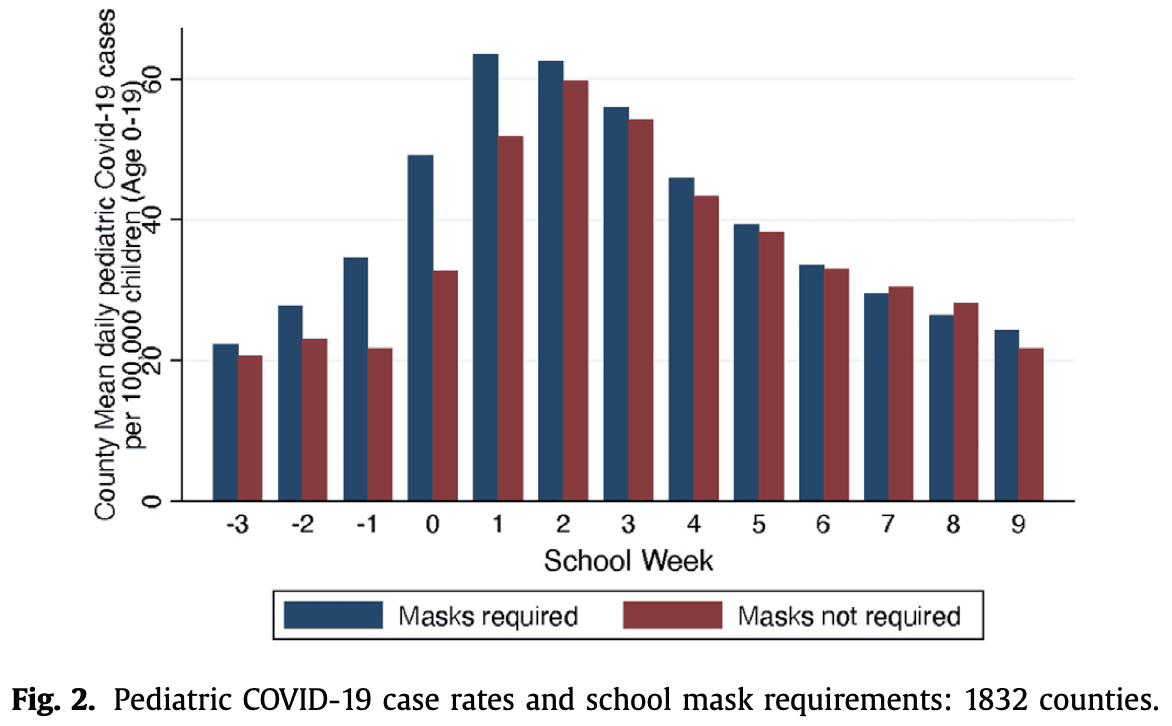
Results: We successfully replicated the original result using 565 counties; non-masking counties had around 30 additional daily cases per 100,000 children after two weeks of schools reopening. However, after nine weeks, cases per 100,000 were 18.3 in counties with mandates compared to 15.8 in those without them (p = 0.12). In a larger sample of 1832 counties, between weeks 2 and 9, cases per 100,000 fell by 38.2 and 37.9 in counties with and without mask requirements, respectively (p = 0.93).

Conclusions: The association between school mask mandates and cases did not persist in the extended sample. Observational studies of interventions are prone to multiple biases and provide insufficient evidence for recommending mask mandates.

This all makes sense to me. The point is not that masks don’t work or even that mask mandates are a bad idea—it’s gotta depend on circumstances—but rather that the county-level trends don’t make the case. It’s also good to see this sort of follow-up of a published study. They discuss how the results changed with the larger dataset:

Thus, using the same methods and sample construction crite- ria as Budzyn et al., but a larger sample size and expanded time frame for analysis, we fail to detect a significant association between school mask mandates and pediatric COVID-19 cases. The discrepancy between our findings and those of Budzyn et al. is likely attributable to the inclusion of more counties, a larger geographic area and extension of the study over a longer time period. By ending the analysis on September 4, 2021, Budzyn et al. excluded counties with a median school start date later than August 14, 2021. According to the MCH data, this heavily over-samples regions that open schools by mid-August including Florida, Georgia, Kentucky and other southern states. The original study would not have incorporated data from New York, Massachusetts, Pennsylvania, and other states that typically start schools in September. While this does not necessarily bias the results, it calls into question whether the results of that study can be representative of the entire country and suggests at least one important geographic confounding variable affects observational studies of school-based mask mandates in the United States.

Also:

First, school districts that mandate masks are likely to invest in other measures to mitigate transmission and may differ by testing rates and practices. Second, the choices made by school districts reflect the attitudes and behavior of their community. Communities that are concerned about the spread of SARS-CoV-2 are also likely to implement other measures, even outside of schools, that may eventually result in lower spread in the community and including within schools. Finally, the timing of public health inter- ventions is likely to be correlated with that of private behavioral changes. Public health measures are typically introduced when case counts are high, which is precisely when community members are likely to react to media coverage and change their own behavior.

This all makes sense. The only part I don’t buy is when they argue that their results represent positive evidence against the effectiveness of mask mandates:

Our study also uses observational data and does not provide causal estimates either. However, there is an important difference: while the presence of correlation does not imply causality, the absence of correlation can suggest causality is unlikely, especially if the direction of bias can be reasonably anticipated. In the case of school mask mandates, the direction of bias can be anticipated quite well. . . .

Maybe, but I’m skeptical. So many things are going on here that I think it’s safer, and more realistic, to just say that any effects of mask mandates are not clear from these data. From a policy standpoint, this can be used to argue against mask mandates on the grounds that they are unpopular and impede learning. Unless we’re in a setting in which mask mandates are demanded by enough people, in which case they could be better than the alternative. For example, when teaching at Columbia, I didn’t find masks to be a huge problem, but remote classes were just horrible. So if a mask mandate is the only way to get people to agree to in-person learning, I’d prefer it to the alternative.

For the next pandemic, I guess much will depend on a better understanding of how the disease spreads. One thing it seems that we’ve learned from the covid epidemic is that epidemiological data will take us only so far, and there’s no substitute for experimental data and physical/biological understanding. Not that epi data are useless—for example, the above analysis shows that mask mandates have no massive effects, and counts of cases and deaths seem to show that the vaccines made a real-world difference—but we should not expect aggregate data to always be able to answer some of the urgent questions that can drive policy.