Advice for weighting the results of conjoint analyses/experiments

Someone asked me, “What advice do you have for weighting the results of conjoint analyses/experiments?”

I replied that a conjoint experiment is basically a regression analysis. Here we discuss survey weights and regression, and here’s the relevant bit:

So the first paper I recommend is Winship, C., and Radbill, L. (1994). Sampling weights and regression analysis. Sociological Methods and Research 23, 230–257.

I also recommend this recent paper by Brandon de la Cuesta, Naoki Egami, Kosuke Imai, Improving the External Validity of Conjoint Analysis: The Essential Role of Profile Distribution, which addresses issues of average predictive comparisons that have come up many times before in this space, for example here and here.

Bias remaining after adjusting for pre-treatment variables. Also the challenges of learning through experimentation.

Hey, this is the kind of post that everyone absolutely loves. No John Updike, no Joe Biden, no authors or politicians at all. Nothing about p-values or scientific misconduct. It’s not even Bayesian! Just statistics, teaching, and code.

So sit back and enjoy . . .

We had the following problem on the practice exam:

An observational study is simulated using the following code for pre-test x, treatment z, and post-test y:

n <- 100
x <- runif(n, -1, 1)
z <- rbinom(n, 1, invlogit(x))
y <- 0.2 + 0.3*x + 0.5*z + rnorm(n, 0, 0.4)
fake <- data.frame(x, y, z)
fit <- lm(y ~ x + z, data=fake)
estimate <- coef(fit)["z"]

In this simulation, the true treatment effect is 0.5. Which of the following statements is correct?

(a) The estimate will probably be less than 0.5 because the model also adjusts for x, which is positively correlated with z, and this adjustment for 𝑥 will suck up some of the explanatory power of x.

(b) The estimate will probably be greater than 0.5 because there is imbalance in the treatment assignment: the treatment is more likely to be assigned to people with higher pre-test scores, which will artificially make the treatment look more effective.

(c) The estimate will probably be greater than 0.5 because, given the finite sample size, the adjustment for x is noisy and is likely to undercorrect for imbalance in the design.

(d) The estimate is unbiased because the model correctly adjusts for differences in pre-test between treatment and control groups.

OK, first take a moment to figure this one out, and then we will go on.
Continue reading

“Of course, this could conceivably be a case of near unbelievable luck: A flawed analysis based on wrong assumptions gave an unusually large causal effect estimate – but the misguided result just happened to be correct. We can imagine how the research team huddled nervously around the computer terminal biting their nails and silently praying as they executed their updated Stata code, only to erupt in joy and celebration as the results appeared on screen and revealed they were right all along. . . .”

An economist who desires anonymity write:

I think you’ll find this both fun and frustrating.

A group of prominent, well-published economists from Norway published a well-cited study on the causal effects of paid maternity leave: “A flying start? Maternity leave benefits and long-run outcomes of children” (https://www.journals.uchicago.edu/doi/10.1086/679627). The paper was published in the Journal of Political Economy—one of the top economics journals—and used a regression discontinuity design to identify unusually large and important causal effects of paid maternity leave on child outcomes. As described in their abstract, “Mothers giving birth before July 1, 1977, were eligible for 12 weeks of unpaid leave, while those giving birth after that date were entitled to 4 months of paid leave and 12 months of unpaid leave. The increased time spent with the child led to a 2 percentage point decline in high school dropout rates and a 5 percent increase in wages at age 30.”

Recently, a comment on the paper was published (“Not a flying start after all?” https://www.journals.uchicago.edu/doi/10.1086/732218). The problem they note: The reform did not take place as described. “Causal identification rested on a discontinuity implying that only mothers giving birth after a specific cutoff date were entitled to paid leave. We show that the analysis relied on an incorrect description of the reform. The reform did not introduce paid maternity leave, but extended it by 5–6 weeks. The postulated discontinuity never existed as treatment and control groups had the same maternity leave conditions.”

The comment goes on to explain that paid 12 weeks maternity leave had been in place for many years, the reform cutoff date was not strict, parts of the reform were implemented the next year, workers in the public sector experienced the reform earlier than the postulated date, the reform was not unexpected as it had been widely discussed in the media (contrary to the original paper’s claim), etc.

The response from the original authors is titled “Still Flying” (https://www.journals.uchicago.edu/doi/10.1086/732220). They take the new information in their stride and respond that: “The new facts led us to formulate a new research strategy taking the new facts into account. Our improved estimates show that the maternity leave reform in Norway had large long-term impacts on the lives of children. Quantitatively, they turn out to be similar to the original estimates in CLS.”

Especially interesting is how they point to two other papers to support their original results: “Since the publication of CLS two additional papers have used similar research strategies to examine the impacts of this maternity leave reform on different outcomes: Butikofer et al. (2021) and Schwartz (2021). Results from both these papers suggest that the July 1st, 1977 date was indeed important.”

What they do not note is that both these studies built on the original flying start paper and exploited the same non-existent sharp discontinuity at July 1st.

Of course, this could conceivably be a case of near unbelievable luck: A flawed analysis based on wrong assumptions gave an unusually large causal effect estimate – but the misguided result just happened to be correct. We can imagine how the research team huddled nervously around the computer terminal biting their nails and silently praying as they executed their updated Stata code, only to erupt in joy and celebration as the results appeared on screen and revealed they were right all along.

The cynical take would be to see this whole story as a natural experiment in itself: What happens if successful researchers believe in a non-existent reform and analyze its effects using “rich administrative data” and the standard researcher degrees of freedom? The answer: three distinct papers all finding large and robust effects of the same non-existent reform, and at least two of them to a level sufficient to convince referees in top econ journals.

In this light, it is perhaps less surprising that the new analysis with “improved estimates” found similar effects, although it appears to have taken some time: The comment notes that it first “informed the Norwegian authors of the two papers that we suspected these errors in February/March 2020”—yet it was only now (August 2024) that the journal published the comment (and its response).

Finally, for what it’s worth, it’s interesting to see that the Journal of Political Economy found it best to place the critical comment behind a paywall while making the original team’s response freely available and ungated.

I also noticed this unfortunate bit from the authors’ response, when they write, “If anything, this will dilute the impacts of the reform by including in the sample some ineligible mothers.” It’s the backpack fallacy!

No, learning that you have measurement error does not in general make your result stronger!

The above story is interesting, and we could stop right here. But I was kinda curious so I clicked through. As my correspondent said, the only paper of the three that’s immediately accessible is the authors’ response to the criticism. Rather than get lost in the details of discontinuities and differences and estimates and standard errors, I’ll follow our general approach and start from scratch, considering the problem as an observational study.

This means we need to identify three things:
1. The experimental units i and treatments z_i
2. The outcome measurement y_i
3. The pre-treatment measurements x_i.

The basic plan is that you then regress y on x and z, but depending on the quality of the pre-treatment measurements and how the treatment was assigned, you might have to do more. In any case, identifying the three components above is the starting point. It’s hard to talk about estimating the treatment effect until you’ve defined what the treatment is.

So let’s get to it. They’re talking about the effects of maternity leave reform on the lives of children. So I’m guessing that the experimental units are children and the treatments are something about how much maternity leave the mother is getting. From the discussion above, I know that this will be a bit complicated . . . I’ll read the paper and see what they say. It seems that the treatment is what they did in Norway after the 1977 reform, which is to give 18 weeks of partially paid leave, and the control is what was given before the reform, which was 12 weeks of partially paid leave. Also, they say the treatment is restricted to workers in the private sector, which apparently represented 70% of Norway’s female workforce at that time.

The other challenge is that there was a twelve-week period leading up to 1 Jul 1977 when the treatment was being introduced, and it seems that maybe they can’t figure out who was getting the treatment and who was getting the control during those twelve weeks. That doesn’t seem like such a big deal—just exclude those children from the analysis, right?—I guess the relevance comes as this was a weakness of the original study, which didn’t recognize that implementation issue.

The outcomes are “dropout rates, college and the log of earnings at age 30” of the children. In a footnote they also say, “CLS also presented results for years of schooling, teenage pregnancy (females) and IQ (males). As there was no robust effect on these outcomes we do not look into these outcomes further.” So actually they looked at 6 outcomes. But maybe more than 6, right? If they looked at IQ for the boys, I imagine they looked at IQ for the girls too. We generally recommend reporting all comparisons of interest. We also recommend following up by fitting a multilevel model, but really the key thing is reporting all the results and displaying them in a single graph. Here there seems to have been a lot of selection going on:
1. Some large number of potential outcome variables in the original data.
2. Some subset of them analyzed in the original study.
3. In that original study, 6 outcomes selected based on statistical significance or some other criterion.
4. In the followup, 3 of the outcomes discarded because their results are not statistically significant (or some other criterion; I’m not quite sure what was meant by “there was no robust effect on these outcomes”).
5. The followup paper reports the remaning 3 outcomes.

The next step is the choice of background or control variables for the regression. I guess the relevant pre-treatment measurements will involve parents’ socioeconomic status, along with birth weight and similar variables describing the babies. Also you’d want to include economic conditions . . . here there’d be some blurring over time, as it’s not like the exact state of the economy on the day you’re born will determine your economic future; I guess that will be covered by including something like a linear time trend over the range of the data, which is from 1975 through 1979.

Their analysis also has some strong data restrictions that don’t quite make sense to me: they exclude 1976, and for each year they only count the 90 days before 9 Apr and the 90 days after 1 Jul. I get that they want to use comparable data from each year, to avoid having to worry about seasonal effects; still, just using 90 days seems like throwing away data. They also do another analysis with 180 days before and after.

I’m concerned that they don’t include pre-treatment predictors such as parents’ SES and baby’s birth weight. Maybe these variables weren’t in the data? But I’d think that if they had all those measures on the kids,

Then there’s the analysis. They show three outcomes in separate figures, which is kind of annoying (but, yeah, I know, it’s standard practice; so few people have learned the benefits of putting multiple plots in a grid); anyway, here they are:


Make of these what you will.

It would be good to see the analysis including more pre-treatment years, a longer time window in each year, adjustments for key pre-treatment variables, and looking at all the outcomes of interest, not just the three that survived many levels of screening.

New Course: Prediction for (Individualized) Decision-making

This is Jessica. This winter I’m teaching a new graduate seminar on prediction for decision-making intended primarily for Computer Science Ph.D. students. The goal of the new course is to consider various perspectives on what it means to predict for the purpose of decision-making. We’ll look at this question in the context of predictive modeling for automated decisions or to inform expert decisions and causal estimation to inform policy. I’m trying to include a mix of theoretical and applied papers, with an emphasis on philosophical and ethical challenges to evaluating decision-making and applying formal methods in practice, especially in contexts where human experts currently make decisions and/or the decisions involve people. Technically the course title is Prediction for Decision-making. But one of the motivations is that we have yet to adequately address the gap between conventional machine learning, where we optimize loss over aggregates, and the needs of human decision-makers in practice, where we often care about doing right by individual cases. Hence the reference to “individualized.” 

Suggestions welcome if this is your cup of tea and you think I missed something important. A few of the listed papers are already coming from pointers I’ve gotten from readers here. I’m especially interested in papers that help illustrate the gaps in current methods when it comes to good individual decisions. 

Course Schedule

Week 1 – Introduction and background on statistical decision rules

     Background: Statistical decision theory, randomized controlled trials

  • Berger, J. O. (2013). Statistical decision theory and Bayesian analysis. Springer Science & Business Media. Chapter 1.
  • Hernan, Miguel A., & Robins, James, M. (2023). Causal inference: what if. CRC PRESS. Chapters 1, 2

    Examples

Week 2 – Prediction versus decision-making

     Optional

Week 3 – Human versus statistical judgment

     Optional

Week 4 – Evaluating (individual) predictions and decisions

Optional

Week 5 – Data shifts and causality

     Optional

Week 6 – Personalization and fairness

      Optional

Week 7 – Calibration for decision-making

     Optional

Week 8 – Communicating prediction uncertainty

    Optional

Week 9 – Designing human-AI workflows 

     Optional

5 different reasons why it’s important to include pre-treatment variables when designing and analyzing a randomized experiment (or doing any causal study)

In presenting causal inference and randomized experiments, we start with the basic framework in which there are pre-treatment predictors x, treatment z, and outcome y, with potential outcomes y(z). Here it is in Regression and Other Stories:

Our presentation is different than many other textbooks which start with z and y, only later including x.

So then the question arises: Why is it such a good idea to include x? Why is the pre-treatment predictor (or predictors) so important, both in practice and for our understanding of causal inference.

Here are five reasons for including pre-treatment predictors:

1. Adjust for bias in non-randomized design
2. Adjust for random imbalances in randomized design (and for nonrandom imbalances because of imperfect randomization, dropout, etc.)
3. Reduce the standard error of the estimated effect
4. Check for imbalance and lack of overlap between treatment and control groups
5. Generalizing to population with a different distribution of x.

We explain further in chapters 19 and 20 of Regression and Other Stories, but I’m not claiming any originality here. This is all common knowledge among statisticians who work on these sorts of problems. But sometimes people hear about randomization or some other identification strategy, and they don’t realize that:
– Even if you have identification, adjusting for pre-treatment variables can give you statistical efficiency (item 3 above) and generalization (item 5);
– If your identification is imperfect, adjusting for pre-treatment variables can let you check that (item 4) and adjust for problems (item 2);
– In real life usually your identification isn’t everything you think it is, so it’s important to adjust anyway (item 1).

There are lots of ways to do this adjustment: linear regression, logistic regression, nonparametric models, etc. In her classic 2011 paper, Jennifer uses a nonparametric model to simultaneously adjust for differences between treatment and control group and to generalize to the population, and in recent years much more has been done in this area, for example this 2018 paper by Athey and Wager. Again, though, in many settings you can get pretty far from simple linear and logistic regression, as we did in 1990 when estimating incumbency advantage (although we did later return to the problem and do better using a probabilistic selection model).

Similarly, if you have an identification method such as regression discontinuity that already includes one pre-treatment predictor, you should include others. For regression discontinuity in particular, the variable that drives the discontinuity is not always a good predictor of the outcome, and you can do better by also including pre-test scores or whatever.

Again, the general theme is x, z, y. The treatment z affects the outcome y, and you want to model this behavior conditional on pre-treatment characteristics x.

Every once in awhile we come across a study in which there are no pre-treatment variables. Typically this reflects a failure of data collection, where the researchers were overconfident from the purported causal identification in their design. That’s one reason why it’s important to think about x in the design stage, before collecting and analyzing the data.

Sometimes there really isn’t any useful pre-treatment information available. Bummer! Even there, though, I think it’s useful to think about pre-treatment variables and what you would do with them—in the same way that, even if you can’t do random assignment, it’s typically a helpful thought experiment to consider a hypothetical, even if infeasible, randomized design (“force some people to smoke and force others to abstain,” etc.), as this can provide more insight into the process you are trying to model, the effect you’re trying to estimate, and the population of scenarios to which this effect might apply.

Violent science teacher makes ridiculously unsupported research claims, gets treated by legislatures/courts/media as expert on the effects of homeschooling

Paul Alper shares this horrifying news story by Laura Meckler:

Brian Ray has spent the last three decades as one of the nation’s top evangelists for home schooling. As a researcher, he has published studies purporting to show that these students soar high above their peers in what he calls “institutional schools.” . . .

His influence is beyond doubt. He has testified before state legislators looking to roll back regulations. Judges cite his work in child custody cases where parents disagree about home schooling. His voice resounds frequently in the press, from niche Christian newsletters to NPR and the New York Times. As president of the National Home Education Research Institute, he is the go-to expert for home-school advocates looking to influence public opinion and public policy, presenting himself as a dispassionate academic seeking the truth.

OK, now for the bad news:

Taken as a whole, the academic literature shows mixed academic outcomes for home schooling: Some studies find benefits; others show deficiencies. Nonetheless, Ray’s work, which concludes home-schoolers score far above public school students on standardized tests, has been widely cited for many years. . . .

Hey, how did that happen?

Ray, 69, received his master’s degree in zoology and earned a PhD in science education at Oregon State University, thinking he might be a science teacher. But soon he grew interested in home schooling — both for his own children and professionally. Oregon State University rejected Ray’s proposal to study home education for his dissertation, but he began collecting data. In 1985, he started a journal called the Home School Researcher. Around this time he met Michael Farris, who had co-founded the HSLDA and was beginning to build the Christian home-schooling movement. “He said, ‘Brian, you’re already an expert. But the moment you get your PhD handed to you, call me, and we’ll bring you into court as an expert witness,’” Ray recalled . . .

Ray’s decades of research demonstrate one point beyond dispute: Some portion of home-schooled students do very well academically, and home education can be successful for some children. The question is whether those children are representative of home-schoolers and whether research supports his oft-stated contention that home-schoolers perform 15 to 30 percentile points better than public school students. (Recently, he said, he has revised his estimate to 15 to 25 points.)

Ray’s studies have included thousands of students across the country, often recruited with the help of HSLDA. He compares their results on standardized tests to those of public school students, consistently finding home-schoolers with higher scores in all subjects. He finds home-schoolers register as high as the 80th percentile — sometimes even higher — meaning their average score is better than at least 80 percent of traditionally educated test-takers. . . .

In an interview, he offered some possible explanations. Home education provides small classes, more feedback from adults and freedom from bullying, he said. If anything, Ray told The Post, standardized tests are written to test what students are taught in public school, so home-schoolers are at an inherent disadvantage.

Meckler continues:

Critics cite numerous problems with Ray’s approach: These tests are optional in the vast majority of the country, and many home-schooled students don’t take them. The ones who don’t might have scored far worse if they had been required to sit for exams, as public school students are. Many students take the exams at home, which might offer advantages over public school test-takers who face a controlled environment. And parents had to opt into Ray’s studies, potentially skewing his sample further. Demographic information collected as part of Ray’s research showed almost all students in his samples were White, Christian and came from two-parent married families. Their parents were more educated than average. In short, they were the type of students who tend to do well no matter where they are educated. . . .

What does he say about that?

In an interview, Ray responded that all studies have “limitations,” but he said that does not make his results invalid. He also said he has worked to include more representative samples and demographics in his research, saying methods “mature over time within a field.” . . . Asked whether it’s possible that students who do well in his studies would do well in any setting, given their demographic advantages, Ray replied, “That’s a reasonable hypothesis.”

But:

He dispenses with the caveats when talking about his results to legislators, courts, journalists and the public. In a 2005 book he wrote about home schooling aimed at general readers, Ray repeatedly cited his studies’ findings with none of the cautions included in academic papers. He mentions none on his website, either. He takes the same approach with the press. “The research said over and over again,” he told the Pensacola News Journal in 2012, “that these young people are performing above average and on average they’re surpassing public school students.” . . .

A 2009 “progress report” focused on his findings said, “Homeschoolers are still achieving well beyond their public school counterparts,” a generalization that does not take into account the demographics of his sample. . . .

Last year, New Hampshire lawmakers were considering whether to remove a requirement that home-schooled students show “reasonable academic proficiency,” which was defined as scoring in the 40th percentile or higher on state exams. Ray was among those making the case for reduced regulation. Ray testified that “40 years of research” by “various scholars” finds home-schooled students “typically outperform public school students by 15 to 30 percentile points.” . . .

The story gets much much worse (see below), but here I want to comment on something else, which is, on a research level, that all of this is just slightly worse than . . . some of the highest-profile academic research on education being conducted at top universities!

Remember that claim that early-childhood intervention increased later adult earnings by 42%? That was another case of selection bias (see also here), albeit a bit less blatant than what Ray did. It makes sense that, when a team of credentialed economists make an error, it’s a more subtle error than that made by someone trained in zoology and science education.

That said, there’s a disturbing consonance between the zoologist’s “If anything . . .” and the economist’s “Their relatively small sample sizes actually speak for — not against — the strength of their findings.” The common thread: an absolute eagerness to explain away problems, a focus not on probing and figuring our what could go wrong but rather an insecure defensiveness. Lots of glib answers (in the zoologist’s case, supported by irrelevant Bible quotations; in the economist’s case, supported by irrelevant mathematical arguments), not much thought. And, of course, policy impact. Lots of hype, lots of NPR appearances, the whole deal.

So, yeah, this world of bogus homeschooling statistics is a kind of funhouse-mirror version of prestige social science.

Just to be clear, I’m not saying that all education research is bad. Education research is important, and there’s some good stuff! The bad thing is this push-a-button, take-a-pill model, the idea that you can do an experiment on 130 kids and discover a 42% effect. This homeschooling stuff is worse, as they’re not even trying to do things right—but the consequences are kind of the same. They make big claims, they get media attention, respectful treatments from courts and legislatures who are just looking for someone credentialed to give them the message they want to hear.

In human terms, though, this is all much worse.

Also from the news article:

[Ray’s oldest daughter, Hallie Ray Ziebart] said her father taught her almost no math, routinely required her to work long hours for his nonprofit institute during school days, and whipped her and her siblings with switches and other objects when they disobeyed his orders. Her allegations were echoed by two of her siblings and by four others who spent time at their home. Some of her charges are bolstered by journals she kept at the time. . . . She said that she was told, for instance, that the slave trade was “meant for evil but God made it for good” and that things worked out for enslaved people “because they got to be Christians.”

Here are some horrible details:

Ziebart has spoken publicly about what she calls physical abuse — being hit with sticks, wooden spoons and a cord as a young child and teenager. She also described this in two journal entries written in her adolescence that she provided to The Post. Several others inside and outside the family also said Ray used physical discipline. In a journal entry dated Dec. 17, 1992, Ziebart, then 12, described one conflict where her father “grab(b)ed my head and shook me hard.” “I have been having ear ac[h]es and I had one today and when he did that it hurt me bad, inside & out,” she wrote. “I love him so much and [he] shouldn’t have hurt me.”

Ray responded: “We used legal and loving spanking. Period.”

I love the “legal” part. Just in case anyone questions the idea that assault and battery is not “loving,” he’s still got legality of it covered.

And this all gives a horrible twist to another part of the story:

Ray often serves as an expert witness in family disputes, typically where one parent wishes to home-school the children and the other doesn’t. Ray listed about 90 cases where he testified (or was prepared to when the case settled) on a document submitted to a Washington state court in 2022.

On the plus side, he doesn’t seem to have tried to run anyone over in a parking lot.

Different perspectives on the claims in the paper, The Colonial Origins of Comparative Development

I was talking with an economist today about the recent prize given to the authors of the very influential 2001 article, The Colonial Origins of Comparative Development: An Empirical Investigation. According to my colleague, many economists have issues with that paper, with issues regarding data quality, the weakness of the instrument, and problems of selection bias in the analysis. The concern seems to be that those data could be used to show just about anything. Which, as usual, does not mean that their theories are wrong, just that their data are consistent with other theories.

I’ve never looked into this particular example, and a search of the blog turned up only this comment, so I’ll just pass along some references that my colleague sent to me:

Daron Acemoglu, Simon Johnson, and James Robinson (2001), The colonial origins of comparative development: An empirical investigation

David Y. Albouy (2012), The Colonial Origins of Comparative Development: An Empirical Investigation: Comment

Morgan Kelly (2019), The Standard Errors of Persistence

This recent post from Alex Tabarrok gives some sense of the importance and ideological dimensions of the work under discussion.

Some people love this work, some people don’t

From a sociology-of-science perspective, it’s interesting how this work is viewed differently in different corners of economics. As discussed by Tabarrok, “The Colonial Origins of Comparative Development” has had a huge influence within and outside the field, and it generally appears to be viewed very positively. But researchers who focus on methodology and replication don’t trust it. I wonder whether some of the popularity of that paper and subsequent work in that area is that it has something to offer to both the right and the left, unlike a lot of work in macroeconomics which will push in just one direction.

The interactions paradox in statistics

A colleague was telling me that people are running lots of A/B tests at the company she works at, and people are interested in interactions. If they start grabbing things that are large and conventionally “statistically significant,” they see all sorts of random things. But when she fits a multilevel model, everything goes away. Also, the interaction models she fits look worse under cross-validation than simple additive, no-interaction models. What to do?

My quick guess is that what’s going on is that the standard errors on these interactions are large and so any reasonable estimate will do tons of partial pooling. Here’s a simple example.

Regarding what to do . . . I think you need some theory or at least some prior expectations. If the client has some idea ahead of time of what might work, even something as simple as pre-scoring each interaction from -5 (expect a large negative interaction), through 0 (no expectation of any effect), through +5 (expect something large and positive), you could use this as a predictor in the multilevel model, and if something’s there, you might learn something.

This sort of thing comes up all the time in applications. On one hand, interactions are important; on the other hand, their estimates are noisy. The solution has to be some mix of (a) prior information (as in my above example) and acceptance of uncertainty (not expecting or demanding near-certainty in order to make a decision).

A quick google search turned up this article from 2016 by Kelvyn Jones, Ron Johnston, and David Manley, who try to do this sort of thing. I haven’t read the article in detail but it could be worth looking at.

Well, today we find our heroes flying along smoothly…

This is Jessica. I hadn’t planned to be down on open science research again so soon, but I seem to keep finding myself presented with messes associated with it. After an 7+ month investigation instigated by a Matters Arising critique by Bak-Coleman and Devezer, Nature Human Behavior retracted the “feel-good open science story” paper “High replicability of newly discovered social-behavioural findings is achievable” by Protzko et al. From the retraction notice:

The concerns relate to lack of transparency and misstatement of the hypotheses and predictions the reported meta-study was designed to test; lack of preregistration for measures and analyses supporting the titular claim (against statements asserting preregistration in the published article); selection of outcome measures and analyses with knowledge of the data; and incomplete reporting of data and analyses.

This is obviously not a good look for open science. The paper’s authors include the Executive Director of the Center for Open Science, who has consistently advocated for preregistration because authors pass off exploratory hypotheses as confirmatory. Another author is a member of the Data Colada team that has outed others’ questionable research transgressions and helped popularize the ideas that selective reporting and harking threaten the validity of claimed results in psych. 

I once thought I did know all about it

If seeing this paper retracted makes you uncomfortable, I don’t blame you. It makes me uncomfortable too. My views on mainstream open science research and advocacy were much more positive a year ago before I encountered all this.

As a full disclosure, late in the investigation I was asked to be a reviewer, probably because I’d shown interest by blogging about it. Initially it was the extreme irony of this situation that made me take notice, but after I started looking through the files myself I’d felt compelled to post about all that was not adding up. When asked to officially participate in the investigation, I agreed but with some major hesitation. I knew that to be comfortable weighing in on the question of retraction, I’d want to think through many possible defenses for how the paper presents its points. That would mean spending more time beyond that I’d already spent going through the OSF to write one of my blog posts to sort through the paper’s arguments and consider whether they could possibly hold up. None of this is at all connected my main gig in computer science. 

But ultimately I said yes out of a sense of duty, figuring that as an outsider to this community with no real alliances with the open science movement or any of the authors involved, it would be relatively easy for me to be honest. 

The final version of the Matters Arising, now published by the journal, summarizes a number of core issues: the lack of justification, given the study design and missing pre-registration, for implying a causal relationship or even discussing an association between rigor-enhancing practices and the replicability rate the authors observe; the inconsistencies between the replicability definition and those in the literature; the over-interpretation of the statistical power estimate, etc. Hard to get beyond this barrage of points. 

Since the rain falls, the wind it blows, and the sun shines

What’s funny though is that I somehow still had sort of expected this to be a difficult call. Maybe I was susceptible to the tendency to want to give such esteemed authors, several of whom have done some work I really respect, the benefit of the doubt. I was obviously aware going into the investigation about the lack of preregistration for the main analyses that they claimed to have preregistered. But I tried to have an open enough mind that I wouldn’t miss any possible value that the paper could still have for readers despite that flaw. 

Unfortunately, as I re-read the Protzko et al. paper to consider what, if any, one could learn about the role of rigor-enhancing practices to their results, I quickly found myself unable to resolve a fundamental issue related to how they establish that the replication rate they observe is high in the first place. The reference set of effects they mean when they use terms like “original discoveries” is not consistent throughout the paper, including in their calculations of expected power and replicability, which they use to establish their claim of “high replicability.” Sometimes these refer to effects from the pilots and sometimes used to refer to effects from the confirmatory studies. As a result of the way the authors set up their claims, referring to rigor-enhancing practices characterizing the whole process, they would need the rigor-enhancing practices to apply to both the confirmatory studies and the pilot studies. 

But the paper text and other materials contradict themselves about how the practices apply across these two sets of studies. For example, I spent some time looking for the pilot preregistrations (which the paper also claims exist), but found only a handful, suggesting that the paper also can’t back up its claims about preregistration there. Given this contradiction between what they say about their design (and the lack of info on the pilots) and the logic they set up to make one of their central points, I didn’t see the paper could redeem itself, even if we decide to be optimistic about the other issues. Retraction was clearly the right decision. You can read some comments related to what I wrote in my review here

What I still don’t get is how the authors felt okay about the final product. I encourage you to try reading the paper yourself. Figuring out how to pull an open science win out of the evidence they had required someone to put some real effort into massaging the mess of details into a story. It was frustrating as a reader of the paper trying to match the reported values to the set of effects or processes they used. The term bait-and-switch came to mind multiple times as I tried to trace the claims back to the data.  Reading an academic paper (especially one advocating for the importance of rigor) shouldn’t remind one of witnessing a con, but the more time I spent with the paper, the more I was left with that impression. It’s worth noting that the lack of sufficient detail about the pilots was brought up at length in Tal Yarkoni’s review of the original submission, as well as Malte Elson’s review for NHB. The authors were made aware of these issues, and made a choice not to be up front about what happened there.

It is true that everyone makes mistakes, and I would bet that most professors or researchers can relate to having been involved in a paper where the story just doesn’t come together the way it needs to, e.g., because you realized things along the way about the limitations of how you set up the problem for saying much about anything. Sometimes these papers do get published, because some subset of the authors convinces themselves the problems aren’t that big. And sometimes even when one sees the problems, it’s hard to back out for peer pressure reasons. 

But even then, there’s still a difference between finding oneself in such a situation and crowing all over the place about the paper as if it is a piece of work that delivers some valuable truth. What’s puzzled me from the start is that this paper was not only published, it was widely shared by the authors as a kind of victory lap for open science. 

Don’t you know that your creator is running out of ideas

So while I came into this whole experience relatively open-minded about open science, my views have been colored less positively after learning about this paper and seeing certain other open science advocates defend it. I personally stopped seeing the value of most behavioral experiments a few years ago, because I could no longer get beyond the chasm between the inferences we want to draw and the processes we are limited to when we design them. But I guess I interpreted this as more of a personal tic. Preregistration, open data and methods, better power analysis etc. practices might not be enough to make me feel excited about behavioral experiments, but I assumed that the work open science advocates were doing to encourage these practices was doing some good. I hadn’t really considered that open science could be doing harm, beyond maybe encouraging a different set of rigor signalling games.

This experience has changed my view, from ”live and let live if people find it helpful” to “this is not helpful,” given that producing evidence to change policy (or logical justifications presented as sufficient for policy without empirical evidence) appears to be a goal of open science research like this. Preregister if you find it helpful. Make your materials open because you should. But don’t expect these practices to transform your results into solid science, and don’t trust people that try to tell you it’s as easy as adopting a few simple rituals. I’m now doubtful that the flurry of research on fixing the so-called replication crisis is truly interested in engaging deeply with concepts like statistical power or replicability. I’m left wondering how many other empirical pro-open science papers are rhetorical feats to “keep up the momentum” regardless of what can actually be concluded from the data. 

P.S. On a lighter note related to the title of this post (or not so light if you remember how the quote ends), remember Rocky and Bullwinkle? My dad used to always try to get us to watch re-runs when they came on TV. The other references in the post (also from my dad’s era) are from a Bert Jansch song.  

Getting a pass on evaluating ways to improve science

This is Jessica. I was thinking recently about how doing research on certain topics related to helping people improve their statistical practice (like data visualization, or open science) can seem to earn researchers a free pass where we might otherwise expect to see rigorous evaluation. For example, I’m sometimes surprised when I see researchers from outside the field getting excited about studies on visualization that I personally wouldn’t trust. It’s like there’s a rosy glow effect when they realize that there is actually research being done on such topics. Then there is open science research, which proposes interventions like preregistration or registered reports, but has been criticized for failing to rigorously motivate and evaluate its claims.

Some of it is undoubtedly selective attention, where we’re less inclined to get critical when the goals of the research align with something we want to believe. Maybe there’s also an implicit tendency to trust that if researchers are working on improving data analysis practices and eliminating sources of bias, they must understand data and statistics well enough themselves not to make dumb mistakes. (Turns out this is not true). 

But on the more extreme end, there’s a belief that the goal of these procedures, whether its “improving science” in the open science case or “improving learning and decision-making from data” in the visualization case, are too hard to evaluate in the usual ways. In visualization research for example, this sometimes manifests as pushback to anything perceived as too logical positivist. Some argue that to really understand the impacts of the visualization or data analysis tools we’re developing, we need to use ethnographic methods like embedding ourselves in the domain as participant observers. 

Arguments against controlled evaluation also pop up in meta-science discussions. For example, Daniel Lakens recently published a blog post that argues that science reforms like preregistration are beyond empirical evidence, because running the sort of long-term randomized controlled experiments to produce causal evidence of their effect is prohibitive. He references Paul Meehl’s idea of cliometric meta-theory, the long term study of how theories affect scientific progress. 

Lakens however is not suggesting a more ethnographic or interpretivist approach to understand the implications of reforms like preregistration. He argues instead that rather than seeking empirical evidence, we should recognize the distinction between empirical and logical justification: 

An empirical justification requires evidence. A logical justification requires agreement with a principle. If we want to justify preregistration empirically, we need to provide evidence that it improved science. If you want to disagree with the claim that preregistration is a good idea, you need to disagree with the evidence. If we want to justify preregistration logically, we need to people to agree with the principle that researchers should be able to transparently evaluate how coherently their peers are acting (e.g., they are not saying they are making an error controlled claim, when in actuality they did not control their error rate).

In other words, if we think it’s important to evaluate the severity of published claims, then needing to preregister is a logical conclusion.

Logic is obviously an important part of rigor, and I can certainly relate to being annoyed with the undervaluing of logic in fields where evidence is conventionally empirical (I am often frustrated with this aspect of research on interfaces!) But the “if we think it’s important” is critical here, as it points to some buried assumptions. It’s worth noting that the argument that preregistration enables evaluating whether researchers are making error controlled claims depends on a specific philosophy of science based in Mayo’s view of severe testing. While Lakens may have chosen a philosophy of science to embrace as complete, this is not necessarily a universally agreed upon approach for how best to do science (see, e.g., discussions on the blog). And so, the simple logical argument Lakens appears to be going for depends on a much larger scaffold of logic, inferential goals, assumptions, epistemic commitments, values, beliefs, etc. 

All this points to a problem with trying to make a logical argument for preregistration, which is that ultimately it’s not really all about “logic.” One might find it useful to adopt in one’s own practice for various reasons, but when it comes to establishing its value for science writ broadly, we end up firmly rooted in the realm of values. Beyond your philosophy of scientific progress, it comes down to the extent to which you think that scientists owe it to others to “prove” that they followed the method they said they did. It’s about how much transparency (versus trust) we feel we owe our fellow scientists, not to mention how committed we are to the idea that lying or bad behavior on the part of scientists are the big limiter of scientific progress. As someone who considers themselves to be highly logical, I don’t expect logic alone to get me very far on these questions.

Overall Lakens’ post leaves me with more questions than answers. I find his argument unsatisfying because it’s not quite clear what exactly he is proposing. It reads a bit as if it’s a defense of preregistration, delivered with an assurance that this logical argument could not possibly be paralleled by empirical evidence: “A little bit of logic is worth more than two centuries of cliometric metatheory.” He argues that all rational individuals who agree with the premise (i.e., share his philosophical commitments) should accept the logical view, whereas empirical evidence has to be “strong enough” to convince and may still be critiqued. And so while he seems to start out by admitting that we’ll never know if science would be better if preregistration was ubiquitous, he ends up concluding that if one shares his views on science, it’s logically necessary to preregister for science to improve. I’m not sure what to do with this. For example, is the implication that logical justification should be enough for journals to require preregistration to publish, or that lack of preregistration should be valid ground for rejecting a paper that makes claims requiring error control?

Elsewhere in his post, Lakens also suggests that empirical evidence is sometimes worth pursuing: 

At this time, I do not believe there will ever be sufficiently conclusive empirical evidence for causal claims that a change in scientific practice makes science better. You might argue that my bar for evidence is too high. That conclusive empirical evidence in science is rarely possible, but that we can provide evidence from observational studies – perhaps by attempting to control for the most important confounds, measuring decent proxies of ‘better science’ on a shorter time scale. I think this work can be valuable, and it might convince some people, and it might even lead to a sufficient evidence base to warrant policy change by some organizations. After all, policies need to be set anyway, and the evidence base for most of the policies in science are based on weak evidence, at best.

It strikes me as contradictory to say that it is a flaw that “Psychologists are empirically inclined creatures, and to their detriment, they often trust empirical data more than logical arguments” while at the same time saying it’s ok to produce weak empirical evidence to convince some people. 

Reading this, I can’t help but think of the recent NHB paper, ‘High replicability of newly discovered social-behavioural findings is achievable’, which as we previously discussed on the blog, had some flaws including a missing preregistration. I bring it up here because one could question whether the paper’s titular claim really required an empirical study (and previous reviewers like Tal Yarkoni did bring this up). If we do high powered replications of high powered original studies, then of course we should be able to find some effects that replicate. Unless we are taking the extreme position that there are no real effects being studied in psychology. This seems like an example of a logical justification that is less tied to a particular philosophy of science than Lakens’ preregistration argument (though it still requires some consensus, e.g., on what we mean by replicate).   

I’m reminded in particular of a social media discussion between Tal Yarkoni and Brian Nosek after the criticism of the NHB paper surfaced, on the question of when it’s ok to produce empirical evidence to justify reforms. Yarkoni argued that it’s wrong to use empirical evidence to try to convince someone who doesn’t understand statistics well that a higher n study is more likely to replicate, while Nosek seemed to be arguing that sometimes it’s appropriate because we should be meeting people where they are at. My personal view aligns with the former: why would you set out to show something that you personally don’t believe is necessary to show? What happens to the “scientific long game” when scientists operate out of a perceived need to persuade with data? Anyway, Lakens has defended the NHB paper on social media, so maybe his post is related to his views on that case.

The statistical controversy over “White Rural Rage: the Threat to American Democracy” (and a comment about post-publication review)

Here’s an interesting example showing how technical choices in a regression model can make a big difference in the result. And I’m not talking about “statistical significance,” I’m talking about substantive interpretation.

David “should have his own weekly column in the NYT” Weakliem has the story:

The Atlantic recently published a critical review of the new book by Tom Schaller and Paul Waldman, White Rural Rage: the Threat to American Democracy. The review, by Tyler Austin Harper, concluded by saying that they were not just wrong, but had it backwards—the threat is from the cities and suburbs. . . .

The report that Harper links to says: “the more rural a county, the lower its rate of sending insurrectionists, a finding which is significant with a p-value <.01%." A just-published paper by Robert A. Pape, Kyle D. Larson, Keven G. Ruby in PS: Political Science and Politics gives a more detailed analysis. The results are from a negative binomial regression in which the dependent variable is the number of people from a county who were charged with crimes related to the January 6 attack on the Capitol. The number is estimated to be 2.88 times as large in urban than in rural counties, controlling [actually, adjusting — ed.] for other factors.

So far, so good. But there’s a problem. Weakliem explains:

A negative binomial regression predicts the logarithm of the dependent variable and their control is population (in 100,000s). The estimated coefficient for population is .148, meaning that the natural log of the predicted number of insurrectionists goes up by .148 for every 100,000 increase in county population.

Whaaaa? That’s nuts! You definitely want to to put county population on the log scale in such a model.

Weakliem follows up summarizing how his analysis differs from that of Pape et al.:

1. Control variables: my [Weakliem’s] main change was to use the logarithm of population rather than population as a predictor variable . . . I also created a variable for people living within driving distance, which I defined as 700 kilometers (which includes Boston, Cincinnati, and Detroit) and an interaction between distance and that variable. My idea was that (a) if you were in driving distance you could make the trip without spending much money and (b) with driving, the cost in time and money is strongly related to the distance . . .

2. Points in common: the number of insurrectionists increased with the percent of the county that was non-Hispanic white; decline in manufacturing employment didn’t make any clear difference; number of insurrectionists was higher in urban areas (although the estimated effect was much smaller in my analysis).

3. Points of divergence: a decline in the white population led to more insurrectionists in their analysis but had no effect in mine; the percent who voted for Trump led to fewer insurrectionists in their analysis but more in mine. . . . I ran a model including both Romney support in 2012 and the difference, and found that they both had similar positive estimates. I think this is important—it suggests that the insurrectionists were drawn both from new Trump followers and traditional Republicans. . . .

Overall, they conclude that participation in the insurrection was largely a response to perceived ethnic threat, and that the sources of “violent populism” are very different from those of “electoral populism.” My conclusion is that the sources are similar–after you control for population and distance, the places where Trump got votes were also the placed where he got supporters on January 6.

Too bad that the flawed paper is published in an official scholarly journal and Weakliem’s reanalysis and discussion are on a blog, where you’d expect they’d get less attention and respect.

I guess Weakliem could write up his posts as a short article and submit it to a journal, but that’s a bit of work, and, based on some of my experiences, I’m guessing it would end up as a Kafkaesque mess, with the most likely outcome being that his letter would be rejected by the journal outright, the next most likely outcome being an exhausting series of revisions, and the best possible outcome being publication along with a defensive and obfuscating response by the authors of the article being criticized.

This is one reason I like the idea of independent post-publication review, to avoid all that.

Heroes and Villains: The Effects of Identification Strategies on Strong Causal Claims in France

This is an interesting one. It’s a polite but spirited debate between some historians and economists regarding a claim about early twentieth-century French history. This would seem to be an area only of interest to specialists, but the topic is support for fascist and fascist-adjacent parties, which unfortunately is a major concern of our times, and not just in France. For a quick background on the history you could take a look at this from journalist Geoffrey Wheatcroft.

Ultimately, this scholarly debate does not tell us much about support for fascism—as is typical in social science, the research only captures some small part of the story—so my treatment of the controversy will focus more on statistical issues than political interpretations.

But here’s the basic summary. An article was published last year in an economics journal, concluding that “home municipalities of French line regiments arbitrarily rotated under Philippe Pétain’s generalship through the heroic World War I battlefield of Verdun diverge politically thereafter . . . under Pétain’s collaborationist Vichy regime (1940–1944), they raise 7 percent more active Nazi collaborators per capita.” Some historians pointed out problems with the data and methods in that article. The economists then replied, arguing that their data and methods were just fine, and not yielding an inch except on one small error that was introduced be an editor in a shorter, popular version of their article that they’d published in a magazine.

I’ll describe the debate and then discuss what seem to me to be the key issues.

The debate

Thomas Blanchet writes:

I wanted to bring to your attention a controversy regarding a paper recently published in the American Economic Review: “Heroes and Villains: The Effects of Heroism on Autocratic Values and Nazi Collaboration in France.” While the paper is obviously in English, the controversy has been happening in French, so academics outside of France may be unaware of it.

The article pretends to find a causal link between serving under the General Pétain in WWI during one of its biggest battle (Verdun), and subsequent collaboration with the Nazi regime in WWII, under France’s collaborationist regime, which was headed by Pétain as well.

When the working paper came out, historians started to take it apart.
– They wrote a first takedown.
– The authors replied
– And the critics replied again.
I’m linking to the Google translations, which are actually quite OK.

As is often the case in these situations, you have to filter out a certain amount of skepticism for quantitative methods coming from the historians. But they make pretty damning points.

The treatment variable is the random assignment of soldiers from given towns to the various regiments in 1914. But it turns out that by the time the Verdun battle happened (in 1916), soldiers had been severely shuffled around:

Since the authors claim to attach a municipality to a regiment, despite the subsequent mixing, we must conclude that they assume that a significant part of the members of the regiment continued to come from the municipalities which originally depended on the recruiting office. Let’s take at random the example of Châteauroux, headquarters of the 90th infantry regiment, and let’s look at the deaths for France between August 1914 and December 1916, among the infantrymen of the 1914 class who passed through the commune’s recruitment office. Only 10% of them were at the time of their death within the 90th regiment : a proportion comparable to those who were part of the 13th (based in Nevers), the 79th (Nancy, Neufchâteau), the 85th (Cosne), and the 95th (Bourges). Conversely, let’s look at the deaths for France between August 1914 and December 1916, among the infantrymen of the 1914 class within the 90th regiment : only 10% were recruited in Châteauroux, that is to say less than in Limoges or in Guéret.

Then, for their outcome variable (share of people who collaborated with the Nazi regime), they use data from a list of collaborators that shows all the signs of being pretty janky:

This is a file in no way “declassified”, and not placed in an archive. Little is known about this list, other than that it was in the possession of Colonel Paillole, a former Giraudist soldier who was a member of the secret services of Free France until November 1944. The authors speak of a “collected” list in 1944-1945 under the supervision of Paul Paillole » : a double error, therefore, since he left his functions at the end of 1944, and there is no indication that he was at the origin of this document. They then write that the file would include “the names of all the members of the French Popular Party (PPF), which are now part of our data”: a new error, since 9,403 names are attributed to the PPF, while it includes, according to estimates, between 40,000 and 50,000 members. It is equally false to write that the list “captures the entire spectrum of collaboration, from economic collaboration to membership in collaborationist parties or paramilitary groups”: according to the author’s admission, although not very rigorous, having makes this list known, economic collaboration has a negligible place in it. He spoke, for this document, of a “list made up of odds and ends, with a dubious restitution in its form, as if it had been repeatedly retouched, possibly redacted, or lengthened” : it is difficult to see there a solid basis for quantification.

So both the treatment and the outcome seem pretty questionable.

The authors had a reply. I didn’t find it very convincing, and it contains this perfect encapsulation of the “what doesn’t kill my statistical significance makes it stronger” mentality:

The fact that in 1915, the infantry regiments broke away from their local roots at the start of the war to incorporate troops from several departments, shows the strength and robustness of the statistical relationship that we put forward in our analysis. In statistical terms, the fact that these regiments, which were originally anchored locally, were subsequently mixed, leads us to underestimate the real effect of the rotation in Verdun on collaboration.

It is a bit unsettling that the paper got published in the AER in spite of all that. The criticism was out before the paper was accepted. (Obviously the criticism having been done in French by historians didn’t help.)

I found that story to be a nice case of very questionable data analysis making its way to a top journal, and I felt it would be interesting to share it outside of the French historians’ bubble.

The issues

It’s hard for me to adjudicate this one, as it involves a lot of specialized knowledge, and the people on both sides of this debate know a lot more about this bit of history than I do. So I’ll just try to lay out the key issues in contention:

1. Where were the soldiers from?

From the published article:

On August 2, 1914, France ordered the general mobilization of every man between 20 and 48 years of age: 92.76 percent of 1914 France’s municipalities sent troops that served in one of the 153 line regiments that were rotated through the Battle of Verdun, and 56.86 percent of all French municipalities did so in one of the 92 regiments rotated through under Pétain’s direct command. . . . We consider a regiment to form part of the exogenous heroic network linked to Pétain if it happened to rotate through Verdun under his direct command (between February 26 and May 1), as opposed to those that were rotated between May and December, under other generals. . . .

Here i is municipality (there are 35000 of these), b is the military recruitment bureau (there are 158 of these), and e is the electoral district (I couldn’t figure out how many of these were). Y is “the intensity of collaboration, measured as the logarithm of the share of collaborators listed in 1944/1945 as being from municipality i, normalized by the population,” and beta is the coefficient of interest.

These are the key predictors:

And here’s their key result:

Verdun-under-Pétain municipalities would later raise 7–9 percent more collaborators per capita compared to otherwise similar municipalities within the same department.

They also fit their model to electoral outcomes, finding:

We show that compared to other municipalities that served at Verdun in the same department, vote shares in Verdun-under-Pétain municipalities—though very similar before World War I—diverge thereafter, and do so in manner that reflects Pétain’s own evolving views. This includes displaying 11.1 percent lower vote shares for the left as early as 1919, voting more for the right and, later, the extreme right as well.

Further these patterns culminate in the last legislative elections of the Third Republic in 1936. Between the two rounds of the legislative election, Pétain gave a highly publicized front-page interview two days before the second round in an attempt to prevent the electoral victory of the left-wing Popular Front. In the first round, we show Verdun-under-Pétain municipalities display a 7.7 percent higher vote for the right, including 2.6 percent for the extreme-right blueshirts of the Francisme Party. Further, despite the fact that the two rounds of the elections were just one week apart, we show there is a dramatic 7 percentage point left-to-right swing between parties participating in the second round just after Pétain’s speech.

Relevant to their causal identification is this map from the published paper:

Also this:

Consistent with the arbitrary nature of the regimental rotation system, we show that municipalities that raised regiments that served at Verdun under Pétain’s direct command (henceforth “Verdun-under-Pétain municipalities”) are very similar along a broad range of pre-World War I characteristics to others. Most importantly, we hand collected novel voting data at the highly granular level of France’s (then) 34,947 municipalities to show that this includes similar vote shares for each political party in the last prewar election in 1914.

I’m not sure what to think. On one hand, there seem to have been differences between these two groups of municipalities in their political trajectories between 1914 and 1944. On the other hand, the chunks in that above map are pretty big; they don’t look like anything close to 35000 or even 158 independent data points. It would be good to see some before/after scatterplots with one dot per chunk, to get a sense of what is going on here. Maybe also scatterplots with one dot per military recruitment bureau or something else that’s more aggregated than municipality. Actually, scatterplots of municipalities could be helpful too, or maybe not, as the data might be too noisy for us to see anything.

It’s the usual story with correlation in observational comparisons: you want to look at the data in many different ways to see what you’re comparing.

2. The list of collaborators

Regression coefficients and averages can be hard to interpret. For example, the published article says that the fitted model “implies that Verdun-under-Pétain municipalities have 0.598 additional collaborators, on average, compared to Verdun-not-Pétain municipalities”; this is “with respect to a mean number of 2.42 collaborators in a municipality.” Setting aside the hyper-precision—given the uncertainty in this process, it would be more appropriate to replace that “0.598” by “0.6”—there would at first seem to be a concern about the scale of the result. An increase of 0.6 collaborators in a town isn’t very much! The point is that the percentage increase is large: presumably there were many more than 2.42 collaborators in these towns, and the available data represent only a very small proportion of the actual value. That’s fine—but then the comparison in the paper is not necessarily revealing any difference in the number of collaborators in these different towns; it could just as well represent a difference in probability of inclusion in the dataset. From that perspective, the details regarding this list could be very relevant to our interpretation of this result.

3. Misclassification

Does it matter that, by 1916, some large proportion of the solders on the front didn’t come from the regions assigned to them in the dataset? The critics say yes, this is a big problem of measurement; the original authors say no, they are getting a sort of reduced-form or intent-to-treat estimate which should still be directionally correct.

The authors write, “In statistical terms, the fact that these regiments, which were originally anchored locally, were subsequently mixed, leads us to underestimate the real effect of the rotation in Verdun on collaboration”—which should be true in expectation if the mixing error is independent of the outcome—but is also missing a couple parts of the story. The first problem here is that misclassification of the predictor doesn’t just decrease the underlying effect size; it also decreases the effect size relative to uncertainty. That is, the signal becomes weaker relative to noise, which leads to higher type M (magnitude) and S (sign) errors. Second, when the main signal becomes smaller, it is more likely to get overwhelmed by other effects. This returns us to the point that the study is observational, a comparison of later political behavior in different regions of France. There could be all sorts of differences between the regions labeled as treatment and control. From that perspective, the analysis is leaning heavily on the finding of no difference in voting patterns before 1916.

Summary

That’s what I’ve got. It’s an observational study. I wouldn’t be inclined to take the collaborators data so seriously, as the numbers just seem too small and thus the results would be sensitive to possible systematic errors. For the electoral analysis, the question is how do the two groups of regions differ, and what else was going on between 1916 and 1940 in these different regions.

P.S. More here from David Weakliem. It seems that the statistical evidence isn’t so clear; as Weakliem puts it, “here is only weak evidence, at best, that service under Pétain increased the number of collaborators.” Given that the data on collaborators was so sparse—that is, the number of collaborators in the data was such a small fraction of the number of collaborators in these towns at the time—I’m also concerned that nonuniformity in data collection would overwhelm any patterns.

Free Book of Stories, Activities, Computer Demonstrations, and Problems in Applied Regression and Causal Inference

This fun, readable book is here, and here’s the description:

This book provides statistics instructors and students with complete classroom material for a one- or two-semester course on applied regression and causal inference. It is built around 52 stories, 52 class-participation activities, 52 hands-on computer demonstrations, and 52 discussion problems that allow instructors and students to explore in a fun way the real-world complexity of the subject. The book fosters an engaging “flipped classroom” environment with a focus on visualization and understanding. The book provides instructors with frameworks for self-study or for structuring the course, along with tips for maintaining student engagement at all levels, and practice exam questions to help guide learning. Designed to accompany the authors’ previous textbook Regression and Other Stories, its modular nature and wealth of material allow this book to be adapted to different courses and texts or be used by learners as a hands-on workbook.

I really like this book, not just for teaching but just to read through, as it’s full of stories that are short enough to read in just one bite but with enough detail to give you insight into applied statistics in a way that you wouldn’t get from usual textbook examples.

And the class-participation activities . . . they work in class but they’re also fun just to read about.

As for the computer demonstrations: we recommend you type them in, line by line, on your own as a way to teach yourself applied regression in R.

And now the book is free—just click through and download it!

“The Active Seating Zone (An Educational Experiment)”

University of Oregon physics professor Raghu Parthasarathy writes:

How can we make a large class more lively? I [Raghu] tackled this question last term by allowing students to self-partition into different sets, with dramatic, and remarkably encouraging, results. . . .

I often teach “general education” classes aimed at non-science-majors, including this one a few times previously. The prior term . . . was painful, with a lack of student engagement that was depressing for me and for the students who were enthusiastic about the topic. “Active learning” activities, especially involving discussions among groups, fell flat; questions were minimal; the atmosphere was lifeless. Outcomes of learning assessments (quizzes, exams) were also poor. . . .

What can we do about a listless class? Especially: What can we do that isn’t paternalistic — that acknowledges that students are adults and can participate or not as they wish . . .

I realized that engagement requires a critical mass: if you’re an engaged student, there’s a question posed that asks for discussion among students, and the students near you are zoned out or watching videos on their phones, your engagement is futile. . . . You’ll need other engaged students to sustain any activity.

What to do about this? Raghu came up with an idea and tried it out:

How can we make a supercritical concentration of enthusiastic students? By putting them all together. After the first week of the term, when students had a sense of what the course is about and my approach to asking and inviting questions, I asked students to move. We’d have two zones in the classroom, an “active” zone in which I’d expect students to interact with me and with each other, and an “inactive” zone, in which I’d have no such expectation. I made clear that there was no grade advantage or penalty associated with either choice. . . .

The classroom is a large lecture hall, shown below, about 18 seats wide and 14 rows deep, with a capacity of about 220. The class enrollment was about 110. The “active” zone would be the front half of the middle part (green shading in the photo); the “inactive” zone would be the back half of the middle and all of the sides (orange).

For the rest of the term, the students self-segregated. What happened next?

Next comes the evaluation:

The clearest outcome: a lively classroom! This exceeded my expectations — students in the active section were very active, talking to each other, asking all sorts of questions, and commenting in ways that spurred other students to comment. The active contingent was around a third of the class, but the room was perhaps twice as animated as any general-education class I’ve taught in many years. . . .

Student questions and comments are valuable for everyone regardless of where they sit; they often clarify topics, or bring up issues that students especially care about.

After every class, students had to submit “post-class notes,” brief summaries that could also include questions or requests that I would (almost always) address at the start of the next class.

Good to be reminded that there’s no reason that active learning should come at the expense of other forms of feedback. Raghu’s post-class notes sound very similar to my pre-class requirement that students post a question or answer in a Google doc, which provides a basis for class discussion.

But back to Raghu’s experiment:

How well did students in the different zones learn the material? Here’s a graph, one of many I made, that shows scores on the midterm exam sorted by seating section. (I asked on the exam: What area do you usually sit in?)

I was expecting a sizeable difference, but I was stunned by the contrast between the zones: on average, a two letter grade difference. . . . Actually, I wasn’t that stunned because I had made similar graphs in prior weeks for quiz results that revealed a roughly one letter grade difference. Notably, I showed these graphs to the class. We discussed the data and potential mechanisms, noting that “correlation is not causation,” etc. The active-area students were themselves the best advocates for their area, encouraging others to come. Few students moved, however. . . . The graph for the final exam is almost identical. . . .

And, yes, he is fully aware that the differences in the groups can quite possibly be explained by selection rather than any effects of class participation. That said, I do think class participation improves learning, so I’d expect that these differences are not entirely explained by selection.

Raghu talks about how he plans to implement this the next time he teaches. My suggestion is to include a pre-test—that’s just about always a good idea if you’re trying to estimate how much is being learned and to compare among students.

P.S. I like Raghu’s idea. I would not do it in my own classes because I want all my students to be active. But I understand that what works in a small class at Columbia might not work in the larger classes that Raghu teaches.

Free Textbook on Applied Regression and Causal Inference

It’s here, complete with examples and code.

The code is free as in free speech, the book is free as in free beer.

Here are the contents:

Part 1: Fundamentals
1. Overview
2. Data and measurement
3. Some basic methods in mathematics and probability
4. Statistical inference
5. Simulation

Part 2: Linear regression
6. Background on regression modeling
7. Linear regression with a single predictor
8. Fitting regression models
9. Prediction and Bayesian inference
10. Linear regression with multiple predictors
11. Assumptions, diagnostics, and model evaluation
12. Transformations and regression

Part 3: Generalized linear models
13. Logistic regression
14. Working with logistic regression
15. Other generalized linear models

Part 4: Before and after fitting a regression
16. Design and sample size decisions
17. Poststratification and missing-data imputation

Part 5: Causal inference
18. Causal inference and randomized experiments
19. Causal inference using regression on the treatment variable
20. Observational studies with all confounders assumed to be measured
21. Additional topics in causal inference

Part 6: What comes next?
22. Advanced regression and multilevel models

And here are the contents, rewritten in fun form:

• Part 1:
– Chapter 1: Prediction as a unifying theme in statistics and causal inference.
– Chapter 2: Data collection and visualization are important.
– Chapter 3: Here’s the math you actually need to know.
– Chapter 4: Time to unlearn what you thought you knew about statistics.
– Chapter 5: You don’t understand your model until you can simulate from it.
• Part 2:
– Chapter 6: Let’s think deeply about regression.
– Chapter 7: You can’t just do regression, you have to understand regression.
– Chapter 8: Least squares and all that.
– Chapter 9: Let’s be clear about our uncertainty and about our prior knowledge.
– Chapter 10: You don’t just fit models, you build models.
– Chapter 11: Can you convince me to trust your model?
– Chapter 12: Only fools work on the raw scale.
• Part 3:
– Chapter 13: Modeling probabilities.
– Chapter 14: Logistic regression pro tips.
– Chapter 15: Building models from the inside out.
• Part 4:
– Chapter 16: To understand the past, you must first know the future.
– Chapter 17: Enough about your data. Tell me about the population.
• Part 5:
– Chapter 18: How can flipping a coin help you estimate causal effects?
– Chapter 19: Using correlation and assumptions to infer causation.
– Chapter 20: Causal inference is just a kind of prediction.
– Chapter 21: More assumptions, more problems.
• Part 6:
– Chapter 22: Who’s got next?

There’s just tons of stuff here. Lots of examples, lots of code, lots of graphs, lots of explanation. Regression is a lot more interesting than you might have thought!

And all of this is free.

You might also be interested in this free book on Bayesian data analysis and this free software for Bayesian modeling and inference.

Edward Kennedy on the Facebook/Instagram 2020 election experiments

The first batch of papers from the Facebook/Instagram 2020 election studies were published about a year ago. I thought it might be interesting to give people a bit of a view into the role of statisticians and methodologists in this kind of project.

This project had several methodologists involved. I reached out to Edward H. Kennedy, Associate Professor of Statistics and Data Science at CMU, in part because he’s the most deeply embedded in the world of academic statistics. Edward has made extensive contributions to the causal inference literature and has also engaged in empirical collaborations in multiple fields, including criminology and biomedicine. Edward coauthored the papers based on randomized experiments that assigned users to chronological feeds, removed reshared content from their feeds, or downranked content shared by “likeminded” others. Below is our exchange via email from August & September 2023.

DE: How did you get involved in this collaboration?

Edward Kennedy: It was pretty straightforward and lucky on my part – in the midst of the pandemic (August 2020), Drew Dimmery emailed me and asked if I’d be interested in working with him, Facebook, and some political scientists, on a project where heterogeneous treatment effects could play an important role. I knew of Drew and the political scientists involved, and I was really excited to apply methods I’d recently been studying theoretical guarantees for, “in the wild”. I remember our first call about the project pretty vividly, which I took while walking around nearby Frick Park with my then 1.5 year old – his daycare was closed that year so we took many walks in the park during that period.

DE: There are a lot of connections (sometimes neglected) between problems in survey sampling and in causal inference. Here these come together because the main estimands are all average treatment effects for a broader population, and the experiment has a biased sample of people from that population. Can you say a bit about how you thought about the choices to (a) designate those population ATEs as the main quantities of interest and (b) then actually choose estimators for those quantities?

EK: My sense is the population ATEs were clearly of more interest in this particular case. However the question of whether to target sample versus population effects is a really interesting one — I actually have a paper with Siva Balkrishan and Larry Wasserman coming out soon about minimax optimal estimation of sample effects. On the one hand, in-sample effects can sometimes be estimated more accurately and under weaker conditions (e.g., allowing covariate dependence / non-random sampling), whereas on the other hand, population effects may be of more primary substantive interest, albeit requiring stronger assumptions to identify.

DE: There has been substantial interest in methods for detecting and estimating heterogeneous treatment effects, and you’ve contributed to this area. These papers involved using systematic methods for looking for these effects, with limited evidence of heterogeneity in effects on key outcomes. How do you think about these results? How should researchers designing a study consider interest in HTEs at the design stage?

EK: Great question – I think a lot of design issues are understudied and could benefit from more research. Perhaps the most obvious answer is that if conditional effects are of specific interest, then one may want to over-sample more subjects of certain types than would be expected from a simple random sample. But in modern continuous/high-dimensional settings I think more work could be very useful here.

DE: With new statistical methods, sometimes it can take a while for them to be accepted and intuitive to empirical researchers in an area. Maybe modern approaches to HTEs are an example. A fun moment in the peer review file for the paper on downranking “like-minded” sources is when one reviewer writes, “I know that post-hoc subgroup analyses are passé, but I was really hoping for a heterogenous treatment effect surrounding age.” How do you think about the role of statistics and statisticians here in shifting (or just being responsive to) what quantities applied researchers want?

EK: Participating in the give-and-take between statisticians and substantive scientific researchers is one of the most fun parts of being a statistician. It’s really exciting to try and decode what precisely the scientific question is in substantive scientific work, and translate that to a formal statistical problem, which then very often can lead to exciting new theory & methods. I’m a big fan of taking scientific questions at face value, and not trying to force them to align with, for example, a coefficient in a potentially misspecified parametric regression model.

DE: Related to both having many subgroups and many outcomes, these papers use methods for controlling false discovery rates. Here on this blog, we might think about taking other approaches that would jointly model effects on these outcomes, thereby borrowing information across them, and perhaps reducing the need for post-estimation adjustment of p-values and intervals. I wonder if you have any thoughts about the approach to multiple-testing taken in these papers (and that seems to be becoming more common in social sciences) and alternatives.

EK: I think both types of approaches can be useful, depending on the context. The hierarchical Bayesian approach can sometimes rely on quite strong modeling assumptions, which one might want to try to avoid in some settings — for example, if the assumptions are not accurate, then potentially severe bias could arise.

DE: Other fields, like life sciences, have more of a tradition of having dedicated statistician authors, but this is less common in the social sciences. You’ve been involved in both empirical work in the life sciences and social sciences (including not just this project, but also work in criminology for example). How does the role of the statistician compare? Are we going to see more of this kind of division of labor in the social sciences?

EK: All of my collaborative projects have been pretty different/unique. In these [Facebook] studies, I served in more of a consulting/advising role, pre-analysis, whereas in other work I have been more explicitly & intimately involved with data analysis. I do think more generally that there is a major gap in the social sciences for statisticians to fill, and that more statistician involvement could be very useful for everyone involved.

DE: Your point that here you were more in a consulting role, without hands-on data analysis, is perhaps relevant in the context of Michael Wagner’s reflections on observing this collaboration as independent rapporteur. To summarize, he sees this as an independent, rigorous project, but also not a model for future research. This is in part because of limits on external researchers’ access to the data, but also more generally their need to rely on internal partners to even figure out what might be possible. To what degree to see this collaboration as a model for future research on/with tech giants? Are there other models — perhaps from other fields — that might work instead?

EK: I’m honestly not sure whether this style of collaboration will be replicated. It’s one of the things I’m most curious to follow going forward – in some ways the collaboration was very unique, and may not be feasible for other research groups, but on the other hand perhaps it could act as a model in some cases. For what it’s worth, though, it worked really well from my perspective – it seemed clear to me that everyone involved was very invested and wanted to work together to do the best job possible. I second Drew Dimmery who said: “Everyone wanted to get this right!” [DE: link]. This motivation/attitude came through in all my discussions with folks both in academia and at Meta.

DE: In the studies we’ve seen so far, there are a lot of outcomes for which we can’t reject the null of no effect. Now maybe this is fine because there is useful evidence against large effects (as quantified by standard CIs or by equivalence tests). My own guesses of likely effects for many of these outcomes weren’t zero, but were also small enough that these studies had low power to detect them. Maybe I had unusual pre-results beliefs. How did you or do you now think about power and precision in these studies? Is there a role for statisticians to help in eliciting and summarizing experts’ prior beliefs for use in research design?

EK: I didn’t have a great sense a priori of power and precision for these particular effects; my contribution was mainly focused on providing guidance in implementing flexible but robust statistical methods for heterogeneous effect estimation, which come with strong guarantees on MSE and inference, for example. But surely there are ways to do more to incorporate prior beliefs, or other structure, to get more precise results. I really enjoyed reading your post on Gelman’s blog detailing your predictions; it would be fun to think about how to use this kind of information at the design stage. There are for sure some interesting problems to work on there.


Thanks to Edward for this exchange. We delayed this post a bit thinking we might link to the as-yet-unreleased paper he referred to above and then I forgot about it for a bit. But that’s OK, this blog is no stranger to posting on delay!

One final bit of commentary from me. Some of my questions were about choices at the design stage, and I think Edward’s answers are consistent with the idea that perhaps the statistics literature has neglected design, compared with analysis. This made me think about systematic reasons we could have a shortage of work on design (rather than analysis) of experiments. For example, do applied stat papers on design have a harder time because they can’t as easily show better performance in real data the way some new estimator or predictive model could?

[This post is by Dean Eckles. Because this post is about a collaboration with Meta, I want to note that I have previously worked for Facebook and Twitter, received funding for research on COVID-19 and misinformation from Facebook/Meta, and coauthored papers with Facebook/Meta researchers. See my full disclosures here.]

Pervasive randomization problems, here with headline experiments

Randomized experiments (i.e. A/B tests, RCTs) are great. A simple treatment vs. control experiment where all units have the same probability of assignment to treatment ensures that receiving treatment treatment is not systematically correlated with any observed or unobserved characteristics of the experimental units. There will be differences in, e.g., mean covariates between treatment and control, but these are already accounted for in standard statistical inference about the effects of the treatment.

However, things can go wrong in randomization. Often this is understandable as some version of latent noncompliance or attrition. Some units get assigned to treatment, but something downstream overrides that and the original assignment is lost (a kind of latent noncompliance). Or maybe when that mismatch is detected, something downstream drops those observations from the data. Or maybe treatment causes units (e.g., users of an app) to exit immediately (e.g., the app crashes) and that unit isn’t logged as having been exposed to the experiment.

So it is good to check that some key summaries of the assignments are not extremely implausible under the assumed randomization. For example, we may do a joint test for differences in pre-treatment covariates. Or — and this is particularly useful when we lack any or many covariates — we can just test that the number of units in each treatment is consistent with our planned (e.g., Bernoulli(1/2)) randomization; in the tech industry, this is is sometimes called a “sample ratio mismatch” (SRM) test.

These kinds of problems are quite common. One very common way they happen arises from the streaming arrival of randomization units to the point where treatment is applied. In cases where users aren’t logged in, this is unavoidable. In cases where there is a universe of user accounts, it can still be a dead end to randomize them all to treatments and use that as the analytical sample: most of these users would never have touched the part of the service where the treatment is applied. So instead it is common to trigger logging of exposure to the experiment and just analyze that sample of users (which might be less than 1% of all users); use of this kind of “triggering” or exposure logging is very common, but also can present these problems. For example, an analysis of experiments across several products at Microsoft found that around 6% of such experiments had sample ratio mismatches (at p<0.0005).

Here’s another example of randomization problems — with public data.

Upworthy Research Archive

Nathan Matias, Kevin Munger, Marianne Aubin Le Quere, and Charles Ebersole worked with Upworthy to curate and release a data set of over 15,000 experiments, with a total of over 150,000 treatments. Each of these experiments modifies the headline or image associated with an article on Upworthy, as displayed when viewing a different focal article; the outcome is then clicks on these headlines. You may recall Upworthy as a key innovator in “clickbait” and especially clickbait with a particular ideological tilt.

One of the things I really like about how they released this data is that they initially made only a subset of the experiments available as an exploratory data set. This allowed researchers to do initial analyses of that data and then preregister analyses and/or predictions for the remaining data. To me this helpfully highlighted that sometimes the best way to provide a data set as a public good isn’t to provide it all at once, but to structure how it is released.

Randomization problems

There were some problems with the randomization to treatments in the released data. In particular, Garrett Johnson pointed out to me that many times there were too many or too few viewers assigned to one of the treatments (i.e. SRMs). In 2021, I followed up on this some more. (The analysis below is based on the 4,869 experiments in the exploratory data set with at least 1,000 observations.)

If you do a chi-squared test of the proportion in each treatment, you get a p-value distribution that looks like this once you zoom in on the interesting part:

ECDF of p-values in the Upworthy data

That is, there are way too many tiny p-values compared with the uniform distribution — or, more practically, there are lots of experiments that don’t seem to have the right number of observations in each condition. Some further analyses suggested that these “bad” SRM experiments were especially common for experiments created in a particular period:

histogram of Upworthy p-values by week of experiment

But it was hard to say much about why that was.

So in 2022 I contacted Nathan Matias and Kevin Munger. They took this quite seriously, but also — because they had not conducted these experiments or built the tooling with which they were conducted — it was difficult for them to investigate the problem.

Well last week they have publicly released the results of their investigation. They hypothesize that this problem was caused by some caching, whereby subsequent visitors to a particular focal article page might be shown the same treatment headlines for other articles. This would create an odd kind of autocorrelated randomization. Perhaps point estimates could still be unbiased and consistent, but inference based on assuming independent randomization could be wrong.

I hadn’t personally encountered this kind of caching issue before in an experiment I’ve examined. Other caching issues can crop up, such as where a new treatment will have more cache misses, potentially slowing things down enough that some logging doesn’t happen. So this is perhaps a useful addition to a menagerie of randomization devils. (Some of these issues are discussed in this paper and others.)

They identify a particular period where this problem is concentrated: June 25, 2013 to January 10, 2014.

In advance of their announcement, Nathan and colleagues contacted the several teams who have published research using this amazing collection of experiments. Excluding the data from the period (making up 22% of the experiments) with this particularly acute excess of SRMs, these teams generally didn’t have their core results change all that much, so that’s nice.

Remaining problems?

I looked back at the full data set of experiments. Looking outside of the period where the problem is concentrated, there are still too many SRMs. 113 of the experiments outside this period have SRM p-values < 0.001. That’s 0.45% with a 95% confidence interval of [0.37%, 0.54%], so this is clearly an excess of such imbalanced experiments (compared with an expected 0.1% under the null) — even if much, much fewer than in the bad period (when this value is ~2/3). The problem is worse before, rather than after, the acute period, which makes sense if the team fixed a root cause:

ECDF of p-values in the Upworthy data by period

If there are only around a half of a percent of the remaining experiments with problems, likely many uses of this data are unaffected. After all, removing 22% of the experiments didn’t have big effects on conclusions of other work. However, of course we don’t necessarily know we have power to detect all violations of the null hypothesis of successful randomization — including some that could invalidate the results of that experiment. But, overall, compared with not having done these tests, I think on balance we perhaps have more reason to be confident in the remaining experiments — especially those after the acute period.


I hope this is an interesting case study that further illustrates how pervasive and troublesome randomization problems can be. And I may have another example coming soon.

[This post is by Dean Eckles. Because this post discusses practices in the Internet industry, I note that my disclosures include related financial interests and that I’ve been involved in designing and building some of those experimentation systems.]

Arnold Foundation and Vera Institute argue about a study of the effectiveness of college education programs in prison.

OK, this one’s in our wheelhouse. So I’ll write about it. I just want to say that writing this sort of post takes a lot of effort. When it comes to social engagement, my benefit/cost ratio is much higher if I just spend 10 minutes writing a post about the virtues of p-values or whatever. Maximizing the number of hits and blog comments isn’t the only goal, though, and I do find that writing this sort of long post helps me clarify my thinking, so here we go. . . .

Jonathan Ben-Menachem writes:

Two criminal justice reform heavyweights are trading blows over a seemingly arcane subject: research methods. . . . Jennifer Doleac, Executive Vice President of Criminal Justice at Arnold Ventures, accused the Vera Institute of Justice of “research malpractice” for their evaluation of New York college-in-prison programs. In a response posted on Vera’s website, President Nick Turner accused Doleac of “giving comfort to the opponents of reform.”

At first glance, the study at the core of this debate doesn’t seem controversial: Vera evaluated Manhattan DA-funded college education programs for New York prisoners and found that participants were less likely to commit a new crime after exiting prison. . . . Vera used a method called propensity score matching, and constructed a “control” group on the basis of prisoners’ similarity to the “treatment” group. . . . Despite their acknowledgment that “differences may remain across the groups,” Vera researchers contended that “any remaining differences on unobserved variables will be small.”

Doleac didn’t buy it. . . . She argued that propensity score matching could not account for potentially different “motivation and focus.” In other words, the kind of people who apply for classes are different from people who don’t apply, so the difference in outcomes can’t be attributed to prison education. . . .

Here’s Doleac’s full comment:

Vera Institute just released this study of a college-in-prison education program in NY, funded by the Manhattan DA’s Criminal Justice Investment Initiative. Researchers compared people who chose to enroll in the program with similar-looking people who chose not to. This does not isolate the treatment effect of the education program. It is very likely that those who enrolled were more motivated to change, and/or more able to focus on their goals. This pre-existing difference in motivation & focus likely caused both the difference in enrollment in the program and the subsequent difference in recidivism across groups.

This report provides no useful information about whether this NY program is having beneficial effects.

Now we return to Ben-Menachem for some background:

This fight between big philanthropy and a nonprofit executive is extremely rare, and points to a broader struggle over research and politics. The Vera Institute boasts a $264 million operating budget, and . . . has been working on bail reform since the 1960s. Arnold Ventures was founded in 2010, and the organization has allocated around $400 million to criminal justice reform—some of which went to Vera.

How does the debate over methods relate to larger policy questions? Ben-Menachem writes:

Although propensity score matching does have useful applications, I might have made a critique similar to Doleac if I was a peer reviewer for an academic journal. But I’m not sure about Doleac’s claim that Vera’s study provides “no useful information,” or her broader insistence on (quasi) experimental research designs. Because “all studies on this topic use the same flawed design,” Doleac argued, “we have *no idea* whether in-prison college programming is a good investment.” This is a striking declaration that nothing outside of causal inference counts.

He connects this to an earlier controversy:

In 2018, Doleac and Anita Mukherjee published a working paper called “The Moral Hazard of Lifesaving Innovations: Naloxone Access, Opioid Abuse, and Crime” which claimed that naloxone distribution fails to reduce overdose deaths while also “making riskier opioid use more appealing.” In addition to measurement problems, the moral hazard frame partly relied on an urban myth—“naloxone parties,” where opioid users stockpile naloxone, an FDA approved medication designed to rapidly reverse overdose, and intentionally overdose with the knowledge that they can be revived. The final version of the study includes no references to “naloxone parties,” removes the moral hazard framing from the title, and describes the findings as “suggestive” rather than causal.

Later that year, Doleac and coauthors published a research review in Brookings citing her controversial naloxone study claiming that both naloxone and syringe exchange programs were unsupported by rigorous research. Opioid health researchers immediately demanded a retraction, pointing to heaps of prior research suggesting that these policies reduce overdose deaths (among other benefits). . . .

Ben-Menachem connects this to debates between economists and others regarding the role of causal inference. He writes:

While causal inference can be useful, it is insufficient on its own and arguably not always necessary in the policy context. By contrast, Vera produces research using a very wide variety of methods. This work teaches us about the who, where, when, what, why, and how of criminalization. Causal inference primarily tells us “whether.”

I disagree with him on this one. Propensity score matching (which should be followed up with regression adjustment; see for example our discussion here) is a method that is used for causal inference. I will also channel my causal-inference colleagues and say that, if your goal is to estimate and understand the effects of a policy, causal inference is absolutely necessary. Ben-Menachem’s mistake is to identify “causal inference” with some particular forms of natural-experiment or instrumental-variables analyses. Also, no matter how you define it, causal inference primarily tells us, or attempts to tell us, “how much” and “where and when,” not “whether.” I agree with his larger point, though, which is that understanding (what we sometimes call “theory”) is important.

I think Ben-Menachem’s framing of this as economists-doing-causal-inference vs. other-researchers-doing-pluralism misses the mark. Everybody’s doing causal inference here, one way or another, and indeed matching can be just fine if it is used as part of a general strategy for adjustment, even if, as with other causal inference methods, it can do badly when applied blindly.

But let’s move on. Ben-Menachem continues:

In a recent interview about Arnold Ventures’ funding priorities, Doleac explained that her goal is to “help build the evidence base on what works, and then push for policy change based on that evidence.” But insisting on “rigorous” evidence before implementing policy change risks slowing the steady progress of decarceration to a grinding halt. . . .

In an email, Vera’s Turner echoed this point. “The cost of Doleac’s apparently rigid standard is that it not only devalues legitimate methods,” he wrote, “but it sets an unreasonably and unnecessarily high burden of proof to undo a system that itself has very little evidence supporting its current state.”

Indeed, mass incarceration was not built on “rigorous research.” . . . Yet today some philanthropists demand randomized controlled trials (or “natural experiments”) for every brick we want to remove from the wall of mass incarceration. . . .

Decarceration is a fight that takes place on the streets and in city halls across America, not in the halls of philanthropic organizations. . . . the narrow emphasis on the evaluation standards of academic economists will hamstring otherwise promising efforts to undo the harms of criminalization.

Several questions arise here:

1. What can be learned from this now-controversial research project? What does it tell us about the effects of New York college-in-prison programs, or about programs to reduce prison time?

2. Given the inevitable weaknesses of any study of this sort (including studies that Doleac or I or other methods critics might like), how should its findings inform policy?

3. What should advocates’ or legislators’ views of the policy options be, given that the evidence in favor of the status quo is far from rigorous by any standard?

4. Given questions 1, 2, 3 above, what is the relevance of methodological critiques of any study in a real-world policy context?

Let me go through these four questions in turn.

1. What can be learned from this now-controversial research project?

First we have to look at the study! Here it is: “The Impacts of College-in-Prison Participation on Safety and Employment in New York State: An Analysis of College Students Funded by the Criminal Justice Investment Initiative,” published in November 2023.

I have no connection to this particular project, but I have some tenuous connection to both of the organizations involved in this debate, as many years ago I attended a brief meeting at the Arnold Foundation regarding a study being done by the Vera Institute regarding a program they were doing in the correctional system. And many years ago my aunt Lucy taught math at Sing Sing prison for awhile.

Let’s go to the Vera report, which concludes:

The study found a strong, significant, and consistent effect of college participation on reducing new convictions following release. Participation in this form of postsecondary education reduced reconviction by at least 66 percent. . . .

Vera also conducted a cost analysis of these seven college-in-prison programs . . . Researchers calculated the costs reimbursed by CJII, as well as two measures of the overall cost: the average cost per student and the costs of adding an additional group of 10 or 20 students to an existing college program . . . Adding an additional group of 10 or 20 students to those colleges that provided both education and reentry services would cost colleges approximately $10,500 per additional student, while adding an additional group of students to colleges that focused on education would cost approximately $3,800 per additional student. . . . The final evaluation report will expand this cost analysis to a benefit-cost analysis, which will evaluate the return on investment of these monetary and resource outlays in terms of avoided incarceration, averted criminal victimization, and increased labor force participation and improved income.

And they connect this to policy:

This research indicates that academic college programs are highly effective at reducing future convictions among participating students. Yet, interest in college in prison among prospective students far outstrips the ability of institutions of higher education to provide that programming, due in no small part to resource constraints. In such a context, funding through initiatives such as CJII and through state and federal programs not only supports the aspirations of people who are incarcerated but also promotes public safety.

Now let’s jump to the methods. From page 13 of the report onward:

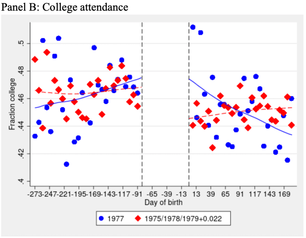
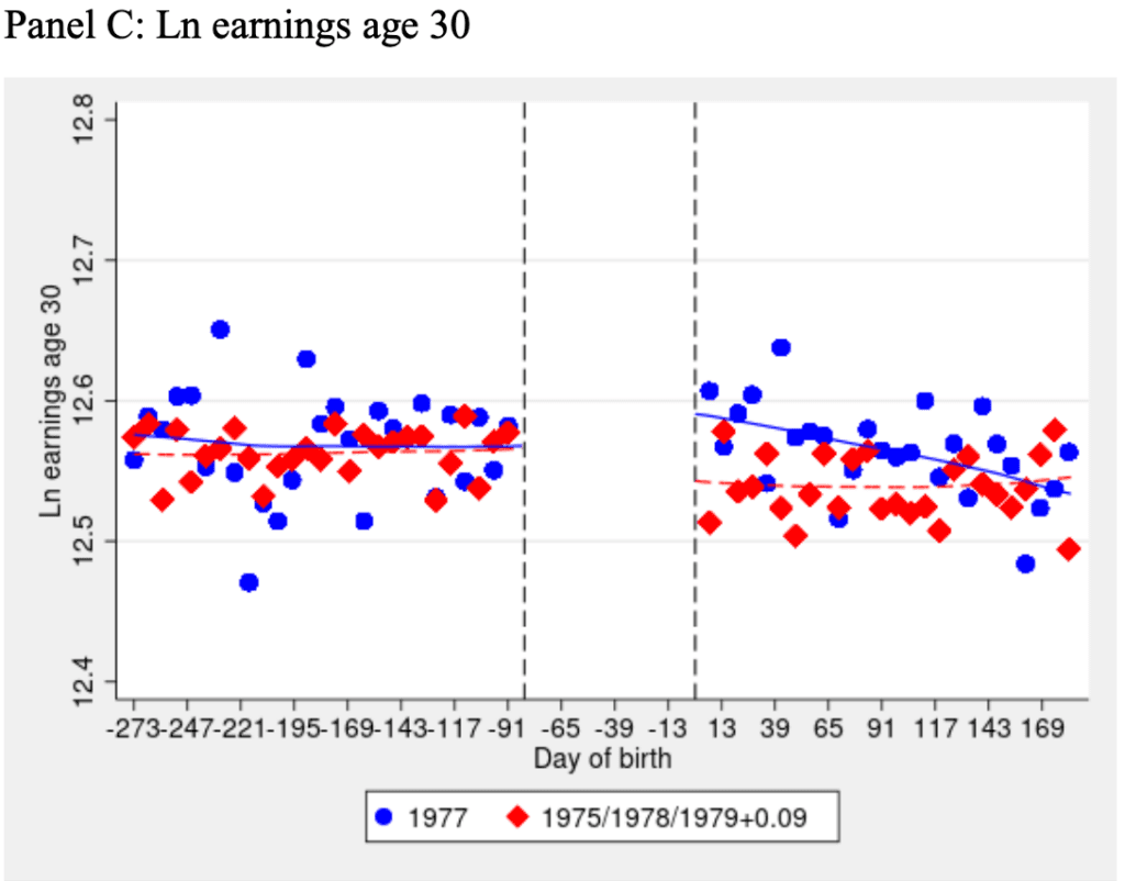
To understand the impact of access to a college education on the people in the program, Vera researchers needed to know what would have happened to these people if they had not participated in the program. . . . Ideally, researchers need these comparisons to be between groups that are otherwise as similar as possible to guard against attributing outcomes to the effects of education that may be due to the characteristics of people who are eligible for or interested in participating in education. In a fair comparison of students and nonstudents, the only difference between the two is that students participated in college education in prison while nonstudents did not. . . . One study of the impacts of college in prison on criminal legal system outcomes found that people who chose or were able to access education differed in their demographics, employment and conviction histories, and sentence lengths from people who did not choose or have the ability to access education. This indicates a need for research and statistical methods that can account for such “selection” into college education . . .

The best way to create the fair comparisons needed to estimate causal effects is to perform a randomized experiment. However, this was not done in this study due to the ethical impact of withholding from a comparison group an intervention that has established positive benefits . . . Vera researchers instead aimed to create a fairer comparison across groups using a statistical technique called propensity score matching . . . Vera researchers matched students and nonstudents on the following variables:
– demographics . . .
– conviction history . . .
– correctional characteristics . . .
– education characteristics . . .
Researchers considered nonstudents to be eligible for comparison not only if they met the same academic and behavioral history requirements as students but also if they had a similar time to release during the CIP period, a similar age at incarceration, and a similar time from prison admission to eligibility. . . . when evaluating whether an intervention influences an outcome of interest, it is a necessary but not sufficient condition that the intervention happens before the outcome. Vera researchers therefore defined a “start date” for students and a “virtual start date” for nonstudents in order to determine when to begin measuring in-facility outcomes, which included Tier II, Tier III, high-severity, and all misconducts. . . . To examine the effect of college education in prison on misconducts and on reported wages, Vera researchers used linear regression on the matched sample. For formal employment status and for an incident within six months and 12 months of release that led to a new conviction, Vera used logistic regression on the matched sample. For recidivism at any point following release, Vera used survival analysis on the matched sample to estimate the impact of the program on the time until an incident that leads to a new conviction occurs.

What about the concern expressed by Doleac regarding differences that are not accounted for by the matching and adjustment variables? Here’s what the report says:

Vera researchers have attempted to control [I’d prefer the term “adjust” — ed.] for pre-incarceration factors, such as conviction history, age, and gender, that may contribute to misconducts in prison. However, Vera was not able to control for other pre-incarceration factors that have been found in the literature to contribute to misconducts, such as marital status and family structure, mental health needs, a history of physical abuse, antisocial attitudes and beliefs, religiosity, socioeconomic disadvantage and exposure to geographically concentrated poverty, and other factors that, if present, would still allow a person to remain eligible for college education but might influence misconducts. Vera researchers also have not been able to control for factors that may be related to misconducts, including characteristics of the prison management environment, such as prison size, and the proportion of people incarcerated under age 25, as Vera did not have access to information about the facilities where nonstudents were incarcerated. Vera also did not have access to other programs that students and nonstudents may be participating in, such as work assignments, other programming, or health and mental health service engagement, which may influence in-facility behavior and are commonly used as controls in the literature. If other literature on the subject is correct and education does help to lower misconducts, Vera may have, by chance, mismatched students with controls who, unobserved to researchers and unmeasured in the data, were less likely to have characteristics or be exposed to environments that influence misconducts. While prior misconducts, assigned security class, and time since admission may, as proxies, capture some of this information, they may do so imperfectly.

They have plans to mitigate these limitations going forward:

First, Vera will receive information on new students and newly eligible nonstudents who have enrolled or become eligible following receipt of the first tranche of data. Researchers will also have the opportunity to follow the people in the analytical sample for the present study over a longer period of time. . . . Second, researchers will receive new variables in new time periods from both DOCCS and DOL. Vera plans to obtain more detailed information on both misconducts and counts of misconducts that take place in different time periods for the final report. . . . Next, Vera will obtain data on pre-incarceration wages and formal employment status, which could help researchers to achieve better balance between students and nonstudents on their work histories . . .

In summary: Yeah, observational studies are hard. You adjust for what you can adjust for, then you can do supplementary analyses to assess the sizes and directions of possible biases. I’m kinda with Ben-Menachem on this one: Doleac’s right that the study “does not isolate the treatment effect of the education program,” but there’s really no way to isolate this effect—indeed, there is no single “effect,” as any effect will vary by person and depend on context. But to say that the report “provides no useful information” about the effect . . . I think that’s way too harsh.

Another way of saying this is that, speaking in general terms, I don’t find adjusting for existing pre-treatment variables to be a worse identification strategy than instrumental variables, or difference-in-differences, or various other methods that are used for causal inference from observational studies. All these methods rely on strong, false assumptions. I’m not saying that these methods are equivalent, either in general or in any particular case, just that all have flaws. And indeed, in her work with the Arnold Foundation, Doleac promotes various criminal-justice reforms. So I’m not quite sure why she’s so bothered by this particular Vera study. I’m not saying she’s wrong to be bothered by it; there just must be more to the story, other reasons she has for concern that were not mentioned in her above-linked social media post.

Also, I don’t believe that estimate from the Vera study that the treatment reduces recidivism by 66%. No way. See the section “About that ’66 percent'” below for details. So there are reasons to be bothered by that report; I just don’t quite get where Doleac is coming from in her particular criticism.

2. Given the inevitable weaknesses of any study of this sort, how should its findings inform policy?

I guess it’s the usual story: each study only adds a bit to the big picture. The Vera study is encouraging to the extent that it’s part of a larger story that makes sense and is consistent with observation. The results so far seem too noisy to be able to say much about the size of the effect, but maybe more will be learned from the followups.

3. What should advocates’ or legislators’ views of the policy options be, given that the evidence in favor of the status quo is far from rigorous by any standard?

This I’m not sure. It depends on your understanding of justice policy. Ben-Menachem and others want to reduce mass incarceration, and this makes sense to me, but others have different views and take the position that mass incarceration has positive net effects.

I agree with Ben-Menachem that policymakers should not stick with the status quo, just on the basis that there is no strong evidence in favor of a particular alternative. For one thing, the status quo is itself relatively recent, so it’s not like it can be supported based on any general “if it ain’t broke, don’t fix it” principle. But . . . I don’t think Doleac is taking a stick-with-the-status-quo position either! Yes, she’s saying that the Vera study “provides no useful information”—a statement I don’t really agree with—but I don’t see her saying that New York’s college-in-prison education program is a bad idea, or that it shouldn’t be funded. I take Doleac as saying that, if policymakers want to fund this program, they should be clear that they’re making this decision based on their theoretical understanding, or maybe based on political concerns, not based on a solid empirical estimate of its effects.

4. Given questions 1, 2, 3 above, what is the relevance of methodological critiques of any study in a real-world policy context?

Methodological critique can help us avoid overconfidence in the interpretation of results.

Concerns such as Doleac’s regarding identification help us understand how different studies can differ so much in their results: in addition to sampling variation and varying treatment effect, the biases of measurement and estimation depend on context. Concerns such as mine regarding effect sizes should help when taking exaggerated estimates and mapping them to cost-benefit analyses.

Even with all our concerns, I do think projects such as this Vera study are useful in that they connect the qualitative aspects of administrating the program with quantitative evaluation. It’s also important that the project itself has social value and that the proposed mechanism of action makes sense. I’m reminded of our retrospective control study of the Millennium Villages project (here’s the published paper, here and here are two unpublished papers on the design of the study, and here’s a later discussion of our study and another evaluation of the project): the study could never have been perfect, but we learned a lot from doing a careful comparison.

To return to Ben-Menachem’s post, I think the framing of this as a “fight over rigor” is a mistake. The researchers at the Vera Institute and the economist at the Arnold Foundation seem to be operating at the same, reasonable, level of rigor. They’re concerned about causal identification and generalizability, they’re trying to learn what they can from observational data, etc. Regression adjustment with propensity scores is no more or less rigorous than instrumental variables or change-point analysis or multilevel modeling or any other method that might be applied in this sort of problem. It’s really all about the details.

It might help to compare this to an example we’ve discussed in this space many times before: flawed estimates of the effect of air pollution on lifespan. There’s lot of theory and evidence that air pollution is bad for your life expectancy. The theory and evidence are not 100% conclusive—there’s this idea that a little bit of pollution can make you stronger by stimulating your immune system or whatever—but we’re pretty much expecting heavy indoor air pollution to be bad for you.

The question then comes up, what is learned that is policy relevant from a really bad study of the effects of air pollution. I’d say, pretty much nothing. I have a more positive take on the Vera study, partly because it is very directly studying the effect of a treatment of interest. The analysis has some omitted variables concerns, also the published estimates are, I believe, way too high, but it still seems to me to be moving the ball forward. I guess that one way they could do better would be to focus on more immediate outcomes. I get that reduction in recidivism is the big goal, but that’s kind of indirect, meaning that we would expect smaller effects and noisier estimates. Direct outcomes of participation in the program could be a better thing to focus on. But I’m speaking in general terms here, as I have no knowledge of the prison system etc.

About that “66 percent”

As noted above, the Vera study concluded:

Participation in this form of postsecondary education reduced reconviction by at least 66 percent.

“At least 66 percent” . . . where did this come from? I searched the paper for “66” and found this passage:

Vera’s study found that participation in college in prison reduced the risk of reconviction by 66 to 67 percent (a relative risk of 0.33 and 0.34). (See Table 7.) The impact of participation in college education was found to reduce reconviction in all three of the analyses (six months, 12 months, and at any point following release). The consistency of estimated treatment effects gives Vera confidence in the validity of this finding.

And here is the relevant table:

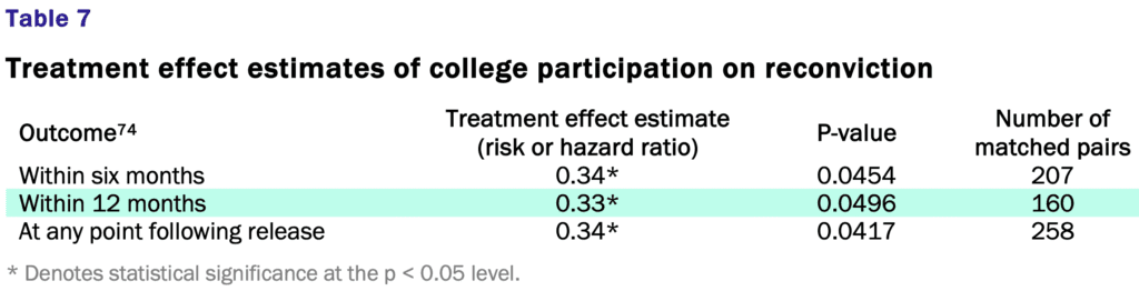
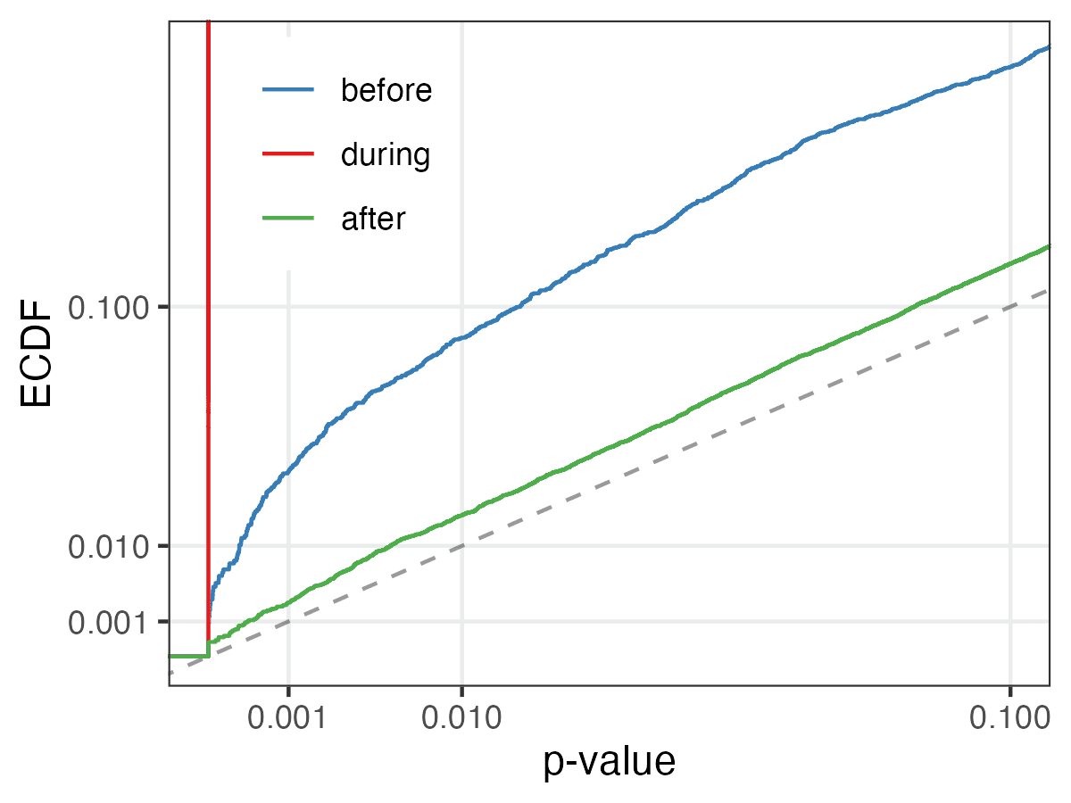
Ummmm . . . no. Remember Type M errors? The raw estimate is HUGE (a reduction in risk of 66%) and the standard error is huge too (I guess it’s about 33%, given that a p-value of 0.05 corresponds to an estimate that’s approximately two standard errors away from zero) . . . that’s the classic recipe for bias.

Give it a straight-up Edlin factor of 1/2 and your estimated effect is to reduce the risk of reconviction by 33%, which still sounds kinda high to me, but I’ll leave this one to the experts. The Vera report states that they “detected a much stronger effect than prior studies,” and those prior studies could very well be positively biased themselves, so, yeah, my best guess is that any true average effect is less than 33%.

So when they say, “at least 66 percent”: I think that’s just wrong, an example of the very common statistical error of reporting an estimate without correcting for bias.

Also, I don’t buy that the result appearing in all three of the analyses represents a “consistency of estimated treatment effects” that should give “confidence in the validity of this finding.” The three analyses have a lot of overlap, no? I don’t have the raw data to check what proportion of the reconvictions within 12 months or at any point following release already occurred within 6 months, and I’m not saying the three summaries are entirely redundant. But they’re not independent pieces of information either. I have no idea why the estimates are soooo close to each other; I guess that is probably just one of those chance things which in this case give a misleading illusion of consistency.

Finally, to say a risk reduction of “66 to 67 percent” is a ridiculous level of precision, given that even if you were to just take the straight-up classical 95% intervals you’d get a range of risk reductions of something like 90 percent to zero percent (a relative risk between 0.1 and 1.0).

So we’re seeing overestimation of effect size and overconfidence in what can be learned by the study, which is an all-too-common problem in policy analysis (for example here).

None of this has anything to do with Doleac’s point. Even with no issues of identification at all, I don’t think this treatment effect estimate of 66% (or “at least 66%” or “66 to 67 percent”) decline in recidivism should be taken seriously.

To put it another way, if the same treatment were done on the same population, just with a different sample of people, what would I expect to see? I don’t know—but my best estimate would be that the observed difference would be a lot less than 66%. Call it the Edlin factor, call it Type M error, call it an empirical correction, call it Bayes; whatever you want to call it, I wouldn’t feel comfortable taking that 66% as an estimated effect.

As I always say for this sort of problem, this does not mean that I think the intervention has no effect, or that I have any certainty that the effect is less than the claimed estimate. The data are, indeed, consistent with that claimed 66% decline. The data are also consistent with many other things, including (in my view more plausibly) smaller average effects. What I’m disagreeing with is the claim that the study demonstrates provides strong evidence for that claimed effect, and I say this based on basic statistics, without even getting into causal identification.

P.S. Ben-Menachem is a Ph.D. student in sociology at Columbia and he’s published a paper on police stops in the APSR. I don’t recall meeting him, but maybe he came by the Playroom at some point? Columbia’s a big place.

Report of average change from an Alzheimer’s drug: I don’t get the criticism here.

Alexander Trevelyan writes:

I was happy to see you take a moment to point out the issues with the cold water study that was making the rounds recently. I write occasionally about what I consider to be a variety of suspect practices in clinical trial reporting, often dealing with deceptive statistical methods/reporting. I’m a physicist and not a statistician myself—I was in a group that had joint meetings with Raghu Parthasarathy’s lab at Oregon—but I’ve been trying to hone my understanding of clinical trial stats recently.

Last week, the Alzheimer’s drug Leqembi (lecanemab) was approved by the FDA, which overall seems fine, but it rekindled some debate about the characterization of the drug causing a “27% slowing in cognitive decline” over placebo; see here. This 27% figure was touted by, for example, the NIH NIA in a statement about the drug’s promise.

So here’s my issue, which I’d love to hear your thoughts on (since this drug is a fairly big deal in Alzheimer’s and has been quite controversial)—the 27% number is a simple percentage difference that was calculated by first finding the change in baseline for the placebo and treatment groups on the CDR-SB test (see first panel of Figure 2 in the NEJM article), then using the final data point for each group to calculate the relative change between placebo and treatment. Does this seem as crazy to you as it does to me?

First, the absolute difference in the target metric was under 3%. Second, calculating a percentage difference on a quantity that we’ve rescaled to start at zero seems a bit… odd? It came to my attention because a smaller outfit—one currently under investigation by about every three-letter federal agency you can name—just released their most recent clinical trial results, which had very small N and no error bars, but a subgroup that they touted hovered around zero and they claimed a “200% difference!” between the placebo and treatment groups (the raw data points were a +0.6 and -0.6 change).

OK, I’ll click through and take a look . . .

My first reaction is that it’s hard to read a scholarly article from an unfamiliar field! Lots of subject-matter concepts that I’m not familiar with, also the format is different from things I usually read, so it’s hard for me to skim through to get to the key points.

But, OK, this isn’t so hard to read, actually. I’m here in the Methods and Results section of the abstract: They had 1800 Alzheimer’s patients, half got treatment and half got placebo, and their outcome is the change in score in “Clinical Dementia Rating–Sum of Boxes (CDR-SB; range, 0 to 18, with higher scores indicating greater impairment).” I hope they adjust for the pre-test score; otherwise they’re throwing away information, but in this case the sample size is so large that this should be no big deal, we should get approximate balance between the two groups.

In any case, here’s the result: “The mean CDR-SB score at baseline was approximately 3.2 in both groups. The adjusted least-squares mean change from baseline at 18 months was 1.21 with lecanemab and 1.66 with placebo.” So both groups got worse. That’s sad but I guess expected. And I guess this is how they got the 27% slowing thing: Average decline in control group was 1.66, average decline in treatment group is 1.21, you take 1 – 1.21/1.66 = 0.27, so a 27% slowing in cognitive decline.

Now moving to the statistical analysis section of the main paper: Lots of horrible stuff with significance testing and alpha values, but I can ignore all this. The pattern in the data seems clear. Figure 2 shows time trends for averages. I’d also like to see trajectories for individuals. Overall, though, saying “an average 27% slowing in cognitive decline” seems reasonable enough, given the data they show in the paper.

I sent the above to Trevelyan, who responded:

Interesting, but now I’m worried that maybe I spend too much time on the background and not enough time in making my main concern more clear. I don’t have any issues with the calculation of the percent difference, per se, but rather what it is meant to represent (i.e., the treatment effect). As you noted, and is unfortunately the state of the field, the curves always go down in Alzheimer’s treatment—but that doesn’t have to be the case! The holy grail is something that makes the treatment curve go up! The main thing that set off alarm bells for me is that the “other company” I referenced claims to have observed an improvement with their drug and an associated 200%(!) slowing in cognitive decline. In their case, the placebo got 0.6 points worse and the treatment 0.6 points better, so 200%! But their treatment could’ve gotten 10 points better and the placebo 10 points worse, and that’s also 200%! Or maybe 0.000001 points better versus 0.000001 points worse—again, 200%.

I think my overall concern is, “why are we using a metric that can break in such an obvious way under perfectly reasonable (if currently aspiration) treatment outcomes?”

See here for data from “other company” if you are curious (scroll down to mild subgroup, ugh).

And here’s a graph made by Matthew Schrag, who is an Alzheimer’s researcher and data sleuth, which rescales the change in the metric and shows the absolute change in the CDR-SB test. The inner plot shows the graph from the original paper; the larger plot is rescaled:

My reply: I’m not sure. I get your general point, but if you have a 0-18 score and it increases from 3.2 to 4.8, that seems like a meaningful change, no? They’re not saying they stopped the cognitive decline, just that they slowed it by 27%.

P.S. I talked with someone who works in this area who says that almost everyone in the community is skeptical about the claimed large benefits for lecanemab, and also that there’s general concern that resources spent on this could be better used in direct services. This is not to say the skeptics are necessarily right—I know nothing about all this!—but just to point out that there’s a lot of existing controversy here.

Studying causal inference in the presence of feedback:

Kuang Xu writes:

I’m a professor at the business school at Stanford working on operations research and statistics. Recently, I shared one of our new preprints with a friend who pointed out some of your blog posts that seem to be talking about some related phenomenon. In particular, our paper studies how, by using adaptive control, the states of a processing system are effected in such a way that congestion no longer “correlates” with the underlying slowdown of services.

You mentioned in the blog where you wonder if there’s some formal treatment of this phenomenon where control removes correlation in a system, and I thought you might find this to be interesting, possibly a formal example of the effect you were thinking about.

We’ve been wondering if there are other similar, concrete examples in the policy realm that resemble this.

My reply: I’m not sure. On one hand, the difficulty of causal inference with observational data is well known—it’s a strong theme of all presentations of causal inference—but it seems that most of the concerns come with selection rather than feedback.

Xu responds:

We tried to explore this connection to a small degree in the lit review – there’s some similarity to how people use inverse [estimated] probability weighting to debias selection, but these are generally one-time interventions so not so much of a feedback loop. Like you wrote in that blog post, something like monetary policy is more like a feedback loop, but it’s hard to isolate such effects in these complex systems.

As I wrote in my earlier post on the topic, I’m pretty sure there was tons of work back in the 1940s-1960s in this area of feedback in control systems. I can just picture a bunch of guys in crewcuts wearing short-sleeved button-up shirts with pocket protectors working on these problems. For some reason, though, I haven’t hear much about any of this nowadays within statistics or econometrics. Seems like there’s room for some unification, along with some communication so that the rest of us can make use of whatever has been doing in this area already.