“What happened in 2024”

The other day, Connor Gilroy, Shira Mitchell, David Shor, and Jonathan Tannen posted a detailed discussion of the challenges of learning about the political preferences of nonvoters, marginal voters, and groups such as young voters who rarely answer opinion polls. Their post was relevant to a discussion we had last month of the political attitudes of nonvoters.

As I wrote at the time, the real interest for campaigns is not nonvoters but rather marginal voters: the people who might be persuaded or dissuaded from voting. Comparing nonvoters to voters is interesting, but marginal voters could well differ from the mass of nonvoters or even the mass of registered voters. Gilroy et al. work at Blue Rose Research, where they have access to some sort of “voter file” that has enough information that they should be able to get a good sense of who the marginal voters are; still, as they explain in their post, a lot of uncertainty about this group remains, especially considering that, strictly speaking, there is no such thing as a marginal voter: your level of “marginality” depends on the campaign itself.

Another firm that uses the voter file is Catalist, which just released their scheduled post-election report. Yair Ghitza, Haris Aqeel, and Josh Yazman write:

Catalist’s What Happened reports offer a comprehensive voter-file based view of the electorate after every major presidential and midterm election. Our 2024 report is based on publicly available vote history data and precinct-level election results from every state . . . as well as Census data, and Catalist’s proprietary modeling and polling, which are all used to estimate the composition and partisan leanings of the electorate from the precinct to the national level.

Here are their key findings:

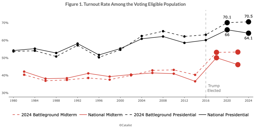
Turnout remained high, especially in battleground states, and especially in Republican areas. National turnout was 64% of the voter eligible population, nearly matching 2020’s historic turnout. In the seven major battleground states turnout was more than 70%, exceeding both the national turnout rate and the battleground state turnout rate for 2020. Even though turnout was high overall, there were differences between groups. Turnout in Republican areas dropped less than in Democratic areas across both battleground and non-battleground states, and turnout remained higher for white voters than voters of color.

Many voters changed their partisan preferences, from supporting Biden in 2020 to Trump in 2024. . . . Shifts in turnout and shifts in voters’ partisan preferences both contributed to the final election outcome and these trends relate to one another across demographic groups and subgroups.

Harris continued to do well among voters who have consistently participated in elections. . . .

The major trends against Democrats in the election were mitigated in the battleground states – turnout was higher, support losses were lessened – which may be related to higher levels of campaign activity and more frequent election participation in these states.

Voters of color continue to support Democrats, but support has dropped successively over the past three presidential elections. . . . Democratic support has continued to erode among voters of color. Drops from 2020 to 2024 were highest among Latino voters (9 points in support), lowest among Black voters (3 points), and 4 points for Asian and Pacific Islander groups (AAPI). Support drops were 5 to 6 points among “Other” voters . . . As with other demographic groups, support drops were concentrated among the younger cohorts of voters, particularly young men. For instance, support among young Black men dropped from 85% to 75% and support among young Latino men dropped from 63% to 47%.

White voters remained over 72% of voters, the same as 2020, and Harris also lost support among some of these voters. . . . concentrated among specific sets of white voters – irregular voters, young voters, and men. Harris also saw support drops among white men with a college degree.

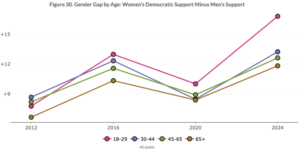
The partisan gender gap remains high and grew in 2024. . . .

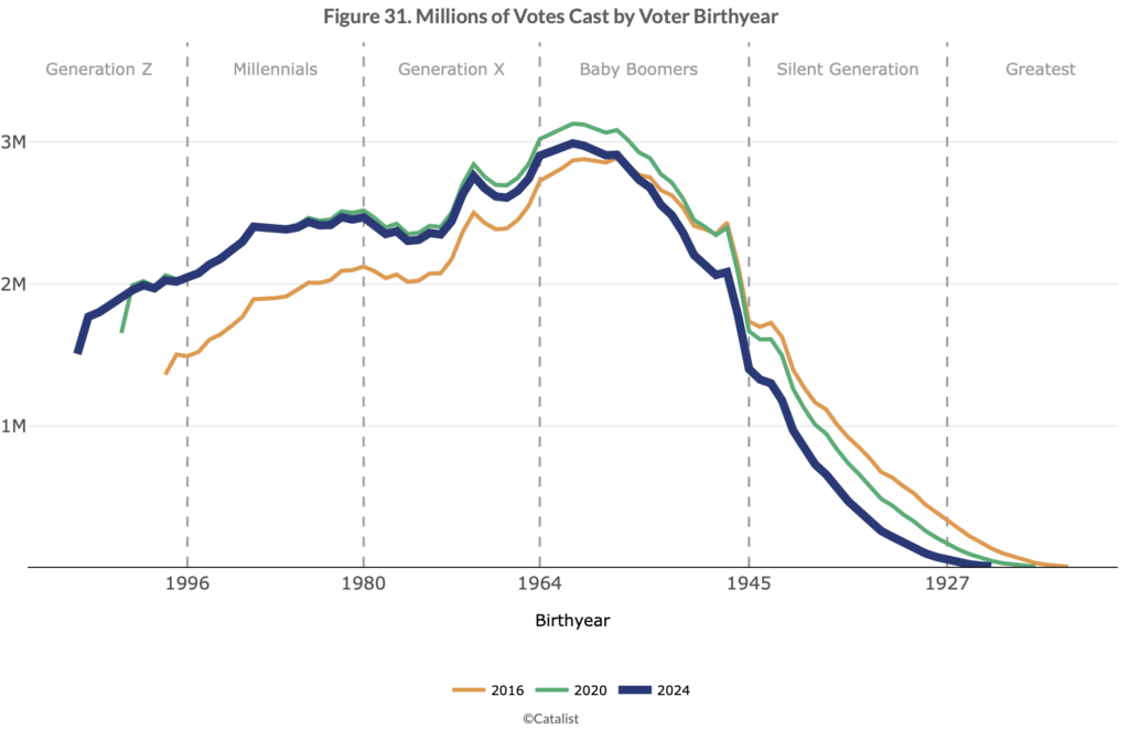
After years of historically high support among Democrats, a significant share of young voters swung toward Republicans. Voters under the age of 30 dropped from 61% Democratic support in 2020 to 55% in 2024. Similar support drops are evident when examining voters by generational cohorts, such as Gen Z or Millennials. These drops were larger than drops for any other generation or age group, and other trends in the demographic data, such as drops among different racial groups and the gender gap, were more pronounced among young voters than the rest of the electorate.

Education polarization remains high, but decreased slightly in 2024. . . .

The urban-rural divide remains strong, but Democrats did worse in cities in 2024. . . . These drops are related to other trends in the data, particularly the drops in Democratic turnout in major metropolitan areas.

They summarize:

Harris lost in 2024 due to a combination of support and turnout drops among key groups, particularly “rotating voters.” The nature of Democratic coalitions is different from Republican coalitions. In recent years, successful Democratic elections have seen a combination of (1) support shifts towards the Democrats among core regular voters, and (2) a consistent refresh of new voters that lean towards Democrats – including young people, voters of color, urban voters, and people who move regularly. In 2024, Harris lost support among presidential repeat voters, meaning those who also voted in 2020, and the new set of “rotating Democrats” did not materialize as they had in previous elections. . . . these groups of voters overlap in many ways and we discuss the strategic implications of this data and how campaigns engage voters along a variety of interrelated channels that go beyond simple “mobilization” or “persuasion.”

And they supply some graphs:

Lots more at the link.

For comparison, here are some previous reports:

Reflections on the recent election

What happened in the 2022 elections

2020: What happened?

What Happened in the 2018 Election

“What Happened Next Tuesday: A New Way To Understand Election Results”

“2010: What happened?” in light of 2018

Wanna know what happened in 2016? We got a ton of graphs for you.

2010: What happened?

What happened in the Congressional vote?

Election 2008: what really happened

“Can language models predict the next twist in a story?”

Ted Underwood writes:

While distant reading has taught us a lot about the history of fiction, it hasn’t done much yet to explain why we keep turning pages.

“Suspense” is the word we use to explain that impulse. But what is suspense? Does it require actual anxiety, or just uncertainty about what happens next? If suspense depends on not knowing what will happen, how can we enjoy re-reading familiar books? (Smuts 2009) And why do we enjoy being surprised? (Tobin 2018)

Beyond these big theoretical puzzles, there are historical questions scholars might like to ask about the way authors use chapter breaks to structure narrative revelation (Dames 2023, 219-38).

This is related to a post of ours from a few years ago, Why do we prefer familiarity in music and surprise in stories?

I don’t have anything to add here; I just wanted to share those links because the topic remains interesting!

Which AI coding assistant should I be using?

This post is by Phil Price, not Andrew.

For more than a year I have been using chatGPT to help write code. Maybe “help write code” is an understatement: often chatGPT writes the code to my instructions. I almost always get much better code in much less time than of I wrote everything myself, but I also frequently run into frustrating problems in which chatGPT acts like a chowderhead. (Here I’m referring to the o4-mini-high flavor of chatGPT.)

One recent experience: I need to do an SQL query: Use Table A to find the ID numbers of all of the customers in a specific group, cross-reference with Table B to find the locations and electric meter numbers associated with those customers, refer to Table C to get the dates and times that the group was selected for some kind of action, and refer to Table D to get the electricity consumption for those meters at those times. The variables have different names in the different tables (e.g. ‘customer_id’ in one table is called ‘customer_number’ in another table). The result is a somewhat involved query, but not an _extremely_ complicated query, you just have to go through one link at a time and be a bit careful. I thought chatGPT would nail this easily but in the end I spent more time coercing chatGPT to do it than it would have taken to do it myself: it would propose a chunk of code; I would try it and it would fail because (for instance) the variable name matching wasn’t done for every one of the steps or some similar issue; I would point out the problem and ask it to try again and it would propose another chunk of code with some different problem; and so on. I even tried the “deep thinking” option, which took much longer but still produced buggy code.

I mentioned this to a friend and he asked if I have tried Claude Code, which is his favorite. This has some features that seem potentially quite useful, including that you can have it scan your whole project code base and use that as context. That sounds great in a way, but also rather scary: what’s to stop it from going off the reservation and reading files I don’t want it reading? To some readers this may seem paranoid: do I really think Anthropic is going to steal my credit card information or something? Other readers will think I’m not nearly cynical enough: of _course_ these companies are going to do all kinds of unethical stuff, maybe not as crude as stealing my credit card information but not necessarily a lot better than that either. OK, yes, chatGPT has significant flaws as a programming assistant, but at least it only knows what I tell it and I have complete control over that.

So…I’m somewhat dissatisfied with ChatGPT o4-mini-high, I’m scared of Claude Code…what else should I consider? There are quite a few coding assistants, are there any that can write good code without the risk that my information will be used in ways I don’t like?

This post is by Phill.


If only Arxiv required researchers to sign at the top rather than the bottom of the page, none of this would’ve happened.

The story

A reader who would like to remain anonymous writes:

A story of research fraud just broke that I’d like to bring your attention to, if you haven’t heard it already.

Last year, a first year phd student in economics named Aidan Toner-Rodgers gained headlines for his paper on AI boosting scientific discovery. Acemoglu calls the work “fantastic” and David Autor was “floored.” I’m sure Autor was floored again when it was discovered that the entire thing was fake.

Hey, that’s a funny line!

My correspondent continues:

It seems TR made up everything; there likely was never an experiment in the first place. He even registered a domain name to look like Corning, who then sent him a cease-and-desist. This blog post by a material scientist points out some of the obvious red flags, as does this twitter thread by a professor of materials chemistry. MIT sent out a press release. They’ve asked arxiv to take down the paper and TR is no longer a student at MIT.

It’s an incredible story, especially given how popular that paper was upon the release of the preprint. It received an R&R from QJE and slipped by Acemoglu and Autor. I’ve been happy to see that the story of the fraud seems to be receiving about as much attention as the paper itself did upon release, but still sad that this could happen in the first place.

Hopefully my next correspondence with you is about research and not whatever this is.

“Whatever this is,” indeed!

I was curious so I googled the usual suspects (*Aidan Toner-Rodgers gladwell*, *Aidan Toner-Rodgers freakonomics*, *Aidan Toner-Rodgers NPR*, etc.), and some fun things came up:

From a Freakonomics episode, Is San Francisco a Failed State? (And Other Questions You Shouldn’t Ask the Mayor):

There was just a study from a grad student at M.I.T. describing how researchers using A.I. were able to discover 44 percent more materials than a randomly assigned group that didn’t have access to the technology.

From NPR’s Planet Money:

One of the big questions in economics right now is which types of workers benefit from the use of AI and which ones don’t. As we’ve covered before in the Planet Money newsletter, some early studies on Generative AI have found that less skilled, lower-performing workers have benefited more than higher skilled, higher-performing workers.

For economists like MIT’s David Autor, these early studies have been exciting. . . . Another recent study by MIT economist Aidan Toner-Rodgers found something similar. It looked at what happened to the productivity of over a thousand scientists at an R&D lab of a large company after they got access to AI. Toner-Rodgers found that “while the bottom third of scientists see little benefit, the output of top researchers nearly doubles.” Again, AI benefits those who can figure out how to use it well, and, it suggests, that in many fields, top performers could become more top performing, thereby increasing inequality.

Tyler Cowen shared the abstract of the Toner-Rodgers papers and none of his commenters sniffed out the problems.

Given that the paper fooled the reporters at the Wall Street Journal and the commenters at Marginal Revolution, it shouldn’t be such a surprise that perennially-credulous outlets such as Freakonomics and NPR fell for it too.

A smooth-looking research article . . .

After doing that quick web search, I followed the second link above to read Toner-Rodgers’s article. It was very well-written: it reads like a real econ paper! No wonder Acemoglu and Autor got conned: the paper is smooth and professional in appearance, down to the footnote on the first page thanking 21 different people as well as “seminar participants at NBER Labor Studies and MIT Applied Micro Lunch for helpful comments.” I’m reminded of the Technical Note at the end of the zombies paper.

. . . with some weird references

The first thing that jumped out at me was this in the reference list:

Diamandis, Peter. 2020. “Materials Science: The Unsung Hero.”

That guy’s a notorious bullshitter–how did that reference get into an otherwise serious-looking paper?

Actually, a lot of the references in Toner-Rodgers’s paper are incomplete, with no publication information at all, just a pile of things pulled off the internet, for example:

Bostock, J. 2022. “A Confused Chemist’s Review of AlphaFold 2.”
Cotra, Ajeya. 2023. “Language models surprised us.”
Ramani, Arjun, and Zhengdong Wang. 2023. “Why Transformative Artificial Intelligence is Really, Really Hard to Achieve.” The Gradient.
Schulman, Carl. 2023. “Intelligence Explosion.”

In the words of the late Joe Biden, “C’mon, man.”

The paper also cites 6 articles by Acemoglu and 6 by Autor . . . ok, I guess that’s why they were “floored” and thought the work was “fantastic.” If only Toner-Rodgers had found his way to including 10 references for each of them, maybe he could’ve moved up to “bowled over” and “amazing.”

Seriously, though, setting aside the junk references, I don’t know that I would’ve noticed any problems with the paper had it been sent to me cold.

Suspiciously wide confidence intervals

The only obviously suspect bits are Figures A.2 and A.3:

The intervals look too wide given how close the points are to the line. But my reaction in seeing something like this is that the model is probably misspecified in some way, or maybe the authors are reporting the results wrong. These graphs don’t scream “Fraud!”; they scream, “Someone is using statistical methods beyond his competence” (as with the multilevel model discussed here).

Funny p-values

Oh, yeah, there’s also Table A1:

Something funny about that first column, no? The estimate is 0.195, the standard error is 0.105, and it’s listed as significant at the 1% level. But 0.195/0.105 = 1.86, which, under the usual calculation, has a p-value of more than 5%.

And Table A3:

0.024/0.015 = 1.6, but a z-score of 1.6 is not significant at the 5% level.

And then these:

First, this looks wrong because with Poisson and negative binomial regressions, you’ll typically get similar point estimates but a wider standard error for the negative binomial. But here the point estimates are much different, and something seems wrong with the standard errors: the negative binomial has tiny standard errors. And again the p-values don’t match the numbers in the table. The estimates in the first two columns of Table A8 are a stunning (one might say, suspicious) 10+ standard errors from zero, but they’re starred as not reaching the 1% level of significance.

It’s kind of amazing for someone to have put so much effort into (allegedly) faking an entire study and then get sloppy at that last bit. Maybe he should’ve faked all the raw data so as to ensure internal consistency of his results. I kinda wonder where all these numbers came from. Maybe he used a chatbot to produce them? It would be kind of exhausting to construct them all from scratch.

That all said, had I been a reviewer I might have pointed out these anomalies, and then the numbers could’ve been cleaned up in the revision process and I’d have been none the wiser.

How did they spot the fraud?

OK, so my next question is, who figured out the paper was a fake, and how did they figure it out? From the Wall Street Journal article:

[Acemoglu and Autor] said they were approached in January by a computer scientist with experience in materials science who questioned how the technology worked, and how a lab that he wasn’t aware of had experienced gains in innovation.

Credit to Acemoglu and Autor for accepting this and not trying to shoot the messenger. Also credit to MIT, which did better than Columbia, UCB, and USC in handling research misconduct. I guess it’s easier to discipline a misbehaving student than a misbehaving professor. In any case, as an MIT alum, I appreciate their statement, “Research integrity at MIT is paramount – it lies at the heart of what we do and is central to MIT’s mission.” In this case, they talk the talk and they walk the walk.

To learn more I followed the link above to the material scientist’s blog post, which gives lots of details on suspicious aspects of the paper, various things that I wouldn’t have noticed–no surprise, given that the last time I published anything in material science was over 40 years ago! I recommend you read the whole thing (the material science post, not my old physics paper).

A story worthy of Borges

Above I asked, how is is that this student reportedly went to the trouble to make up an entire study, complete with a fake webpage, and complete and submit a long, professionally-written research paper based on fake study, and then fall down on his p-value calculations. Converting a z-score to a p-value, that’s the easiest thing in the world, no?

But after reading the report by the material scientist, I’m not so sure, as the p-values appear to be the least of the issues. If anything, Toner-Rodgers should’ve put less effort into faking the statistical summaries and more work into designing a more convincing fake study.

But it’s hard to design a convincing fake study. Fake things look fake. Reality is overdetermined. Remember that Borges story with a map that is on a one-to-one scale with reality? Anything else would be unrealistic. Similarly, if you want to fake a study, it should be coherent, and the only way to do that is to not just fake the tables but to fake the raw data, but then outsiders can check the raw data and find evidence for its construction, so really to be on the safe side you need to actually gather the data, which means you need to perform the study.

In short, the only way to produce a truly convincing fake experiment is . . . to do the experiment for real. But that would take a lot of work! (Also there’s a risk with real data that you might not find the effect you’re looking for, but modern methods of data analysis have enough researcher degrees of freedom that this shouldn’t be a problem.)

So, yeah, Toner-Rodgers showed real talent in writing a real-looking paper with lots of almost-real-looking tables and graphs–but perhaps his most impressive achievement was in “social engineering”: whatever it took for him to persuade Acemoglu, Autor, and others that he’d done a real study. You gotta be a stone-cold faker to pull that off.

A solution that should make everyone happy

The above-linked news article said that the author of this apparently-fraudulent paper is no longer at MIT. But this shouldn’t be a problem. When authors of fraudulent papers leave MIT, they usually can go to Duke, no? There must be a position in the business school for this guy. He has a great future ahead of him. Maybe some Ted talks?

Failing that, I’ve heard that UNR is doing a search for dean of engineering. “Artificial Intelligence, Scientific Discovery, and Product Innovation” sounds perfect for that, no? But really I think that Duke’s Fuqua School would be ideal, a place where he could be mentored by one of their senior faculty with very relevant expertise.

Graduation Days: A tale of two campuses

Speaking of schools and lockdowns . . .

Last weekend we went to the graduation ceremonies at Carnegie Mellon University. Very pleasant, anyone who wants can stroll through campus and enter campus buildings (convenient if you want to go to the bathroom!), frisbees in the air, some security people around just in case anything were to go wrong.

This week is Columbia’s graduation. As usual, campus is locked up, also the individual buildings are locked, rent-a-cops everywhere as well as lots of NYPD in the neighborhood. And we get this email from Public Safety:

Dear Columbia Community,

As we prepare to celebrate our graduates, please review these important details about campus operations and access during this special time. . . .

Students will not be able to have guests access the Morningside campus beginning Saturday, May 17 at 12:00 p.m. through Wednesday, May 21 and alumni will not be able to access campus during this same time period.

The guest registration portal will be suspended for students and alumni during this period, and all previously issued QR codes for student guests will no longer work for campus entry during this time.

Commencement and Class Day guests should use their event-specific ticket to enter campus. . . .

Commencement Day (May 21) – Enhanced Security Measures

Campus Access Points
Starting at 6:00 a.m., there will be no pedestrian crossover along College Walk between upper and lower campuses
Staff should use the following entry points only:
For offices in upper campus: Earl Gate on 117th and Broadway
For offices in lower campus: Taint Gate at 115th and Amsterdam

Important Reminders
Deliveries cannot be made to campus from 6:00 a.m. to 2:00 p.m.
Columbia University ID is required to enter campus
If you do not have a University ID, bring a photo ID and a letter from your school on University stationery
Large bags are not permitted and all bags may be subject to search
Faculty and staff may request guest access beginning at 2:00 p.m. on Commencement Day

Event Attendance
If you have guests attending Commencement or your school’s Class Day ceremony, please ensure they have their event-specific tickets ready for campus entry. These special events require separate ticketing from the standard guest access system.

Congratulations to the Class of 2025! We look forward to celebrating your achievements.

Columbia University Public Safety

You can’t blame Public Safety for this–they’re just doing their job. It’s just a harsh contrast to the pleasant and open campus at CMU.

Why were schools so slow to return to in-person instruction?

Weakliem writes:

It’s now pretty widely agreed that schools were too slow to return to in-person instruction during the Covid epidemic: “remote learning” usually meant less learning and students suffered from the loss of normal social interaction.

Based on my experiences as a teacher and a parent of school-age children, I agree; indeed I felt that way at the time.

Weakliem then asks:

So why didn’t the schools go back faster?

He continues:

Some observers hold that cautious policies were imposed by what Nate Silver calls the “Indigo Blob”: “the merger between formerly nonpartisan institutions like the media, academia and public health . . . and instruments of the Democratic party and progressive advocacy groups.”

There are a couple of problems with this analysis. One is that general public opinion was not in favor of faster reopening. In April 2021 an NBC News poll asked people who had children in school “do you believe that your child’s school system has been too slow in re-opening, too fast in re-opening, or struck the right balance?” 14% said too slow, 14% too fast, and 70% struck the right balance. That’s an impressively high level of public agreement with policy, which may be because policies responded to local opinion or because people generally have a positive view of their local schools and trusted them to do the right thing. The second is that opinions on the issue were not closely related to education. . . .

Weakliem summarizes:

Returning to the question of why schools didn’t go back to in-person instruction more quickly, I’d say that it was because decision-makers were generally aligned with public opinion–the idea that children need special protection has a lot of intuitive appeal, so in the presence of uncertainty they were inclined to play it safe. Of course, there were also large partisan differences (see this post), but I don’t think that these appeared because Democrats followed the “Indigo Blob”—it was because they reacted against Trump.

Unfortunately, Weakliem is an obscure retired sociology professor so not so many people will see his analysis, as compared to the hundreds of thousands who will hear about the nefarious “indigo blob” etc etc. What can you do?

To get to the social science question: I hated the school closings and lockdowns when they were happening; the problem, though, was not that they were being imposed by a dictatorial government or that they were caused by some sort of conspiracy of the news media (let alone, by “progressive advocacy groups”). Rather, school closings and lockdowns were solutions to a coordination problem: if large fractions of the population don’t feel safe sending their children to school, and don’t feel safe going to work, then it makes sense to coordinate this behavior. The other thing was the fear of the health system being overwhelmed, hence the reasonable push to flatten the curve.

The real problem was not the shutdowns but rather that schools remained remote, even a year later! For that I’d blame a mixture of things including laziness at all levels. At Columbia, I got the impression that it was just easier for them to tell us to stay remote. Maybe they were afraid of lawsuits too? We also had faculty who were too lazy to come to work and teach, and I guess a lot of students found it more comfortable in the short term to sit at home and not go to school, but mostly I’m inclined to blame the administration—and, hey, it’s their job to make the hard decisions an take the blame, right?

An alternative Monty Hall problem. As with the usual Monty Hall problem, just set it up as a probability tree and it all works out

Johannes Fischer writes:

What is the optimal strategy in the problem posed on this tumblr post?

You are playing the Monty Hall problem. However, you secretly know one of the goats is the former pet of an eccentric billionaire who lost it and is willing to pay an enormous amount for its return, way more than the car is worth. You really want that goat. The host is unaware of this. After you pick your door, as is traditional, the host opens one door, which he knows doesn’t have the car. He reveals a goat, which you can tell is the ordinary goat and not the secretly valuable one. The host offers to let you switch doors. Should you?

I [Fischer] can’t wrap my head around whether the information gained in the second stage (seeing a goat revealed, but importantly, learning that the goat is not the one you want) changes the probability meaningfully from the original problem. I’m stuck between 1/2 chance that switching makes sense and 2/3 chance.

My reply:

As always, you can solve these problems by drawing a tree. Call the three outcomes g, c, G (for goat, car, and amazing goat). Your preferences are in the order G > c > g.
I can’t type the tree so I’ll show it in outline form.
Step 1 is which door you picked, Step 2 is which door Monty shows to you.

1a (probability 1/3): you picked g
Then in step 2, Monty can open c or G. You’ve already said that he won’t open c. So he will open G.
1b (probability 1/3): you picked c
Then in step 2, Monty can open g or G. You’ve already said that he doesn’t distinguish between the goats, so he will open g (with probability 1/2) or he will open G (with probability 1/2)
1c (probability 1/3): you picked G
Then in step 2, Monty can open g or c. You’ve already said that he won’t open c. So he will open g.

In summary, here are the possible outcomes:
(i) probability 1/3: You picked g, Monty opens G.
(ii) probability 1/6: You picked c, Monty opens g.
(iii) probability 1/6: You picked c, Monty opens G.
(iv) probability 1/3: You picked G, Monty opens g.

Now condition on the fact that Monty opens g. So you know it’s (ii) or (iv). So renormalize. Conditional on Monty opening g:
(ii) probability 1/3: You picked c, Monty opens g.
(iv) probability 2/3: You picked G, Monty opens g.

So, first off, you’re in great shape. You either have the car or the awesome goat. The second thing is . . . don’t switch, dude!

You said, “I’m stuck between 1/2 chance that switching makes sense and 2/3 chance,” but both those answers are wrong. Switching would clearly hurt you here.

P.S. The above description still makes it look kinda complicated–it’s super-direct when you draw the tree. I recently bought a tablet to help with my work, and I thought I’d try to draw the tree on the tablet, but it just came out as a messy scrawl.

It came out better when I sketched it on paper and then took a picture:

But for my workflow I’d prefer to do it all using the computer.

Struggles with surveying nonvoters and young voters

This post is by Connor Gilroy, Shira Mitchell, David Shor, and Jonathan Tannen.

Our 2024 retrospective report has generated some response. Three recent blog posts about the 2024 election find different results than we’ve seen at Blue Rose Research. Here we explore what might account for these differences, demonstrating with publicly-available voterfile and survey data. At the end, we also bring in our own private survey data, and look forward to further conversations as other organizations do similar explorations with their own data.

Two of the recent blog posts are about party preference among registered 2024 nonvoters: 

  • Bonica et al. Part 1: Does Higher Turnout Now Help Republicans? A Data-Driven Analysis of Partisan Turnout Dynamics (Part 1)
  • Bonica et al. Part 2: Did Non-Voters Really Flip Republican in 2024? The Evidence Says No.

Andrew has blogged about the second post here.

And a third post is about party preference among young people:

  • Soler et al.: Have young voters really abandoned the Democrats?

These posts are authored by academics, who are right to be skeptical of claims that don’t come with full replication code and data. However, releasing our data and models would violate legal agreements, let alone give the Republican party a competitive advantage. We want to be as collaborative as possible within these constraints, so we’ll first use publicly-available data to show inconsistencies with the claims in these posts (then turn to our survey). 

The inconsistencies appear to come from measurement error and nonresponse bias. Measuring current party preference using voterfile party registration requires care, since older registrations may not reflect current preferences. Using survey data requires adjusting for differences between sample and population. This can be done with regularized prediction models as Andrew discusses here, or with survey weights, which Andrew discusses in his 2007 “Struggles” paper that connects both approaches.

In particular, we are concerned that the analyses in the recent posts do not sufficiently account for political engagement. Political engagement is correlated both with answering surveys and with voting. Failing to account for it will lead to implausible results.

Voterfile party registration as a proxy for current party preference

Bonica et al. Part 1 uses voterfile party registration as a proxy for current party preference. They assert:

We can reasonably assume that at most 10% of registered Democrats would have voted for Trump, and at most 10% of registered Republicans would have voted for Harris—though these crossover rates were likely even lower.

This would be wonderful news for Democrats, but is not based on data. We present survey evidence later, but we think even public voterfile data shows registered Democrats are more likely to cross over. The problem is, voterfile party registration is a snapshot at the time the person registered. Party registration as a proxy of current vote choice is thus less accurate for older registrations, becoming stale further back in time. Figure 1 below shows that among 2024 nonvoters, older registrations are much more Democratic than newer ones. It’s unlikely all of those registrants would still be Democrats if they reregistered. We can’t rule out that “at most 10%” would vote for Trump, but it’s clear the decisions in party registration have fundamentally changed, and assuming these old registrations would reregister as Democrats (and vote for Harris) is risky.

Note on Figure 1: The states with voterfile party registration lean more Democratic than the country overall, with a 51.4% Harris two-way vote share in 2024.

Nonresponse bias in survey data due to political engagement

Bonica et al. Part 2 and Soler et al. use the 2024 Cooperative Election Study (CES) and AP VoteCast data. 

Different surveys (CES, VoteCast, Blue Rose) give conflicting answers about whether the youngest voters shifted more Republican in 2024, and young voters’ gender gap. VoteCast shows similar results to Blue Rose for young white men, while CES estimates far higher Democratic support for this group (see Soler et al.). These differences may be due to different sampling methods (e.g. VoteCast uses some probability samples) and different adjustment variables (e.g. VoteCast also adjusts for Catalist’s vote choice index, in addition to the demographic and vote choice variables used by CES). 

At Blue Rose we collected 26 million survey responses, asking many more questions than the CES or VoteCast to adjust for ways that survey-takers are not representative of the population. We adjust for hundreds of variables (see our StanCon 2020 talk), which we think produces more plausible estimates. As Andrew says here, adjusting for many more variables can make a big difference for survey accuracy.

We, like many researchers, are particularly worried about nonresponse bias from political engagement. Suppose politically engaged people are more likely to take political surveys. Suppose they are also more Democratic. Then surveys that fail to adjust for political engagement will be biased, especially for groups with the biggest gap in Democratic support by political engagement.

We see many examples in our data that political engagement is increasingly correlated with vote choice. One (very imperfect) administrative proxy for political engagement is whether someone voted in 2020. In Figure 2, we see that among 2024 nonvoters who registered in recent years, those that voted in 2020 are more likely to register as Democrats than those who didn’t. 

In addition, we’ve invested heavily in linking individuals’ records between the 2020 and 2024 voterfiles. We can then examine this subset of linked records for change over time. We limit to people who registered in 2020 and then re-registered in 2023 or 2024, and registered as either Democrats or Republicans in both time periods. (This group skews young and Democratic-leaning.) In Figure 3, again we see a difference by our proxy for engagement: 2020 voters went from 65.6% to 63.0% Democratic, while 2020 nonvoters fell from 61.3% to 54.9%. 

In Figure 4, among people aged 19-29 who registered in recent years, we again see a difference by our proxy for engagement that is widening over time.

Given these political engagement gaps in Democratic party registration widening in recent years, we encourage researchers to be hesitant of relying on survey analyses that don’t adjust for political engagement. We do not believe that adjusting for 2020 vote (our very imperfect proxy above) is sufficient. 

The weighting variables in the 2024 CES are few. According to the CES documentation, weights are registration status, age, race, gender, education,“born again” status, 2020 Presidential vote choice, and 2024 Presidential vote choice, and some subset of interactions. None of these adequately account for potential differential response rates by political engagement. If for some group (e.g. young voters or nonvoters) political engagement is positively correlated with both survey response and vote preference after conditioning on these weighting variables, the CES will overestimate Democratic shares of these groups (except where poststratification has adjusted to election results directly).

Other CES issues

The CES does not show a gender gap among young white respondents. Soler et al. present AP VoteCast results with a 20+ point gap between young white women and men (larger than ours), and then oddly a CES analysis claiming no gap. Even voter registration (in states with party registration) shows a 20 point gap between young women and men. We think there being no gap is extremely unlikely, and encourage researchers to examine their weights that might be failing to account for survey bias.

Results from Our Survey Data

Finally, we analyze our own private survey data, and we hope others can do similar explorations with their own data.

Youth nonvoter findings hinge on political engagement

Below in Figure 5, we present the 2024 vote choice among respondents who say their political identity is “very important” or “not at all important” to them. The key takeaway here is that among young registered voters, low engagement voters were vastly more supportive of Trump than highly-engaged. Failing to account for political engagement (which correlates with both voting and answering surveys) will miss this sharp difference and lead to incorrect statements about nonvoting young people.

Registered-Democrat nonvoters were disproportionately Trump-y

Above, we’ve shown that registration patterns have changed sharply, which suggests those nonvoting Democrats might register differently if they registered today. The result of that decline is we have more registered Democrats who don’t vote for Democrats than we have registered Republicans who don’t vote for Republicans. 

In our survey data, we see that registered Democrats who did not vote in 2024 have twoway Harris support of 69%, down from 76% recalled Biden 2020 support (this is the number that the blog claims is at least 90%). On the other side, nonvoting registered Republicans have Trump twoway support of 87% (and 85% recalled Trump 2020 support). And when we ask those survey takers for their current self-reported party and ideology, nonvoting registered Democrats are substantially more moderate and conservative than their voting peers (see the table below). Nearly half of nonvoting Democrats identified as moderate, and 20% as conservative. This explains how a Democratic lead in party registration among nonvoters becomes a Trump lead in actual voting preference.

When we aggregate across registered party, we find that Democrats held only a slight lead among people who voted in 2020 but not 2024: 51% of the two-way vote, far from the 62% that just party registration would suggest. And this group moved rightward between 2020 and 2024 *the most* out of any row in the table below.

Collapsing all who didn’t vote in 2024 (rows 1 and 2 above) gives only a 44.5% Harris twoway cohort, very different from the idea that this was somehow a 60% Harris group, as claimed in Bonica et al. Part 2.

And it isn’t just our results. A recent analysis by the Harris for President Analytics Team found a sharp decline in Democratic support among low-engagement voters, for the first time in recent cycles showing below 50% support (though this finding is of voters and not nonvoters, the trend based on engagement is stark).

A closing note

We want to once again acknowledge it’s not ideal for us to discuss results without releasing data and code. As academically-minded researchers, we deeply appreciate the transparency of folks working in academia. However, we cannot publicly release data and code that would risk the aims and work of the campaigns we serve. We hope our analyses of publicly-available data help people engage with our discussion, and our survey results suggest ways for other surveys to be analysed. We look forward to further conversations about the difficult and important topics of measurement error, nonresponse bias, and understanding the American public.

Too many polls: “As news consumers, we’re like gluttons stuffing our faces with 5 potato chips at a time, just grabbing them out of the bag.”

It was actually in 1988 that my colleague and I decided there were too many polls; this came up during the long process of research that eventually led to our 1993 paper, Why are American Presidential election campaign polls so variable when votes are so predictable? As we wrote at the time, “Journalists should realize that they can report all the polls they want, and continue to make incorrect causal inferences about them, but they are not helping to predict or even influence the election. . . . the polls are not worthy of as much attention as they get.” We published this in 1993!

Then in 2004, in the early days of this blog, I wrote a post, Too many polls, which began:

The U.S. is over-polled. You might have noticed this during the recent election campaign when national polls were performed roughly every 2 seconds. . . . My complaint is not new, but this recent campaign was particularly irritating because it became commonplace for people to average batches of polls to get more accurate estimators. As news consumers, we’re like gluttons stuffing our faces with 5 potato chips at a time, just grabbing them out of the bag.

That was 20 years ago, and my complaint was not new even then! Too many polls then, way way way too many polls now.

The rational-choice argument

I continued:

Back in the 1950s, when the Gallup poll was almost the only game in town, it was rational to respond to the survey—you’d be one of about 1000 respondents and could have a reasonable chance of (indirectly) affecting policy. Now you’re just one of millions, and so answering a pollster is probably not worth the time.

In recent years, as polling has proliferated, response rates have been going down. Why bother responding at all? . . .

The recent proliferation of polls—whether for marketing or to just to sell newspapers—exploits people’s civic-mindedness. Polling and polling and polling until all the potential respondents get tired—it’s like draining the aquifer to grow alfalfa in the desert, or dredging all the crabs out of the bay—a short-sighted squandering of a resource that should be renewable.

The literature on the topic

I was talking with a journalist about this the other day, and I mentioned my why-it-was-rational-to-respond-to-polls-back-in-the-1950s but no longer, and I might have also mentioned my view that, over the decades, pollsters have drained the aquifer that was public participation. I did not remember my post from 2004 and I didn’t have anything written to point to.

Then recently I was writing something else on the topic and came across this 2019 paper, Where have the respondents gone? Perhaps We Ate Them All, where Thomas Leeper makes the point I’d made earlier:

Because researchers acting independently might each seek to maximize their response rate and achieve intended sample sizes, the common pool resource of human respondents can be prone to overextraction.

He even uses the analogy to overfishing! And he discusses the increase over the decades in the number of people surveyed. He didn’t bring in the rationality of survey response in the era where surveys were rare, but maybe that’s mentioned somewhere in the literature too.

This all makes me wish I’d published my 2004 post in a journal as well as blogging it. It could’ve saved people a lot of time.

Anyway, I’ll post this now, as I still think these are important points that should be spread more widely than an obscure blog post from 2004 and an obscure journal article from 2019:

1. There are way too many horserace polls. Each new poll gives essentially zero value. The next campaign, when someone says something stupid like, “What we need now is a high-quality poll from Pennsylvania,” you can point them to this post and tell them we already have more polls than we need.

2. Back in the 1950s, it was individually rational for a politically-involved person to respond to opinion polls. No longer.

3. Over the decades, pollsters of all sorts drained the aquifer that was public participation in surveys.

Using Stan to do sequential Bayesian updating

Gaurav Sood writes:

I was thinking about Bob’s post, and I think we can do something with Wasserstein Barycenter Priors

I have the Gaussian thing going here.

But the right approach is the barycenter priors ….

I haven’t been following the details here, but I think this discussion is about a problem that I’ve seen many times in applications, which is that you want to update your posterior as new data come in, and it’s expensive to re-fit the model with all your data each time a new little batch of data come in. We’ve solved this problem in different ways at different times: sometimes we approximate the posterior distribution by a normal or mixture of normals; other times we approximate the posterior for the hyperparameters and use it as a prior for the model we’re fitting to the new data; sometimes the problem can be simplified by factorization in some way or another. There’s also particle filtering, which is a particular class of iterative simulation algorithm using multiple chains.

Naming the problem

As with any problem that comes up often, there are many solutions. I’m excited that Bob recently implemented a version in Stan. Bob called it “chaining Bayesian inference” . . . I’m not thrilled with that term. “Sequential Bayesian updating” sounds better to me, so that’s what I used in the title of this post. I’m open to other suggestions.

Gaurav’s approach

Here’s what Gaurav writes in his new post:
Continue reading

The Lives They’re Living and this new biography of Elaine May

I’ve been enjoying this really mellow podcast, The Lives They’re Living, hosted by Ben Yagoda. I’m pretty much the target audience for this show, where Yagoda interviews people who talk about various elderly luminaries, people like Calvin Trillin, Quincy Jones, and Albert Brooks, along with more obscure (to me) but still interesting people such as the film editor Thelma Schoonmaker. Yagoda did an episode on John McPhee, and I really don’t ever need to hear anything more about that self-satisfied preppy (sorry, Phil!), but he immediately redeemed himself by interviewing the great Paul Dickson. Yagoda’s rule is he only does shows on people who are currently alive, but maybe he’ll relax that at some point and do something on Martin Gardner–that would be cool–or, even better, Veronica Geng. We’ll see.

One of the episodes I listened to a couple months ago was on the legendary comedian, actress, and playwright Elaine May. I don’t think I’ve ever seen May in anything . . . ummm, let’s google her . . . OK, she wrote and directed Mikey and Nicky, and she co-wrote Heaven Can Wait. Neither of those was a classic, exactly, but both were very good. In any case, the episode, with Yagoda interviewing Carrie Courogen, the author of a recent biography of May, was fascinating. And then the other day I was in the library, and what should I see in the new-book rack but that biography! So I checked it out and took a look and . . . I didn’t like it! Sorry. I appreciated the author’s efforts, but the book was a bit too performative for my taste. Thinking about it, it reminded me a lot of Jimmy Breslin’s biography of Damon Runyon, which I absolutely loved. Both of them were creative efforts, not just straight-up bios. The key differences were:

1. Runyon had better stories. He lived a more eventful life than May, at least from the outside. That’s no slam on May. It’s not necessary for an artist to lead an outwardly interesting life. What’s important is the art, not the life. It just creates a problem if you want to write a biography in a storytelling style.

2. Breslin was interested in puncturing the Runyon myth; Courogen was always saying how great and amazing May was; indeed, its title describes May as “Hollywood’s Hidden Genius.” I’m not saying that a good biography needs to be oppositional to its subject–I’ve read and enjoyed lots of biographies that are close to uniformly positive–; it’s just that I don’t think that attitude meshed well with the intrusive-biographer approach.

Oh well, that’s just my take. I’m sure that May-heads will like this new biography a lot. Courogen is a fan and she also seems to be very careful in tracking down which aspects of May’s stories were true and which were made up. It may also just be a matter of taste, that I usually like my biographies straight-up (Breslin on Runyon aside).

The real message of this post is not any negativity on Courogen–I respect what she was doing with that book–but rather to recommend Yagoda’s podcast, at least for those of you who share some of my tastes.

Chaining Bayesian inference with priors constructed from posterior draws


This post is from Bob.


Chenyang Zhong, a stats professor at Columbia, presented the following paper at our Bayesian computation reading group on Friday.

The goal is to be able to chain Bayesian inferences on a data stream in situations where there’s no analytic form of the posterior. The problem is that the textbook solution of using analytic posteriors (e.g., chaining binomial likelihoods with beta priors), only works for simple conjugate models.

The model

The unknown prior in this case is constructed from draws from the posterior of a previous model. To ground us with some notation, suppose our joint model is the product of a likelihood and prior,

        p(y, theta | x) = p(y | theta, x) * p(theta).

Sequential data

For example, consider the case where we receive a sequence of data sets

        (x1, y1), (x2, y2), …, (xn, yn), ….

In Chenyang’s case, the data is private, so you can view the problem as a kind of federated learning or as a kind of meta-analysis. We know we can fit a model p(theta, y | x) and get posterior draws

        theta_post(1), …, theta_post(M) ~ p(theta | x1, y1).

Chenyang assumes the posterior draws may be shared. What we’d like to do is use the posterior p(theta | x1, y1) as the prior for theta when analyzing data x2, y2, i.e.,

        p(theta | x1, x2, y1, y2) propto p(y2 | theta, x2) * p(theta | y1, x1).

But we don’t have a closed form expression for p(theta | y1, x1), so what do we do?

Kernel density estimate as a posterior approximation

Chenyang’s idea is to use a kernel density estimate with a normal basis as a proxy for p(theta | y1, x1). Specifically, what he’s going to do is write an empirical prior that penalizes squared distance from the posterior draws.

        p(theta | y1, x1) approx 1/M SUM_m normal(theta | theta_post(m), h * I),

where I is the identity matrix and h > 0 is a variance parameter. Most of Chenyang’s paper is about how to compute this efficiently. By “high dimensions” he’s talking about a modest 6 to 20 dimensions. He takes M to be about 10,000. He then goes about constructing a really neat way to Metropolis sample exactly using only nearest neighbors of theta.

It’s easy to establish that the maximum likelihood estimate and posterior mean of the prior will be the sample mean of the posterior draws theta(1), …, theta(M). How strongly it concentrates around that mean will depend on how spread out the posterior draws are. What’s interesting is that how hard it pulls does not matter how large M is—the more the merrier in terms of accuracy. But it will depend on the variance term h.

What if we just use Stan?

Stan’s pretty darn fast at normal approximations, so what if we just coded the approximate posterior directly rather than trying to use a graph of nearest neighbors and adjust? Turns out it works very cleanly. Given the data set in his paper, which is a logistic regression with N = 1500, it takes Stan 2s to fit the posterior for (x1, y1), and 35s to fit the posterior for (x2, y2) using 10,000 posterior draws from the approximate posterior (this is my 2017 iMac Pro, which is very slow compared to current ARM-based Macs).

I coded this all up as a Stan case study that you can find here, along with the results:

Should I add this as a new technique to the third section of the Stan User’s Guide? This problem comes up all the time on our forums.

What’s left to do?

I have two four questions left after fitting the model.

  1. How to set the variance term h? It doesn’t affect the mean, but it does affect how strongly the prior concentrates. Chenyang mentioned something about potentially wanting to discount the past, which you can do. Is there a way to set that by tweaking h? Alternatively, is there a way to set it optimally so that the posterior for the final fit is closest to p(theta | x1, y1, x2, y2) in cases where we want to equally weight the past?
     
  2. How many posterior draws do we need? In simple cases like this, probably not 10,000!
     
  3. Is this just an easier way to do the computation rather than estimating a covariance matrix and using a multivariate normal? The reason I ask is that I know you can generate from the empirical covariance by differencing in this way—it’s equation (11) in Goodman and Weare’s affine invariant sampling paper.
     
  4. How can this approach handle constrained parameters? We can just keep exactly the same code and keep the constraints on the parameters and everything should work, but it seems more natural to lay down a multivariate normal approximation on the unconstrained scale (e.g., after log transforming positive constrained parameters).

[edit: added third and fourth question]

Bad advice all over the internet

Alex Kirshner shares this ridiculous story about some incompetent thieves. As Kirshner put it:

Intentionally writing a bad check with the goal of stealing money is one of the most obvious frauds imaginable, and even better, it’s a fraud against an ultrapowerful bank that has the customer’s name, address, and Social Security number.

The interesting part is that the dumb idea—write a bad check and use it to draw money out of your own bank account apparently became (briefly) very popular because it was suggested to people on some TikTok accounts.

I’d heard about TikTok but was never quite sure what it was, so I looked it up on wikipedia:

TikTok, whose mainland Chinese counterpart is Douyin,[a][3] is a short-form video hosting service owned by Chinese internet company ByteDance. It hosts user-submitted videos, which can range in duration from three seconds to 60 minutes. . . .

I don’t quite see how this differs from Youtube, but I guess that there’s a big enough market to support two video sharing services.

The story interested me as an example of how people can say the most ridiculous things, but if they say them with brash confidence, people will believe them.

Remember the claim that scientific citations are worth $100,000 each? Or that claim that the replication rate in psychology is statistically indistinguishable from 100%. Those are the kind of things that are ludicrous on their face. Some of the other silly claims we’ve seen over the years—beauty-and-sex ratios, himmicanes, ESP, etc.—they’re implausible but they could be true, maybe? The errors are unambiguous but subtle. The $100,000 thing and the 100% thing are funny because, as Orwell would say, only an intellectual could be so thick-headed as to believe them.

But, the idea that you can make money by depositing fake checks to your own bank account . . . it’s hard to imagine a scam that’s stupider than that. Absolutely amazing. I’m sure that TikTok and Youtube are full of things that are even worse. Seems like a good opening for Wolfram Research!

Plotting truth vs. predicted value

Someone asked me why we recommend plotting truth on the y-axis and predicted value on the x-axis rather than the other way around.

At first thought it might make sense to plot truth on x-axis and predicted value on the y-axis, as, under the generative model, the truth comes first.

The reason why we recommend plotting truth on the y-axis and predicted value on the x-axis is that, when considering predictions, the relevant ordering is not generative but inferential. And, inferentially, the data come first, as that is what are observed.

Here’s how I responded to my correspondent: We discuss this in section 11.3 of Regression and Other Stories: “A confusing choice: plot residuals vs. predicted values, or residuals vs. observed values?”

The quick answer is that E(y|x) is like a regression. And, with a regression, x is the thing you know and y is the thing you want to predict. With observed and predicted data, the prediction is what you know and the true value is what you don’t know, hence it makes sense to label y = true and x = predicted. Another way of putting it is, if all is going well, E(true | predicted) = predicted. So the slope of the fitted regression line should be 1. Equivalently, E(true – predicted | predicted) = 0, which is why we plot residuals vs. predicted, not residuals vs. true value. We show that in section 11.3 with a simulation too.

P.S. I did a google search and found this paper from 2008 by Gervasio Piñeiro et al. that makes the same point. It has over 1000 citations! That’s good.

A study is conducted on two groups. When does it make sense to report two separate estimates, and when does it make sense to just report the pooled estimate?

A journalist writes that he read a paper reporting on a medical experiment conducted on two different groups of people, and all that was reported was the estimated average effects. In this case, the treatment when applied to people in the first group was qualitatively different from the treatment when applied to the second group.

That is, there were groups 1 and 2, and in each group, there was a comparison of T to C. The journalist wanted to see T1 – C1 and T2 – C2, but all that was reported was (T1 + T2)/2 – (C1 + C2)/2, and the concern was that T1 and T2 were two different things. When asked why he didn’t share the separate estimates for 1 and 2, the author said that his team didn’t do this because they didn’t want to risk introducing too many statistical comparisons into their analysis.

The journalist asked for my thoughts on this, and I replied as follows:

Yes, I’ve seen people do this sort of averaging before. Sometimes it’s a mistake, other times it makes some sense because the separate estimates can be so noisy. The situation is that you can get a more stable estimate of (A+B)/2 than you can of either A or B, so that’s cool. The bad news is that now you’re not estimating either A or B, you’re estimating (A+B)/2, so the question is what interpretation does this have.

Here’s an example where some averaging is ok. Way back a few decades ago my colleagues and I estimated “the incumbency advantage” in congressional elections. We estimated the effect separately for each election year, which made sense, because the effect was changing over time. It could’ve been reasonable to estimate by averaging over each decade, because within any given decade it doesn’t change so much and then you get a more stable estimate. What we did, though, was estimate for each year and then plot the time series of estimates, so that the reader could do the smoothing by eye–I think that was the best way to go, short of fitting a hierarchical time series model, which would’ve been more work (but maybe now this would be the way to go).

What we did not do, though, was separately estimate the incumbency advantage for Democrats and for Republicans. Actually, we did separate estimates, plotted the separate time series, and they just looked like two noisy versions of the same thing, so we decided to make things simple and estimate a single incumbency advantage for each year. I think this was ok, largely because (A+B)/2 can be interpreted as the average incumbency advantage for that year, and (a) there’s no strong theoretical reason to think the incumbency advantage would be much different between the two parties, and (b) even if it does, we’re estimating an average incumbency advantage, which has a clear enough interpretation.

Here’s an example where averaging doesn’t make sense to me. Many years ago I was working with some colleagues who were studying civil war. I don’t remember all the details, but the basic story was they were fitting logistic regression to predict whether a country would be in civil war. The data were country-years, and the outcome was 1 if civil war and 0 if not. I argued that they should be fitting two separate models: one model predicting the probability that a civil war starts in a given country and year, and one model predicting whether a civil war ends. These would be fit to two different datasets, the first being all the country-years that were not already in civil war and the second being the others. So, for example, the United States from 1789-1861 and 1866-present would be in the first dataset, and the United States from 1861-1865 would be in the second dataset. There’d be a lot more data points in dataset 1 than in dataset 2; that’s just the way it is. The point is that there’s no good reason to be interested in averages of these two processes.

I don’t know enough about the context of the problem to say more than that.

Back before he was a vaccine denier, law professor Richard Epstein was a cliche-spinning dispenser of misinformation

A few days ago we had this post on Stanford people and their issues with covid. Basically, they were afraid–perhaps with good reason–that governments would use the public health emergency to implement restrictions on freedom and maybe some version of socialized medicine, and because of that they felt that various public health officials were overstating the risk, and so they reacted in the other way and made effort to minimize the risk, and in retrospect this led them to say some things that were reasonable (recommendations that lockdowns be limited and precautions focused on oldsters and other high-risk groups) and some things that were unreasonable (estimates of total covid deaths in the U.S. of 500 or 5000, and various versions of vaccine denial).

Overall it’s not clear to me if the Stanford people had a positive or negative net effect. It’s easy to point to some of their more ridiculous positions on risks–in short, it was absurd to downplay the risk of the disease while hyping the risks of the vaccine–; on the other hand, there was a lot of behavioral action which, in retrospect, was overreaction, and so I think it was good that some prominent people stuck their necks out and pushed against that.

A complication is that most people working in public health (doctors, nurses, epidemiologists, government officials, etc.) are politically liberal, and the Stanford group gives off a more politically conservative vibe. I can see how public health people mistrusted the Stanfords on the grounds that they (the Stanfords’) opposed some anti-covid policies as much on political as epidemiological grounds . . . still, people can hold a view for political reasons and it can remain a reasonable view. It’s fair enough to be skeptical about policy recommendations founded in political activism, but ultimately you have to look at the recommendations in themselves.

The other complication is that the national government in 2020 was run by Republicans. Had it been a Democratic administration, it would’ve been simpler for liberals to support whatever the government was doing and conservatives to oppose. As it was, both sides were kinda contorted, and indeed the government was partly at war with itself.

Anyway, that’s all background. A minor figure in the Stanford drama was Hoover Institution-affiliated law professor Richard Epstein, who distinguished himself by saying two different stupid things about covid–one was the aforementioned forecast of 500 or 5000 deaths, the other was a logically incoherent argument against a vaccine mandate.

And now we come to today’s story, which is that, while searching for something completely unrelated, I came across this post from a decade ago, “Politics and the English language, 2014 edition,” where I wrestled with about Epstein’s cliche-clotted language and his false or at least highly debatable claims. The guy wrote like a parody of a bullshitting lawyer.

The point is, he already had a track record of this sort of thing, long before covid ever happened. And he’d achieved academic and worldly success with this shtick! It’s no surprise that he kept doing it. Too bad for the other Stanfords, though, to have to be associated with this sort of crap. Recall that Stanford heath economist Jay Bhattacharya lamented, “In the end, Stanford’s leadership undermined public and scientific confidence in the results of the Santa Clara study. Given this history, members of the public could be forgiven if they wonder whether any Stanford research can be trusted.” Having Epstein in the mix didn’t help.

P.S. Don’t worry, Epstein still has his Hoover affiliation. Fair enough. Across the bay, the University of California is still employing the sleep guy and the torture guy, even if its statistics department did finally get rid of all three of their known sexual harassers.

Don’t Hold Out On Me: Some thoughts on out-of-sample prediction

Ryan Socha writes:

Typically in statistical modeling, we validate or test models by checking how well they perform on a holdout dataset. However, conceptually, it seems possible that we could do essentially the same job by instead keeping the training dataset fixed and using one or more “holdout evaluation functions” that differ from the training objective.

Finding such functions is probably more difficult than finding extra data in most cases, but I am curious if there are any works that come to mind when you think of “holdout evaluation functions” as a means of assessing model performance in ways that can’t be Goodharted.

Beyond this, there’s a more general question – to what extent are holdout datasets fungible with holdout evaluation functions? Are there cases where having access to additional data is inherently superior to any alternate way of evaluating a model’s performance on the given data? Or, are there cases where no amount of additional holdout data can detect there’s some flaw in what the model’s doing?

I am particularly curious whether there might be a procedure that can convert from holdout datasets to holdout evaluation functions, or the other way around. Some caution is probably required to make sure that any alternate evaluation functions constructed to replace a holdout dataset do not “secretly contain” copies of the holdout data – but maybe that kind of smuggling is required for any such procedure to be possible in the first place?

A natural case where this kind of thing might be useful: suppose we want a model to generalize to a certain distribution that’s out of distribution from the training data, but no actual instances of that distribution yet exist. In cases like this, it seems like our only option for validating an approach is to make sure that the way we’re evaluating it is well-suited for the high-level properties we expect the new distribution to have. Although this seems to lose some of the flavor of the evaluation functions needing to be holdout functions, so perhaps it is not the best example after all and this is only of theoretical interest.

This is far beyond my math chops, all thoughts or comments appreciated. Feel free to put this and any response you might have on your blog if you think it would be of interest. As always, even just telling me you think this is a bad line of thought would be a welcome reply.

My reply: Over the years we’ve thought a lot about cross validation and external validation. Two key papers are:

[2014] Understanding predictive information criteria for Bayesian models. {\em Statistics and Computing} {\bf 24}, 997–1016. (Andrew Gelman, Jessica Hwang, and Aki Vehtari)

[2017] Practical Bayesian model evaluation using leave-one-out cross-validation and WAIC. {\em Statistics and Computing} {\bf 27}, 1413–1432. (Aki Vehtari, Andrew Gelman, and Jonah Gabry)

In writing these, we followed the general trend in machine learning, also expressed in the your question, moving away from looking at “information criteria” as ways to evaluate or compare models and toward a more direct interpretation of leave-one-out cross validation as an estimate of what would be obtained under external validation using new cases.

Some interesting issues arise:

1. As noted in your question, predictive performance on new data can depend on the scenario. The further the new data are in predictor space from the training data, the more uncertain and the less accurate you will expect the predictions to be. This suggests, first that any evaluation of a model’s predictive performance should require some specification of where the evaluation will be done, and second that cross validation can be studied by looking not just at average predictive performance but also on how the predictive accuracy depends on predictors in the model, as in this graph from our 2017 paper:

2. The choice of where to evaluate predictions, and how to average over these to get a summary measure of predictive accuracy, reminds me a lot of . . . poststratification! When doing this, it’s important to include predictors that capture the differences between the training and test data, and it can make sense to use multilevel modeling to facilitate predictions for new scenarios. Prediction goals can inform both design and analysis. For example, if you’re doing a study now with the goal of making inferences for future effects, then time could be a factor, and it would make sense to spread your study (your training data) across some period of time, which will then give you some leverage to estimate time trends when fitting your model. Realistically, though, inferences might still strongly depend on priors, for example if you have only one week to conduct your experiment but you want to estimate effects for a year going forward.

3. The other thing this reminds me of is the technique we’ve been using a lot lately, of poststratifying a survey on itself. That is, taking the data, fitting a model, and then creating an aggregate inference by averaging the model predictions over a hypothetical new population that’s exactly the same in its predictors as the data used to fit the model. This might seem to be a very circular thing to do, but it can be useful for two reasons:

The first reason that poststratifying a survey on itself is not an empty identity mapping is that the process of fitting the model can be thought of as a smoothing of the data, so MRP where poststrat is on the sample itself can be thought of as a three step procedure: (i) transform the data, (ii) apply a smoother on the transformed space (which is kinda what the multilevel model or Bayesian inferences is doing, where the transformed space is the space of parameters and thus step (i) of inference can be seen as an inversion of the assumed data-generating process), (iii) reverse-transform back to data space. Even if steps (i) and (iii) are inverses of each other, you get something from step (ii). Just like how you can flip two pairs of edges on a Rubik’s cube by first twisting to line up the edges in the right place, then applying the operator that does what you want, then reversing your original set of twists.

The second advantage of poststratifying a survey on itself is that you can use this as a diagnostic tool to understand what’s happening in an MRP situation. MRP does two things: it adjusts for different distributions of predictors in sample and population, and it does smoothing for small-area estimation. By poststratifying a survey on itself, you can isolate these two things and just see what the smoothing is doing, then you can poststratify on the population of interest and see the predictive effect of imbalance in predictor distributions between sample and population. We used this technique recently in an example of a survey with measurement error where we were getting results we didn’t understand. The mysterious patterns happened even when we were poststratifying the survey on itself, so we knew that it was not a problem with an unrepresentative sample; it was our Bayesian model that was to blame.

4. A few years ago we discussed the pervasive twoishness of statistics: the way that classical statistical inference, Bayesian statistics, and bootstrapping all have an incoherence in which two models coexist, with no requirement that the two models be part of a single consistent system–and how that’s actually a good thing. Cross validation, or external validation, has the same property: there’s the model used to fit the data, and the assumed population. Mathematically we can write these as p(y|theta,x) and p(x_new).

Misattribution (when someone claims you said something that you’ve never said)–it’s kind of like plagiarism in reverse.

We’ve talked a lot about copying-without-attribution on this blog and elsewhere. I’ve called it a statistical crime: my obscuring the source, the copier makes it harder for the reader to track down what’s going on, also copying-without-attribution typically introduces errors (see, for example, here and here). From the standpoint of the original author, the crime of plagiarism is that it’s stealing. From the standpoint of the reader, the crime of plagiarism is that it removes context; it’s wanton destruction of information.

Copying-without-attribution is usually considered to be a bad thing, so why do people do it? I see two reasons.

First, laziness. You’re supposed to describe some method or tell some story or whatever, you don’t feel like understanding it and then explaining it in your own words, so you copy. But you think copying would look bad–it would make you appear to be less of an expert–so you hide the traces.

The second reason for copying without attribution is to grab credit. I had someone say this to me directly once! I asked him why he’d written something up under his own name, even though it was a collaboration with someone else, and he flat-out said that he didn’t like it that he was always having to share credit–he wanted something where he was the sole author. I replied that, if he wanted to write something sole-authored, he should do all the damn work himself. I thought that was a pretty good response, but, as we know, getting off a good line doesn’t always affect behavior: this guy made the calculation that he could keep up with the plagiarism because his collaborator knew that it would be irrational to make a big deal out of it . . . I guess that’s called a game of chicken.

Anyway, that’s plagiarism: its consequences and the motivations for it.

Misattribution

Today I want to talk about something that also bothers me, that’s kind of the opposite of plagiarism, and that’s when someone claims you said something that you’ve never said. As with copying-without-attribution, one particularly infuriating thing about misattribution is that it’s so brazen. Someone writes that you claimed X, there might even be a reference given, but actually you never said X, nor did you imply it.

I’ll give some examples in a moment, but first let me speculate on how it happens. My guess is that often it starts with a simple mistake: someone reads something quickly, they just assume they know what it’s going to say (after all, we’re in a hurry, that’s why we skim rather than reading everything in detail), and they erroneously make the misattribution. The big problem comes in the next stage, which is when then they take the misattribution and run with it, extrapolating from the false attribution to make further claims. And then when the misattribution is pointed out, not going back and correcting it.

As with copying-without-attribution, I think misattribution persists because it serves a useful function: it allows the writer (the misattributer) to make a cleaner argument. You made moderate statement Y, and the later writer falsely writes that you said more extreme statement X. The writer, having attributed X to you, can now say how silly and wrong you are.

This has happened to me! Some examples are here (search on “I never said that” and “nor did I ever say such a thing”), here, and here. There are lots of other examples–I write prolifically and for general audiences, and much of my writing is technical or jargon-filled or just plain hard to read, so it makes sense that people can misread me sometimes! It still annoys me.

Evaluation blind spots and eliciting moving targets

This is Jessica. There have been a few interesting articles in the past couple weeks that point to evaluation blind spots in LLM evaluation. One is this explainer article from OpenAI on why they withdrew their late April update to GPT-4o. It’s worth reading if you aren’t familiar with the kinds of adjustments these models undergo after pre-training. While many concrete details are lacking, they give an overview of their evaluation approach, which involves combining different types of reward signals (e.g., fine tuning on good examples, adjusting the model’s reward distribution to match preferences elicited from humans and ChatGPT), various safety checks, offline testing against benchmarks, and interactive “vibe checking” by experts aimed at getting a sense of how it feels to interact with the model in practice.

The recent model update was problematic they claim because it introduced inappropriate levels of sycophancy (including “validating doubts, fuelling anger, urging impulsive actions” etc). The article attributes this mistake to their decision to de-prioritize results of the vibe checking done by experts, some of which had suggested something being off about the model. Leading up to this release, signals about general model behavior and personality (which the vibe-check evals are about) were not  “launch-blocking” the way safety tests for things that might cause catastrophic risks were. So they went forward on the grounds that the model looked good on these other tests. 

They also suggest that several changes to the reward signals in the post-training process contributed to the increased sycophancy: 

In the April 25th model update, we had candidate improvements to better incorporate user feedback, memory, and fresher data, among others. … For example, the update introduced an additional reward signal based on user feedback—thumbs-up and thumbs-down data from ChatGPT. This signal is often useful; a thumbs-down usually means something went wrong.

But we believe in aggregate, these changes weakened the influence of our primary reward signal, which had been holding sycophancy in check.

AI safety concerns are hard to separate from model behavior in general

There are a few things I find interesting in this. First, it strikes me as being kind of naive and behind the times on an epistemological level to assume that behavior and personality can be separated from other safety risks. There has been plenty of public discussion at this point about the potential for large language models to persuade people to believe things that aren’t true, and evidence that this is already happening. More generally, it seems like it should be common knowledge that small shifts in complex system dynamics can throw things out of whack in ways that become significant. It’s weird to think that OpenAI somehow still saw these behavioral risks as less pressing than the possibility of cyberattacks or the creation of bioweapons. It suggests a mismatch between how OpenAI (and perhaps the AI community more broadly) sees (or wants to see) what they are doing and where the models are these days. The article mentions, for example, that they had not originally expected the models to be used as much as they are for emotional support. I wonder if overlooking the change in sychophancy is partly a result of their not wanting to acknowledge these use cases because they don’t fit some preferred narrative of the models as superintelligent agents capable of strategizing or reasoning beyond human abilities.

On the other hand, hindsight is always 20-20, and it is naturally going to be harder to predict the impacts of changes to a model’s tone or personality than it is to predict what could go wrong if it supplies specific harmful information. From this perspective it’s less surprising to hear that their evaluation approach was underprepared to catch subtle but potentially harmful shifts in behavior like sycophancy.

Going forward, they say that signals of general model behavior will have launch-blocking potential. This implies that AI safety really subsumes all model behavior, which seems right. If LLMs provide a new kind of primitive or basic interface to computing, which I would argue is the right way to think about them, then it’s hard to argue that a few narrow use cases should take precedence. 

Post-hoc alignment with human values is a messy game of heuristics

The fact that incorporating new reward signals that they thought would be helpful threw the model out of whack makes clear what a delicate, heuristic-layering process posthoc adjustments to align model behavior with human values are. It’s impressive that these kinds of approaches have worked as well as they have. But from the standpoint of evaluation, is there any way out of getting stuck in a kind of whack-a-mole game, where every time some new kind of feedback is introduced in the posthoc tuning process, the entire model surface must be re-surveyed for new types of vulnerabilities or risks? Is there really some final uber state of evaluation that will be reached through this process, where all potentially harmful aspects of model behavior can be checked and therefore controlled? Or will the criteria themselves keep shifting as the use cases change, making these kinds of “woopsies” model updates inevitable?

It makes me wonder as well about the stability of the signals that are being elicited. Human experts using a model may be more robust evaluation instruments than benchmark-style evaluations or crowd-based preference feedback when it comes to picking up on subtle shifts in behavior, but it’s not clear to me that we should expect people’s judgments about the appropriateness of model personality or changes in behaviors like sycophancy to be a) stable and b) informative about the actual riskiness of model updates. I would expect human appraisals of what’s appropriate to shift with our emerging understanding of what these models can and cannot do, and to be idiosyncratic to some degree. It seems hard to assess the value of subtle behavioral shifts outside of some specific downstream task, but there are so many downstream tasks. So I wonder if evaluation noise is something inherent because the eval targets are themselves poorly defined.

Beneath all of this there is also the incentive issue of needing to create a model that feels pleasant enough to use to keep people coming back while also avoiding the dark side of people being vulnerable to flattery and preferring to believe things that align with their beliefs more than reality. I guess I’m wondering how far can we really expect to take a philosophy of alignment based on applying a bunch of patches posthoc before it backfires due to people being poor judges of what is good for them.

P.S. Right after posting I saw this Rolling Stone article, which talks about chatbot-based emotional support on a whole different level. Apparently delusion is no longer available only to those mentally afflicted. Now we can democratize it too.