Rich guys and their dumb graphs: The visual equivalents of “Dow 36,000”

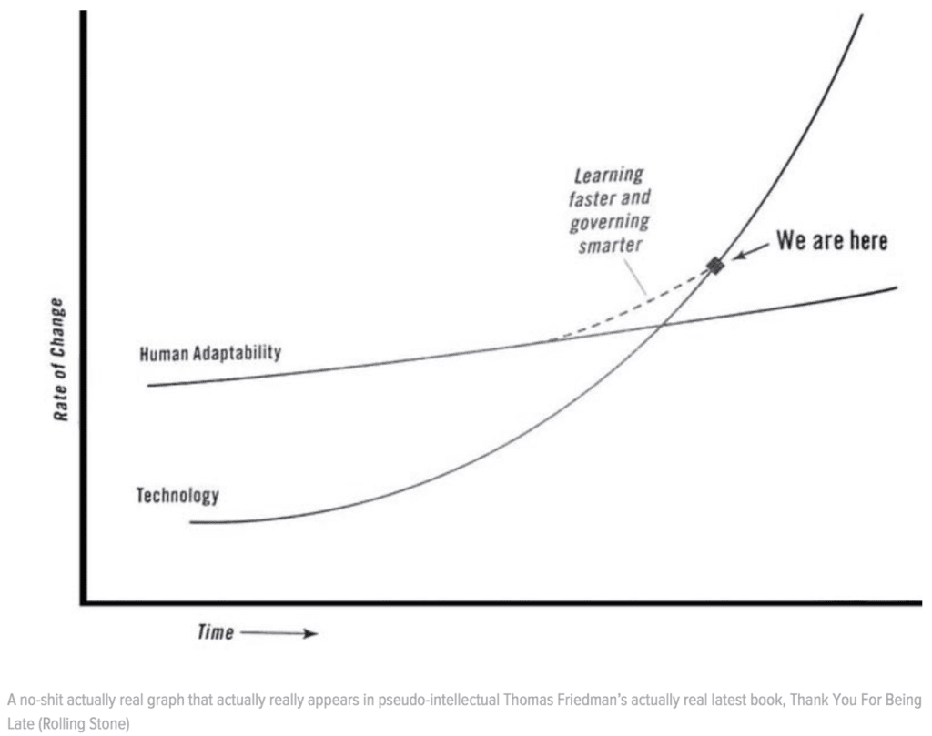
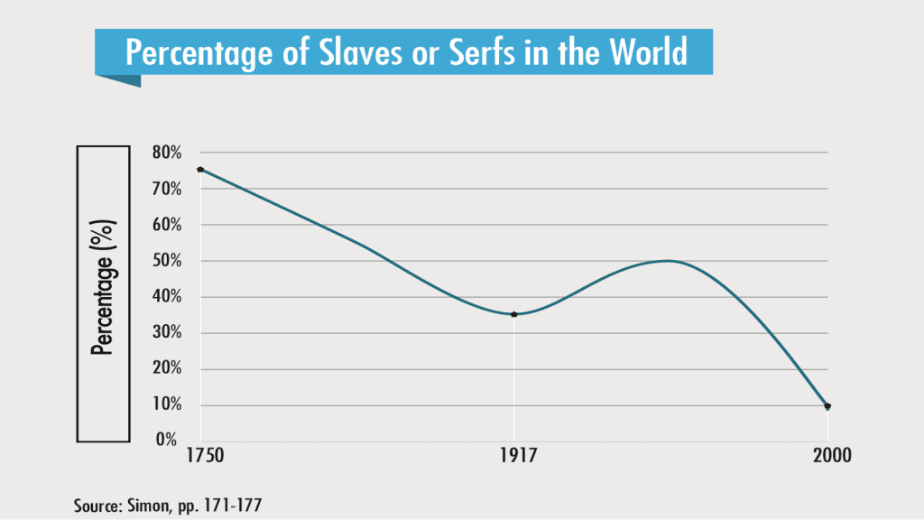
Palko links to this post by Russ Mitchell linking to this post by Hassan Khan casting deserved shade on this post, “The Third Transportation Revolution,” from 2016 by Lyft Co-Founder John Zimmer, which includes the above graph.

What is it about rich guys and their graphs?

slaves-serfs

screen-shot-2016-11-30-at-12-22-53-pm

Or is it just a problem with transportation forecasts?

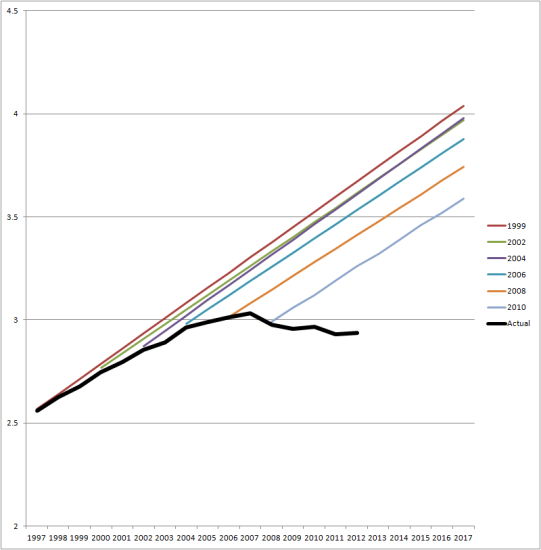
VMT-C-P-chart-big1-541x550

I’m tempted to say that taking a silly statement and putting it in graph form makes it more persuasive. But maybe not. Maybe the graph thing is just an artifact of the power point era.

Rich guys . . .

I think the other problem is that people give these rich guys a lot of slack because, y’know, they’re rich, so they must know what they’re doing, right? That’s not a ridiculous bit of reasoning. But there are a few complications:

1. Overconfidence. You’re successful so you start to believe your own hype. It feels good to make big pronouncements, kinda like when Patrick Ewing kept “guaranteeing” the Knicks would win.

2. Luck. Successful people typically have had some lucky breaks. It can be natural to attribute that to skill.

3. Domain specificity. Skill in one endeavor does not necessarily translate to skill in another. You might be really skillful at persuading people to invest money in your company, or you might have had some really good ideas for starting a business, but that won’t necessarily translate into expertise in transportation forecasting. Indeed, your previous success in other areas might reduce your motivation to check with actual experts before mouthing off.

4. No safe haven. As indicated by the last graph above, some of the official transportation experts don’t know jack. So it’s not clear that it would even make sense to consult an official transportation expert before making your forecast. There’s no safe play, no good anchor for your forecast, so anything goes.

5. Selection. More extreme forecasts get attention. It’s the man-bites-dog thing. We don’t hear so much about all the non-ridiculous things that people say.

6. Motivations other than truth. Without commenting on this particular case, in general people can have financial incentives to take certain positions. Someone with a lot of money invested in a particular industry will want people to think that this industry has a bright future. That’s true of me too: I want to spread the good news about Stan.

So, yeah, rich people speak with a lot of authority, but we should be careful not to take their internet-style confident assertions too seriously.

P.S. I have no reason to be believe that rich people make stupider graphs than poor people do. Richies just have more resources so we all get to see their follies.

Some things, like cubes, tetrahedrons, and Venn diagrams, seem so simple and natural that it’s kind of a surprise when you learn that their supply is very limited.

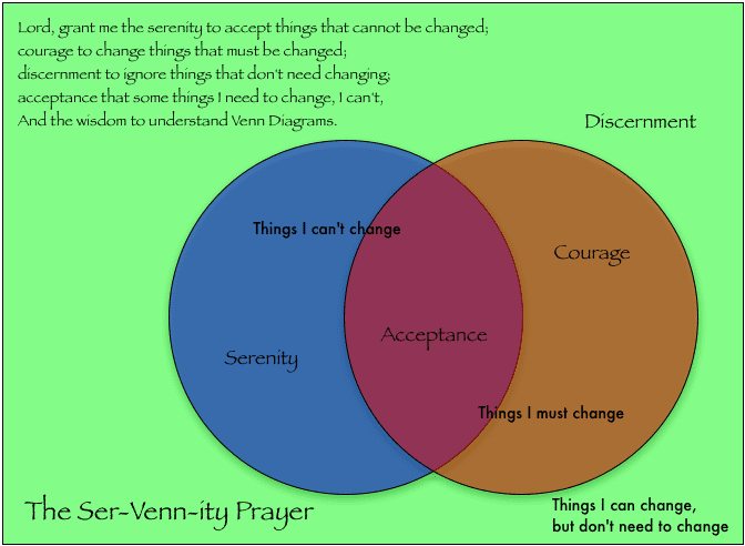
ser-venn-ity.png

I know I’ve read somewhere about the challenge of Venn diagrams with 4 or more circles, but I can’t remember the place. It seems like a natural for John Cook but I couldn’t find it on his blog, so I’ll just put it here.

Venn diagrams are misleading, in the sense that they work for n = 1, 2, and 3, but not for n > 3.

n = 1: A Venn diagram is just a circle. There are 2^1 options: in or out.

n = 2: A Venn diagram is two overlapping circles, with 2^2 options: A & B, not-A & B, A & not-B, not-A & not-B.

n = 3: Again, it works just fine. The 3 circles overlap and divide the plane into 8 regions.

n = 4: Venn FAIL. Throw down 4 overlapping circles and you don’t get 16 regions. You can do it with ellipses (here’s an example I found from a quick google) but it doesn’t have the pleasing symmetry of the classic three-circle Venn, and it takes some care both to draw and to interpret.

n = 5: There’s a pretty version here but it’s no longer made out of circles.

n > 5: Not much going on here. You can find examples like this which miss the point by not including all subsets, or examples like this which look kinda goofy.

The challenge here, I think, is that we have the intuition that if something works for n = 1, 2, and 3, that it will work for general n. For the symmetric Venn diagram on the plane, though, no, it doesn’t work.

Here’s an analogy: We all know about cubes. If at some point you see a tetrahedron and a dodecahedron, it would be natural to think that there are infinitely many regular polyhedra, just as there are infinitely many regular polygons. But, no, there are only 5 regular polyhedra.

Some things, like cubes, tetrahedrons, and Venn diagrams, seem so simple and natural that it’s kind of a surprise when you learn that their supply is very limited.

“Vanishing Voices: An Assessment of Diverse Participation in NYC Government and Why it Matters for Communities”

It’s a mixed in-person / remote presentation 5pm Monday 12 Sept 2022, 5pm at Teachers College:

Dr. Catherine DeLazzero will be joined by Dr. Jonathan Auerbach to report preliminary findings from a two year investigation of diversity on NYC community boards, which the Manhattan Borough President has described as “the independent and representative voices of their communities—the most grassroots form of local government” (2021). They will describe what enables board members to have influence on their communities through a pipeline of participation (from appointments to leadership to voice to outcomes); why some voices magnify and others disappear; barriers to inclusion, equity, and fairness; consequences for communities; and recommendations for improvement. Dr. DeLazzero and Dr. Auerbach examine “diversity” as intersections of life experience (i.e. demographics), subject matter expertise, and viewpoints. Dr. DeLazzero and Dr. Auerbach will also present new methods for assessing and visualizing diverse participation in organizations (i.e. diversity analytics). For additional work in this area, see their recent article, Linked Data Detail a Gender Gap in STEM That Persists Across Time and Place.

Exploratory and confirmatory data analysis

Valentin Amrhein points us to a recent article, “Exploratory hypothesis tests can be more compelling than confirmatory hypothesis tests,” published in the journal Philosophical Psychology. The article, by Mark Rubin and Chris Donkin, distinguishes between “confirmatory hypothesis tests, which involve planned tests of ante hoc hypotheses” and “exploratory hypothesis tests, which involve unplanned tests of post hoc hypotheses.”

All of that reminded me of two old posts:

From 2016, Thinking more seriously about the design of exploratory studies: A manifesto

From 2010, Exploratory and confirmatory data analysis:

I use exploratory methods all the time and have thought a lot about Tukey and his book and so wanted to add a few comments.

– So-called exploratory and confirmatory methods are not in opposition (as is commonly assumed) but rather go together. The history on this is that “confirmatory data analysis” refers to p-values, while “exploratory data analysis” is all about graphs, but both these approaches are ways of checking models. I discuss this point more fully in my articles, Exploratory data analysis for complex models and A Bayesian formulation of exploratory data analysis and goodness-of-fit testing. The latter paper is particularly relevant for the readers of this blog, I think, as it discusses why Bayesians should embrace graphical displays of data—which I interpret as visual posterior predictive checks—rather than, as is typical, treating exploratory data analysis as something to be done quickly before getting to the real work of modeling.

– Let me expand upon this point. Here’s how I see things usually going in a work of applied statistics:

Step 1: Exploratory data analysis. Some plots of raw data, possibly used to determine a transformation.

Step 2: The main analysis—maybe model-based, maybe non-parametric, whatever. It is typically focused, not exploratory.

Step 3: That’s it.

I have a big problem with Step 3 (as maybe you could tell already). Sometimes you’ll also see some conventional model checks such as chi-squared tests or qq plots, but rarely anything exploratory. Which is really too bad, considering that a good model can make exploratory data analysis much more effective and, conversely, I’ll understand and trust a model a lot more after seeing it displayed graphically along with data.

– Anyone can run a regression or an Anova! Regression and Anova are easy. Graphics is hard. Maybe things will change with the software and new media—various online tools such as Gapminder make graphs that are far far better than the Excel standard, and, with the advent of blogging, hot graphs are popular on the internet. We’ve come a long way from the days in which graphs were in drab black-and-white, when you had to fight to get them into journals, and when newspaper graphics were either ugly or (in the case of USA Today) of the notoriously trivial, “What are We Snacking on Today?”, style.

Even now, though, if you’re doing research work, it’s much easier to run a plausible regression or Anova than to make a clear and informative graph. I’m an expert on this one. I’ve published thousands of graphs but created tens of thousands more that didn’t make the cut.

One problem, perhaps, is that statistics advice is typically given in terms of the one correct analysis that you should do in any particular setting. If you’re in situation A, do a two-sample t-test. In situation B, it’s Ancova; for C you should do differences-in-differences; for D the correct solution is weighted least squares, and so forth. If you’re lucky, you’ll get to make a few choices regarding selection of predictors or choice of link function, but that’s about it. And a lot of practical advice on statistics actually emphasizes how little choice you’re supposed to have—the idea that you should decide on your data analysis before gathering any data, that it’s cheating to do otherwise.

One of the difficulties with graphs is that it clearly doesn’t work that way. Default regressions and default Anovas look like real regressions and Anovas, and in many cases they actually are! Default graphics may sometimes do a solid job at conveying information that you already have (see, for example, the graphs of estimated effect sizes and odds ratios that are, I’m glad to say, becoming standard adjuncts to regression analyses published in medical and public health journals), but it usually takes a bit more thought to really learn from a graph. Even the superplot—a graph I envisioned in my head back in 2003 (!) back at the very start of our Red State, Blue State project, before doing any data analysis at all—even the superplot required a lot of tweaking to look just right.

Perhaps things will change. One of my research interests is to more closely tie graphics to modeling and to develop a default process for looking through lots of graphs in a useful way. Researchers were doing this back in the 1960s and 70s—methods for rotating point clouds on the computer, and all that—but I’m thinking of something slightly different, something more closely connected to fitted models. But right now, no, graphs are harder, not easier, than formal statistical analysis.

– To return briefly to Tukey’s extremely influential book: EDA was published in 1977 but I believe he began to work in that area in the 1960s, about ten or fifteen years after doing his also extremely influential work on multiple comparisons (that is, confirmatory data analysis). I’ve always assumed that Tukey was finding p-values to be too limited a tool for doing serious applied statistics—something like playing the piano with mittens. I’m sure Tukey was super-clever at using the methods he had to learn from data, but it must have come to him that he was getting the most from his graphical displays of p-values and the like, rather than from their Type 1 and Type 2 error probabilities that he’d previously focused so strongly on. From there it was perhaps natural to ditch the p-values and the models entirely—as I’ve written before, I think Tukey went a bit too far in this particular direction—and see what he could learn by plotting raw data. This turned out to be an extremely fruitful direction for researchers, and followers in the Tukey tradition are continuing to make progress here.

– The actual methods and case studies in the EDA book . . . well, that’s another story. Hanging rootograms, stem-and-leaf plots, goofy plots of interactions, the January temperature in Yuma, Nevada—all of this is best forgotten or, at best, remembered as an inspiration for important later work. Tukey was a compelling writer, though—I’ll give him that. I read Exploratory Data Analysis twenty-five years ago and was captivated. At some point I escaped its spell and asked myself why I should care about the temperature in Yuma–but, at the time, it all made perfect sense. Even more so once I realized that his methods are ultimately model-based and can be even more effective if understood in that way (a point that I became dimly aware of while completing my Ph.D. thesis in 1990—when I realized that the model I’d spent two years working on didn’t actually fit my data—and which I first formalized at a conference talk in 1997 and published in 2003 and 2004. It’s funny how slowly these ideas develop.).

Just show me the data, baseball edition

Andrew’s always enjoining people to include their raw data. Jim Albert, of course, does it right. Here’s a recent post from his always fascinating baseball blog, Exploring Baseball Data with R,

The post “just” plots the raw data and does a bit of exploratory data analysis, concluding that the apparent trends are puzzling. Albert’s blog has it all. The very next post fits a simple Bayesian predictive model to answer the question every baseball fan in NY is asking,

P.S. If you like Albert’s blog, check out his fantastic intro to baseball stats, which only assumes a bit of algebra, yet introduces most of statistics through simulation. It’s always the first book I recommend to anyone who wants a taste of modern statistical thinking and isn’t put off by the subject matter,

  • Jim Albert and Jay Bennet. 2001. Curve Ball. Copernicus.


A two-week course focused on basic math, probability, and statistics skills

This post is by Eric.

On August 15, I will be teaching this two-week course offered by the PRIISM center at NYU.  The initial plan was to offer it to the NYU students entering the A3SR MS Program, but we are opening it up to a wider audience. In case you don’t like clicking on things, here is a short blurb:

This course aims to prepare students for the Applied Statistics for Social Science Research program at NYU. We will cover basic programming using the R language, including data manipulation and graphical displays; some key ideas from Calculus, including differentiation, integration, and optimization; an introduction to Linear Algebra, including vector and matrix arithmetic, determinants, and eigenvalues and eigenvectors; some core concepts in Probability including random variables, discrete and continuous distributions, and expectations; and a few simple regression examples.

This is a paid class, but Jenniffer Hill, who runs the program, tells me that department scholarships are available based on program and student needs.

If you would like to take a course, we ask that you fill out a short survey here. (If you need financial assistance, please indicate it under “Is there anything else you’d like to share with us?” survey question.) You can register  here. We are planning to offer it in-person at NYU and online via Zoom.

Warning: This is my first time teaching this class, so I am not sure how much material we will be able to cover. We will have to gauge that as we go.

If you have taught something like this before and have suggestions for me, please leave those in the comments.

The “Mapping the Terrain” survey of students, teachers, and parents in majority Muslim societies:

Alex Koenig writes:

I am writing to bring your attention to a new data resource that might be of interest to you, your colleagues, and your students: the 2018-19 and 2019-20 “Mapping the Terrain” survey of psychosocial well-being among youth in majority Muslim societies and the tools we have created to make accessing and engaging with the data easy and productive. Mapping the Terrain is a research project of the Advancing Education in Muslim Societies (AEMS) initiative.

I’ve not looked into this at all, but from the outside it looks pretty cool. The data and codebook are right there, so anyone can jump in. I could do without the 3-d pie charts but, hey, nobody’s perfect!

How much should theories guide learning through experiments?

This is Jessica. I recently wrote about the role of theory in fields like psych. Here’s a related thought experiment:

A researcher is planning a behavioral experiment. They make various decisions that prescribe the nature of the data they collect: what interventions to test (including the style of the intervention and any informational content), what population to recruit subjects from, and what aspects of subjects’ behavior to study. The researcher uses their hunches to make these choices, which may be informed by explanations of prior evidence that have been proposed in their field. This approach could be called “strongly” theory-driven: they have tentative explanations of what drives behavior that strongly influence how they sample these spaces (note that these theories may or may not be based on prior evidence). 

Now imagine a second world in which the researcher stops and asks themselves, as they make each of these decisions, what is a tractable representation of the larger space from which I am sampling, and how can I instead randomly sample from that? For example, if they are focused on some domain-specific form of judgment and behavior (e.g., political attitudes, economic behavior) they might consider what the space of intervention formats with possible effects on those behaviors are, and draw a random sample from this space rather than designing an experiment around some format they have a hunch about.  

Is scientific knowledge gain better in the first world or the second?

Before trying to answer this question, here’s a slightly more concrete example scenario: Imagine a researcher interested in doing empirical research on graphical perception, where the theories take the form of explanations of why people perform some task better with certain visual encodings over others. In the first world, they might approach designing an experiment with implications of a pre-existing theory in mind, conjecturing, for example, that length encodings are better than area encodings because the estimated exponent of Stevens’ power law from prior experiments is closer to 1 for length compared to area. Or they might start with some new hunch they came up with, like density encodings are better than blur encodings, where there isn’t much prior data. Either way they design an experiment to test these expectations, choosing some type of visual judgment (e.g., judging proportion, or choosing which of two stimuli is longer/bigger/blurrier etc in a forced choice), as well as the structure and distribution of the data they visualize, how they render the encodings, what subjects they recruit, etc. Where there have been prior experiments, these decisions will proably be heavily influenced by choices made in those. How exactly they make these decisions will also be informed by their theory-related goal: do they want to confirm the theory they have in mind, disconfirm it, or test it against some alternative theory? They do their experiment and depending on the results, they might keep the theory as is, refine it, or produce a completely new theory. The results get shared with the research community.

In the “theory-less” version of the scenario, the researcher puts aside any hunches or prior domain knowledge they have about visual encoding performance. They randomly choose some some set of visual encodings to compare, some visual judgment task and some type of data structure/distribution compatible with those encodings, etc.. After obtaining results they similarly use them to derive an explanation, and share their results with the community. 

So which produces better scientific knowledge? This question is inspired by a recent preprint by Dubova, Moskvichev, and Zollman which uses agent-based modeling to ask whether theory-motivated experimentation is good for science. The learning problem they model is researchers using data collected from experiments to derive theories, i.e., lower dimensional explanations designed to most efficiently and representatively account for the ground truth space (in their framework these are autoencoders with one hidden layer, trained using gradient descent). As theory-informed data collection strategies, they consider confirmation, falsification, crucial experimentation (e.g., sampling new observations based on where theories disagree), and novelty (e.g., sampling a new observation that is very different from its previously collected observations) and compare these to random sampling. They evaluate how well the theories produced by each strategy compare in terms of perceived epistemic success (how well does the theory account for only the data they collected) and “objective performance,” how well they account for representative samples from the full ground truth distribution.

They conclude from their simulations is that “theoretically motivated experiment choice is potentially damaging for science, but in a way that will not be apparent to the scientists themselves.” The reason is overfitting: 

The agents aiming to confirm, falsify theories, or resolve theoretical disagreements end up with an illusion of epistemic success: they develop promising accounts for the data they collected, while completely misrepresenting the ground truth that they intended to learn about. Agents experimenting in theory-motivated ways acquire less diverse or less representative samples from the ground truth that are also easier to account for. 

Of course, as in any attempt to model scientific knowledge production, there are many specific parameter choices they make in their analyses that should be assessed in terms of how well they capture real-world experimentation strategies, theory building and social learning, before we place too much faith in this claim. For the purposes of this post though, I’m more interested in the intuition behind their conclusions. 

At a high level, the possibility that theory-motivated data collection reduces variation in the environment being studied seems plausible to me. It helps explain why I worry about degrees of freedom in experiment design, especially when one can pilot test different combinations of design parameters and one knows what they want to see in the results. It’s easy to lose sight of how representative your experimental situation is relative to the full space of situations in which some phenomena or type of behavior occurs when you’re hell bent on proving some hunch. And when subsequent researchers design experiments informed by the same theory and set-up you used, the knowledge that is developed may become even more specialized to a particular set of assumptions. Related to the graphical perception example above, there are regularly complaints among people who do visualization research about how overfit certain design principles (e.g., choose encodings based on perceptual accuracy) are to a certain class of narrowly-defined psychophysics experiments. On top of this, the new experiments we design on less explored topics (uncertainty visualization, visualization for machine learning, narrative-driven formats etc.) can be similarly driven by hunches researchers have, and quickly converge on a small-ish set of tasks, data generating conditions or benchmark datasets, and visualization formats.

So I find the idea of random sampling compelling. But things get interesting when I try to imagine applying it in the real world. For example, on a practical level, to randomly sample a space implies you have some theory, if not formally at least implicitly, about the scope of the ground truth distribution. How much does the value of random sampling depend on how this is conceived of? Does this model need to be defined at the level of the research community? On some level this is the kind of implicit theory we tend to see in papers already, where researchers argue why their particular set of experimental conditions, data inputs, behaviors etc. covers a complete enough scope to enable characterizing some phenomena.   

Or maybe one can pseudo-randomly sample without defining the space that’s being sampled, and this pseudo-randomly sampling is still an improvement over the theory-driven alternative. Still it seems hard to conceptually separate the theory-driven experiment design from the more arbitrary version, without having some theory of how well people can intentionally randomize. For example, how can I be sure that whatever conditions I decide to test when I “randomly sample” aren’t actually driven by some subconscious presupposition I’m making about what matters? There’s also a question of what it means for one to choose what they work on in any real sense in a truly theory-free approach. For various reasons researchers often end up specializing in some sub-area of their field. Can this be like an implicit statement about where they think the big or important effects are likely to be?

I also wonder how random sampling might affect human learning in the real world, where how we learn from empirical research is shaped by conventions, incentives, ego, various cognitive limits, etc. I expect it could feel hard to experiment without any of the personal committments to certain intuitions or theories that currently play a role. Could real humans find it harder to learn without theory? I know I have learned a lot by seeing certain hunches I had fail in light of data; if there was no place for expectations in conducting research, would I feel the same level of engagement with what I do? Would scientific attention or learning, on a personal level at least, be affected if we were supposed to leave our intuitions or personal interests at the door? There’s also the whole question about how randomizing experimenters would fare under the current incentive structures, which tend to reward perceived epistemic success.

I tend to think we can address some theory problems, including the ones I perceive in my field, by being more explicit in stating the conditions that our theories are intended to address and that our claims are based on. For example, there are many times when we could do a better job of formalizing the spaces that are being sampled from to design an experiment. This may push researchers to recognize the narrowness or their scope and sample a bit more representatively. To take an example Gigerenzer used to argue that psychologists should do more stimuli sampling, in studies of overconfidence, rather than asking people questions framed around what might be a small set of unusual examples (e.g., “Which city lies further south: Rome or New York? How confident are you?”, where Rome is further north yet warmer), the researcher would do better to consider the larger set of stimuli from which these extreme examples are sampled, like all possible pairs of large cities in the world. It’s not theory-free, but would be a less drastic change that would presumably have some of the same effect of reducing overfitting. It seems worth exploring what lies between theoretically-motivated gaming of experiments and trying to remove personal judgment and intuitions about the objects of study altogether.  

Stan goes mountain climbing, also a suggestion of 3*Alex

Jarrett Phillips writes:

I came across this recent preprint by Drummond and Popinga (2021) on applying Bayesian modeling to assess climbing ability. Drummond is foremost a computational evolutionary biologist (as am I) who is also an experienced climber. The work looks quite interesting. I was previously unaware of such an application and thought others may also appreciate it.

I’m not a climber at all, but it’s always fun to see new applications of Stan. In their revision, I hope the authors can collaborate with someone who’s experienced in Bayesian data visualization and can help them make some better graphs. I don’t mean they should just take their existing plots and make them prettier; I mean that I’m pretty sure there are some more interesting and informative ways to display their data and fitted models. Maybe Jonah or Yair could help—they live in Colorado so they might be climbers, right? Or Aleks would be perfect: he’s from Slovenia where everyone climbs, and he makes pretty graphs, and then the paper would have 3 authors named some form of Alex. So that’s my recommendation.

“Data Knitualization: An Exploration of Knitting as a Visualization Medium”

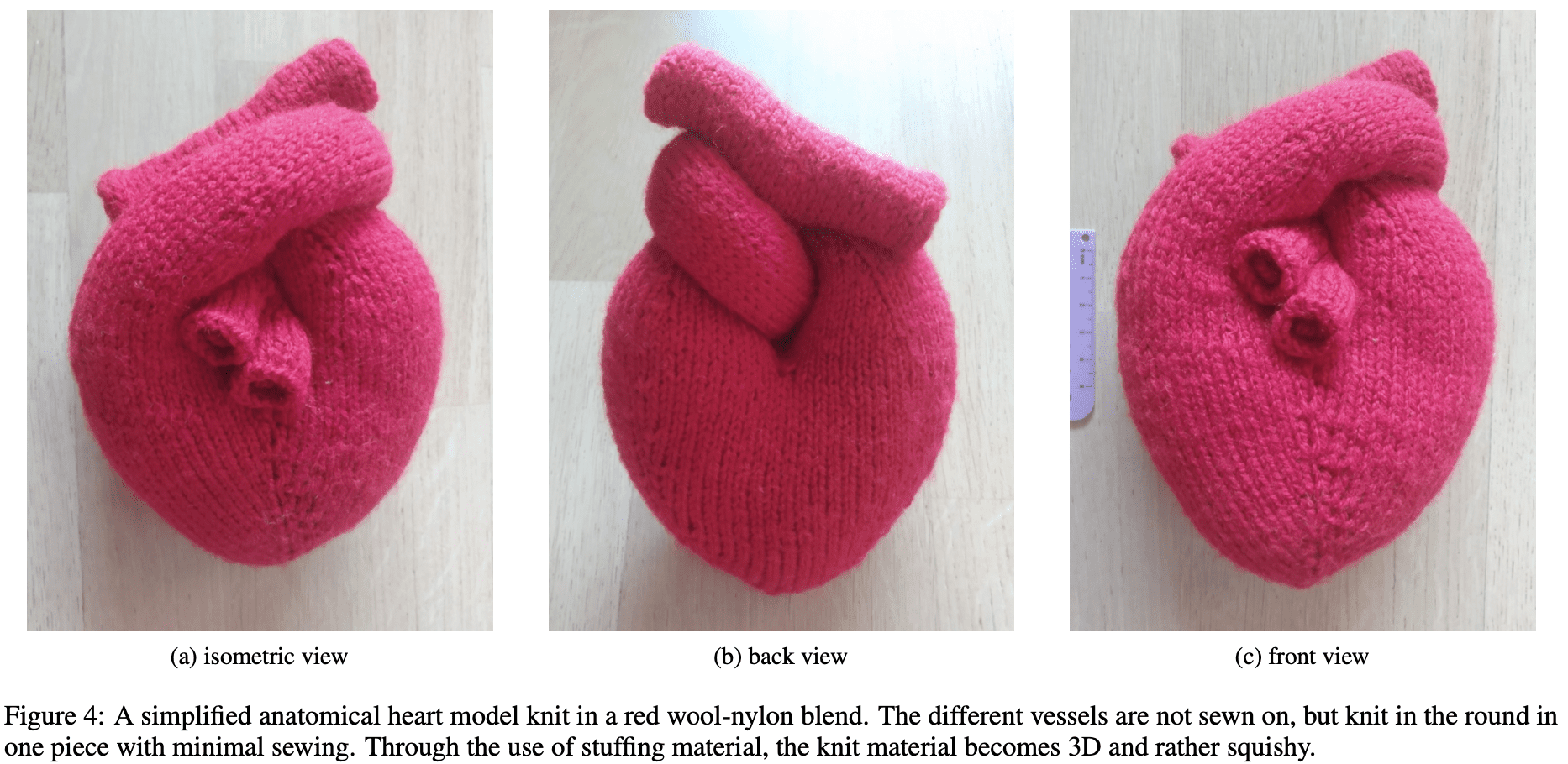
Amy Cohen points us to this fun article by Noeska Smit. Here’s the description of the above-pictured fuzzy heart model:

The last sample I [Smit] knit is a simplified 3D anatomical heart (see Figure 4) in a wool-nylon blend (Garnstudio DROPS Big Fabel), based on a free pattern by Kristin Ledgett. She has created a knitting pattern that is knit in a combination of in the round and flat knitting techniques. This allows the entire heart to be knit in one piece, with only minimal sewing where the vessels split, visible in Figure 4b. The heart is filled with soft stuffing material while it is knit.

This sample is a proof of concept for how hand knitting can be used to represent complex 3D structures. While this sample is not anatomically correct, it demonstrates how the softness and flexibility of the stuffed knit allow for complex 3D shapes to be created using only basic knitting techniques. As the vessels are not sewn down, this particular model can be ‘unknotted’ and put back together freely. This sample only requires basic knitting knowledge on how to cast on, knit, purl, increase and decrease stitches, and bind off. The combination of the soft stuffing with the fuzzy knitted material gives an almost cartoon-like impression, in stark contrast to how disembodied human hearts typically appear in the real world. In a way, this makes a medical concept where a realistic representation can elicit a strong negative response more approachable. Perhaps it is similar to how surgical images can be made more palatable by using color manipulation and stylization.

What can I say? I love this sort of thing.

P.S. More here: “‘Knitting Is Coding’ and Yarn Is Programmable in This Physics Lab”

Tips for designing interactive visualizations

This is Jessica. This week I was working with some collaborators on a project that involved coming up with an interactive visualization. In this case the specific problem was related to ML error evaluation, but the process reminded me more generally how chaotic this kind of interactive design work can feel early on, where you have some class of datasets you want to support and some high level tasks or comparisons you want to let users make with the tool, but you need to somehow find a starting place without overfixating on some subset of the huge space of different ways you could encode the relevant subsets of data.  

Here’s a process I find helpful. It assumes data with some categorical or ordinal attributes and some quantitative variables: 

  • Start with the idea of a big grid, where rows and columns can be used to represent categorical variables, and each cell contains the correspond subset of data you get from crossing two categorical variables.  
  • Imagine each data point is a unique mark in the grid.
  • Now consider the queries you want to support (if you’re designing an interactive vis there are probably multiple). Consider what the outcome variable is for each query. If discrete, the levels of the outcome can be assigned to either the rows or columns of the grid, or it can be mapped to color (hue) of the marks. If continuous, and the query involves multiple categorical predictors, assume its plotted to an axis within each cell. If continuous and you only have one categorical variable, you could plot it to a single axis running the length of the grid rather than separate axes within each cell.
  • If you have remaining categorical predictors, assign them to the rows and columns, then to color. Only to shape if you must. If you have remaining continuous predictors, assign them first to the remaining axis in the cells, and then to size or color (default to single hued sequential color schemes).
  • Ask yourself what’s missing? If queries involve more than about 5 variables, you will run out of reasonable visual encodings, so interactivity may be necessary.But remember that if you start adding buttons or dropdowns for remaining categorical variables, and sliders for remaining quantitative variables, it will be hard to compare within those because people have to remember what they just saw. Maybe you need to let people select multiple values for these variables at once and see the corresponding views side by side.

Essentially, this process defaults to the idea of a trellis plot and combines it with the idea of unit visualization. Many visualization tools rely on trellis plots (aka small multiples, facet grids) because they prioritize position encodings which are generally the most accurate way for people to decode information. Unit visualization on the other hand has been less popular as a default in systems, but has been the topic of some research on teaching people how to use visualization effectively; it can be easier to think about data when there’s no confusion about what a data point is. My tendency to gravitate to unit viualization is as an easy direct way to try to counteract insensitivity to sample size in human judgments from viusalized data. If every mark is a point, its harder to ignore the amount of data you’re dealing with. 

I like this as a starting point for design, because you’ve baked in these two rules of thumb in and any deviation from using trellis plots and presenting sample size directly should consequently be because you had a good reason, not because you started brainstorming with some fancy encodings already in mind. I should probably give this advice in my interactive vis course when students are starting to design! I see a lot of visualizations that overuse interactive widgets and overlook the value of position encodings for allowing comparisons with the eyes that otherwise require memory, despite my many reminders that it’s all about making the comparisons as direct as possible.

This process does assume some things about the data, including mutually exclusive levels of categorical variables, but I think it could be helpful even if your data deviates slightly. In the project that inspired this post for example, the data points are associated with pairs of attributes, but a grid view still works where the same categorical variable is used for rows and columns in some views. 

Statistical graphics discussion with Laura Wattenberg about the NameGrapher

I had some questions about the NameGrapher and Laura answered them:

AG: Are the data given both by year of Social Security Number registration and year of birth? Also why is your data only by decade before the 2000? I recall the Social Security Administration data being every year?

LW: The SSA data are by date of birth only, and has the limitation that early decades are less complete and reliable, and skewed female due to survivorship (and possibly by willingness to register for a SSN later in life). Going decade by decade does cost detail, but it has several advantages: faster rendering for responsive animation, smoother curves, and helping to offset the choppiness of the early data years.

AG: I think the x-axis needs to be fixed in that the decade numbers don’t quite line up with the axis. The data for 2010 onward are yearly; before 2010 they’re by decade. But then I think the data for the decades 2000-2010, 1990-2000, etc., should be plotted at 2005, 1995, etc. As it is, the point for each decade is displayed to the left of the decade marker, thus visually assigning 2000-2010, 1990-2000, etc., to the years 2000, 2010, etc.

LW: We’ve actually been going back and forth on the x-axis labeling, it’s a problem. The trick is that the most recent decade is actually year-by-year data to allow a closer look at current trends, so moving the labels to the midpoint of decades ends up with a traffic jam in the 2000s.

AG: I’m not colorblind so I can’t say, but this green and orange palate . . . does it work for everyone? I have no idea.

LW: We did test the colors in a color-blindness simulator and they seemed acceptable.

So there you have it!

P.S. They’re naming kids Judas nowadays.

Excellent graphical data storytelling from Australian Broadcasting Corporation on the recent election

Someone who goes by the handle Conchis writes:

I thought you might be interested in, and would be interested in your views on what I thought was a nice piece of data-driven journalism from the ABC (Australian public broadcaster) investigating possible drivers of the recent Australian election result, which was won by Labor after 9 years of a conservative government, and with a surprisingly poor showing from the right.

For context, following the usual tradition outside the US: red=Labor, blue=conservative Coalition parties (and grey=independents and minor parties such as the Greens). And the Liberals are the main centre right/Conservative party. Australia also has a compulsory preferential voting system, though that doesn’t matter too much for understanding what’s going on in the story or charts, as they use 2 Candidate Preferred measures throughout.

I agree. This is an excellent dynamic visualization, one of the best I’ve ever seen. Just a wonderful mix of graphics and text developing over time.

Credit to:

Reporter and developer: Julian Fell
Designer: Ben Spraggon
Editors: Matt Liddy and Cristen Tilley

Giving an honest talk

This is Jessica. I gave a talk about a month ago at the Martin Zelen symposium at Harvard, which was dedicated to visualization this year. Other speakers were Alberto Cairo, Amanda Cox, Jeff Heer, Alvita Ottley, Lace Padilla, and Hadley Wickham, and if you’re interested in visualization you can watch them here (my talk starts around 2:08:00). But this post is not so much about the content but the questions I found myself asking as I put together the talk. 

As an academic, I give a lot of talks, and I’ve always spent a fair amount of time on making slides and practicing talks, I guess because I hate feeling unprepared. Having come up as a grad student in visualization/human computer interaction there was always a high premium on giving polished talks with well designed slides with lots of diagrams/visuals, which is annoying since I’m not very gifted at graphic design and have to do a lot of work to make things not look bad. But, as a student and junior faculty member I enjoyed giving talks because so many of my talks were technical talks of the kind you give at conferences. Even if they take a while to prepare they are easy, mindless even, because you’re constrained to presenting what you did. There is never time to get too far into the motivation, so you usually repeat whatever spiel you used to motivate the problem in the intro of your paper and then quickly get into the details. 

But, inevitably (at least in computer science) you get more senior and your students give most of the technical talks, while you do more invited lectures and keynotes where you’re expected to talk about whatever you want. So what do you do with that time? As a junior faculty member, I still treated the more open-ended invited talks I did like longer technical talks, since part of being pre-tenure is showing that you can lead students to produce a cohesive body of technical work. But the more senior I get, the more I question how to treat invited talks. 

One philosophy is to continue treating invited talks as an opportunity to present some recent subset of work in your lab, where you string together a few technical talks but with a little more motivation/vision. This is nice because you can highlight the work of the grad students and give a little bit more of a big picture but still get into some details. But, lately the thought of giving talks like this seems constrained and rote to me similar to the way individual paper tech talks do, since often most of the work is already done, and concerns ideas I might have had a relatively long time ago. Also, because you’re focused on presenting the individual projects and what each contributes, you’re more or less stuck with the way you motivated the stuff in the original papers. So at least to me, it can feel like the bulk of the talk is dead and I’m just reviving it to parade around in front of people so that they get something polished with some high level message. If you give a lot of talks, it gets harder and harder to feign enthusiasm about topics you haven’t really thought twice about since you finished that project, or worse you’ve thought a lot about it and you have some issues with.  

As I’ve probably mentioned before on this blog, one issue I have lately is that I’m more interested in critiquing some of my past work more than I am selling it, since critiquing it helps me figure out where to go next. I tend to care, perhaps more than other computer scientists, about the philosophy that underlies the projects I take on. Repeatedly questioning why/if what I’m doing is useful helps me figure out which of the many things I could do next are actually worth the time. The specific technical solutions can be fun to think about but they don’t really do a good job of representing what I’ve learned over my career.

But —since the vision, at least for me, shifts slightly with each project, how do you get the talks to feel dynamic in a way that matches that? Talking about work in progress could be better, but I find it hard to implement this in a successful way. Sometimes you sense that the reason you were invited is to impart some wisdom on the topic you work on, and so if the importance or potential impact of the in-progress work is still something you’re figuring out (which it generally is for me for the projects I’m most excited about), then you risk not delivering much for them to take away as a message. I guess my premise for the ideal talk is that it gives the audiences something useful to think about, without alienating them, and provides me some value as presenter. It’s not clear to me many people in most audiences I speak to would benefit from jumping into the weeds of what I haven’t yet figured out with me.  

So, at least in making the talk for the Zelen symposium, which I knew would be seen by people I respect in my field (like the other speakers) but also need to be accessible to the broader audience in attendance, I found myself racking my brain for what I could say that would be a) useful, b) interesting, but most importantly c) an honest portrayal of what I was questioning at that moment. Eventually I settled on something that seemed like a good compromise – motivating better uncertainty visualizations in the beginning, then admitting I didn’t really think visualizing uncertainty alone solves many problems because satisficing is so common, then suggesting the idea of visualizations as model checks as a broader framework for thinking about how to use a visualization to communicate. But it was very hard to fit this into 20 minutes. I had to motivate the problems that led to lots of my work, then carefully back up to question the solutions, but still provide some resolution or “insight” so it looked like I deserved to be invited to speak in the first place. 

Anyway, the specifics don’t matter that much, the point is that sometimes it can be very hard to find a “statement” that both expresses your honest current viewpoint about a topic you’re an expert in and which is somewhat palatable to people who don’t have nearly as much of the backstory. This is why I hate when people ask you to give a talk and then say, “You don’t have to prep anything new, you can just use an old talk.” No, actually I can’t. 

In this case, I’m not sure how successful the Zelen talk was. It worked well for me, and I suspect some people liked it in the audience, but I also got less questions than anyone else, so hard to say how many people I lost. It got me thinking that maybe the more honest and “current” the ideas I present in a talk, the less I will connect with audiences. It’s like the idea of an honest talk implies that you’ll lose more people, because you’ll have to tell a more complicated story than the one that you yourself were once fooled by. Sometimes to provide a sense of context on the types of problems your work tries to solve it makes more sense to admit the shortcomings of all the existing solutions, including your own, rather than cheerleading your old work. Maybe I just need to be ok with that and not give in to the pressures I perceive for polished, enthusiastic talks. It reminds me of Keith’s comment on a previous post: CS Peirce once wrote that the best compliment anyone ever paid him, though likely meant as an insult was roughly “the author does not seem completely convinced by his own arguments”.

All of this also makes me think of Andrew’s talks, which he has mentioned he sometimes gets mixed responses to. As far as I can tell, he’s perfected the art of the honest talk. There are no slides, while there might be some high level talking points what he says seems spontaneous, and there might not be any obvious take-home message, because it’s not some heavily scripted performance, its a window into how he’s thinking right now about some topic.  I wish more people were willing to experiment and give us bad but honest talks.

Humans interacting with the human-computer interaction literature

Steve Haroz writes:

An upcoming publication at the conference on human-computer interaction (CHI 2022) presents an application, called Aperitif, that automates statistical analysis and analysis writeups. I am concerned about what it claims to do, and I thought it might interest you for your blog.

It presents a preregistration application with a user interface to enter variables, specify their types, and enter hypotheses. Then it automatically generates analysis code and methods description text.

As amazing as it would be to make preregistration easier, the application seems to attempt too much with the automation. While facilitating statistical reasoning could be helpful, full automation seems to result in questionable choices and severe limitations:
– The application cannot preregister hypotheses with multiple independent variables. No ANOVAs. No interaction effects.
– Non-linear models can’t be preregistered. So preregistering a logistic regression for a forced-choice experiment would be impossible.
– The process of checking assumptions, such as normality, is inflexible. For example, it will include a Shapiro-Wilk test in the generated code even if there are many thousands of observations (which a Shapiro-Wilk test doesn’t handle well).
– It has a built-in power analysis that doesn’t seem to account for whether an experiment is within-subject or between-subject.

I [Haroz] was a reviewer for the submission, and I’ve made my review public. It discusses these concerns and more. I worry that an automated system that so severely constrains what kinds of models and hypotheses can be preregistered and analyzed will do more harm than good, especially for users who do not have the statistical training to question the application’s limitations. I urge caution from anyone considering using Aperitif.

Interesting. I guess that nobody was actually going to use this tool in a real problem—it seems more like a demonstration than something that would be used in applications. That said, it makes sense to point out what’s missing here. A challenge here is that the paper is on human-computer interaction, and so it makes sense for the researchers to try to develop a tool that’s easy to use—but then they end up in the awkward position of making a user-friendly tool that you wouldn’t want users to actually use!

Teaching visualization

This is Jessica. I had been teaching visualization for years, to computer science students, informatics students, and occasionally journalism students, and recently overhauled how I do it curriculum-wise, including to focus a little more on ‘visualizations as model checks’ and visualization for decision making.

Previously I had been working from an outline of topics I’d gotten from teaching with my postdoc mentor Maneesh Agrawala, which had originated from Pat Hanrahan’s course at Stanford and I think included some materials from Jeff Heer. It was a very solid basis and so beyond adding some topics that weren’t previously represented (visualizing uncertainty, visualization to convey a narrative), I hadn’t really messed with it. But there was one issue, which seems common to lots of visualization course designs I’ve seen, which is that around midway through the quarter we’d leave the foundational stuff like grammar of graphics and effectiveness criteria behind and start traversing the various subareas of visualization focused on different data types (networks, time series, hierarchy, uncertainty) etc. Every time I taught it it felt like about midway through the course, I’d watch the excitement the students got when they realized that there are more systematic ways to think about what makes a visualization effective sort of fade as the second half of the course devolved into a grab bag of techniques for different types of data. 

The new plan came about when I was approached through my engineering school to work with an online company to develop a short (8 week) online course on visualization, which is now open and running multiple times a year. I agreed and suddenly I had professional learning designers interested in trying to identify a good curriculum, based on my guidance and my existing course materials and other research I sent their way. Sort of a power trip for a faculty member, as there is nothing quite like having a team of people go off and find the appropriate evidence to back up your statements with references you’d forgotten about.

Anyway, I am pretty happy with the result in terms of progression of topics: 

The purpose of visualization.  Course introduction. Covers essential functions of visualizations as laid out in work on graph comprehension in cognitive psych (affordances like facilitating search, offloading cognition to perception/freeing working memory), as well as an overview of the types of challenges (technical, cognitive, perceptual) that arise. I have them read a paper by Mary Hegarty and the Anscombe paper where he uses plots to show how regression coefficients can be misleading.

Data fundamentals and the visualization process. How visualization can fit into an analytical workflow to inform what questions get posed, what new data get collected, etc., and the more specific “visualization pipeline’, i.e. the process by which you translate some domain specific question into a search for the right visual representation. Also levels of measurement (how do we classify data abstractly in preparation for visualizing data) and basic tasks by data types, i.e. what types of questions can we ask when we visualize data of different dimensions/typess.

Visualization as a language. Introduction to Jacque Bertin’s view, where visual representations are rearrangeable, with different arrangements exposing different types of relationships, not unlike how words can. Characterizing visual or “image space” in terms of marks and encoding functions that map from data to visual variables like position, size, lightness, hue, etc. Semantics of visual variables (e.g., color hue is better for associating groups of data, position naturally expresses continuous data).  The grammar of graphics as a notational system for formalizing what constitutes a visualization and the space of possible visualizations. The idea of, and toolkits for, declarative visualization and why this is advantageous over programmatic specifications.

Principles for automated design. The problem of finding the best visualization for a set of n variables where we know the data types and relative importance of them, but must choose a particular set of encodings from the huge space of possibilities. Heuristics/canonical criteria for pruning and ranking alternative visualizations for a given dataset (taken from Jock Mackinlay’s canonical work on automated vis): expressiveness (do the encoding choices express the data and only the data?), effectiveness (how accurately can someone read the data from those encodings?), importance ordering (are the more accurate visual channels like position reserved for the most important data?)  Graphical perception experiments to learn about effectiveness of different visual variables for certain tasks (e.g, proportion judgment), pre-attentiveness, how visual variables can interact to make things harder/easier, types of color scales and how to use them. 

Multidimensional data analysis and visualization. The challenges of visually analyzing or communicating big multidimensional datasets. Scatterplot matrices, glyphs, parallel coordinate plots, hierarchical data, space-filling/space-efficient techniques, visualizing trees, time series (ok it gets a little grab baggy here).   

Exploratory data analysis. Returns to the idea of visualization in a larger analysis workflow to discuss stages of exploratory analysis, iterative nature (including breadth and depth first aspects), relation to confirmatory analysis and potential for “overfitting” in visual analysis. Statistical graphics for examining distribution, statistical graphics for judging model fit. The relationship between visualizations and statistical models (the students do a close read of Becker, Cleveland, and Shyu). 

Communication and persuasion. Designing visualizations for communication. Narrative tactics (highlighting, annotation, guided interactivity, etc.) and genres (poster-style, step-through, start guided end with exploration, etc.). Visualization design for communication as an editorial process with rhetorical goals. The influence of how you scale axes and other encodings, how you transform/aggregate data on the message the audience takes away (there are lots of good examples here from climate change axis scaling debates, maps being used to persuade, etc.) 

Judgment and decision making. Sources of uncertainty (in data collection, model selection, estimation of parameters, rendering the visualization) and various arguments for why it’s important to be transparent about them. Ways to define and measure uncertainty. Heuristics as tactics for suppressing uncertainty when making decisions from data. Techniques for visualizing uncertainty, including glyph-based approaches (e.g. error bars, box plots), mappings of probability to visual variables (e.g., density plots, gradient plots), and outcome or frequency-based encodings (animated hypothetical outcomes, quantile dotplots, ensemble visualization). Evaluating the effectiveness of an uncertainty visualization.  

Naturally there are activities throughout, and some applied stuff with Tableau. I didn’t really have a choice about, but I like Tableau among GUI visualization tools so that was fine for the purposes of this online version (I’ll probably still be teaching D3.js or maybe observable in my CS course). Also there are some interviews with guest experts, including Steve Franconeri on perceptual and cognitive challenges, Dominik Moritz on technical challenges, Danielle Szafir on perception, and Jen Christiansen on conveying a narrative while communicating uncertainty. 

I’m especially happy I was able to work in content that isn’t as typical to cover in visualization courses, at least in the computer science/informatics paradigm I’m used to. This includes talking more about the relationships between statistical models and visualization, the need for awareness of where we are in larger (inferential) data analysis process when we use visualization, the way axis scaling influences judgments of effect size. And decision making under uncertainty has become a relatively big portion as well, along with a more explicit than usual discussion of visualization as a language and the grammar of graphics. 

There are some major omissions – since this course is aimed more at analysts than the typical computer science student and I had a limited amount of space, the idea of interaction and how it augments visual analysis is implied in specific examples but not directly discussed as a first order concern. I usually talk about color perception more. And then there’s the omission of the laundry list of data types/domains: text, networks, maps, but I certainly won’t miss them. 

There are ways it could be further improved I think. When I talk about communication it would be good to bring in more observations from people who are experts on this, like data journalists. I recall Amanda Cox and others occasionally talking about how interactivity can fail, how mobile devices have killed certain techniques, etc. Relatedly, more on responsive visualization for different display sizes could be useful. 

Also I would love to also connect the model check idea more specifically to the communication piece. I did this in a paper once, where I basically concluded that if you see a visualization as a model check, then you can communicate better if you design it to specify the model rather than making the audience work hard to figure that out. But I think there’s a lot more to say about the subtle ways graphs convey models and influence what someone concludes by suggesting, for instance, what a plausible or important effect is. This is implicit in some materials but could be discussed more directly.

PS: This course is publicly available (it’s distinct from the course I teach in computer science at Northwestern, enrollment info is here).

Advice for the government on communicating uncertainty

This is Jessica. Yesterday I had the chance to speak at a public session of the President’s Council of Advisors on Science and Technology. The topic was communicating science to the public. The task put to the speakers was to provide concrete recommendations in the form of organization X should do Y by time Z. 

You can watch the session here, it’s the second half. I’m not sure if I succeeded in being as specific as they wanted, but here’s a summary of what I talked about: 

My premise, following points previously made by Chuck Manski, is that conventional certitude – the practice of presenting point estimates as if they are ground truth because that’s how it’s always been done, or that’s what’s expected from consumers – pervades government reporting of data-driven estimates. The Census reports population estimates, including for the entire country, to the single digit. CBO, BLS, BEA report estimates of the federal budget, unemployment rates and counts, GDP, without acknowledging uncertainty or acknowledging only some forms (e.g., sampling error) and burying the information about those away from the top level estimates. The CDC has been reporting total and new infections and deaths throughout the pandemic as point estimates, despite widespread scientific acknowledgment that the data was crap early on. Etc.

There are various documented reasons why scientists and other experts are wary of expressing uncertainty, the most obvious of which is that they think that the average person won’t know what to do with uncertainty. These days, where we see belief in science itself becoming politicized, wariness about conveying uncertainty may also stem from concerns that admitting to any fallibility or possible error in scientific forecasts can be dangerous because it might be weaponized.

But this kind of thinking ignores the basic contract that needs to be in place for public trust in government estimates to last. At the very least, members of the public should be able to expect that the government will be honest about how much they know. Even if a person does a poor job of translating from a distribution of possible outcomes to a decision strategy in a given situation (i.e., they don’t know what to do with the uncertainty as feared) it’s still better to have expressed it. Doing so establishes the basic requirements for individual accountability and reduces the chances that the forecaster will be blamed (see e.g., Susan Joslyn’s work).  

I used the Census Bureau debacle over the new DAS to illustrate what can happen when the veneer of conventional certitude is challenged. The Census has been noising data for years, but then computer scientists come up with a better set of approaches based in differential privacy which involve adding calibrated noise to the data. So the Census updates their pipeline to accord with the state-of-the-art. There are some differences (e.g., block counts are no longer invariant), but by and large the public and other stakeholder reactions are much more drastic than any available evidence that the new system is substantially reducing the usefulness of the data — most analyses have suggested differences are fairly nuanced. What did change is that suddenly the idea that Census data is precise, or that we don’t have to consider possible error when we consult it, was challenged. This shouldn’t have been a revelation, but somehow has been shocking enough to enough people that the legitimacy of Census data is now being questioned. 

So my high level advice was, quantify uncertainty wherever possible and report it with all point estimates. But step two is the need to be strategic about how you communicate it. Verbal phrasing like “masks can help stop the spread” is obviously better than saying “masks stop the spread,” but we shouldn’t assume that verbal expressions are the only way to express uncertainty. There are lots of ways to communicate uncertainty that acknowledge the need to make information engaging and concrete and of varying levels of resolution while also anticipating that people will try hard to ignore it, including:

-Visualizing it to capture attention, and because what we visualize implies what we think is important. Relegating uncertainty information to liner notes or linked spreadsheets while putting unadorned point estimates on the main page tells the public we are pretty sure we can’t be wrong, which works great until we’re wrong of course.

-Use frequency framing including icon arrays for visualizing base rates and test error rates at the same time (e.g., this) and sets of icon arrays for relative risks (e.g., this). Use frequency formats for continuous variables (quantile dotplots, hypothetical outcome plots) in place of error bars or text intervals, which tend to produce biases. 

-Use sets of scenarios or narratives or anecdotes with information about how representative they are. E.g., if you want to communicate how effects of a new health or climate intervention or law might play out differently based on circumstances, precede descriptions of the scenarios with language like “Here’s something we expect to see a lot,” “here’s something we expect to see sometimes”, “here’s something that could happen on rare occasions, but which is worth considering because of the high stakes.”

-Tailor information to different needs and levels of attention (many agencies like CDC do this already), but in doing so, integrate uncertainty information at all levels (which no one seems to be doing well), not just in the detailed reports that are hidden behind multiple clicks. And, expect people to be trying to suppress the uncertainty at all levels. I used election forecasting and the progression of FiveThirtyEight’s top level forecast displays between 2016 and 2020 as an example. In 2016 we got text probabilities, which many probably rounded for lack of a better idea of what to do with them. In 2020, we got a grid of colored maps proportional to the forecast’s prediction of Biden’s chances of winning, and a sentence saying he was favored to win. It’s easy to ignore the uncertainty in the former, hard not to internalize it in the latter. 

-Explicitly acknowledge transitory uncertainty (another term Manski has used). Many government agencies make revisions to estimates over time (e.g., the BEA regularly revising GDP estimates), and of course scientists revise their estimates about climate, health outcomes, etc. across papers over time. It makes no sense to report point estimates when we know revisions are coming. A simple starting place when a modeling approach is relatively established is to assume the revision process is stationary and use past data to estimate how much an estimate might be revised in the future; this uncertainty can also be propagated forward even after observed data has come in. Bank of England fan charts are a great example. 

Additionally many agencies such as CBO and BEA have the necessary information to calculate the error rate of their past forecasts, but don’t represent it, or will report it separately, using units that are not easy to judge among non-experts (e.g., here). Amanda Cox’s Budget Forecasts, Compared to Reality chart (adaption here) is a very simple way of expressing past prediction error, all you have to understand is that the light blue lines are the guesses and the thick line is what was observed. This kind of chart should come standard with any reporting of new projects for an established model. More forthright communication about how estimates or recommendations have changed over time could also be useful for that matter, to signal to the public that the government is aware that evidence changes. 

When transitory uncertainty is hard to quantify exactly, such as early on in the pandemic where many were struggling with what assumptions were appropriate in trying to estimate the amount of bias in early covid infection rates, labeling data with qualitative quality scores like low, medium and high based on expert guidance could help people adjust their sense of confidence in their decision strategy to the quality of the data that its based on. You could even color code the estimates with familiar stoplight colors to visually suggest that some come with a warning of poor input data quality. 

-Label partial expressions of uncertainty (i.e., of risk) incomplete. On the occasions when quantified uncertainty is reported, it represents uncertainty only in the narrow “small world” sense defined by the assumptions of the model. For example, BLS reports sampling error, but not non-sampling errors like non-response. In instances like epidemiological models used to project outcomes under certain scenarios, like the SEIR models behind covid policy, major classes of outcomes are ignored, like behavioral or economic responses. The problem is that when most people see a set of predictions or a chart and they even have error intervals, it’s easy for them to assume that they’re seeing a complete expression of uncertainty. We should be labeling forecasts from models in a way that conveys that they are exploratory, like “results of hypothetical experiments.” 

I ended it by going back to the Census example I started with, and suggesting (as others have) that the Census Bureau transition to releasing the noisy measurements file in the future, rather than only the post-processed data meant to keep up the appearance of precision. There’s a perspective from which negative counts, and counts that don’t aggregate perfectly over different areal units, could be a feature in the sense of normalizing public expectation that no data-driven estimates are perfect, rather than a bug that we need to shield the average person from. I guess this view could be controversial. 

The other talks (by Arthur Lupia, Consuelo Wilkins, and Kathleen Hall Jamieson) were quite interesting. Hall Jamieson had a number of specific ideas on how vaccine communication could be improved, including simple verbal changes like community immunity instead of herd immunity, and not calling it the Vaccine Adverse Event Reporting System which implies that a causal link between the vaccine and whatever happened exists. Wilkins made points about the need to understand the reasons different communities might lack trust and what their priorities are (especially marginalized communities whose concerns about engaging with the government are more likely to concern issues like privacy and profit incentives behind the research). This resonated with me as I think the value of the kinds of methods that make up user-centered design, which is the de facto approach to designing software interfaces, are often overlooked or just not as widely familiar as they should be (ie empathizing with the audience goes a long way). Also having thought about how one could realistically get public buy-in to the new Census DAS has made clear to me that trust has to be built through community leaders first (imagine trying to explain differential privacy concisely to the average person; probably not going to work!) Lupia talked about the need for science communication to separate the recommendations being made (which are based in values that can be contentious depending on politics or ideology) from the evidence, and suggested a template approach to any recs that would separate the two.   

A checklist for data graphics

Christian Hennig offers the following checklist for people who are making data graphics:

1. Is the aim of the graph to find something out (“analysis graph”), or to make a point to others?

2. What do you want to find out?

3. Who is the audience for the graph? (It may be yourself.)

All these should ask also: …and does it work for this aim? (2b: Could you do a different/simpler graph from which the same thing could be learned?)

4. Do all the graphical elements make sense? This concerns proper use of colours, plot symbols, order, axes, lines, annotations, text; it also involves questioning default choices of the software!

5. Is the graph informative but not overloaded?

6. Is the graph easy to understand? (. . . and well enough explained?)

7. Does the graph respect the “logic of the data”? This concerns whether graphical elements are used in ways that correspond to the meaning of the data, such as whether lines connect observations that really belong together and should be seen as connected; whether value with particular meaning such as (often) zero can be seen as such and are treated appropriately; whether variables (or objects) are standardised to make them comparable if the graph suggests to compare them; whether orderings of observations or variables (e.g., along x- or y-axis) are meaningful and helpful etc.

And here’s the background, from Christian:

I have done two sessions in a course on data visualisation (statistics students), and apart from some examples and discussions on certain details I have one “baseline” slide that has a few questions that are meant to help with doing data graphs. I didn’t want them to be very specific, rather my idea was that one could ask these questions to themselves when doing more or less whatever data graph in order to check whether the graph is good.

I just thought I share them with you in case you are in need of ideas for the blog, or at least you’d be interested. I was somehow expecting that such a thing already exists on the blog, or in other places, but I haven’t really found what I wanted, so I thought I had to do it myself. There is an obvious limitation in that I wanted it to fit on one slide, so for sure this can be added to. Probably it can also be improved sticking to the one slide limit, so I’d be really curious what you or your blog audience thinks. (Also if you have some place in mind where this kind of thing exists already, I’d be happy about a pointer.)

In fact it’s slightly longer than a slide as I have added a few things that I would say orally in the course.

All this reminds me of the advice I give in my Communicating Data and Statistics class, which is to think about:

– Goals

– Audience.