Adam Sales writes:
I’ve got a question that seems like it should be elementary, but I haven’t seen it addressed anywhere (maybe I’m looking in the wrong places?)
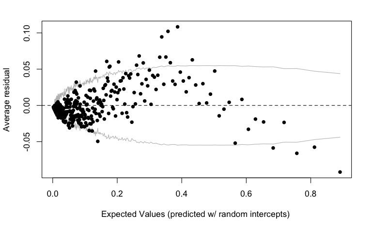
When I try to use binned residual plots to evaluate a multilevel logistic regression, I often see a pattern like this (from my student, fit with glmer):
I think the reason is because of partial pooling/shrinkage of group-level intercepts being shrunk towards the grand mean.
I was able to replicate the effect (albeit kind of mirror-imaged—the above plot was from a very complex model) with fake data:
makeData <- function(ngroup=100,groupSizeMean=10,reSD=2){
  groupInt <- rnorm(ngroup,sd=reSD)
  groupSize <- rpois(ngroup,lambda=groupSizeMean)
  groups <- rep(1:ngroup,times=groupSize)
  n <- sum(groupSize)
  data.frame(group=groups,y=rbinom(n,size=1,prob=plogis(groupInt[groups])))
}
dat <- makeData()
mod <- glmer(y~(1|group),data=dat,family=binomial)
binnedplot(predict(mod,type='response'),resid(mod,type='response'))
Model estimates (i.e., point estimates of the parameters from a hierarchical model) of extreme group effects are shrunk towards 0---the grand mean intercept in this case---except at the very edges when the 0-1 bound forces the residuals to be small in magnitude (I expect the pattern would be linear in the log odds scale).
When I re-fit the same model on the same data with rstanarm and looked at the fitted values I got basically the same result.
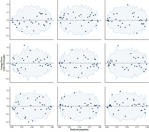
On the other hand, when looking at 9 random posterior draws the pattern mostly goes away:
Now here come the questions---is this really a general phenomenon, like I think it is? If so, what does it mean for the use of binned residual plots for multilevel logistic regression, or really any time there's shrinkage or partial pooling? Can binned residual plots be helpful for models fit with glmer, or only by plotting individual posterior draws from a Bayesian posterior distribuion?

My reply: Yes, the positive slope for resid vs expected value . . . that would never happen in least-squares regression, so, yeah, it has to do with partial pooling. We should think about what's the right practical advice to give here. Residual plots are important.
As you note with your final graph above, the plots should have the right behavior (no slope when the model is correct) when plotting the residuals relative to the simulated parameter values. This is what Xiao-Li, Hal, and I called "realized discrepancies" in our 1996 paper on posterior predictive checking, but then in our 2000 paper on diagnostic checks for discrete-data regression models using posterior predictive simulations, Yuri, Francis, Ivan, and I found that the use of realized discrepancies added lots of noise in residual plots.
What we'd like is an approach that gives us the clean comparisons but without the noise.
I finally get to say that I’ve written a blog post on this :p https://dansblog.netlify.app/posts/2022-09-04-everybodys-got-something-to-hide-except-me-and-my-monkey/everybodys-got-something-to-hide-except-me-and-my-monkey.html
Apologies to clogging the blog with this – but every way I’ve tried to contact Dan has been kicked back. So, I have a question:
Dan
In your linked paper, your explanation of no pooling, complete pooling, and partial pooling is the clearest I’ve seen. However, I don’t have a background in Bayesian analysis and I don’t use R (I use JMP) so I am trying to get my own understanding of the modeling differences. In particular, I am trying to simplify the many issues surrounding choice of priors and just see if I can portray the partial pooling in a simpler way. But I ran into a problem just replicating your results for the complete pooling case. My regression model gives
Response Max(activity (2mins))
Whole Model
Regression Plot
Actual by Predicted Plot
Effect Summary
Source Logworth PValue
Mean(age) 0.512
0.30751
Day*Mean(age) 0.383
0.41361
Day 0.042
0.90866 ^
Lack Of Fit
Source DF Sum of Squares Mean Square F Ratio
Lack Of Fit 50 279.7539 5.59508 1.3058
Pure Error 431 1846.7236 4.28474 Prob > F
Total Error 481 2126.4776 0.0867
Max RSq
0.1434
Residual by Predicted Plot
Summary of Fit
RSquare 0.013652
RSquare Adj 0.0075
Root Mean Square Error 2.102606
Mean of Response 4.047423
Observations (or Sum Wgts) 485
Analysis of Variance
Source DF Sum of Squares Mean Square F Ratio
Model 3 29.4317 9.81057 2.2191
Error 481 2126.4776 4.42095 Prob > F
C. Total 484 2155.9093 0.0851
Parameter Estimates
Term Estimate Std Error t Ratio Prob>|t| Lower 95% Upper 95% VIF
Intercept 3.8177741 0.244409 15.62 <.0001* 3.3375333 4.2980148 .
Mean(age) 0.0157111 0.01538 1.02 0.3075 -0.014508 0.0459308 1.0000348
Day[1] -0.028056 0.244409 -0.11 0.9087 -0.508297 0.4521848 6.5532641
Day[1]*Mean(age) -0.012585 0.01538 -0.82 0.4136 -0.042804 0.0176348 6.5532038
Mean(age)
Leverage Plot
Day
Leverage Plot
Least Squares Means Table
Level Least Sq Mean Std Error Lower 95% Upper 95% Mean
1 3.8354529 0.13488291 3.5704204 4.1004854 3.83539
2 4.2597676 0.13516132 3.9941881 4.5253472 4.26033
Day*Mean(age)
Leverage Plot
If you look at the parameter estimates and compare them to what you report, the coefficients and p values are essentially identical for the day and age*day variables. The intercepts are close. But the age coefficient and its p value are quite different – more than I would expect for using JMP rather than R. Also, you show the first few rows of the data and they are exactly what I have. Any idea why the regression results vary the way that they do?
Thanks.
Dan:
1. In your linked post, you write, “In a study involving aged monkeys, it’s difficult to imagine how a direct replication could take place.” I don’t understand this statement of yours. The original paper says, “we combined field experiments with behavioral observations in a large age-heterogeneous population of Barbary macaques (Macaca sylvanus) at La Forêt des Singes. . . . Experiments were conducted in three periods: October 2012, April–September 2013, and April–October 2014.” So to do a direct replication, you’d just need to go to another primate colony and conduct the same measurements. I guess you could say it’s not a “direct” replication because it would be a different set of monkeys, but the term “direct replication” is just about never taken to imply that the same participants are in the study.
2. Regarding the challenge of the residual plot: as my correspondent wrote above and as you demonstrate with the last set of plots in your post, when we’re stuck on this it just about almost helps to reproduce the plot with simulated data from the model. As Francis and I discussed in our article from 2000, it is possible to get residual plots that have the desired behavior of no expected pattern if the model is true, but only if we make the plot using “realized” parameter values rather than estimated parameter values. The trouble there is than then the plots themselves become random variables, which suggests that you may need to look at multiple plots rather than just one (although if you have enough internal replication in your data, just one plot can be enough) and, more troubling, can lead to plots that are so noisy that they are not effective for seeing problems of model misfit. Hence the challenge.
Just to understand the last question: In PPC we could always generate the reference distribution of the residual plots, so the question is how to locate the realized discrepancies (a residual plot) into its reference distribution (S residual plots), and hopefully obtain a p-value?
Yuling:
I don’t think the goal is to obtain a p-value. I think the goal is to look at the data and learn by seeing unexpected patterns, where “expected” is defined based on the fitted model. This can always be done using posterior predictive checking.
It’s pleasant if we can have graphs that, if the model were true, would have certain simple symmetry properties, or would approximately have such properties, because then the posterior predictive check can be done visually without a need to compare to a bunch of graphs simulated from the model.