People sometimes confuse certainty about summary statistics with certainty about draws from the distributions they summarize. Saying that we are quite confident that the average outcome for one group is higher than the average for the other can be taken as a claim about the full distributions of the outcomes. And intuitions people might have about the relationship between the two from settings they know well are quickly broken when considering other settings (e.g., much larger sample sizes, outcomes with measured with greater coarseness).
Sam Zhang, Patrick Heck, Michelle Meyer, Christopher Chabris, Daniel Goldstein, and Jake Hofman study this confusion in their recently published paper. Among other things, by conducting these studies with samples of data scientists, faculty, and medical professionals, this new work highlights that this is a confusion that experts seem to make as well, thereby building on prior work with laypeople by a overlapping set of authors (Jake Hofman, Dan Goldstein, and Jessica Hullman), which has been discussed here previously. They also encourage, as often comes up here, plotting the data:
[T]he pervasive focus on inferential uncertainty in scientific data visualizations can mislead even experts about the size and importance of scientific findings, leaving them with the impression that effects are larger than they actually are. … Fortunately, we have identified a straightforward solution to this problem: when possible, visually display both outcome variability and inferential uncertainty by plotting individual data points alongside statistical estimates.
One way of plotting the data (alongside means and associated inference) is shown in their Figure 1:
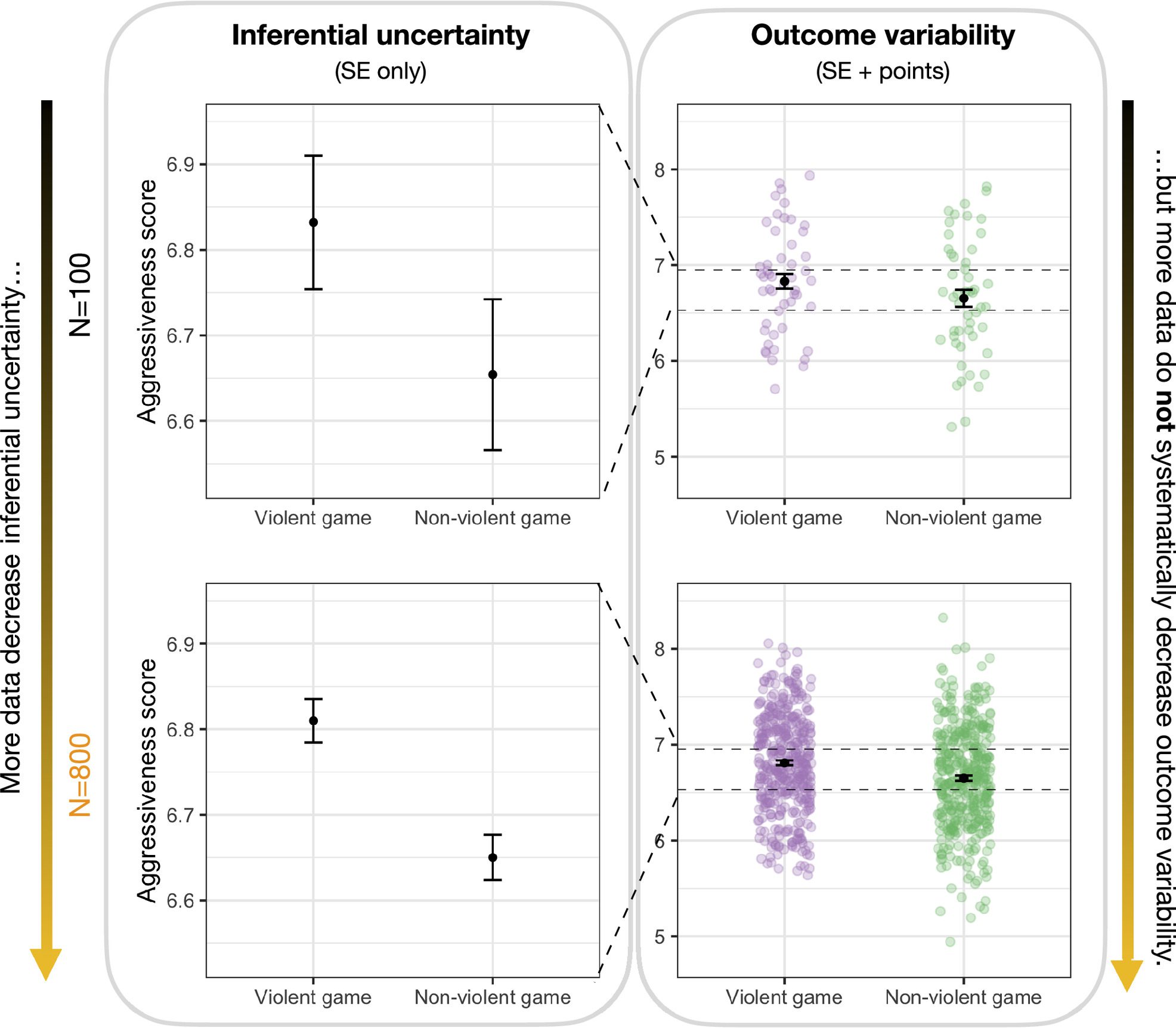
So I like the admonition here to plot the data, or at least the distribution. Perhaps this also functions as a nice encouragement for researchers to look at these distributions, which apparently is not as common as one might think. Overall, I agree that there is clear evidence that people, including experts, mistake inferential certainty (about means and mean effects) for predictive certainty.
Here what I want to probe is one of their measures of predictive uncertainty, which maybe questions exactly what quantifying predictive uncertainty in the context of causal inference and decision making is good for.
“Probability of superiority”
These studies quantify predictive certainty in multiple ways. One of them is having participants specify a histogram of outcomes for patients in the different groups, using an implementation of Distribution Builder. But these also have participants estimate the “probability of superiority”. The first paper describes this as: “the probability that undergoing the treatment provides a benefit over a control condition” (Hofman, Goldstein, Hullman, 2020, p. 3).
This isn’t quite right as a description of this quantity, except under additional strong assumptions — assumptions that are certainly false in major ways in all the behavioral and social science applications that come to mind. (I want to note here also that this misuse appears to be common, so this is not at all an error specific to this earlier work by these authors; see below for more examples.)
“Probability of superiority” (or PoS; in some other work given other names as well, like “common language effect size”) is defined as the probability that a sample from one distribution is larger than a sample from another, usually treating ties as broken randomly (so counted as 0.5). It is a label for a scaled version of the U-statistic of the Mann–Whitney U test / Wilcoxon rank-sum test. So it is correct to say that it is the probability that a random patient assigned to treatment has a better outcome than a random patient assigned to control. But this may tell us precious little the distribution of treatment effects, which is related to what is often called the fundamental problem of causal inference.
First, even in a very simple setup, it is possible to get very small values for PoS while in fact everyone (100%) is benefitting from treatment. To see this and other points here, it is useful to think in terms of potential outcomes, where Yi(0) and Yi(1) are the outcomes for unit i if they were assigned to treatment and control respectively. Simply posit a constant treatment effect τ, so that Yi(1) = Yi(0) + τ. Then if τ > 0, everyone benefits from treatment. However, it is possible to have a PoS arbitrarily close to 0 by changing the distribution of Yi(0). Now PoS still does say something about the distributions of Yi(1) and Yi(0), but not much about their joint distribution. Even short of this exactly additive treatment effect model, we usually think that there is a lot of common variation, such that Yi(0) and Yi(1) are positively correlated (even if not perfectly so, as with a homogeneous additive effect).
I think some of the confusion here arises from thinking of PoS as Pr(Yi(1) > Yi(0)), when really one needs to drop the indices or treat them differently, decoupling them. Maybe it is helpful to remember that PoS is just a function of the two marginal distributions of Yi(0) and Yi(1).
These problems can get more severe, including allowing reversals, if there are heterogeneous effects of treatment. Hand (1992) points out that Pr(Yi(1) > Yi(0)) can be very different than Pr(Yj(1) > Yk(0)), presenting this simple artificial example. Let (Yi(0), Yi(1)) have equal probability on (5, 0), (1, 2), and (3, 4). Pr(Yj(1) > Yk(0)) = 1/3, so PoS says we should prefer control. But Pr(Yi(1) > Yi(0)) = 2/3: the majority of units have positive treatment effects.
So PoS can be quite a poor guide to decisions. Fun, trickier problems can also arise, as PoS is also intransitive.
To some degree, the problem here is just that PoS can appear to offer something that is basically impossible: a totally nonparametric way to quantify effect sizes for decision-making. Thomas Lumley explains:
Suppose you have a treatment that makes some people better and other people worse, and you can’t work out in advance which people will benefit. Is this a good treatment? The answer has to depend on the tradeoffs: how much worse and how much better, not just on how many people are in each group.
If you have a way of making the decision that doesn’t explicitly evaluate the tradeoffs, it can’t possibly be right. The rank tests make the tradeoffs in a way that changes depending on what treatment you’re comparing to, and one extreme consequence is that they can be non-transitive. Much more often, though, they can just be misleading.
It’s possible to prove that every transitive test reduces each sample to a single number and then compares those numbers [equivalent to Debreu’s theorem in utility theory]. That is, if you want an internally consistent ordering over all possible results of your experiment, you can’t escape assigning numerical scores to each observation.
Overall, this leads to my conclusion that, at least for most purposes related to evaluating treatments, PoS is not recommended. In their new paper, Zhang et al. do continue using PoS, but they also no longer give it the definition above, at least explicitly avoiding this misunderstanding. It is interesting to think about how to recast the general phenomenon they are studying in a way that more forcefully avoids this potential confusion. It is not obvious to me that a standard paradigm of treatment choice or willingness-to-pay for treatment involves the need to account for this predictive uncertainty.
PoS and AUC
Does PoS have some sensible uses here?
I want to highlight one point that Dan Goldstein made last year: “Teachers, principals, small town mayors are reading about treatments with tiny effect sizes and thinking they’ll have a visible effect in their organizations”.
Dan intended this as a comment on the need for intuitions about statistical power in planning field studies, but here’s what it made me think: Sometimes people are deciding whether to implement some intervention. It might be costly, including that they are in some sense spending social capital. They might also be deciding how prominently to announce their decision. It is then going to be important for them whether their unit’s outcome will be better than the outcomes of some comparison units (e.g., nearby classrooms, schools — or recent classroom–years or school–years) where it was absent. Maybe PoS tells them something about this. They aren’t trying to do power calculations exactly, but they are trying to answer the question: If I do this (and perhaps advertise I’m doing this thing), are my outcomes going to look comparatively good?
This also fits with the artificial choice setting the first paper gave participants, where participants are giving their willingness to pay for something that could improve their time in a race, but they should only care about winning the race. (Of course, one still might worry about that, in a race, there is shared variance from, e.g., wind, so a PoS computed from unpaired outcomes will be misleading. Similarly, there are common factors affecting two classrooms in the same school.)
But maybe PoS is useful in that kind of a setting. This makes sense given that PoS is just the area under the curve (AUC) for a sequence of classifiers that threshold the outcomes to guess the label (in our examples, treatment or control). This highlights that PoS is perhaps most useful in the opposite direction of the main way it is promoted under that label (as opposed to the AUC label): You want to say something about how much treatment observations stand out compared with control observations. Perhaps only rarely (e.g., the example in the previous paragraph) does this provide the information you want to choose treatments, but it is useful in other ways.
Inference, then perhaps prediction
One interesting observation is that in the central example used in the studies with data scientists and faculty, the real-world inference is itself quite uncertain. The task is adapted from a study that ostensibly provided evidence that exposure to violent video games causes aggressive behavior in a subsequent reaction time task (in particular, subjecting others to louder/longer noise, after they have done the same). The original result in that paper is:
Most importantly, participants who had played Wolfenstein 3D delivered significantly longer noise blasts after lose trials than those who had played the nonviolent game Myst (Ms = 6.81 and 6.65), F(1, 187) = 4.82, p < .05, MSE = .27. In other words, playing a violent video game increased the aggressiveness of participants after they had been provoked by their opponent’s noise blast.
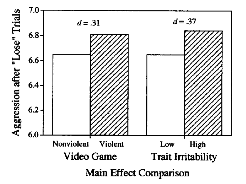
Figure 6 of Anderson & Dill (2000): “Main effects of video game and trait irritability on aggression (log duration) after “Lose” trials, Study 2.”
Hmm what is that p-value there? Ah p = 0.03. Particularly given forking paths (there were no stat. sig. effects for noise loudness, and this result is only for some trials) and research practices in psychology over 20 years ago, I think it is reasonable to wonder whether there is much evidence here at all. (Here is some discussion of this broader body of evidence by Joe Hilgard.)
As for that plot, I can, with Zhang et al., agree maybe that some other way of visualizing these results might have better conveyed the (various) sources of uncertainty we have here.
Researchers and other readers of the empirical literature are often in the situation of trying to understand whether there is much basis for inference about treatment effects at all. In this case, we barely have enough data to possibly conclude there’s some weak evidence of any difference between treatment and control. We’re going to have a hard time saying anything really about the scale of this effect, whether measured in the different in means or PoS.
Maybe things are changing. There are “changing standards within experimental psychology around statistical power and sample sizes” (SI). So perhaps there is room, given greater inferential certainty, for measures of predictability of outcomes to become more relevant in the context of randomized experiments. However, I would caution that rote use of quantities like PoS — which really has a very weak relationship with anything relevant to, e.g., willingness-to-pay for a treatment — may spawn new, or newly widespread, confusions.
What uses for PoS in understanding treatment effects and making decisions have I missed?
[This post is by Dean Eckles. Thanks to Jake Hofman and Dan Goldstein for responding with helpful comments to a draft.]
P.S.: Other examples of confusion about PoS in the literature
Here’s an example from a paper directly about PoS and advocating its use:
An estimate of [PoS] may be easier to understand than d or r, especially for those with little or no statistical expertise… For example, rather than estimating a health benefit in within-group SD units or as a correlation with group membership, one can estimate the probability of better health with treatment than without it. (Ruscio & Mullen, 2012)
In other cases, things are written with a fundamental ambiguity:
For example, when one is comparing a treatment group with a control group, [PoS] estimates the probability that someone who receives the treatment would fare better than someone who does not. (Ruscio, 2008)
Wow, thanks for the post. I suspected you had some thoughts on standardized measures of effect size and am glad to hear them.
I comment as the person who is probably responsible for the rote use of PoS in experiments on what people infer from visualizations of distribution. I used PoS in my first paper on hypothetical outcome plots, which (by animating or juxtaposing multivariate draws) give you multivariate probability information that is hard to extract from other visualizations of distribution. PoS seemed like the right way to ask for effect size, since we were doing the study on lay people and its touted as easier to understand than other measures. Using PoS also seemed like an improvement over more common types of tasks in empirical evaluations of uncertainty visualizations, where people tend to focus narrowly on ability to read univariate probabilities or elicit subjective confidence reports, and then maybe look for correlations between these and test statistics when its a multivariate judgment. We have used PoS again in several studies in my lab since then. I don’t think we’ve ever explained it in the erroneous way you point out from the 2020 paper.
But that said, I have become increasingly skeptical about standardized effect size info being important when people see visualizations. This is mostly because it’s use often seems to ignore that the degree to which variance information matters depends on the decision problem being studied, including the stakes/scoring rule. In contrast, often uncertainty visualization studies are designed as if it is taken for granted that all uncertainty matters. I personally think we shouldn’t be interpreting such experiment results without careful assessment of the statistical decision problem being studied and the value of the information to that (see e.g., our recent work: https://arxiv.org/abs/2304.03432). In fact, when we looked carefully at the decision problem in one of our previous studies that elicited PoS in the context of a binary decision task, similar to the artificial task in the Hofman, Goldstein, Hullman paper, we realized that PoS was not at all the relevant quantity for the decision.
Very interesting — I will have to read your (very new I see!) “rational agent benchmark” paper, as this seems very closely related to my less detailed thoughts here.
Note: that quote is from your earlier 2020 paper. I have edited the post above to include an explicit citation, rather than just “first paper”, which was confusing.
Yes, I got which paper (and that I am an author on it!) I was talking about other uses of PoS in my lab (i.e., stuff led by my students).
Dean:
Wow, lots of blog action in one day.
Not so relevant to the above post, but we’ve discussed that horrible “noise blasts” research in the past; see here. In my opinion, it’s NPR-bait junk science at its worst.
Regarding the general topic of varying treatment effects, I’m reminded of our recent paper on visualizing varying effects.
Yes, that shares not just the “noise blasts” method, but Anderson and Bushman are frequent coauthors. That includes, for example, this very recent paper aiming to explain away null results: https://www.craiganderson.org/wp-content/uploads/caa/abstracts/2020-2024/23BA.pdf
One notable objection there is that prior studies with null results for effects of violent media err in controlling for baseline traits!
“Figure 1 illustrates some of the ways in which true violent media effects can be hidden or underestimated by inappropriate data analyses. Panel A, for instance, shows the inappropriateness of statistically controlling for trait aggression when testing the effect of media violence on bullying behavior, that is, testing whether Area C is statistically significant when in fact one should be testing whether Area B þ C is statistically significant. This is inappropriate for at least three reasons. First, trait aggression measures often include aggressive behavior items (e.g., “I get into fights a little more than the aver- age person”; Buss & Perry, 1992). Thus, controlling for trait aggression means that you have partialed out the dependent variable from itself.”
I have long favored “dox plots” (a box plot and a dot plot superimposed) for displaying small data sets. With larger data sets, the overlapping of points can make it hard to see the general pattern, as overlapping points visually saturate to make the distribution look uniform over a broad range. In Figure 1 above, the n=100 panel on the right looks good, but in the n=800 panel below it the points become a schmear.
I also prefer the box part of the dox plot to the mean plus/minus the SE, as the latter keeps getting smaller as n goes up, while the box plot shows the distribution of the items.
(“Dox plot” was the term I learned when I was part of the Leland Wilkinson/Systat universe– I have rarely seen it used outside the community of Systat users and former users.)
Check out viopoints, which arranges the dot plot like a violin plot so you can see the distribution. Then it doesn’t look uniform with large numbers of points: https://rdrr.io/cran/viopoints/man/viopoints.html
When I use it I also like to overlay a boxplot, sometimes adding another line showing the mean as well.
In my opinion, an important point with data visualization (maybe just similarly to the rest of statistics?) is that those best for some settings may not work well in others.
Much of my empirical work has involved 1e5–1e8 observations, so it starts to really not make sense to plot all the data points. But then, say, doing some meta-analysis work, you end up with a lot fewer points and want to see each one.
Also, I’ve worked a lot with observations that are log-normal-ish, but with some zeros, so this can push towards doing things like plotting CDFs on log scales. But not sure those would be my first choice elsewhere.
I think probability of superiority has a lot of useful applications, especially when making within subjects comparisons and looking at things like Likert ratings. As a side note, I also usually refer to it as PSup, because PoS has another meaning in lay terms: piece of sh** – though maybe that is how you would want it to be known lol.
I have found PSup particularly useful when looking at within subjects comparisons between Likert ratings in things like MRP. I’ve seen applications of MRP where people conduct such a comparison by subtracting one Likert rating from another and then running MRP on the difference, but it is also possible to look at the difference as a within subject PSup comparison and then run MRP on the likehood that one or the other Likert rating is higher, the same, or different, and then calculate the population-level PSup for the population of interest. This can be interpreted relatively simply as the proportion of people we expect to rate one item higher than another and is quite a good indicator of preference (with the caveats about tied scores being assigned randomly).
Perhaps there is some flaw with my idea above that I’m not aware of, but to me it is preferable to running MRP on the difference scores. It seems like you are rather responding to substantial misinterpretations of the metric?
I think the use with paired samples, such as the same person’s responses to multiple survey questions, avoids a lot of the interpretive problems I’ve highlighted here.
Of course, one can still wonder about measurement error (say especially for questions from two different waves of a survey). But the problems seem much less severe to me.
It’s not just me that uses “PoS”. Some of Jessica Hullman’s papers use that abbreviation too!
Ha yes I know it’s not just you – I just recall myself wondering how to shorten the term and feeling like PoS was vaguely familiar, and my colleague told me what it makes them think of! So I’ve since used PSup.
The interpretive issues are certainly interesting. Have you any thoughts on other non-parametric measures of differences such as the Cucconi test (https://en.wikipedia.org/wiki/Cucconi_test) – I haven’t yet used it but it interestingly can detect differences in both the shape and location of two distributions. I was wondering about expanding beyond things like PSup to look at this or similar summary statistics (while also of course looking at the actual data, of course!)
Yes, given that I was making a critical argument, I didn’t try to avoid that association.
No, not familiar with that statistic and test. Interesting… I wonder if there’s a paired version of that, which it seems like is what you want for your existing uses.
Fwiw, I am notoriously uninformed about pop culture references and abbreviations people use in texts and what emojis really mean etc. Always think twice before you copy me!
Jessica no worries I’m sure other people have also used PoS!
super fascinating post
i wonder if an analogy could be made between the “obviously dominant strategy” concept in game theory/mechanism design and probability of superiority
obvious dominance (introduced in Shengwu Li’s job market paper) is when a strategy is so dominant that even a “cognitively limited” agent who is not able to engage in “contingent reasoning” is still able to perceive it as dominant. when such an agent considers a deviation from an obviously dominant strategy, they check payoffs of any possible outcome under the alternative, and find that the worst case outcome from the original strategy leaves them as well off as the best case outcome from deviating
perhaps Probability of Superiority could be motivated as something that a similarly behavioural agent would be likely to perceive as the optimal policy?
for example, in the debate over whether increased housing supply and relaxed zoning laws will reduce home prices and rents, many people argue that since most new developments are market-rate luxury condos affordable only to gentrifying yuppies, this is evidence that supply does not reduce prices. the “YIMBY” counterargument is that the prices of other homes is lower relative to its counterfactual, but this “trickle down” story is a challenging argument to make, both econometrically and in terms of persuasion in the broader public sphere. policies that reduce rents and house prices uniformly and therefore have a higher PoS (even if they may have a lower average causal effect) may be perceived as more effective
Yeah, that’s an interesting proposal… Not immediately clear what the right analog is there, but maybe that’s what makes it interesting.
I think of the work of Charles Manski, where he explores decision theory where stochastic dominance is key criterion. I haven’t read it yet, but the most recent is https://arxiv.org/abs/2308.05171. One of the earlier ones is “Actualist rationality”.
I had thought about writing a bit more about Manski on related points, as in his book “Identification for Prediction and Decision” (and I imagine perhaps elsewhere in a paper or two), he explicitly argues for comparing distributions of outcomes, rather than treatment effects. I guess this is pretty natural from a standard social choice theory perspective.
What do you think of Stephen Senn’s criticism of the paper? https://twitter.com/stephensenn/status/1674667986186035200?t=AMt_0rR4FjoZzL5uwLhGuw&s=19
I’m not sure, but I think he is basically expressing the same line of criticism: That outcome variability is not so directly informative about treatment effects. Senn quotes this part of the paper:
“it also makes clear that while violent video games may change aggressive behavior on average, the relationship is far from deterministic: knowing only if someone played a violent video game or not says relatively little about how aggressively they might behave.”
On its own, I think the first part of this sentence is most readily interpretable as suggesting that the marginal distributions immediately tell us a lot about the distribution of treatment effects, which we’ve seen is not really so simple, and this kind of data is compatible with a constant (one might say deterministic) treatment effect. But then the second part provides a purely descriptive or predictive version of this.