Alex Hoffman pointed me to this widely-circulated map comparing the fifty states in something called the Human Development Index:
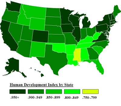
As Alex points out, the coding of the map is kind of goofy: the states with the three lowest values are Louisiana at .801, West Virginia at .800, and Mississippi at .799, but their color scheme makes Mississippi stand out as the only yellow state in a sea of green.
But I’m concerned about more than that. Is Alaska really so developed as all that? And whassup with D.C., which, according to the table, is #4, behind only Connecticut, Massachusetts, and New Jersey? I know about gentrification and all that, but can D.C. really be #4 on any Human Development Index worth its name?
Time to look behind the numbers.
The report gives the following information:
The HDI combines three basic dimensions:
* Life expectancy at birth, as an index of population health and longevity
* Knowledge and education, as measured by the adult literacy rate (with two-thirds weighting) and the combined primary, secondary, and tertiary gross enrollment ratio (with one-third weighting).
* Standard of living, as measured by the natural logarithm of gross domestic product (GDP) per capita at purchasing power parity (PPP) in United States dollars.
OK, I think I see what’s going on. The 50 states don’t vary much by life expectancy, literacy, and school enrollment. Sure, Hawaiians live a few years longer than Mississippians, and there are some differences in who stays in school, but by far the biggest differences between states, from these measures, are in GDP. The average income in Connecticut is twice that of Mississippi.
To check out the relation between HDI and income, I loaded in the tabulated HDI numbers and plotted them vs. some state income numbers (excluding D.C., unfortunately) that I happened to already have on my computer:
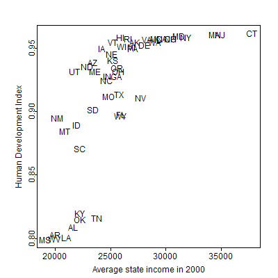
Interesting. The pattern in strong but nonlinear. Let’s try plotting the ranks:
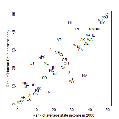
The pattern seems pretty clear, with most of the states falling right on the 45-degree line. The correlation between the two rankings is 86%. I’m actually surprised the correlation isn’t higher–and I’m surprised the first scatterplot above is so nonlinear–but, then again, I’m using state income rather than GDP, so maybe there’s something going on there.
(In response to some mathematically-inclined readers: No, the log transformation is not what’s doing this, at least not if you’re logging income as is stated in the report. Logging stretches out the lower end of the scale a bit but does not change the overall pattern of the plot. The income values don’t have enough dynamic range for the log transformation to have much effect.)
Or maybe more is going on with those other components than I realize. If anyone’s interested in following up on this, I suggest looking into South Carolina and Kentucky, which are so close in average income and so far apart on the HDI (see the top scatterplot above).
Searching around, I found the aforementioned numbers that range from 0.799 to 0.962, and another set that range from 3.58 to 6.37. The rankings of these two sets are identical; unfortunately I couldn’t find the exact formula for either of these. But I did find this report which gives some formulas and also, in its Appendix B, the actual numbers used for the 50 states in preliminary calculations. These rankings do not exactly agree with the ones shown in the map–in the preliminary data, Massachusetts, not Connecticut, is #1, D.C. is in the lower half, and Alaska is second-to-last.
So I’m not completely sure what’s happening here. But if you go by the maps that everybody’s linking to (having appeared in Catherine Rampell’s New York Times blog), you’re pretty much just mapping state income and giving it a fancy transformation and a fancy new name.
I think they should’ve just gone with the traditional measure of human underdevelopment in U.S. states: distance from the Canadian border.
Reflection
Why do I have such strong feelings about this? It’s probably a simple case of envy, that this little bit of index-averaging has probably received more publicity than all of my life’s research put together, envy that it has received so much funding. I’m sure they all have had good intentions, but I think something went wrong, at least with this part of the project.
But maybe I’m thinking about this all wrong: these folks are clearly doing well, so maybe I should emulate them. I’ll start by making maps of everything ranked by state, and we’ll see how that goes.
I think that you are giving "these people" too much credit.
The problem is that they are taking a system meant to compare countries around the globe — with variability in all three areas — to regions within a single country.
It's not that the metric is poor; it's that it is stupidly applied.
Judging by the flashiness of their website (https://measureofamerica.org/), I'd guess they're spending a lot more money on marketing/PR than research.
Why need to compare such things, when we can focus on main issues of economy and poverty? Wake up guys! There are still many things to do in order to gain back our economy. We, the taxpayer are part of the building blocks of the U.S. financial system, and the sole reason for the existence of Federal and state governments. . The taxpayer, who has had their tax dollars allocated to aid large businesses short of cash, as a payday loan to improve the economy, has also had to worry about their employment being terminated by these very same companies. Neil Barosky was appointed as oversight for the bailout by Timothy Geithner, and he hasn't come out with a report yet that explains why it is getting so much harder for the average taxpayer to get personal loans from the companies that we all paid for to bailout. Let’s just hope and work our best to gain back the firmness of our nations economy.
Could the inclusion of life expectancy explain the surprisingly low ranking of D.C.?
I want to know what "at purchasing power parity (PPP)" means. That makes it sound like they controlled for differences in Cost-of-Living. This could certainly explain why states like Utah and North Dakota seem to be ranked much better in HDI than their per-capita income would suggest.
You'd think that the inclusion of cost-of-living would rank Utah lower. The ratio of median house cost to median income is 11th highest in the nation.
Hi Andrew,
I just wanted to say that I have <a>posted an update on this issue at The Map Scroll. The long and skinny of it is, AHDP disavows the data upon which the map in my original blog post was based. But they do, of course, stand by their own methodology – and indeed, they have their />own maps of their HDI for US states, at https://measureofamerica.org/maps. But their data are not compatible with the data that go into the UN's HDI, so the data in that map do not represent their work.
It would be great if you could post their map, and hopefully end some of this confusion.
Instead of the HDI, they should have used the Human Poverty Index. That measure does have different versions for rich and poor countries. The rich-country version is based on income, functional illiteracy, inequality, and long-term unemployment. See the Wikipedia entry.
That being said, most of your criticisms of the HDI also apply to international comparisons. There's a very strong correlation between per capita income, literacy, and life expectancy; the latter two rise steadily, but not perfectly, with income. The real fun is seeing which countries have a different relative ranking on the HDI than on a pure income measure. The UAE, iirc, comes off the worst here, while Cuba is one of the best. The US ranks lower in HDI than in income.
@Jason: the PPP does control for cost of living, but on an international basis, so it makes no difference for a domestic comparison.
It should be no surprise that the state of Mississippi is at the bottom of this list.
The whole state was declared a disaster area after Hurricane Katrina. 90% of buildings were destroyed on the Mississippi Gulfcoast (perhaps it's largest population center at the time). That area is marsh land so long expensive bridges are required to get from different sections of the Gulf Coast. These were all destroyed during Katrina. They have all been rebuilt, but this had to be a top priority before rebuilding a lot of other primary infrastructure in the region.
I'll start by making maps of everything ranked by state, and we'll see how that goes.
Not a bad idea. As any inventor has found out, producing the better mousetrap (or research or idea) is only about 25% of the path to success. The other 75% is marketing.
So, indeed, if you want success and recognition, your choices are to provide people with what they want (one dimensional, easily-understood metrics and strict unambiguous comparisons with peers) or you can take the difficult path and *really* spend all your time on marketing to convince people that they want what you provide.
Either way means a hell of a lot of marketing in proportion to the good idea.
Or, you can do what most of us academics do, which is produce the good idea and wait for someone to 'discover' us. Of course, most of us are still waiting :-).