This is Jessica. This past week we’ve been talking about exploratory data analysis (EDA) in my interactive visualization course for CS undergrads, which is one of my favorite topics. I get to talk about model checks and graphical inference, why some people worry about looking at data too much, the limitations of thinking about the goal of statistical analysis as rejecting null hypotheses, etc. If nothing else, I think the students get intrigued because they can tell I get worked up about these things!
However, I was also reminded last week in reading some recent papers that there are still a lot of misconceptions about exploratory data analysis in research areas like visualization and human-computer interaction. EDA is sometimes described by well-meaning researchers as being essentially model-free and hypothesis-free, as if it’s a very different style of analysis than what happens when an analyst is exploring some data with some hunches about what they might find.
It bugs me when people use the term EDA as synonymous with having few to no expectations about what they’ll find in the data. Identifying the unexpected is certainly part of EDA, but casting the analyst as a blank slate loses much of the nuance. For one, it’s hard to even begin making graphics if you truly have no idea what kinds of measurements you’re working with. And once you learn how the data were collected, you probably begin to form some expectations. It also mischaracterizes the natural progression as you build up understanding of the data and consider possible interpretations. Tukey for instance wrote about different phases in an exploratory analysis, some of which involve probabilistic reasoning in the sense of assessing “With what accuracy are the appearances already found to be believed?“ Similar to people assuming that “Bayesian” is equivalent to Bayes rule, the term EDA is often used to refer to some relatively narrow phase of analysis rather than something multi-faceted and nuanced.
As Andrew and I wrote in our 2021 Harvard Data Science Review article, the simplistic (and unrealistic) view of EDA as not involving any substantive a priori expectations on the part of the analyst can be harmful for practical development of visualization tools. It can lead to a plethora of graphical user interface systems, both in practice and research, that prioritize serving up easy-to-parse views of the data, at the expense of surfacing variation and uncertainty or enabling the analyst to interrogate their expectations. These days we have lots of visualization recommenders for recommending the right chart type given some query, but it’s usually about getting the choice of encodings (position, size, etc.) right.
What is better? In the article we had considered what a GUI visual analysis tool might look like if it took the idea of visualization as model checking seriously, including displaying variation and uncertainty by default and making it easier for the analyst to specify and check the data against provisional statistical models that capture relationships they think they see. (In Tableau Software, for example, it’s quite a pain to fit a simple regression to check its predictions against the data). But there was still a leap left after we wrote this, between proposing the ideas and figuring out how to implement this kind of support in a way that would integrate well with the kinds of features that GUI systems offer without resulting in a bunch of new problems.
So, Alex Kale, Ziyang Guo, Xiao-li Qiao, Jeff Heer, and I recently developed EVM (Exploratory Visual Modeling), a prototype Tableau-style visual analytics tool where you can drag and drop variables to generate visualizations, but which also includes a “model bar.” Using the model bar, the analyst can specify provisional interpretations (in the form of regression) and check their predictions against the observed data. The initial implementation provides support for a handful of common distribution families and takes input in the form of Wilkinson-Pinheiro-Bates syntax.
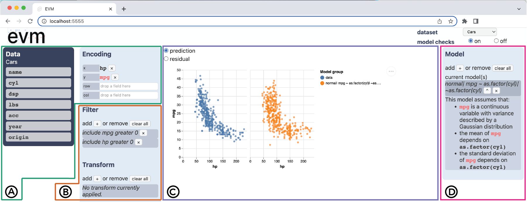
The idea is that generating predictions under different model assumptions absolves the analyst from having to rely so heavily on their imagination to assess hunches they have about which variables have explanatory power. If I think I see some pattern as I’m trying out different visual structures (e.g., facetting plots by different variables) I can generate models that correspond to the visualization I’m looking at (in the sense of having the same variables as predictors as shown in the plot), as well as view-adjacent models, that might add or remove variables relative to the visualization specification.
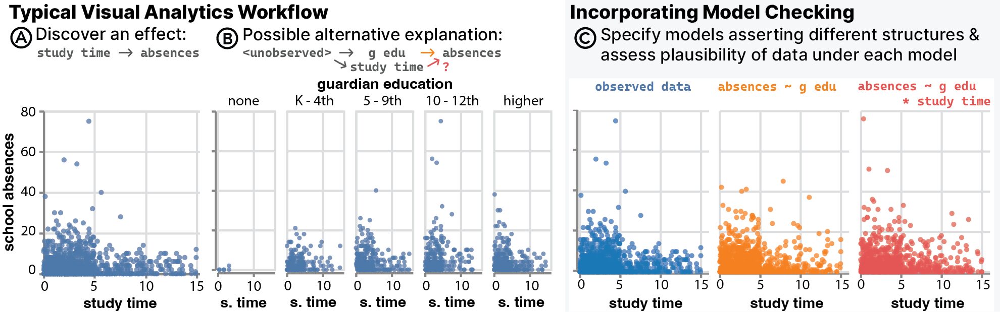
As we were developing EVM, we quickly realized that trying to pair the model and the visualization in terms of constraining them to involve the same variables is overly restrictive. And a visualization will always generally map to multiple possible statistical models so why aim for congruency.
I see this project, which Alex presented this week at IEEE VIS in Melbourne, as an experiment rather than a clear success or failure. There have been some interesting ideas proposed over the years related to graphical inference, and the connection between visualizations and statistical models, but I’ve seen few attempts to locate them in existing workflows for visual analysis like those supported by GUI tools. Line-ups, for instance, which hide a plot of the observed amongst a line-up of plots representing the null hypothesis, are a cool idea, but the implementations I’ve seen have been standalone software packages (e.g., in R) rather than attempts to integrate them into the types of visual analysis tools the non-programmers are using. To bring these ideas into existing tools, we have to think about what kind of workflow we want to encourage, and how to avoid new potential failure modes. For example, with EVM there’s the risk that having the ability to directly check different models one generates as they look at data leaves them with a sense that they’ve thoroughly checked their assumptions and can be even more confident about what explains the patterns. That’s not what we want.
Playing around with the tool ourselves has been interesting, in that it’s forced us to think about what the ideal use of this kind of functionality is, and under what conditions it seems to clearly benefit an analysis over not having it. The benefits are nuanced. We also had 12 people familiar with visual analysis in tools like Tableau use the system, and observed how their analyses of datasets we gave them seemed to differ from what they did without the model bar. Without it they all briefly explored patterns across a broad set of available variables and then circled back to recheck relationships they had already investigated. Model checking on the other hand tended to structure all but one participants’ thinking around one or two long chains of operations geared toward gradually improving models, through trying out different ways of modeling the distribution of the outcome variable, or selection of predictor variables. This did seem to encourage thinking about the data-generating process, which was our goal, though a few of them got fixated on details in the process, like trying to get a perfect visual match between predictions and observed data (without any thought as to what they were changing in the model spec).
Figuring out how to avoid these risks requires understanding who exactly can benefit from this, which is itself not obvious because people use these kinds of GUI visual analysis tools in lots of different ways, from data diagnostics and initial data analysis to dashboard construction as a kind of end-user programming. If we think that a typical user is not likely to follow up on their visual interpretations by gathering new data to check if they still hold, then we might need to build in hold-out sets to prevent perceptions that models fit during data exploration are predictive. To improve the ecosystem of visual analysis tools, we need to understand goals, workflow, and expertise.
It would be nice to note that EDA means “exploratory data analysis.” This took me a while to figure out.
Added to first sentence, thanks!
A nice post!
I’m reminded of ViSta, the Visual Statistics system created by Forrest Young many years ago. Still alive at https://www.uv.es/visualstats/
I really like the perspective in this post: Totally agreed that EDA isn’t just floating around in a pool of data without any expectations, goals, or models. In fact, I think one of the best ways to be surprised by data is to make expectations explicit, and then see how things deviate from that. The tool looks neat.