Everyone’s seen Venn diagrams so they’re a great entry to various general issues in mathematics and its applications.
The other day we discussed the limitations of Venn diagrams with more than 3 circles as an example of our general failures of intuitions in high dimensions.
The comment thread from that post featured this thoughtful reflection from Eric Neufeld:
It’s true that Venn diagrams are not widely applicable. But thinking about this for a few days, suggests to me that Venn diagrams play a role similar to truth tables in propositional logic. We can quickly establish the truth of certain tautologies, mostly binary or ternary, with truth tables, and from there move to logical equivalences. And so on. But in a foundation sense, we use the truth tables to assert certain foundational elements and build from there.
Something identical happens with Venn diagrams. A set of basic identifies can be asserted and subsequently generalized to more widely applicable identifies.
Some find it remarkable that all of logic can be seen as resting on purely arbitrary definitions of two or three primitive truth tables (usually and, or and not). Ditto, the core primitives of sets agree with intuition using Venn diagrams. No intuition for gigantic truth tables or multidimensional Venn diagrams.
That’s an interesting point and it got me thinking. Venn diagrams are a great way to teach inclusion/exclusion in sets, and the fact that they can be cleanly drawn with one, two, or three binary factors underlines the point that inclusion/exclusion with interactions is a general idea. It’s great that Venn diagrams are taught in schools, and if you learn them and mistakenly generalize and imagine that you could draw complete Venn diagrams with 4 or 5 or more circles, that’s kind of ok: you’re getting it wrong with regard to these particular pictures—there’s no way to draw 5 circles that will divide the plane into 32 pieces—but you’re correct in the larger point that all these subsets can be mathematically defined and represent real groups of people (or whatever’s being collected in these sets).
Where the problem comes up is not in the use of Venn diagrams as a way to teach inclusions, unions, and intersections of sets. No, the bad stuff happens when they’re used as a tool for data display. Even in the three-circle version, there’s the difficulty that the size of the region doesn’t correspond to the number of people in the subset—and, yes, you can do a “cartogram” version but then you lose the clear “Venniness” of the three-circle image. The problem is that people have in their minds that Venn diagrams are the way to display interactions of sets, and so they try to go with that as a data display, come hell or high water.
This is a problem with statistical graphics, that people have a few tools that they’ll use over and over. Or they try to make graphs beautiful without considering what comparisons are being facilitated. Here’s an example in R that I pulled off the internet.
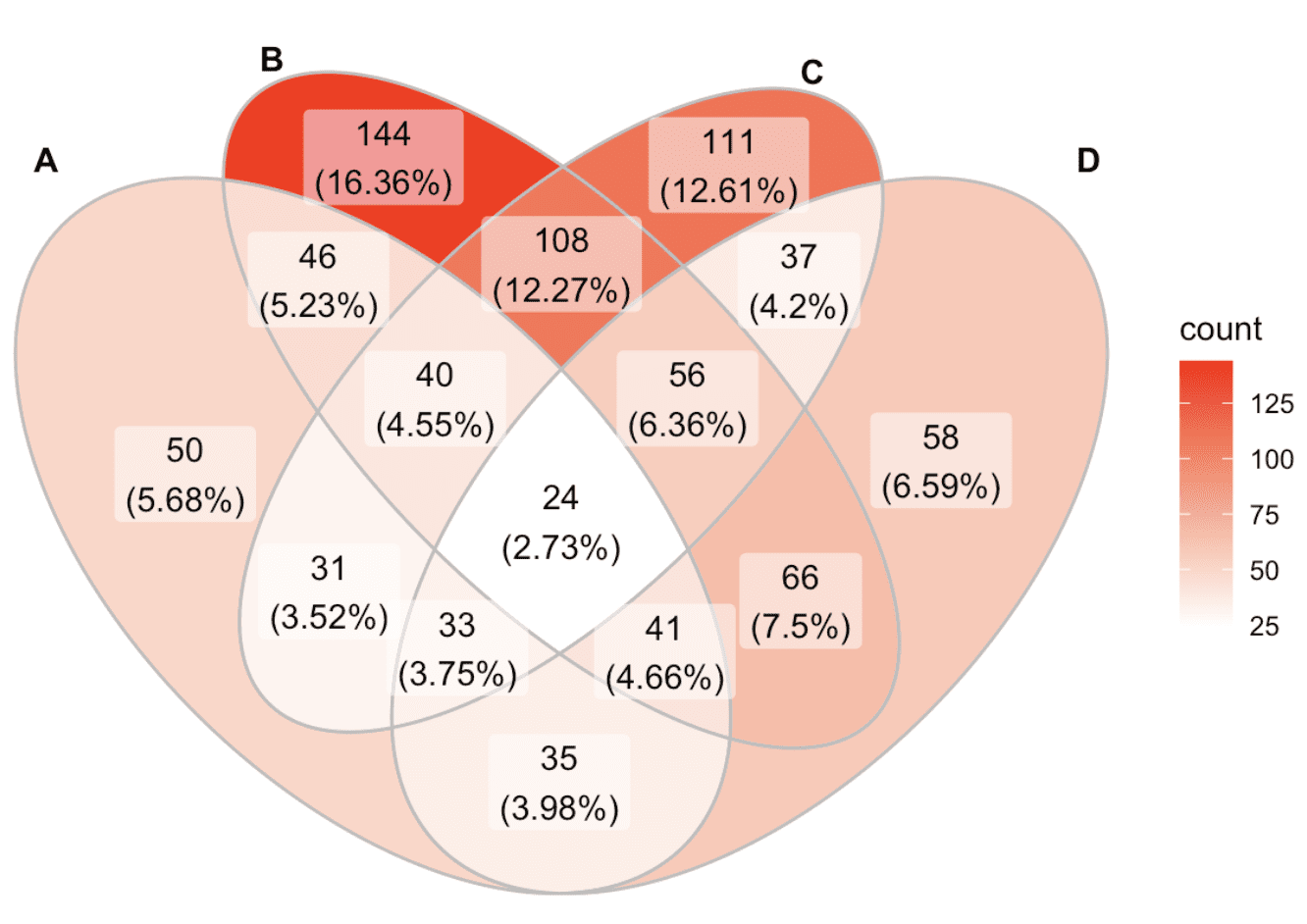
Yes, it’s pretty—but to learn anything from this graph (beyond that there are high numbers in some of the upper cells of the image) would take a huge amount of work. Even as a look-up table, the Venn diagram is exhausting. I think an Upset plot would be much better.
And then this got me thinking about a more general issue, which is when a wonderful conceptual tool is used as an awkward practical tool. A familiar example to tech people of a certain age would be the computer language BASIC, which was not a bad way for people to learn programming, back in the day, but was not a great language for writing programs for applications.
There must be many other examples of this sort of thing: ideas or techniques that are helpful for learning the concepts but then people get into trouble by trying to use them as practical tools? I guess we could call this, Objects of the class Venn diagrams—if we could just think of a good set of examples.
In playing guitar or similar stringed instruments with frets, the simplest way to learn to play a tune is by reading tablature. That’s a simple diagram of which fret to use for each string, annotated with numbers to show which finger to use. Most beginners start out doing that but it is a very “paint by numbers” kind of mechanical approach.
For long-term musical development, it’s arguably necessary to learn to play by ear (i.e. imagining the sound of the tune and then placing fingers in locations that can produce the sound you are imagining) and/or play from standard notation. Unlike tablature (with its direct instructions to play this finger here, then this finger there and so forth) playing from notation involves a layer of abstraction. The sheet music is a representation of the song itself, independent of the mechanics of translating it onto guitar, etc. It’s up to the musician to implement a set of mechanical actions to create the physical realization, which is instrument-specific.
The “arguable” part is probably just standard notation. I think it’s widely accepted that eventually a musician needs to be able to play his instrument by translating a tune into that instrument-specific realization rather than working from mechanical instructions. It’s also arguable that starting with tablature is in any way an impediment to developing the skills eventually needed. But I do think stringed instrument tablature is an object of the class Venn diagrams.
Interestingly, early music notation (say, prior to 1550) was not a direct “representation of the song itself” in the way we think of it: accidentals (sharps and flats) were added by the performer depending on a complex and not fully deterministic set of rules. Google “musica ficta” if you are curious.
Early music tablature is “ficta-free” and hence an important source for understanding these complex performer-dependent rules — precisely because the mechanistic nature of tablature gives us a more direct view of which notes would actually have been played!
For smaller numbers of sets (as in the figure in your post), a Hasse diagram should work. But almost all visualizing tools have challenges with high dimensions!
I haven’t read this chapter, but it seems that there is a family (a set!) of visualizing representations of sets, posets, etc. https://www.taylorfrancis.com/chapters/mono/10.1201/9780203746240-3/visualizations-venn-diagrams-karnaugh-maps-hasse-diagrams-logic-tables-lattices-george-epstein
Gerd Gigerenzer has pointed out linguistic problems with “AND” of Venn not being the same as “and” of ordinary English. His first example to illustrate the discrepancy is
Peggy and Paul married and Peggy became pregnant.
Peggy became pregnant and Peggy and Paul married.
His second example is
Mark got angry and Mary left the party
Mary left the party and Mark got angry.
Another of his examples is when we say “We invited friends and colleagues” when we mean “We invited friends or colleagues.”
A proposed member of the class: Utiliy is a foundational concept in economics, but as you have pointed out, a naive conflation of the *mathematical* construct and the *practical* construct will definitely hold you back from understanding economic choices.
The Venn example may be attractive, but it is invented random data, so I don’t know what to look for: the biggest group, the smallest group, the combination of all four, the combination of none….. In fact the combination of none is not shown and the percentages are calculated as percentages of the sum of all combination frequencies. Maybe sometimes this makes sense, maybe not. It will depend on the application.
Using colour to show frequencies is not as good as using area. In the diagram the largest group (top left) has a small area, not that much different from the smallest group that is also dead centre and so gets more attention. A different colour scheme would do better. Like you, I would prefer an upset plot or a mosaic plot. However, the data then has to be reorganised into a better form. At the moment it is a list of four character vectors of different lengths.
None of this detracts from using Venn diagrams as a conceptual tool and as an alternative display, but they are not great for real data.
The geospatial and mapping world suffers from similar problems. Non convex problems like shortest paths vs map geometry, reinforces our convexity reasoning (ie shortest path is a st line). Trying to map non-convex problems (map of ethnicity n the former Yugoslavia for example) creates more problems. Or for that matter red and blue states illustrations …
I think just about everything in the world is learned this way. Start with a few rules that mostly work, until you get a feel for the concept, and then explore.
Statistics is like this. Such a pity the way it was taught and learned – memorizing a baker’s dozen of significance tests, using mental pattern matching to select the right answer during an exam, then looking up numbers on tables to calculate the answer. Later in life, Mosteller’s book “Statistics: A guide to the unknown”, and later, the text by Friedman, Pisani and Purves entitled just “Statistics” made the subject come alive. Looking forward to Laudet and Kosuke. (Regression and Other Stories is great, but for those hobbled by old school approaches might find and of these three books excellent “training wheels”.)
Dmitri mentioned guitar. I’d go so far as to say all of sheet music is an attempt to capture the experience of live music on paper. But there is much about articulation that I don’t think has a written form yet. Many with technical proficiency just sound mechanical.
Perhaps this is wading into Turing Test territory.
But I do remember questioning some of what I learned in elementary statistics, but at the time just soldiered on. Now those same things (e.g., significance) are being challenged in this blog, but are articulated far more clearly.