I know I’ve read somewhere about the challenge of Venn diagrams with 4 or more circles, but I can’t remember the place. It seems like a natural for John Cook but I couldn’t find it on his blog, so I’ll just put it here.
Venn diagrams are misleading, in the sense that they work for n = 1, 2, and 3, but not for n > 3.
n = 1: A Venn diagram is just a circle. There are 2^1 options: in or out.
n = 2: A Venn diagram is two overlapping circles, with 2^2 options: A & B, not-A & B, A & not-B, not-A & not-B.
n = 3: Again, it works just fine. The 3 circles overlap and divide the plane into 8 regions.
n = 4: Venn FAIL. Throw down 4 overlapping circles and you don’t get 16 regions. You can do it with ellipses (here’s an example I found from a quick google) but it doesn’t have the pleasing symmetry of the classic three-circle Venn, and it takes some care both to draw and to interpret.
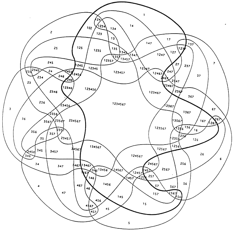
n = 5: There’s a pretty version here but it’s no longer made out of circles.
n > 5: Not much going on here. You can find examples like this which miss the point by not including all subsets, or examples like this which look kinda goofy.
The challenge here, I think, is that we have the intuition that if something works for n = 1, 2, and 3, that it will work for general n. For the symmetric Venn diagram on the plane, though, no, it doesn’t work.
Here’s an analogy: We all know about cubes. If at some point you see a tetrahedron and a dodecahedron, it would be natural to think that there are infinitely many regular polyhedra, just as there are infinitely many regular polygons. But, no, there are only 5 regular polyhedra.
Some things, like cubes, tetrahedrons, and Venn diagrams, seem so simple and natural that it’s kind of a surprise when you learn that their supply is very limited.
I’m not too surprised that trying to visualize higher-order combinatorial structure with a 2D picture doesn’t work so well. The combinations grow exponentially.
How about scatterplots? They work fine in 2D, are workable in 3D, but beyond that, you’re reduced some kind of projection or multiples plot of pairwise interactions. Again, I think that’s because we can just embed 2D and 3D ones on the plane or in a 3D visualization, but we fall apart after that.
How about hypercube visualization? A line in 1D, a square in 2D, a box in 3D, and pretty much impossible to “visualize” in 4D.
How about quadrature? That works fine in 1D and 2D and can work in 3D, but beyond that, the number of evaluations growing exponentially makes it prohibitive.
Then there’s the dual approach to scaling Gaussian processes. Works like a charm for 1D models like birthdays, and can work up to 3D, but beyond that, the combinatorics become a problem. Just like quadrature.
Bob:
Yes, good point regarding the difficulty of displaying 2^N in two dimensions when N > 3. In some sense, it’s just “luck” that the Venn diagram with 3 circles works so well.
Isn’t it related to the free parameters? Each circle has three (x, y, r), ellipses four (x, y, a, b), then spheres again have four (x, y, z, r), etc.
It is something like n shapes of p parameters each can only represent up to n*p pieces of information.
For circles that gives the sequence 3, 6, 9, 12. We can see it would break down for n = 4 circles, where we must represent 2^4 = 16 different values. But switch to using ellipses/spheres and it still works.
We can also constrain the possibilities. Eg, say “not-A & B” and “A & not-B” must be equal, etc. This reduces the number of values that must be represented, which is why the symmetrical n = 5 diagram can still work. Maybe.
I’m not sure what exactly the relationship is, but the number of paramrters is definately a limiting factor.
Actually, we can represent/store up to five values in each ellipse. I forgot about rotation.
This is a simple consequence of the fact that circles can finitely intersect in at most two points and Euler’s relation F − E + V = 2 for the number of faces, edges, and vertices in a plane graph.
https://www.ams.org/notices/200611/ea-wagon.pdf
Thanks, it doesn’t satisfy me on my question of “why” though. The circles seem to be a special case.
Is there an equation for arbitrary shapes in an arbitrary number of dimensions in the paper? Or elsewhere? I still suspect there is a simple explanation based on information theory.
I guess what I’m wondering is the limit on information that can be stored/represented with n circles/ellipses/spheres/etc.
Not quite the same as scatterplots, but I’ve wondered in the past if you could do Isotype (or different scatter glyphs) that are intended for more intersections in Venn like diagrams, https://andrewpwheeler.com/2015/07/21/venn-diagrams-in-r-with-some-discussion/. (Riffing on natural frequencies from Gigerenzer.)
Last time I mused about it though wasn’t sure of a good way to do the binpacking in a visually pleasing way.
Huh, is it a general rule that you need n (n-1)-dimensional hyperspheres to divide an (n-1)-dimensional hyperplane into 2^n distinct regions of overlap, while still preserving whatever desirable flavor of symmetry? Wikipedia gives the example for n = 4 (https://en.wikipedia.org/wiki/Venn_diagram#Extensions_to_higher_numbers_of_sets), and my intuition is it generalizes. Also works for n = 2 if you have two partially overlapping parallel lines.
I do agree that Edwards–Venn diagrams can get pretty confusing. As such one should ideally try to organize them into some aesthetically pleasing arrangement, like a choo-choo train.
Otherwise, what’s our recourse if we want a simple 2D visualization of patterns of intersect among n sets? If you don’t care about the identity of individual elements, my go-to has been to 1) find the matrix of all the pairwise jaccard indices, 2) order the rows & cols according to some criterion, e.g. make the similarities distances by taking 1-J_i,j and feed the distance matrix to some clustering algorithm or 1D PCoA, etc., 3) plot the re-ordered matrix in whatever manner (eg a heatmap or maybe a network), and 4) try to eyeball any sort of block diagonal structure. Could also use more convoluted measures of pairwise similarity, eg estimating the bivariate normal correlation coefficient under a binary probit (and then getting a distance from the law of cosines, or the FVU, etc.).
I also see lots of UpSet plots, chord diagrams, Sankey diagrams, etc. recruited for this purpose, but personally I have a harder time pulling out the main patterns of relationship from those.
Here is a four-circle venn diagram:
https://conceptdraw.com/a389c3/p1/preview/640/pict–template-4-set-venn-diagram—template.png–diagram-flowchart-example.png
You can see it represents only 14/16 possibilities. It seems impossible to arrange the circles to include AC and BD without losing at least one of the other regions.
I’m thinking we can store/represent 12 values due to the 4 circles of 3 parameters (x, y, r) each. Then one more from the enclosing square. And the last can be derived from the others (ie, degrees of freedom).
Anyway, I bet there is some fundamental reason it only works with up to n = 3 circles.
Edwards wrote a book: “Cogwheels of the Mind: The Story of Venn Diagrams”.
One important use of Venn diagrams is when they are used to show which subsets are possible in a particular context, eg to show hierarchical structures within sets. In those, the dimensional restriction isn’t always binding, and they can be very useful.
To your main point: another example I like is that random walks are recurrent in 1d and 2d but not higher dimensions (eg here https://www.statslab.cam.ac.uk/~james/Markov/s16.pdf)
This popular n=4 venn diagram is not too bad: https://informationisbeautiful.net/visualizations/ikigai-japanese-concept-to-enhance-work-life-sense-of-worth/
However, it is often seen in a more symmetrical drawing that eliminates regions – making it mathematically offensive.
Incidentally, I think the number of subsets m in a venn diagram of n sets is a Mersenne number m_n=(2^n)-1.
1, 3, 7, 15, 31, 63, 127, 255, …
That sequence appears in other places:
https://oeis.org/search?q=1%2C+3%2C+7%2C+15%2C+31%2C+63%2C+127
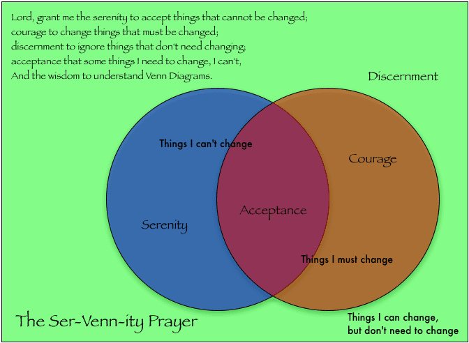
I guess this is part of the “prayer” joke. But obviously there is no overlap between “Things I can’t change” and “Things I must change”
I cannot – yet I must. How do you calculate that? At what point on the graph do “must” and “cannot” meet? Yet I must – but I cannot!
Here, I wrote about complex Venn diagrams (link)
About the polyhedra, do you mean 5 *convex* regular polyhedra, i.e. the Platonic solids? Because otherwise I think it should be 9.
Martin:
Yes, I was thinking of the convex ones.
I’m hearing more shade thrown at Venn diagrams in the above comments than I think is deserved. As for me, I find them very helpful in client practice when fit to real data–where the better word is often “Euler” diagram. (A Euler diagram is a Venn diagram in which some intersections are zero). Although it’s indeed impossible to perfectly represent all combinations when N > 3, in many data situations some intersections are zero or near zero which permits a closer 2D representation of the remaining intersections. After all, the whole point of data visualization is to simplify and highlight the important relationships. If one’s quibbling that a Venn (or Euler) diagram isn’t perfect for every intersection, go ahead and present your 4-way (or more) data table.
I like this topic. I went down this rabbit hole briefly when trying to use venn diagrams as an analogy to help explain multiple regression and multicolinearity.
After a lot of searching, I came to the conclusion that any more than 3 circles would be more confusing than pedagogical helpful.
Visualizing stuff beyond 3 dimensions has always been a real challenge. Eg, 3d scatterplots are possible, but never found a 4d one that was interpretable. Small multiples are usually the only option, but sometimes it loses info.
I prefer to use Carrollian diagrams moreover than Venice diagrams and sets up a framework for reasoning with this visual aide. 2-3 variables i find easy but then 4 is about the limit for practicality still, imho
Karnaugh diagrams can work upto 6 sets, though you have to know how to read and use them. One advantage of Karnaugh diagrams is that they show the symmetries throughout
Upset plots (as in R’s UpSetR package) are sometimes helpful for displaying the intersections among a large number of dimensions.
https://github.com/hms-dbmi/UpSetR
I seem to remember a problem in Concrete Mathematics that goes: construct a Venn diagram for an arbitrary number of sets using identical convex shapes.
It’s true that Venn diagrams are not widely applicable. But thinking about this for a few days, suggests to me that Venn diagrams play a role similar to truth tables in propositional logic. We can quickly establish the truth of certain tautologies, mostly binary or ternary, with truth tables, and from there move to logical equivalences. And so on. But in a foundation sense, we use the truth tables to assert certain foundational elements and build from there.
Something identical happens with Venn diagrams. A set of basic identifies can be asserted and subsequently generalized to more widely applicable identifies.
Some find it remarkable that all of logic can be seen as resting on purely arbitrary definitions of two or three primitive truth tables (usually and, or and not). Ditto, the core primitives of sets agree with intuition using Venn diagrams. No intuition for gigantic truth tables or multidimensional Venn diagrams.
Who needs Venn diagrams for n>3?
But else in the case of n=2, it bothers me that they are symmetrical: Venn diagram for A and B is not the same of that for notA and notB.
This is why I consider a 2×2 table the perfect tool to analyse such situations.