Some recent blog comments made me rethink how to express disagreement when I write. I’ll first display my original blog entry, then some of the comments, then my reaction, and finally my new approach. As usual with negative comments, my first reaction was to be upset, but once the hurt feelings went away, I realized that these dudes had a point.
Act 1
A few days I ago, I posted the following on 538:
Self-described “political operative” Les Francis, with real-world experience as former executive director of the Democratic National Committee:
I don’t need any polls to tell me that Republicans will do well in November. The “out” party almost always shows significant gains in the first midterm election of a new President.
Political scientists Joe Bafumi, Bob Erikson, and Chris Wlezien, from elite, out-of-touch, ivory-tower institutions Dartmouth, Columbia, and Temple Universities:
Game over.
Act 2
After posting, I typically check the comments because sometimes I have some typos or obscure points that I need to fix or explain. The comments at 538 aren’t always so polite, but this time they went over the top:
Otto said…
Maybe I’m just a poor country lawyer but I don’t understand this post or what those graphs are supposed to say. Is the point that the President’s party doesn’t actually do poorly in midterms?
Also, I think the author is being sarcastic when he refers to those colleges as being ivory towers but it’s tough to tell.
benh57 said…
I concur with Otto. Huh?
bigbadbutt said…
Yeah, as far as i can tell, both articles agree. Not sure what you’re trying to imply here..
Bram Reichbaum said…
If the contest is whether political consultants or political operatives are more intelligible, game over indeed. [insert Marvin the Martian voice] This post makes me very angry. [/MMv]
And so on. You get the point. The commenters really, really hated it, and nobody got the point of the graphs.
Act 3
OK, I realized I needed more explanation, so I added a few paragraphs (see here), saying what was on the horizontal and vertical axis of the graphs and explicitly stating that those graphs demonstrated that the polls are indeed informative in predicting the election.
Act 4
The next day I checked the comments again and found that, even with the additional explanation, people were confused. In particular, many people thought that the main message of the graphs was that polls are more predictive of the vote as the election approaches. This elicited a “duh” reaction, and deservedly so. But that wasn’t the point that I (or Bafumi et al.) were trying to make with the graphs! Our point was that, even a year ahead of time, the generic ballot polls are good predictors, if appropriately piped through a linear model (as estimated from past data). Beyond this, many of the commenters were pretty rude, but I suppose that is the norm on a political website.
Act 5
Now is the time for me to reflect upon what I did wrong and what I could do better next time. I expect that others have similar challenges in communication and might also learn something from my experiences.
What did I do wrong? Five things, I think:
1. I flat-out disagreed with someone else (Les Francis, in this case). As a reader, when you see someone write that Person X is wrong, one of your first reactions is gonna be, “Hey, maybe not! Let me give X a fair shake.” By presenting the story as a conflict with me on one side, I’m inviting the readers to disagree. This is especially an issue when posting on 538, where most of the readers are coming to read Nate’s posts. They don’t know me and don’t have a sense of the research that lies behind many of the things I write (nor would it be appropriate for me to expect them to be familiar with my work).
2. I’d set up the graphs so that if you click on them, they get bigger. But not everybody realized this: people complained that the graphs were too small. I guess it would be better to do say this explicitly.
3. Different blogs have different expectations. On Marginal Revolution or Instapundit, you’ll see short posts where you have to follow the links. I enjoy doing this–it’s fun to try to guess the point and then click through to see what’s going on. But the readers of 538 emphatically don’t like it at all! Some were unhappy to have to click on links, others thought that linking was uncool in itself (“I think Gelman purposely left this post vague and devoid of anything coherent to us simple folk in order to drive traffic to his blog to seek out a better explanation. That’s kind of lame”), and most of them didn’t seem to want to click at all. That’s fine–it’s their expectation when reading 538, and I have to go with this.
4. The graphs needed more explanation. People without quantitative training often have difficulty reading a scatterplot, and I’d forgotten that.
5. Beyond explaining the details of the graphs (where the data came from, what was the meaning of each dot, etc.), I also needed to carefully step the readers through the political interpretation. One of the problems here is that I’ve blogged so much on this topic already that it’s hard for me to remember that other people aren’t already familiar with these ideas.
The new version
How could I have done this better? Here’s a try:
Les Francis, who describes himself as a political operative real-world experience as former executive director of the Democratic National Committee, wrote this today on Frum Forum:
I don’t need any polls to tell me that Republicans will do well in November. The “out” party almost always shows significant gains in the first midterm election of a new President.
As a frequent user of polls myself, this jumped out at me. It may be true that Francis doesn’t need any polls to draw his conclusions–although it would be to know this, as Francis is certainly aware of the polls at this time. On the other hand, I think the polls can tell us a lot more than Francis gives them credit for. In particular, what are these “significant gains” that he’s talking about? Not 2002, since Bush’s party actually gained seats in that midterm election. The 54 seats the Republicans gained in 1994? The 8-seat swing in favor of the Democrats in 1990, or their 27-seat swing in 1982? The Republicans’ 15-seat gain in 1978, or the Democrats’ 12-seat win in 1970? The Republicans’ 2-seat gain in 1962? Or the Democrats’ 19-seat pickup in 1954? (I picked these quickly off Wikipedia so maybe these numbers aren’t precise, but they’re pretty close, I’m sure.)
There’s a big range here in these gains, from 54 seats all the way down to 2. Perhaps the polls actually are useful in forecasting whether the out-party’s midterm gains will be closer to the 54 seats of 1994, the 15 seats of 1982, or the 2-seat pickup of 1962.
Let’s go to the research. Political scientists Joe Bafumi, Bob Erikson, and Chris Wlezien wrote a paper a few years ago on forecasting House seats elections from generic congressional polls: those surveys that ask randomly-sampled Americans a question like,
Looking ahead to the Congressional elections in November, which party do you plan to vote for if the election were being held today.
One might think that such “generic ballot questions” wouldn’t be so useful, given that House elections are local but this question only asks about parties. But Bafumi, Erikson, and Wlezien actually found out that the generic ballot predicts the election very well, even many months before the election. The key is that you can’t just take the generic ballot number straight; you need to adjust it, which Bafumi et al. do by first fitting a model to results from previous elections.
In particular, the out-party consistently outperforms the generic polls. Once you adjust for this (which you can do, using past election results), the generic polls are impressive predictors of the vote on Election Day.
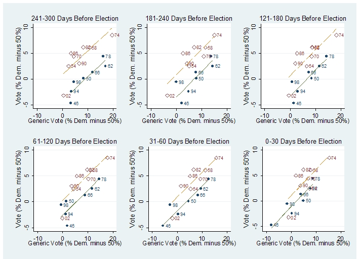
Here’s the key graph from Bafumi, Erikson, and Wlezien (click on it to see it in larger format):
Nearly a year ago—September 23, 2009, to be precise–I used these graphs, combined with a generic poll reported at that time, to conclude that the Republicans had a good chance of taking the House in 2010.
The exact calculation went as follows:
– The Democrats had a 41.2%-37.7% lead in the generic poll in September, 2009. This maps to .412/(.412+.377) = 52% of the generic opinion, excluding nonresponses.
– Bafumi, Erikson, and Wlezien’s graph only goes back to 300 days before the election. But if we assume it applies to earlier polls as well, we can read off the graph to see , first, that 52% for the Democrats is near historic lows (comparable to 1946, 1994, and 1998) and that the expected Democratic vote–given that their party holds the White House–is around -3%, or a 53-47 popular vote win for the Republicans.
Would 53% of the popular vote be enough for the Republicans to win a House majority? A quick look, based on my analysis with John Kastellec and Jamie Chandler of seats and votes in Congress, suggested yes.
To work with generic polls today, we could use one of the later graphs on the above grid to make a projection. But my real point here is not the specific prediction but just that the polls tell us a lot. Through some statistical analysis we can use the polls to learn a lot more than that the out party will likely show “significant gains” which might be somewhere between 2 and 54 seats in the House.
To return to my original point: Francis’s anecdotes and insights about Obama, Pelosi, etc., can be valuable but he’s doing himself no favors by dismissing the polls or by making statements such as “Barack Obama’s 2008 winning margin was somewhat out of synch with the political alignment of the country at the time,” which is unsupported by any data I’ve seen. (See, for example, this discussion, from nearly two years ago, on how the Democrats’ gains in House voting in 2008 were in fact as large as their gains in the presidential vote.)
Epilogue
I’m sure the above could be done better, and I’m also sure that had I posted it in that form on 538, it still would’ve drawn its share of flak. Having done this rewrite, though, I hope I’ll be able to communicate better next time.
And, to the 538 commenters: Thanks for the tough love. I hope I’m better for it.
Hmm, With the explanatory post (which reads well, by the way) I still can't read those graphs.
First, you have a red line and a blue line; presumably Democrat and Republican, respectively, but I can't make sense of the plot. How about labeling the lines? I hear the kids these days really like it.
What's the difference between "vote" and "generic vote"? Brand-name vote? I have no clue here.
Is there any reason not to simply label the axes with "50%" at the current "0"? It would be much easier to grasp, and you'd not have to add that "minus 50%" rider to each axis. Could use the extra space to explain the difference between the vertical and horizontal axis.
I guess that you show a whole set of graphs in order to exhibit a trend or common feature over time. Is there some way you could extract that trend or feature and plot it in its own graph, and sort of neatly summarize the argument rather than have each reader do it on their own (and possibly failing, as in my case)?
I posted the first 'huh' comment on Monkeycage – I read your original post on the paper, understood the graphs, but still didn't get your larger point.
Because for me the main contribution of the Bafumi et al. paper is that they show that the outparty systematically outperforms early polls in midterm elections.
If you take that as the main message from Bafumi et al, then the contrast with Les Francis really isn't that obvious at all.
Your main take home point from Bafumi was that even early polls are highly informative in midterm elections – that makes it more of a contrast to Les Francis – but even then that's not clear to me:
I read his main point to be: The outparty does well in midterm elections (not: polls are useless) – and since the red dots – with the easily explainable exception of 2002 – are mostly above the blue dots on the y-axis, that argument doesn't exactly seem to be refuted by the graphs.
So your post relied on a very specific understanding of Les Francis and a very specific reading of Bafumi et al – which indeed would have required a bit more explanation to be understandable.
Sebastian:
Yes, exactly.
Janne:
These are all good points, but . . . it's just a blog post! Also, it's Bafumi et al.'s graph, not mine. I have no problem with promoting their work on the blog, but I'm not going to redraw their graphs for them! As graphs go, it's pretty good, I think.
Finally, I explain in the revised entry that "generic vote" is defined as the response to a question such as:
But I can see how that could've gotten lost with all the Act 1, Act 2, stuff.
1) After reading "Act 1", I didn't know you were trying to say either. "What the heck is "generic vote"?" was my main question. Even after reading your link (which should be linked like "Research from political scientists…" not "Political scientists" to be less confusing), I still didn't know what the heck the "generic house vote" was.
2) The rewrite answered all my questions and made me interested in what you had to say.
3) There's a typo in the rewrite, which I point out solely so that if you repost it you can fix it: "although it would be to know this" -> "although it would be hard to know this"
Bill: Yup, as much as I hate to admit it, the commenters were right!
Am I to make anything of the fact that the red line consistently goes through the origin (or at least appears to be closer to the origin) compared to the blue line?
I'd be tempted to conclude that early generic polling under dems is 'more optimistic' than similar polling under reps, but I'm not sure I'm reading it right.
I'm not sure how much effort I want to put into understanding this stuff — it is "only" a blog post, as Andrew puts it — but I have to say that from a quick read through it, I can't understand the rewrite either. I guess I missed the part about why there are two lines and two colors, and what the lines mean. In fact, I'm not even sure what the points mean! I'm guessing that each one represents an election, is that right? Andrew, one of the rules you always used to stress was to tell people what each unit of analysis represents!
But the main thing I am missing is: how do I look at the graphs and tell that there is something wrong with the claim that the "out" party almost always has big gains in the first midterm election after a new president. Am I supposed to look at each point (each election?), recall which ones represent the first midterm after a new president, recall what the composition of Congress was at that time, and use the % Democratic number to figure out whether the out party had big gains? Clearly not, that's ridiculous. But then, how DO these plots tell me whether the claim is valid or not?
In your rewrite, you do give a paragraph on the subject, which I find somewhat irritatingly written by the way, where you go to Wikipedia (wait, why Wikipedia, why not use the plots? Isn't that what they're for?) to say something about the gains during midterms, which is what I thought was the subject of your post. But — that irritating style — it's almost like you're deliberately making it hard to see the data. The midterm gains for the out party were, apparently: -?, +54, +8, +2, +15, +12, +2, +19…in some order. It would be nice to see these in chronological order, or at least in some logical order (e.g. by unemployment rate or GDP growth rate or something), but you gave them in apparently haphazard order and I'm not going to bother reordering them.
So, I dunno, maybe I need to read more closely, but I still don't get it.
The basic problem here is that you can't have the cake and eat it. Your first post was, if that's the right word, snazzy (and hard to understand). The revised post is easier to understand, but in the process of making it so you lose all the snazziness. You have to know what you want.
And I have quantitative training and have used scatterplots quite recently, but those graphs you linked don't exactly look self-explanatory to me.
Phil:
Your suggestions are reasonable. Let me clarify a bit: This was a blog entry promoting somebody else's work, making a point that I'd already made before. So you shouldn't expect me to make the maximum possible effort in such a post.
What I'm really talking about here is that I have to reach an acceptable minimum standard. My original post on 538 did not reach this standard, but I think my suggested replacement (under the heading "The new version" above) does, despite its imperfections.
The point of listing the median gains in time order was to point out that Francis' casual statement that "the out party almost always shows significant gains" was actually pretty sloppy, in that "significant" seems to range, at the least, from 15 to 54 seats. And, yes, I have posted on this blog more than once the time series of House votes. So, sure, with a bit of effort I could've added more info to the post. Again, though, my real point here is to think about the minimum needed to convey my point, given that I neither expect or want to spend hours on this blog entry.
Lemmus:
I think that with a bit more effort it would be possible to be both informative and snazzy, for example by adding a paragraph at the beginning saying that I just read something that crystallizes some of the differences between political practitioners and political scientists. Also, I agree about the graphic not being self-explanatory. It was self-explanatory to me, but I do research in that area. From the commenters at 538, I learned that these graphs, wonderful as they are, need more explanation for general audiences. (The other point is that readers at 538, unlike here or at Marginal Revolution or Instapundit, are not inclined to follow the link and give me the benefit of the doubt.)
Andrew,
What I think you are missing is how hard it is to understand those graphs without reading the Bafumi, et.al. article. It's not a question of them not being self-explanatory. They seriously violate the layperson's expectations of graphs. You have to look at a whole set of graphs, comparing each one in a specific context (number of days before the election) that is unfamiliar to most people. The label (days before the election) applies to one axis but not the other. And on and on.
No matter how hard you try, you'll never make this make sense to the 538 audience.
I am always amazed at how many words it takes to explain a plot. It really makes you appreciate what a high density of information is contained in a good plot.
The text of the rewrite is much clearer, and I enjoyed the post, but I must confess to having the same issues as Janne and Phil. The graph isn't self-explanatory at all, so you really need either
1. a paragraph telling us what the lines and numbers are, and what your interpretation of it is, or
2. to cut the graph completely.
The big takeaway message is: anything you include must be explained clearly. Since this is "just a blog post", the tricky bits become "tl;dr".
Andrew, I wouldn't expect anyone to put in "maximum effort" on a blog post. But I think you (and perhaps even William O) are overthinking this a bit. The main problems with the original post were (1) the plots are completely incomprehensible without some explanation of what they show (for instance, I doubt 3% of the readers would know what "generic vote" means, without an explanation) and (2) there was (and still is) not a clear connection between the plots and what seemed to be your main point, which (a reader would have expected) was that you do, in fact, need polls to predict that the incumbent party would have a substantial loss of seats.
So I'm not just saying "it's better to put more work into a blog post," I think the advice here is much more specific: give people enough information to interpret your plot, and make sure the relevance of the plot is clear. Those are both always good advice, surely.
Is the point you are trying to make something along these lines:
"Bafumi says you can ignore polls before mid-term elections, since the historical data indicates the non-presidential party always gains seats anyway. But in fact polls before the midterm elections have historically been highly accurate in predicting the outcome. If the pre-election polls are saying the presidential party will gain seats, it will probably gain seats."
If this is in fact the point (I also found the initial post and the graphs confusing), I disagree. That the non-presidential party will usually gain seats is indicated by historical data. That the pre-election polls are going to be accurate is also indicated by historical data! So the point is that one historical trend (pre-election polls being accurate) should be favored over another (the non-presidential party gaining seats) with no explanation of why this should be the case.
Buried here is an interesting question, what should you think when the pre-election polls before a mid-term election indicate that the presidential party will gain seats? Should you assume the polls are inaccurate, or should you assume this will be one of those rare mid-term elections when the presidential party will make gains?
I would be inclined to assume that the polls will be off, if only because polls show a snapshot in public thinking, and public opinion could switch in the time between the poll and the election. The data in the graphs indicate that polls taken closer to the election are more accurate. There is also some reason to believe that polls today are less accurate than before due to people being less willing to cooperate, or less reachable on landlines. However, you also have to examine the reasons why the non-presidential party have usually made gains, what happened in the few elections this wasn't the case, and decide which situation is more applicable to this year.
As a long time "political operative" myself, I'd like to offer an important perspective on the origins or this post. Just because someone ran a party organization doesn't mean they have any clue what they are doing. From my practical experience, they are more likely to dismiss logic than embrace it.
The plots, at first glance, convey the impression that the out-party consistently underperforms the generic polls before the election, since the gap between the red line (intuitively Republicans) and blue line (intuitively Democrats) seem to narrow as you get closer to the election.
The fact that the conclusion of the paper is the opposite of this is hard to stomach as a result.
Even in the final post is takes time to see that the numbers in the chart reflect the year of the election.
Also, the input variable that matters (generic ballot percentage) and the output variable that matters which is discussed (change in number of seats held by a party) don't match that variables compared on the plots.
Honestly, this might have worked better in tabular form or with a presentation of the regression formula statistics omitting the plots entirely.