A journalist pointed me to a recent research article, “The impact of a poverty reduction intervention on infant brain activity,” which stated:
Here, we report estimates of the causal impact of a poverty reduction intervention on brain activity in the first year of life. . . . Shortly after giving birth, mothers were randomized to receive either a large or nominal monthly unconditional cash gift. Infant brain activity was assessed at approximately 1 y of age in the child’s home, using resting electroencephalography (EEG; n = 435). . . . using a rigorous randomized design, we provide evidence that giving monthly unconditional cash transfers to mothers experiencing poverty in the first year of their children’s lives may change infant brain activity.
This research was also featured in the newspaper:
A study that provided poor mothers with cash stipends for the first year of their children’s lives appears to have changed the babies’ brain activity in ways associated with stronger cognitive development, a finding with potential implications for safety net policy.
The differences were modest — researchers likened them in statistical magnitude to moving to the 75th position in a line of 100 from the 81st — and it remains to be seen if changes in brain patterns will translate to higher skills, as other research offers reason to expect.
Still, evidence that a single year of subsidies could alter something as profound as brain functioning highlights the role that money may play in child development and comes as President Biden is pushing for a much larger program of subsidies for families with children.
I actually don’t think a difference of 6 percentile points would be so modest, if there was really evidence that it was happening. I mean, sure, you’re not turning all these kids’ lives around, but it’s the usual story. First, they’re just paying people $333 a month: this is about 20% of the average income of the mothers in the sample, so it’s a lot but not massive in all cases. Second, the effect will vary: a 6 percentile change on average could correspond to an approximate 18 percentile change on a third of the people. The point is that if there really were an average 6 percentile-point-effect, I’d consider that to be respectable.
The other issue that was raised was external validity: you can change brain activity but will this change people’s lives? The argument in the published paper is that these brain activity patterns are associated with various good things—that’s the “as other research offers reason to expect” bit from the news report.
Here, though, I want to ask a more basic question: Do the data in the paper support the claim of “important evidence of the effects of increased income”?
At first glance
Are the paper’s claims supported by its evidence? From one perspective the answer would seem obviously to be yes, as it was published in a top journal, and it has this impressive figure:

According to the preregistration, they expected a positive effect in the alpha and gamma bands and a negative effect in the theta band, which is exactly what they found, so that looks good. On the other hand, I don’t see any uncertainty bounds on this graph . . . . we’ll get back to this point.
Also, if you read the abstract carefully, the claims are kind of hedged. Not, “We found an effect on brain activity” or “Giving money causes changes in brain activity,” but “using a rigorous randomized design, we provide evidence that giving monthly unconditional cash transfers to mothers experiencing poverty in the first year of their children’s lives may change infant brain activity.” No problem with the randomized design, but the “may” in the sentence is telling. And there’s this:

The preregistered plan was to look at both absolute and relative measures on alpha, gamma, and theta (beta was only included later; it was not in the preregistration). All the differences go in the right direction; on the other hand when you look at the six preregistered comparisons, the best p-value was 0.04 . . . after adjustment it becomes 0.12 . . . Anyway, my point here is not to say that there’s no finding just because there’s no statistical significance; I can just see now why there’s all that careful language in the abstract and the rest of the paper. Without a clean p-value, you don’t say you discovered an effect. You say you “may” have discovered something, or that the results are “suggestive,” or something like that. So they followed those rules.
Looking in detail
Before going on, I want to thank thank the article’s authors, Sonya Troller-Renfree, Molly Costanzo, Greg Duncan, Katherine Magnuson, Lisa Gennetian, Hirokazu Yoshikawa, Sarah Halpern-Meekin, Nathan Fox, and Kimberly Noble. Along with their article they include comprehensive supplementary material (including preregistration information) and access to all their data! This is a rare published research article where I can figure out what was really done.
I was wondering what was going on with the figure shown above, so I downloaded the data, which was easy! And I took a look. I know basically nothing about studies of brain activities, so I took the data as given.
My first plan was to follow their plan of separate analysis for each of the different brain bands (theta, alpha, beta, and gamma), but instead of straight differences, I’d first take the log—all the measurements are positive and it would seem reasonable to start with proportional effects—and, most importantly, include pre-test brain activity as a predictor. Thus, for each frequency zone, fit y ~ z + x, where y = outcome (log brain activity), z = treatment indicator, x = pre-treatment measure. Then try including interaction of x and z. That’s our usual workflow. And I’d plot y vs. x with blue dots for the controls (z=0) and red dots for the treated kids (z=1).
But I couldn’t follow that plan, because . . . there were no pre-treatment measurements of brain activity. I guess that makes sense: they weren’t gonna do these measurements on newborns! So, no pre-test. The study does have some individual demographic and socioeconomic variables, and I guess it makes sense to include them in the model, but I can’t imagine them having huge predictive power. [Added later: It turns out that these variables do have strong predictive power! But adjusting for them does not make any treatment effects pop out. See P.S.]
So let’s take a look at the data and see what we’ve got. The preregistration talked about two measures: Absolute and Relative Power. In my little analysis here I looked at Absolute Power measure because this is what the authors seemed to be focusing on in their paper. So here are the raw data for the 435 children in the study: first the log measurements themselves, then relative to the mean, then the averages, relative to the mean at each frequency, for the treated (red) and control (blue) groups:

Sorry about the blurry graph; I’m just trying to get the point across without spending too much time struggling with the different graphics formatting.
Anyway, the two groups of children almost entirely overlap, except for the three blue curves at the bottom of the graph. One of them has really low values. The average curve looks similar to what was in the published paper, and we see average differences as high as 7%, which isn’t nothing. There is a question of whether such a large difference could’ve arisen just by chance . . . we’ll get to that in a moment.
But first let’s follow the authors’ lead and go back to the original, unlogged scale. First the raw data, then the z-scores (y – y_bar)/s_y, where y_bar is the average over the children in the data, s_y is the sd over the children in the data, and we’re doing this normalization separately for each frequency:

This looks like what they found! Again, full credit for a rare case of clean data sharing. I wish in the published article they’d shown the color graph with all 435 paths. It would’ve been easy enough to do.
At this point, I think it would make sense to construct a predictor using health, demographic, and socioeconomic variables measured before the treatment, and maybe I’ll get to that, but first let me move to the question of sampling variability. N=435 is a pretty large number of kids, but as we can see in the above graphs, there’s a lot lot of overlap between the red and blue curves, so as baseline it would be good to see what could happen by chance alone.
To get the chance distribution, my first thought was to just look at sd/sqrt(n), and I guess that n is large enuf that the normal approximation would do the trick, but since we have the raw data right here I’ll just permute the 435 treatment assignments (keeping the same observations but randomly permuting the treatment assignment variable) and see what happens. I’ll reproduce the rightmost graph just above, and to see what might happen I’ll do it 9 times:


Hmmmm . . . the patterns in these random permutations don’t look so different, either qualitatively or quantitatively, from what we saw from the actual comparison.
Measurement and statistical power
What’s going on, then? The simplest summary is that there’s a reason they didn’t find statistical significance, however measured, as the data are consistent with no effect. As usual, the way we think of this is that there’s a lot of variation between people, and so with even a moderate sample size it will be difficult to detect small average differences. The authors of the paper wrote that the study was powered to detect differences of 0.21 standard deviations—-but 0.21 standard deviations is a lot, when you consider all the differences between children, along with the many factors that affect them before birth and in the first year. If the true effect is, say, 0.07 standard deviations, then this study just isn’t up to finding it, at least not using this direct approach of calculating averages or running simple regressions. The authors also average over frequency bands, which seems like a good idea, but it doesn’t help as much as you might think because the individual paths are so highly autocorrelated. It also doesn’t help to analyze the data on the individual scales; I think log scale would make more sense if you could figure out what was happening with that one kid with the really low measurements. These are small things, though. In the absence of a pre-test measurement or more granularity in some other ways, it just doesn’t seem like there’s enough going on in these data for any average treatment effect to show up.
Another way of saying this is that, to the extent that there is an effect, we would anticipate that effect to be highly variable, with some kids benefiting much more than others.
My impression from reading the article and the quotes in the newspaper was that the researchers were like, yeah, sure, it’s not quite statistically significant, but that’s just kind of a technicality because if you get enough data your p-values will go down. But that’s not right! I mean yeah, it is correct as you get more data your p-values will go down—but you don’t know where the estimate is going to end up. The effect might be negative, not positive, or it could just look patternless.
There are, I assume, good theoretical reasons that this treatment could have an effect on brain patterns and learning ability—giving a few hundred extra dollars a month to a poor person can make a difference, and I’ll take the researchers’ word for it on the relevance of this particular measure as a proxy for some ultimate cognitive outcome of interest. But, again, it would not be at all a surprise for average effects to be small and to show patterns much different from those expected by the researchers.
So I think the main message from the data so far is not that there’s evidence for an effect, and not that the effect is zero (not statistically significant != no effect), but just that, given the design of the study, the data are too noisy to learn anything useful about the effects of this particular treatment on this particular outcome.
Conclusions
Where does that leave us? This study was a supplement applied to a subset of kids in a larger study of 1000 children. In retrospect maybe this was all a waste of effort—but I guess you couldn’t know this ahead of time. If there were strong theoretical reasons to believe an effect size of 0.21 standard deviations, then with careful statistical analysis this might’ve all turned out ok. And, once the data have been collected, it’s great that they are being shared. It’s also possible that useful things will be learned from later waves of the study. Recall that my big disappointment when considering statistical analysis was that there were no pre-treatment EEG’s at age 0. We can’t go back in time, but it should be possible to do future comparisons.
I always recommend including a pre-test in the model, but it’s especially relevant here, given that a key part of this research involves the supposition that the EEG spectrum can be considered as an important descriptor of a child. I think that would imply that the spectrum, or aspects of it, are stable over time, so that adjusting for pre-test (maybe using simple linear regression, maybe some more sophisticated analysis) would give a huge benefit when trying to observe treatment effects. It often seems that the clean causal identification arising from randomized experiments leads researchers to not think carefully enough about including pre-tests in their designs and analysis. I’m speaking in generalities here, as I have no idea whether it would’ve been feasible to perform EEG’s on newborns.
Finally, there is more in the study that I have not discussed. In particular, section 6 of the supplementary material presents data broken down by brain region, yielding results that the authors find to be consistent with their story of what is going on. I guess it might be possible to study this more carefully using a multilevel model. So for now I do not find the data convincing, but it is possible that a fuller analysis, along with the new data that will come in the future, will clarify some of these issues.
P.S. In comments, Michael asked me to rerun the analysis adjusting for pre-treatment predictors.
So I created a pre-treatment score, combining birthweight, gestational age, mother’s education, household income, mother’s health status, amount of smoking during pregnancy, amount of drinking during pregnancy, and indicators for if mother was white and if she was black. I just added these all up, after first rescaling each continuous predictor to have mean 0 and standard deviation 0.5 and flipping the sign of the variables for smoking, drinking, and black.
I’ll now show four analyses:
1. Linear regression predicting log(absolute power) from the treatment indicator, with a separate model fit for each band. The researchers were planning to see a positive effect for the alpha and gamma bands and a negative change for the theta band; I’m just restricting here to the preregistered comparisons. I already did this analysis yesterday, but I hadn’t included it in the above post, so I’ll share it here.
2. Linear regression predicting log(absolute power) from the treatment indicator and the pre-treatment score, again fit separately for each band. Here we’d expect the pre-treatment score to have a positive coefficient for the alpha and gamma bands and a negative coefficient for theta, but the main reason for including this pre-treatment predictor is to sharpen the estimated treatment effect in each regression.
3. I tried some other regressions, including adding the interaction between treatment and pre-treatment score, including sex of child as a predictor in the model, and combining the three bands by creating from each child’s data a contrast: log(alpha power) + log(gamma power) – log(theta power), with the goal of reducing variation and see a treatment effect more clearly.
4. A permutation analysis such as shown in the above post, but this time under a restricted randomization. What I did here was to take the 435 kids and group them into 10 bins based on their pre-treatment scores. Then I rerandomized the treatment assignment within each bin. The point of this exercise was to adjust for possible accidental imbalance between the treatment and control groups in the sample.
Here’s what we found.
Analysis 1:
 formula:      log(absalpha) ~ treat
 observations: 435
 predictors:   2
------
            Median MAD_SD
(Intercept) 1.84   0.04
treat       0.06   0.06

Auxiliary parameter(s):
      Median MAD_SD
sigma 0.62   0.02

 formula:      log(absgamma) ~ treat
 observations: 435
 predictors:   2
------
            Median MAD_SD
(Intercept) -0.47   0.07
treat        0.12   0.10

Auxiliary parameter(s):
      Median MAD_SD
sigma 1.06   0.04

 formula:      log(abstheta) ~ treat
 observations: 435
 predictors:   2
------
            Median MAD_SD
(Intercept) 3.55   0.03
treat       0.03   0.05

Auxiliary parameter(s):
      Median MAD_SD
sigma 0.53   0.02
As we said earlier, the differences go in the right direction in each case, but the standard errors are large.
Analysis 2:
 formula:      log(absalpha) ~ treat + pre_score
 observations: 435
 predictors:   3
------
            Median MAD_SD
(Intercept) 1.87   0.04
treat       0.05   0.06
pre_score   0.09   0.02

Auxiliary parameter(s):
      Median MAD_SD
sigma 0.61   0.02

 formula:      log(absgamma) ~ treat + pre_score
 observations: 435
 predictors:   3
------
            Median MAD_SD
(Intercept) -0.43   0.06
treat        0.11   0.10
pre_score    0.13   0.03

Auxiliary parameter(s):
      Median MAD_SD
sigma 1.04   0.04

 formula:      log(abstheta) ~ treat + pre_score
 observations: 435
 predictors:   3
------
            Median MAD_SD
(Intercept) 3.57   0.03
treat       0.03   0.05
pre_score   0.08   0.01

Auxiliary parameter(s):
      Median MAD_SD
sigma 0.52   0.02
The bad news is that the estimated treatment effects remain overwhelmed by their standard errors. The good news from a statistical perspective, maybe, is that the pre-treatment score is a strong predictor of brain activity. Actually, it’s a strong positive predictor of brain activities in all bands, including theta, where I thought the coefficient would be negative. Perhaps I’m doing something wrong here. The trouble is that I don’t really have a sense of the meaning of this brain-activity measure. In any case, this adjustment doesn’t help us resolve the treatment effect.
Analysis 3:
Nothing interesting showed up from the alternative regressions fit to the data.
Analysis 4:

This looks like the earlier permutation plots in this post, which is no surprise, given that the correlation between treatment indicator and pre-test is just 0.02.
In summary, analysis including the pre-treatment predictor didn’t change my conclusion that these data are just too noisy in this case to offer any good evidence about the treatment effect. It’s possible that more could be done with this brain-scan data; again, the data are freely available so anyone can go in and take a look.
P.P.S. In comments, Greg suggests that, instead of looking at the alpha and beta bands that were in the preregistration, we should look at total power in the high-frequency regions, which are bins 6–49 of their data. So I did that, creating a total high-frequency power measure for each child.
In the P.S. above, I already had created a pre-treatment score, combining a bunch of demographic, socioeconomic, and health factors. My first step is to graph log(total high-frequency power) vs. pre-treatment score, using red dots for the treated children and blue dots for the controls:
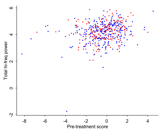
The pre-treatment score predicts total hi-freq power, a bit, but there’s no apparent difference between the red and blue dots. Also, as before, we notice that one blue dot that’s much lower than all the others. I still don’t know what’s going on with that kid; maybe the researchers should look carefully at that data point. But I have no idea so I’ll continue to keep it in the analysis. In any case we have 435 data points, so this one point won’t have a big influence on our results.
I started by regressing log(total hi-freq power) on treatment and pre-treatment score:
 formula:      log(hifreq) ~ treat + pre_score
 observations: 435
 predictors:   3
------
            Median MAD_SD
(Intercept) 4.17   0.05
treat       0.08   0.08
pre_score   0.11   0.02

Auxiliary parameter(s):
      Median MAD_SD
sigma 0.75   0.03
This is similar to what we saw before. The treatment group is higher than the control group, on average, but there’s so much variation that it could just be noise. The pre-treatment score does predict the outcome—that’s a relief—but, again, there’s still lots of unexplained variance.
In the article, they worked on the raw scale, so we can try that too:
 formula:      hifreq ~ treat + pre_score
 observations: 435
 predictors:   3
------
            Median MAD_SD
(Intercept) 81.71   3.53
treat        7.28   5.64
pre_score    7.67   1.64

Auxiliary parameter(s):
      Median MAD_SD
sigma 56.68   1.99
The z-score is higher, but given that these data are all-positive and I’d expect any effects to be multiplicative, I don’t really see the sense in working on the original scale, so I’ll go back to the log scale for the rest of my analyses.
In the supplementary materials, they report regression results adjusting for sites (these are the 4 cities where they did their study) and a bunch of individual or family-level variables (mother’s age, completed maternal schooling, household income, net worth, general maternal health, maternal mental health, maternal race and ethnicity, marital status, number of adults in the household, number of other children born to the mother, maternal smoking during pregnancy, maternal alcohol consumption during pregnancy, father living with the mother, child’s sex, child’s birth weight, child’s gestational age at birth, child’s age at interview (in months), and the total number of usable epochs). I did these one at a time, starting with our log model from before:
 formula:      log(hifreq) ~ treat + pre_score
 observations: 435
 predictors:   3
------
            Median MAD_SD
(Intercept) 4.17   0.05
treat       0.08   0.08
pre_score   0.11   0.02

Auxiliary parameter(s):
      Median MAD_SD
sigma 0.75   0.03
Then adding in site indicators:
 formula:      log(hifreq) ~ treat + pre_score + factor(site)
 observations: 435
 predictors:   6
------
              Median MAD_SD
(Intercept)   3.97   0.08
treat         0.09   0.07
pre_score     0.09   0.02
factor(site)2 0.21   0.11
factor(site)3 0.37   0.09
factor(site)4 0.20   0.10

Auxiliary parameter(s):
      Median MAD_SD
sigma 0.73   0.03
OK, site seems to make a difference. I have no intuition on that one! Next I should add in all the other factors. Not all of them are available in the data, but I’m just trying to get the general idea, so I’ll add in as much as I can without putting in too much effort to track everything down:
 formula:      log(hifreq) ~ treat + factor(site) + girl + standardize(birthweight) +
	   standardize(gestage) + standardize(momedu) + standardize(income) +
	   white + black + standardize(momhealth) + standardize(smoking) +
	   standardize(drinking) + standardize(momage) + standardize(networth) +
	   standardize(mommentalhealth) + standardize(numadults) + dad +
	   momsingle + momcohab + mommarried + momdivorced
 observations: 435
 predictors:   24
------
                             Median MAD_SD
(Intercept)                   4.03   0.18
treat                         0.14   0.07
factor(site)2                 0.02   0.13
factor(site)3                 0.17   0.11
factor(site)4                -0.02   0.11
girl                          0.01   0.07
standardize(birthweight)      0.14   0.08
standardize(gestage)          0.08   0.08
standardize(momedu)           0.05   0.07
standardize(income)           0.16   0.08
whiteTRUE                     0.06   0.14
blackTRUE                    -0.38   0.09
standardize(momhealth)        0.02   0.08
standardize(smoking)          0.12   0.07
standardize(drinking)        -0.07   0.07
standardize(momage)          -0.05   0.08
standardize(networth)         0.00   0.07
standardize(mommentalhealth) -0.10   0.07
standardize(numadults)       -0.01   0.08
dad                          -0.01   0.09
momsingle                     0.15   0.18
momcohab                      0.31   0.19
mommarried                    0.13   0.19
momdivorced                   0.30   0.24

Auxiliary parameter(s):
      Median MAD_SD
sigma 0.72   0.03
I’ve standardized the numerical predictors, which doesn’t affect the regression but allows us to interpret all the coefficients on a common scale, in case we care. Anyway, now the coefficient for the treatment indicator has gone up, just as in Table SI7.1 of the report. You get similar results on the unlogged scale, but as discussed above, I’ll prefer the log unless given a good reason otherwise.
To summarize: if you use the total high-frequency power measure, you see no clear differences between the groups, but then when you adjust for potential imbalance by site and all these other factors, the difference increases.
So where does that leave us? I’m not sure. As before, the average difference between treated and control groups is not zero, and it’s in the direction predicted by theory. The treatment predicts an increase in high-frequency power, which is generally associated with characteristics of better health and higher socioeconomic status and is also, according to other literature associated with various positive cognitive outcomes.
The adjustment takes the estimate from 0.07 to 0.14, which in turn corresponds to a much different conventional interpretation, given that the standard error is 0.07. One thing we have to wrestle with is how much of a difference this should make, as I really really don’t like the idea of thresholding on two standard errors (or on any statistical-significance cutoff); see general discussion in our paper Abandon statistical significance and a specific example in the context of the Orbita trial of heart stents.
But how much do I believe the adjustment? I’m not sure. I’d say I believe some of it, not all of it. It’s a big least squares fit—ok, not quite least squares, I used stan_glm, but I used the weak default priors which don’t do much. So I’m inclined to think we overadjusted. Just for example, the estimated coefficient for smoking is 0.12. Do I really think that higher maternal smoking predicts higher high-frequency brain activity in the baby? Probably not. This is just some pattern in the data, but by adjusting for it I can, in some small way, be sending my estimate of the treatment effect in the wrong direction. The right thing to do is to adjust using the true (population-level) coefficients for these predictors, not the least-squares coefficients. We don’t know the true coefficients, but I’m pretty sure that a regularized estimate that partially pools them toward zero will be closer to the truth. We can do this in stan_glm by assigning a prior to the coefficients, and that will give us an estimate somewhere between 0.14 and 0.07. No big deal, I guess: the point is that if this study were replicated, I’d guess, not that the true effect is zero, but that the result would be lower than 0.14. I still want to understand why there were those big site differences.
At this point you might say, Hey, look, they adjusted for a bunch of reasonable things, they got an estimate that was more than two standard errors from zero, so why am I being so mean??? But I’m not being mean! I’d say the same thing had the estimates gone the other way. Suppose they’d found an estimate of 0.14 (with standard error 0.07) in the basic model (either the direct comparison or the regression on treatment and pre-treatment score), but then after least-squares adjustment for site and a bunch of other predictors, the estimate went down to 0.07. Then I’d be making the very same argument, only this time it would be in their favor! I’d be saying not to get so freaked out about the adjusted estimate, as the least squares is probably overadjusting.
In any case, I thought I’d share this with you because this sort of adjustment issue comes up a lot in experiments and observational studies, and our default unregularized methods aren’t really up to the problem. These noisy estimates lead to lots of confusion, of course there are researcher degrees of freedom and forking paths, but really I’m more concerned about the challenge of learning the most that we can from the data.
The other thing that Greg noted out in his comment was that they did analyses broken down by brain region. It would be a good idea to look at that too, but I can only do one thing at a time!
And, just to be clear: I do not consider the analyses in this post to be definitive in any way. They’re just my attempt to explore these data to look into some of the questions that came up.
This is an incredibly minor nitpick, but I think $333 a month would actually have a major effect on material conditions for these women. From the article “mothers reported average household incomes of just over $20,000 in the calendar year prior to birth”. Ignoring for a second the discrete threshold effects that make this demographic fall prey to the most cynical aspects of modern capitalism e.g. payday lenders, that’s almost a 19% increase in household income.
Ryan:
Yes, good point. I should’ve made that clear. Even a large dollar amount could have a small total effect, given that effects will vary across people.
I edited the paragraph in the text to clarify.
A quick suggestion on graphs: Because the design is balanced, the z score of the the treated and control group should add to zero. Isn’t it redundant to draw both the red and blue curves as they have to be symmetric?
Yuling:
The N’s in the two groups are different, so the two lines contain the same information but are not exactly mirror images of each other. But, yes, I agree with you. The reason I did it this way is to be consistent with the graph in their paper. Also in this case the redundancy has the advantage of echoing the red and blue lines from the graph that shows all the individuals.
The straight conclusion from p-values that there’s no evidence anything is going on doesn’t seem so bad here, does it?
Christian:
Agreed. Indeed, in a slightly alternative world, the authors would’ve published their results as a null finding, and then I’d have to explain why this doesn’t imply that the effect is exactly zero!
This is basically what Scott Alexander concludes in his blog post though:
“But this study basically shows no effect. We can quibble on whether it might be suggestive of effects, or whether it was merely thwarted from showing an effect by its low power, but it’s basically a typical null-result-having study. The authors should not have reported their result as an unqualified positive, and the media should have challenged their decision to do so rather than uncritically signal-boosting it.”
While I do agree with Alexander’s last sentence, the first sentence is not correct. A null result does not mean that the null hypothesis is correct, only that if the null hypothesis were true the data would not be surprising, which you’ve shown in the permutation analysis. Nevertheless, I’m worried that the detractors of the study may misinterpret the null result as no effect.
Re-reading the second sentence, I understand it to be an antecedent to the last sentence, which is okay, but I still find the word “quibble” to be a poor choice. Interpreting a null result as confirming the null hypothesis is not a quibble. Greenland has written a lot about this misinterpretation and how it can be dangerous.
Finally, as a longtime reader of the blog, I obviously know you’re not a big fan of NHST, but I think the same thing applies to the posterior distributions from your analysis (I’m less familiar with Bayesian statistics, so please let me know if I’m wrong). The mode of these distributions are small but in the right direction, but the distributions are too wide to say anything definitive. There is a lot of uncertainty around the estimates , so that the effect actually maybe close to zero or even negative (in your terminology type M or type S errors). But that statement is a lot different from the statement “this study basically shows no effect” from Alexander’s post.
William:
I agree. It is a mistake to stay that the study shows no effect. It is more accurate to say that the study is too noisy to reveal whatever underlying effects are there.
I guess the confusion comes between the two similar-sounding phrases, “no effect” and “null result.” The former is a statement about the underlying world—in this case, that the treatment induces no average change in brain activity—whereas the latter is a statement about the results in the study not being statistically conclusive. I think it’s fair to say that this study had a “null result” but not that it “shows no effect.”
I expect that Alexander understands this point and was just writing in a casual way.
Since there’s two outcomes for a p-value analysis (“get’s it right”, or “get’s it wrong”), the appropriate thing to do, if you have the courage of your Stat convictions, is to not merely applaud when p-values get it right, but to compare how often it does so to random.
Wouldn’t it make sense to then go ahead and apply that covariate-based predictor before doing the re-randomization? Wouldn’t that probably reduce the scatter between individuals and make it easier for possibly real average effects to show up? I have no idea if that would make a big difference, but it seems premature to dismiss the results without trying it. But maybe I haven’t thought it through enough.
Alternative title: In which Andrew almost endorses Fisher’s exact test
More seriously, especially with a rich outcome like this (across all these frequencies), it does seem nice to actually plot a bunch of the null replicates like this. Though also maybe the right analysis here (which perhaps would have been worth preregistering) is somewhat more complex: One might want the test statistic to combine a positive contrast for for alpha and gamma bands and a negative contrast for the theta band.
Dean:
Regarding your second paragraph: Sure, but I don’t really know if those bands are precise or just rough empirical guidelines based on imperfect analyses of previous data. Replicate measurements on individual kids would be good too.
Also, yeah, the graphical hypothesis test works well in this example, but only because the conclusion is that the data can’t be distinguished from noise. If there were actually some pattern, then I’d like to do some estimation, i.e. grownup statistics.
But again, shouldn’t the noise reduction (via covariates) be done first before concluding hat the data can’t be distinguished from the noise?
Michael:
Yes, as I wrote in the above post, it would make sense to put together a pre-treatment predictor given available information such as whether mom smoked during pregnancy, etc. I just doubt that anything short of an actual pre-test will do much for us here. But, yeah, any conclusion is only conditional on the data and model used in the analysis. The conclusion that the data can’t be distinguished from noise is not an absolute statement; it’s a statement conditional on whatever analyses we’ve done.
In the paper, the adjustments for the limited demographic factors included did appreciably raise the effect sizes and ratios of effect sizes to SE’s. That’s in Table 2. The big adjustment is probably due to the large accidental racial imbalance between the groups. The adjusted individual curves might still flunk the re-randomization NHST but it’s hard to say without trying.
Michael:
OK, I did it. See P.S.
The way I see it, several things should be relatively uncontroversial.
1. Babies in poverty-stricken families suffer developmental issues.
2. Giving cash to them should alleviate some of these issues. (Getting better nutrition is one obvious pathway)
3. Some of those improvements could show up in baby brain activity.
4. That does not necessarily mean that these improvements are permanent. (Kids develop faster != kids develop more as a grown up)
As a matter of fact, it is hard to imagine sufficiently large cash for sufficiently poor families with babies will have zero effect on development.
Just as it is hard to imagine a sustained support for those poor families having zero effect on the kids’ grown up future. Obviously.
“The authors of the paper wrote that the study was powered to detect differences of 0.21 standard deviations—-but 0.21 standard deviations is a lot, when you consider all the differences between children, along with the many factors that affect them before birth and in the first year. If the true effect is, say, 0.07 standard deviations, then this study just isn’t up to finding it, at least not using this direct approach of calculating averages or running simple regressions.”
Just to repeat my observation from a previous post, the probability of a false positive under the null is 5%. The conditional probability of a false positive given a significant result depends on the power and can be much larger than 5%.
Andrew, this is a great deconstruction. I wanted to build on this a bit, to design an exercise for my students (for the Bayes factor lecture I am about to give this semester). Can I get your reproducible code + data from you?
One further thing I would do is a Gelman and Carlin 2014 style what-if simulation to see what future data would look like and what one could infer from it, assuming that these data are meaningful. It would be a wonderful exercise, and very sobering.
Also, I want to try a multilevel model, ‘coz that’s my bread and butter activity. I always want to break up the story into fixed and random effects, in every problem I ever face (sorry for the frequentist terminology, but it seems that ship has sailed already).
Shravan:
OK, code is below. It’s ugly. I mean, really ugly. I should learn the goddam tidyverse already.
load("37871-0001-Data.rda") library("haven") library("rstanarm") eeg <- read_dta("pnas_povreductioneeg.dta") names_eeg <- names(eeg) print(names_eeg) table(eeg$treat, is.na(eeg$absalpha)) with_data <- !is.na(eeg$absalpha) eeg_1 <- eeg[with_data,] M1_theta <- stan_glm(log(abstheta) ~ treat, data=eeg_1, refresh=0) M1_alpha <- stan_glm(log(absalpha) ~ treat, data=eeg_1, refresh=0) M1_gamma <- stan_glm(log(absgamma) ~ treat, data=eeg_1, refresh=0) print(M1_theta, digits=2) print(M1_alpha, digits=2) print(M1_gamma, digits=2) hzbin_indexes <- grep("hzbin", names_eeg) hzbin <- eeg_1[hzbin_indexes] n <- nrow(hzbin) k <- ncol(hzbin) treat <- eeg_1$treat mean_log <- colMeans(log(hzbin)) mean_log_treated <- colMeans(log(hzbin[treat==1,])) mean_log_control <- colMeans(log(hzbin[treat==0,])) mean_data <- colMeans(hzbin) mean_data_treated <- colMeans(hzbin[treat==1,]) mean_data_control <- colMeans(hzbin[treat==0,]) sd_data <- apply(hzbin, 2, sd) z_data <- array(NA, dim(hzbin)) for (i in 1:k){ z_data[,i] <- unlist((hzbin[,i] - mean_data[i])/sd_data[i]) } mean_z_treated <- colMeans(z_data[treat==1,]) mean_z_control <- colMeans(z_data[treat==0,]) par(mfrow=c(1,3)) par(mar=c(3,3,1,1), mgp=c(1.5,.5,0), tck=-.01) plot(c(1,k), range(log(hzbin)), xlab="Hz", ylab="log (absolute power)", bty="l", type="n", main="Raw data", cex.main=.8) for (i in 1:n){ lines(1:k, log(hzbin[i,]), lwd=0.5, col=ifelse(treat[i]==1, "red", "blue")) } plot(c(1,k), range(t(log(hzbin)) - mean_log), xlab="Hz", ylab="log (absolute power)", bty="l", type="n", main="Individuals, relative to the mean", cex.main=.8) for (i in 1:n){ lines(1:k, log(hzbin[i,]) - mean_log, lwd=0.5, col=ifelse(treat[i]==1, "red", "blue")) } plot(c(1,k), range(mean_log_control - mean_log, mean_log_treated - mean_log), xlab="Hz", ylab="log (absolute power)", bty="l", type="n", main="Group averages, relative to the mean", cex.main=.8) lines(1:k, mean_log_control - mean_log, col="blue") lines(1:k, mean_log_treated - mean_log, col="red") plot(c(1,k), range(hzbin), xlab="Hz", ylab="absolute power", bty="l", type="n", main="Raw data", cex.main=.8) for (i in 1:n){ lines(1:k, hzbin[i,], lwd=0.5, col=ifelse(treat[i]==1, "red", "blue")) } plot(c(1,k), range(t(hzbin) - mean_data), xlab="Hz", ylab="absolute power", bty="l", type="n", main="Individuals, relative to the mean", cex.main=.8) for (i in 1:n){ lines(1:k, hzbin[i,] - mean_data, lwd=0.5, col=ifelse(treat[i]==1, "red", "blue")) } plot(c(1,k), range(mean_data_control - mean_data, mean_data_treated - mean_data), xlab="Hz", ylab="absolute power", bty="l", type="n", main="Group averages, relative to the mean", cex.main=.8) lines(1:k, mean_data_control - mean_data, col="blue") lines(1:k, mean_data_treated - mean_data, col="red") plot(c(1,k), range(z_data), xlab="Hz", ylab="z-score of absolute power", bty="l", type="n", main="z-scores", cex.main=.8) for (i in 1:n){ lines(1:k, z_data[i,], lwd=0.5, col=ifelse(treat[i]==1, "red", "blue")) } plot(c(1,k), range(mean_z_treated, mean_z_control), xlab="Hz", ylab="absolute power", bty="l", type="n", main="Group averages of z-scores", cex.main=.8) lines(1:k, mean_z_control, col="blue") lines(1:k, mean_z_treated, col="red") # Random data y_fake <- array(sample(unlist(hzbin)), dim(hzbin)) mean_fake <- colMeans(y_fake) sd_fake <- apply(y_fake, 2, sd) z_fake <- y_fake for (i in 1:k){ z_fake[,i] <- (y_fake[,i] - mean_fake[i])/sd_fake[i] } mean_z_fake_treated <- colMeans(z_fake[treat==1,]) mean_z_fake_control <- colMeans(z_fake[treat==0,]) plot(c(1,k), range(z_fake), xlab="Hz", ylab="z-score", bty="l", type="n", main="Randomly permuted data", cex.main=.8) for (i in 1:n){ lines(1:k, z_fake[i,], lwd=0.5, col=ifelse(treat[i]==1, "red", "blue")) } plot(c(1,k), range(mean_z_fake_treated, mean_z_fake_control), xlab="Hz", ylab="absolute power", bty="l", type="n", main="Group averages of random data", cex.main=.8) lines(1:k, mean_z_fake_treated, col="blue") lines(1:k, mean_z_fake_control, col="red") # Permuting the people par(mfrow=c(3,3)) for (i in 1:9){ treat_perm <- sample(treat) mean_z_treated_perm <- colMeans(z_data[treat_perm==1,]) mean_z_control_perm <- colMeans(z_data[treat_perm==0,]) plot(c(1,k), range(mean_z_treated_perm, mean_z_control_perm), xlab="Hz", ylab="absolute power", bty="l", type="n", main="Group averages under permuted assignments", cex.main=.8) lines(1:k, mean_z_control_perm, col="blue") lines(1:k, mean_z_treated_perm, col="red") } # Create a pre-treatment predictor mean_impute <- function(a) ifelse(is.na(a), mean(a[!is.na(a)]), a) standardize <- function(a) (a - mean(a))/(2*sd(a)) eeg_1$girl <- as.numeric(eeg_1$cfemalea0) eeg_1$birthweight <- as.numeric(eeg_1$cweightlba0_r) eeg_1$gestage <- as.numeric(eeg_1$cgestagewksa0_r) eeg_1$momedu <- mean_impute(as.numeric(eeg_1$momeduyrsa0)) eeg_1$income <- mean_impute(as.numeric(eeg_1$hhrevisedincomea0)) eeg_1$white <- as.numeric(eeg_1$mracea0) == 1 eeg_1$black <- as.numeric(eeg_1$mracea0) == 2 eeg_1$momhealth <- as.numeric(eeg_1$mgoodhealtha0) eeg_1$smoking <- as.numeric(eeg_1$mcigduringavgwka0_r) eeg_1$drinking <- as.numeric(eeg_1$malcduringavgwka0_r) eeg_1$pre_score <- standardize(eeg_1$birthweight) + standardize(eeg_1$gestage) + standardize(eeg_1$momedu) + standardize(eeg_1$income) + eeg_1$white - eeg_1$black + standardize(eeg_1$momhealth) - standardize(eeg_1$smoking) - standardize(eeg_1$drinking) M1_theta <- stan_glm(log(abstheta) ~ treat, data=eeg_1, refresh=0) M1_alpha <- stan_glm(log(absalpha) ~ treat, data=eeg_1, refresh=0) M1_gamma <- stan_glm(log(absgamma) ~ treat, data=eeg_1, refresh=0) print(M1_theta, digits=2) print(M1_alpha, digits=2) print(M1_gamma, digits=2) M2_theta <- stan_glm(log(abstheta) ~ treat + pre_score, data=eeg_1, refresh=0) M2_alpha <- stan_glm(log(absalpha) ~ treat + pre_score, data=eeg_1, refresh=0) M2_gamma <- stan_glm(log(absgamma) ~ treat + pre_score, data=eeg_1, refresh=0) print(M2_theta, digits=2) print(M2_alpha, digits=2) print(M2_gamma, digits=2) M2r_theta <- stan_glm(log(reltheta) ~ treat + pre_score, data=eeg_1, refresh=0) M2r_alpha <- stan_glm(log(relalpha) ~ treat + pre_score, data=eeg_1, refresh=0) M2r_gamma <- stan_glm(log(relgamma) ~ treat + pre_score, data=eeg_1, refresh=0) print(M2r_theta, digits=2) print(M2r_alpha, digits=2) print(M2r_gamma, digits=2) M3_theta <- stan_glm(log(abstheta) ~ treat + pre_score + girl, data=eeg_1, refresh=0) M3_alpha <- stan_glm(log(absalpha) ~ treat + pre_score + girl, data=eeg_1, refresh=0) M3_gamma <- stan_glm(log(absgamma) ~ treat + pre_score + girl, data=eeg_1, refresh=0) print(M3_theta, digits=2) print(M3_alpha, digits=2) print(M3_gamma, digits=2) eeg_1$contrast <- log(eeg_1$absalpha) + log(eeg_1$absgamma) - log(eeg_1$abstheta) M4 <- stan_glm(contrast ~ treat, data=eeg_1, refresh=0) print(M4, digits=2) eeg_1$contrast <- log(eeg_1$absalpha) + log(eeg_1$absgamma) - log(eeg_1$abstheta) M5 <- stan_glm(contrast ~ treat + pre_score, data=eeg_1, refresh=0) print(M5, digits=2) # Resampling within categories for (i in 1:9){ n_groups <- 10 groups <- as.numeric(cut(eeg_1$pre_score, n_groups)) treat_perm <- rep(NA, n) for (i in 1:n_groups){ treat_perm[groups==i] <- sample(treat[groups==i]) } mean_z_treated_perm <- colMeans(z_data[treat_perm==1,]) mean_z_control_perm <- colMeans(z_data[treat_perm==0,]) plot(c(1,k), range(mean_z_treated_perm, mean_z_control_perm), xlab="Hz", ylab="absolute power", bty="l", type="n", main="Group averages under permuted assignments", cex.main=.8) lines(1:k, mean_z_control_perm, col="blue") lines(1:k, mean_z_treated_perm, col="red") }When I tried there were too many dependency issues that popped up after this or that package got updated a few months later, and the pipes slowed down everything. Is it better now?
Anon:
There are two parts to this.
The first part is that the tidyverse keeps getting better, so there are more and more reasons to climb that learning curve.
The second part is that upgrades to R make it harder and harder to work with data without using the tidyverse. When working with data frames, I’m always having to do things like “unlist” and “as.numeric” to strip out all sorts of invisible meta-data and let me get direct access to the numbers. I have a feeling that with tidyverse this would all be done for me automatically.
It looks like read_dta (that you used) is from a tidyverse package though:
https://haven.tidyverse.org/reference/read_dta.html
I’m not sure why it is failing to automatically detect numeric columns, but I assume it tries to. Perhaps the stata missing values are being detected as characters?
Andrew, seriously the Tidyverse is terrible, it’s the worst thing about R. It relies enormously on what amounts to “Fexpr”s https://en.wikipedia.org/wiki/Fexpr
Already by 1980 it was well understood in the Lisp community that they’re impossible to reason about effectively.
What you want, and I’m being 100% serious here, is Julia with the packages:
CSV, DataFrames, DataFramesMeta, StatsPlots, SQLite, Stan.jl
Seriously, spend just 2 weeks working in Julia, you won’t go back.
Looks like you’d also want StatFiles.jl for reading DTA files.
I think you can safely use haven without really learning the so-called tidyverse — it has nice features for reading in data files in various packages, and you can ignore everything else. If you are worried about future dependency issues in an analysis using it, you can look into renv.
I have mixed feelings about the tidyverse and the number of dependencies it brings into an analysis I may want to revisit years later. But it’s also true that you can use a useful package like stringr or ggplot2 (predating the tidyverse, yet now somehow a part of it) without endorsing the whole idea. I just use the pieces I like.
I strongly disagree with Daniel L, which doesn’t happen all that often. The tidyverse is fantastic. Or, perhaps, the tidyverse is the worst collection of packages in any language, except for all the others. There are things about it that I find frustrating but it is just way faster and cleaner than alternatives that I know of for exploratory data analysis and quick-and-dirty analysis.
Some readers of this blog may remember my posts about the speed of Olympic runners on the Tokyo track https://statmodeling.stat.columbia.edu/2021/08/04/how-much-faster-is-the-tokyo-track/ and https://statmodeling.stat.columbia.edu/2021/08/20/tokyo-track-revisited-no-i-dont-think-the-track-surface-is-1-2-faster/
I was discussing exploratory data analysis with a friend who is a big Python fan, and used those posts as an example of why I vastly prefer R to Python for EDA. (I used those posts just because I could look up the posts and the code on my phone while we were having the conversation). My friend said “send me the data and I’ll see what I can do with Python and the packages I usually use” (matplotlib and so on), so I did, and he wrote back a couple of days later and said OK you win, for this specific task R (with the tidyverse) is easier and cleaner and maybe just better.
Perhaps I should mention that I’ve been using Python for the past two years in my consulting, working in small teams of Python users, so I’m not the Python newbie I was a few years ago…but I still sometimes SMDH about how much of a pain it is to do in Python some of the common things that are simple in R. Python has some big advantages in areas other than exploratory data analysis and I’m not recommending R as a general purpose programming language, but for tasks like the one Andrew has undertaken here I think R with the tidyverse is better than R without the tidyverse, which is better than Python and which I _think_ I would say is better than Juila too. Actually we are using Julia in one of my projects, to take advantage of its speed in generating correlated random samples — a task we need to repeat a zillion times — but I don’t have enough experience with other aspects of Julia to say definitively that R+tidyverse is better for EDA than Julia+whatever. But that’s the way I’d bet, for sure.
Daniel, here’s a task/challenge for you. At the bottom of the comments on https://statmodeling.stat.columbia.edu/2021/08/04/how-much-faster-is-the-tokyo-track/ there is the data and code that I used to generate the graphic in that post. Use Julia to make a similar graphic and send me the graphic and the code. I’ll do a post on R vs Julia for EDA, showing both graphics and code, and we can generate some discussion. The graphic doesn’t have to be exactly like the R one as far as colors and line types and legend placement and so on, it just needs to convey the same information in approximately as readable a fashion.
Phil, you’re on… Will take a look and send you something
This is in response to Phil but it seems that I can’t do a further nested reply. I love using tidyverse in R but I actually think that nearly all of the functionality of dplyr and ggplot for exploratory data analysis can be achieved almost as easily in python using pandas and seaborn. As an example, here is the same figure as in the track and field post:
“`
import pandas as pd
import seaborn as sns
dat_orig = pd.read_csv(‘TopResults.txt’, sep=’, ‘)
dat = dat_orig.melt(
id_vars=[‘Year’, ‘Event’, ‘Sex’, ‘distance’],
value_vars=[‘place_1’, ‘place_2’, ‘place_3’, ‘place_4′],
var_name=’place’)
dat[‘place’] = dat[‘place’].str.strip(‘place_’)
dat[‘m_per_sec’] = dat[‘distance’]/dat[‘value’]
sns.catplot(data=dat, x=’Year’, y=’m_per_sec’,
hue=’place’, #style=’Event’,
row=’Sex’, col=’distance’,
kind=’point’)
“`
This is an unfortunate example since it actually highlights a very small piece of functionality that isn’t yet implemented in seaborn. For some reason catplot doesn’t seem to allow for manipulating style/marker as a function of a variable while relplot does (but relplot doesn’t give you a point plot). I may open a git issue about this to see why… but in any case for nearly all other examples I find pandas+seaborn to be basically as easy as tidyverse with some tradeoffs on either side.
Where python really suffers is in basic statistics although this is improving — the Stan ecosystem is still not as developed as in R (although Arviz seems very promising) and the basic stats package + lmer in R is significantly better than statsmodels.
David:
You can use cmdstanPy to run Stan within Python. I guess that someone could write a Python package similar to rstanarm and brms that would fit linear models, generalized linear models, and hierarchical models.
For anyone interested, it seems that this is possibly already in the works for a future seaborn update:
https://github.com/mwaskom/seaborn/issues/2661
https://github.com/mwaskom/seaborn/issues/2429
Andrew:
I totally agree and have used cmdstanpy (and pystan) for years on projects where collaborators were more comfortable with python. However, I still think that the ecosystem (especially brms) still makes doing bayesian modeling in R more preferable for now. I know there have been ports of these packages to python (e.g. https://github.com/adamhaber/pybrms) but I never find them very easy to use. If only I had more free time I’d implement a brms directly in python…
David:
If you can lay out what’s needed here, why the currently available version doesn’t work as well as it should, and what you think are the next steps, I could post this on the blog and then maybe someone could implement it. I don’t know Python myself, but there could be readers who have the interest and talent to do this.
Scott Alexander (or is it Alexander Scott?) weighed in:
https://astralcodexten.substack.com/p/against-that-poverty-and-infant-eegs
Joshua:
What he says is reasonable.
But he writes, “I debated saying something like this, because the people I linked (Stuart, Andrew, etc) all included something like ‘obviously I’m still in favor of cash transfers and we should still all be against poverty’.”
I never said anything like that in my post! These are policy questions, and my post did not address poiicy at all.
The pushback against the paper (as evidenced on Lemoine’s Twitter thread) is interesting – and I think Alexander’s mischracterization fits in with that. Even though he tries to find a non-aligned path, the pressure to fit everything, and social science in particular, into a zero sum framing is relentless.
P.S. I looked more carefully at Alexander’s post, and there’s one place where I’m not sure I agree with him. I’m not completely sure on this, but I think that maybe he’s too down on this brain activity measure. Yes, it’s an indirect measure, it’s not the same as cognitive functioning. But brain activity doesn’t seem like such an unreasonable thing to look at here. I don’t know this literature, so all I can say that it could make sense, and it seems to me that he’s being too negative on this aspect of the study. I agree with the general thrust of his post, though.
Andrew –
It certainly seems to me to be worthwhile to measure. But in addition to how the measure generalizes w/r/t larger questions of cognitive function, how valid a measure is it?
I have no relevant technical background, but perhaps some questions to consider – suggested by a friend (with the caveat I may have gotten some of it wrong):
What is the firm rationale for the divisions of alpha, beta, etc., given the variability from person to person and across settings? How clear are the “bands” What about the technical issue of estimating the power spectrum? Do patterns represent real oscillatory activity or are they epiphenomal. If evaluating oscillation, how is it accounted for that EEG measures activity over large regions of brain all at once with high sensitivity to synchronous firing of local groups of neurons all pointed in the same direction?
Thus, how meaningful is the relationship between “increased activity” and “decreased activity,” given uncertainties about frequency band criterion combined uncerainties of activity level criterion. in different “bands,” brain health or cognitive health?
A few things about the study that wasn’t mentioned.: Out of 1000, they could gather fata from around 400 of the infants due to COVID. This large missing data could have affected the biased the randomization. Hopefully, they will have close to full data in the coming years. Second, brain waves are surrogate, but there the first year results out of a multi-year study. So they will be collecting imprtant, meaningful outcomes in later years.
Scott Alexander weighs in: https://astralcodexten.substack.com/p/against-that-poverty-and-infant-eegs
Jonathan:
He attributes to me something I never wrote! See the comment above.
As a sidenote, one point I didn’t see much discussion is the ethical aspects of all these RCTs in poor communities.
Randomizing really poor families and vulnerable families and new born children.
Also by the way very irresponsible and clueless headline from the NY times (https://www.nytimes.com/2022/01/24/us/politics/child-tax-credit-brain-function.html?smid=tw-nytimes&smtyp=cur)
Conditional:
I don’t see the ethical problem in giving a poor family a 50% chance of getting a lot of free money and a 50% chance of getting a little bit of free money.
Hi Andrew thanks for the reply, long time fan of the blog:
I guess there are arguments and interpretations that in fact wouldn’t see this an unethical. I mean sure, we can argue that if this study was not even made the amount received by all families would be 0. On a net benefit basis for the whole group of people the whole group is surely better off.
But personally I can’t shake the feeling of discomfort seeing the randomization of the amount of cash received by vulnerable families, which by assumption of the researchers themselves, would make some of the children way better of in terms of brain development (of course we know the causation link is not there, but by assumption, before the analysis, the authors thought that it was)
As a sidenote In applied economics we’re seeing an explosion of papers that are doing similar RCTs in nature in the past few years.
These a lot of times require significant funding, effort and time. I can only imagine the pressure to find significant results (despite the pressure of things like tenure-track races etc)
Theoretically, you have this issue with almost every RCT.
Researchers are generally going to have a weak hypothesis that one of their treatments is probably better, yet you still randomize people to the (expected) worse arm of the trial anyways.
> These a lot of times require significant funding, effort and time. I can only imagine the pressure to find significant results (despite the pressure of things like tenure-track races etc)
Seems like there might be an interesting case where observational studies could be less biased than RCTs due to less researcher degree of freedom related issues.
Andrew wrote: “All the differences go in the right direction; on the other hand when you look at the six preregistered comparisons, the best p-value was 0.04 . . . after adjustment it becomes 0.12 . . . ” Isn’t the best p-value 0.02, which gets adjusted to 0.07? Or am I missing something? Still consistent with no evidence of an effect.
Steve:
The beta band did not have a preregistered hypothesis; this is discussed in the supplementary material.
Thanks.
Is there any theoretical justification for looking at EEG numbers as opposed to more direct measurements like say learning ability or motor skills or something of that nature?
It’s just incredibly difficult to interpret what these EEG differences mean.
Even if this study found a huge effect, I still wouldn’t know what to think about it or if it justifies massive investment in cash aid (as opposed to universal pre-k or other measures).
Ethan:
I’m no expert in this area, but it’s my impression that these sorts of tests on one-year-olds aren’t so informative. It’s possible that measures of brain activity, while not directly relevant for their own sake, are more stable over time and could thus provide a better outcome for a study of babies.
As to the policy question: I think for now that will have to be decided based on other evidence.
This is just the one year result. This is a multi-year study and looking at more meaningful end points in subsequent years, like learning, developmental mile stones.
Ethan –
> Is there any theoretical justification for looking at EEG numbers as opposed to more direct measurements like say learning ability or motor skills or something of that nature?
Why say opposed? It’s not binary. It’s information.
It provides more context for the endless focus on nature vs. nurture which is frequently (and tribalistically, and foolishly imo) treated as dichotomous. Although the “objectivity” of EEG as a measure could probably be reasonably questioned (see my comment above) it probably isn’t any less objective than learning ability (and I would guess even measuring motor skills in that population can get quite complicated).
> Even if this study found a huge effect, I still wouldn’t know what to think about it or if it justifies massive investment in cash aid (as opposed to universal pre-k or other measures.
Well there’s certainly a raging debate about the wisdom of massive investment in those other areas..
First, thanks for this detailed discussion. I’m wondering a little about how to interpret the results honestly still. Perhaps reasonable people can disagree about whether 0.21 SD difference was something they could have reasonably expected from this study at the onset. Regardless, once you have the data, is the right thing to do not to present your best estimate and measure of uncertainty? We don’t have concerns about them picking and choosing which results they wanted to show, given that most of it was largely pre-registered, and although there was no pre-test measurement, this is still better than observational data. In terms of interpreting the results, following some of the language from Sanders Greenland’s recent work pushing the idea of “compatibility intervals”, we would conclude that the evidence suggest a modest increase in activity, but under the model, the data are also consistent with a slight decrease in brain activity or more substantial activity, suggesting that a larger sample size is needed to draw more definitive conclusions about average effects. They didn’t quite present the results in this way — but would this be an incorrect conclusion to draw, and does it conflict with your statement: “So I think the main message from the data so far is not that there’s evidence for an effect, and not that the effect is zero (not statistically significant != no effect), but just that, given the design of the study, the data are too noisy to learn anything useful about the effects of this particular treatment on this particular outcome.”
Anon:
Yes, I think it would be just fine for them to present their results: raw data, simple comparisons, estimates, and uncertainty intervals. I think their original paper would’ve been clearer had the included the graph showing the data for all 435 people overlaid.
Regarding the specifics: yes, I think it’s fine for them to say that they observed this difference in average levels, and that the estimate is noisy and the observed difference could be explained by chance.
Hi Andrew
One question/nitpick about the permutation you did. If the treatment actually did something, wouldn’t it lead to a bimodal distribution of the 435 readings? And wouldn’t that lead to some random permutations having higher numbers of one group or the other? Does your objection hold if you permute only within experimental groups?
Feeling:
1. You can look at the graph with all data; there’s no bimodality.
2. You can’t permute only within groups, because the whole idea is to get different values for the comparison.
I am one of the authors of the study and am speaking for myself. I was trained in economics but participated in virtually all of the analyses of the EEG data and in writing up the results. First off, I would urge everyone to actually read the paper and its appendix to see what evidence we present and the words we use to describe that evidence. And I would encourage you all to download the data and have a go at it. We are delighted that Andrew was able to post a cogent reanalysis of the data the day after the article and data first appeared. Authors Sonya Troller-Renfree and Molly Costanzo did all of that terrific work.
I want to raise a different issue that bears on the merits of article and the strength of its conclusions.
Preregistered hypotheses are properly accorded a great deal of weight in reaching conclusions from a piece of research. Gelman’s analyses of our data focused exclusively on those preregistered hypotheses, as have almost all of the blog post reactions. Results for them are featured in Table 2 of our paper, and we pointed to their p>.05 nature in several places in the paper, including our conclusion. Had we stopped our analysis with them, we probably would not have tried to publish them in such a high-prestige journal as PNAS.
But the paper goes on to present a great deal of supplementary analyses. Statisticians have a difficult time thinking systematically (i.e., statistically) about combining pre-registered and non-preregistered analyses and often choose to give 100% weight to the preregistered results. That is a perfectly reasonable stance — and is what classical statistics was designed to do.
For us, the appendix analysis of results by region (in SI6.1), coupled with the visual regional differences in Figure 2 and by results from the regional analyses in the past literature, led us to judge that there probably were real EEG-based power differences between the two groups (although we take Gelman’s point that baseline (i.e., the day after the birth or before) differences not controlled for by our host of demographic measures for the mother may account for them). Our thinking was reinforced by our non-preregistered alternative approach of aggregating power across all higher-frequency power bands. This gets around the problem of the rather arbitrary (and, among neuroscientists, unresolved) definition of the borders of the three high-frequency power bands and eliminates the need for multiple adjustments. Results (in Table SI7.1) show an effect size of .25 standard deviations and a p-value of .02 for this aggregated power analysis.
As our cautious “may cause” language in the paper suggests, we are far from assigning 100% weight to the supplemental analyses, but our weighting of that information is definitely not zero. Our non-zero weighting of the non-preregistered results led us to our “weight of the evidence” conclusions from all of the data analyses we conducted, while Gelman and most of his fellow bloggers have good reasons to believe in their interpretation of data that assigns a zero weight to anything other than the pre-registered results. I hope that everyone agrees that we will know a lot more with the age-4 data, but we and not Gelman believe that there is enough going on to bring the age-1 results to the attention of scientific and policy audiences.
A last point about the ethics of conducting research projects with low-income mothers. Our research team devoted a great deal of attention to these issues and I would urge those making this point to examine our recruitment procedures, including consent forms, that are posted on our babysfirstyears.com website. And, of course, all of our procedures were cleared by a number of IRB boards involved in the study.
Greg,
Thanks for the thoughtful comments.
Just to clarify one point: You write, “Gelman’s analyses of our data focused exclusively on those preregistered hypotheses” and that my interpretation of data “assigns a zero weight to anything other than the pre-registered results.”
That statement of yours is not accurate.
Look at all the graphs that I made above: they’re a big part of my interpretation of the data, and they’re not part of the pre-registered results. This echoes your published paper, lots of whose space was taken up by graphs that were not part of those pre-registered comparisons. I agree that preregistration is a relevant part of the design but not the only story.
Also, I agree that everyone who wants to look into this more should read your article and the supplementary information. Both of these are well-written and clear, and are also very open in their approach. In particular, the supplementary information explains explores possibilities and does not just follow the unfortunately common practice of trying to demonstrate the correctness of the claims in the main paper. So thanks for that as well as for making your data and code public.
Greg:
I followed your suggestion and did some analyses of total high-frequency power. See P.P.S. added to the above post. I hope this is helpful.
Greg –
Looking at Andrew’s P. P. S…(and if my qiesrik seems stupid please understand I have no background in this material)…
Given the amount of attention that has been focused on the influence of ACEs recently, it would be interesting (to me) to see if # of ACEs (perhaps above a threshold number) has some significant moderating effect? – although I doubt that NHANES has those data. Also, did you do any kind of cluster or sensitivity analyses to see whether there were patterns regarding any of the other variables you controlled for?
Moderator measurement must precede random assignment to avoid endogeneity problems. Because ACEs are environmental experiences of the child and we recruited newborns, it was not possible to measure ACEs for the child prior to random assignment.
We have not done any of the cluster analyses you discuss but welcome you to be the first. The entire age-1 data should be deposited at ICPSR within a couple of weeks.
Greg:
One more thank you for sharing the data so promptly!
Greg –
>…but welcome you to be the first.
Lol. I’d like to, but lack the skills, resources, and brains. A bad combo.
As for this…
> to avoid endogeneity problems…
For sure – in terms of determining causality. And for sure # of ACEs wouldn’t likely be associated with randomized group assignment. But I still wonder whether ACEs might show a signal – perhaps in that financial stability might help to mitigate # of ACEs?
Dear Greg,
I’m butting in here as a new commenter. I’m a statistician, and though I have nothing near the authority of Prof Gelman nor that of many other commenters here, a couple of your points raised some issues I find I meet often when working with scientists in similar areas. I’d welcome opposition to any of these points.
Before anything else, I’d like to echo the sentiment of Prof Gelman and others commending you and other authors for making your data available and pre-registering the study. To my mind that’s the most- and second-most important things you can do. Please note that any criticisms I’m making are secondary in importance to this.
One small criticism I’d make is that you released your data, but not the code to generate your results. This isn’t a big issue, as it was reproducible anyway, but it is good practice to release a comprehensive pipeline. A big advantage is that it makes all your analysis choices very clear.
However, the main two points I’d like to raise comes down to your statement that:
‘Results for [our pre-registered hypotheses] are featured in Table 2…, and we pointed to their p>.05 nature in several places …. Had we stopped our analysis with them, we probably would not have tried to publish them in such a high-prestige journal as PNAS.’
Unfortunately I think that this somewhat defeats the point of pre-registration. The idea of it is roughly to avoid the possibility of cherry-picking hypotheses; that is, testing many potential hypotheses and only reporting the likely-looking ones, as though the plan was to only test them all along.
Although I appreciate you did report your pre-registered hypotheses, they come across as de-prioritised in the paper. Your title, abstract and results mostly focus on secondary non-pre-recorded findings. This is essentially the same problem as not reporting them at all.
Put in context, your main finding was in beta- waves: but you could have tested lots of things; total ECG amplitudes, changes in Fourier-transformed profile with time, ‘low’ or ‘high’ frequencies from combining alpha/theta, beta/gamma, and so on. I don’t think you did test all of these things, but I can’t know because you didn’t pre-register them as primary hypotheses.
Secondary investigations (/endpoints/hypotheses) are usually allowed to be more vague than primary, and should not be treated with the same precedence in a publication. This is mostly heuristic – if HA, HB are primary hypotheses, and HC is a secondary hypothesis which is precisely defined and would be a headline result if rejected, then you should control the type 1 error rate against the joint null for HA, HB, and HC (roughly, control the probability of getting a headline null hypothesis rejection under the joint null): that is, if HC is to be treated the same as HA and HB, it should be a primary hypothesis too. I usually go by the rule of thumb that only primary endpoints can be headline results. This is somewhat different for planned Bayesian analyses, of course.
If I were advising on how to present these results, I’d suggest that the title and abstract should both immediately make clear that pre-registered primary null hypotheses were not rejected (ideally along with a report of the minimum effect size the study was powered to detect).
My third problem is that your choice of journal (and specifically journal impact) was based on your findings. It’s clear you intended to publish this even if nothing came up (which is great) but this is also a problem (though it’s not your fault).
Putting it numerically, given H0, if proportion k of papers reject H0 at type 1 error rate k and go into journal A, and proportion (1-k) of papers do not reject H0 at type 1 error rate k and go into journal B, and twice as many people read A as B, then on average readers will assume that about proportion 2k/(1+k) of paper reject H0, which is higher than k. That won’t do. Ideally, all decisions on publication should be agnostic to the results.
It seems the obvious fix for most of these problems is for journals to agree or not agree to publish a given study at the pre-registration stage. I don’t know of any high-impact journals who currently do this, though.
Again, commendations on all the good practices followed in this paper – would that all papers did as you did, all would be well! You’ve made it eminently possible for an attentive researcher to fully follow your work. All my points concern only the impression you might give to inattentive ones.
Thomas:
You write to Greg: “One small criticism I’d make is that you released your data, but not the code to generate your results.” But they did release their code! It’s in the form of Stata .do files, available at the same place as their data.
Completely missed this – thank you for pointing it out.
Thanks for the helpful comments, Thomas. Just a few notes:
We both agree that journals should be agnostic to results, ideally through procedures such as registered reports and lament the fact that they aren’t. Although I said that we would probably not have submitted the paper to PNAS had we stopped with our pre-registered p>.05 results, I meant to imply that we certainly would have submitted it to a different journal willing to value null results.
I take your point about how we summarize our results and in the value of drawing a sharper distinction between pre-registered and non-preregistered results in those summaries. I will do that in my future work.
A larger lesson for us is to put more thought into what we pre-register. With more than 40 hypotheses per wave (mostly about family outcomes rather than child outcomes) and three data collection waves, our preregistration effort was a large one. As I understand it from my neuroscience colleagues, there was ample evidence at the time to support brain-region-specific hypotheses rather than just the whole-brain hypotheses we did pre-register. As it turns out, that would have brought the robust-to-multiple testing regional results under the preregistration umbrella, although Andrew may still have been able to make them go away.
Greg:
I’m not trying to make any results go away! I’m just doing what seem to me to be the most natural steps of data analysis. I haven’t gotten to the regional results yet.
“brain-region-specific hypotheses”
This would require source reconstruction, according to my understanding of current opinion in cognitive neuroscience. As far as I understood from this work, there are no structural MRIs for these subjects.
Like many others, commend the authors for making the data and code available. Big step forward!