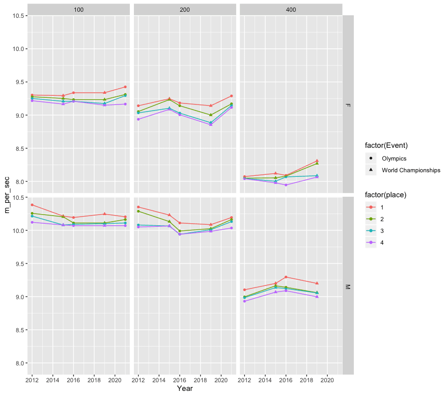
Speed (meters per second) in Olympic and World Championship finals in track sprinting.
This post is by Phil Price, not Andrew.
The guy whose company made the track for the Tokyo Olympic stadium says it’s “1-2% faster” than the track used at the Rio Olympics (which is the same material used at many other tracks), due to a surface that returns more energy to the runners. I’d be interested in an estimate based on empirical data. Fortunately the Olympics are providing us with plenty of data to work with, but what’s the best approach to doing the analysis?
One obvious possibility is to compare athletes’ performances in Tokyo to their previous performances. For instance, Karsten Warholm just set a world record in the men’s 400m hurdles with a time of 45.94 seconds, which is indeed 1.6% faster than his previous best time. Sydney McLaughlin set a world record in the women’s 400m hurdles at 51.46 seconds, 0.8% faster than her previous time. So that 1-2% guesstimate looks pretty reasonable.
On the other hand, it’s common for new records to be set at the Olympics: athletes are training to peak at that time, and their effort and adrenaline is never higher.
I can imagine various models that could be fit, such as a model that predicts an athlete’s time based on their previous performances, with ‘athlete effects’ as well as indicator variables for major events such as World Championships and the Olympics, and with indicator variables for track surfaces themselves. But getting all the data would be a huge pain, I think.
Another possibility is to look at the first-place times for each event: instead of comparing Karsten Warholm’s Olympic time to his other most recent competition times, we could compare (the first place time in the 400m hurdles at the Olympics) to (the first place time in the 400m hurdles at a previous major competition). We might not be comparing McLaughlin to McLaughlin this way, we’d be comparing McLaughlin to whoever won the last World Championship in the event, but maybe this approach would help remove the influence of the time-dependence of a single person’s training fitness and such. There are some problems with this approach too, though, with the most obvious one being that some athletes are simply faster than others and that is going to add a lot of noise to the system. Usain Bolt sure made that Beijing track look fast, didn’t he?
A technology-based solution would be to use some sort of running robot that can run at a fixed power output. You could run it on different tracks and quantify the speed difference. But as far as I know such a robot does not exist, and even if it did, it would have to use almost the same biomechanics as a human runner if the results are to be applicable.
Everything I’ve listed above seems like a huge pain. But there’s something that would be easier, that I think would be almost as good: compare the third- or fourth-fastest times in Tokyo with the third- or fourth-fastest times at other competitions. The idea is that the third-fastest time should be more stable than the fastest time, since a single freak performance or exceptional athlete won’t matter…basically the same reason for using a trimmed mean in some applications. For instance, in the men’s 400m hurdles at the World Championships in 2019, Kyron McMaster finished third in 48.10 seconds. In the 400m hurdles at the Tokyo Olympics, Alison dos Santos finished third in 46.72 s. That’s 2.7% faster. For women, the 2019 World Championship time was Rushell Clayton’s 53.74 s, compared to Femke Bol’s third-place time of 52.03s in Tokyo; that’s 3.2% faster.
Anyone got any other ideas for the best way to quantify the effect of the track surface?
[Added later: I got data (from Wikipedia) from recent Olympics and World Championships, and generated the plot that I have now included. The columns are distances (100, 200, and 400m), rows are sex.]
This post is by Phil.
Compare each athlete’s qualifying time for Rio 2016 vs their performance at Rio 2016, and compare this to each athlete’s qualifying time for Tokyo vs their performance at Tokyo.
Much more data than just comparing winners times or 3rd/4th place times, and it is averaged across performances by athletes from many countries.
This seems good. I would add to it an identical analysis for a timed event not on the track, e.g., swimming and one for a non-timed events not on the track e.g., shot, discus, javelin.
Compare runners who were disqualified for “random” reasons (like smoking pot or getting COVID) to those who successfully competed at Tokyo over a +/- 3 month window.
Just do a histo for each of the last four or five competitions for a given event. If the track is faster the mean should shift.
Robert Chung developed a model which is effective at estimating rolling / wind resistance for bicycles. The model uses time series from GPS and power meters. It appears sensitive enough to pick up on differences in tires and other setup; the time series seems to be a richer data source than just lap times.
I imagine that many runners are wearing heart rate monitors in training and you might be able to do something similar with HRM data, especially in longer distance events where performance is cardio-limited. Controlling for heart rate might help compare the same athlete’s performance on different tracks.
Here’s a presentation of Chung’s method;
https://wallace78tria.files.wordpress.com/2013/02/indirect-cda.pdf
Alternatively, just stop trying to test claims where the SNR is very low.
Let enough data accumulate before we even evaluate this claim.
Rahul:
Sure, but that just pushes the question back one step to ask: When do we have enough data to evaluate the claim? The question, “When do we have enough data?”, is itself a statistical question, as discussed in this article, where Weakliem and I discuss why N = 3000 is not enough to try to evaluate claims about beauty and sex ratio.
Right. Fair enough.
I guess my point is that at some margin we have to be ready to say no, I can’t use a smart approach or technique to give an answer. I just need to get more data.
I tried looking at a difference in difference estimate, because there’s presumably time trends and people possibly giving the Olympics priority over other events and so on. Thus, I looked at whether the difference of the log-transformed finishing time between the 2021 Olympics (Tokio) and the 2019 World Championship was larger than the difference between the 2016 Olympics (Rio) and the 2015 World Championship. Maybe there is some evidence for that for the shorter sprint events, but I’m not feeling super confident on that. Perhaps it will become clearer once more events are finished. Does someone know whether longer events like 5000 and 10000 m took place somewhere else (or would we not expect an effect on this, or is temperature etc. just so much more important, etc.?)?
I made the data I put together available [here](https://www.kaggle.com/bjoernholzhauer/how-much-faster-is-the-tokyo-track/code) and the code for the DiD plot can be found [here](https://www.kaggle.com/bjoernholzhauer/is-the-tokio-track-faster-than-the-one-in-rio/), if you want to play with it. I guess I should return to this once the Olympics are finished and update it all once we have all the track events.
I actually used a form of this question in my spreadsheet modeling/simulation book. It concerned the RAZR swimsuits from the 2008 Olympics, which were banned as ‘artificially’ leading to too many broken world records. I put it in the chapter on time series modeling. It was a simplified example, focused on the winning times, and I agree with the need to look at more than just the winning times. However, regardless of how many times are looked at, we have over 100 years of Olympic data, and the time trends can be modeled. In the swimsuit case, almost all time series models suggested that the 2008 winning times were not unusual. What may have been unusual (and this wasn’t in the exercise) is the number of records broken, but that would require a different approach (probably a discrete probabilistic model of some sort).
Perhaps all of the above in a multilevel model? It seems like any legitimate way might be a pain.
I would think there are only a few companies and/or surface materials on world class tracks, so that would be the treatment variable. Most of these athletes race in a series of races during the summer each year (I believe called the Diamond League), even in non-championship years. This should give a large amount of longitudinal data on many top athletes.
For this analysis, I would exclude any middle and long distance events, for a few reasons. 1) these (particularly 5 and 10K) are very affected by heat and humidity, 2) at championships they have to run multiple rounds for the 800m, 1500m, 3K steeplechase, and 5k, (more fatiguing than rounds for say 200m), 3) at top races in the Diamond League (like Zurich, Rome, etc), they have pace makers that drop out after a specified number of laps (this is done to set an even tempo and create some level of drafting, in order to achieve top times), 4) tactics vary greatly at championship events compared to the ‘time trial’ like performances on the Euro circuit.
I would then use varying intercepts and slopes over time (perhaps splines) for athletes in the model (i am thinking performance might be U shaped over the course of a career). Fixed effects might be spline for time (ie date, performances get marginally better over the years), and the track surface material. You might also have to include some effect for time of track season (ie early summer might have slower results than mid to late summer). I would also include a varying intercept for the particular meet. You might also need to include something for humidity and air pressure, as sprint times come down to hundredths of a second, and maybe a dry day in Zurich isn’t the same as a muggy day in Tokyo?
It sounds like you were looking for a simple way to test the claim about the surface, but I don’t really see how that is possible with so many variables…
Phil:
I don’t see why just use the third-fastest time. I think it would make sense to use all the top times, get data from the past several Olympics in many events, and fit a time series model. I’m not saying it would be easier (see Jd’s comment above) but I don’t see how just using a single time would help.
My rationale for excluding the top time or two is that I think those are subject to the most noise. As we know, if you look at samples taken from just the tail of a distribution (of athlete speeds) the variation in the highest value is larger than the variation in the second-highest, and so on. The fastest runner is often not challenged all the way to the end — picture Usain Bolt cruising across the finish at the 100m in Tokyo — so they may or may not give maximum effort. But I think there’s almost always a close race for the bronze medal, so that the people fighting it out for bronze are usually giving it maximum effort all the way to the line. At the other end of the race, although I’m sure there’s strong motivation all the way at the back of the race — nobody wants to finish last, everyone wants to try hard — I would think there just wouldn’t be as much desperate all-out effort among the people fighting for 6th/7th as there is for people fighting to get on the podium.
All of that said: sure, even if I’m right about the large amount of variability at the top and bottom, a trimmed mean should be better than just picking a single placing. The trimmed mean of places 3-5 would be better than just place #3 for example.
I don’t buy the speculation about relative variability. Every Olympic athlete is somewhat unique. There is a clear Bolt effect in the 100m run data. But there is a Phelps effect in the swimming data. And, I’m sure there are “unique” events for particular 2nd or 3rd or 4th finishers. I think it is the nature of elite athletics that the data is filled with such unique athletes. My inclination is to use as much of the data as possible, resisting the temptation to seek exceptional causes.
I think this issue arises with virtually all statistical analyses. We have discussed the “Trump” effect. Every data set has some combinations of unique and systematic influences – isn’t the goal to identify which is which? Trimmed means are better than single measures, and any kind of smoothed time trends also help. But I can think of dozens of reasons why a 6th place finisher might try harder or not as hard to become a 5th place finisher. As others have suggested, the number of relevant variables are large – perhaps too large to yield intelligible models. But the number of Olympics and events is large enough to create multidimensional time series models to see what stands out as particularly unusual.
Dale,
I’m almost positive there’s less meet-to-meet variability (for elite competition such as Diamond League, World Championships, and Olympics) in third- and fourth-place times than in the fastest times. Are you saying you don’t think that’s true?
I’m saying I don’t know. I’d like to see the data. Also, it isn’t clear to me that it would be a good justification for focusing on those times rather than the winning times. If there is less variability away from the winners, then perhaps any advantage provided by the tracks (swimsuits, running shoes, etc.) may not be as relevant to those athletes.
Phil:
I understand your reasoning but I don’t think it makes sense to throw away data. I’d rather start with the top 8 (that’s how many are in the final heat, right?) for every race in all of the past several Olympics and go with there. If you want, the data could be modeled with lower variance for places 2-5 or something like that. No need to pull out a single-number summary. That said, it’s easier to model a single-number summary, so I see the value in doing a separate analysis for each place and then plotting the estimates. That’s a version of the secret weapon.
I guess the first step is for someone to create a convenient dataset.
Phil –
> My rationale for excluding the top time or two is that I think those are subject to the most noise
Can’t that be quantified – by looking at the degree of, and related characteristics of, variance? I can come up with speculative reasons why there’d be a lot of noise among 3rd or 4th place finishers, especially compared to their personal records or qualifying times.
Yes, of course it can be quantified! Andrew is right that the first thing to do here is for someone to put together a dataset to work with. I’ll probably do a cursory job at it, maybe just from recent Olympics and World Championships.
Note that when I propose to compare, say, the time of the fourth-place finisher at the 2020 and 2016 Olympics, those are probably different people. It might be even better to look at difference-in-differences — the personal best time and the Olympics finishing time for the 4th-place finisher in 2020, and the same for the 4th-place finisher in 2021 — but that’s a lot more work.
My first thought was comparing qualifying times of all the runners in the Olympic heats and finals to their times in their qualifying finals as well as their times in other international competitions (which would likely be against many of the same runners.
Using times from other international competitions would help to control for (1) discouragement for some runners from having no hope against the best runners and (2) alternativeoy, pushing people to perform at a higher level because of high stakes and high-level competition. Basically, the point being make the comparison sample the most similar in as many ways as possible.
Easy for me to suggest that someone else do that.
But that would seem to me to help control for a potential effect of facing international-level competition, which I could imagine would have an influence for a variety of reasons, if not just those I mentioned.
If comparing to times in other international competitions wouldn’t yield enough data, add in qualifying races in their own countries and test to see how that addition affects the comparison, and calibrate accordingly if necessary to enlarge your dataset. Perhaps that’s no no for the statistically literate?
I doubt there will be one smoking gun of data that clarifies this, but I would be curious to know what the mean number of PRs and WRs are for an Olympics. That data might be used in conjunction with other analyses to support the hypothesis.
Well, the 200m men’s prelims were, for the Japanese runners, way more than a smoking gun: none of them qualified, and all had times nowhere close to their best…
(Yes, I know three anecdotes do not data make, but said prelims happened to be on the TV while I was in the room…)
Peripheral, but I’ve recently been working on a model in Stan to predict the outcome of the Individual Sprint, and to derive optimal stakes under uncertainty.
I’m not expecting the model to perform all that well – after all, track data is really limited since 2019 and I’m not accounting for performance in other events – but its proved a nice example for playing with Bayesian workflow.
I’m describing that workflow, and my failures, over a series of blog posts; the first is [here](https://www.infreq.com/posts/2021-07-23-tokyo-2020-i/).
…It didn’t help that the model proposed I bet on Matthew Glaezer to win the Men’s Sprint… and he pulled out before the qualifying races today.
Should clarify – I’m talking track cycling above.
Though like the athletics – a lot of speed records being broken. In cycling this is often down to air density (and hence altitude, and velodrome temperature) and technological advance.
No specific comment except that I appreciate this effort, keep it up!
I’m pretty much in line with jd’s assessment, but wanted to point out a couple more athlete centered factors that would matter.
I think the importance of the Olympics is going to swamp track effects here, and so comparing times of a given athlete vs. previous races (trials, or diamond league) as mentioned is not going to give you a clean effect. I’ve been involved in track and field for a while, and the Olympics is by far the most important meet of everyone’s career. That is to say they will make a lot of changes to how they are preparing (e.g., running fewer races so they will have fewer minor injuries). That doesn’t necessarily mean they will have their fastest time ever, but I would be shocked if Olympic times were not better than the mean/mode of recent times for pretty much everyone.
Similarly the Olympics is far more competitive than even world championship races, because anyone who can possibly get the chance to go will try to compete. Just having a larger pool of people, some of whom might have a great meet and breakout, is really going to affect the middle of the pack. This makes me think that just comparing the #3 and #4 fastest times across meets is really not going to work. Same with taking the average time of the top 10 or something. If anything I expect the very top athletes to be MORE consistent than a group of people in the middle, almost by definition.
All that to say I think there is a low likelihood of finding a “simple” way to assess that claim.
In addition to the various ideas already posted, I would be interested in the rate at which personal bests are occurring at this olympics vs at prior olympics. If the track is a substantial factor then I would expect more runners than typical to produce a personal best during this meet. This also allows you to include runs in qualifying heats getting a larger sample, while also ignoring the top runners in some of the preliminary rounds that strategically run only fast enough to get to the next round. Or you only look at the last finish time for each runner, if they only make it to the first round you use that data point, if they make it to the semi-finals you ignore the races for the athlete prior to the semis…
Overall I would expect that the impact would be more easily detectable in comparing the median elite athlete or the field of athletes than by focusing on a specific finishing position like first with all the outliers that have been discussed.
This is an option I was thinking of suggesting, with varying levels of thought into it.
How frequently are sprinters running their personal fastest (or even something like a speed equal to their top X%ile) times in Tokyo vs other world level events.
One could look at the general effect of Olympics vs. World events in predicting the number of racers who hit PR and if there is an extreme effect of Olympics you could add event type as a predictive factor.
Of course you’d also have to compensate for number of events for each runner (if I’ve run in 10 international events it might be less likely that *this* olympics will be the one I’ll get my PR at even if the track is faster… vs if I only clocked two international events.) Though PR times could theoretically be obtained from all official race records… anything less compelling than the olympics will presumably be a less likely race than the olympics to PR at.
But that’s as far as I ran with it.
I’m not a statistician, so take this with a pinch of salt, but I think you have good reason to junk the results from this year’s events: since COVID hit drug testing regimes around the world have been scaled back significantly. If you look at the number of tests performed by any federation (and bear in mind that many places in the world do poorly on this in normal times) you’ll see they are still down on usual years, and for much of the pandemic way, way down. Even if these athletes are now being fully tested, many will be getting benefits from almost a year of juicing themselves to the gills.
There’s been a couple of recent science of sport podcasts that have touched on this and explained the situation well. I’ve seen less coverage in mainstream press.
TL:DR – sure, some of these impressive performances will be due to the stiffer track and having more rest last year, but some will be from juiced competitors.
One final aside: my understanding is that the stiffer Tokyo track favours faster short length events. But, it should also be harder for racers in longer events, given then pounding on joints and ligaments. If the track is having a significant effect, couldn’t you look to see if it’s causing problems for the longer events, as well as helping the shorter events?
K:
Some of this could be studied by comparing to events such as throwing and high jump that could benefit from drugs but don’t get the advantage of the track.
Good point – you’d just have to think carefully about how to account for some of the discrepancies in terms of access to drug cheating, which I think varies depending on the resources going in to the sport in question (cycling would make a good comparison to sprinting as they are both well supported financially, if not for the fact that you’ve not really got any cycling data without question marks).
Here’s some data:
Year, Event, Sex, distance, place_1, place_2, place_3, place_4
2012, Olympics, M, 100, 9.63, 9.75, 9.79, 9.88
2015, World Championships, M, 100, 9.79, 9.80, 9.92, 9.92
2016, Olympics, M, 100, 9.81, 9.89, 9.91, 9.93
2019, World Championships, M, 100, 9.76, 9.89, 9.90, 9.93
2021, Olympics, M, 100, 9.80, 9.84, 9.89, 9.93
2012, Olympics, F, 100, 10.75, 10.78, 10.81, 10.85
2015, World Championships, F, 100, 10.76, 10.81, 10.86, 10.91
2016, Olympics, F, 100, 10.71, 10.83, 10.86, 10.86
2019, World Championships, F, 100, 10.71, 10.83, 10.90, 10.93
2021, Olympics, F, 100, 10.61, 10.74, 10.76, 10.91
2012, Olympics, M, 200, 19.32, 19.44, 19.84, 19.90
2015, World Championships, M, 200, 19.55, 19.74, 19.87, 19.87
2016, Olympics, M, 200, 19.78, 20.02, 20.12, 20.12
2019, World Championships, M, 200, 19.83, 19.95, 19.98, 20.03
2021, Olympics, F, 200, 21.53, 21.81, 21.87, 21.94
2021, Olympics, M, 200, 19.62, 19.68, 19.74, 19.93
2012, Olympics, F, 200, 21.88, 22.09, 22.14, 22.38
2015, World Championships, F, 200, 21.63, 21.66, 21.97, 22.01
2016, Olympics, F, 200, 21.78, 21.88, 22.15, 22.21
2019, World Championships, F, 200, 21.88, 22.22, 22.51, 22.59
2012, Olympics, M, 400, 43.94, 44.46, 44.52, 44.79
2015, World Championships, M, 400, 43.48, 43.65, 43.78, 44.11
2016, Olympics, M, 400, 43.03, 43.76, 43.85, 44.01
2019, World Championships, M, 400, 43.48, 44.15, 44.17, 44.46
2012, Olympics, F, 400, 49.55, 49.70, 49.72, 49.75
2015, World Championships, F, 400, 49.26, 49.67, 49.99, 50.14
2016, Olympics, F, 400, 49.44, 49.51, 49.58, 50.34
2019, World Championships, F, 400, 48.14, 48.37, 49.47, 49.60
Here’s the R code I used to generate the plot that is now in the post:
require(dplyr)
require(tidyr)
require(ggplot2)
dat_orig = read.csv(‘~/Personal/Misc/TrackAndField/TopResults.txt’)
dat = pivot_longer(dat_orig, c(‘place_1’, ‘place_2’, ‘place_3’, ‘place_4’),
names_to = ‘place’, names_prefix = ‘place_’)
dat$’m_per_sec’ = dat$distance/dat$value
ggplot(dat, aes(x = Year, y = m_per_sec)) +
geom_point(aes(color = factor(place), shape = factor(Event))) +
geom_line(aes(color = factor(place))) +
facet_grid(Sex ~ distance)
Phil:
Nice graphs. I like that you labeled the y-axis in units of speed rather than time.
A quick improvement: I suggest putting the male and female lines on the same graphs, i.e. just one row of graphs instead of two. There’s no overlap so you can just label “men” for the upper set of lines and “women” for the lower set on each graph.