A few months ago we answered the question, How often is the wife taller than the husband?.
This is a fun one because if you walk down the street you’ll see lots of direct streaming data on the topic!
Looking at the data, the answer in the U.S. seems to be that the woman is taller than the man in about 1 in 20 heterosexual married couples.
Here’s a related question. How often is the wife older than the husband? Or, more generally, what is the distribution of the age gap?
A couple years ago, we linked to a post by Philip Cohen, “Science says: Get married at age Whatever You Want (and these are the odds of divorce),” but this didn’t directly address the question of age differences.
I recently became aware of some work on marriage age gaps:
1. Visualization of the age gap in the U.S.: What to condition on?
Nathan Yau presents a fun visualization of the ages of married couples:
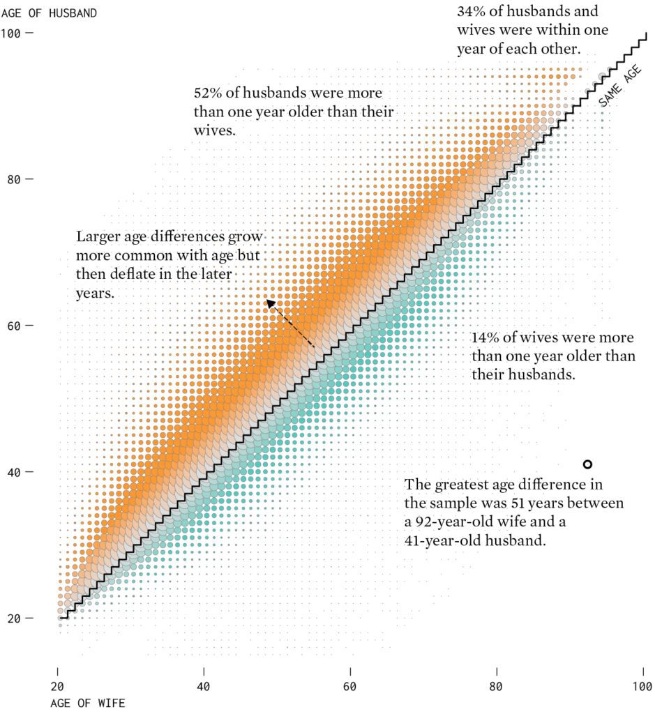
Excellent use of color. I could do without the staircase pattern—a simple 45-degree line would work just fine—but overall the graph is great. I love the annotations too. Interesting that 34% of husbands and wives were within one year of each other. My first guess would’ve been a lower percentage than that—but I guess this number makes sense, given that “within one year” represents three possibilities (y=x, y=x+1, y=x-1), so that will be something like 11% or 12% within each category. 1/8 or 1/9 of all couples being the same age, that sounds plausible.
Unfortunately, Yau’s blog doesn’t seem to allow comments. But I had something to add, so I’ll say it here. Yau writes:
I [Yau] thought for sure that greater age gaps would grow with age. After a certain age it would seem that age would matter less? But as shown in the [graph], the age of wife and husband stick pretty close to the equal line.
My comment is that it would be interesting to see data characterized not by current age of the survey respondents but by the age at which they were married. If two people marry at the age of 23 and stay married for sixty years, then, depending on when they’re included in the survey, the could show up on that graph at (23,23), (33,33), (38,39), (66,67), (75,75) . . . all sorts of possibilities. If your intuition is that age would matter less for older people, this would be people who married at an older age, right? Yau writes that he looked at second and third marriages. That makes sense too.
There will be another challenge when plotting the data based on age at marriage, in that then you’re mixing ages and cohorts. If we want to compare people of the same cohort who married at different ages, you’d need to combine data from surveys in different years.
2. Age differences at marriage and divorce in the U.K.
I guess there must be a big sociology literature on all this. . . . ummm, yeah, there is! A quick search yielded a 2008 report from the U.K. Office for National Statistics which includes an article, “Age differences at marriage and divorce,” by Ben Wilson and Steve Smallwood. Here are some relevant graphs:
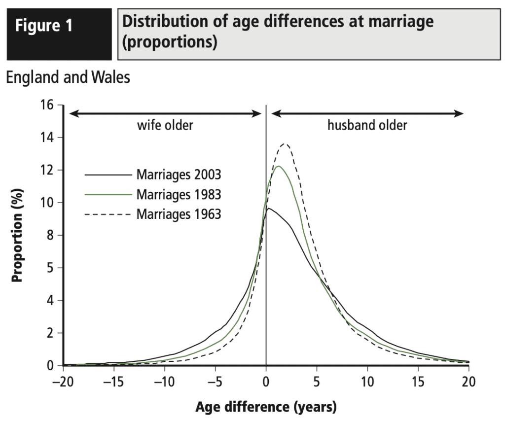
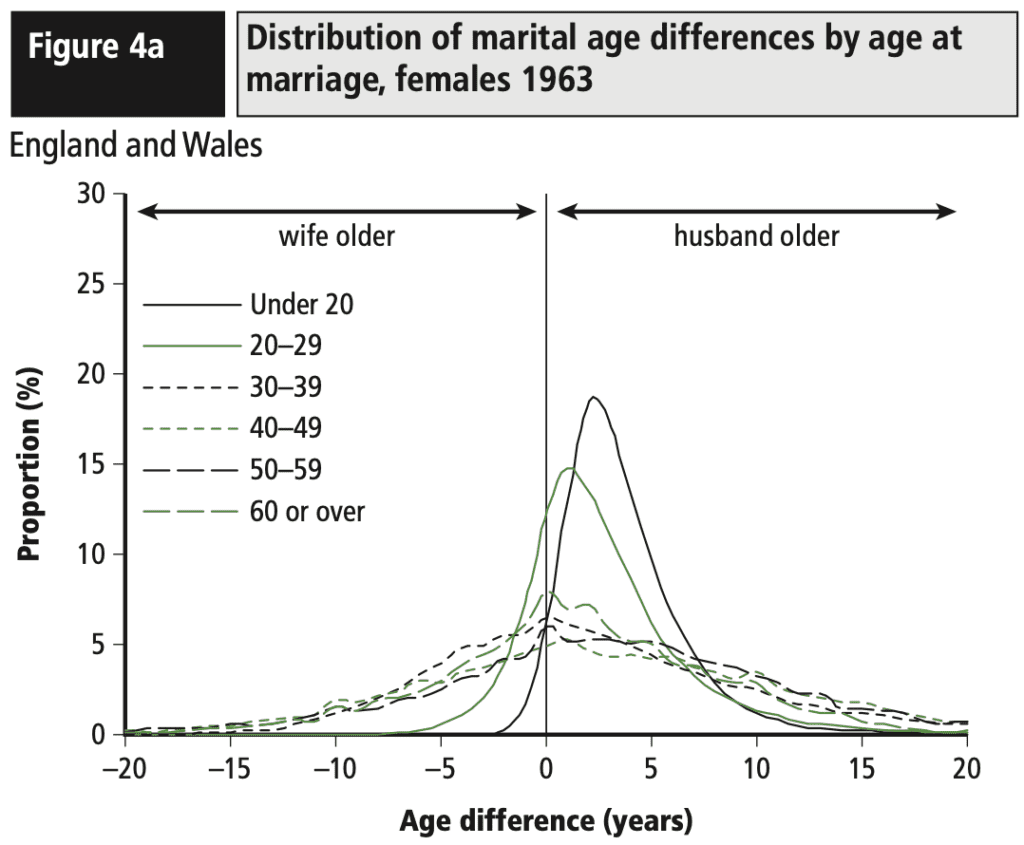
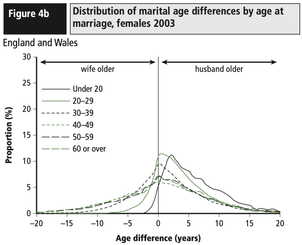

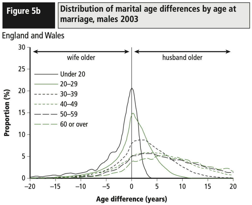
Lots of good stuff here showing patterns by age and by time. I’d also like to see that big colored graph, but using age at marriage rather than current age.
3. How the graphs get made
In his above-linked post, Yau says, “The data comes from the 2022 five-year American Community Survey. I downloaded the data via IPUMS, analyzed and made the charts in R, and finished them up in Adobe Illustrator.” I don’t know Adobe Illustrator, but I should be able to do the rest, right? Well, maybe not! Data munging isn’t so easy for me. Somehow you have to line up the ages for the spouses in the data . . . I got stuck! The year of marriage is in the data, though, so it shouldn’t be hard for Yao to remake the graph in that way. I’d be curious to see how it turns out!
Also good to be reminded that being able to manipulate data is an important skill in itself.
4. Spousal Age Gap in India
Using the Indian electoral roll data, we estimate the age difference between the spouses. We also estimate how the age difference varies across states and by the age of the husband and the wife. In particular, we use data from nearly 70M couples from 31 states and union territories . . .
The average age gap between a (heterosexual) couple is 4.1 years (the median is three and the 25th percentile is two years), with husbands generally older than their wives. The gap is nearly 80% larger than the US, where the average gap is 2.3 (538, CPS data). Compared to the US, where the man is older 64% of the times, in India, the man is older nearly 90% of the times.
Lots of detail on the data and the analysis. Gaurav reports that the estimated gap varies by state (with the highest gap being in Assam) and by age, “with the age gap being larger for older husbands.” But that sounds like possible selection bias, no?
Good stuff, but . . . no graphs! Whassup with that? I want some graphs.
> it shouldn’t be hard for Yao to remake the graph in that way. I’d be curious to see how it turns out!
seems like a case for basic reproducibility standards! you can’t share the data itself per IPUMS data release policy, but you can at least share your processing script! (though tbf the hardest part is just downloading the appropriate data from IPUMS)
as for the figure itself, I’m not really sure the double encoding (which isn’t explicitly defined in a legend — guessing the orange-teal color gradient corresponds to distance from the 1-to-1 line) is doing anything for me here, because I can already see how far away points are from that line. Point size being proportional to density is nice (but again, no legend, so is it eg the point area? radius, as given by CEX? and what’s up with the overlapping points — seems like you should scale the maximum point size to correspond to the size of the cell
anyway, I had a go at stratifying by years married. Personally, I think a ridgeplot is a bit informative of the actual distribution at each location. Here’s what that output looks like: https://i.imgur.com/YKUsxF3.png
and here is the script used to produce it :] https://pastebin.com/tiTzDHEM
(using ggplot to make the figure, reminding me how much I deeply detest ggplot. Had to eg truncate the data for |age differences| > 20, which contribute trivial mass (see https://i.imgur.com/7MyV4H5.png), bc I couldn’t figure out how to scale the horiz axis without messing up other annotations and clipping)
not doing anything fancy like trying to stratify by generation, ethnicity, religious affiliation, etc. But it does look like as the husband’s age at marriage increases, the distribution of relative wife ages at marriage spreads out, and also trends in expectation the husband being relatively older and older
(this is also using the first 1E5 entries of this dataset, instead of all 6,436,486… all the splitting and matching etc. isn’t efficiently implemented enough to work quickly at the latter scale, but I’ll check back in 20 minutes and see if it’s done processing)
(and for visualizing things like spread and mean, I think scatterplots of the sample variance and expectation as functions of husband’s age at marriage would probably be clearer, maybe with some X% interval on the estimates if sampling intensity varies substantially by age bin. I think there’s often a perverse inclination to pack as much information as possible into a plot when you don’t actually need to see everything jointly)
also miswrote the “stratifying by years married” bit above — had initially tried to do that, but quickly had the idea to just work at the unit of age at marriage
Thanks for posting, Andrew! Re. “no graphs”, I have them as part of the notebooks: https://nbviewer.org/github/soodoku/spousal_age_gap/blob/master/notebooks/04_spousal_age_gap_analysis-sol2.ipynb
I will drop some of the graphs on the main page.
Interesting point re. selection bias w.r.t. older husbands with the largest age gap. I agree we have to deal with long lived husbands who are plausibly on to their second marriage, or it may be that longevity correlates with wealth and that explains some of the age gap. I suppose your point also applies to Nathan’s graph.
@Nikolai kind of interesting https://imgur.com/YKUsxF3 as you see husband age < 18 and age gap of -10, etc.
https://en.wikipedia.org/wiki/Marriage_age_in_the_United_States
I didn't think the data would be funky here.
yeah I took a look at those a bit closer and you do unfortunately have some husbands in their early-mid teens marrying wives 10-30 years their senior
would also be interested in seeing an inverted view — age difference as a function of wife’s age. Will try to generate later this afternoon when I have a moment :]
There were also some fields corresponding to data quality, and if there’s a marriage state field once could filter on legality of marriage on the year of marriage.
Pretty curious now… will try to port over to data.table for speed and roll my own ridge plot later :)
Awesome! Looking forward.
efficient handling of the i/o is being a bit more annoying than anticipated haha
I did roll up my own ridge plot of those first 100,000 entries (https://i.imgur.com/P35fRBM.png) but will need to return to this tomorrow for the rest :]
Neat. If you deposit to GitHub and tag @soodoku after opening an issue there, happy to take a look but no pressure
ah I was able to figure it out! Or rather, I stopped using loops (or apply family statements, rather), and just did the heavy lifting w/ data.table. The 6M+ entries of the IPUMS 2022 5y dataset only takes a few seconds to munge, now :]
Otherwise, you (and anyone else interested) can see the output here: https://i.imgur.com/m1QlbRh.png for the difference as a function of husband age at marriage, and here: https://i.imgur.com/XHlHg6u.png as a function of wife age at marriage.
Some behaviors are interesting! eg as newlywed wives age past 40, the distribution of relative husband ages stabilizes (location and scale visually plateau until noise at the far tail), but as newlywed husbands age, they marry relatively younger and younger wives
(for easier comparison, I also made versions of the lineplots with the “other” lineplot also included in light grey: https://i.imgur.com/eM23mi1.png, https://i.imgur.com/L6sxWu2.png)
I’m not sure that I understand the visualization on top. my understanding is that the size of the circles corresponds to the number of couples in the sample with that particular age combination. But you can’t see the full circles near the line y = x, since those seem to be overlapping. Instead, you have to use the small portion of the circle that you can see to estimate the area. At first I was confused what those strange shapes were near the line y = x
Phil–
Yes– near y=x they look like fish scales! I thought it had something to do with the line stepping, but I now see that, as you note, they are overlapping circles.