In preparation for this new class, I was reading the Port Huron Statement, White Collar, the classic 1962 manifesto from the Students for a Democratic Society. It’s good!
Here’s the stirring beginning:

The statement continues:

It’s interesting to think how things have changed. Social inequality is still a big deal and nuclear war is still a threat, but now the most important issues are economic problems, the government, and immigration. OK, those numbers came from a poll of all American adults, but I think if you just surveyed young left-wing activists–today’s equivalent of the Students for a Democratic Society–that the economy would still be the leading issue, maybe with democracy or political polarization as #2.
It’s funny, though–and I’m far from the first to point this out–that Americans are so much less satisfied with the economy now than they were in 1962, given how much richer the society is: a smaller percentage living in poverty and with the median American having better cars, bigger houses, and all the rest. I get it: for one thing, people measure their status against what they already have, and we take for granted so much that we have now; also, the economy isn’t just about ownership and consumption, it’s also about having a stable job and a sense of good things happening in the future. Just for example, global warming is very low on most people’s list of most important issues, but there is widespread concern that future generations will struggle economically, that there is some form of unsustainability, whether from physical (environmental) constraints or from societal problems that won’t be resolved. I kinda want to say that usual economic theory doesn’t handle this so well, but it’s not quite a problem with economics, which can include the value of future wellbeing; the problem lies more at the intersection of economics, politics, and psychology, in that in the short term voters are influenced by short-term economic conditions that seem to have only a very indirect connection to larger concerns.
In any case, let’s return to the pleasant world of 1962, where the economy was in the middle of a decades-long period of growth and young radicals could focus their energy elsewhere.
There’s lots to chew on. For example:

Listed fourteenth, huh? I couldn’t easily find the relevant Gallup report online, but I was able to access this 1985 article, “The Polls: America’s Most Important Problems Part I: National and International,” by Tom Smith, which reports that Gallup started asking that question back in 1935! Here’s the data summary from 1962:
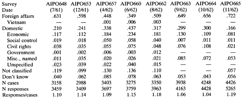
Wait–“foreign affairs” was listed by 72% of respondents! “International affairs” and “foreign affairs” are the same thing, no? So I guess the writers of the Port Huron Statement were engaging in a bit of poetic license on this one.
Then there’s this:

With this footnote:
I was curious how this has changed since then. Since 1962, America has become much more unequal economically, at least at the high end; that’s been well documented. On the other hand, it’s much more common to own stock than it used to be. Overall I’d say that “the percentage of stock owned by the top X%” is not a good measure of inequality–really you’d want the percentage of total wealth–; on the other hand, to the extent that government and elite policies are focused on pumping up the stock market–or, at least, stopping it from crashing–then, yeah, it’s a relevant number to look at.
Anyway, I googled *what percent of stock is owned by the richest 1%*, which turned up a 2024 article from an advocacy organization that begins:
New Federal Reserve analysis of stock markets has found that the concentration of ownership of the public equity stock market has hit an all-time high.
The article also points to this news article entitled “The rich now own a record share of stocks,” that pointed to this op-ed that reported:
While the richest 1 per cent owned just 40 per cent two decades ago, their share stood at 54 per cent in the most recent data from 2022.
The Federal Reserve link gives this graph:
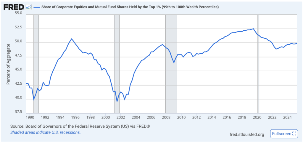
If the Port Huron Statement is correct, the richest 1% back in 1962 owned over 80% of the stock, but now it’s only 52%–so, hardly an “all-time high”! We need a graph that goes back before 1990.
Hey–some googling turns up this paper, “Household Wealth Trends in the United States, 1962 to 2019” . . . sounds like just what we’re looking for! But, no, I don’t see the percentage of stock owned by the richest 1% in 1962.
My guess is that the Port Huron Statement is correct, or nearly correct, in its stock numbers and that the news reports claiming “the concentration of ownership of the public equity stock market has hit an all-time high” are wrong–but it doesn’t really matter because stock ownership was so much less of a thing back in 1962.
At that point you might ask, Why did I just spend a half hour failing to tracking down a number that doesn’t really matter? The answer is, you don’t always know what matters ahead of time. And it’s good to check things when you can.
Comparing total wealth in “real terms” over long periods of time is nonsense on stilts. It is flatly incoherent to compare a basket of goods in 2025, which includes things like smart phones, to a basket of goods in say 1990. But that’s what these “in real terms” comparisons are doing, and it’s totally incoherent. Forget measurement error: you’ve not even measuring the same thing. Percent stock ownership might not be perfect but at least it actually means something.
Even if you accept the basket of goods approach to measuring inflation, you should also be skeptical of any paper that deflates over time using CPI since CPI is known to overstate inflation (that’s why e.g. the Fed uses PCE instead). Compounding that over decades of course leads to an enormous over-deflation over time. Frustrating thing, it’s a dirty little secret in economics but most people just go along with it anyway because using CPI is conventional.
I think your comment is overstated (though you may well be able to speak more definitively to the issues regarding CPI measurement). As you say, it is well known that the CPI overstates inflation. But it is hardly complete “nonsense on stilts.” Technological changes have always posed difficulties for price measurement over time and the CPI data does not ignore these (e.g. see https://www.bls.gov/cpi/quality-adjustment/questions-and-answers.htm). These adjustments may indeed be inadequate, but they are not worthless. You cite percent stock ownership as better in that “at least it actually measures something.” I agree it is imperfect, but it is not really better than the CPI in my view. It measures the wrong thing. Increasingly wealth is eschewing public stock ownership in favor of private equity. This makes wealth measurement even more difficult, but suggests that public stock ownership may be a poor indicator of the true distribution of wealth.
I am by no means an expert on these things and I’ve not done any research myself. But I think measurement is both difficult and critical to saying anything about the long term trends. BLS attempts to address some of these issues – no doubt, it is inadequate for the task. Percent stock ownership has the advantage of being a well defined measure, but unfortunately doesn’t attempt to measure the right thing. If we have to choose between a well-defined measure of the wrong thing, and an ill-defined attempt to measure the right thing, the choice is far from clear.
William, I agree with you that an “all items” CPI is pretty much nonsense. I don’t think that’s true for a kind of “essentials” based CPI. Since the CPI people publish sub-indexes it’s possible to generate ones that include just some set of essentials. For example rent, food at home, transportation, energy, childcare+education, and healthcare. There’s still issues with this, but the issues are far less than if you include say food at restaurants, entertainment, luxury cars, sailboats, trips to Europe, computer equipment, telecommunications, etc.
Here’s nominal median household income divided by the sum of several important basic CPI indexes, all indexed to the same value in the 1980’s. Once can argue about weighting all your want I guess, but uniform weighting is at least indicative of something.
What this index shows is that through my lifetime, median households steadily trended downward in purchasing power of essentials.
https://fred.stlouisfed.org/graph/?g=1PtMp
It makes perfect sense to me if median US households are basically trending poorer over an entire lifetime, that economics would be the big concern.
Daniel
Why do you say “median households steadily trended downward in purchasing power of essentials” and link to a graph that shows a fairly steady rise over the past decade? I know there are other – perhaps better – measures of prices and income that could be used (we’ve had a number of such discussions over the past year or two and I don’t think we need to rehash all of that now). But I am puzzled by your statement and a link to a graph that seems to say something different.
Though there were periods of increase, the overall trend was down. The level even now after a decade of increase, is still well below the average level from 1985-1995.
I dont deny a short term increasing trend in this graph, just that it still represents an overall decline over 40 years. I wish I could see this graph back to 1955 or so.
> uniform weighting is at least indicative of something.
Mostly about the person doing the weighting.
There’s no easy fix here, limiting the CPI to a few sub-indexes doesn’t necessarily get us closer to the “truth”. Without knowing how the additional variables bias the estimate, it’s not clear that the issues are lesser by omitting them. This is similarly true for uniform weighting or looking at variables like % stock ownership, these may be indicative of something but it’s not clear what, or if what they indicate is useful. Not to mention other issues with your approach, like the fact that household income is for the entire US population while the CPI is based on Urban Consumers, that household size isn’t constant over time, that tax rates aren’t constant over time, and so on.
Here is one attempt to measure the concentration of wealth in the US over a long time period: https://eml.berkeley.edu/~saez/SaezZucman14slides.pdf. I’m sure the analysis is controversial, underlining some of the measurement issues. But it is interesting that the concentration of wealth at the top of the distribution was at its lowest around the time of the Port Huron Statement (actually a bit afterward, but relatively low from around 1960-1980).
Saez, Zucman, and others maintain a website on economic inequality, https://realtimeinequality.org/, so you can go there for up-to-date estimates. They only go back to 1975, but from Piketty’s earlier work, economic inequality was decreasing in the 60s. That turned around with Reagan. As for stock ownership, remember that most people had defined benefit retirement plans back then, not 401ks.
I was politically active in the early 60s, part of the “old left,” but I remember the Port Huron Statement well and later got to know many of the principals (Hayden, Gitlin, etc.) as well as rank and file in the new left. Many of them got more radical, less democratic and less intellectual as the 60s wore on. Being part of the old left involved a lot of ideological baggage, but it also provided a grounding in the practical experience of our parents’ generation’s struggles in the 30s, so we were a stabilizing and moderating force in the Free Speech Movement and anti-war movement in Berkeley.
Getting back to the point about how people viewed the economy at the time, it looked pretty good to us. We figured that we could always drop out of political activity and get a regular job that would support a family.
I was born in 1966 and though I had leftists in my family tree, there were apparently none living who still considered themselves leftists when I was growing up (though there would have been good reason for them to conceal the fact if they had been). The memory of ’68 still loomed large at Columbia in 1984 when first-years like me would be graduating at the 20th anniversary of the events. I’ve been wondering for a while, though, about what the background was of the people involved, especially as leaders. Were they extrapolating from what they learned in ordinary US public schools that inculcated the kind of idealism that led to political action? Or, as in your experience and in a lot of bios I’ve seen in the past year or two, were they often the children of left activists of an older generation?
I wonder how many people who hadn’t read leftwing theory in 1962 would have had “ownership of stock” in a list of top ten indicators of how fair the economy/country is. This was also shortly before Milton Friedman and the courts would declare that stockholder interest is solely in the level of profits a corporation reports, which seems to cut against the idea that owning stock would give a person a say in how things are being run at either the corporate or societal level. Yet somehow the idea of how a person’s life is supposed to go hasn’t changed since when the SDS leaders were growing up.
The only name I remember from Columbia was Mark Rudd, and as far as I know he was no red diaper baby. I was on the West Coast, so I have no personal knowledge of what went on there, but my impression was that Mark was representative of the New Left of the time. At Berkeley, it got so that you could substitute “defiant” for “radical” in what they said without changing the meaning at all. I think Marx had something similar in mind when he wrote “Left Wing” Communism, an Infantile Disorder.
The one I am sure of is Eric Foner, and I remember thinking he was the second example I’d seen in several months. I think I remember another autobiographical piece, which I remembered as by Gitlin, but I can’t find anything like that so it probably was someone else.
This interview with Rudd both says he wasn’t from an activist family but a lot of the organizers were: https://jacobin.com/2021/03/mark-rudd-interview-lessons-sds-weather-underground. It seems like we have a lot more biographies of rightwing figures than anyone on the left, for the most part, especially people born after 1940ish.
I think the distinctions you’re describing were hard to see a couple of decades later, for the most part, for most people.
I just found in my notes the names Foner, Lethem, and Joan Wallach Scott (https://www.bostonreview.net/articles/a-general-air-of-anxiety/) grouped under this category, though Lethem obviously isn’t a New Left figure and as far as I know Scott wasn’t active in the movement in the 60s.
Actually, Lenin wrote “Left Wing” Communism, an Infantile Disorder.”
Stock ownership gets complicated by the shift away from defined benefit retirement plans. Defined contribution plans often hold stocks through mutual funds, which means the investors don’t have any say in corporate governance, don’t benefit from the favorable tax treatment of dividends and capital gains, etc. So by some measures stock ownership today is much broader than earlier, that doesn’t necessarily extend to governance or tax issues.
“Percentage of people who own stocks,” is, for most of the reasons already given, not a particularly interesting measurement, given that (a) stock markets have a lower share of total wealth than they have is some time with the rise in private equity; (b) defined benefit plans were in essence overconcentrated stock ownership plans, so that if you worked for a company that paid a traditional pension, your post-retirement income was tied up in the equity returns to the company, though you didn’t actully own stock; and (c) bond markets are larger than stock markets, and the wealthy own almost all of the bonds. The “correct” metric here is in the last sentence of the footnote, the wealth fractions, which, even to the extent that they aren’t measured that presicely, are at least measuring the right thing. And, as is also pointed out above, those 30% wealth fractions to the top 1% are indeed higher now. https://realtimeinequality.org/?id=wealth&wealthend=03012023&wealthfreq=monthly&wealthgroups=Top%201%25&wealthstart=01011976&wealthtype=wealth&wealthunit=Adults&wealthy=share although it’s hard to know if the values in the footnote extrapolate back in the Saez-Zucman methodology.
I realize you were trying to verify the stock ownership part only, but, remembering that half the population has essentially no wealth at all https://realtimeinequality.org/?id=wealth&wealthend=03012023&wealthfreq=monthly&wealthgroups=Bottom%2050%25&wealthstart=01011976&wealthtype=wealth&wealthunit=Adults&wealthy=perAvg , it is probably roughly right
I have a pretty clear memory of what motivated radicals in my extended circle from the late 60s onward, though not from the Port Huron days. Remember that the most influential book about the US power structure was “The Power Elite” by C. Wright Mills. That was followed a few years later by “Who Rules America” by William Domhoff. My point is that power was seen in a broader, network-y sense rather than a strictly Marxist who-owns-the-capital sense.
It is also true that, until a few years into the 1970s, most leftists, at least the ones congregated around universities, thought that economic survival was no longer an issue, at least in this country. When I was booted from college in 1968, I was content to move temporarily to a different city where I didn’t know anyone simply to check it out, with just a month’s rent or so in my pocket. There was no problem finding a minimum wage job which paid all my immediate expenses and then some. It wasn’t really until the mid 70s recession that it became clear the economic problem hadn’t been “solved” for a large part of the population (including us).
So the motivation for revolt back then was not so much economic inequality but the authoritarian irrationality of the system, its violence, its general repressiveness. The looseness of this attitude rendered the broad left vulnerable to authoritarians within its own ranks, alas.
The World Inequality Database tracks income and wealth disparities over longer periods than the Saez-Zucman series (but looks like it is more or less consistent with that series over the period of overlap). It shows top 1% wealth share bottoming out right around 1975, though it is still higher today then on the 1960s.
https://wid.world/country/usa/
I’m largely with Daniel on this one, and I think we read similar stuff. In short, I find that much of mainstream economics seems to not be measuring or analyzing the right things to really understand how people are experiencing our economy. If you have not read many of Blair Fix’s excellent deep dives on measuring inflation, wealth etc, they are really worth it.
https://economicsfromthetopdown.com/
Here’s a recent piece from a different writer about the ‘poverty threshold’ and how it relates to ‘affordability crisis’.
https://economicsfromthetopdown.com/
It’s always amusing what’s left unsaid in discussions about the distribution of wealth.
What if obese Americans had invested the excess money they spent on food in stocks instead? :)
Some of you statisticians should team up with some nutritionists and economists and work out the annual cost in excess food for each pound over a person’s “normal” weight. Then do a actual few examples of obese food stampers like the poor woman in Amy Klobuchar’s recent food stamp debacle (link below).
Here’s what you should produce:
1) avg food cost of obesity per pound over a lifetime for some common weight trajectory (at current food prices)
2) mean/median cost of obesity in food costs in the US as a whole
3) total retirement earnings lost to obesity
4) shift in total stock ownership if all americans were normal weight and had invested their “obesity cost” in retirement instead
5) cost of obesity to taxpayers in food aid
6) cost of obesity in tons of CO2 produced
BTW, I checked with GPT, it claims that with the data I suggest are “scarce”
Of course the whole exercise could be repeated for health care costs, right?
I’d also be curious to know the details of food costs in various inflation indexes. The labor cost in basic food production is down to almost zero. GPT tells me – FWIW – that the mean potato production in the US is 13,735 tons per farm! That’s what, the labor of a few people for a year? For goodness sakes sometimes you can still get potatos for $0.25/lb. Potato chips, on the other hand, are like $6/lb! But you can be sure obese people eat a lot more chips than potatoes and are thus subject to greater “inflation”. You gotta wonder does AK have a big stake in Pepsi? (Pepsi owns Lays and many snack food brands).
https://www.msn.com/en-us/politics/government/democrats-brutally-roasted-for-rolling-out-morbidly-obese-woman-to-defend-food-stamps/ar-AA1GBPx6
PS the fact that climate crusaders are up in arms about meat consumption, which is beneficial, rather than obesity, which is total wasted consumption, is about enough statement on how much attention anyone should pay to them and their nutter schemes for CO2 reduction.
There should be a name for this fallacy, but I am not thinking of one. There are many exercises such as the one you suggest here about the total impact of consuming meat, including dietary impacts of what is consumed instead. There is a lengthy list of hypotheticals in this type of exercise, with the results that I think almost any policy could be justified on such grounds. For a simple example (likely true in many places): recycling is bad for the environment once you account for the amount of water required to clean containers for reuse. These types of exercises can be informative, but I think they suffer from a logical flaw that the number of required hypotheticals makes the calculations unlikely to be realistic (I think there is something like the Piranha principle at work here). Virtually any safety requirement can be shown to be inefficient if only that money were spent in any number of different ways. But not spending the money on workplace safety does not mean that money will be spent on any particular alternative safety investment – in fact, it may be spend on something worse (this also reminds me of NHST problems where rejection of the null does not mean that your preferred alternative is supported).
I think any health policy analysis will suffer from this logical flaw. There will always be an alternative Y that is more effective than X if only actions A,B,C,… are followed. But not doing X does not mean that A,B,C,… are enacted.
Dale:
I don’t know if “fallacy” is the right term here, but I think the general form of the argument goes like this:
1. Some people are making naive and simplistic arguments in favor of some position X.
2. Therefore we should believe not-X.
There can be some validity in this reasoning–recall the Dan Davies point that “Good ideas do not need lots of lies told about them in order to gain public acceptance”–but this sort of reasoning often fails because it does not recognize the non-naive and non-simplistic arguments out there.