
Paul Alper sent us this fun feature from the New York Times that teaches students how to read a graph.
They start with the above scatterplot and then ask a series of questions:
What do you notice?
What do you wonder?
How does this relate to you and your community?
What’s going on in this graph? Create a catchy headline that captures the graph’s main idea.
The questions are intended to build on one another, so try to answer them in order.
Then they follow up with some details:
This graph appeared in the Nov. 17, 2021 New York Times Upshot article “Where Are Young People Most Optimistic? In Poorer Nations.” It displays statistics from an international survey of more than 21,000 people from 21 countries conducted by Gallup for UNICEF. A report entitled “The Changing Childhood Project: A Multigenerational, International Survey of 21st Century Childhood” offers all of the survey’s findings with its 32-question survey and its methodology by country. The survey sample was nationally representative and was conducted by landline and mobile telephone from February to June 2021. The survey’s objective was to find out how childhood is changing in the 21st century, and where divisions are emerging between generations.
Are the 15- to 24 year olds (youth) more optimistic than 40+ year olds (parents)? Does the difference in optimism vary between the least wealthy and most wealthy countries? How might the degree of political stability, economic opportunity, climate change and the Covid pandemic affect the youths’ and parents’ responses? Which countries’ statistics surprise you? What do you think about the statistics for the United States?
And:
Here are some of the student headlines that capture the stories of these charts: “The Opposing Futures in the Eyes of Different Generations” by Helena of Pewaukee High School and “The Ages of Optimism” by Zoe, both from Wisconsin; “Is Each Generation Making the World Better?” by Maggie of Academy of Saint Elizabeth in Morristown, N.J. and “Generation Battle: Is the World Getting Better or Worse?” by Taim of Gladeville Middle School in Mt. Juliet, Tenn.
Cool! I really like the idea of teaching statistical ideas using recent news.
And it seems they do this every week or two. Here’s the next one that came up:
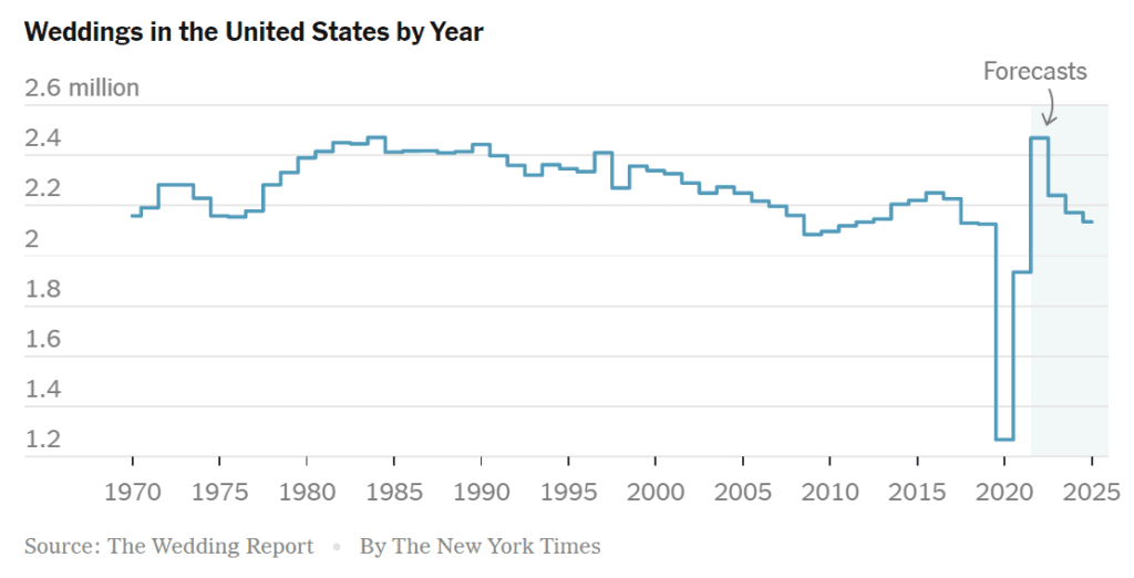
Since they’re doing it as a bar graph anyway, I guess they could have the y-axis go all the way down to zero. Also, hey, let’s see the time series of divorces too!
I learned about a new bit of graphing technology recently. Search for “CSV generated graphs in After Effects” — there’s a YouTube video. I complemented someone on their animations recently and they said they did stuff like this.
It would be interesting if one of the questions explicitly asked students to think about the survey method of calling people by phone. (I wonder, by the way, how the fraction of people who answer a phone call from an unknown caller differs among countries. I certainly never answer…)
With the wedding one, I think I’d have preferred to see per capita weddings rather than by total count, maybe with multiple lines reflecting subpopulation heterogeneity. The first order pandemic story does jump out at you, but a different exploratory DV perspective could provide nice ground for further hypothesis generation (did folks have longer engagements until lockdown restrictions eased enough that family could travel again? Is the spike from individuals who’d been on the cusp of marriage but delayed, or who’d experienced “accelerated” relationship dynamics from pandemic co-isolation? Is it just a byproduct of demographic change? some change in the age distribution, SES, cultural composition etc. of the country shifting in response to the pandemic?).
With the top graph, I don’t know how much I like those axis labels being internal to the plotting window… the truncated axes are also *so* close to their absolute bounds, and there’s a lot of white space in the bottom right half of the plot that seems a bit wasted, but maybe that’s part of the message. Aesthetically, the tick labels are off-center the grid lines. For spatial data, I also like to toggle e.g. connecting points w/ edges corresponding to geographic or linguistic distances (as from phylolinguistic reconstruction, to maybe reflect shared culture), just to at a glance see how much pseudoreplication / autocorrelation is structuring the data. Point color and shape are also not used — could represent e.g. GDP per capita, or maybe an adjusted Gini index, reflecting age (ie, comparing cdfs as a function of age, rather than overall, or something similar). Dunno that these should feature in any final sort of plot (would be a bit cluttered), but could be nice to see as part of a general exploratory process.
1000 people per country is a bit small for granularity deeper granularity while being totally adequate for two bins, but idk that (15, 24) and (40, Inf) really represent natural breakpoints (since the former straddles the age of majority for many countries, and also often represents pretty big changes to lifestyle and independence etc. I guess 40+ is… what, when mortality starts to loom? The NYT piece says they represent “youth” and “parents”, which is… eh)? Would be curious to see e.g. a line plot with age on the horizontal and proportion responding “getting better” on the vertical, with separate lines per country? The question also seems a bit underspecified? What does it mean for the world to get better? Better for whom? For the sum totality of living humans? For the new generation? For the older generation? For the survey respondent specifically? “Sure literacy is up and poverty is down, but my back hurts and I just lost my job!”. The NYT article also doesn’t seem to know which question was asked (initially it quotes “Do you think the world is becoming a better or worse place with each generation?”, and then later says of the exact same graph “Will the next generation do better than the one that came before?”)
Hi Andrew, just wondering how someone like you would think of that wedding plot. Is it beneficial in your opinion to imagine that each year’s (million) weddings can be collapsed down and drawn from a distribution who may be described by say a normal, say something like ~N(2.3 mil, 50k)?
At what point would you start adding features to augment the understanding of the data, say the sequential rise in the 1980’s or the progressive decline between 2000 and 2010?
Finally, seeing the sharp decline in 2020 without a symmetric rebound in 2021 to me shows that an asymmetric distribution is probably a more truthful representation of the data. How do you strike the balance of simplicity / complexity in the face of uncertainty / small datasets?
Be interesting to see what the actual questions are. From the plot text, it looks like one group is asked about each generation, which might suggest to some respondents that it is about what they will leave the next generation, while the other is asked about the current state of affairs. Comparing these with the y=x line seems ill-advised.
Plots that don’t include 0 always have me asking “ok, what is this hack and / or liar trying to trick me into believing?”.
Those are pretty good questions to ask, however. The podcast “Stats and Stories” (in which Andrew had an excellent appearance back in June!) is an interesting listen for those in need of a podcast suggestion. They cover the “journalism meets statistics” realm and it’s usually decent.