Alex Tabarrok writes:
Here’s a regression puzzle courtesy of Advanced NFL Stats from a few years ago and pointed to recently by Holden Karnofsky from his interesting new blog, ColdTakes. The nominal issue is how to figure our whether Aaron Rodgers is underpaid or overpaid given data on salaries and expected points added per game. Assume that these are the right stats and correctly calculated. The real issue is which is the best graph to answer this question:
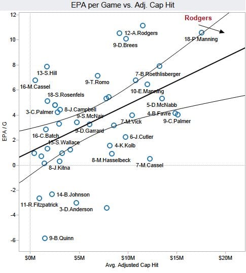
Brian 1: …just look at this super scatterplot I made of all veteran/free-agent QBs. The chart plots Expected Points Added (EPA) per Game versus adjusted salary cap hit. Both measures are averaged over the veteran periods of each player’s contracts. I added an Ordinary Least Squares (OLS) best-fit regression line to illustrate my point (r=0.46, p=0.002).
Rodgers’ production, measured by his career average Expected Points Added (EPA) per game is far higher than the trend line says would be worth his $21M/yr cost. The vertical distance between his new contract numbers, $21M/yr and about 11 EPA/G illustrates the surplus performance the Packers will likely get from Rodgers.
According to this analysis, Rodgers would be worth something like $25M or more per season. If we extend his 11 EPA/G number horizontally to the right, it would intercept the trend line at $25M. He’s literally off the chart.
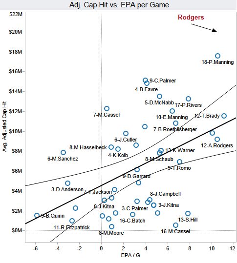
Brian 2: Brian, you ignorant slut. Aaron Rodgers can’t possibly be worth that much money….I’ve made my own scatterplot and regression. Using the exact same methodology and exact same data, I’ve plotted average adjusted cap hit versus EPA/G. The only difference from your chart above is that I swapped the vertical and horizontal axes. Even the correlation and significance are exactly the same.
As you can see, you idiot, Rodgers’ new contract is about twice as expensive as it should be. The value of an 11 EPA/yr QB should be about $10M.
Alex concludes with a challenge:
Ok, so which is the best graph for answering this question? Show your work. Bonus points: What is the other graph useful for?
I posted this a few months ago and promised my solution. Here it is:
OK, actually this is more challenging than I thought it was!
After seeing the above-linked post, the solution seemed clear to me and I said I’d post it in a couple days. I was busy and didn’t get around to it, then a few months later somebody asked me about it and I explained it all over again. But again I didn’t get around to writing it up. But when I looked at the problem today, I completely forgot my reasoning from before so I decided to start from scratch. And now the problem doesn’t seem so easy!
Below are my current thoughts.
To start with, there are lots of complications I don’t want to consider here, especially because I’m no football expert. To start with, quality is being measured here by career average Expected Points Added, but you’re not paying a player for a career, you’re paying for what he’ll do next year, or however long the contract is. So you’ll want to project into the future. Also, EPA is a noisy measure—all measures are noisy measures!—and also the QB has to fit into a system. Related to this last point, you’d expect a QB to typically be more valuable to the team he’s on than to most other teams, as they’re paying a premium to keep him. And then there’s the economic argument that nobody’s really being overpaid, at least in a prospective sense, because if they were, the team wouldn’t have signed the contract in the first place. Even if you don’t believe that rationality argument completely, it would seem that the fact that a team is paying $X for a player is giving us some information about player quality.
OK, but let me set all that aside. The statistical issue is that a point can be above the regression line in both graphs, so that in the first graph, a QB is above average in quality after adjusting for salary, and in the second graph, that same QB is above average in salary after adjusting for quality.
From a generic statistical perspective we know this is true, and it’s easy to put it in a familiar regression-to-the-mean setting. Consider a woman who is 6 feet tall with a mother who is also 6 feet tall. The daughter is tall after adjusting for mother’s height and the mother is tall after adjusting for daughter’s height.
But somehow the height example doesn’t give that flavor of paradox.
Let’s go back to the football example. I want to compare Rodgers to other, comparable, players—but it’s hard to do this because nobody else on the graph has an avg adjusted cap hit of $21 million. So let’s choose another data point, Ben Roethlisberger, who’s also above the regression line in both graphs.
Is Big Ben underpaid (as appears in graph 1) or overpaid (as appears in graph 2)? I’d have to say that, according to these data, he’s underpaid at $10.5 million. Why do I say this? Because if you look at graph 1, you can see what you can get for $10.5 million, and Ben’s production is on the high end of that range. He’s better than average for $10.5 million.
But what about graph 2? Looking at all the players who are producing 7 EPA/g, Ben’s among the most expensive. But . . . so what? Thanks 7 EPA/g is pretty good! It actually looks like all these guys at 7 EPA/g are underpaid, in the sense that they’re outperforming other players at their salaries. Which is fine, but then . . . if all these guys are underpaid, why can’t they negotiate higher salaries? Or, to flip it around, why are the overpaid guys (by this criterion) being paid so much. And that brings us back to the economic argument that I said we were going to set aside.
I guess that my reasoning above is kinda based on economics already, in that I’m comparing Ben Roethlisberger to other QB’s who are paid $10.5 million, following the reasoning that this is what his team could expect to see if they were to get a new quarterback and pay that much.
To put it another way, I feel a lot more comfortable saying that all the QB’s with EPA/g higher than 6 are underpaid, than I would be saying that all the QB’s with avg adjusted cap hit greater than $10 million are overpaid.
But I have to admit, I’m not super-confident in this reasoning.
What I’d really like to do here is transfer the example to a cleaner setting so as not to get tangled in all the NFL details. I tried mothers’ and daughters’ heights; that had the regression lines but not the overpaid/underpaid thing. What about consumer products? Suppose an online retailer is offering 30 different brands selling a similar product (winter coats, say), the coats have user ratings, we plot the cost and rating of each coat. Suppose a coat costs $200 and has an average user rating of 4.3 stars. Further suppose that the other $200 coats mostly have ratings below 4.3 stars, and that the other coats with 4.3 stars mostly cost less than $200. That’s the Ben Roethlisberger situation. We’re talking about an 80th percentile coat selling for the 80th percentile price.
Would you be underpaying or overpaying for the coat? I don’t see a clear answer here. Ultimately I think it depends on your tradeoff of cost and quality.
OK, now we’re getting closer to an answer. From an economic standpoint, we should be able to answer, “Is this coat worth more or less than $200,” without comparison to any other coats. Whether you are overpaying or underpaying for the coat just depends on the relative value of the coat, compared to whatever else you could spend $200 on. The existence of a similar coat that costs $150 does’t change that—except to the extent that this provides information about how much these coats are going for. Indeed, coats are pretty cheap right now. It could be that all the coats on sale are worth it.
Beyond this, I guess maybe the term “overpaid/underpaid” just isn’t so clearly defined, which is why this is such a tricky question. It might be easier if the question were defined more specifically, such as: You’re currently paying Aaron Rogers $15 million. He wants $21 million. Should you pay it, or should you hire a different quarterback? But then this is a different question too: it might be worth it to “overpay” for a QB if there are no good alternatives out there.
I do somehow feel that there’s more to be said from a purely statistical perspective here, so I still don’t think I have 100% of the answer on this one. If only I’d taken down some notes when I first thought about it!
Maybe I’m stating the obvious, but this seems to be a case of P(x|y) versus P(y|x), the answer you get depends on what you are conditioning on versus what the predictand is. If you are choosing between the QBs at a given performance level, you picked the expensive one. But if you had a budget of $25m, you got much more than you expected for that money.
Same with the coat, you either chose the most expensive one from all the 4.3s or you chose the best one for your $200.
I don’t think this is a question of trade-offs so much as a question of questions. The coat is both expensive for a 4.3, and highly rated for $200. Is the question, could you have got as good a coat cheaper (yes) or is the coat highly rated for its $200 cost (also yes)?
James:
Sure, this is like the example of a 6-foot-tall mother with a 6-foot-tall daughter. The mother is taller than expected given her daughter’s height, and the daughter is taller than expected given her mother’s height.
But, to get back to the football example, how do we think about the question of being overpaid or underpaid? If we want, we could say that Ben R. is overpaid given his performance level, and that he is overperforming given his pay level. But that seems too glib. I feel like there must be some underlying decision questions that the “overpaid or underpaid” question is intended to answer.
I agree with James that it’s a question of questions.
As I said over at MR, “These are not causal estimates, but the causal stories they imply are different.”
Does pay lead to performance or performance lead to pay? It’s certainly both, but depending on where you are in the contract cycle, you’ll be more interested in one of those relationships. For example, if you’re trying to figure how much to compensate someone based on their performance, you put performance on X and pay on Y (Ben, you’re not getting a raise GIVEN how you’re playing! (though there are other factors, like availability of alternatives (ding ding ding) that should matter too)). On the other hand, if you’re trying to figure out how efficiently you’re spending your money, you put pay on X and performance on Y (Ben really paid off for us, GIVEN our spending!). And of course the team would like to pay for performance but the player would like to perform for pay, so it is only natural that over/under-payment depends on perspective.
But I think my point is that “overpaid or underpaid” is a bit too vague and needs unpicking into a more precise question before you can answer it.
It seems to me that “overpaid or underpaid” must be implicitly asking about possible alternative employees (rather than changing his salary, which may not be possible), and the answer is simply different depending on whether you are asking: would picking another $25m guy do worse (so he’s underpaid), or would picking another 11EPA guy be cheaper (so he’s overpaid)? Those are different questions and the answers to both are yes.
He is underpaid compared to the $25m guys, cos he’s better than them for the same cost. He’s overpaid compared to the 11EPA guys, as he costs more for the same performance. The two comparisons aren’t in conflict because they are made with two different sets of alternative picks – the most expensive guys on the one hand, and the top performers on the other.
Your last paragraph clarifies things for me.
Quite interesting because ‘the most expensive players tend to be overpaid’ and ‘the best players tend to be underpaid’ are exactly what you would expect given the noisy relationship between contracts and performance.
Yet we struggle to make sense of a very good player that is getting paid a lot.
Thank you, Andrew!
-Brian1 and 2
Brians:
Thanks for sharing the example (which, as can be seen above, continues to irritate me)!
> From an economic standpoint, we should be able to answer, “Is this coat worth more or less than $200,” without comparison to any other coats.
On the surface, this is true, but in reality I think things are a little more complicated within this domain. For a coat, the value it provides may be warmth or aesthetic value.
However, within a sports league, a player’s value on the field is dependent on how much they improve the team. Improving the team means improving performance in matches against other teams, who themselves are composed of other players (and coaching staff and so on).
In this way, I believe that each player’s evaluation is necessarily linked to the population of players, albeit in an indirect way. I suppose that metrics like career average Expected Points Added have the population “baked in” via the expected points model, but I do wonder if this could leave you exposed in situations where there are changes to the metagame in a short space of time (for example, big tactical changes).
Ben:
Yes, I was thinking of that. But it could be that all QB’s are being overpaid (or underpaid), if their value to the team is not assessed accurately relative to other positions on the field. To this, you might reply that it’s reasonable to assume, at first approximation, that the teams know what they’re doing and that, within their constraints, they’re paying on average about what they should for QB’s—but that’s another economic argument. One of the key meta-questions here is how much the statistical question can be answered without reference the economic question.
” From an economic standpoint, we should be able to answer, “Is this coat worth more or less than $200,” without comparison to any other coats. Whether you are overpaying or underpaying for the coat just depends on the relative value of the coat, compared to whatever else you could spend $200 on.”
I’m confused by this. Isn’t a coat of similar quality for $150 something else that you could spend part of your $200 on?
+1 This is exactly what incremental cost-effectiveness analysis is supposed to help weed out. From an economic standpoint, the $200 coat is “dominated” by the $150 coat of equal quality: it costs more and is of equal or lesser quality than the cheaper coat.
In graph 2, one could construct a concave cost-effectiveness frontier by connecting Moore, Cassel, Hill, Rodgers, and Brady. No other players offer as efficient tradeoffs in costs versus EPA/G. The closer another point is to this line (i.e. closer to the lower-right quadrant in graph two), the closer the player is to providing efficient tradeoffs.
A team’s player-selection would then be based on budget. If one has the budget, Rodgers would be the most optimal selection. Alternatively, if one wants to spend the cash on an elite set of RBs or WRs instead, and less on QB, Moore or Cassel represent efficient tradeoffs.
Abc:
Sure, but this doesn’t really work given the variation in the graph. If this “efficient frontier” argument really held, then what are all those other QB’s doing out there? There’s gotta be some noise in these measurements.
There is most certainly noise–I don’t think the efficient frontier is meant to be thought of deterministically. It could be more telling to get an estimate of the proportion of time a given player is on the frontier, given the underlying variation across all players, assessed via simulation. The underlying question pertains to assessing player value. The other QB’s ‘out there’ represent bad deals (in terms of efficiency) by the metrics under consideration (cap hit vs EPA/G) for a particular contract.
Abc:
Yes, to put it another way, any NFL starter is in the efficient frontier by definition.
Looking at Ben R.’s performance this year, I find it hard to imagine anyone arguing he’s underpaid.
Sometimes you go with the eye test.
Joshua:
No, that’s not right. First, it’s cheating to use information on individual players beyond what’s in the graph. Second, the above charts are from a few years ago, it’s not about performance in 2021.
Andrew –
Sure. That was (mostly) a joke. People use the “eye test” to argue whatever they like to argue. It’s actually a poor replacer for an analytical approach, imo.
But Ben does look pretty washed up. Sometimes what a player is currently making towards the end of a contract or the end of a career doesn’t reflect their real value at all – as it’s more or less an artifact of how good they used to be.
Perhaps the people paying the quarterbacks use more complex metrics than just win/lose. On the ESPN website, the lowest price ticket for the upcoming week for the Steelers is $86 and for Green Bay is $163. Does this reflect the relative value of the quarterbacks in some way? Touchdowns versus interceptions is a metric, but jersey sales must count as well. The correct value for Aaron Rodgers has lots of inputs many of which are not simple hard numbers creating a situation where a single right answer is not possible.
Open markets with multiple willing sellers and well informed buyers for fungible goods and services are useful abstractions, but they are not all that common. How much should Magnus Carlsen be paid? What’s the right price for a painting by Rembrandt? What’s the right price for the James Webb device? I wouldn’t sell my dog for anything less than $50,000; is that a right price?
I’ve been trying to write up something coherent, but I’ve run out of time. Here are some less-coherent thoughts.
Overall, I think this puzzle is great because it uses a bunch of common statistical/rhetorical slights of hand to make it seem like we have a paradox, when there really is none, or at least there’s not enough information to know. We see this all the time in policy discussions.
The two biggest statistical slights of hand are that EPA is an inferred number and that the explanatory value of the correlation is so low. The rhetorical slight of hand is that the question “is Aaron Rodgers underpaid or overpaid given data on salaries and expected points added per game” may have an answer in these statistics, but in our head the question just becomes “is Aaron Rodgers underpaid or overpaid?”
Leaving aside that EPA is not a measurable quantity, the regression line only has r=.46. But the analysis then goes on to talk about it as if r=1. So if, as the original question does, you ask “given only information on salary and EPA, how much should Aaron Rodgers get paid,” then you can answer the question by regressing to the line. But in our heads we’re asking “how much should Rodgers get paid,” and if EPA only explains half of the salary variance then we just don’t have enough information to answer the question. As humans, though, we take the information we have and act as if it’s all the information. You see this all the time in other areas.
Another issue is the interpretation of the data points. The data points are “given a contract for $$, what were the resulting EPA?” But contracts are negotiated based on prediction of future performance based on past. What were the EPAs of those QBs in the seasons before the contract – that’s what you should use if you want to compare the situation to Rodgers.
That’s all I have time for now. The comments in the OP have some good insights and examples as well – probably worth checking out. https://web.archive.org/web/20130524132245/https://www.advancednflstats.com/2013/05/point-counterpoint-on-rodgers-extension.html
Andrew
The OP comments have some good discussion on “why are the answers different when you flip the axes?” E.g.
—
Suppose there’s a $1 Powerball-type lottery with a 50% payout rate. There are a bunch of different prizes, from $5 to $5 million. People buy as many tickets as they like.
Brian 1 is answering: if you know a person bought 200,000 tickets, how much do you expect them to win? The answer: $100,000.
Brian 2 is answering: if you know a person won $100,000, how many tickets do you expect they bought? The answer: I dunno, maybe, 10 or 20? Because, hardly anyone buys 200,000 tickets, but *someone* has to win the big prizes.
So, Brian 1 finds that $100K is associated with 200K tickets. Brian 2 finds that $100K is associated with 20 tickets.
They’re both right, for their respective questions.
I’m pretty surprised that measurement error didn’t come up at all in this discussion. The assumption around causality here that good performance (higher EPA) translates to higher pay, which is the question the second plot answers. I don’t think anyone would argue that you should be able to get 9 EPA just because you pay some random guy 20M. But if you look at that second plot you’ll see that the “high performing” quarterbacks on the underpaid side are not people who would be considered successful QBs by any means, some of them were never even the primary starter for their team. The EPA is a noisy measurement of performance, particularly for people who didn’t play many games, and it’s not totally clear to me how to correct for that appropriately.
As a side note, I don’t really understand how EPA is calculated here. I assumed that it was points added relative to the average player, but then the distribution should be centered at 0, no?
JM:
I was thinking about measurement error. Actually, that was the key point in my initial answer (the one whose details I forgot). The idea goes as follows:
– If all salaries are “correct” and depend only on ability, and if the ability measure (EPA/g) is error-free, then you should see a deterministic relation between ability and salary.
– We don’t see such a deterministic relation; thus there must be some combination of three things:
1. Salary != economic value
2. EPA/g != ability
3. Economic value is determined by factors other than ability.
Obviously, all three of these represent real issues:
1. Even setting aside mistakes and brilliant trade moves, salary is the product of negotiation, league rules, etc.
2. Ability is multidimensional, EPA/g is a noisy measure, and ability varies over time.
3. The value of a particular QB depends on the talents of the rest of the offensive unit, not to mention other issues such as ticket sales, probability of making the Super Bowl, etc.
The way the problem has been set up, it seems that we’re supposed to assume that problem #2 isn’t a real issue: we’re thinking that EPA/g is a perfect measure of ability, so that all the departures from a deterministic line come from problems #1 and 3. But I’m still not sure how that helps answer the question of “overpaid/underpaid.”
I agree with JM. Here’s how I think about it.
First, what we measure is salary and actual EPA/g, but I propose that the “true” relationship is between salary and expected EPA/g.
If the true relationship is between salary and expected EPA / g, and EPA/g is a noisy measure of expected EPA/g, then you’re going to have attenuation bias if you regress salary as your Y variable against actual EPA/g as your X variable. So I think using salary as the X variable is the right model.
I grant your point that other things influence salary on the margin, so salary doesn’t perfectly measure economic value, but I think magnitudes of the errors 1. Salary != economic value and errors 2. EPA/g != ability are not on the same scale.
Well, without thinking too hard about it and just reading this blog post, my first impression would be to have picked the 2nd graph. Assuming that EPA was the only thing that mattered (a gross simplification and fraught with error), I would want to know how QB production predicts salary. If I need ~10-11 EPA for my team, then I look at all QBs in the range of that EPA and look at predicted salary. Rogers new $21M salary is way higher than even Manning. I could get a Brady with similar production for cheaper.
But the real question here seems to be, “overpaid” or “underpaid” relative to what?? How does one define “overpaid” or “underpaid”? I think you might need to know in order to answer the question.
I find it hard to believe Rodgers is underpaid: isn’t he paid more than every one else?!
At the end of the day, his predicted EPA is a wild extrapolation, while his predicted Adj. Cap Hit is more of an interpolation. Do we know something about his leverage in the two regression fits?
This is kind of a strange puzzle in that the answer seems obvious
First, salary doesn’t predict performance, it follows it. The appropriate way to plot the data is X: EPA/g, Y: Salary.
Second, QB salaries are rising over time. For players that remain at the top of the game throughout their careers, we should expect each contract to show a significant jump relative to the average at the time the new contract is signed. Thus, “old Rogers” *should be* below average on the last day of his old contract, and “new Rogers”, *should be* above average on the first day of his new contract. I would expect to see similar patterns with other players – the sign of the shift reflecting their play between contracts.
I don’t know how the “adjusted salary cap” metric works. Presumably it’s supposed to in some way control for the proportion of the salary that’s paid to the QB and in that sense control for salary rise, but I suspect it doesn’t do that very well.
Rogers’ play isn’t the only metric that contributes to his salary. It’s the amount of money he brings in that’s key. His exact EPA isn’t that important, what’s important is that he’s a top quarterback. Here are the basic considerations GB would face in determining Rogers’ contract:
1) Suppose Rogers were to leave GB and sign with the worst team in the league. How much revenue would he be worth to that team? **ALOT** more than he would be worth to GB!
2) Rogers might take a little less to stay with GB, since it’s a competitive team and he’s likely to perform better in the current system than in a new one.
3) How much revenue would GB lose if it let Rogers go? How many people in Oklahoma City or Boise or Lexington are going to tune in MNF to watch GB with a second string QB?
Oh, now I get the jump: the “old Rogers” data point captures the average adjusted cap hit over the life of the old contract, while the “new Rogers” data point doesn’t “foresee” the future rise in salary cap. “New Rogers” is just the initial point of the contract. Another way of saying that is that future salary cap rise isn’t reflected in the data. To put “new Rogers” on context on the chart, you’d need to forecast the average salary cap hit over the life of the new contract, which means you’d have to forecast the rise in salary cap over the life of the contract.
> First, salary doesn’t predict performance, it follows it.
This seems backwards: salary is given based on past performance — as it occurs in the offseason — to compensate for (predicted) future performance.
“salary is given….to compensate for…future performance”
Hmm…I phrased that somewhat confusingly. Let me rephrase: high performance – in the absence of other factors – causes salary to rise. High salary does not cause performance to rise. The causal effect is: increased performance leads to increased salary.
But IMO it is appropriate to say that performance “predicts” salary and not vice-versa. Everyone assumes that a star player whose contract is up for negotiation – again in the absence of other factors like injuries or age nearing the end of career – will get a higher salary. But no one believes that if they take an average player and give that player a superstar salary that they will suddenly perform like a superstar. Salary does not predict performance. It may be given in anticipation of future performance, but it can’t make that performance happen.
Exactly.
And viewing the dependence of salary/performance not as static but as a discrete time process, I think the “paradox” of this post unfolds. A simple model is:
* estimate salary = beta(T) * perf given the field in year T
* predict perf(T+1) for ARod his currently known perf(T)
* choose a salary from salary(T+1) = beta(T) * \hat{perf(T+1)} = beta perf(T)
Viewing the above plots as the T+1 data, we can then say that: given the observed beta(T+1) (from fig 2) and his T+1 performance, his T+2 salary will go down. And that E(perf(T+1) | salary(T+1)) is not an important quantity.
“his T+2 salary will go down”
You mean his *hit on salary cap* will go down yes?
Sorry, let me clarify. Applying the model one step forward, for year T+2, we:
* fit beta(T+1) from Fig 2
* estimate \hat{perf(T+2)} = perf(T+1) ~= 10 EPA/G
and so the plug in salary for year T+2 in our toy (one year contract) model is $10M, which will be less than his T+1 salary.
What you say re: “hit on salary cap” is of course true too in reality, but far beyond the scope of my simple model!
> — to compensate for (predicted) future performance.
That’s only partially applicable in some cases.
Many athletes get contracts that outlast their reasonably predicted performance. By the time they reach the end of their contract, they are “overpaid” in comparison to their peers. And that could easily have been predicted. The reazon they got contracts where they’d be “overpaid” in predictable ways was effectively because they were being paid on the basis of past performance (prior to when when they signed the contract) – which gave them the leverage to be able to negotiate a contract where they’d be “overpaid” in foreseeable ways at some point in the future.
Both analyses use least squares regression, which makes a distinction between which variable is x and which is y. So the 2 lines are answering different questions, and since the correlation is fairly low, you are going to see a big difference between the lines.
What if instead you used a regression model that minimized the squared distance to the line in the direction perpendicular to the line (not vertical), I have heard of this called “organic correlation” and “principal components regression” and a few other things, but it has the advantage of giving the “same” line whichever variable you assign to x and y (I’m just not sure how to code it in Stan). If you (we) are really interested in both adjustments/comparisons, then this may make more sense.
Given that this is a game with a winner and a loser, and thus an extra 0.1 EPA/G has incredibly non-linear payoffs in the utility function (which could reasonably include only wins and losses), maybe we should be thinking about this in terms of quarterback ranks, and not quarterback values (since “marginal games one/lost” is not a measure we have).
If we line people up by rank of EPA/G and rank of salary, it sure looks like Rogers is basically top ranked (or very close) in quality and top paid. So maybe you pay exactly as much as you need for the top quarterback.
Sure that ignores the idea you could pay for the top runningback or top safety or whatever instead, but those comparisons are already shut off by looking only at QBs.
I guess I’m suggesting that relationship between ability/pay ranks might be more important here than the relationship between the difference in ability and the dollar difference in pay. And if you think “he’s the best QB and the highest paid” then the only potential inefficiency is that he’s paid too much/little more than the next guy. But it certainly bounds the lower end of his “optimal” salary pretty tightly…. that of the second best guy. I sorta think in general high-end tournament career pay (athletes, CEOs, academics) is better understood in terms of quality rank than in terms of quality difference.
This is the answer I liked most: https://statmodeling.stat.columbia.edu/2021/07/21/a-regression-puzzle-and-its-solution/#comment-1936938
Took me a bit to remember, but there’s a definite problem in how the first person is using their graph:
> If we extend his 11 EPA/G number horizontally to the right, it would intercept the trend line at $25M.
Comparing this with the second person’s statement:
> The value of an 11 EPA/yr QB should be about $10M.
Both people are doing EPA/G -> $, but the second person did the regression for that. So if we take it for granted both people are doing the EPA/G -> $ logic, then the second plot, definitely.
“there’s a definite problem in how the first person is using their graph:”
Yes, but you’ve identified the wrong problem. The problem with the first graph is that pay is a function of performance, and this graph plots performance as a function of pay.
Interesting to see so many opinions on this. As the intro points out, the data points are exactly the same and the difference between them along either dimension is exactly the same in both plots, so both graphs **MUST** “say” the same thing. The problem specifies that both graphs are accurate representations of reality. The only question left is how they express the same reality, and the only difference between them is the OLS trend and the dependent variable. The OLS trend changes between the two graphs – as it would with any asymmetrical data set – because in the first chart performance is assumed to be the dependent variable in and in the second chart salary is assumed to be the dependent variable. Also, to learn anything with this we have to use the “old Rogers” data point, not the “new Rogers” data point. The latter actually plotted because technically it’s unknown: no one knows what Rogers’ average salary cap hit will be like at the end of his new contract, because no one knows what the salary cap will be for his team or any other time. So when we think about “new Rogers” we have to think about how it will change over time, while “old Rogers” is fixed and permanent.
Since in real life pay is a function of performance and the first chart shows the opposite, it’s asking: how did GB do on Rogers’ old contract? Extremely well, it seems. At the end of his old contract his performance per dollar of salary cap hit was 2x the average. Most excellent. If we plot Rogers’ new contract he is, in effect, getting massive pay cut relative to the average – by current data he’ll be getting only about 1.2x the average performer. But he’s still getting a big raise. The move toward the average is because the salary cap is rising.
The second chart is showing pay as a function of performance, it’s asking: how is rogers’ avg salary cap hit *today* (or at the end of his last contract) relative to other players? He’s below average! That’s because the salary cap was much lower when his previous contract was signed X years ago. As the salary cap has risen, his hit on it shrinks relative to his performance. His new contract will move him far above the average, but he should slide back towards the average in the future as the salary cap rises.
The error in the data doesn’t affect this analysis. It’s not that nuanced. What’s confusing is that intuitively it seems like the linear trends of the two different regressions should be the same because the data are the same, but they aren’t.
Wasn’t the simple thought that, if the correlation goes to zero, the regression line becomes near horizontal, and in the first alternative, the fair salary goes to infinity? so that approach is nonsense.
Another problem with the riddle is regression to the mean, which is why high-performing players are underpaid, and highly-paid players underperform.
Mendel:
Interesting. I like this, to consider the hypothetical of zero correlation and then consider players in the upper right quadrant, who are paid more than average (and are thus paid more than expected given performance) and who perform more than average (and thus perform better than expected given pay). That does clarify the problem a bit.
If there’s no correlation between pay & performance, that means that either there is no relationship between pay and expected performance, or there is no relationship between expected performance and actual performance. (Or some weird third alternative where those relationships cancel out, but let’s ignore that.)
But if there’s no relationship between expected performance and actual performance, and “expected performance” is a reasonably competent prediction of actual performance, then every player should have essentially the same expected performance. So that couldn’t account for the scatter. (Unless you want to treat them as totally incompetent predictions, where the teams are all noise traders.)
So the world where the correlation is zero is a world where a quarterback’s pay is not-at-all based on expected performance.
In that world, graph 2 would be a reasonable one to look at (my top-level comment goes into this in more detail). But that would be a weird world to be in, and a weird world in which to consider this question. Brian would be asking ‘given these assumptions about Rodgers’s future performance, what should his contract be’ and the answer would be ‘contracts don’t depend on expected performance, so the fair salary is just the average salary’.
Really, neither graph is all that relevant. In that world you’re trying to be the groundbreaking GM with the novel idea to pay players more if they’re going to play good, and this kind of past data on pay & performance won’t tell you how much more you should pay them because no one has ever tried it before.
“I have discovered a truly remarkable proof which this margin is too small to contain.”
I think my comments on the previous post were pointing in the right direction.
In order for all the points to basically fall on a straight line with r near 1, what would need to be the case? Teams would need to be able to perfectly predict QB performance, and they would need to give contracts which are completely based on expected performance.
The points are much more scattered than that, due to some combination of contracts not matching expected performance, and actual performance not matching expected performance. What if we only had 1 of those 2 mismatches?
If contracts were completely based on expected performance and the scatter was entirely due to the gap between actual performance and expected performance, then graph 1 would be the right graph to draw. The x-axis shows contract size, which (in this hypothetical) would just be a rescaling of expected performance, and then the y-axis shows actual performance. And the argument based on graph 2 would be wrong, as it is essentially claiming things like ‘QBs who produced 10 EPA were on average making $10M, therefore $10M is the fair salary for a 10 EPA QB and a higher salary is an overpay.’ But that is wrong because the 10 EPA quarterbacks are mostly players who performed better than expected, and outperformed their contracts.
If actual performance perfectly matched expected performance, but contracts incorporated other major factors besides expected performance, then graph 2 would be the right graph to draw. The x-axis shows actual performance, which (in this hypothetical) is identical to expected performance, and the y-axis shows how much the team chose to pay the player given that they knew that this was going to be his level of performance. And arguments based on graph 1 would be wrong because it’s essentially claiming ‘QBs who were paid $15M produced 7 EPA on average, therefore $15M is a fair salary for a 7 EPA QB and a lower salary is an underpay.’ But that is wrong because $15M quarterbacks are mostly players who were paid more than their expected performance, and were overpaid relative to their performance.
In reality both of these mismatches are present, so neither graph is exactly right. I think more of the variation is due to the mismatch between expected performance and actual performance, so the argument based on graph 1 is closer.
“then graph 2 would be the right graph to draw. ”
They have the exact same data. How can one be wrong and the other be right? :) They’re both right. It’s a question reading them correctly with respect to the dependent variable, not whether they are “right” or not.
Graph 1 is correct.
A QB’s salary is the market’s prediction of their future performance. Graph 1 plots actual performance on the y-axis and predicted performance on the x-axis. Rodgers has a positive residual, meaning he performed better than the market predicted he would (assuming the regression line captures the correct transformation from salary to EPA/G).
Graph 2 is regressing the prediction against the actual, which doesn’t make much sense or answer the question.
This same phenomenon arises if you regress actual NBA wins against projected wins–in 2020-2021, the Brooklyn Nets won 48 games (were only projected to win 45.5), but the average team that won 48 was only projected to win 43. They clearly outperformed expectations, and I would argue their situation is similar to Rodgers.
This example suggests that we generally feel a tension between the following claims:
(1) y_i > E[Y | X = x_i], and
(2) x_i > E[X | Y = y_i].
Without loss of generality, suppose x_i > 0 and y_i > 0. If we divide (1) by x_i, we obtain:
(1a) y_i / x_i > (1 / x_i)E[Y | X = x_i] = E[Y / x_i | X = x_i] = E[Y / X | X = X_i].
Similarly, if we divide (2) by y_i, we obtain:
(2a) x_i / y_i > (1 / y_i)E[X | Y = y_i] = E[X / y_i | Y = y_i] = E[X / Y | Y = y_i].
Finally, if we invert (2a), we obtain:
(2b) y_i / x_i < 1 / E[X / Y | Y = y_i].
Thus, in a world where
(3) E[Y / X | X = x_i] = 1 / E[X / Y | Y = y_i]
is true, (1a) contradicts (2b), and so there is no i for which (1) and (2) both hold. So perhaps we unconsciously assume (3) obtains in general, at least approximately, and thus find examples where (1) and (2) both hold to be surprising.
Our supposition of (3) may stem from two more primitive fallacies:
(3a) E[Y / X | …] = 1 / E[X / Y | …], and
(3b) E[… | Y = y_i] = E[… | X = x_i].
We can call (3a) the 'inversion fallacy', and (3b) the 'similarity fallacy'. The inversion fallacy holds that the expectation of a reciprocal is (roughly) the reciprocal of the expectation. The similarity fallacy holds that the units belonging to a Y-neighborhood of i and the units belonging to an X-neighborhood of i largely overlap, resulting in approximately equal expectations over these neighborhoods.
We can arrive at a stronger result by stipulating that X and Y are positive random variables. If so, then since f(z) = 1 / z is a convex function when z > 0, we have
(4) 1 / E[X / Y | Y = y_i] <= E[Y / X | Y = y_i]
via Jensen's inequality. Thus, combining, (1a), (2b) and (4), we obtain:
(5) E[Y / X | X = x_i] < y_i / x_i < E[Y / X | Y = y_i].
In a world where
(6) E[Y / X | X = x_i] = E[Y / X | Y = y_i]
is true, (5) cannot hold for unit i, and so neither can the combination of (1) and (2). So perhaps the only fallacy at work here is (6), which is the supposition that the X-neighbors and Y-neighbors of every unit are similar in terms of their Y-to-X ratios.
Mixed:
Sure, this relates to the well-known problem of regression to the mean. This NFL example is related but not quite the same. I say this because of my analogy given in the above post to the heights of mothers and daughters. Consider a six-foot-tall mother with a six-foot-tall daughter. I fully understand that the mother is unexpectedly tall conditional on her daughter’s height and that the daughter is unexpectedly tall conditional on her mother’s height. This does not bother me. But this understanding of regression-to-the-mean does not help me understand the question of whether Aaron Rodgers is underpaid or overpaid. The “overpaid/undepaid” issue introduces a new challenge.
Andrew:
The tension I’m referring to is the fact that, in this example, we naturally infer from (1) that he is overpaid, while we naturally infer from (2) that he is underpaid. Since he cannot be both, either (1) and (2) cannot both be correct, or else something is going wrong with these inferences. Since it’s clear in this example (and in your parent-child height example) that (1) and (2) are correct, the problem must be with the inferences we’re inclined to make from these about whether his pay is appropriate. So my short take on this is that we need to spell out more fully what we think determines appropriate pay, and use this to clarify what sort of evidence would support the ‘overpaid’ v. ‘underpaid’ hypotheses. These erroneous inferences must be stemming from a sloppy implicit model of these things that would benefit from fleshing out more explicitly.
That said, since we do naturally arrive at these conflicting inferences, it suggests that we will generally find data points like his to be surprising, since we don’t usually expect a single data point to support contradictory hypotheses. So there’s a further question of what we might be implicitly assuming that causes us to not expect to see data points like this one, even though as you point out they’re ubiquitous.
The result above, in brief, says that if we have positive random variables X and Y, and we have a unit for which (1) and (2) both hold, then the ratio of Y to X for that unit is bounded by its average given X and its average given Y. So a possible explanation for our intuitive surprise at cases such as these is that we incorrectly presume that these averages are (roughly) the same, which precludes the possibility of units for which (1) and (2) both hold. If we had a cognitive bias to this effect, that might explain why we find a case like this puzzling, beyond the issues with sloppy, non-explicit reasoning I mentioned above.