Following up on yesterday’s post on an example of misrepresentation of data from a graph, I wanted to share a much more extreme example that I wrote about awhile ago, about some data misrepresentation in an old statistics textbook:
About fifteen years ago, when preparing to teach an introductory statistics class, I recalled an enthusiastic review I had read (Sills 1986) of the sixth edition of Hans Zeisel’s (1985) book, Say It With Figures. I bought the book and, flipping through it to find examples for use in class, came across the two sketches reproduced in figure 2.
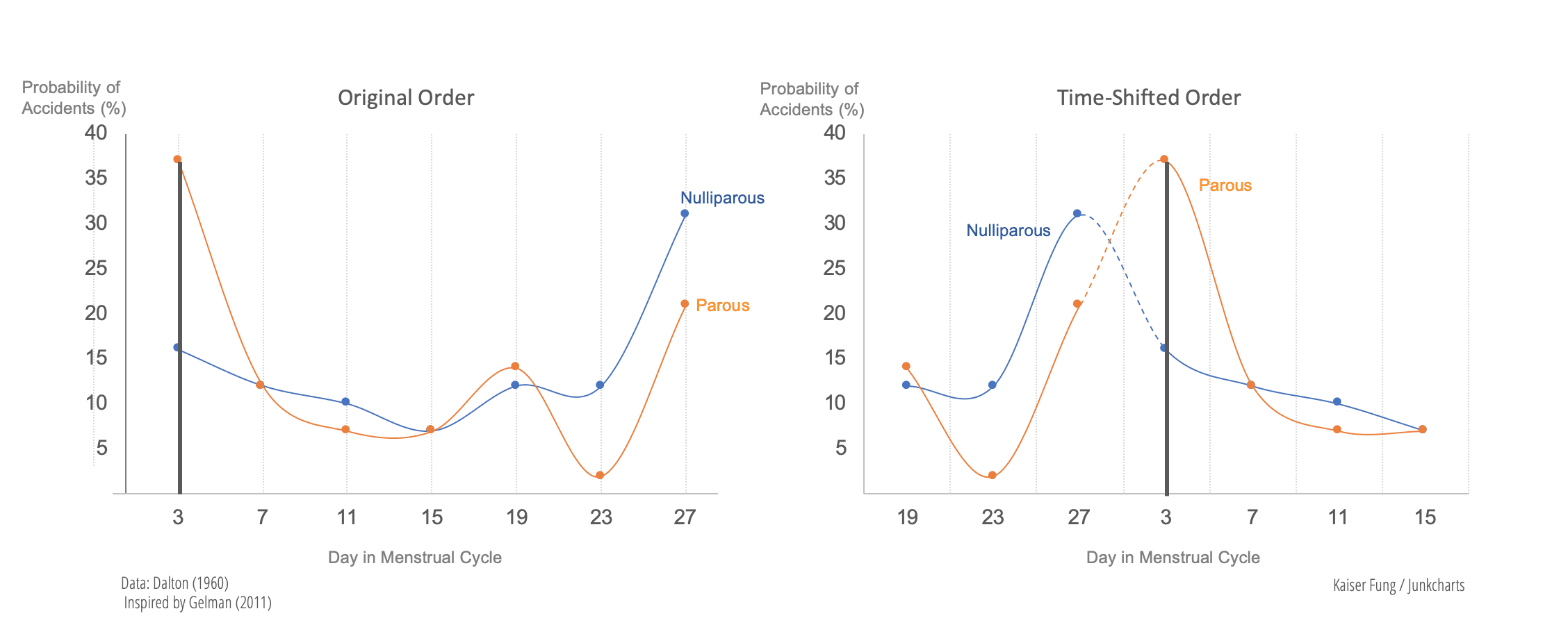
The curves represent data from hospital admissions of premenopausal women who had been involved in traffic accidents, with the left hump representing accidents that had occurred just before the menstrual period and the right hump showing accidents occurring just after the period.
This seemed like a great example for class. I figured that a graph of the actual data would be even better than a sketch, so I went to the library and found the cited research by Katharina Dalton (1960). The graphs are reproduced in figure 3, and they look nothing like Zeisel’s sketches in figure 2!
For one thing, the sketched densities show almost all the probability mass just before and after menstruation, but the data show only about half the accidents occurring in these periods. Perhaps more seriously, the sketch shows two modes with a gap in the middle, whereas the data show no evidence for such a gap. Similarly, the two bell-shaped pictures in the right sketch of figure 2 do not match the actual data as shown in the histograms on the right side of figure 3.
Dalton’s findings were conveniently summarized by an article in Time magazine on November 28, 1960: “In four London general hospitals Dr Dalton questioned 84 female accident victims (age range 15–55), all of whom had normal, 28-day menstrual cycles. Her findings: 52% of the accidents occurred to women who were within four days, either way, of the beginning of menstruation. On a purely random basis, the rate would have been only 28.5% for the same eight days. Childless women, noted Dr Dalton, appear to be abnormally accident-prone just before menstruation, while women who have borne children are vulnerable over the whole premenstrual and menstrual period.” What is relevant to our discussion here is that these findings were not accurately described in Zeisel’s book. On an unrelated but amusing (from a current perspective) note, the Time article quoted Dalton as saying that these findings “cause one to consider the wisdom of administering tranquilizers for premenstrual tension.”
I suspect that Zeisel heard about the research (perhaps even by reading Time magazine), recognized that it would be a good teaching example, and went to the library to read Dalton’s original article. He then could have too hastily summarized the data in a sketch, inadvertently knocking out most of the accidents that did not occur just before or after menstruation and mistakenly inserting a gap in his histogram between the two modes. Or perhaps he was looking for an example of a mixture model and didn’t look too closely at the data. In any case, this is a benefit to our students, who get a lesson in how easy it is to misread a research report. Had Zeisel’s book not been so appealing and well written, we would not have been drawn to the example in the first place.
For teachers, the most important lesson is that going to the source of the data turned up a better example to use in class. For students, the lesson is to be sceptical when seeing second-hand reports of data, even when coming from a credible-seeming source.


The above example of one of three in my article, which concludes:
Teaching activities already exist in which students apply critical reading skills to news reports and scientific articles with statistical content; here, the recommendation is to have an inquiring eye when reading books that we teach from as well. Much can be learned by redoing analyses and going to the primary and secondary sources to look at data more carefully, and this can help us improve our teaching, even from our favourite books.
The article was published in a British journal, hence the classy spelling in that last sentence.
Again, I have no reason to believe that the textbook author misrepresented the data on purpose. I’m guessing it was just sloppiness: he read the original source, abstracted the key message as he saw it, then redrew it using those bell-shaped curves, never thinking that it would have been easy enough to just copy the actual data and make the point directly from there.
P.S. Kaiser made these plots to present the above information more appealingly while remaining faithful to the reported data:
“Again, I have no reason to believe that the textbook author misrepresented the data on purpose. ”
Exactly!
This is why everything in science *must* be replicated. Even the most scrupulous workers can make (in this case) an egregious mistake in an instant, just by acting to quickly without thinking. Now, imagine what could be hiding in a much more complicated analysis or experimental set up – even in the most painstakingly constructed experiments and analyses, little, seemingly inconsequential thought leaps can cover a lot of holes.
A variant of Hanlon’s Razor: https://en.wikipedia.org/wiki/Hanlon%27s_razor
+1 :) Applies to me too! :)
I think the main problem with the sketch is failing to wrap the distribution. Even if one used a simplified representation with a couple of (too-)well-defined “bells”, the distance between those (wrapped) normals wouldn’t be larget (even though it’s almost 2pi when taking the longer route between them).
And perhabs, because this are cyclic data, there is not two peak at all, but only one around day 1 : a little before and a little after ? (Sorry for my bad english)
You are right. I did estimate a wrapped normal and a von Mises distrubution using the R package “circular” and these are the results: https://imgur.com/a/5Zv3HLO
I’m not 100% sure about the data I guessed from the histograms (6,5,4,3,5,5,13 and 16,5,3,3,6,1,9) and of course the binning degrades the quality of the data and the difference between the distributions may be magnified.