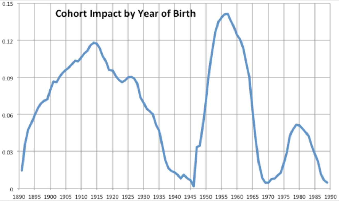
Following up on yesterday’s post on mortality trends, I wanted to share with you a research note by actuary Gary Venter, “A Quick Look at Cohort Effects in US Male Mortality.” Venter produces this graph:
And he writes:
Cohort effects in mortality tend to be difficult to explain. Often strings of coincidences are invoked – what age they were when smoking reduced, when heart disease treatments improved, etc. One possibility suggested by this pattern is a relationship to the size of the cohort. Being in a bigger age group, especially when society had to adjust to cope, could itself stress that population, producing higher mortality rates. Also the rate of change in cohort size could have related effects.
Looking at the birth rates supports this, but with a lag – see Figure 2. It may be that having a big population three to five years older could produce more stress – less employment and advancement opportunities, for example, while a smaller slightly older population could produce more opportunities. Here I should note that in the mortality data, year of birth is defined by subtracting age at death from year of death. Due to truncation etc. there is some imprecision in this calculation. For comparison, birth rates were thus averaged over the two years ending with each year shown.
There’s lots more in Venter’s report. I didn’t study it in detail, and I’m sure his analysis can be improved in various ways, but he’s trying his best to do a full age-period-cohort decomposition, so that’s cool. Also I assume it would make sense to look at women too and to break things up by ethnicity and region of the country (although that latter variable is tricky, as people can move).
In case it would be helpful to others: The caption for the graph you show is
“Figure 1: Cohort Impacts: Increase from Base Mortality”
Are the units deaths per 100,000? I can’t tell from the text. Figure 2 is labeled with units but not Figure 1. Thanks!
I don’t know. My best guess (from the label in Figure 2) is that it is deaths per 10 people. The numbers in Figure 1 seem in the right ballpark for that: e.g., max for a cohort is a bit less than 0.15 and 0.15 deaths per 10 people is 15 deaths per 1000 people; the web says US death rate is 8 per 1000 people, which would be .08 on the graph, pretty much in the middle.
Oh, thanks. I thought maybe the “-1/6” in Fig. 2 was shorthand for “x10 to the -6.”
Isn’t it strange that the impact is presented as always positive? I mean, to me figure 1 might be better off centered on something rather than relative to the lowest. It makes it seem like every cohort is above average.
I’ve been saying since last fall that the death rate pattern sure looks like The Late Sixties: guys who turned 18 in the late 1960s or in the 1970s tended to die from drug-related causes a lot more than other cohorts.
I hear that there was a lot of drug use starting in the late 1960s.
Here’s my analysis from last fall of evidence that the worst sufferers from the White Death seem to be people who turned 18 around the peak of the Drug Era that began in the later 1960s.
http://www.unz.com/isteve/is-there-a-generational-explanation-for-rising-white-death-rates/
1958 baby……..looks to be just one year off the peak (’57?)
I did all the usual stuff…smoked weed, a variety of fun pills now and then, some blow and some blotter. Most of it centered around my college days. That said, don’t know anyone who croaked early b/c of drugs. And THAT said, just about everyone I knew had a similar drug profile……and I went to middle class Catholic schools and spent college at a UC……Freshman year in the dorms (76-77) I’d say 2/3 of the 25 or so guys on my floor smoked weed damn near every day. (My Senior class – ’76 – was the same vintage depicted in Dazed and Confused, btw, and they pretty much got it spot on, for what it’s worth.)
I wonder…is it still like that? I suspect dope smoker rates are lower, despite more leniency and acceptance. Back then there were a few abstainers, and the full-on stoner crowd, of course, but the majority seemed to fall in the middle between the two. Somehow I get the sense that the two extremes have grown.
“One possibility suggested by this pattern is a relationship to the size of the cohort. Being in a bigger age group, especially when society had to adjust to cope, could itself stress that population, producing higher mortality rates.”
There is no readily available evidence from other data for this. I think he is just reaching here.
“Following up on yesterday’s post on mortality trends…” What was yesterday’s post?
David:
The posts on this blog are on a queue and typically don’t show up until months after I write them! I’m guessing that, in this case, “yesterday’s post” was this one from 19 Jan, but I’m not sure.