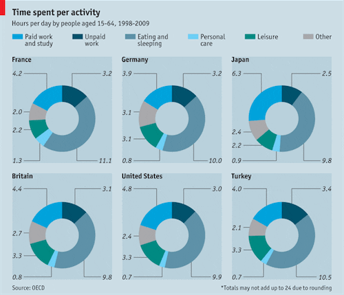
Matthew Yglesias shares this graph from the Economist:

I hate this graph. OK, sure, I don’t hate hate hate hate it: it’s not a 3-d exploding pie chart or anything. It’s not misleading, it’s just extremely difficult to read. Basically, you have to go back and forth between the colors and the labels and the countries and read it like a table. OK, so here’s the table:
Average Hours Per Day Spent in Each Activity

           Work,   Unpaid  Eating, Personal
Country    study    work  sleeping   care   Leisure  Other

France       4        3       11       1       2       2
Germany      4        3       10       1       3       3
Japan        6        2       10       1       2       2
Britain      4        3       10       1       3       3
USA          5        3       10       1       3       2
Turkey       4        3       11       1       3       2
Hmm, that didn’t work too well. Let’s try subtracting the average from each column (for these six countries, the average (unweighted by population) time spent are 4.6 hours on paid work and study, 3.1 hours on unpaid work, 10.2 hours eating and sleeping, etc.):
% Excess Hours Per Day Spent in Each Activity
(compared to avg over all countries)

           Work,   Unpaid  Eating, Personal
Country    study    work  sleeping   care   Leisure  Other

France     -10%       0%    +10%    +50%     -20%    -20%
Germany    -10%       0%      0%    -10%     +10%    +20%
Japan      +40%     -20%      0%      0%     -20%      0%
Britain      0%       0%      0%    -10%     +10%    +10%
USA          0%       0%      0%    -20%     +10%      0%
Turkey     -10%      10%      0%    -20%     +10%    -10%
OK, the Japanese spent more time at work and the French spend more time grooming. Beyond that, I don’t see these numbers as particularly “stereotype confirming” (in Yglesias’s words). But I’m not fully up on my pop culture. What is the stereotype about Turkish people? I have the impression that in Dashiell Hammett’s day they were called “Turks” and the detective was likely to be waylaid by one of them in a dark alley (this counts as “other activities,” I believe), but I’m sure there are some new stereotypes I’m not aware of. Blogging counts as “unpaid work,” right?
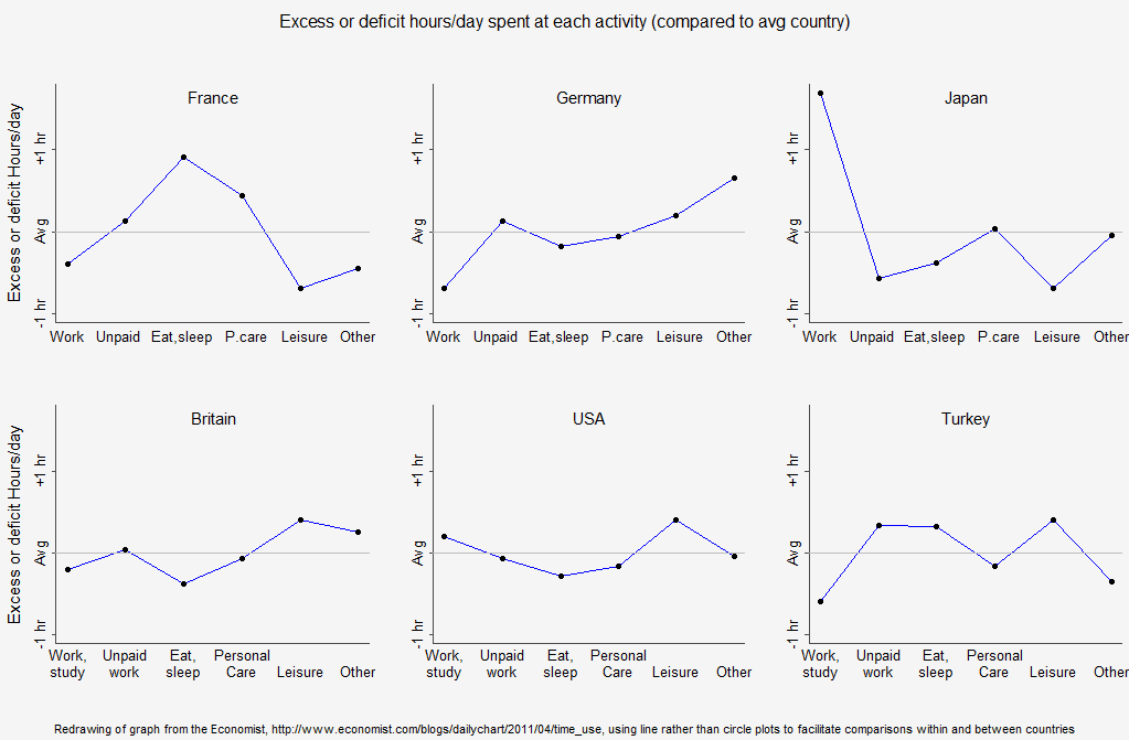
Anyway, my first thought was that the above ugly graph should be redone as a line plot, Here’s what I came up with after an hour of work (yeah, yeah, I must have a lot of real work to do if I’m willing to put in this level of procrastination. On the upside, I’m pretty high on the procrastination ladder if I spend an hour on an R script as a way of taking a break!):
Click to see the full-sized version.
I could’ve done this a little better–in particular, the text is hard to read–but it’s basically what I was envisioning. [See P.S. below for something better.] Also, I don’t really know what to make of the ordering of the countries or the ordering of the categories on the x-axis–I just copied what the Economist graph did.
Why do I like my display better? I like it because you can directly compare within a country–to see which activities are done more and which are done less, compared to the average. And you can also compare between countries to see where people spend more time on any particular activity. This between-country comparison would be clearer if we put all the lines on the same graph, but that looks a bit busy to me and I’m happier with the separate line plots. If you had data on a lot of countries I could see batching them (for example, the lines for northern European countries on one plot, the lines for Southern European countries on another, and other plots for English-speaking countries, east Asian countries, south Asian countries, Middle Eastern/North Africa, sub-Saharan Africa, and Latin America).
I can see where the Economist’s graphics designers were coming from with their plots. In any country, the categories add to 24 hours, and the circle plot enforces that constraint. (They could’ve made pie charts but everyone knows how bad that is.) But there are a lot of categories so they needed colors and a legend. And the circle arcs are hard to compare so they needed to put in the exact numbers. The result, though, doesn’t work for me. I mean, sure, maybe it was fine–Matthew Yglesias is more in the target audience of the Economist than I am, and he liked the graph–but I think it could’ve been much better. And I’m sure that if a graphics designer worked with me on it, the graph could be better still.
At some point this would represent a bit too much effort spent on one particular graph in a weekly newspaper. But if we have enough good examples of these, they could represent a template that could be used all over.
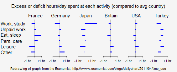
P.S. I was dissatisfied with my graph above because of lack of readability of the labels. So I spent another 45 minuteshour to make this:
Wow! All the information, it’s clear and readable, and I got it in under 600 x 250 resolution on a png. I like it.
P.P.S. Here’s the R code I used to make the graphs.
P.P.P.S. See here for yet another version.


That really is a great plot! Can you share what R package you used to create it?
Would you be willing to share your code for the second, improved, version? It's just non-standard enough that it's not quite obvious to me how you made that graph. I'm sure I could figure it out eventually, but in the interests of helping others with similar data…?
In your last graph, how about making the excesses and deficits in different colors? blue and red?
Thanks, it is a nice plot.
I like the quote "They could've made pie charts but everyone knows how bad that is." As if a donut chart is vastly superior to a pie chart!
If they were really trying to achieve the look of a 24-hour clock (which I doubt) they could have permuted the categories to make them more indicative of a typical day. Put the sleeping category from 23:00 to 07:00 (or whatever), then personal care, then paid work, then the other categories in the "evening."
I'm with jme here. Could you share de script? Or at least say the package and main commands?
thanks in advance anyway,
M
This kind of discussion should be part of the med school curriculum. Very instructive – on how a set of such simple data can yield or emphasize distinct messages, depending on the presentation.
You made the point really well. Love the last graph!
I have a few comments…
Your 2nd graph is great, but it takes away the ability to compare time spent between activities. You can't look at it and determine how much more time people spend working vs eating and sleeping, for instance. So, it's better for comparing the time spent on each activity across countries, but impossible for comparing the lengths of time spent between activities. You've lost information, even if you are improving the most interesting comparison. Yours might be the better display, but you should acknowledge that you've lost information in it.
And why on earth did your first attempt use line graphs? The activity categories are listed in an arbitrary order. I'm not sure the 1st attempt was much of an improvement. I guess that's why you felt compelled to create the 2nd one.
The last plot is very good.
The line plot is not very good, although it is way better than the original.
By the way, I suggest reserving line plots for cases in which both axes represent continuous variables. There's no logical reason for, say, "unpaid work" to be connected to "eat, sleep" but not to "leisure". I'm not fanatical about this principle, but if I find myself violating it I try to make sure I have a reason.
Thank you for the R code.
Just for the heck of it, I switched the roles of country and activity in your last plot to see what the graph looked like and to make it easier to compare countries within an activity. The Japan-Work/Study really sticks out in this graph.
This is fun. Thank you for the diversion (from work) this morning.
Perhaps you could have colored the positive bars green and negative bars red. May make it more readable.
Your final plot is really nice, congratulations!
1) Why did you present the rounded numbers in the first table?! That was a bit confusing.
2) Switching to percentage differences from averages is an interesting idea, but it may make people forget the scales of the different times. An initial parallel coordinate plot with common scaling gives an effective overview. Of course, it is not for presentation but it is nice for exploring the data interactively. Use the ipcp command in iplots. If you don't commonscale then you get a pcp which gives you the information you get from your plot, though again not for presentation purposes, just more quickly and more flexibly for exploratory purposes.
French have a deficit in Leisure and an excess in personal care?! Hard to believe!!!
While I appreciate the efforts to focus attention on country outliers, the final graph introduces a couple of new problems. First, you've reified the concept of an "average" country, without justification; this might not be problematic if these countries were selected at random from the universe of countries, but these six were deliberately selected for illustration. We don't know what a global average (whether weighted by country or population) would actually look like.
The reader also loses the ability to compare across activities. For me, it's not just that the French eat and sleep and extra hour per day that's interesting, it's the fact that the two activities take up nearly 12 hours out of every 24.
A parallel coordinate plot might give this overview, but then again it might prove just as difficult to read in its own way as the original. Bottom line, I think it's important to stress that there are always tradeoffs when presenting data, and no solution is without its costs.
Stewart:
1. There's definitely a limit to what can be conveyed in any single display. In this case, my graph could be supplemented with a 24-hour breakdown for the average country.
2. In general I agree with you that averages can be confusing. In this particular example I think the average is OK, because there's really not much variation from country to country. You can see this from the first table of numbers I presented above.
Fair points both. Thanks for the response, and for the R code, which is much appreciated.
Nice work! I'm sending my readers here. The Economist has a thing for donut charts, which are a cheeky version of pie charts.
Am I the only one who'd like to see the x axis reversed (- on the right, + on the left) in the last graph? I perfectly know this is against all logic, but still I don't know why my mind is suggesting me that it should be the other way around.
Aha… here's another view of the same data. The stereotypes are there if you want to see them.
(5 mins with the R TeachingDemos package)
This must be very subjective, but I fit in the category of people who find the original plot simply better than what you suggest. Nonetheless the object of your point is right, many complex-yet-neat graphs are hard to read.
Your final solution resembles Tufte "spark lines". I talked to Ed Tufte briefly at his presentation in Pittsburgh last year and he strongly urged I try them for my data (data intensive Software Engineering). I found a couple Excel packages that helped (sparks as either line or bar charts)
My only concern is this approach loses the scale. That is, a small difference can be exaggerated in importance. Huff describes this problem in "How to Lie with Statistics". It's not a problem if you know what you are doing and are being honest, but if I don't know the provenience, I might question the presentation.
Nonetheless, THANKS for that R code. I WILL use it.