
A colleague who specializes in the natural selection of bad science points us to this article from 2005, Competition and Innovation: An Inverted-U Relationship, by Philippe Aghion, Nick Bloom, Richard Blundell, Rachel Griffith, and Peter Howitt.
But the above graph (if you just look at the dots and ignore the curve!) does not look like an inverted-U or like anything non-monotonic. It looks like a flattening curve with diminishing returns.
What happened?
Here’s what it says in the article:
In Figure I we show the scatter of data points in between the tenth and ninetieth deciles of the citation-weighted patent distribution, and overlay a fitted exponential quadratic curve. The same exponential quadratic curve is plotted together with a spline approximation in Figure II. It can be seen that the exponential quadratic specification provides a very reasonable approximation to the nonparametric spline, and that they both show a clear inverted-U shape.
OK, so the problem is with this “exponential quadratic curve.” It’s not that the data show an inverted U, it’s that the inverted-U is being induced by the quadratic functional form.
I don’t have the data or code from this article, but I’m guessing that if you simulated data from an underlying model where E(y|x) is an increasing function of x but with declining rate of increase, that this quadratic fit could easily find an inverted U-shape.
We’ve seen this happen before, in a notorious paper by some psychologists that claimed that, in sports, “Top talent benefited performance only up to a point, after which the marginal benefit of talent decreased and turned negative”–but when you look at the data, there is no such negative turn. The reported negative turn, or inverted-U shape, arose entirely from (a) the data being consistent with diminishing but positive returns, and (b) the quadratic curve being too restrictive. Here was their fitted curve:
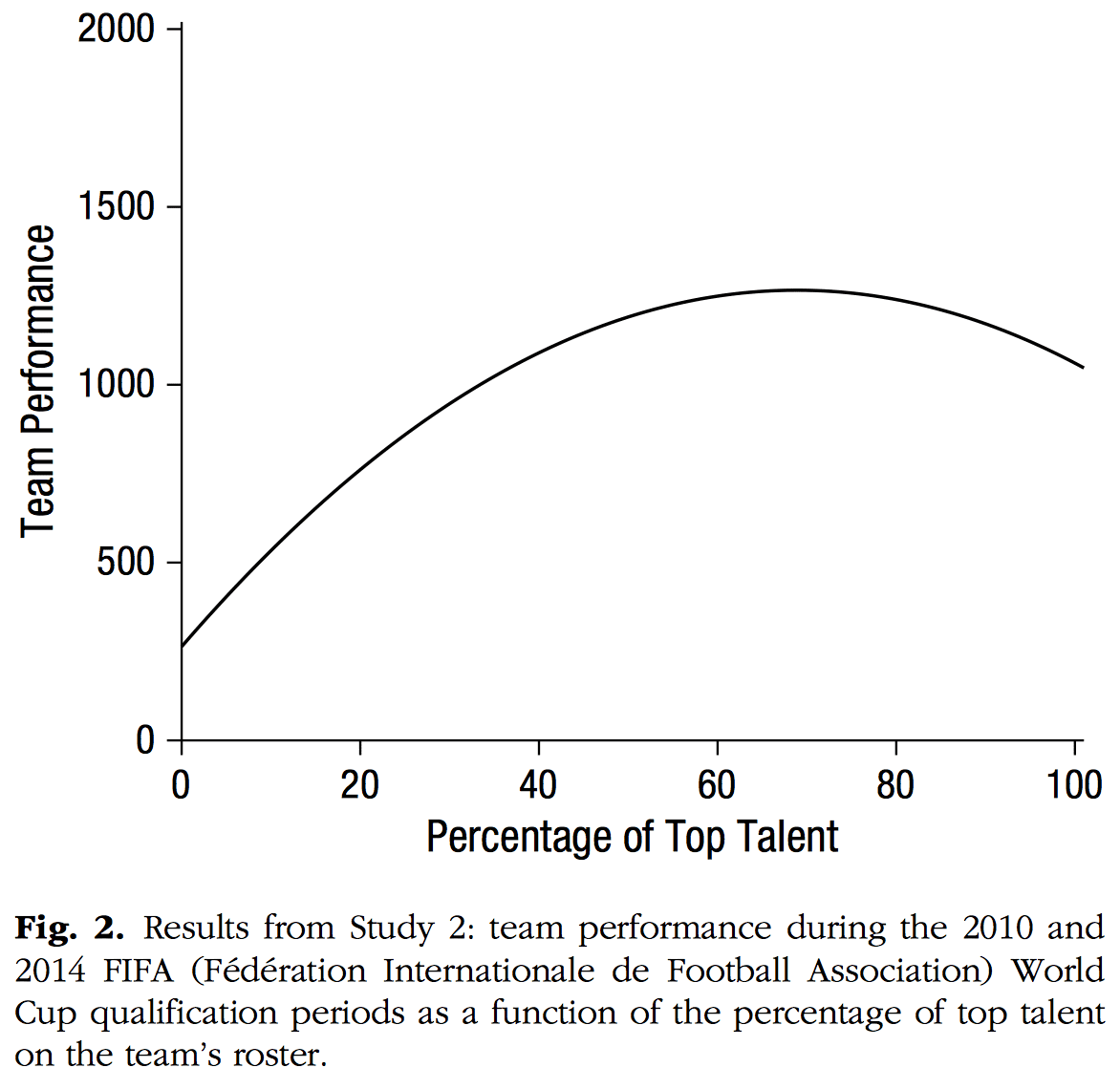
and here were their data (ignore all the lines on the graph and just look at the dots):
>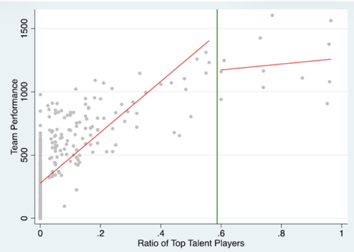
As with the econ paper under discussion today, if you fit a quadratic curve you get this inverted-U shape, but if you look at the data, all you see is a flattening of the slope.
Another issue that arises in both these examples is that the predictor has an upper bound at 1, which means that, even if the quadratic model is correct, you can have a negative curvature–that is, a negative coefficient on the quadratic term–without there being a decline in the curve in the range of the data. So looking at the estimate and significance of the coefficient on the quadratic term is not enough. In a practical sense this shouldn’t matter because you shouldn’t be routinely fitting quadratic curves–they have the well-known problem that the fitted curve can look like a U or inverted U even if the data pattern is monotonic–but if you do this, you can’t just look at the coefficient.
But let’s continue with the paper under discussion. Here’s their Figure II:

In the above-quoted paragraph, the authors accurately state that both curves show a clear inverted-U shape.
Fine. But what about the data? In particular, how is it that the nonparametric curve goes down so fast at the right of the graph? The curve goes all the way down to E(y|x) = 2.5 at the extreme value of x=1. But if you look at the data in Figure I, there’s this whole cluster of points at the upper right, and, at least based on these data, E(y|x) is around 8 or so in the region where x=1.
I can’t figure out what’s going on. My best guess is that the fitted quadratic-like curve is what you get after adjusting for other predictors not included in the graph–from Table I, these include year effects, industry effects, and some other predictors–but I’m not sure, and it still seems weird that they’re plotting a fitted curve that isn’t close to the empirical pattern of E(y|x) in the key region of the data where they’re reporting a decline.
One possibility is that the data in the upper right of Figure I “don’t count” in that they all belong to one or two industries that have high levels of competition and high levels of innovation, so that this patter is accounted for in the industry effects in the model. But, if that’s the case, I’m still concerned, because this sort of pattern between industries would still be relevant to the question of the correlations of competition and innovation. They write, “It is very likely that different industries will have observed levels of patenting activity that have no direct causal relationship with product market competition, but reflect other institutional features of the industry. Consequently, industry fixed effects are essential to remove any spurious correlation or ‘endogeneity’ of this type.” And I kind of get this, but to the extent that industries with lower profit margins have more patents, that could be relevant too. At the very least, I’d like to see this in the data. Once they subtract industry effects, they’re getting leverage from changes over time within industries, and these could just represent parallel time trends, no? In some sense this is addressed by their instrumental variables analysis described on pages 708-710, but in any case I still have concerns about their claimed inverted-U.
Again, it’s just crazy that their fitted curve doesn’t even go through the data. This is a self-defeating graph on the order of the notorious air pollution in China regression. Again, I haven’t seen the data and there could well be some way around this problem, but, if so, the authors should at least address the problem and explain why they believe this inverted-U pattern to be true in some underlying sense, even though it does not appear in the data.
“Inverted-U” is in the title of the paper!
And then the article has a long section, “Explaining the Inverted U.” So they’re really invested in the idea. For example:

But . . . what if you’re explaining something that isn’t really happening! Again, see Figure I.
So don’t know what to think.
From these graphs, it looks like their pattern is an artifact of including a quadratic (rather than, say, a saturation function such as y = a*(1 – exp(-bx))), in their model, and, as noted above I’ve seen acclaimed researchers do this sort of thing before. Also the statistical analysis includes questionable confirmatory statements such as “Again, we find an inverted-U shape, although due to a substantially smaller sample, the coefficients are not statistically significant.” Also I’ve seen problems with others’ analysis of patents; see for example here and here. Data from patents can be tricky to analyze.
In addition to my concern about using patents as a proxy for innovation, I don’t know what to think about using 1 – profit margin as a proxy for competition (see pages 704-705 of the paper), both when comparing across industries and over time. At the very least, I’d prefer if they’d talk about “patents” and “profit margin” rather than “innovation” and “competition” throughout. That’s just a change in words but I think it would make the issues a lot clearer.
There are also some other data issues, like what industries they are considering, and why they’re doing analysis at the industry rather than firm level, and selection (“Our sample includes all firms with names beginning “A” to “L” plus all large R&D firms. After removing firms involved in large mergers or acquisitions and those with missing data . . .”), and the question of whether it even makes sense to try to predict number of patents (or even “innovation”) from the average profit margin (or level of “competition”) in the same year, rather than considering some sort of lag. They kind of address that last question with a robustness check, but the trouble is that I don’t believe that either, given that their only evidence is statistical significance of a quadratic term in a curve that doesn’t seem to fit the data. Also it’s not clear to me why the lagged model should be the robustness check and not the main analysis.
On the other hand, I haven’t looked into this particular case in detail so maybe it all makes sense if you look at it carefully enough.
One more thing is that I think they’re saying they’re using Poisson regression, but their data are weighted counts which aren’t integers? Also it’s well known that Poisson regression will understate uncertainty. Negative binomial regression is just about always better (see chapter 15 of Regression and Other Stories) or else you can use some sort of robust standard errors or whatever. But straight-up Poisson regression will generally give you standard errors that are too small–often much too small.
The big picture, as I see it, is that this paper has some theoretical results and some empirical results. The theory alone could be interesting but wouldn’t count for much without the empirics. The empirical results are iffy–at best, there are some patterns there and the authors just didn’t fully display their data and explain their model, but I’m doubtful. It’s possible that future, more careful, analysis found similar results–or not! It looks to me like the authors followed a standard practice in social science research of finding a statistically significant coefficient estimate and taking this as evidence in favor of a particular theory. But there are enough gaps between data and theory, gaps that include the functional form of the model, the method used to average over industries and years, and the variables being measured, that I don’t see it. As I said, this is standard practice in social science, and we wouldn’t really be looking this a paper from 2005 had two of its authors not been in the news “for having explained innovation-driven economic growth.”
P.S. My colleague sent me this paper because two of its authors recently won the Nobel prize in economics. This would not be the first time that economics Nobel prize winners made mistakes in interpreting data analysis in high-profile studies. Two cases we’ve discussed in the past are:
Did blind orchestra auditions really benefit women?
How does a Nobel-prize-winning economist become a victim of bog-standard selection bias?
It happens!
Of course, even if the paper, “Competition and Innovation: An Inverted-U Relationship,” is absolutely terrible and even if there is no such inverted-U relationship, that does not mean that the corpus of work by Philippe Aghion, Nick Bloom, Richard Blundell, Rachel Griffith, and Peter Howitt is valueless, or that they don’t deserve a major prize. And similarly for the authors of the two papers discussed in the links immediately above. Everybody makes mistakes. I’ve felt the need to issue corrections to four of my published papers, and I don’t think that all, or even much, of my work is bad.
So don’t take this post as a criticism of this Nobel prize. Rather, we can take it as a plus. When research gets public attention, people will go back and read the original papers, and this leads to post-publication review, as in this post. This is a good thing!
P.P.S. At this point, you may well be saying that I’m just being picky, this is how people did empirical work 20 years ago, why am I being mean to these authors, I’m a hater, tall poppy syndrome, every paper has flaws and assumptions, etc etc etc. So, to keep it simple, let me just say this: I don’t believe their story is supported by the evidence of that paper from 2005. I disagree with their claim that “We find strong evidence of an inverted-U relationship using panel data.” I just don’t see it. It might that their theory is correct, and it might be that further data analysis supplies strong empirical support; I don’t know. I’m not making a statement about reality here; I’m making a statement about evidence. Which I think is a reasonable thing to look at, given that this is what the editors of the Quarterly Journal of Economics had in their hands when they had to decide whether they wanted to publish this claim of strong evidence. Again, this is an issue with lots of empirical work, and I’m not saying this paper was worse than the accepted standard at that time, or even now.
P.P.P.S. See here for my reanalysis.
Statistics textbooks sometimes say: use of linear regression requires an “assumption” that the relationship is linear. But assuming it isn’t the right step; instead, linearity should be checked before imposing a linear fit. The same is true for any other functional form, including “u-shapes” (or inverted u-shapes). Happiness scholars the world over typically use a quadratic specification for age, on the assumption that the relationship is u-shaped. It mostly isn’t; a non-parametric fit shows that in many countries happiness mostly declines over the life-course. But the quadratic coefficients are often statistically significant (especially when the model includes “bad controls”), and too many researchers use statistical significance as a way of determining that their results are “right”, when in fact p<0.05 only tells them that they are using a large sample. Recent article-length version of these arguments: https://link.springer.com/article/10.1007/s10902-024-00728-9/. I'm not surprised that Aghion et al. were getting this wrong in 2005; many people do even today.
> linearity should be checked before imposing a linear fit
How?
With non-parametric methods, e.g. LOESS curves and/or kernel regression. LOESS curves will give you an unadjusted/bivariate pattern (so see Andrew’s post below).
I always have problems with such 2 dimensional graphs, given that the world is multivariate. Now, if these points are residuals from a model where other factors have been included, then it reflects more than 2 dimensions – but it still doesn’t look like a good fit. Andrew questions the quadratic form, but I don’t think a leveling off is much better. While diminishing returns is a common feature, the data suggests there is more going on. Any fit is noisy and suggests that there are either missing important factors or that there is little to be said from this data.
I’ve noticed similar 2 dimensional graphs in The Economist magazine pretty often, usually with the points representing different countries. But given the myriad differences between countries, a noisy two dimensional plot strikes me as quite unconvincing.
Dale:
One way to handle this issue is to plot adjusted data vs. the predictor.
In this case, they’re plotting y vs. x, and they’re fitting a model that looks something like, E(y_i) = exp(a*x_i + b*x_i^2 + c*W_i), where a*x_i + b*x_i^2 is the quadratic curve (they’re estimating b to be negative), W is the matrix of other predictors in the model (industry indicators, year indicators, etc.), and c is the vector of coefficients for those predictors.
So here I might suggest plotting y^adj vs x, where y^adj_i = y_i/exp(c_hat*W_i). That is, plot the data after being adjusted for all the other predictors, and then the relationship with x should be more clear.
I’ve done this in some applications, for example in figures 4 and 6 of our paper on the effect of redistricting.
I agree. What is the point of making adjustments and then plotting only the unadjusted data? How is a reader supposed to make any sense out of that? I think both graphs would be appropriate.
Yup. Indeed in that above-linked 1994 paper we plot both the raw and the adjusted data!
The first figure shows data that looks nothing like the curve they drew over it. Instead they should simulate data from their model and compare predicted vs actual. Of course, if its this curve +/- rnorm we will see the model has essentially no predictive skill.
But, did they check p < 0.05 to reject the horizontal line first? I bet that is what is driving this entire process.
I wish economists would study stuff like the ongoing .999 100 oz silver bar shortage at LBMA. How tarrifs in the US and whatever policies in China are impeding arbitrage by shipping bars from NY and Shanghai.
How the public is selling their silver at these all tine high prices but that is actually not helping because the coins, etc require refining into the specified format. So the refiners have a glut of silver and have even stopped buying 90% silver, and now many coin stores stopped buying it too. Despite the ATH spot prices.
It would be fascinating stuff to study instead.
I often show students this blog post which highlights the absurdity of over-interpreting polynomial regressions: https://datacolada.org/27.
Bradford:
Yes, I link to one of the examples from there, the soccer teams example discussed in the above post.
Thanks for your reply. The Data Colada post also shows an alternative test of the Aghion et al inverted-U at the end – they believe that the pattern does reverse according to their spline-type analysis. Anyway, I just really like the funny demonstration that quadratics “prove” that 27-year-olds are shrinking and the 5th percentile of income earns more than the median.
Bradford:
Interesting, but I still don’t believe it given all the data issues!
Also, the dots in that linked plot are not the same as the dots in Figure I above.
Quote from the blog post: “So don’t take this post as a criticism of this Nobel prize. Rather, we can take it as a plus. When research gets public attention, people will go back and read the original papers, and this leads to post-publication review, as in this post. This is a good thing!”
I am not a fan of awards in science. I have mentioned this a few times here in posts concerning scientific awards, and don’t really wanted to quote some stuff I wrote somewhere again to try and make this point BUT it in turn allows me to better (attempt to) make some jokes using wordplay. I enjoy that a lot, so here it goes. This is what I wrote somewhere concerning scientific awards (in this case specifically in psychological science because that’s what I know of, and write about, most):
“Psychological scientists build on each other’s work, and should be reminded of that every time they read or cite something that has been written by someone else. This view of building on previous work by others is perhaps best captured by the metaphor of dwarfs standing on the shoulders of giants, and Isaac Newton who wrote: “If I have seen further it is by standing on ye sholders of giants” (Newton, 1675/1676). Concerning Psychological Science and individual awards: perhaps standing on the shoulders of a giant does not necessarily imply the dwarf has been looking in the right direction; perhaps the giant later turns out to be a dwarf, or the dwarf later turns out to be a giant; and perhaps there are many giants, and many dwarfs, who are standing on each other’s shoulders. If any of these things are possible and/or probable, it shouldn’t be about which giant, or which dwarf, is on top at a certain point in time. It should be about what can be, and has been, seen.”
Which in light of the blogpost and the quote from it depicted above makes it possible to better make the following wordplay jokes:
“If I have seen further it is by standing on a possibly contrived inverted U-shaped curve”
Or in light of the post-publication review coming up with new insights or corrections:
“If I have seen further it is by standing on the shoulders of Nobel Prize recipients who may have been unjustly awarded”
Long ago I discovered that there’s a foreground/background reversal possibility in fitting a function. You can regard the function as foreground (the result) and the dispersion of the data around it as “error”, or you can use the function to better identify the deviations of individual data points — like why is this industry different from what looks like the trend in most of the others. Of course, even that reversal depends on the approximate appropriateness of the functional form, but it might be that the case identification in a “wrong” form like the above might still be useful. The context for discovering this was a regression attempt to understand the relationship between strike activity and subsequent restructuring in a sample of industries (yes, n was too low, but it was just a term paper!), but what I really found was that some industries were interesting outliers for idiosyncratic reasons, and I wouldn’t have learned this without doing the study.
It is not necessary for the data to be noisy, nor insufficiently numerous, (conditions mentioned on the website linked by Bradford Tuckfield) to get a misleading inverted-U shape by fitting a quadratic. If you create a data set with x = 1, 2, …, 100, and y = log(x) and fit a quadratic regression of y on x, you will get a p-value < 0.0005 for the quadratic term. Moreover, the vertex of the fitted parabola will be at approximately x = 82.5–comfortably within the range of the data. And with R2 = 0.93, you don't get a warning that the model fits badly just from perusing output statistics. You need to graph the data to see that the "inverted-U" relationship is simply the result of forcing a quadratic upon data that clearly are something different.
For those who use Stata, you can run this all of quickly:
clear*
set obs 100
gen x = _n
gen y = log(x)
regress y c.x##c.x
predict yhat
graph twoway scatter y x || line yhat x
Something similar drives the results in the Ashraf/Galor “Out of Africa” paper. They use OLS with a quadratic to find a U-shaped relations between genetic diversity and development. But the quadratic relationship is not in the data; with OLS, add higher-order terms, and the quadratic term goes to zero. Non-parametric regressions show something even more complicated.
Alfred:
Oh, yeah, that paper is horrible! We discussed it a few years ago. See also here.
On the plus side, they didn’t receive a Nobel prize.
The biggest problem with this work goes back to before there was even any data or fit… to the assumptions underlying the idea that number of patents per year is a measure of “innovation”.
First off, lots of people who read patents know that there is no innovation in many of them. I worked a bit on some software issues with a UK lawyer whose whole job was to invalidate patents by filing counterclaims… he was broadly quite successful, and indeed filed a commentary on a patent claim potentially against software that we were developing in a public forum online when he found out someone had filed such a patent.
The purpose of patents is largely strategic maneuvering between elites in an economy where getting the government to punish your competitors and enhance your profit is the key to success.
Of course, some patents are really “making patent” an idea no-one had previously. But I suspect that this is practically speaking a negligible fraction of real world patents.
For your amusement, you can go try looking up patents on “burrito on a stick” or peruse some of these examples: https://www.freepatentsonline.com/crazy.html
The very first example is Halliburton attempting to patent the business model of patent trolling. Somewhere down the page someone tried to patent playing with a cat using a laser pointer.
At my university, a bunch of people are researching innovation. When talking about the shortcomings of patents as a measure of innovation, they would listen patiently and then ask, ‘Have you got any better ideas?’ Finding a good measure of innovation is very tricky. I can think of many worse ‘measures’ for innovation than patents. Therefore, until I hear of a better one, I will accept patents as the best overall measure of innovation*.
*Specific fields may have their own indicators that are more suitable than patents.
Practically speaking virtually anything you can think of is probably more related to innovation than patent filings. As anoneuoid said, patent filings primarily tell you about rent seeking behavior and support for it.
Think of the innovation in open source / free software. It went from some niche ideas in 1991 by some SciFi subculture nerds to fundamentally responsible for the entire computer technology, logistics, retail and entertainment industry’s operations… Without essentially ANY patents.
In the science realm, Think of specialty FORTRAN compilers in 1990 produced by Intel with specialty licenses, and Wolfram Mathematica software and the Itanium patents and all that, compared to AMD64 instruction set, the Python, Julia, R, Stan, Jax, TensorFlow, Jupyter ecosystem, Raspberry Pi, RISC V, Arduino ecosystem today.
Essentially ALL the economic and scientific value from innovation in the last 35 years has come explicitly from non-patent developments. Globally if you put a patent on the Linux kernel ALONE, and started charging 1990s UNIX rents on it you’d have a collapse that makes the Great Depression look like a walk in the park. You’d probably shut down all shipping, all manufacturing, all movie production, all of the music industry, all online sales, etc. Even fields that dont use it directly rely on other industries that do.
@Daniel Lakeland:
You will not get an argument from me that many major software developments are open-source or based on open-source work. While this is an important aspect, it is not the only form of innovation. Consider developments in engineering, medicine and pharmacology, to name but a few. Even if we were to develop a reliable indicator of IT innovation, there is so much more to innovation than software. All I am trying to say is that innovation is a fuzzy concept which is very difficult to measure. I am open to other measures of innovation! So far, however, I have only heard arguments as to why patents are a bad measure (they are!), but not what should replace them.
Yes, other areas of innovation exist. Glued laminated lumber, and other forms of engineered lumber, reduced volatile organic compound paints and wood stains, vaccines, drugs, etc. Some other innovations are cheating on your diesel emissions tests, that one made literally hundreds of billions of dollars over 2 decades for auto makers. There are also all sorts of innovations in crypto-currency scams and click farming and phishing scams. Apparently chinese hackers made over $1B last year just sending text messages to people threatening them about bills from the NY department of transportation or whatever.
https://yro.slashdot.org/story/25/10/16/1934236/chinese-criminals-made-more-than-1-billion-from-those-annoying-texts
Then there’s drug companies that get patents by taking two OTC meds and combining them into a single pill and then patenting *the combo*…
Patents aren’t just a “not very good” measure of innovation, they may well be STRONGLY correlated *against* innovation in many industries. You are likely measuring “degree of consolidation” and “anticompetitive behavior” by measuring patent counts, unless you consider those “innovation” then using patent counts is potentially strongly misleading.
I came across a researcher at Federal Reserve Bank of St Louis – Kalyani – recently who has a preprint of a paper looking not just at patents, but at ‘creative’ patents based on a simple text-based measure of creativity. I’d be interested if this kind of approach seems any good to you or Lakeland:
The Creativity Decline: Evidence from US Patentd
Kalyani 2024
@Jamie:
I had a look at the introduction section of the paper. Kalyani (2024) proposes a method of assessing the quality of patents. First, patent texts are cleaned using traditional NLP methods (e.g. removing commonly used English words), and then split into combinations of one, two, and three words. The similarity is then compared. More similarly worded patents are considered less creative/more derivative. While I am somewhat sceptical about this kind of approach, I have no strong opinion on it.
I do see a risk that this approach might depend on factors unrelated to patents. Imagine the following scenario: Company Y develops a product for which person A writes the patent application. The company develops a new product and someone has to write the next patent application. If Person A writes the application too, it might sound more similar to the initial patent than if Person B had written the application for the same product. I believe that the ‘personal footprint’ in how we use language would be a relevant factor that this approach cannot account for. Perhaps someone with more experience of this kind of NLP would like to weigh in.
I would like to add that this approach is intended as a quality indicator, not as a substitute for research using patents. It may address some of the noise obscuring the innovation signal, but in my view, it does not fully remedy these issues.
Raphael:
You write, “until I hear of a better one, I will accept patents as the best overall measure of innovation.”
This can make sense in some settings: comparing industries with low and high levels of technological innovation, it makes sense to expect that the industries with more innovations would be issuing more patents.
But the paper at hand is not just using patents to measure innovation; it is using changes in number of patents over time to measure changes in levels of innovation, and this is all being passed through a brittle model yielding a curve with a barely perceptible inverse U shape which is then driving all the theory and conclusions. At that point, I think that problems with the measure become very important.
@Andrew:
I agree that there are issues with Aghion et al.’s approach. The setup does not allow for strong causal statements. As your blog post points out, there are also issues with the empirical approach, such as the use of a quadratic polynomial. My point was solely aimed at patents. Despite their flaws, the data are officially logged, publicly available and allow international and inter-industry comparisons to a degree. They come with standardised metrics (e.g. filings include the specific sector in which the company operates). They cite literature and are citable themselves, allowing for further analysis. There is surely a cottage industry of alternative indicators that are better in one way or another and that do not have the weaknesses of patents, which have been set out well in the commentary section; however, it is not the ‘patents’ aspect that is the primary reason for my lack of trust in the results of this study.
The way you describe the paper is consistent with the way the authors do in the abstract. But skimming through it, I have to think that in actuality the theory must have come first, and is what motivates the empirical portion. Econ articles typically sit somewhere on the Empirical/Theoretical continuum, but to be published in the top journals you typically need at least a bit of both. As a result you end up with a mix of papers, some which lean heavily into the Empirical portion but still include some basic model, and others that lean heavily into the Theoretical portion but include some basic regressions. This paper has more empirical content than a typical theory paper, but to me it still reads as primarily being a theory paper.
I agree that the more you think about this the more weird and problematic it seems. Though we should note that in this paper they’re using citation-weighted patents, do include industry fixed effects in their regression specification, and they do cite other work to support these choices.
Sometimes I imagine a group at NASA discussing a plan to send a probe to planet Z. The nerds say their best guess of distance to Z is 6 AU. But they say this is not a lot more than a guess; the probe could have either enough fuel to go half-way or enough to make a round trip. Person A says, OK, let’s not do this until we have a much better idea. We do not want to make expensive decisions on the basis of guesses. Person B says, no, until you can show me something better, the distance to Z is 6 AU.
I think NASA has done well by ignoring Person B.
@Alfred:
I agree with the conclusion of your analogy. However, in your example, human lives and hundreds of millions of dollars are at stake. These stakes are very different from ‘Let us publish a paper on a relevant topic with an imperfect variable because we do not have anything better’. (I would like to re-emphasise that I am not defending the methodology of the paper in question, but the general idea of using patents for innovation research.)
I’ve known a few people who racket up double and triple digit patent counts.
They were average people and in no sense ‘inventors’. The last one I met had no technical skills in any field. Nor were they wealthy or had any notable career success. They were run of the mill corperate “I know how to use microsoft office” drones.
What they did have was the luck to stumble into a situation were patents could be gamed endlessly, and a corporate support network to facilitate it.
Both of these expanded considerably once major businesses realized they needed defensive patents that could be used as bargaining chips against other corporate patent trolls.
So I have no trouble believing patent counts are mostly correlated with the existence of that patent-gaming culture.
“The purpose of patents is largely strategic maneuvering between elites in an economy where getting the government to punish your competitors and enhance your profit is the key to success.”
Daniel, you should read Noam Chomsky’s work. e.g. The Essential Chomsky. He develops the more general idea that the government protects large corporations and large concentrations of wealth instead of the average person in great depth.
https://www.nobelprize.org/prizes/economic-sciences/2025/advanced-information/
It appears that first figure from the OP is actually used to support the Nobel prize?
I assumed it had been not retracted, but at least kind of ignored/minimized as a silly claim. How do we reconcile this with the prestige/credibility our society has bestowed?
Anon:
Oh, that’s bad.
Economics is a pseudoscience.
Anon:
As a political scientist, I’m not bothered by that at all!
Quote from above: “It appears that first figure from the OP is actually used to support the Nobel prize?
I assumed it had been not retracted, but at least kind of ignored/minimized as a silly claim. How do we reconcile this with the prestige/credibility our society has bestowed?”
Perhaps by becoming a bit more critical of things, by thinking a bit more about things, by realizing that some people might not view a Nobel Prize in the same way other people do, by pondering about the possible existance of curtains and the possibility of peeking behind them, and via poetry and/or creative writing of course!
Here’s something I wrote in the comment section of the blog post posted october 9th, 2025:
Maybe it doesn’t matter if their research might be weak
As long as they are, or presented something, sleek
Getting their Nobel Prize might even turn into a “winning streak”
And give them even more attention, or money to go and speak
At least, when the audience still pays attention and is meek
They tell the audience to just clap, and to not ponder and seek
Just be amazed, and don’t look for the curtain to take a peek
Because when you do, you might see a leak
You might hear something creak, or notice the squeak
Did they truly stand on the shoulder of a giant, and provided a peak
Or can one simply have one’s feet on the ground and spot something bleak
Maybe if they would truly have seen further, they would not dress up chic
To go and accept an award and think and/or imply they are playing in the same league
I would start by re-expressing y. The marginal distribution of y is clearly skewed high.
I’ll bet log(y) vs x is nearly linear and homoskedastic.
(And that technology certainly existed at the time of this work.)
Paul:
I agree regarding log scale. But if the data have a bunch of zeros, then it can be simpler to just use negative binomial regression (or, if that tool is unavailable to a researcher, to use Poisson regression and then adjust the standard errors appropriately). As I wrote above, I don’t fully understand what’s going on here because they say they’re using Poisson regression but they also seem to be saying that the data are averages of weighted counts, not raw counts.
In any case, as discussed above, I think that measurement issues (using profit margin to as a proxy for competition and using patents as a proxy for innovation),along with the fragility of the finding, which is based on changes in these numbers over time, makes it hard for me to trust any of the conclusions.
To Raphael K:
The problem with this view is the way academia works. There are two issues. (1) The first person to publish using the flawed measure says it is flawed and suggests caution. The 2nd does the same. The 3rd-10th drop the caveats. And 11 to the end of time say this is “the standard measure” or something like that. You might even see claims that it is “unparalleled” which is true but misleading. (2) Getting better measures is hard work and often takes a lot of time. Why would anyone bother to do better if you can publish using guesses? A while back Andrew linked to a paper that points out that most historical population estimates are made-up. Yet people use them and say they are “the best available” I think there is a reason they are the best available; nobody cares to do the work needed to improve them.
Alfred:
One of the worst examples I can remember is a series of papers that defined the dates of peak fertility as days 6-14 of the menstrual period. Standard guidelines is days 10-17, with the warning that they can vary a lot so these are only guidelines. But somehow it entered some bit of the social psychology literature that it was days 6-14 (for example here, and that perpetuated itself. It just became what they all did. A quick google could’ve pointed them in the right direction, but they were less interested in getting it right and more interested in following the crowd in their subfield. Or, to put it more carefully, they were effectively defining “getting it right” as “following the crowd in their subfield.”
This is the paper on population. The last few pages are pretty funny; the author quotes the way people say silly things to justify using made-up data
Guinnane TW. We Do Not Know the Population of Every Country in the World for the Past Two Thousand Years. The Journal of Economic History. 2023;83(3):912-938. doi:10.1017/S0022050723000293
This thesis, supervised by Prof. Jeremy Fox,
https://ucalgary.scholaris.ca/server/api/core/bitstreams/ed420af9-4275-4bf9-acc3-7f555c651389/content
deals with an ecological hypothesis proposing that the relationship between disturbance and diversity is U-shaped, and consequently, much of it is devoted to examining false detections of U-shapes caused by issues related to quadratic regression.
«The reported negative turn, or inverted-U shape, arose entirely from (a) the data being consistent with diminishing but positive returns, and (b) the quadratic curve being too restrictive.»
Some time ago I was reading very happily the Schaum book on Numerical Analysis (which is extraordinarily good) and each chapter summarized a topic before introducing sample exercises.
One of the point made very prominently in the chapter on interpolation was that since a polynomial of order N can have at most N-1 turning points perfect interpolation of N points means that the head and tail of the interpolated curve necessarily go to infinity and therefore extrapolation is absurd. The problem persists with imperfect interpolation of using a polynomial of order N over less than N points and also of course for a polynomial of order N over more than N points, where it becomes arguably even more serious and affects not just extrapolation but interpolation too. In the case of a quadratic curve of course both ends must go to infinity in the non-degenerate case. The chapter also pointed out that since many functions have a good approximation with a truncated Taylor series expansion which is of course a polynomial then to some extent they have the same issue.
The book also made a secondary point that I have seen rarely made: that Chebyshev polynomial interpolation is often a good idea as used in the apposite cases it suffers less from such issues.
«The reported negative turn, or inverted-U shape, arose entirely from (a) the data being consistent with diminishing but positive returns, and (b) the quadratic curve being too restrictive.»
Ah “esprit de l’escalier”! Put another way “degrees of freedom” is we all know a very important topic in modeling and not just statistical (whether stochastic or arithmetic) modeling.