Hanno Böck writes:
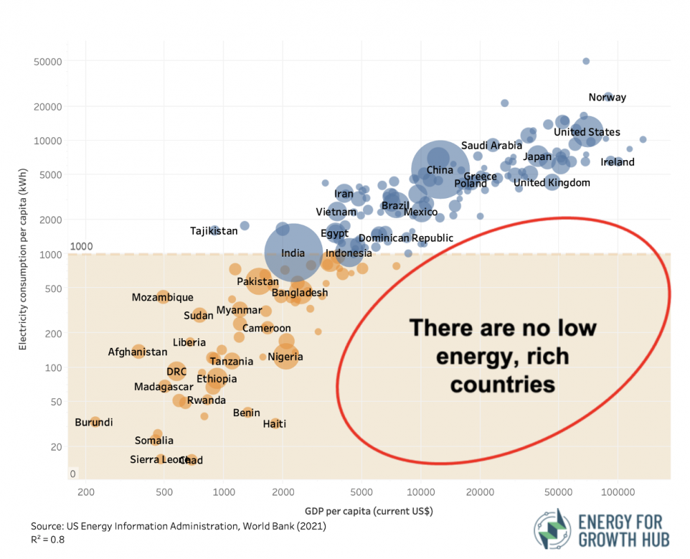
I recently saw a graphic coming from here posted multiple times on social media that I found quite misleading in its data representation.
There exist some variations of it, but they all share the same problem.
The most notable issue is that the graphic uses logarithmic scales on both axes. This has the effect of squeezing everything together on the upper right end and visually creates a much stronger correlation than there actually is.
Another thing to note, and this is where I’d be curious what you think about it, is that it gives an R^2 value of 0.8 at the bottom. First of all, R^2 is, as far as I can tell, not something that can be easily and intuitively understood (it seems a simple r coefficient would be more appropriate). But that’s not the main problem. The value is, as far as I can tell, simply wrong.
When I try to calculate R^2 for that data, I get 0.43. It appears that what was done here was to calculate the R^2 value over the log values of the input data. (If I do that, I get 0.81.)
In case you want to play with the data, here’s some quick python I wrote to create similar graphs with a non-log scale, and the relevant data sources from the world bank and EIA.
My reply:
I don’t think the logarithmic scale is a problem, and it’s fine to compute the R-squared of log-scaled data. In any case, the scatterplot tells the story; I don’t thin R-squared adds anything here.
I clicked through to the source, and the real problem seems to be their title, “How does energy impact economic growth.” The data they show are cross-sectional with no such causal implication.
Bock responded:
I’m surprised that you don’t see a problem in the log scale. I believe this is the main issue with this graph. (As a rule of thumb, I’d say log scales should rarely be used in public communication at all, as they are not easy to understand intuitively. If they are used, there needs to be a good explanation, which I don’t see here.)
To maybe illustrate this more clearly, I have attached linear and log-scaled versions of the data. To me, they tell a different story. The log version implies that there is a general, strong correlation between electricity consumption and per capita gdp. But the actual data tells me that the correlation is only present below a certain threshold, and above that, we have extreme differences of energy use in countries with very similar gdp levels. (E.g. quite rich countries like Denmark/Switzerland with a very low electricity use.)
Regarding your point about causal inference, that’s probably a valid point as well, but not really what I’m trying to get at here. The reason is that I don’t think that blog post got a lot of attention, but the graphic is shared very widely.


Böck posted a longer discussion here. Setting aside the above-discussed issues with the log scale and R-squared, the rest of his post has interesting economics content.
Lots of scientific rules are in the form of scaling rules : Y=aX{power b}. And its typical to use log/log plots to estimate b, the exponent, which then becomes the slope. These slopes sometimes have real meaning. Scaling rules are everywhere: see, for example, the metabolic theory of ecology, or Geoff West’s work on how various ‘human-interactions’ scale with city size. You can Google both.
A good entre to the scaling rules for city size is here:
https://scholar.google.com/citations?hl=en&user=Cr-_ezcAAAAJ
+1. Once you’ve seen the elegance in some of those derivations, you can’t unsee the scaling principles and power laws everywhere :)
What Böck gets wrong is laying out a hard rule against log graphs. Just because log graphs CAN be misleading doesn’t mean they HAVE to be. I think the biggest issue that one needs to consider (and then explain) is what the expected form of the relationship is (hence Andrew’s – in my view, correct – statement that it’s okay). As Böck rightly points out, the relationship between energy consumption per capita and GDP per capita is less-well characterized as a linear relationship of the raw values, and it is indeed better characterized a linear relationship of the log values (an elasticity of electricity consumption as a function of average income). Moss & Kincer take the other angle to explore the relationship between electricity abundance (*proxied* by consumption) and GDP (then why put energy on the Y axis?!). You can take issue with the direction of implied causality (and even the implication of causality at all), but that’s not a log issue. Even if you take the elasticity of energy consumption approach, Böck still has the point that this result should not be used as argument against energy efficiency (or reducing the energy intensity of GDP), but again that’s not a graph problem. In fact, everyone is aligned: we need better energy productivity – more efficient generation means more energy per input, and at a given input level, that means more energy – and we’ll be richer, whether by income, sustainability, or both, hooray!
One thing that is perhaps quite interesting and *is* related to the log graph is the identification of informative outliers. On the raw graph, high income countries as a whole look exceptional – delivering high incomes without very high per capita energy consumption. Switzerland and Denmark look especially good. But these two countries are “low” in their income tier, but not “low” overall, which is hard to see in the raw graph. Similarly, high income countries consume WAY more energy per capita than low income countries, but that is obscured in the raw graph (partly a kWh vs. MWh scaling issue). Again, this comes down to identifying the correct functional form.
Yes, I am curious about how Böck apparent dislike of logs squares with Andrew’s apparent (usual) preference for logs: https://statmodeling.stat.columbia.edu/2019/08/21/you-should-usually-log-transform-your-positive-data/
Will:
Yeah, I like logs, both for economy in display and because real-world patterns are typically multiplicative. In any case, there’s nothing stopping anyone from displaying data in multiple formats.
Böck seems far off here. The claim in the original image is that there are no “low energy, rich countries”, this is equally true in his linear plot even though the physical space on the bottom right of the plot is smaller. If you are interested in using a linear scale, wouldn’t it be more appropriate to limit the y-axis to something more reasonable rather than stretch it so far just to incorporate Iceland?
I also don’t see why a statement like “the correlation is only present below a certain threshold” is appropriate here. I agree with him (though this is also apparent in the log-scale chart), but the population of interest is all countries, not countries below a certain threshold. To be honest I can barely find Sweden/Denmark in his linear-scale chart, and the only thing that comes to my mind is “what’s going on in Iceland”
Answering only the last question–Iceland has a very large industrial sector that uses lots of electricity (e.g., aluminum smelting), in part because of it’s abundant hydro and geothermal energy (which are both very cheap, and generally very reliable).
Others have already said that it’s weird to somehow think of logs as illegitimate. I agree with that. Here’s some other issues though:
1) energy use is very obviously causal for GDP. It takes energy to do things! So let’s put energy use on the x axis for interpretability.
2) log-log plots are useful for power law relationships. If y = x^a then log(y) = a log(x) and the graph becomes linear. Fine
3) The graph is very obviously nonlinear. As long energy use increases log GDP increases faster than linearly. Which means GDP increases faster than any power law of energy use.
4) given 3 The next plot we are looking for is log(GDP) vs energy use. So, does anyone have the data and can plot that up for us?
I think an issue here is whether the goal is to create a model that fullfills linearity assuptions as well as possible, or whether it is to understand how well one can predict the original variable with the model. Having only the log(Y)-transformed figure can give you the impression that Y is more precisely predicted than it is.
I created a quick R-code to illustrate (I had problems attaching a previous R-code, so we’ll see if this goes through). Here we have a truly linear relationship between log(X) and log(Y), with a population R^2 of .80. The first plot is for the scatter between log(X) and log(Y). However, if our goal is to understand how well we can predict Y, then we can see in the second plot that the transformed model misses some observations by a lot more than the first figure might imply, at least for me.
set.seed(100)
n = 200
logX = rnorm(n)
logE = rnorm(n)
logY = 2*logX + logE
Y = exp(logY)
X = exp(logX)
fit = lm(logY ~ logX)
plot(log(X),log(Y))
abline(fit$coefficients)
x = seq(min(X),max(X),1/100)
Mx = exp(log(x)*fit$coefficients[2] + fit$coefficients[1])
plot(X,Y)
points(x,Mx,type=’l’)
Other issues with Bock’s argument aside, I really feel like people commenting here are unfairly overlooking Bock’s qualifier around the usage of log-transforms. He is not saying that log-transforms shouldn’t be used, he specifically said it shouldn’t be used *in the context of public facing visualisations*, without “good reason”. That’s a important distinction, and I personally agree with him. The general public are likely to understand raw data better than they understand log transforms.
This is what I was going to say. And with the displays shown the fact that there are logs should be clearly indicated in the axis labels. These days logs are not taught very much (I was telling my students recently about the bad old days of 8th grade having to learn to interpolate from physical log tables). So if the goal of a visualization is to communicate accurately to the audience, it’s something that needs to be highlighted.
‘he specifically said it shouldn’t be used *in the context of public facing visualisations*, without “good reason”.’
I most strongly disagree. Why should “the public” be denied the most useful plot becasue someone thinks some of the public might not understand it? “The Public” has millions of people with science and engineering degrees and backgrounds.
Quite to the contrary, the rule scientists should use in communicating with the public should be:
compromise nothing to absolute precision and accuracy unless absolutely necessary.
Scientist’ – or god forbid journalists’ – ideas about what the public supposedly understands or doesn’t understand and the various sloppy low-fidelity “easy to understand” substitutes they use are a worse problem in generating misunderstanding than precise but overly technical language or charts. When technical language is necessary, the “duh” option is just to supply a little bit of extra explanation.
I agree with Elin though that the axes should be clearly labeled.
The point is that public-facing communications should be accessible to people *without* STEM degrees or whatever, for there are millions more without them. This is like arguing we don’t need to install ramps in place of stairs because there are millions of people who don’t use wheelchairs.
And anyway, I disagree that the log-transform is even the most useful graph for anyone except the person modelling (or assessing the model of) the relationship. *I’m* glad it’s there as a statistician as I have implicit interest in model fitting but honestly I think raw values are often more informative when it’s simply a matter of simply showing (not modelling) how one variable relates to another.
I do agree with Kaiser’s comment below that Bock’s graph specifically is pretty bad, and Andrew’s comment above that there’s usually no reason not to display multiple graphs.
“compromise nothing to absolute precision and accuracy unless absolutely necessary.”
Well I super strongly disagree with the “precision” part, as I think most people do. For example, there’s only so many decimal digits you need before it becomes irrelevant and, at worst, confusing. If I get a result of 1.00000000000000000001, I’m fine just reporting “1” in most situations.
As for the “accuracy” part, sure, but no accuracy is lost in the linear graph, so it’s not relevant. Whether or not to display the log-transform or raw data is not a question of sacrificing accuracy or precision (because neither is sacrificed in either case), it’s just a matter of which we think would be more useful and more likely to be understood by a random person in the wider population.
I’ve already made my case for the raw data, and most people arguing against Bock’s assessment here seem to be focusing purely on the modelling virtues of the log-transform (which I agree with, by the way), but not the visualisation virtues. I would love to hear others’ thoughts on the matter of log-transforms as it relates to visualisation (especially Kaiser Feng, if he sees this).
> countries like Denmark/Switzerland with a very low electricity use
Is the per capita electricity use in Switzerland “very low”?
It’s 45% less than in the US but it’s also more than twice the global per capita electricity use.
It’s above the per capita electricity use in 80% of the listed countries, home to 90% of the global population.
Someone has to chime in and point out that the charts are horrific – overlapping bubbles that are overplotted by colliding long text labels, as if a colony of ants is marching across the chart
+1
Bock’s statistical point is that the relationship between energy consumption and GDP is non linear, and that for high values of GDP the variation about the trend is greater than the trend itself. I noticed this myself when first examining the graph he was criticizing: I realized the scale was logarithmic when I saw that at the same GDP there could be a nearly 50-fold range of energy consumption. High GDPs are associated with a large range of energy expenditures, so you can’t say “increasing energy expenditure will increase GDP”; this is the causality point made by Andrew.
It’s like eating food: at low intake levels, it avoids starvation, but once you get enough food to survive, a large range of intake levels can be associated with a particular level of health, depending on all sorts of details (type of food, activity levels, etc.).
Bock’s policy point is that the interesting variation is the variation among rich countries (analogous to non-starving people), and that the details (e.g., thermal energy is abundant and cheap in Iceland) become important in explaining this variation. One example of such detail I noticed is Bermuda’s very high GDP (likely due to financial industries) yet modest energy use (due to its mild climate, small size, and limited use of automobiles).
None of the 3 graphs are great, but they all show the same thing if read carefully, and I credit the attempt to include 4 variables in one graph; it was Bock’s untransformed plot that allowed me to see Bermuda.