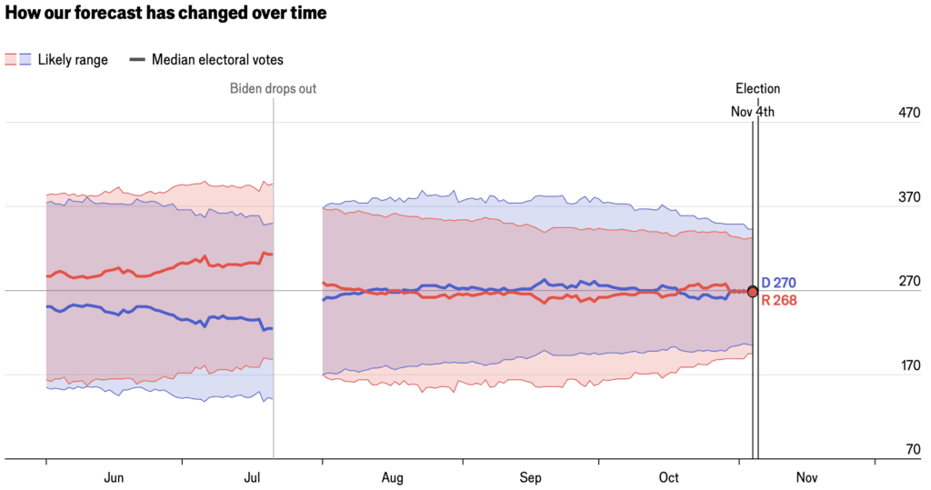
There’s a lot of talk about how the polls can go wrong. Fair enough—I wrote an article a few years ago on failure and success in political polling and election forecasting, and a few years before that, Julia Azari and I wrote about the 19 things we learned from the 2016 election. From historical patterns, we’d expect the polls to be off in some way that we can’t predict right now.
But, before the election is done and we remain in a state of ignorance, with the coin spinning above us in the air, let’s look at what the poll-based forecasts say.
What if the polls are right?
The focus is, understandably, on which party will win the national election, but here I want to let’s look at all 50 states. I’m pulling the latest state-by-state forecast of the candidates’ two-party vote share from the Economist’s model (for which we supply here some statistical background here).
Here’s the forecast swing from 2020:

We can zoom in on the swing states:

Don’t overinterpret those points near 50%—the forecast has a lot of uncertainty!
Now let’s look at all 50 states again, but I’ll plot it as the forecast swing from 2020:

As I’ve said many times, different forecasts can use different methods, but they’re all using pretty much the same data, so different reasonable forecasts should come to similar conclusions. Indeed, if you go over to our friendly competitors at Fivethirtyeight, you’ll see very similar point forecasts for the states. There are some slight differences for the less competitive states, as you can see when we redo the graph of the forecast swing:

Non-swing states are polled much less frequently so their forecasts are more dependent on hard-to-validate model choices. The focus is on getting things right—or, maybe I should say, to avoid being embarrassed—in the national forecast and thus in the swing states. (For further discussion of incentives for election forecasters, see this article from 2020 and this post from 2024.) The other 40 or so states pretty much just come along for the ride, and usually we don’t stare at our forecasts for them very carefully. They’re like those distorted images you can find in the periphery of a photo if you know where to look.
Just as a point of reference, here are the state-by-state swings from 2016 to 2020:

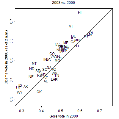
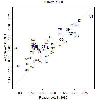
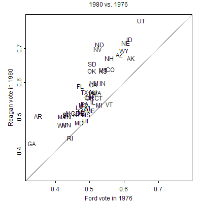
From a historical standpoint, all these swings are small. Here are some swings from past decades:
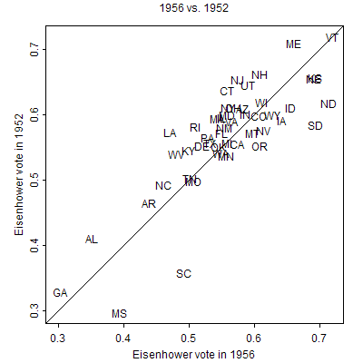
P.S. The above is just for the presidential election. Anyone who wants to type in the relevant numbers (yeah, that’s my ugly workflow!) can feel free to do something similar with Congress and relevant local races.
This is the most excitable I’ve seen people re: complaining about forecasts, but the race just seems genuinely hard to call (based on polling). Forecasting is hard, especially when you know from prior experience that polls have not been too reliable!
The one area I do perhaps agree with is that the error bounds have been a little implausible. 538 has had fairly equal (and large) chances of a blowout in either direction which seems like a particularly conservative way of hedging your bets.
“Don’t overinterpret those points near 50%—the forecast has a lot of uncertainty!”
Why not put error bars on the plots?
Anon:
I don’t include error bars on the plots because then I would’ve had to type in more numbers! Also, there would be some difficulty interpreting the error bars, given that the uncertainties for the different states in the forecast distribution are statistically dependent.
Another graph suggestion – say what ‘swing’ is and what positive and negative means.
One of the graphs looks at 1956, Permit me to turn the clock back even further to an era long before all this heavy mathematical forecasting. I was 12 and the high school principal came into my class to urge us to tell our parents to vote for Truman because if Dewey were** elected, there would be school on Saturday. And, if you go to Google, you can see that Truman, quite unexpectedly, did win New York State despite Dewey being the Governor of New York State. Just to make sure, I have things correct, I did a Google search for the 1948 election and found out instead that
“Dewey took 45.99% of the vote to Truman’s 45.01%, a margin of 0.98%. Progressive Party candidate Henry A. Wallace, a former Democratic Vice President who ran to the left of Truman and was nominated by the local American Labor Party, finished a strong third, with 8.25%.”
Moral of the story: In general, do not trust the memory of the elderly.
**I did not learn all that much while in junior high school, but one of the things grilled into us was the use of the subjunctive. Unfortunately, it is no longer a marketing skill.
If only the subjunctive were still valuable.
> I was 12 and the high school principal came into my class to urge us to tell our parents to vote for Truman because if Dewey were** elected, there would be school on Saturday.
Though I have relatives around from your generation, it does slightly boggle my mind that there are still people with (admittedly shaky) memories of this era. I hope that all of us will live to see the coming era consigned to the dustbin of history.
The 3 graphs with swing on the vertical axis are suggestive: the first two look consistent with regression to the mean – there looks to me like an inverse relationship between the Biden share in 2020 and the swing towards Harris in the 2024 polls. The 2016 Clinton share does not have that relationship with the swing towards Biden.
Am I reading this correctly? If so, would regression to the mean be expected in such data? Is there a good way to remove that effect from the analysis? A sample of 3 elections is too small, but any ideas why the third diverges from the pattern in the first two of those graphs?
Dale:
Yes, in expectation you’d expected to see regression to the mean. From a mathematical standpoint, the vote proportions can’t drift indefinitely; they are constrained to fall between 0 and 1. From a political standpoint, if there are conditions under which a party will be dominant in a given state, these conditions will change over time, bringing the state closer to the national average. Some changes in the postwar period are discussed in our book Red State Blue State, and the changes of a century are discussed in my article, The twentieth-century reversal: How did the Republican states switch to the Democrats and vice versa?.
In any given election, though, all sorts of things can happen. Historically, sometimes we see regression to the mean from one election to the next and sometimes we don’t.
Dale–I have always puzzled over the concept of regression to mean which is always presented in a convincing way regarding heights of parents and off springs. However, sometimes there really is an effect such that, above or below the mean, almost all off springs are indeed taller or heavier or better off–e.g., better nutrition and greater opportunity afforded undernourished and impoverished immigrants to the U.S.
Regression to the mean has always puzzled me a bit. Certainly, extreme observations are not always – or even on average – followed by less extreme outcomes. But the phenomenon seems to hold when the variability is sort of constant. It wasn’t clear to me whether or not election polling would be subject to this or not. Perhaps someone can clarify the conditions under which regression should be expected and when not. I’d be interested in some clear guidance about when that might apply.
If you are sampling from a uni-modal stationary distribution, then “regression to the mean” should be expected. That is, there’s a greater probability of the next sample being closer to the “center” of the distribution than the last sample, simply because there’s more probability to be near the center than there is to be farther from the center.
In the absence of stationarity, all bets are off. A strong trend is always possible.
I don’t like the term “regression to the mean”, I prefer “regression toward the mean”. The son of the tallest man in America is likely to be very tall…but not as tall as his dad.
As for how to think about ‘regression toward the mean’ as a general phenomenon: if a parameter value is a combination of deterministic and random variation, then the most extreme cases will generally be those where both the randomness happened to go in the same direction as the determinism…and the more extreme the case, the more extreme the amount of luck involved. A subsequent realization is unlikely to have an equally (or more) lucky event.
In the most extreme cases there is no determinism at all. Suppose I get 1000 pennies and flip each of them ten times, counting how many times they come up heads. One of them comes up heads all ten times. Hey, great, a lucky penny! But if I flip that same penny ten more times, I’m almost guaranteed to get fewer than ten heads. There’s a solid chance I’ll get more than 5 heads (or fewer) — I wouldn’t bet heavily on regressing _to_ the mean — but regressing _towards_ the mean is almost assured.
I guess everyone reading this blog already understands that. But when I hear people say they’re puzzled over regression towards the mean, I always wonder what’s hard to understand about it. Sorry if this is making all of your roll your eyes and say “duh, of course I know that, that’s not what I mean”.