Following up on yesterday’s post, I was wondering how many Americans drink. A quick google led to this page from Gallup. The overall rate has been steady at a bit over 60% for decades:

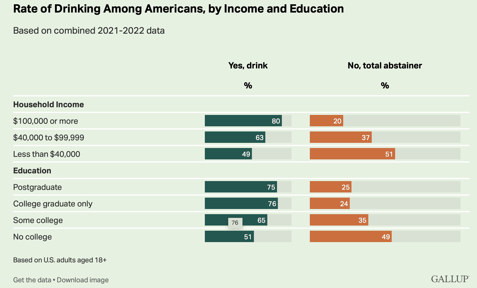
And the graph at the top breaks things down by income. The richies are much more likely to drink than the poors. I guess there’s something to that stereotype of the country club.
Man, those barplots are awful. At least scale them the same way!
Have to say, I’m somewhat surprised that the percentage of total abstainers is consistently around 40%. That’s a lot higher than I would’ve guessed. I’m not American so maybe it’s a culture difference.
> the percentage of total abstainers is consistently around 40%
The percentage of people claiming to abstain, that is.
Not quote the same thing.
Anonymous:
Great point. Even with that caveat, I’m still surprised it’s so high.
I’m quite surprised by these results. I certainly believed in the stereotype of working class guys drinking more than dainty professors. When George W. Bush’s image makers portrayed him as someone who you could have a beer with ( despite him being abstinent), I thought that they were appealing to working class Americans not educated elites. I thought my use of alcohol came from my lumpen proletarian roots in Eastern Europe not my diplomas.
Interesting real world data. I’m now going to finish my breakfast of a bottle of Pol Roger.
My guess is that it has to do with drinking wine with dinner.
Of course it does. And this is why it seems “moderate drinking benefits health.” (A claim that is always quietly walked back when new info comes in.) It’s people from upper middle class backgrounds (regardless of current income) who drink that way.
Why is it interesting to distinguish between “total” abstainers and those who have occasion to drink? The former implies some kind of religious or philosophical stance against drinking ever while the latter could be occasional drinkers or lushes. And the first graph is labeled “rate” of drinking which I think distorts the meaning of that word. Admittedly, I haven’t read the report which probably has a lot more detail, but I do think these types of questions are not well thought out. I think it is interesting to know who drinks, how much, and how often. But the two graphs above don’t tell me much about that.
While I agree that there are philosophical and religious reasons for abstinence, and that these are probably the main reasons, there is at least one other. Some people have a mutation which increases the number of taste receptors in the tongue, to the point where the bitterness in coffee and alcohol is magnified enough to make them unenjoyable–a punishment rather than a treat. I abstain from coffee, alcohol, and some other things due to that. Among my genetically-related family whom I know well, there are two out of 17 with this syndrome. (That is probably a large over-estimate for the general population.)
The Internet used to (I haven’t checked recently) call such people “supertasters” although it is certainly not a superpower. “Finicky eater” was the term applied to me.
I looked a bit further at the data and want to nitpick some additional issues. The first graph has the wording “Do you have occasion to use alcoholic beverages such as liquor, wine or beer, or are you a total abstainer?” Clicking on the source and the link to additional data on alcohol and drinking, I see a graph for the question “Do you have occasion to use alcoholic beverages such as liquor, wine or beer?” The data is the same, so I believe the inconsistency in the wording is editorial not in the data. But it does make me wonder which wording was actually used. I don’t think the two questions would elicit the same responses – the added phrase “or are you a total abstainer?” is more restrictive and, in my view, less interesting.
Just more reasons why I dislike survey data and why I don’t answer surveys myself.
I’ll add: Prohibition ended in 1933 and the time series graph begins in 1939. I’d speculate that “total abstention” meant something different in 1939 than it does now. So, if that is the wording that was used, another source of variation is added to the data. There is a benefit to having the same wording used over time (since changes in wording will bring about changes in responses), but words take on different meanings over time so it isn’t clear that those benefits are realized.
Could there be a cultural effect, with alcohol being more central to European culture, and incidentally european-amerucans more likely to be rich or educated?
Yesterday’s and today’s blogs about alcohol consumption and economic status, seem weird to me. The numbers and graphs appear to be entirely self- reporting and thus, the numbers are highly suspicious. That is, any interpretation is sort of a waste of time. However, on a personal note and based on many decades of evidence, regardless of socioeconomic status, the maternal members of my family were/are complete teetotalers, while the paternal members of my family were/are lushes.
Did anyone else notice that the bars in the first figure are distorted in several ways? First, the gray background bars, which presumably represent 100% for reference, are different total lengths in the two columns. Second, the gray bars are all truncated at about the 90% length, so that, for example, the 51 and 49% colored bars are visibly more than half the length of the gray bars. Third, the colored bars also cannot be compared for length across columns. (This is the first problem again, really.) For example in the “some college” row, the 65% and 35% bars are about the same length. Oh, and what is that floating “76” doing in that row?
Yesterday’s blog also featured a “self-refuting figure”, where it was pointed out that the some of the confidence intervals were inconsistent with the numbers next to them. So, we may have a new and very efficient first screening method for detecting “papers to ignore”. Just check the figures for internal contradictions.
Maybe the people making the graphs were drunk at the time.
I’m also confused by this. I’d much prefer they have asked something like “In the last 12 months have you had any alcoholic beverages”…
In the actual wording, how would a person who has been completely sober for 12 years after experiencing crippling alcoholism answer? “Yes, I’ve had occasion (12 years ago) to drink alcohol” or “No, I’ve been teatotalling for long enough that I’m assuming you aren’t asking about 12 years ago”
And that’s just one example. I drink alcohol, but if I’m honest, pretty rarely these days. In the last 30 days perhaps 5 drinks? I don’t really know. I can guarantee there was no day in the last 30 days where I had more than 2. Typically it would be beer or wine with dinner. If my family made significantly less money we would probably not bother with spending it on alcohol… so there’s probably a lot of that effect in the consumption vs income data.
The real interesting question is the pattern of usage. For example, on average, how many days per week does the person consume, and then on days they do consume what’s the distribution of quantity, and what’s both the peak blood alcohol concentration (BAC), and the area under the curve of BAC vs time.
A study where you gave people free grocery shopping for a month in exchange for monitoring their alcohol consumption and a couple random measurements throughout the day of BAC on random days would be an interesting study. A lot of these studies rely on very poor self-reported measures.
While the study design you suggest seems attractive, it makes me wonder about relative prices. If you told me you would pay for everything in my shopping basket, I would be inclined to add things I would not normally buy and increase both the quality and quantity of my purchases. I like the idea, but I do not think it captures the desired effect. The effect it captures is “Given unlimited groceries, how much alcohol would you consume?” But if I understand you correctly, this is not the effect you wanted to capture. We also have to consider that people might behave differently under observation. They would probably bias their individual behaviour towards their perception of what is ‘socially acceptable’. However, I agree with you that the result of such a study would still be very interesting!
I would suggest another data source that already exists for analysing the relationship between alcohol and income: High-frequency sales data collected by market research companies. The participants receive some kind of compensation: It is very small and it is not clear how much you get. But this ambiguity makes people think they are compensated sufficiently (which they are not IMHO).
The data will not only show how much was spent on alcohol, but also how expensive it is, what kind of beverage it is, etc. Surely the research companies will also ask for information on socio-economic background (I admit I have never worked with this type of data). For certain demographic groups that participate, I think we might be able to get a pretty accurate picture of alcohol consumption. However, it is important to note that this would only cover alcohol consumption at home (not in pubs, not at sporting events, etc.) and would also include alcoholic drinks bought for a group or event (e.g. a birthday celebration at home).
Sorry what I meant was free shopping service like they would pay for the food but you would buy it for them and then catalog all the things that they’re eating.
Seems quite possible to look at the existing consumer panels you mention for this kind of analysis. Though I wonder how (a) representative these panels are for this purpose and (b) how well these purchases match total consumption. I guess that’s where the more ambitious continual BAC monitoring comes in.
Here’s a recent paper using such data on beer: https://pubsonline.informs.org/doi/abs/10.1287/mksc.2022.1371
Once again, who are these people who will answer a random number and give out personal information? I really don’t think I know a single person who would do this.* Well, other than as a joke.
*I’d guess I know at least 100 people well enough to say this confidently. Less than 300.
In 2018 gallup reported about 8% of people answered the phone, 25% of those agreed to answer questions, and 80% of those completed the survey.
https://news.gallup.com/opinion/methodology/225143/listening-state-telephone-surveys.aspx
So about 1% of people are responsible for these results. That still seems too high from my experience but I can’t rule it out.
>For results based on the total sample of 2,020 national adults, the margin of sampling error is ±3 percentage points at the 95% confidence level. For results based on the sample of 686 adults who drink alcoholic beverages. . .
If the total sample of adults is 2,020, and only 686 drink, how do they get 63% of adults are drinkers?
> If the total sample of adults is 2,020, and only 686 drink, how do they get 63% of adults are drinkers?
My guess is that this could come from a larger survey, where a number of those polled did not respond to the drink/abstain question.
Yes, I think you’re right, it’s some kind of sampling issue, not a miscalculation. But, in Gallup’s report for 2023, I see that they report (in a linked statement about margins of error similar to the one quoted by Anoneuoid for 2021-2022) that the drinker sample was 631, and the total sample was 1015, which gives precisely the 2023 reported result of 62% (= 631/1015). The 2023 report is at https://news.gallup.com/poll/509501/six-americans-drink-alcohol.aspx .
Browsing further results in Gallup, I checked 2018 and 2021 results, and,unlike for 2023, they don’t add up. For 2018, 636/1007=63%, not the stated 60%.; for 2021, 678/1033=66%, not the stated 63%.
I suspect there’s some good reason for the discrepancy, but it’s not evident in their posted reports.
“Work is the curse of the drinking classes” – Oscar Wilde