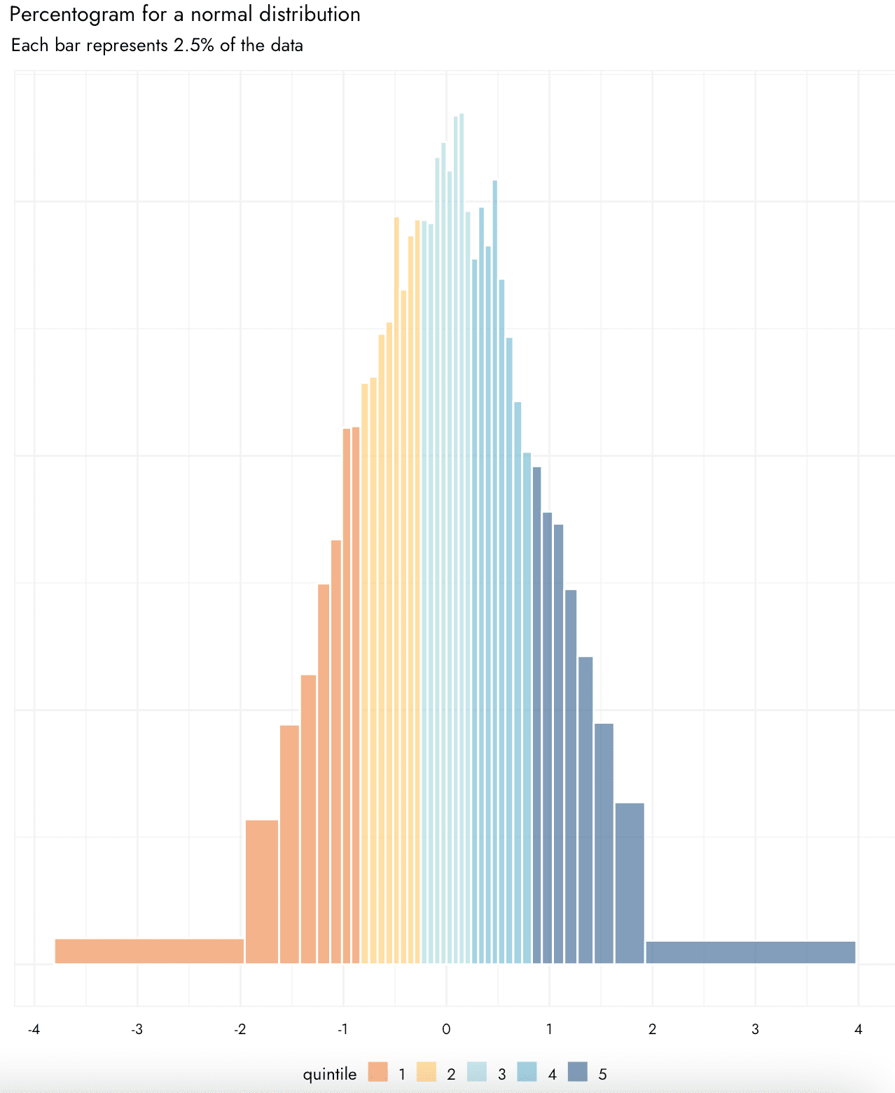

Jamie Elsey writes:
I’ve been really interested to see you talking more about data visualisation in your blog as it’s a topic I really enjoy and think it is underappreciated. I’ve recently been working on some ways of legibly presenting uncertainty as part of my work, and devised what is, to me, a slightly novel way of showing distributions of data in a way I find to be quite useful. I wondered if you have seen this type of thing before, and what you think? – basically, it is like a histogram or density plot in that is shows the overall shape of the distribution, but what I find nice is that each bar is made to have the same area and to specifically represent a chosen percentage. One could call it an “percentogram.” Hence, it is really easy to assess how much of the distribution is falling in particular ranges. You can also specifically color code the bars according to e.g., particular quantiles, deciles etc.
I think this could be potentially useful for plotting things like posterior distributions, or the results of things like cost effectiveness analyses where some of the inputs include uncertainty/are simulated with variability. This is not a proper geom yet and the code is probably a bit janky, but if you’d like to see the code I can also share what I have so far (it is a function that will take a vector of data and returns a dataframe from which this kind of plot can be easily made).
I thought you might find it interesting especially if it is something you haven’t seen before, or maybe there is some good reason why this kind of plot is not used!
The above graphs show percentograms for random draws from the normal and exponential distributions.
In response to Elsey’s question, my quick answer is that I’ve seen histograms with varying bin widths but not with equal probability.
Elsey did some searching and found this on varying binwidth histograms, with references going back to the 1970s. It makes sense that people were writing about the topic back then, because that was a time when statisticians thought a lot about unidimensional data display. Nowadays we think more about time series and scatterplots, but histograms still get used, which is why I’m sharing the idea here.
I googled *equal probability histograms in r* and found this amusing bit from 2004, classic R-list stuff, no messing around:
Q: I would like to use R to generate a histogram which has bars of variable bin width with each bar having an equal number of counts. For example, if the bin limits are the quartiles, each bar would represent 1/4 of the total probability in the distribution. An example of such an equal-probability histogram is presented by Nicholas Cox at https://www.stata.com/support/faqs/graphics/histvary.html.
A: So you can calculate the quartiles using the quantiles() function and set those quartiles as breaks in hist().
Indeed:
percentogram <- function(a, q=seq(0, 1, 0.05), ...) {
  hist(a, breaks=quantile(a, q), xlab="", main="Percentogram", ...)
}
I'll try it on my favorite example, a random sample from the Cauchy distribution:
> y <- rcauchy(1e5)
> percentogram(y)
And here's what comes up:

This is kinda useless: there's a wide range of the data and then you see no detail in the middle. You'll get similar problems with a classical equal-width histogram (try it!).
There's no way out of this one . . . except that if we're going with percentiles anyway, we could just trim the extremes:
percentogram <- function(a, q=seq(0, 1, 0.05), ...) {
  n <- length(a)
  b <- quantile(a, q)
  include <- (a >= b[1]) & (a <= b[length(b)])
  hist(a[include], breaks=b, xlab="", main=paste("Percentogram between", q[1], "and", q[length(q)], "quantiles"), ...)
}
OK, now let's try it, chopping off the lower and upper 1%:
percentogram(y, q=c(0.01, seq(0.05,0.95,0.05), 0.99))

Not bad! I kinda like this percentogram as a default.
I played around with something similar when trying to create representations of posteriors that also reflect MCSEs of quantiles. Basic idea was to create bins that keep quantiles together if they are within 2 MCSEs of each other. See the bottom of this page: https://github.com/mjskay/uncertainty-examples/blob/master/mcse_dotplots.md
The first half of that page is a very different approach – to use dotplots of quantiles, but (essentially) blur the dots according to MCSE. The idea is to try to make it obvious you shouldn’t rely on some of the quantiles of a posterior depending on the MCSE for that particular quantile.
This is awesome, I once had an idea for showing uncertainty in maps using a blur concept. Basically have your statistics in whatever color gradient you like but then have this additional layer of “blur” on top of that, idea being that your eye would look toward the unblurry statistics and ignore the really uncertain areas. Cool to see blurry things in ggplot2. I should probably give it a shot again.
This quantile-based approach has become popular as an (optional) element of binned scatter type plots. See “On Binscatter” by Cattaneo, Crump, Farrell, and Feng https://arxiv.org/abs/1902.09608 and several related works by members of that team. They have some pretty nice software implementations in several languages, including for two-way and density estimation: https://nppackages.github.io/.
Their theoretical analysis treats them as a particular form of nonparametric regression/density estimation, considering things like how using quantiles vs even bins affects MSE. I think this is worthwhile but complementary to work on properties as a visualization method. I believe there was an HCI-style user study comparing quantile and evenly spaced bins (among other studies) in the context of regression discontinuity designs published in a top economics journal recently, the citation to which is eluding me at the moment, but generally it seems like a good idea for certain types of data with uneven spacing.
Oh, I found the user study:
ArXiv: https://arxiv.org/abs/2112.03096
Published version: https://academic.oup.com/qje/advance-article/doi/10.1093/qje/qjad011/7068116
Testing these displays on how well people can make out a true vs false discontinuity visually, they find “Bin spacing (equally spaced versus quantile-spaced), axis scaling, and the presence of a vertical line indicating the policy threshold do not appear to matter” for accuracy, but they do find support for your recommendation to use small bins.
I like the look of the first 2 visualizations, but I do think a regular histogram + a table of quantiles would provide more information, without asking much more of the reader/viewer. While we’re on the topic of data visualizations, I’m curious if anyone here has been using GPT3/4 to assist with making visualizations? I’ve found it pretty useful for writing standard boiler plate Python code that you can then edit yourself. It’s also fun to play around with, you can ask it make a plot in the style of The Economist or Alberto Cairo (probably even Andrew Gelman) and it’ll do some modifications for you haha
I have no idea why, but when I was taught histograms in high school (12-16) in England (can’t remember my exact age) around the millennium, unequal bin width histograms were what we were taught as the default. I remember being very confused at university and for a time after when I failed to encounter them anywhere! I should try and get hold of a copy of our course textbook and see if any sources are mentioned. I expect the course book was first penned in the late eighties or early nineties.
Looks like it is still on the syllabus!
https://www.bbc.co.uk/bitesize/guides/zc7sb82/revision/9
Fantastic. There is nothing new under the sun!
This cracks me up – I don’t think I was taught this in GCSE stats! Interesting that their definition of the histogram would not match what I think a typical definition of one is – that the ‘area of the bar conveys the frequency of the data’ – which is indeed exactly my thought of what would be better than a typical histogram. But I thought the most standard histogram conveys counts by height with a constant width.
I’m especially pleased for my education to have come full circle. I suspect I can retire happy now :)
That type of graph looks like a variable-width bar chart / marimekko chart / mosaic chart, but I like how the widths of the bars have a specific meaning. What is a little weird is that very extreme thin shapes – thin and flat or thin and tall – look “smaller” than wider shapes. It makes them look “less important.” I’m not sure that vague implication is helpful here. I guess it’s a side effect of how people see area/volume and how we’re not the best at estimating those. But I don’t have a suggestion for how to fix that or make it better.
I like this idea – it had not occurred to me previously. It isn’t perfect, but the equal bin widths is not perfect either. And a shameless plug for my favorite software, JMP, is that I just discovered it has an add-in that accomplishes exactly what is shown (as well as providing for making the bin widths vary in numerous other ways – e.g., 6 sigma binning or binning based on any formula you want to enter).
I use JMP daily! It is so efficient for data visualization, among other things.
I just really prefer kernel density estimates. It’s not clear to me what value insisting on bins and then fiddling with the bin widths brings. Though there are “average shifted histograms” as a kind of KDE or KDE like computation as well, and so maybe as an intermediate to producing a density estimates curve this would be useful.
I don’t really see the advantage of kernel density estimates. You still have to fiddle with the bin widths–they’re just called bandwidths. KDEs can still hide meaningful artifacts in that bandwidth choice. KDEs are less ugly–but the ugliness is part of the data, and might mean something
Somebody:
Agreed with the ugly-is-good. As the saying goes, any graph should contain the seeds of its own destruction.
Bandwidth is generally a single parameter, whereas there’s bin width, or there are the individual breaks (ie. each width could be separate as here). It’s a lot easier to just change a single parameter and adjust how “noisy” the KDE is than to adjust the location of individual bins. The biggest problem with histograms is they make things look very jagged and noisy which are in fact quite smooth. Just select 15 random draws from a normal distribution and do a histogram with default setting vs a KDE with default setting. Or do something like a mixture model… 20 normal(0,1) and 6 normal(3,1) samples…
In any case I find them extremely useful, and I find histograms usually ugly, but sometimes I use histograms anyway, so they have their uses for sure. They tend to be really good when there’s a point density mixed in for example (ie. there are some exactly 0 or exactly 1 values among some spread out values)
Daniel:
I agree that if you want to display a continuous distribution, that a continuous display is better. But if you want to display data, I prefer the histogram. In your example: use the continuous display if your goal is to display the underlying distribution; use the histogram if you want to display the 15 data points.
In the HistDAWass package, I developed a set of functions for extracting histograms and for plotting them with several criterio. One of this Is the extracting of equal frequency histograms. Your proposal Is very funny and useful in using colours. I am developing a set of other visualizations for distributional data. Contact me of you like that.
Here’s a quick stab at a version version using ggplot2. In this function, the possible parameters are binwidth, bins, breaks and trim.
Bins is the number of bins, binwidth is it’s width (in quantiles) and breaks is just a vector of quantiles to use directly. Trim is the percentage of the distribution to be discarded at the tails.
“` r
StatPercentBin <- ggplot2::ggproto("StatPercentBin", ggplot2::StatBin,
default_aes = ggplot2::aes(x = ggplot2::after_stat(density), y = ggplot2::after_stat(density), weight = 1),
compute_group = function(data, scales,
binwidth = NULL, bins = 30, breaks = NULL, trim = 0,
closed = c("right", "left"), pad = FALSE,
flipped_aes = FALSE,
# The following arguments are not used, but must
# be listed so parameters are computed correctly
origin = NULL, right = NULL, drop = NULL,
width = NULL) {
x <- ggplot2::flipped_names(flipped_aes)$x
if (is.null(breaks)) { # If breaks is not provided, we need to compute them
if (!is.null(binwidth)) { # Either with binwidth
trim <- trim/2
quantiles <- seq(trim, 1 – trim, binwidth)
} else { # or the number of bins
quantiles <- seq(trim, 1 – trim, length.out = bins)
}
} else {
quantiles <- breaks
}
breaks <- quantile(data[[x]], quantiles)
bins <- ggplot2:::bin_breaks(breaks, closed)
bins <- ggplot2:::bin_vector(data[[x]], bins, weight = data$weight, pad = pad)
bins$quantile <- quantiles[-length(quantiles)]
bins$flipped_aes `stat_percent_bin()` using `bins = 30`. Pick better value with `binwidth`.
“`
https://i.imgur.com/g0JTHRj.png
“` r
ggplot(data.frame(y = rcauchy(1e5)), aes(y)) +
geom_histogram(stat = StatPercentBin, trim = 0.02,
aes(fill = after_stat(quantile)))
#> `stat_percent_bin()` using `bins = 30`. Pick better value with `binwidth`.
“`
https://i.imgur.com/xH0q8BM.png
Ugh, the comment system mangled the indentation 😓
Here’s a gist with the code: https://gist.github.com/eliocamp/c73ab8d2c87fc9a668ea88d04ad8ca20
(which has some tweaks)
Great to see this implemented as a stat/geom! I had made code that allows it to be plotted as geom_rect and then enables filling according to some kind of quartile/octile etc., though it would be nice to have this done more automatically. It’s great that this can color according to the percentiles though I personally think it is more legible to not color every single bar separately but cluster the coloring in some way – I wonder if that can be done easily
You can do `cut_width(after_stat(quantile), 0.1))` instead of `after_stat(quantile)` to color by deciles
Great – I am going to try this out, thank you! (the custom cut_width thing – for some reason it won’t let me reply directly to that comment)
Choosing the bin size in this way is basically the key idea behind the Lebesque integral, if I recall correctly? en.wikipedia.org/wiki/Lebesgue_integration
I ran up a light-weight Stata implementation, described here: https://teaching.sociology.ul.ie/bhalpin/wordpress/?p=752
I should have web-searched first: the redoubtable Nick Cox coded this for Stata in 1999.
ssc install eqprhistogram
This is so cool! Would definitely use that
I like how it shows the tails – that gives a better idea of what the distribution looks like there than occasional scattered bins. I also like the coloring for the quar/quintiles – that information isn’t normally shown on histogram. But for the overall shape of the distribution, at least with these examples, I don’t think it adds very much. I guess if you’re going to color the quartiles or whatever grouping though you have to use this otherwise the bins wouldn’t line up with the color groupings.
It would be interesting to see it on some less typical distributions.
That’s right – my thought was that if you want certain percentile-related qualities color coded, then just using the typical histogram wouldn’t quite work as some bins would straddle the cutpoints. FWIW you could of course color or put marks on a typical density plot, but I find this to be quite a legible way of doing it
In his reply to Daniel (and why can’t I reply directly to Andrew’s reply?) Andrew writes that he prefers a histogram for displaying data. I agree and am puzzled that no one has given an example of how well or badly a percentogram would do. You could try the distribution of carats in the diamonds dataset (or the distribution of price), the distribution of movie lengths in the ggplot2movies dataset, Hidalgo stamp thicknesses, Newcomb’s speed of light or whatever takes your fancy.
Antony:
It will depend on the problem. For example, when making a histogram of Republican vote share in congressional election districts, I would prefer to have breaks at 0, 0.05, 0.1, 0.15, etc.—equal bin widths—as this would be most readable me. In other settings, the bins don’t have such clear interpretations, and I might prefer the percentogram.
It’s great to see this on the blog – in particular to see some people showing this kind of plot was even suggested as standard in some GCSE stat classes! But it doesn’t seem to be much used, and I think it has some utility.
To be clear I don’t think it would always be appropriate or the best thing, especially for some unusual distributions. When thinking of the plot I was considering trade-offs between what I think are two really key dimensions of a visualisation: veracity (how accurately it shows exactly what’s going on with the distribution), and legibility (how well and how easily people can read specific important bits of information they want from the graph). How the plot stacks up on these two dimensions is going to depend on the context of both the stage of the research project and who the plot is intended for.
In my case, I was imagining using this to convey some end points of certain types of research that we often have to present to people who aren’t going to go into the code or exact bits of data themselves. In a cost effectiveness analysis or risk assessment, they often want to be able to read off how much probability is in certain tails or sections of the graph. They also often want to know the median or some central ‘confidence interval’ type assessment. With this plot, you can read that kind of information off really quite easily (high legibility) for a whole range of questions you might have, while retaining a good semblance of the broad shape of the distribution. In addition, because percentiles are incorporated into the bar format, I could add additional information with a dot and whiskers e.g., conveying an X% highest density interval and mean or mode on the very same graph, which may not be the same as the percentile breaks but can be important to know. Finally, I think using some color to code not each individual block but to group the blocks also makes it easier to hone in on the quantities of interest. Andrew and I discussed via email and I agree though that the color choices above are probably overkill and gradations of a single color might be preferable.
Anyway, I’m glad the ‘percentogram’ has some appeal (maybe people will use it more if it has a specific name other than ‘variable binwidth histrogram’!)
Thank you for raising it. I’m not even joking when I say that what I was taught about histograms in high school has bugged me for years.
I believe this is what is described in the variable binwidth (not otherwise specified, like Scott) in the historgram Wikpedia page. Or am I reading that wrong?
Also, isn’t this the default behaviour of truehist() in MASS? (That I could have very wrong since I can’t seem to find Venable & Ripley and the documenation in MASS isn’t terrific)
Psyoskeptic:
1. Yes, we discuss in the above post that this is an example of a varying-width histogram.
2. No, this is not the default behavior of truehist(), as I could see opening R and trying an example.
RE: 1 – What I meant is that this seems to be exactly (other than colour) what is described on the Wikipedia page under that section.
Yeah, I should have checked truehist() before typing. :)
RE:1 What I meant is that this seems to be exactly what’s described as a common variable bin width plot on the histogram Wikipedia page. After the Shimazaki and Shinomoto’s version is explained it describes this one. (sans colour)
Note that it’s also described in that “found this” link:
“Equal probability. There is at least one other way to build a histogram in a simple, systematic way: use as limits a set of quantiles equally spaced on a probability scale (e.g., Breiman 1973, 208–209; Scott 1992, 69–70). That way, each bar represents the same area. Unless our data come from something like a uniform distribution, the bin widths will be markedly unequal, but they will reflect the character of the distribution. Breiman points out that the associated error will be approximately a constant multiple of the bar heights, so long as the bin frequencies are not too small.”
Why doesn’t the first plot look like a bell curve? To me it looks triangular with some flat legs at the sides. Is there some optical illusion going on? A peculiar artifact of the particular sample being plotted?
General principle: avoid optical illusions in scientific graphics…
John:
I think it’s a problem with the aspect ratio of the plots. If they were squatter and wider, they’d look more like what you’re used to seeing.
It’s interesting but I don’t think it works well.
If we have a theoretical density it’s easier to plot the curve. If for some reason we want to approximate the curve with a small number of horizontal segments that’s not an efficient way to do it.
If we want to represent an empirical distribution without fitting a potentially misleading density function this doesn’t seem an efficient way to do that either.
Standard histograms look nicer and offer more details on the tails – which may be more relevant than having finer resolution in the high probability region.
If we want to display quantiles we can also do so adding vertical segments and it’s even possible to use color if we create our own histogram using stacked bars.
An advantage of using equal-width bins rather equal-probability bins is that the y-axis doesn’t need to be read as a density and can be read as the probability of the bin. That’s what the lattice histogram does by default but for some reason it doesn’t even seem to be an option in the hist function (one has to tweak the axis labels or find an alternative way to work around this limitation).
https://imgur.com/lMl1zao
For example the “deceased population” charts in the first of the Covid-in-rural-Bangladesh mentioned the other day are misleading and despite being labeled “Proportion of population, %” what the y-axis actually gives is a density.
If it was really a proportion one would be able to use the chart as a look-up table to find that in 2019 between 25% and 30% of the dead were older than 80 – without having to multiply the density displayed in the histogram by the number of years in the 80-85 interval (which is not even a real thing in the first place but an artifact of capping the age at 80).
https://imgur.com/A5forxX
It seems like it’s related to a box plot but with more finely grained boxes.
I believe these are usually called equal-area histograms, because each bin has the same area (as the area is the probability density, i.e. height, times the width).
What’s interesting here is that the uncertainty is mostly in the horizontal locations rather than the vertical, which will take a bit of time to get used to ( and will make these histograms look better than they are.