Bob Carpenter writes:
Here’s an app estimating county-level Covid for the US with the uncertainties. The methodology sounds very pragmatic in its combination of
optimization and sampling for hierarchical models.
I like it! And not just because they use Stan.
I just have a few criticisms regarding their displays:
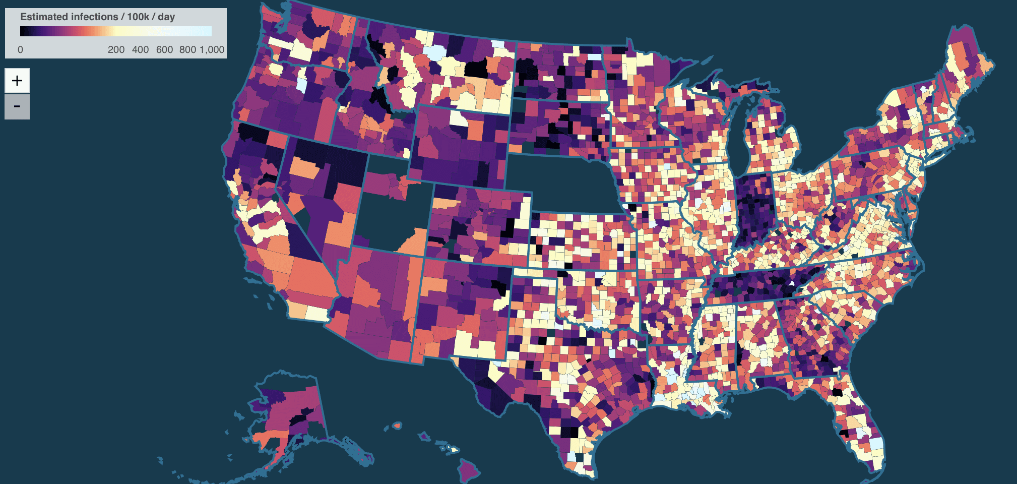
1. I don’t like the color scheme of their map. This thing where they mix in hue changes with intensity changes is just a mess. Not as bad as the notorious rainbow color scheme but not good.
2. I wish they would not list states in alphabetical order: Alabama, Alaska, etc.

If you want a look-up table, that’s fine, but for the main display it’s better to show things that are telling the story.
3. All these graphs look kinda the same. Not identical, but similar. How bout showing the estimated national curve and then for each state showing it relative to the national average?
4. I don’t like this rate-per-100,000 thing. I get that this is standard for epidemiology, but for anyone else (including me), it’s a mess, involving lots of shifting of decimal places in my head. If you want to do the rate per X, why rate per million—this would be a bit easier to follow, no? Or go the other way and just give straight-up percentages. The y-axes for these graphs are labeled 0, 1k, 2k. That’s just 0, 1%, 2%. To me, “1%” is much more clear than “1k” with an implicit “per 100,000.”
5. The x-axes on these time series are a disaster. “12/8, 6/13, 12/22”? What’s that all about? Just give months and years, please! I don’t want to have to decode the damn axis. Baby steps here.
But these are minor comments. Overall it’s an impressive page, and great to see all the data and code there too.
While the alphabetical state order may annoy you, the people of Mississippi may be shocked to find that Harvard, Yale and the CDC have eliminated them as a state.
Anon:
This reminds me of a discussion in a footnote of one of my papers about whether North and South Dakota are exchangeable.
Hey you are right — thanks for pointing that out! I am not sure about the CDC, but we (the website developers) don’t want to omit any state. There are counties that get omitted if they are not reporting data in stable enough way that we can use it, but most issues with individual states are pretty transient.
Indeed, the state-level page is still there (https://covidestim.org/us/MS). So we will look into this.
Very happy to have this pointed out (and also for Andrew’s welcome suggestions in the post).
Nick
Yes, this is great! However, it doesn’t look like they are using the spatial information correctly. For example, are the rates in Indiana really that different from Illinois or Ohio? This should be an easy fix with Stan. I didn’t look at their code. But there are nice Stan case studies about Nearest neighbor Gaussian processes.
“0, 1%, 2%. To me, “1%” is much more clear than “1k” with an implicit “per 100,000.”
It’s a bit annoying doing it this way, but incidence calculations don’t always work out so friendly when rounding to the nearest percentage point. Sometimes you’re left with 13 (or whatever) per 100,000 (e.g. rare diseases). I wonder if values like 0.013% are more or less interpretable than 13 per 100,000. I am not sure why incidence is calculated as events per 100,000 instead of events per million. Maybe it’s one of those “it’s always been done like this” things.
Unanon:
Yes, it depends. In this case, switching to percentages seems like a no-brainer, cos then the y-axis can be labeled 0%, 1%, 2%, rather than the unintuitive 0, 1K, 2K. Saying “1K per 100,000” rather than just “1%”–that just seems wrong.
If the axes were a factor of 10 lower, then, yeah, I agree that 0.0%, 0.1%, 0.2% would not be so clear, and I’d recommend doing it as number per million.
There is no convention in epidemiology to report incidence rates as events per 100,000. Nor any other pre-specified denominator. The normal practice is to choose a power of 10 denominator such that the numerator is relatively simple number that is quick and easy to read and understand.
Of course, one has to be flexible. If in the same report you are showing incidence rates in a large lower-incidence population and also incidence rates in a higher-incidence subpopulation, where the incidence rates differ by one or two orders of magnitude, it could confuse readers to show some things per 100,000 and others per 1,000. So you might settle on one or the other denominator for both. Clarity of communication is, or should be, the driving factor.
In that regard, reporting incidence rates as 1K per 100,000 instead of 1 percent is a mild deviation from standard practice, though, personally, it seems pretty clear to me.
The color scheme is ideal because it’s colorblind-friendly.
I just get “an unexpected error has occurred” in the middle of a blank page.
for what it’s worth.
As for incidence, I’d rather see “as a fraction of some important other risk” (and then report that other risk rate so people could convert if they need to).
So for example deaths from COVID per day as a fraction of deaths from heart disease per day.
Daily COVID cases as fraction of 1/365 times the number of COVID cases in the first 365 days of the pandemic
I get the error in Firefox, but it works in Chrome.
I like this site: https://covid19.biglocalnews.org/county-maps/#/
How to ensure I never see your website…
I don’t mind the colors but I don’t like the continuous scale or the log scale for the colors on the map. Why not 5-8 discrete colors and a hatch pattern (rather than black) for missing/insufficient data? The continuous scale over-subdivides the lower quarter of the spectrum and leaves the upper half almost indistinguishable.
Update:
1. It works on my version of Firefox (now).
2. The color scale for the map has been reversed and spans an appropriate range, so now it’s much more intuitive.
3. States/counties with missing data are much easier to distinguish.
4. Full credit for having the same vertical axis on every single graph. Facilitates comparisons