Lauren, Jessica, and I just wrote a paper that I really like, putting together some ideas we’ve been talking about for awhile regarding variation in treatment effects. Here’s the abstract:
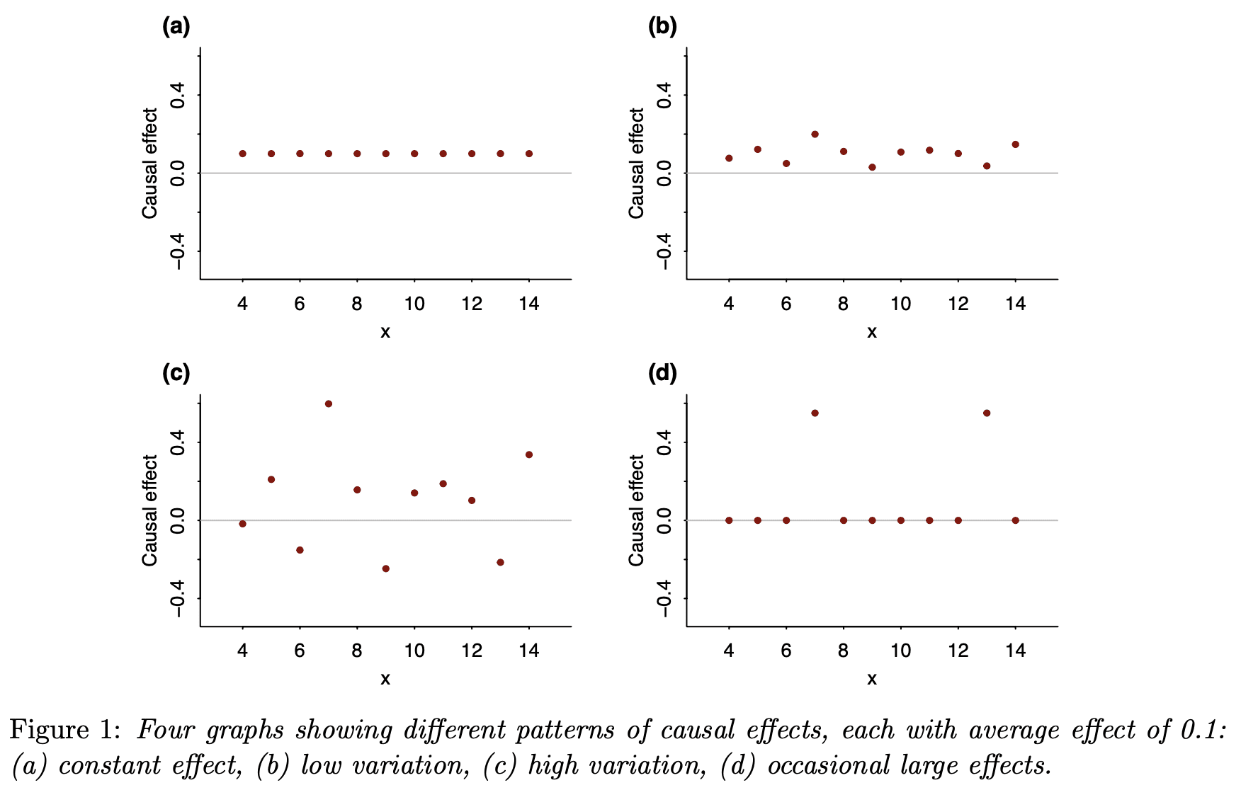
The average causal effect can often be best understood in the context of its variation. We demonstrate with two sets of four graphs, all of which represent the same average effect but with much different patterns of heterogeneity. As with the famous correlation quartet of Anscombe (1973), these graphs dramatize the way in which real-world variation can be more complex than simple numerical summaries. The graphs also give insight into why the average effect is often much smaller than anticipated.
And here’s the background.
Remember that Anscombe (1973) paper with these four scatterplots that all look different but have the same correlation:

This inspired me to make four graphs showing with different individual patterns of causal effects but the same average causal effect:
And these four; same idea but this time conditional on a pre-treatment predictor:
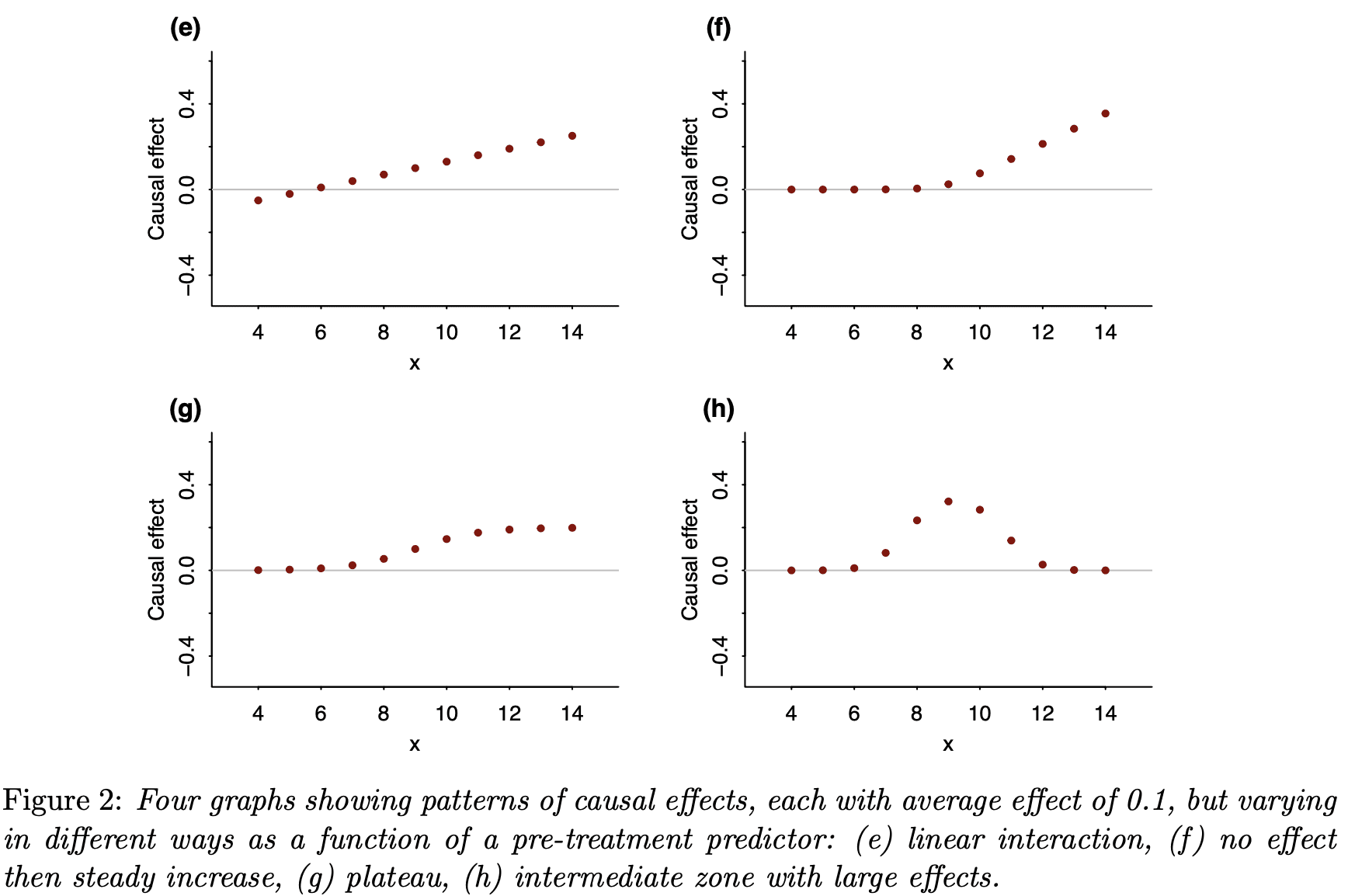
As with the correlation quartet, these causal quartets dramatize all the variation that is hidden when you just look at a single-number summary.
In the paper, we don’t just present the graphs; we also give several real-world applications where this reasoning made a difference.
During the past few years, we’ve been thinking more and more about models for varying effects, and I’ve found over and over that considering the variation in an effect can also help us understand its average level.
For example, suppose you have some educational intervention that you hope or expect could raise test scores by 20 points on some exam. Before designing your study based on an effect of 20 points, think for a moment. First, the treatment won’t help everybody. Maybe 1/4 of the students are so far gone that the intervention won’t help them and 1/4 are doing so well that they don’t need it. Of the 50% in the middle, maybe only half of them will be paying attention during the lesson. And, of those who are paying attention, the new lesson might confuse some of them and make things worse. Put all this together: if the effect is in the neighborhood of 20 points for the students who are engaged by the treatment, then the average treatment effect might be more like 3 points.
OK, I made up all those numbers. The point is, these are things we should be thinking about whenever you design or analyze a study—but, until recently, I wasn’t!
Anyway, these issues have been coming up a lot lately—it’s the kind of thing where, once you see it, you start seeing it everywhere, you can’t un-see it—and I was really excited about this “graphical quartet” idea as a way to make it come to life.
As part of this project, Jessica created an R package, causalQuartet, so you can produce your own causal quartets. Just follow the instructions on that Github page and go for it!
I occasionally work with the marketing department within my company in my capacity as a data scientist. Measuring the impact of marketing activity has regularly meant imposing some period after treatment where the effect is assumed to have decayed back to zero (or our competitors have responded).
I look forward to reading that paper!
This is a general effect, of course. Statistical summaries are, of course, summaries, so they cannot provide a full description of the data. Therefore, any set of statistical summaries can describe an infinite number of datasets.
A while ago I created an R package to create these datasets programmatically.
https://eliocamp.github.io/metamer/
Great paper, I agree that once you start thinking about this sort of thing, it’s hard not to think about it. The quartets are also a very effective tool to highlight the issue. I think in the social sciences (or at least in Economics) this issue can be exacerbated by the fact that the conditions which allow a researcher to make use of a natural experiment might themselves imply that the ATE doesn’t generalize well. Though truthfully I’m not aware of any empirical data on this
A great example of focusing on average while ignoring variation (see this paper PMID: 19878144). Background: considerable evidence in humans and model organisms argues that caloric restriction increases lifespan. Finding: this paper shows that while restriction may on average increase lifespan, it may in some instances shorten lifespan substantially. A concern arises if humans respond similarly: will I live longer, or die earlier with caloric restriction? Although average response may be important for public health policy (though premature deaths can’t be ignored), the variability of individual responses should be the center of our attention – can we identify those who might benefit and those who might be harmed?
https://www.ncbi.nlm.nih.gov/pmc/articles/PMC3476836/
I’m not sure this study is primarily measuring the health benefits of calorie restriction. They put enough food for three mice in a cage with five mice, and don’t seem to have monitored behavior, cause-of-death, or even body weight.
Agreed, the study has many deficiencies, including poor documentation of study design. But cause-of-death, this is niormally impossible to determine in mice and in model organisms generally, and often in humans. And the point of the paper was not to document the features of mice experiencing caloric restriction, but simply to argue that caloric restriction may not be universally beneficial, and in some cases may be harmful. In the context of Jessica and Andrew’s paper, this is a good example of variability being more telling than average response.
Sorry, I should have been more explicit.
They need to check whether the mice are fighting (even killing) each other, because that may be why some strains have shorter lives. That is what typically happens when you put multiple animals in a small space without enough food (humans included).
So, I don’t accept that the study can tell us when/if caloric restriction may give health benefits.
It could still be a good example of variability to use though. Some strains may be more aggressive/docile or otherwise responsive to food deprivation than others.
When fighting et al like that is discovered, it is a strict requirement to separate the mice. It is considered highly unethical to do otherwise..
Indeed, that is why I wrote they “don’t seem to have monitored behavior, cause-of-death, or even body weight.”
It would be difficult to discover that was going on if you fail to monitor those things. Perhaps they did and didn’t report it though.
Andrew, is this paper published, in press or parked somewhere where it can be cited? Several us are writing genetic and metabolic papers where this issue is central. Variation itself seems to be both embedded in our genetics and an integral part of organism health and disease. It would be great to cite your paper.
Joe:
I put it on my website and we submitted it to American Statistician, the journal that published the Anscombe article back in 1973. After reading your comment, I posted it to Arxiv, so it should appear there in a couple days.
OK, Arxiv version is here.
Thank you! :)
A good example would be survival after a cancer drug. Say the patients normally have expected survival of 2 years, but in the treatment group this is 2.5 years. Real life examples like this abound.
Does that mean a few patients lived much longer, or many patients lived a few months longer? Some may even have died sooner due to the drug, but the net effect can still be positive.
There is more than one explanation consistent with the same aggregate effect, and distinguishing between them can have a large impact on our decisions. Spending a million dollars for 50% chance of living an extra six months is very different from 5% chance of living an extra decade but 60% chance of living three fewer months (or whatever the numbers would work out to).
And this is all before we consider uncertainty in the estimates and even mechanism. Were these patients sampled from a population that represents you? Maybe the drug slows tumor growth via caloric restriction by inducing nausea/vomiting/diarrhea. In that case there would be much cheaper and safer ways to get the same effect.
It is crazy to make decisions based off aggregate effects. That is one tiny piece of the puzzle.
This is a great post. I went after similar issues about nine years ago in this disquisition: https://econospeak.blogspot.com/2014/05/regression-analysis-and-tyranny-of.html
My concern was not only about the variation of effects within a given distribution, but also the assumption that no or limited variation in modeling is required for different components of the sample.
Inspired by your Anscombe (1973) reference:
Conditional quantiles along with the conditional expectation.
https://gib.people.uic.edu/Anscombe.pdf
I’m curious why you plotted a solid line at y=0 or, at least, did not include an additional line – maybe dashed – at y=0.1. Initially, I thought the line was representing the average effect, which confused me given the data points. It was only after reading the figure caption that I realized the line was showing zero and nothing else.
Is having an x-axis at y=0 necessary for all graphs? You have an additional axis at the bottom, so I’m not sure why the y=0 line is needed.
I’ve been exploring an idea that might be of interest.
Suppose you’re trying to figure out the potential heterogeneous treatment effects and what to know how large HETE (heterogeneous treatment) effects are. One way to do it is to setup a model with interactions and estimate those relations (such as those quartets) and proceed from there.
But what if you don’t have all the data or are missing the interaction variables with x?
I think comparing the distributions of y_1, y_0 (those w/ and w/ out the treatments) could yield insights on the relative size of these effects.
That is, if the distribution of y_1 is very different from y_0 (removing difference in means / ATE) then you can infer that there probably is some strong HETE effects. If however, the distributions are similar then there are probably no strong HETE effects.
One way to calculate this might be to calculate the AUC of distributions (with y_1 subtracted by ATE) or to build a model (treatment ~ y). If you get a high AUC or predictive model then you have a pretty good case for there being a strong HETE effect worthy to investigate further.
I think the cool part of this approach is that you don’t need the variables the treatment variable interacts with – just the treatment and response variables.
Sam: Great minds think alike. Megan Higgs and I came up with a very similar concept and wrote an article to appear shortly in the American Heart Journal. Stay tuned!