Kevin Lewis points us to this article from the Annenberg Public Policy Center:
The holiday-suicide myth, the false claim that the suicide rate rises during the year-end holiday season, persisted in some news coverage through the 2021-22 holidays . . . In fact, although the U.S. suicide rate increased in 2021 after two years of declines, the average daily suicide rate during the holiday months remained among the lower rates of the year.
APPC’s media analysis, which is based on newspaper stories published over the 2021-22 holiday season, found that a little more than half of the stories that directly discussed the holidays and the suicide rate supported the false myth, while the remainder debunked it.
How horrible! It’s a Gladwell world out there, we just live in it.
The APPC article continues with some graphs:
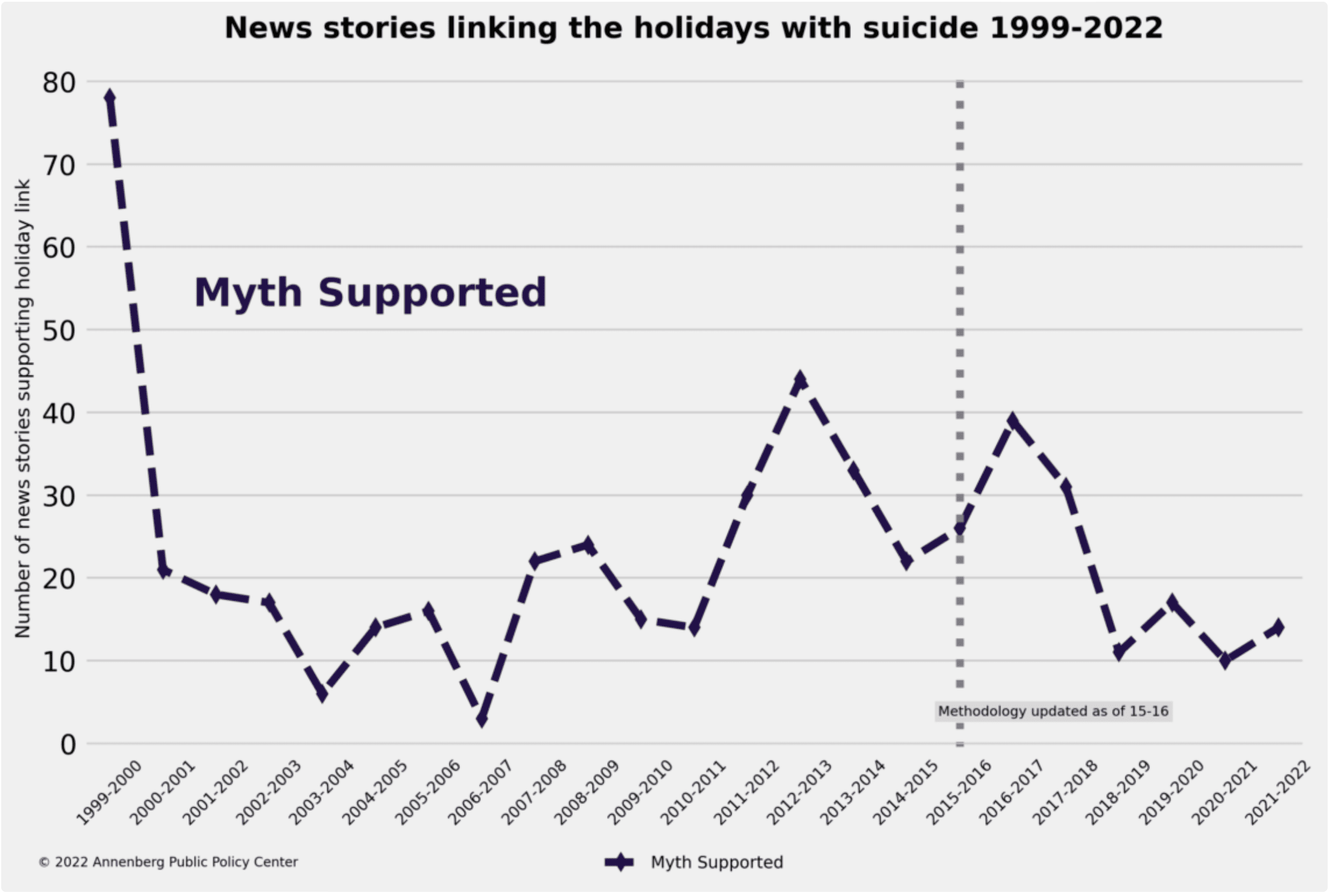
OK, just 15 of those bad news stories in the past year. That’s 15 more than we’d hope, but not as bad as it sounded from the headline!
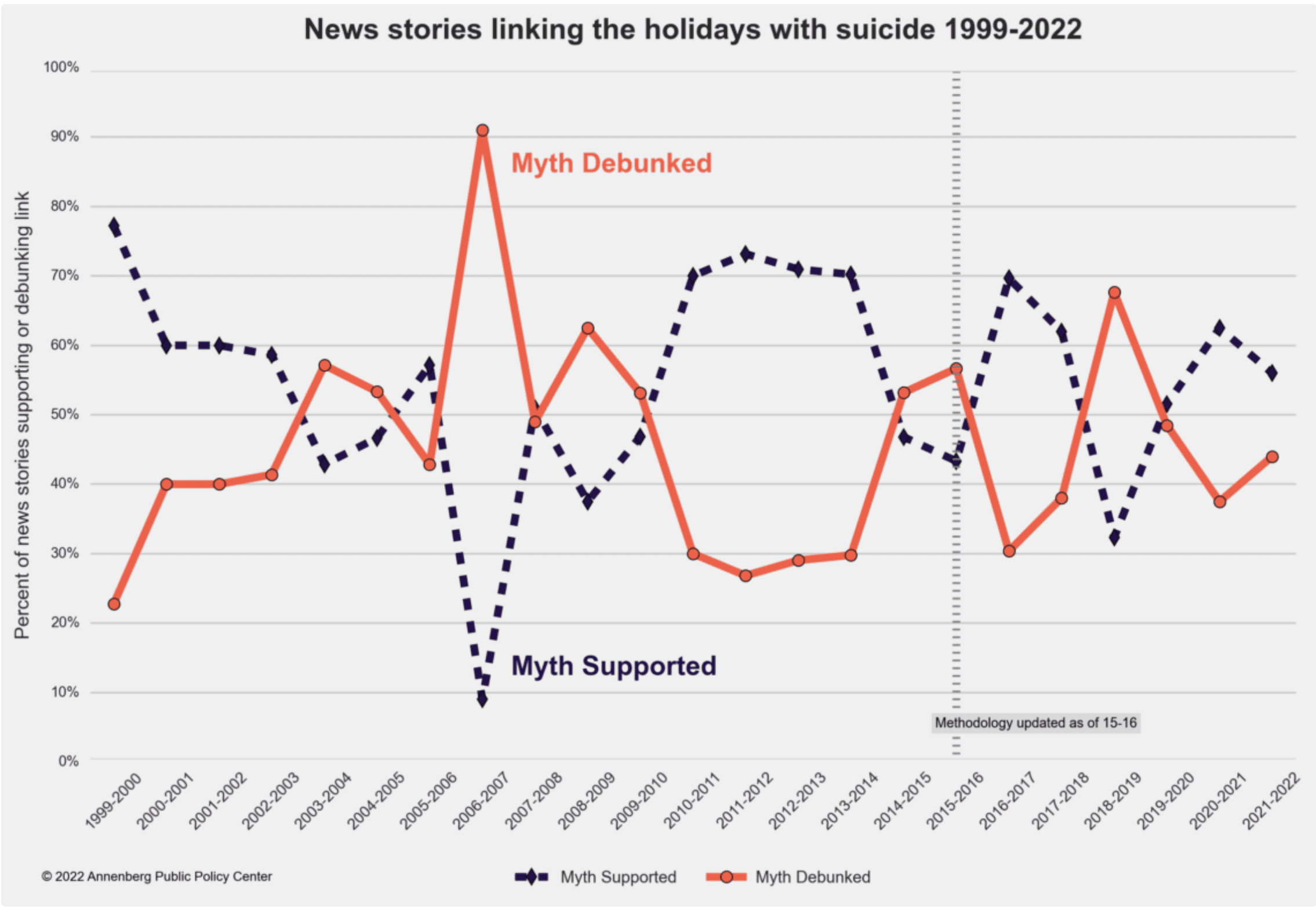
Also, I gotta say that this second graph above is not so great. It takes up a lot of space and conveys very little information. Why not just show the two lines of raw data (number of news stories supporting or debunking) on the same graph? That would be much clearer and would avoid the weird Rorschach dynamics of the second graph above. (By the way: I don’t think I’ve ever been able to spell Rorschach correct on the first try. Or even the second try.)
But let’s forget about the confusing graph and forget about the problem with the news stories. What about the data? APPC supplies the graph:

This is a nice graph.
The only thing is . . . given the whole holiday thing, it would be helpful to see the data for each week. They supply a ridiculous table which provides essentially no information beyond the time series graph but they manage to display so that it takes up a whole page on the screen:

I made it small here to spare you some of the pain. “130.52,” indeed. Why stop at 2 decimal places? Why not give full precision with 130.5183428923748923748293?
In any case, the topic of suicide is important. The APPC article states:
It’s important for reporters and news organizations to dispel the myth because allowing people to think that suicide is more likely during the holiday season can have contagious effects on people who are contemplating suicide. National recommendations for reporting on suicide advise journalists not to promote information that can increase contagion, such as reports of epidemics or seasonal increases, especially when the claim has no basis in fact.
I get that . . . but would they also say it’s wrong for news outlets to report that suicide rates are higher in the summer and early fall? I’m kinda suspicious of the recommendation not to report things.
Just to be on the safe side, I delayed this post until February.
What am I missing? Isn’t the second graph the 2 lines you are asking for (except that it is measuring the % of news stories rather than the number, which I would agree is not the best measure)? Further support that the number rather than the % should be used is that the first graph appears to show something like stories in 2006-07 and the related 2nd graph shows 9 or 10% of these as supporting the myth – given these strange mismatching numbers maybe they need those decimal places in their measures.
But my original question – can you clarify what you mean by the 2nd graph not conveying much information when the 1st has even less?
Dale:
Yes, I want the number, not the percent. Also it’s horrible to display x and 1-x on the same graph, as this creates all sorts of distracting Rorschach patterns.
On the third graph, I’m not entirely sure what’s being shown on the vertical axis. “Average daily suicide rate per month”? Eh? The word “rate” makes me think they’re presenting suicides per million population or something like that. Are they? The explanation at the bottom of the graph doesn’t really help: “Sum of monthly suicide avg. (deaths per day).” A sum of monthly averages? How many months are they summing over?
You’d think they could just show suicides per month. Are they worried that some months are a bit longer than others? They could show average number of suicides per day for each month. Is that in fact what they did? It’s not clear.
Another point: I looked at the recommendations for reporting on suicide from the organization SAVE. It does indeed advise journalists to refrain from reporting on suicide methods or exact locations. That’s something I can understand. You might not want people on the edge to know exactly where is “good” place to jump from, for example.
The recommendations also advise against using the word “epidemic” with regard to suicide, on the grounds that it implies suicide is “common and not preventable.” That sounds more dubious to me. Epidemics aren’t preventable? If you announce an epidemic, you’re announcing that prevention is vital.
What the recommendations do not say is to avoid talking about increases at all. In fact, they specifically urge that the word “increase” be used in place of the word “epidemic.” It really looks to me like Annenberg is misrepresenting those recommendations a little. When a claim lacks any basis, of course it shouldn’t be made. But there’s no blanket recommendation to refrain from reporting on seasonal increases.