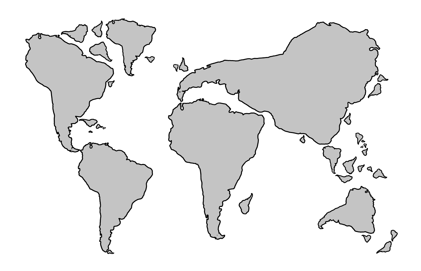
Gwynn points us to a new book, “Slow Down: The end of the Great Acceleration – and Why It’s Good for the Planet, the Economy, and Our Lives,” by Danny Dorling. The author is a geographer, so I assume he hasn’t claimed to have “discovered a new continent,” but I expect he’ll appreciate the above world map from xkcd.
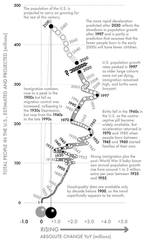
I haven’t seen Dorling’s book, but what Gwynn really wanted to point out were the visualizations on its webpage. These are a series of plots, each tracing a time series over a series of years with y on the y-axis and y'(t) (that is, dy/dt) on the x-axis. Here’s an example:
And here’s another:

And here’s one more:

We could keep going forever. The general theme is that if you plot y vs. y’, showing the direct passage of time using a dot for each year, you can visually convey second derivatives too. When teaching these ideas, I will typically show time series graphs of y(t), y'(t), y”(t), but that’s just not so intuitive. Showing y(t) and y'(t) on the two axes has just the right amount of redundancy to really make these patterns clear.
These graphs come up in physics—Dorling illustrates with the classic phase portrait of the pendulum—but there must also be a statistical literature on this—I was thinking I could ask Lee Wilkinson but then I remembered, sadly, that he’s no longer alive—so feel free to inform me of this in the comments.
Anyway, not only does this graphical form work; also, Dorling pulls off the details very well. I’m especially impressed at how he integrates explanatory text into the images, and just more generally how the graphs look professional and “designed” without sacrificing their statistical integrity. It’s unusual to see visualizations that combine the best of infoviz and statistical graphics. The only thing I don’t get in the above graphs are what the thickness of the line over time is supposed to represent. At first I thought the width was proportional to y, or maybe sqrt(y), but it’s not. Is it just arbitrary? That was confusing to me.
There are animated versions too! I love this stuff.
How would I do it differently?
As I said, I think these graphs are wonderful. Still, if I were doing them I would make some changes:
1. If you’re graphing an all-positive quantity (as in the examples shown above), I think it would make more sense to show relative (that is, percentage) change rather than absolute change.
2. I’d rotate the whole damn thing 90 degrees, then it will fit better on the screen (see examples above), also somehow it works better for me showing forward progression going to the right rather than going up.
3. Some color would be good. I’m not saying to make these graphs all garish, but even something as simple as drawing the main line in blue could help it pop out a little. I say this as someone who uses B&W by default and, as a result, makes graphs that by default look kinda boring.
4. My final concern is with the way that the passage of time is displayed. For the wikipedia graph, there’s one dot per year so that works. But for the graphs showing the population of the U.S., there’s a dot at 1600, then 1820, then no orderly pattern. There are numbers every 20 years through 1900, but the dots at the intervening decades skip 1890. Then it seems that there’s no dot until 1920, then a dot almost every year—but not quite every year—through 1970, then every 10 years until 1994, then a dot halfway between 1994 and 1995, etc. I understand the value of labeling particular years (revealing, for example, the local minimum of the rate of change in 150), but it’s not clear why 1945, 1955, 1960, and 1970 are in bold—but not 1950 and 1965, or 1975. This is getting picky, but it kinda gets in the way of appreciating the graph. I don’t have any easy answers here but I think the irregular proliferation of numbers here is getting in the way of reading the graph.
P.S. But something went wrong! In comments, Carlos points out:
The first chart is not coherent. Comparing 1970-1980 to 1980-1990 the former period shows lower annual increments but the ten-year increment is twice as high.
Yeah, whassup with that?? I’d assumed the graphs were made by computer and then enhanced by hand, but now I’m kinda concerned. No way these could be as bad as this graph, though. Or this one. Or the all-time winner here.
P.P.S. I corresponded with Dorling and it turns out that the error mentioned in the above P.S. was introduced in the editing process, during which the graphs were reformatted by a professional designer who unfortunately introduced an error in that graph.
It looks like the thickness of the line generally scales with the radius of the plotted points, which appear to scale with their position on the Y-axis.
No attempts at some sort of uncertainty for the future is annoying. There’s gonna be that very specific bend at 2050 in the US population graph? I think I’d rather just have nothing, or like an arrow pointing in the vague extrapolation direction.
I find more annoying that even the past cannot be taken at face value. The first chart is not coherent. Comparing 1970-1980 to 1980-1990 the former period shows lower annual increments but the ten-year increment is twice as high.
Good catch Carlos (for some reason I’m not getting a reply button on your post, so I’m responding to myself)
Hmm, there’s also an extra point between 1994 and 1995. Charitably, I think it must be a hand-labeling problem.
“No attempts at some sort of uncertainty for the future is annoying”
First it would be small on this chart. Second the chart is already packed with info. This is a summary chart. IMO it would be appropriate to use another, simplified chart of the forward projections to show uncertainty.
“Comparing 1970-1980 to 1980-1990 the former period shows lower annual increments but the ten-year increment is twice as high.”
Time is not represented spatially in any way on this chart. It doesn’t matter what the spatial intervals are between the dots. I suspect the missing dots between 1970 and 2000 are missing because they are very close together and would create too much clutter if they were present. The path substitutes for them.
The big problem is that there’s no legend for the dots, which **is** a major error. There should be a legend explaining exactly what the dots and their colors represent. No explanation on the web page either.
> Time is not represented spatially in any way on this chart.
Sure, nobody disputes that. That’s what the labels on the dots are for.
> It doesn’t matter what the spatial intervals are between the
dots.
The vertical interval between dots represents changes in population. The position of the dots labelled 1970, 1980 and 1990 tell us that the change in population between 1970 and 1980 was something like 22 million while the change in population between 1980 and 1990 was something like 12 million. That’s 2.2 million per year on average in the earlier period and 1.2 million per year on average in the later period.
> I suspect the missing dots between 1970 and 2000 are missing because they are very close together and would create too much clutter if they were present. The path substitutes for them.
The problem is that this substitution produces an inconsistent chart. It shows annual increments increasing from 2 million per year in 1970 to 2.5 million per year in 1990. But average growth in 1980-1990 cannot be that high if the dots are correctly labeled and positioned.
> The big problem is that there’s no legend for the dots, which **is** a major error. There should be a legend explaining exactly what the dots and their colors represent. No explanation on the web page either.
The black labels seemt to correspond to the years – also highlighted in black font – in the text.
> Hmm, there’s also an extra point between 1994 and 1995. Charitably, I think it must be a hand-labeling problem.
Yes, that may be it. It makes more sense if the point labelled 1990 is in fact something else like 1985 and 1990 is the following point.
The chart would be clearer – and this kind of error less likely to happen – if all the years multiple of ten were marked differently. Labelling and highlighting random years make it quite confusing.
Carlos Said:
“It shows annual increments increasing from 2 million per year in 1970 to 2.5 million per year in 1990. But average growth in 1980-1990 cannot be that high if the dots are correctly labeled and positioned.”
Oh! Now I get your complaint. by the axis, growth is increasing; by the dot spacing, growth is decreasing. This gets back to the meaning of the different dots. 1980 is white and the text is gray, where 1970/1990 are black. I don’t think this is just a text reference as you suggested. It has fundamental meaning with regards to the data. I suspect the white dots / grey text are some kind of estimate or guess, while the black dots/text are actual data or anchor points.
Again, the thing needs a legend. It bothers me that people ignore this kind of fundamental stuff so often.
> I don’t think this is just a text reference as you suggested.
Why not? Every year mentioned in the text is labelled in black font. When there is a reference to the 1960s, for example, 1960 is highlighted.
The only years in black font that can’t be found in the text are 1 (first year of history), 2020 (last year of history) and 2100 (last year of forecast).
The question of which of the remaining points are labelled (in gray) or not seems more arbitrary.
Jim, look at #3 here: https://www.dannydorling.org/books/SLOWDOWN/Illustrations.html#img66
Carlos said: “Jim, look at #3 here”
OK, got it. You’re right. Somehow the chart is f’d. The legend is still confusing. I’ve never heard of a *point* on a chart referred to as a “subdivision” (“White dots indicate subdivisions”). Is it data or not?
Nice, thanks for sharing!
I agree color would be great. In particular, it would really help differentiate observed from predicted. I like the “brick wall” in the US graph separating past from future, but this is missing in the Japan graph.
Rotating 90 degrees would work for the Wikipedia and US graphs, but I think it would be confusing for the Japan graph since it would look like “going back in time”.
I don’t like the weird dots and lines on the bottom of each graph. I think they are supposed to look like a pendulum swinging, but they don’t really look much like a pendulum and I don’t see how they convey useful info. Better to remove them altogether.
Finally, I think the y-axis grid lines interact in a weird way with the annotations, because they make it look like the annotation is pointing to a specific part of the line when generally it is about a different part of the line. Like the pendulum thing, I think the grid lines are not necessary because the labeling and annotation is sufficient and the specific y values are less important than the overall shape of the relation.
The vertical graphs look good on a phone, so maybe that was the goal?
Is this at all related to functional data analysis, as in Ramsay and Silverman? I really like the work that Jeffrey Morris and colleagues have done in that area:
Morris, J. S., & Carroll, R. J. (2006). Wavelet‐based functional mixed models. Journal of the Royal Statistical Society: Series B (Statistical Methodology), 68(2), 179-199.
Time series analysis comes up all the time in psycholinguistics and cognitive neuroscience, but I have the impression that this kind of thing has not really caught on.
In some fields, these are called phase plots, phase-plane diagrams, or the like–as I now see you mentioned.
I think I’ve always seen y on the abscissa and y’ on the ordinate, on the principal that, by definition, the state of the system (y) is the or at least a key input to the function (shown by the graph) that produces the net change (y’). I think that’s more of a transposition of the graph rather than your suggested 90 degree rotation, mostly to preserve positive directions to being up or to the right on both axes.
See, for example, Differential Equations for Engineers and Scientists, Lambe and Tranter, 1961, pp. 266 and 350 or several places in Sterman’s Business Dynamics.
What’s up with the pendulum? A visual reference to a phase portrait I suppose, but the pivot point is not at zero but rather at the value corresponding to 2100, which makes the pendulum swinging to zero have no information content whatsoever.
I’d rotate the graph 180 degrees, and put the pendulum pivot point at zero. That way, the swinging pendulum would represent fractional rates of change, as a supplement to the absolute rates of change plotted explicitly.
Well, okay, not rotate 180 degrees, but reflect vertically.
The thickness of the line may show distance to the present time (around 2020). This would explain why in Figures 1 and 3 the largest point is at the end of the time series and why points size decrease after 2020 in Figure 2.