This is Jessica. Since my last post on use of differential privacy at the Census I’ve been reading some scholarly takes on the impacts of differentially private Census data releases in various applications. At times it reminds me of what economist Chuck Manski might call dueling certitude, i.e., different conclusions in the face of different approaches to dealing with the lack of necessary information to more decisively evaluate the loss of accuracy and changes in privacy preservation (because the Census can’t provide the full unnoised microdata for testing until 72 years have passed). There are also many ways in which analyses of the legal implications of the new disclosure avoidance system (DAS) remind me of what Manski calls incredible certitude and which comes up often on this blog i.e., an unwarranted belief in the precision or certainty of data-driven estimates.
A preprint of one of the more comprehensive papers about political implications of the new DAS was posted by Cory McCartan on my last post. His coauthor Shiro Kuriwaki now sends a link to The use of differential privacy for census data and its impact on redistricting: The case of the 2020 U.S. Census, by Kenny, Kuriwaki, McCartan, Rosenman, Simko, and Imai, recently published in Science Advances. It’s dense but their methods and results are worth discussing given that use of Census data figures prominently in certain legal standards like One Person, One Vote and Votings Rights Act.
A few things to note right off the bat as background:
- The Census TopDown algorithm that makes up the DAS involves both the addition of random noise, calibrated according to differential privacy (DP), and a bunch of post-processing steps to give the data “facial validity” and make it “usable”, in the sense of not containing negative counts, making sure certain aggregated population counts are accurate and consistent with the released data, etc. The demonstration data the Census has released for 2010 provides final results from this pipeline, and offers three different epsilon (“privacy-loss”) budgets (the key parameter for DP), two of which are evaluated in the main body of the Kenny et al. paper: with total epsilon of 4.5 (the initial budget, with more privacy preservation) and one with total epsilon of 12.2 (less privacy protection in favor of accuracy based on feedback from data users). However, the end of the paper reports their analysis applied to the new DAS-19.61 epsilon data, which is what the Census will use for 2020 – pretty high, but I assume the bureau still thinks it’s an improvement over the old technique if they are using it.
- The Census has not released DP-noised data without the subsequent post-processing steps, so Kenny et al. compare to the (already noised) 2010 Census data release. Treating deviation from 2010 figures as error, especially when the analyses focus on race, carries some caveats since the 2010 Census data has already been obscured, through swapping data from carefully-chosen households across blocks to limit disclosure of protected attributes like race. However, given the 72 year rule, I guess it’s this or using the recently released 1942 Census, as some other work has.
- Regarding post-processing, Kenny et al. say “The question is whether these sensible adjustments unintentionally induce systematic (instead of random) discrepancies in reported Census statistics.” However, it seems pretty apparent from prior work and the statements of privacy experts that it’s the postprocessing that’s introducing the bigger issues. See, e.g., letters from various experts calling for release of the noisy counts file to avoid the bias that enters when you try to make the data more realistic. There’s also a prior analysis by Cohen et al. that finds that TopDown, applied to Texas data, can bias nearby Census tracts in the same direction in ways that wouldn’t be expected from the noised but unadjusted counts, impeding the cancellation of error that usually improves accuracy at higher geographical levels.
- Finally, there are two relevant legal standards to redistricting that the paper discusses. First the One Person, One Vote standard requires states to minimize deviation from equal population districts according to Census data. Second, to invoke the Voting Rights Act in a Voting Rights case, one has to provide evidence that race is highly correlated with vote choice and show that it’s possible to create a district where the minority group makes up over 50% of the voting age population. So the big questions are about how the ability to comply with these standards and the districts that might result in the new DAS will be affected.
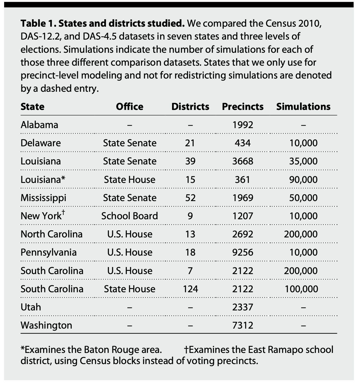
The datasets that Kenny et al. use combine data spanning various elections from districts and precincts in states that are of interest in redistricting (PA, NC), Deep South states (SC, LA, AL), small states (DE), and heavily republican (UT) and democratic (WA) states.
Undercounting by race and party
The first set of results expose a bias toward undercounting certain racial and partisan groups with epsilon 12.2. They fit a generalized additive model to the precinct-level population errors for the DAS-12.2 data (defined relative to the 2010 Census), to assess the degree of systematic bias versus residual noise (what DP alone adds). Predictors include two-party Democratic vote share of elections in the precinct, turnout as a fraction of the voting age population, log population density, the fraction of the population that is White, and the Herfindahl-Hirschman index (HHI) as a measure of racial heterogeneity (calculated by summing the squares of the proportion of the population from four different groups of White, Black, Hispanic, Other, so that 1 denotes complete lack of diversity). i is the precinct index.
PDAS,i −PCensus,i = t(Democratici,Turnouti, log(Densityi))+ s(Whitei)+s(HHIi)+i
Here are two figures, one showing bias given non-White population, the other showing bias given HHI. The authors attribute the loss of population of mixed White/non-White precincts and consequently their diluted electoral power to the way the new DAS prioritizes accuracy for the largest racial group in an area.
Several of the HHI graphs flatten closer to 0 around 40% HHI; is that an artifact of higher sample size when you reach that HHI? It’s hard from these plots to tell what proportion of precincts have more extreme error. I also wonder how consistent the previous swapping approach to protecting attributes like race was – my understanding is that households were assigned a risk level related to their uniqueness, and higher risk households more likely to be swapped, hence it would make sense to expect more swapping in areas that were more racially homogenous. But then we might expect Census 2010 data to already be biased at low/high % non-White and high HHI. Complicating things, Mark Hansen provides an example suggesting that swapping did not necessarily keep race consistent. It’s rumored that about 5% of households were swapped in Census 2010, so existing bias in the 2010 data may be significant.
The biases are qualitatively similar but less severe when they use the epsilon 19.61 dataset:

Using DAS 12.2, the authors also find in a supplemental analysis, presumably due to the relationship between party and racial heterogeneity, that “moderately Democratic precincts are, on average, assigned less population under the DAS than the actual 2010 Census”, while higher-turnout precincts are on average assigned more population than they should otherwise have (on the order of 5 to 15 voters per precinct). They argue that when aggregated to congressional districts, these errors can become large (on average 308 people, but up to 2151 for a district in Pennsylvania; “orders of magnitude larger than the difference under block population numbers released in 2010”). They don’t discuss the size of the average congressional district however, but I believe it’s in the hundreds of thousands. With epsilon=19.61, the errors go down 10 fold, falling between -216 and 319. While I find the consistency of the race and party bias hard to ignore, I can’t help but wonder how these errors compare to the estimated error associated with the imputation process Census uses for missing data. I would expect at least an order of magnitude difference (with the DAS-19.61 errors surely being substantially smaller) there, in which case it seems we should at least be mindful that some of these deviations from the new DAS are within the bounds of our ignorance.
Achieving population parity for One Person, One Vote, detecting gerrymandering
The next set of analyses rely on simulations to look at potential redistricting plans. Kenny et al. describe:
The DAS-12.2 data yield precinct population counts that are roughly 1.0% different from the original Census, and the DAS-4.5 data are about 1.9% different. For the average precinct, this amounts to a discrepancy of 18 people (for DAS-12.2) or 33 people (for DAS-4.5) moving across precinct boundaries.
Their simulation looks at how these precinct-level differences propagate to district level. They use a few different sampling algorithms, including a merge-split MCMC sampler for state legislative district simulations described as building from some prior work available on arxiv, which are implemented in the redist package.
They use two states, Louisiana and Pennsylvania, to look at deviation from population parity, the requirement that “as nearly as is practical, one [person’s] vote in a congressional election is worth as much as another’s.” They simulate maps for Pennsylvania congressional districts and Louisiana State Senate districts which are constrained to achieve population parity with varying tolerated deviation from parity ranging from 0.1% to around 0.65%, defined using either Census 2010 data or one of the new DAS demonstration datasets. Using Pennsylvania data, they find that plans generated from one dataset (e.g., epsilon=12.2) given a certain tolerated deviation from parity on the generating data had much larger deviation when measured against a different dataset (e.g., released Census 2010). For example, 9,915 out of 10,000 maps simulated from DAS-12.2 exceeded the maximum population deviation threshold according to Census 2010 data, with high variance in the error per plan making it hard for redistricters to predict how far off any given generated plan might be from parity. For Louisiana State Senate, they find that if enacted plans were created from DAS-12.2 they would exceed the 5% target for population parity according to 2010 data. However, for DAS-19.61 data, things again look a lot better, with a much smaller percentage of generated plans exceeding the 5% for Louisiana (when evaluated against Census 2010).

At this point I have to ask, did population parity ever make sense, given that Census population counts are obviously not precise to the final digit, even if the bureau releases that level of precision? Kenny et. al. describe how “[e]ven minute differences in population parity across congressional districts must be justified, including those smaller than the expected error decennial census figures.” From this discussion around population parity and later discussion around the Voting Rights Act, it seems clear that there’s been a strong consensus legally that we will treat the Census figures as if they are perfect (again, Chuck Manski has a term for this – conventional certitude).
How much of this willful ignorance can be argued to be reasonable, since it supports some consensus on when district creation might be biased? To what extent might it instead represent collective buy-in to an illusion about the precision of census data? (One which I imagine many users of Census data may hate to see shattered since it would complicate their analysis pipelines). Previously it has seemed to me that some arguments over differential privacy are a bit like knee-jerk reactions to the possibility that we might have to do more to model aspects of the data generating process (which DP, when not accompanied by post processing, allows us to do pretty cleanly). danah boyd has written a little about this in trying to unpack reasons behind the communication breakdown between some stakeholders and the bureau. Kenny et al describe how “it remains to be seen whether the Supreme Court will see deviations due to Census privacy protection as legitimate;” yep, I’m curious to see how that goes down.
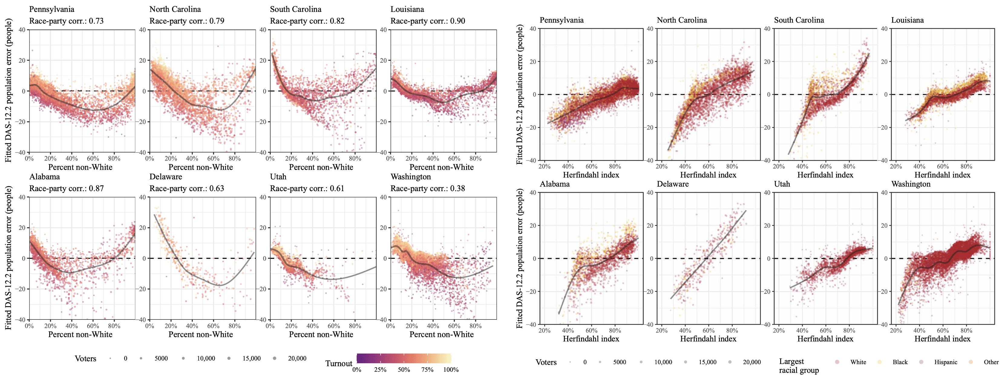
Kenny et al. next use simulation to compare the partisan composition of possible plans, specifically how the biases in precinct-level populations affect one’s ability to detect partisan and racial bias in redistricting plans (such as packing and cracking). They use an approach to detecting gerrymandered plans with each data source informed by common practice, which is to simulate many possible plans using a redistricting algorithm and then look at where the expected election results from the enacted plan falls in the distribution of expected election results from the set of simulated (unbiased) plans.
So they simulate plans using North and South Carolina, Delaware, and Pennsylvania data, and plot the distribution of differences between the enacted plan’s expected Democratic vote share and each simulated plan’s expected Democratic vote share. When this distribution of differences is completely above zero, the enacted plan had fewer Democratic voters than would be expected, vice versa if lower than zero. They find that for a handful enacted plans compared against the distribution of simulated plans generated using Census 2010 data, what looks like evidence of packing or cracking reverses when the simulated plans are instead generated using DAS 12.2 data (see the light blue (Census 2010) vs green (DAS-12.2) boxplots on the right half of the upper chart below of South Carolina house elections, which orders districts according to ascending expected Democratic vote share). They also do a similar analysis on racial composition. At the district level, results are again mixed across the states and types of districts, with some states (N/S Carolina) congressional district make-up relatively unaffected, while others show that the DAS datasets (up to epsilon 12.2) reverse evidence of packing or cracking of Black populations? that can be seen using Census 2010. Results are less severe but qualitatively similar with epsilon 19.61 (bottom chart), where they note that few districts where the DAS datasets can differ by up to a few percentage points, potentially shifting the direction of measured partisan bias for a plan. Again we should keep in mind that the Census 2010 data is itself obscured, and we don’t know exactly how much this might affect our ability to detect actual packing and cracking under that dataset.
They also compare the probability of a precinct being included in a majority minority district (MMD) under different datasets, since evidence that the creation of MMDs is being prevented is apparently frequently the focus of voting rights cases. Here they find that as their algorithm for finding MMDs (defined by Black population and applied to the Louisiana State House districts in Baton Rouge) searches more aggressively for MMDs (y-axis on the below figure), the DAS data leads to different membership probabilities for different precincts. Without knowing much about how the algorithm encouraging MMD formation works, I find the implications of this relationship between aggressiveness of MMD attempts and error relative to 2010 hard to understand, but I guess there’s a presumption that since these districts come up in Voting Rights Act cases we should assume that aggressive MMD search can happen.
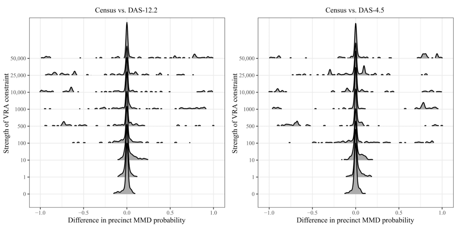
A critique of this analysis by Sam Wang and Ari Goldbloom-Helzner argues that the paper implies that a precinct jumping between having a 49.9% versus 50.1% chance of being included in an MMD across different data sources is meaningful, when in reality such a difference is so small as to be of no practical consequence. They mention finding in their own analysis (of Alabama state house districts) that for districts that were in the range of 50.0% to 50.5% Black voting age population, there was less than 0.1 percentage point (as fraction of total voting age population) difference in the majority of cases, and always less than 0.2 percentage point difference. They also question whether Kenny et al.’s results may be obscured by artifacts from rerunning the simulation algorithm anew on each different dataset to produce maps, rather than keeping maps consistent across datasets.
I have my own questions about the precision of the redistricting analyses. In motivating their analyses Kenny et al. describe:
If changes in reported population in precincts affect the districts in which they are assigned to, then this has implications for which parties win those districts. While a change in population counts of about 1% may seem small, differences in vote counts of that magnitude can reverse some election outcomes. Across the five U.S. House election cycles between 2012 and 2020, 25 races were decided by a margin of less than a percentage point between the Republican and Democratic party’s vote shares, and 228 state legislative races were decided by less than a percentage point between 2012 and 2016.
Should we not distinguish between the level of precision with which we can describe an election outcome after it has taken place, and our ability to forecast a priori with that level of precision? If we accept that Census figures are presented with much more precision than is warranted by the data collection process to begin with, would we still be as concerned over small shifts under the new DAS, or would we arrive at new higher thresholds on the amount of deviation that’s no longer acceptable?
All in all, I find the evidence of biases that Kenny et al. provide eye opening but am still mulling over what to make of them in light of entrenched (and seemingly incredible) expectations about precision when using Census data for districting.
There’s a final set of analyses in the paper related to establishing evidence that race and vote choice are correlated through Bayesian Improved Surname Geocoding. Since this post is already long, I’ll cover that in a separate post coming soon. There is lots more to chew on there.
P.S. Thanks to Abie Flaxman and Priyanka Nanayakkara for comments on a draft of this post. It takes a village to sort out all of the implications of the new DAS.
P.P.S. (10/27/21) – My comments on rest of Kenny et al.’s results here: https://statmodeling.stat.columbia.edu/2021/10/27/is-the-accuracy-of-bayesian-improved-surname-geocoding-bad-news-for-privacy-protection-at-the-census-technically-no-pr-wise-probably/
Thanks for a great discussion and some excellent points. The widespread practice of treating census data as error- and bias-free is certainly a bigger problem here, and to the extent that the DAS helps people move to modeling that involves measurement error, that’s a good thing. Realistically, though, 95%+ of the use of census data is by the lay public, reporters, or others who don’t have the computational or technical ability to make these adjustments or communicate these errors. “Conventional certitude” may be a reasonable position to take for these users. In fact, that’s why this post-processing is applied in the first place—we can’t hope to explain to the whole country how to deal with negative population counts etc.
I think it’s worth differentiating between different kinds of error in the DAS and in 2010 data. Swapping keeps block population invariant, so all the analyses based only on population (the redistricting simulations just use total population, and the GAM fits are to the error in total population) are using the actual 2010 ground truth (i.e., not affected by privacy protection). Partisan information comes from election returns and is also not subject to privacy protection. However, the VRA analyses do use race counts and so may be affected by swapping.
I’ve already written about how the harms the Bureau is trying to avoid may be nonexistent. But to the extent that one is still concerned about privacy leakage through reidentification, we have learned a bit more from a recent FOIA request to the Bureau:
https://drive.google.com/file/d/1l5ZKpflm2o8W2z4UqOS3tqiLsVMK8e_8/view?usp=sharing
The released document confirms that the Bureau’s sole motivation for the DAS is protecting individual race from being re-identified, which I think makes our BISG analysis all the more relevant (looking forward to that post). And on the privacy-accuracy tradeoff side of things, they ran experiments across a different range of privacy loss budgets. Their final budget of 19.6 is off the charts (literally), but looks to cut the re-ID risk by a bit less than 50%, from 17% to around 9%.
But to stray a bit from the focus of our paper—the real cost of the DAS / a definition of ‘harm’ which is synonymous with race re-ID is not the noise injection—it’s the suppression of released information versus what was provided in 2010 (https://www.census.gov/newsroom/blogs/random-samplings/2021/09/upcoming-2020-census-data-products.html). The Bureau plans on releasing only 68 of 169 tables at the block level (versus 235 block-level tables in 2010). Lots of block and tract level data that researchers used in the past will now only be available at the county level. To my mind, this kind of data suppression is a steep price to pay for a marginal reduction in race re-ID.
Thanks for these links, and the clarification on swapping and block population invariance.
“Realistically, though, 95%+ of the use of census data is by the lay public, reporters, or others who don’t have the computational or technical ability to make these adjustments or communicate these errors. “Conventional certitude” may be a reasonable position to take for these users. In fact, that’s why this post-processing is applied in the first place—we can’t hope to explain to the whole country how to deal with negative population counts etc.” I don’t disagree, but the idealist in me does like the idea of unadjusted noised counts as a wake-up call/forcing function.
I wasn’t aware of the extent of suppression but will take a closer look. I’m also looking forward to the next post! Still mulling over what to make of BISG’s performance but it surprised me.
I’m really missing in-person conferences right now, because I’d love to hear what people are saying about the Census Bureau shifting from pure DP with epsilon = 4.5 to probabilistic DP with epsilon = 19.6 in the span of a couple of months.
The slides at the google drive link McCartan provides above seems to imply that for the type of database reconstruction attack the Census was concerned about, even with high epsilon the rate of confirmed reidentifications is lower than what it was with swapping (which was 17%) …. they don’t experiment past epsilon 16 but if you look at the graph on slide 30, it seems even with epsilon around 20 you’re still probably under 10% confirmed reidentification. I was glad to finally see some Census documentation of this since I’d been wondering whether the bureau sees DAS-19.61 as a privacy improvement over the old approach, or whether they just decided to give in to stakeholders requests for more accuracy this time as long as they succeeded in getting differential privacy in the pipeline.
I guess my point is that Census seemed to make a very large, very abrupt change very late in the game. On one hand, I suppose we should be happy that they course-corrected in the name of improving utility (rather than stubbornly pressing forward by releasing useless data), but — from the outside looking in — it seems like it was rushed.
As for the plot in that presentation, I feel like I’ve read too many of Andrew’s posts related to “The Garden of Forking Paths” to be overly convinced* by one plot of one metric. Particularly if that plot was made in Dec 2019 (the date on the first slide), 18 months before they switched from pure DP to probabilistic DP, and in light of the plot on slide 15, which seems to imply that epsilon > 4.3 potentially offers ~no protection.
*Note: When I say that I’m not “overly convinced”, I’m saying that I’m not convinced that this was all worth it. I’m sure the privacy protections are better than before, but I don’t think they’re anywhere near what was being promised early on, and the “cost” with regards to utility remains to be seen.
Jessica:
I agree that requiring exactly equal populations is kinda silly, first because as you say the population is just an estimate, and second because populations change during the period between censuses. They even change in the one or two years between the census and the first post-census election. I can see why from a legal perspective it can make sense to have a strict rule—back before the 1960s, districts within a state could vary in population by a factor of 3 or more, I believe—but requiring strict equality is a problem if it gets in the way of regulating gerrymandering, for example.
For state leg districts, the de facto or de jure standard most places is a maximum 5% deviation from equality. This seems much more reasonable than saying ‘one person one vote’ and leaving it up to states to guess whether a map will be struck down (and thus encouraging perfect equality).
Now, parties will often use this leeway to their advantage, making their opponents’ districts on the larger side and their districts on the smaller side, but that seems more relevant to a fight about partisan gerrymandering and not to one just about vote dilution on the basis of district sizes / 1P1V.
Post-census population changes might even be a bigger concern this round than in the past, given the movement of people during the pandemic—young adults moving back home, people moving out of some urban areas, etc. The rise of housing costs in many areas might’ve also pushed people around more over the last year than in the past.
P.S. There’s something odd about the above graphs for South Carolina State House. The little boxes go up and down and up and down because two or three sets of estimates are being compared. There should be a way to plot these data so that the comparison can be done directly without the reader needing to mentally realign these two shifted series. Another problem is that the graphs have so much white space. Perhaps a solution would be to rotate things 90 degrees and make a dot plot with five columns: first the census and then the 4 other estimates. I’m not quite sure; there could be other ways of doing it; but I think something much better could be done.
The top and bottom South Carolina charts were excerpts from two different larger figures in the text/supplement that I put together. Would be easier to compare if side by side but each was already pretty wide (or better yet Census 2010 and all three DAS could be in a single chart). Could help if the groupings had a little more space between them so the different sets of three are easier to identify. I guess they could have just plotted the distributions of the difference between one of the DAS (e.g., 19.61) and the Census 2010, but that gets more abstract, i.e., a plot of differences in differences.
Jessica:
I just think the comparisons are very hard to make with this sort of sawtooth graph. Adding space between the groupings wouldn’t resolve the problem of the data being presented in the format 1,2,3, 1,2,3, 1,2,3, 1,2,3, etc. Using dots rather than boxes and more distinct colors could help.
But the 123 123 is because the higher priority comparison is between the Census 2010 and each DAS within a set of districts (at least by my read, you’re looking for sets of three where there’s some reversal from + to – or vice versa between the light blue and one of the DAS). Looking at the trend within one series, e.g., the trend across the blue box plots, is lower priority. So would be easier to compare within the sets of three without getting distracted by the neighboring sets if they were more visually distinct from one another.
Thanks Andrew. I agree it’s a bit hard to intuit: We want to compare each group of 1,2,3 but different groups have different findings. What we have in the paper is the best we could think of, but I’ll think about your suggestions.
The type of histogram plot is common — perhaps the most common — format in showing results of redistricting simulations; e.g. Figure 3 in https://arxiv.org/abs/1801.03783. So it would be cool to discuss improvements to this type of plot.