Kevin Brown writes:
I came across the lexicon link to your ‘super plots’ posting today. In it, you plot the association between individual income (X) and republican voting (Y) for 3 states: one assumed to be poor, one middle income, and one wealthy.
An alternative way of plotting this, what I call a ‘herd effects plot’ (based on the vaccine effects lit) would be to put mean state income on the X axis, categorize the individual income into 2 (low-high) income groups, and then plot. This would create a plot with 50 x 2 points (two for each state). It would likely show the convergence of the voting tendencies of the poor and wealthy within high income states.
Some of the advantages of this alternative way of plotting is that you could see the association across all 50 states without the graph appearing to be ‘busy’. Also aliens wouldn’t have to keep in mind that Mississippi is a poor state because that information would be explicitly described on the X axis. Could also plot the marginal association with state income as a 3rd line.
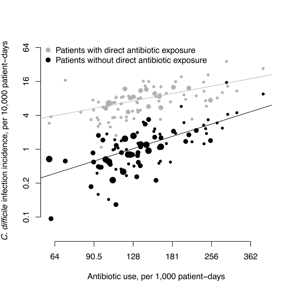
Here’s an example from a recent paper [Importation, Antibiotics, and Clostridium difficile Infection in Veteran Long-Term Care: A Multilevel Case–Control Study, by Kevin Brown, Makoto Jones, Nick Daneman, Frederick Adler, Vanessa Stevens, Kevin Nechodom, Matthew Goetz, Matthew Samore, and Jeanmarie Mayer, published in the Annals of Internal Medicine] looking at herd effects of antibiotic use and a hospital acquired infection that’s precipitated by antibiotic use. Each pair of X-aligned dots represents antibiotic users and non-users within one long-term care facility with a given overall level of antibiotic use.
My reply: Rather than compare high to low, I would compare upper third to lower third. By discarding the middle third you reduce noise; see this article for explanation.
I’ve seen a few figures like this with size fo the circle representing weight or N or something. I prefer open circles because you can see overlap better.
I think another solution for the income/state superplot might be to draw a plot with all income categories for all states (250 points) but to use transparency, color, and selective labeling to highlight a few (e.g., 3) key states. Is the data used to make those plots available somewhere?