Perhaps in response to my lament, “People used to send me ugly graphs, now I get these things,” Stuart Buck sends me an email with the above comment and a link to this “Graphic of the day” produced by some uncredited designer at Thomson Reuters:
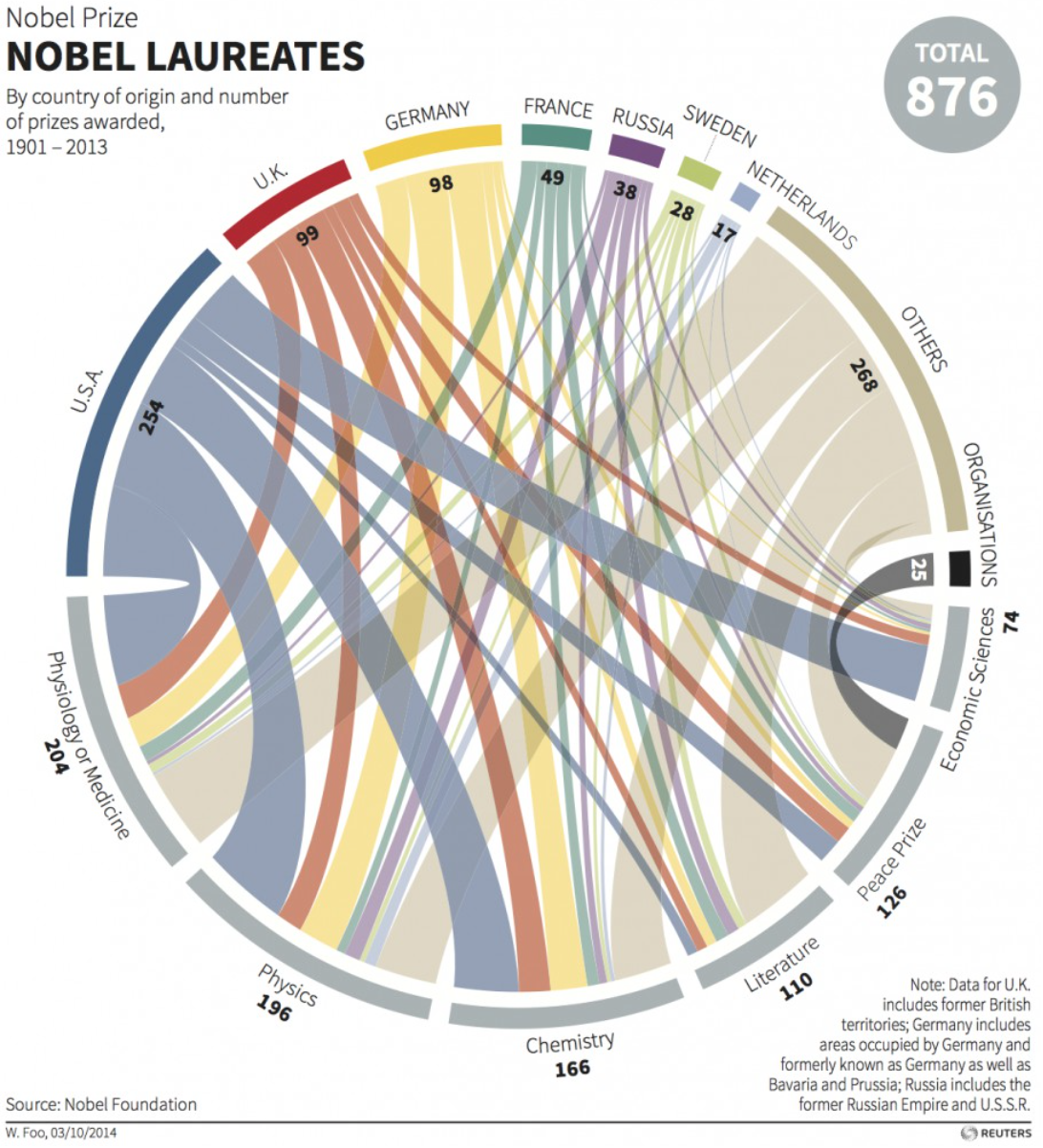
From a statistical perspective, this graph is a disaster in that the circular presentation destroys the two-way structure (countries x topics) which has to be central to any understanding of these data. In addition, to the extent that you’d want to get something out of the graph, you’ll end up having to perform mental divisions of line widths.
At this point I’d usually say something like: On the plus side, this is a thought-provoking display (given its tentacle-like appearance, one might even call it “grabby”) that draws viewers’ attention to the subject matter. But I can’t really even say that, because the subject of the graph—nationalities of Nobel Prize winners—is one of the more overexposed topics out there, and really the last thing we need is one more display of these numbers. Probably the only thing we need less of is further analysis of the Titanic survivors data. (Sorry, Bruno: 5 papers on that is enough!)
Perhaps one feature of a bad plot is that it is easy to show something impossible or ridiculous and for this to go undetected. This plot makes that very easy; joining “Peace prize” and “Physiology or medicine” or “UK” and “Organisations” would be nonsensical, yet you’d never see it in the spaghetti of lines.
Two points:
(1) The US has a virtual monopoly on Econ. Nobels. More so than any other areas.
(2) Why are the Swedes doing so well? Nepotism?
And 22% have been won by Jews, with higher concentrations in some fields.
Though that level of success is exceeded by the percentage of male winners.
One could argue the list might reflect something about a country’s educational system, but if one goes through the lists, you see some countries have nearly all their winners from many decades ago. And some are listed as belonging to this or that country when they actually did their work somewhere else.
“And some are listed as belonging to this or that country when they actually did their work somewhere else.”
Well, one of the few things that this graph gets right is that the caption does say “by country of origin.”
this plot is all the rage in genomics (usually backed by d3 interaction), apparently they didn’t get the memo.
Using this kind of chart with two kinds of entity is certainly original, but it works for me.
Is this any worse than the mileage charts in road atlases? By listing the same cities on two axes they conceal the symmetry of the distance relationship. Here, on the other hand, the geometry hints at a symmetry that does not exist in the data. Effective use of colour prevents any possible confusion. Countries have colours. Prizes don’t.
Aren’t these called circular migration plots? I don’t really mind them when used sensibly. Although, I have to agree in this case it’s a horrible choice.
1. There’s no ordering or cyclicality, so that makes this particular graph choice inappropriate
2. Counts are misleading
Do you have links to these plots used sensibly? Just curious of how they work well.
Thomas:
This probably sounds patronizing (to the makers of this graph, not to you), but I think people just think circles are pretty. Also there’s the puzzle-like aspect of the graph (search this blog for “Chris Rock effect”), so that the reader gets the satisfying experience of working moderately hard to discover facts which in retrospect are obvious. I’ve noticed that a lot of popular visualizations have this feature. Which, to those of us trained on Tukey’s EDA, is a bug.
“Probably the only thing we need less of is further analysis of the Titanic survivors data.”
Interest in the Titanic appears to have moved away from survivor data. Items in today’s news are that the Titanic’s priest is to be sainted, and that a deck chair from the Titanic is expected to bring a tidy sum at auction. Hard to get graphs from those factoids.
I wonder which nation was credited with Einstein’s prize? There are other Nobel laureates who emigrated from their native land.
agree that it may not be best chart. but wonder too if it benefits in it’s “live” form with interactivity – as in the paths/lines or countries are emphasized when you run your mouse over, or additional information pops up based on user activity. News outlets too have dual need to not only present the information, but entertain and draw readers.
Small point: the designer is named in the lower right corner of the figure, under the hline.
Sorry, left corner.
Some people will never be satisfied. But when I did my undergraduate studies, representations of Volvox were much worse. I, for one, welcome this fancy crap!
Somewhat off-topic: paper on the downsides of bar graphs.
https://journals.plos.org/plosbiology/article?id=10.1371/journal.pbio.1002128
They use the term ‘univariate scatterplot’ for jittered dotplots. At first I did not like that phrase (and the lack of a Cleveland citation), but now I think that is a better term—the word ‘dotplot’ could easily be misinterpreted.
I agree Stephen Few that bar graphs are intuitive for comparing proportions. See for example https://www.perceptualedge.com/articles/visual_business_intelligence/are_mosaic_plots_worthwhile.pdf