A couple people pointed me to this recent news article which discusses “why, beyond middle age, people get happier as they get older.” Here’s the story:
When people start out on adult life, they are, on average, pretty cheerful. Things go downhill from youth to middle age until they reach a nadir commonly known as the mid-life crisis. So far, so familiar. The surprising part happens after that. Although as people move towards old age they lose things they treasure–vitality, mental sharpness and looks–they also gain what people spend their lives pursuing: happiness.
This curious finding has emerged from a new branch of economics that seeks a more satisfactory measure than money of human well-being. Conventional economics uses money as a proxy for utility–the dismal way in which the discipline talks about happiness. But some economists, unconvinced that there is a direct relationship between money and well-being, have decided to go to the nub of the matter and measure happiness itself. . . There are already a lot of data on the subject collected by, for instance, America’s General Social Survey, Eurobarometer and Gallup. . . .
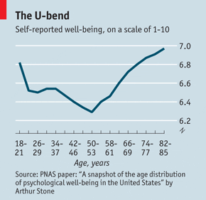
And here’s the killer graph:
All I can say is . . . it ain’t so simple. I learned this the hard way. After reading a bunch of articles on the U-shaped relation between age and happiness–including some research that used the General Social Survey–I downloaded the GSS data (you can do it yourself!) and prepared some data for my introductory statistics class. I made a little dataset with happiness, age, sex, marital status, income, and a couple other variables and ran some regressions and made some simple graphs. The idea was to start with the fascinating U-shaped pattern and then discuss what could be learned further using some basic statistical techniques of subsetting and regression.
But I got stuck–really stuck. Here was my first graph, a quick summary of average happiness level (on a 0, 1, 2 scale; in total, 12% of respondents rated their happiness at 0 (the lowest level), 56% gave themselves a 1, and 32% described themselves as having the highest level on this three-point scale). And below are the raw averages of happiness vs. age. (Note: the graph has changed. In my original posted graph, I plotted the percentage of respondents of each age who had happiness levels of 1 or 2; this corrected graph plots average happiness levels.)
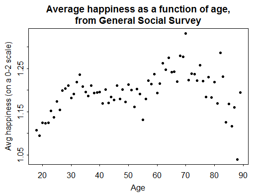
Uh-oh. I did this by single years of age so it’s noisy–even when using decades of GSS, the sample’s not infinite–but there’s nothing like the famous U-shaped pattern! Sure, if you stare hard enough, you can see a U between ages 35 and 70, but the behavior from 20-35 and from 70-90 looks all wrong. There’s a big difference between the publishedl graph, which has maxima at 20 and 85, and the my graph from GSS, which has minima at 20 and 85.
There are a lot of ways these graphs could be reconciled. There could be cohort or period effects, perhaps I should be controlling for other variables, maybe I’m using a bad question, or maybe I simply miscoded the data. All of these are possibilities. I spent several hours staring at the GSS codebook and playing with the data in different ways and couldn’t recover the U. Sometimes I could get happiness to go up with age, but then it was just a gradual rise from age 18, without the dip around age 45 or 50. There’s a lot going on here and I very well may still be missing something important. [Note: I imagine that sort of cagey disclaimer is typical of statisticians: by our training we are so aware of uncertainty. Researchers in other fields don’t seem to feel the same need to do this.]
Anyway, at some point in this analysis I was getting frustrated at my inability to find the U (I felt like the characters in that old movie they used to show on TV on New Year’s Eve, all looking for “the big W”) and beginning to panic that this beautiful example was too fragile to survive in the classroom.
So I called Grazia Pittau, an economist (!) with whom I’d collaborated on some earlier happiness research (in which I contributed multilevel modeling and some ideas about graphs but not much of substance regarding psychology or economics). Grazia confirmed to me that the U-shaped pattern is indeed fragile, that you have to work hard to find it, and often it shows up when people fit linear and quadratic terms, in which case everything looks like a parabola. (I’d tried regressions with age & age-squared, but it took a lot of finagling to get the coefficient for age-squared to have the “correct” sign.)
And then I encountered a paper by Paul Frijters and Tony Beatton which directly addressed my confusion. Frijters and Beatton write:
Whilst the majority of psychologists have concluded there is not much of a relationship at all, the economic literature has unearthed a possible U-shape relationship. In this paper we [Frijters and Beatton] replicate the U-shape for the German SocioEconomic Panel (GSOEP), and we investigate several possible explanations for it.
They conclude that the U is fragile and that it arises from a sample-selection bias. I refer you to the above link for further discussion.
In summary: I agree that happiness and life satisfaction are worth studying–of course they’re worth studying–but, in the midst of looking for explanations for that U-shaped pattern, it might be worth looking more carefully to see what exactly is happening. At the very least, the pattern does not seem to be as clear as implied from some media reports. (Even a glance at the paper by Stone, Schwartz, Broderick, and Deaton, which is the source of the top graph above, reveals a bunch of graphs, only some of which are U-shaped.) All those explanations have to be contingent on the pattern actually existing in the population.
My goal is not to debunk but to push toward some broader thinking. People are always trying to explain what’s behind a stylized fact, which is fine, but sometimes they’re explaining things that aren’t really happening, just like those theoretical physicists who, shortly after the Fleischmann-Pons experiment, came up with ingenious models of cold fusion. These theorists were brilliant but they were doomed because they were modeling a phenomenon which (most likely) doesn’t exist.
A comment from a few days ago by Eric Rasmusen seems relevant, connecting this to general issues of confirmation bias. If you make enough graphs and you’re looking for a U, you’ll find it. I’m not denying the U is there, I’m just questioning the centrality of the U to the larger story of age, happiness, and life satisfaction. There appear to be many different age patterns and it’s not clear to me that the U should be considered the paradigm.
P.S. I think this research (even if occasionally done by economists) is psychology, not economics. No big deal–it’s just a matter of terminology–but I think journalists and other outsiders can be misread if they hear about this sort of thing and start searching in the economics literature rather than in the psychology literature. In general, I think economists will have more to say than psychologists about prices, and psychologists will have more insights about emotions and happiness. I’m sure that economists can make important contributions to the study of happiness, just as psychologists can make important contributions to the study of prices, but even a magazine called “The Economist” should know the difference.
"I think journalists and other outsiders can be misread if they hear about this sort of thing and start searching in the economics literature"
"mislead"?
Typo fixed; thanks.
There is actually tons of work in this area by economists so your "occasional" doesn't sound right to me. I don't know the proportion of work in this area that is by economists, do you?
I suspect that economists working in this area (I am not one) would contest the suggestion that their work is not economics. They are interpreting happiness as some sort of indicator or proxy for utility so it sounds like economics to me.
"The Economist" is quite right to say that it is a new branch of economics (well relatively new, maybe 15 years old). "Positive psychology" come into existence at about the same time (some would say slightly later).
Any good work in this area will draw on insights from both disciplines [& even other disciplines like statistics ;) ] and some is cross-disciplinary, like Deaton & Kahneman's work.
So what you call it and who does it is not important: what matters is the insights generated, if any.
& since I'm just at the minimum of that curve in PNAS,I am going to keep believing in it…
For those unfamiliar with early 1960s ensemble comedies, the big W reference comes from It's a mad, mad, mad, mad world.
https://en.wikipedia.org/wiki/It's_a_Mad,_Mad…
The download link you give for the data has SPSS and STATA type files. What functions do you use to read these into R.
Usually I either use one of the text formats, or I read data from SQL databases, so I'm not that familiar with importing from these other packages.
Also, it looks a little like you could recover the graph from the Economist by doing some kind of LOESS type fitting with short smoothing length. At least, the data points in the vicinity of 55 years old look like they would contribute to a local minimum on your graph with a small enough window.
Not that the LOESS type results are meaningful, just that it might be the case that the U shape comes primarily from over-fitting.
Kevin:
It still seems more like psychology to me. I agree that the label doesn't really matter; I just think it can be limiting to journalists to think of this merely as part of economics.
I agree that this is pyschology. Many people try to link happiness with socioeconomic status, but we have seen from studies this isn't true. Some of the poorest areas of America are the most happy. You can find plenty of studies that describe this relationship. Another example that correlation doesn't imply causation.
Dan:
R has a read.dta() function; it's part of the "foreign" package (which gets loaded automatically when you load the "arm" package).
It would seem to me that those in the far right of that plot (ie those over 80+) are very population-specific in terms of their happiness – you can imagine that those who are sick, in chronic pain, etc over 80 will not be very happy. If some sort of smoother was used that placed weights based on the number of people in each bin (or if a plot that had point size proportional to population size), there might still be that U-shaped effect you're looking for…As for the far left (young people), the GSS data is showing the exact opposite effect, which is strange…
And the confidence band or prediction interval for that plot?
Anon:
For the graph from the Economist, I have no idea, but you can click on the link and read the journal article.
For my graph, you can get a sense of the errors in the individual points by looking at the variation. For example, there's no reason to expect average happiness to jump much between the ages of 51, 52, 53, 54, etc., so the scatter tells you the sampling error.
The graph comes from this article:
https://weblamp.princeton.edu/chw/papers/Stone_Sch…
Very interesting post, but just a comment on the PS at the end: The question of happiness lies at the very origins of economics in the 18th century when some defined it as the "science of pleasure and pain". Psychology was closely related to it as many early economists drew from findings by psychologists to build their own theories. While happiness concerns experienced a phase of relative decline afterwards, they have now come back as central concerns in the discipline since the mid-1970s; researchers are studying mental well-being and again, they work in closer contact with psychologists on these matters. Therefore, their interest in the topic (and The Economist's focus) is not that surprising after all, and does not exclude psychology either! In fact, there are clear signs that economics is receiving its letters of nobility as a discipline of intimacy –perhaps ill-equipped against a global financial turmoil (and not always good at explaining prices, in fact!) but closer to, and increasingly able to make sense of, our bodies, feelings and minds.
@ptubaro
The problem with your analysis is
a) the U-shape appears in the raw data for almost every country outside the US
b) you get exactly that pattern of you control for marital status or just do it for the non-married
c It isnt hard to find in data for any other country than the US which is clearly special
this is discussed in
D Blanchflower and Andrew Oswald, 'The U-Shape without controls: a response to Glenn', Social
Science and Medicine, vol. 69, pp. 486–488.