A few years ago I have used Cindy Brewer’s ColorBrewer system for picking the right color scheme for graphics, based on experience from cartography. Recently, it has also been made into a R library. In particular, ColorBrewer distinguishes three types of color schemes: diverging, quantitative and qualitative:

Diverging blurs out the mean (appropriate for visualizing normally distributed real variables, or also correlations with color), quantitative blurs out the zero (appropriate for visualizing exponentially distributed positive variables with color), and qualitative makes it easy to distinguish adjacent values (appropriate for categorical variables).
ColorBrewer provides guidelines with respect to appropriateness of a color scheme for print, monitors, laptops, projectors, photocopying and even color blindness (I’ve once had someone complain about my color schemes after a lecture – just to find out that he’s color blind).
I’ve been frustrated by people who do not use infinite palettes for visualizing data, and RColorBrewer exacerbates the problem by not being able to create palettes of arbitrary size. But, using simple linear interpolation between colors, one can create very appealing infinite palettes that maintain the approximate perceptual linearity (meaning that a change in our perception of color strength is proportional to the change in value across the scale) of ColorBrewer’s palettes:

While some people might argue that 11 bins are enough, I’d respond to this by saying that binning is an act of pure and inexcusable laziness in the case when you can easily visualize a continuum.
Just a few days ago, I’ve come across another tool: Juice Analytics Chart Chooser. It lists a number of charts: both as pictures, and also as PowerPoint and Excel templates:
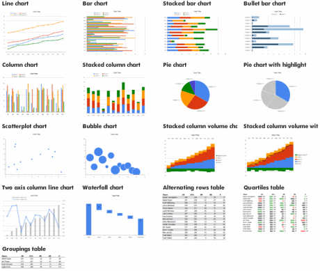
Each chart may have some of the following features:
- Trend involves a variable indicating time
- Composition involves a set of variables that add up to 1
- Distribution exhibits an occurrence count for different values of some variable
- Comparison pairs up two or more variables
- Relationship visualizes a complex relationship between two or more variables
Thereby, you can see how visualizations carry many parallels to models. Picking a visualization is very much alike picking a good model. I have discussed this before.
For the end, here is a chart I use for assigning dimensions to graphical elements. A full circle indicates a good choice, an empty one an acceptable choice, while the absence of the circle means that the element isn’t useful for presenting that particular aspect of the data.
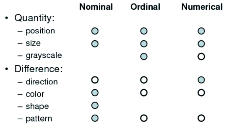
Note, nominal corresponds to the qualitative scale above, quantitative to diverging and ordinal approximately to sequential.
Happy Thanksgiving!
> binning is an act of pure and inexcusable laziness in the case when you can easily visualize a continuum,
Nope – there are often good reasons for using discrete steps on a color palette, even for a continuous variable. Eg. it’s much easier to visually gauge the approx. distance between two values, eg. is it in the adjacent bin, or 3 bins away. Meanwhile it’s super hard to gauge positions, let alone distances when using a continuous color palette. It’s also an accessibility issue.
This is an old page, yet folks might accidentally find it; best to browse around this topic before accepting someone’s view that’s not supported in this article.