In response to this query on how to reexpress Venn-diagram data graphically, Antony sends along this picture:
and writes:
The Autism data are surprisingly clearly structured. I haven’t included the basic barcharts for each variable, though they provide useful information towards understanding the data.
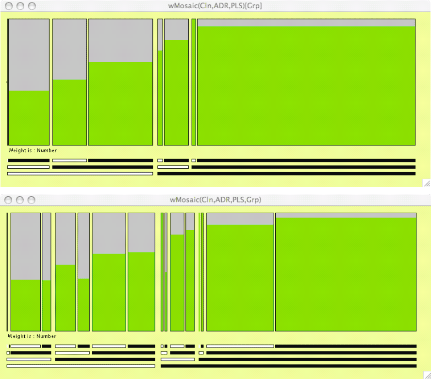
Since this is a categorical dataset with five variables, some variation of a mosaicplot should be a first choice for displaying the variables in combination. I calculated how many were diagnosed and how many not from the prevalence percentages. I then drew doubledecker plots weighted by these numbers with the diagnosed selected.
In the top figure Groups A and B are aggregated and the seven possible combinations of the three tests are plotted in the nested ordering of Clinician, ADI-R and PL-ADOS. The increasing prevalence with this ordering stands out (ie that Clinician tests have higher prevalence rates, and within those then ADI-R). The sizes of the different groups are also emphasised.
In the lower figure Groups A and B are separated by splitting each of the 7 bars in the top figure accordingly. Here it is obvious that there is very little difference between A and B in terms of prevalence with any of the combinations of tests.
The diagrams were drawn with Heike Hofmann’s MANET software. It includes a line for the empty zero combination (far left of both plots). The diagrams could also have been drawn with Martin Theus’s MONDRIAN software, which runs on all platforms, while MANET only runs on the Mac, but then the labelling beneath the plots would have had to have been added. For a publication the labelling would be further refined.
This graph is indeed pretty, and the bars do a good job of conveying that the ultimate data are counts. Still, I think I’d prefer a set of line graphs. I just find these mosaic plots hard to read. Maybe Masanao and I can try the line plots and then write a joint paper with Antony and Igor comparing the different representations.
I'm going to have to agree with you, Andrew. I've never been a big fan of the mosaic for lots of categories. Much the same problem of pie charts. Information gets confusing in a hurry.
Mosaicplots are best used interactively, rather than for presentation, and there is rarely a good alternative. Pie charts are best rarely used and there is usually a better alternative.
I'm curious to see Andrew's line plots, how will he show the sizes of the groups?
Antony,
I like it too, it conveys in a forceful manner that unless you have the trained clinician in the loop you chance close to a coin flip to be right seven years later.
One of the commenter in my blog reminded me of something else, there are values outside of all the circles. It is the number of kids that have been identified by clinical services as having a problem but for which no tests were performed at age 2 yet showed a percentage of them having autism at age 9. Some of these numbers are interesting on their own.
Igor.
Igor,
Your point about the clinician is a good one. Analysing data in a vacuum (i.e. without a domain expert to interact with) is always second best. We want to put statistical insights in context — and find out if they are of any practical use.
If the additional data you mention are comparable and available, it would be easy to add them to the plot.
Antony,
I don't have any additional data, the data I am mentioning is on the graph. They are the numbers outside of the circles.
These numbers tell another story: these kids pass through the sieve of having first been referred clinically at age 2 but for some reason, they could not take the tests or were not deemed (by the clinical staff or the family) in such a condition that they should take the test. Yet, 14 % of them had a diagnosis of autism at age 9. I would say this is odd.
Igor.