Igor sends along this graph on autism diagnosis
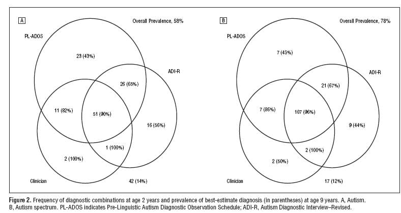
and asks whether this information can be presented better graphically. The answer is definitely yes, although I don’t have time in the next 15 seconds to figure out exactly how to do it. My intuition is to do some sort of line plot, showing the probability of autism given different factors which can interact, perhaps using a structure of multiple graphs as in Figure 2 of this paper. Even with binary factors, a graph with the factor on the x-axis can work well, especially if you use small multiples to display different conditions.
I’m not sure, though, since I haven’t read enough to have figured out what the substantive goal is here.
Any other thoughts?
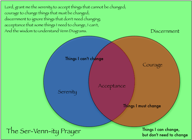
P.S. I still like this Venn diagram, though:
Andrew,
Thanks for the feedback. Most people find out about their kids having some sort of autistic spectrum disorder (ASD)at age 2/3 or soon before. At that age, words should have come out a long time ago and make sense. In ASD, words are still work in progress for most or have not emerged yet for others. Because of this, kids with age less than 3 are rarely diagnosed with ASD and precious time is lost in any type of intervention. Therefore it becomes tremendously important to find out at age 2 if something is amiss. There is a physiological test (Head perimeter) test that can be done from birth but it doesn't help to figure out if there is an issue in families with big heads. So the effort is trying to figure another type of testing procedure that can grasp the full ASD.
I think some of the issues that needs to be clear from reading this graph are as follows:
– as soon as you have a prepared clinician in the loop, your odds are going through the roof that her/his diagnosis of autism is founded and will remain founded 7 years later. The results also show that these stats are not so good for people in the ASD but not autism.
– pl-ados or adi used alone or in conjunction with each other is not enough.
– while some data begin to be meaningful, others with 1 or 2 people in them should be viewed with a grain of salt.
But I may also be missing some other issues because of the graph.
Igor.
Andrew, there has been some discussion at the JunkCharts blog about improving this chart. I have made a couple of stabs; the most recent can be found here. As noted in the JunkCharts comments, I did only the left side; the right is obviously similar.
I have posted a redesign on my website – I am concentrating on the hierarchical structure of the subsets and the percentages. Thanks for the challenge (I saw it on Junk Charts), this has been very interesting!
I would venture to say that the information shown would be more suited towards a spreadsheet of some sort rather than a venn diagram. But I would have to see it to completed to know for sure, interesting information though.