How to grab power in a democracy – in 5 easy non-violent steps

In the past decades violent means of grabbing power have been discredited and internationally regulated. Still, grabbing power is as desired as it has always been, and I’d like to introduce some new methods used today:

    \t

  1. Establish your base of power by achieving a critical mass (75%+) within a group with a high barrier to entry. Examples of barriers to entry: genetics (familiar ties, skin, eye color, hair type – takes 2+ generations to enter), religion (takes 2-10 years to enter), language (very hard to enter after the age of 10).
  2. Encourage your followers to have many children – because of common ethical concerns, other groups will help you bring them up.
  3. Control the system of indoctrination, such as religious schooling, government-based educational system, entertainment, popular culture – limiting the loss of children to out-group (only needed for non-genetic barriers to entry).
  4. Wait 18 years for your followers’ children to become eligible to vote.
  5. Win elections by popular vote – and have the option of abolishing democracy and instituting the rule by in-group.

Other tricks of the trade:

  • Support economic and social policies that benefit the in-group disproportionally more than out-group.
  • \t

  • Supporting the immigration of people that can join the group, or evangelize your message to potential followers.
  • Focus on out-group members in distress, as they appreciate help, become more willing to convert, and are more eager about in-group.
  • \t

  • Support emigration of out-group members.

Barriers to entry are an important factor that strengthens the internal cohesion of the group and helps maintain the base of power you’ve established.

This strategy has been and is being applied in numerous countries, and is a weaker form of genocide especially when the in-group is based on genetics.

Disclaimer: I do not endorse such (or any) power-grabbing strategies. I believe that being aware of such strategies is the first step to making the world a better place. I find that structuring research findings in the form of “How to”s and “5 Easy Steps” appealing to self-interest communicate information more efficiently than academic treatises in today’s conditions of information overload.

Bibliography: Jack Parsons (who sadly recently passed away) wrote a book, Population Competition for Security or Attack: A Study of the Perilous Pursuit of Power Through Weight of Numbers.” Nobody wanted to publish it, though, so Jack had to start his own publishing house.

What do you think?

[July 5, Stefano Bertolo points to Bryan Caplan’s article on “liberty in the long term”.]
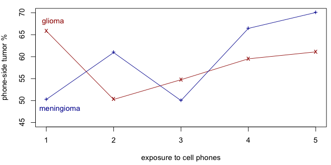
Tumors, on the left, or on the right?

In response to the post The bane of many causes in the context of mobile phone use and brain cancer, Robert Erikson wrote:

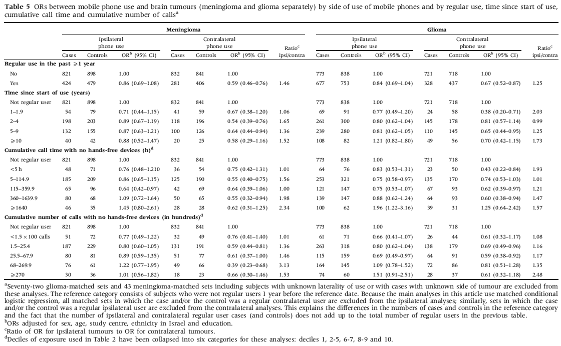
The true control here is the side of the head of the tumor: same side as phone use or opposite side. If that is the test, the data from the study are scary. Clearly tumors are more likely on the “same” side, at whatever astronomical p value you want to use. That cannot be explained away by misremembering, since an auxiliary study showed misremembering was not biased toward cell phone-tumor consistency.

A strong signal in the data pointed by Prof. Erikson is that the tumors are overwhelmingly likelier to appear on the same side of the head as where the phone is held. I’ve converted the ratios into percentages, based on an assumption that the risk for tumors would be apriori equal for both sides of the head.

lateral1.png

There is a group of people with low-to-moderate exposure and high lateral bias, but the bias does increase quite smoothly with increasing exposure. It’s never below 50%.

But even with something apparently simple like handedness, there are possible confounding factors. For example, left-handed and ambidextrous people have a lower risk of brain cancer, perhaps because they zap their brain with cell phones more evenly across both sides, reducing the risk that a single DNA strand will be zapped one too many times, but they also earn more. I’ve written about handling multiple potential causes at the same time a few years ago.

The authors also point out that people might be inclined to blame it all on the phones and to report phone use on the side where the tumor was identified. This could be resolved if the controls are led to think that they have a tumor too, or if instead of asking how the phone is held, the interviewers instead made a call and observed the subject, or asked about a value neutral attribute such as handedness. Still, even in papers that reject the influence of phones on brain tumors, it’s always the case that more tumors are on the right side, just as we know that more people are right-handed than left-handed.

In the light of this investigation, I fully agree with Prof. Erikson that there is something going on.

The table in question is here:
lateral2.png

The bane of many causes

One of the newsflies buzzing around today is an article “Brain tumour risk in relation to mobile telephone use: results of the INTERPHONE international case-control study”.

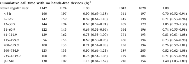
The results, shown in this pretty table below, appear to be inconclusive.

nonlinearity.png

A limited amount of cellphone radiation is good for your brain, but not too much? It’s unfortunate that the extremes are truncated. The commentary at Microwave News blames bias:

The problem with selection bias –also called participation bias– became apparent after the brain tumor risks observed throughout the study were so low as to defy reason. If they reflect reality, they would indicate that cell phones confer immediate protection against tumors. All sides agree that this is extremely unlikely. Further analysis pointed to unanticipated differences between the cases (those with brain tumors) and the controls (the reference group).

The second problem concerns how accurately study participants could recall the amount of time and on which side of the head they used their phones. This is called recall bias.

Mobile phones are not the only cause for development and detection of brain tumors. There are lots of factors: age, profession, genetics – all of them affecting the development of tumors. It’s too hard to match everyone, but it’s a lot easier to study multiple effects at the same time.

We’d see, for example, that healthy younger people at lower risk of brain cancer tend to use mobile phones more, and that older people sick with cancer that might spread to the brain don’t need mobile phones. Similar could hold for alcohol consumption (social drinkers tend to be healthy and social, but drinking is an effect, not a cause) and other potential risk factors.

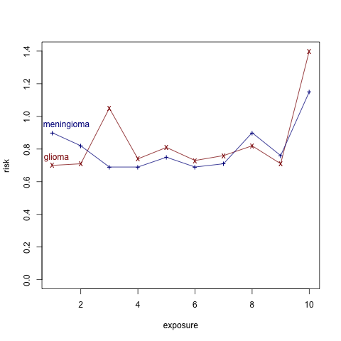
Here’s a plot of the relative risk based on cumulative phone usage:

risks.png

It seems that the top 10% of users has much higher risk. If the data wasn’t discretized into just 10 categories, there could be interesting information here, beyond the obvious one that you need to be old and wealthy enough to accumulate 1600 hours of mobile phone usage.

[Changed the title from “many effects” to “many causes” – thanks to a comment by Cyrus]

What visualization is best?

Jeff Heer and Mike Bostock provided Mechanical Turk workers with a problem they had to answer using different types of charts. The lower error the workers got, the better the visualization. Here are some results from their paper Crowdsourcing Graphical Perception: Using Mechanical Turk to Assess Visualization Design:

visi-quality.png

They also looked at various settings, like density, aspect ratio, spacing, etc.

Visualization has become empirical science, no longer just art.

Forecasting market future

McKinsey had a great chart today:

mckinsey2.png

To explain the chart – the green are the predictions for the next year at various times in the past. The blue is the truth that eventually comes along. So, the predictions do tend towards the truth as time goes on.

They’re consistently optimistic – but does the data justify a more sophisticated model? Or is the design of markets inherently biased towards rewarding optimists more than realists?

Recidivism statistics

From the news today:

A man charged with trying to kill a Danish cartoonist was arrested last year in an alleged plot to harm U.S. Secretary of State Hillary Clinton, officials said. […] The suspect was one of four people arrested last summer in Nairobi in an alleged plot to harm Clinton during her tour of African countries, the newspaper Politken reported. The suspect was released from a Kenyan jail in September because of a lack of evidence and returned to Denmark, where he had been living, Sky News reported Sunday.

Just a few days ago, CNN reported:

That announcement led to questions about how many other former Guantanamo detainees may be planning to carry out terrorist attacks.

Pentagon officials have not released updated statistics on recidivism, but the unclassified report from April says 74 individuals, or 14 percent of former detainees, have turned to or are suspected of having turned to terrorism activity since their release.

Of the more than 530 detainees released from the prison between 2002 and last spring, 27 were confirmed to have engaged in terrorist activities and 47 were suspected of participating in a terrorist act, according to Pentagon statistics cited in the spring report.

More at Wikisource.

These are actually lower than the general population, where about 65% of prisoners are expected to be rearrested within 3 years. The numbers seem lower in recent years, about 58%. More at Wikipedia.

Learn to program!

I often run into people who’d like to learn how to program, but don’t know where to start. Over the past few years, there has been an emergence of interactive tutorial systems, where a student is walked through the basic examples and syntax.

    \t

  • Try Ruby! will teach you Ruby, a Python-like language that’s extremely powerful when it comes to preprocessing data.
  • WeScheme will teach you Scheme, a Lisp-like language that makes writing interpreters for variations of Scheme very easy.
  • Lists by Andrew Plotkin is a computer game that requires you to be able to program in Lisp. Lisp is the second-oldest programming language (after Fortran), but Ruby and Python do most of what Lisp has traditionally been useful for.

Maybe there will be a similar tool for R someday!

Thanks to Edward for the pointers!

Privacy vs knowledge and the nature of insurance

Wired reports a great new opportunity to make money online by suing internet companies for revealing the data:

An in-the-closet lesbian mother is suing Netflix for privacy invasion, alleging the movie rental company made it possible for her to be outed when it disclosed insufficiently anonymous information about nearly half-a-million customers as part of its $1 million contest to improve its recommendation system.

I’m not sure whether the litigators have read this particular section of the Netflix prize rules:

To prevent certain inferences being drawn about the Netflix customer base, some of the rating data for some customers in the training and qualifying sets have been deliberately perturbed in one or more of the following ways: deleting ratings; inserting alternative ratings and dates; and modifying rating dates.

So yes, you can match a set of reviews with someone else, but how will you know that it’s really a person and not a random coincidence? 0.5 million review traces give plenty of opportunity for a false positive match. Netflix learned from AOL’s data release disaster, which resulted in a few people getting fired.

But this theme is important. Many internet companies provide free services in return for the ability to employ user data for profit. Andrew Parker looked at which companies make profit out of user data. Usually, the data is never given away, but just used to make other people’s lives easier. Let’s say that you bookmark a particular page – others won’t see that you’ve done it, but they will see that there are people that find that page worthy of saving – therefore it can be listed higher up in search results.

A more problematic area is medicine. Wired reports that there is a market out there for medical records, and that anonymity protection isn’t very secure.

Keeping medical data public would allow massive advances in medicine. For example, the Personal Genomes project seeks to analyze a number of volunteers in a lot of detail (see, for example, Steven Pinker’s medical record). If a few million people did that, we’d know so much more about disease, risks, factors affecting it, effectiveness of drugs, diet, the effects of genome.

One-sided disclosure gets many people worried – their insurance rates might go up, they might not get a job. It would help if everyone was doing that: nobody feels well being naked when others wear swimsuits.

But we should also ask ourselves as a society – what is insurance? Is insurance a protection against uncontrollable risk or is it an instrument of equality? Is genome our destiny or an uncontrollable risk?

Previous posts on this topic: EU data protection guidelines, Privacy vs Transparency.

Visualizing UK budget

I was impressed by the Where Does My Money Go? – an interactive visualization interface to the UK government budget. If one ignores the painful color scheme (see below), the interactivity of exploring the data is notable.

UK_budget.png

One particularly interesting aspect is a regional spending breakdown, which shows which regions are contributing to the budget and which ones are disproportionally benefiting from it.

The British also have a great website that quantitatively analyzes the behavior in their parliament: Public Whip.

A compendium of conjugate distributions

On many occasions it’s handy to have a list of conjugate prior distributions. Several books have it, but if you’re typing away on a beach somewhere, let me provide some links:

John Cook’s summary of univariate conjugate prior relationships:

conjugate.png

John links to another two good sources: Wikipedia and to Daniel Fink’s “A Compendium of Conjugate Priors”.

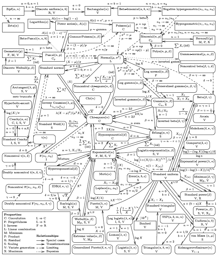
John Cook also has a clickable diagram of distribution relationships, a subset of a much larger one by Leemis and McQueston (click to enlarge):

univ16.png"

(Material found via LingPipe’s introduction to Bayesian statistics, thanks Bob.)

Dividing the Netflix prize – and Bayesian philosophy

It’s been a dramatic month: A month ago, a coalition of some of the leading teams qualifies for the $1 million grand prize for improving the accuracy of the movie-recommending model by more than 10%. But, they would close the competition 30 days afterward, in case someone else is able to improve upon the result. This happened less than a day before the deadline, by The enormous Ensemble, composed of 23 previously separate teams and individuals. Of course, most of the progress towards the victory was through the models making use of new significant patterns in the data, such as that of time.

The development of an ensemble from many separate teams was another accomplishment, and the GPT’s inclusion rules provide some insight into the process: “shares” of the winnings were distributed based on how much was a contribution able to improve the result in terms of percentage points. Simon Owens describes what it was like to participate in The Ensemble.

Bayesian statistics always works with ensembles: the posterior is a weighted average of all models, the weight being based on the fit of each model times the prior quality of the model. There are some additional Bayesian elements that could be a part of future competitions, such as Bayesian scoring functions.

In the past I was asked to contrast Occam’s razor with the Epicurean principle. Occam’s razor is the Bayesian prior, or the the yang principle: simpler models have greater a priori weight (because we tend to economize that what is useful). Occam’s razor goes back to Aristotle, who wrote “For the more limited, if adequate, is always preferable,” and “For if the consequences are the same, it is always better to assume the more limited antecedent” in his Physics. We mathematically express it as the prior.

Epicurean principle is the yin, or mathematically expressed as the integral over the model space. Ensembles go back to Epicurus’ letter to Herodotus: “When, therefore, we investigate the causes of […] phenomena, […] we must take into account the variety of ways in which analogous occurrences happen within our experience.” Thus, Bayesian statistics combines the yin and the yang, balancing the pursuit of simplicity with the limitations of uncertainty.

[7/31/09: Added a link to Simon Owens’ interview with The Ensemble.]

This week’s New York R Meetup is about Bayes

This Thursday at 7pm Jake Hofman and Suresh Velagapundi will present a session at New York R Statistical Programming Meetup at NYU – Silver Center (100 Washington Square East, Room 401). Here’s the outline:

Background:

  • Conditional probability & Bayes’ Rule
  • Treating parameters as random variables & putting distributions on them
  • Bayesian inference: from priors & likelihoods to posteriors

From Principles to Practice:

  • Simple plan; difficult to execute (normalization)
  • Resort to approximation methods (variational & MCMC)
  • Model selection / complexity control a la Bayes

Visualizing correlations circularly

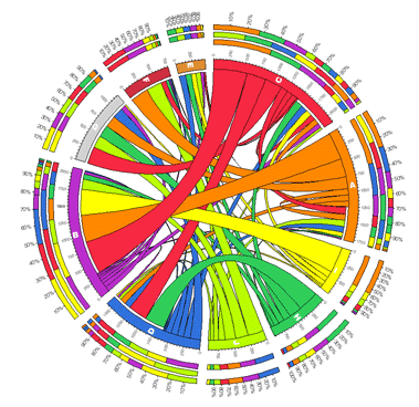
Some time ago FlowingData had an article on visualizing tables – which really is about visualizing spreadsheets in terms of correlations between columns. While Circos generates very colorful displays:

circos.png

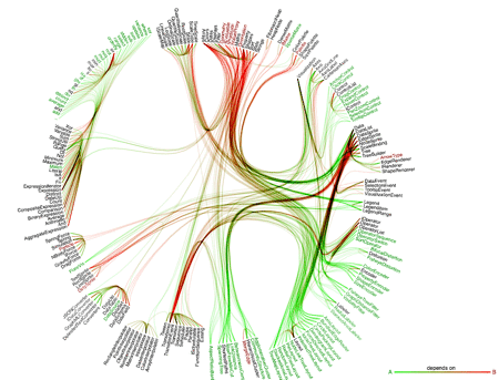
Today I was impressed by a much cleaner and Tuftier variant on the theme by Mike Bostock, called Dependency Tree:

dependency-tree.png

Click on the link, it’s interactive. Jeff Heer and Bostock also have a new JavaScript visualization toolkit out ProtoVis, which simplifies the creation of such stuff. The computer scientist in me finds this development very cool. But I still like my correlation matrices.

Google Fusion Tables

Google just launched a pre-alpha “Fusion Tables”. The visualization capability is okay, the interface is not fully stable, but the cool thing is the ability to merge two tables, something I’ve spent a lot of time doing manually in the past, or with ad-hoc scripts.

Here’s an example where I merge their GDP table with a disease table. I need to pick the “WHO Regions/Country” in the right column, so that both tables get aligned:

fusion-tables.png

Afterwards, I can do a scatter plot of GDP rank (X) with child mortality/1000 (Y):

gdp-child-mortality.png

So, high GDP makes child mortality less likely, but not always, and it’s not a correlation.

Even if Fusion tables is pre-alpha, the table fusion capability makes it immediately useful. The collaboration features look cool, but it will take some time to get them to work right. Then we’ll have proper horizontal collaboration.

Statistics police?

The Numbers Guy has an article titled This U.K. Sheriff Cites Officials for Serious Statistical Violations, and a corresponding blog post:

Mobilized by distressingly low levels of public trust in official statistics, the U.K. government is embarking on a daring, and possibly unique, experiment. With broad support, Parliament in 2007 approved the formation of the U.K. Statistics Authority, a group with the budget, authority and independence to question other government agencies on the numbers they release to the public.
[…]

The agency’s task is a delicate one. If it uncovers reams of faulty data that might have been used in crafting public policy, Britons’ fraying faith in public institutions could be further eroded.

Interesting, a truth-assurance agency would be a good thing, also useful for validating the truthfulness of other statements that often get twisted by marketing. We might be finally making progress with the problems that Josiah Stamp identified many years ago.