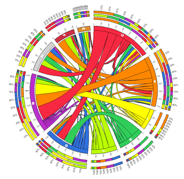
Some time ago FlowingData had an article on visualizing tables – which really is about visualizing spreadsheets in terms of correlations between columns. While Circos generates very colorful displays:
Today I was impressed by a much cleaner and Tuftier variant on the theme by Mike Bostock, called Dependency Tree:
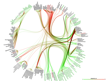
Click on the link, it’s interactive. Jeff Heer and Bostock also have a new JavaScript visualization toolkit out ProtoVis, which simplifies the creation of such stuff. The computer scientist in me finds this development very cool. But I still like my correlation matrices.