The Cooperative Election Study (CES) is a cool open-data survey funded by a consortium of universities. It has a cool structure where if you buy into the survey, you get to include a “module” of a few minutes of questions (I think the price you pay is proportional to the number of people in your module times the average number of minutes it takes for the respondents to answer your question), and then all the respondents get asked some “core” questions. The result is a very large national sample with pre- and post-election components. The CES started in 2006, I think, and it was originally the CCES (Cooperative Congressional Election Study) but more recently they’ve been doing presidential elections too.
The openness and large size of the survey make it useful for estimating attitudes and voting patterns at the congressional district or state level, and my colleagues and I are using it to study political polarization. We also used it in our MRP case studies.
Like all surveys, the CES has problems of representativeness, especially when looking at local areas. We can see this, for example, by comparing the raw CES estimates of Democratic and Republican voters with election outcomes at the congressional district level. The CES can then be weighted to adjust for this, but (a) users don’t always do this adjustment, and (b) there’s always a concern about other nonrepresentativeness that was not adjusted for.
A few months ago the CES came up in a dispute about estimating the opinions of nonvoters. Or, more specifically, occasional voters, the kind of people who might vote in the presidential election or might not. I think the consensus regarding these occasional voters is that, if they were forced to vote in 2024, most of them would have voted for Republicans. Also, the Trump campaign did an effective job of turning out these occasional voters.
This all makes sense, and I don’t think there’s much controversy any more regarding the occasional voters and nonvoters.
But one of the issues that came up in the discussion was that you have to be careful when using the Cooperative Election Study. Actually, you have to be careful with any survey, but particular issues arose with the CES.
In particular, here’s a graph from Soler et al., one of the articles cited in our earlier post:
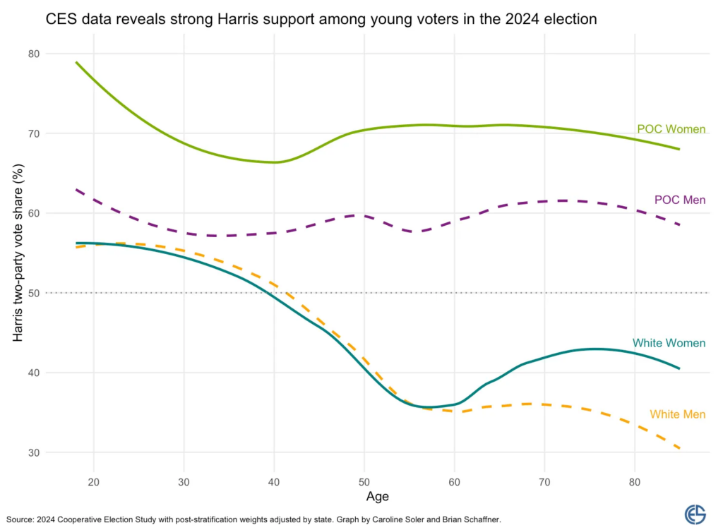
But if you look at CES, you see no gender gap among white voters under 60. Shira Mitchell pointed this out to me, and, like her, I’m skeptical. I mean, sure, I guess it’s possible, but it seems more likely that this is problem with that analysis of the CES, not something happening in the real world. I say this partly because when we looked at the 2016 election, we did not see such a pattern. That said, we did find a lower gender gap for young voters than for older voters, so who knows, it’s possible.
Soler et al. also share the estimated gender gap by age as estimated by Blue Rose Research, which is where Shira works:
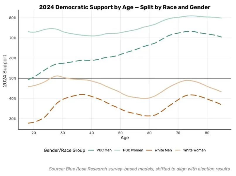
This has the biggest gender gap among the youngs, which fits with the news reporting I’ve seen on the election (angry young women on the left, culturally conservative bros on the right), but I don’t really know. The Blue Rose graph looks more plausible to me than the CES graph, as it’s hard for me to believe there’s a zero gender gap for whites under 60. I guess these questions remain open.
P.S. Just to emphasize: no survey is perfect, and it’s always good to look at our data from many directions to find problems. I’m not saying that you shouldn’t ever use CES, and I’m hoping that after a careful study of this and other issues, they can make it better.
Question (just because I ran out of steam trying to track it down on my own): is it possible that the first graph used aggregated age ranges? The abrupt change at 60 seems suspicious as does the smoothed curves (if the birthyear variable was used for precise integer ages, why not use a line chart connecting the actual data points?). Also, the text in the Soler et al discussion talks about ranges of ages (e.g. 18-24 year olds) rather than specific ages. So, I am just wondering whether there was some aggregation of ages in producing that strange looking graph.
I’m still wondering about this. The graph’s footnote says “2024 Cooperative Election Study with post-stratification weights adjusted by state.” I suppose this means I’d have to know exactly what weights were used – were they specific by integer ages or aggregated in age ranges? I can’t seem to find any explanation. The graph still looks like splines to me and it still feels like some age aggregation was involved. But the CES does provide birth year, so there should not be a need for that.
Interesting how (in white women) support for Harris goes down with age, but then up after 60. What’s up with that? Generational? (Old enough to remember a time before Roe v Wade). Something to do with being retired?
I think it would be helpful to provide a strict technical definition for this concept of “representativeness”, especially when addressing point “(b) there’s always a concern about other nonrepresentativeness that was not adjusted for”.
We don’t really have a formal definition such concept in survey statistics, for a good reason, as well discussed in the series of papers by Kruskal and Mosteller. But I’d love to see a statistical formalization of such concept.
Raphael:
Representativeness would be defined as the distribution of the sample being close to the distribution of the population. The challenge is that with a finite sample you can’t be representative on all variables, and you can’t in general have a sense of representativeness on unmeasured variables.
Thank you, Andrew!
Your last point is where I believe lies the main problem with such concept: we select samples and conduct surveys to be able to measure variables we wouldn’t otherwise. So, I think ideally we should have a definition of representativeness that would be functionable in practice for unmeasured variables. However, I don’t think that’s possible, as pointed out by Alan Stuart in his “The ideas of sampling” book under what he called the central paradox of sampling.
Raphael:
I agree, but I think Stuart takes it too far, because he doesn’t seem to recognize that for many variables you can measure representativeness. An example I gave in my Struggles paper is, what if you take a simple random sample of 100 from a population that’s 52% women and 48% men, and you happen to get 60 women and 40 men. This is unrepresentative and you can adjust for it, even though by construction the sampling probabilities are all equal. So the concept of representativeness has some value beyond the concept of sampling probabilities.
A visual representation of uncertainty would be nice. I look at the curves and wonder “Is it going up and then down, or is it all just a straight line (maybe even a flat line) with some noise?”
Noiser:
The sample size is large enough that I think the usual uncertainty intervals would be very narrow. On the other hand, yeah, if you consider possible nonresponse, there’s tons of uncertainty, which is the topic of the post. I guess it would be possible to build a model to account for that, but I think that for now Shira’s take is to not use the CES for this purpose. Well, that’s easy for her to say–she has access to the voter file, which has tons more information. For the rest of us, and for anyone who wants to use the CES to learn various things that you can’t get from the voter file, it would be good to figure out what’s going on. In any case, I don’t think the patterns in the graph are explainable by “noise.” They’re some combination of real gender gap and differential nonresponse.
There is strong evidence for a gender gap in voting behavior across many democratic societies, and also evidence that the gap has increased in recent years and that it’s particularly large among the young generation. So an opposite finding from the US seems highly unusual and definitely invites skepticism.
An example that doesn’t suffer from sample bias is the German Representative Election statistic for the 2025 federal election. It’s not an exit poll but based on the actual votes cast (every election, a random sample of ballots are marked with demographic data).
25%of young men but only 13% of young women voted the far right AFD. A whopping 37% of young women but only 18% of young men voted for the Left.
https://bsky.app/profile/piglet42.bsky.social/post/3mczge3ftxs2e