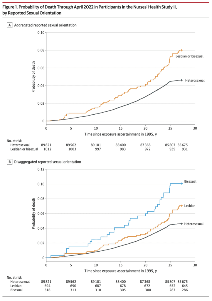
This recently-published graph is misleading but also has the unintended benefit of revealing a data problem:
Jrc brought it up in a recent blog comment. The figure is from an article published in the Journal of the American Medical Association, which states:
This prospective cohort study examined differences in time to mortality across sexual orientation, adjusting for birth cohort. Participants were female nurses born between 1945 and 1964, initially recruited in the US in 1989 for the Nurses’ Health Study II, and followed up through April 2022. . . .
Compared with heterosexual participants, LGB participants had earlier mortality (adjusted acceleration factor, 0.74 [95% CI, 0.64-0.84]). These differences were greatest among bisexual participants (adjusted acceleration factor, 0.63 [95% CI, 0.51-0.78]) followed by lesbian participants (adjusted acceleration factor, 0.80 [95% CI, 0.68-0.95]).
The above graph tells the story. As some commenters noted, there’s something weird going on with the line for heterosexual women 25+ years after exposure assessment. I guess these are the deaths from 2020 until the end of data collection in 2022.
Maybe not all the deaths were recorded? I dunno, it looks kinda weird to me. Here’s what they say in the paper:
The linkages to the NDI [National Death Index] were confirmed through December 31, 2019; however, ongoing death follow-up (eg, via family communication that was not yet confirmed with the NDI) was assessed through April 30, 2022. In the sensitivity analyses, only NDI-confirmed deaths (ie, through December 31, 2019) were examined.
Given the problem in the above graph, I’m guessing we should just forget about the main results of the paper and just look at the estimates from the sensitivity analyses. They say that sexual orientation was missing for 22% of the participants.
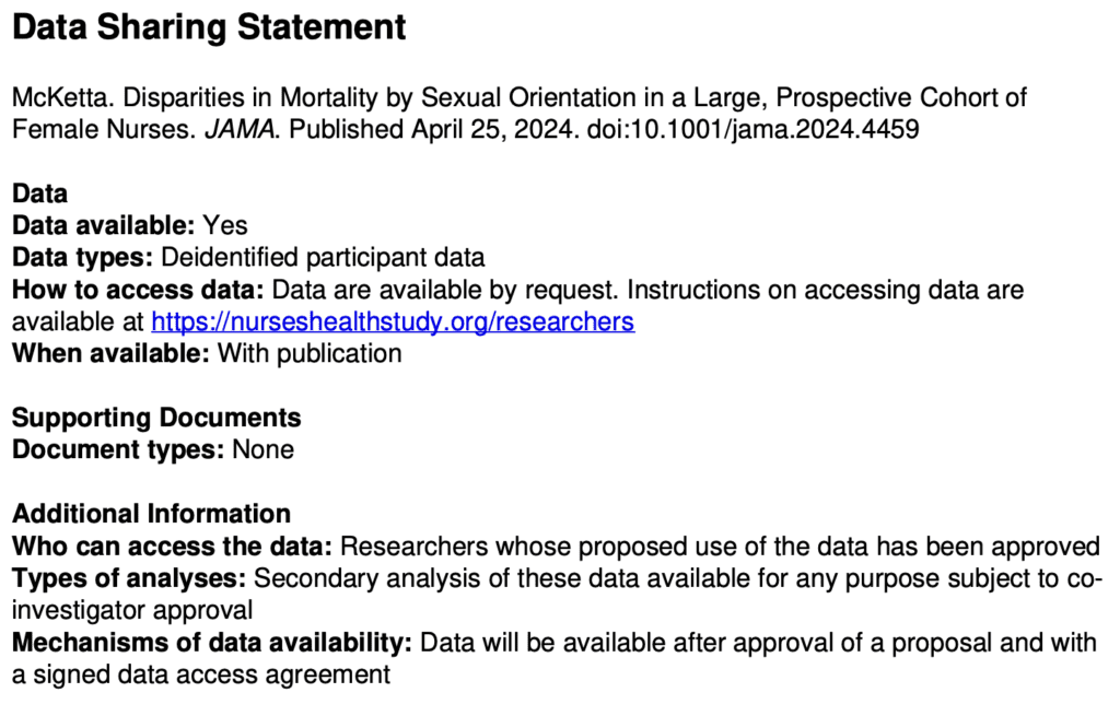
Getting back to the data . . . Table 1 shows that the lesbian and bisexual women in the study were older, on average, and more likely to be smokers. So just based on that, you’d expect they would be dying sooner. Thus you can’t really do much with the above figures that mix all the age and smoking groups. I mean, sure, it’s a good idea to display them—it’s raw data, and indeed it did show the anomalous post-2000 pattern that got our attention in the first place—but it’s not so useful as a comparison.
Regarding age, the paper says “younger cohorts endorse LGB orientation at higher rates,” but the table in the paper clearly shows that the lesbians and bisexuals in the study are in the older cohorts in their data. So what’s up with that? Are the nurses an unusual group? Or perhaps there are some classification errors?
Here’s what I’d like to see: a repeat of the cumulative death probabilities in the top graph above, but as a 4 x 2 grid, showing results separately in each of the 4 age categories and for smokers and nonsmokers. Or maybe a 4 x 3 grid, breaking up the ever-smokers into heavy and light smokers. Yes, the data will be noisier, but let’s see what we’ve got here, no?
They also run some regressions adjusting for age cohort. That sounds like a good idea, although I’m a little bit concerned about variation within cohort for the older groups. Also, do they adjust for smoking? I don’t see that anywhere . . .
Ummmm, OK, I found it, right there on page 2, in the methods section:
We chose not to further control for other health-related variables that vary in distribution across sexual orientation (eg, diet, smoking, alcohol use) because these are likely on the mediating pathway between LGB orientation and mortality. Therefore, controlling for these variables would be inappropriate because they are not plausible causes of both sexual orientation and mortality (ie, confounders) and their inclusion in the model would likely attenuate disparities between sexual orientation and mortality. However, to determine whether disparities persisted above and beyond the leading cause of premature mortality (ie, smoking), we conducted sensitivity analyses among the subgroup of participants (n = 59 220) who reported never smoking between 1989 and 1995 (year when sexual orientation information was obtained).
And here’s what they found:
Among those who reported never smoking (n = 59 220), LGB women had earlier mortality than heterosexual women (acceleration factor for all LGB women, 0.77 [95% CI, 0.62-0.96]; acceleration factor for lesbian participants, 0.80 [95% CI, 0.61-1.05]; acceleration factor for bisexual participants, 0.72 [95% CI, 0.50-1.04]).
I don’t see this analysis anywhere in the paper. I guess they adjusted for age cohorts but not for year of age, but I can’t be sure. Also I think you’d want to also adjust for lifetime smoking level, not just between 1989 and 1995. I’d think the survey would also have asked about whether participants’ earlier smoking status, and I’d think that smoking would be asked in followups?
Putting it all together
The article and the supplementary information present a lot of estimates. None of them are quite what we want—that would be an analysis that adjusts for year of age as well as cohort, adjusts for smoking status, and also grapples in some way with the missing data.
But we can triangulate. For all the analyses, I’ll pool the lesbian and bisexual groups because the sample size within each of these two groups is too small to learn much about them separately. For each analysis, I’ll give the reported 95% adjusted acceleration factor as an estimate +/- margin of error:
Crude analysis, not adjusting for cohort: 0.71 +/- 0.10
Main analysis, adjusting for cohort: 0.74 +/- 0.10
Using only deaths before 2020, adjusting for cohort: 0.79 +/- 0.10
Imputing missing responses for sexual orientation, adjusting for cohort: 0.79 +/- 0.10
Using only the nonsmokers, maybe adjusting for cohort: 0.77 +/- 0.17
Roughly speaking, adjusting for cohort adds 0.03 to the acceleration factor, imputing missing responses adds 0.05, and adjusting for smoking adds 0.03 or 0.06. I don’t know what would happen if you add all three adjustments; given what we have here, my best guess would be to add 0.03 + 0.05 + (0.03 or 0.06) = 0.11 or 0.14, which would take the estimated acceleration factor to 0.82 or 0.85. Also, if we’re only going to take the nonsmokers, we’ll have to use the wider margin of error.
Would further adjustment do more? I’m not sure. I’d like to do more adjustment for age and for smoking status; that said, I have no clear sense what direction this would shift the estimate.
So our final estimate is 0.82 +/- 0.17 or 0.85 +/- 0.17, depending on whether or not their only-nonsmokers analysis adjusted for cohort. They’d get more statistical power by including the smokers and adjusting for smoking status, but, again, without the data here I can’t say how this would go, so we have to make use of what information we have.
This result is, or maybe is not, statistically significant at the conventional 95% level. That is not to say that there is no population difference, just that there’s uncertainty here, and I think the claims made in the research article are not fully supported by the evidence given there.
I have similar issues with the news reports of this study, for example this:
One possible explanation for the findings is that bisexual women experience more pressure to conceal their sexual orientation, McKetta said, noting that most bisexual women have male partners. “Concealment used to be thought of as sort of a protective mechanism … but [it] can really rot away at people’s psyches and that can lead to these internalizing problems that are also, of course, associated with adverse mental health,” she said.
Sure, it’s possible, but shouldn’t you also note that the observed differences could also be explained by missing-data issues, smoking status, and sampling variation?
And now . . . the data!
Are the data available for reanalysis? I’m not sure. The paper had this appendix:
I don’t like the requirement of “co-investigator approval” . . . what’s with that? Why they can’t just post the data online? Anyway, I followed the link and filled out the form to request the data, so we’ll see what happens. I needed to give a proposal title so I wrote, “Reanalysis of Disparities in Mortality by Sexual Orientation in a Cohort of Female Nurses.” I also had to say something about the scientific significance of my study, for which I wrote, “The paper, Disparities in Mortality by Sexual Orientation in a Cohort of Female Nurses, received some attention, and it would be interesting to see how the results in that paper vary by age and smoking status.” For my “Statement of Hypothesis and Specific Aims,” I wrote, “I have no hypotheses. My aim is to see how the results in that paper vary by age and smoking status.” . . .
Ummmm . . . I was all ready to click Submit—I’d filled out the 6-page form, and then this:

A minimum of $7800 per year per cohort?? What the hell???
To be clear, I don’t think this is the fault of the authors of the above-discussed paper. It just seems to be the general policy of the Nurses Health Study.
Summary
I don’t think it’s bad that this paper was published. It’s pretty much free to root around at available datasets and see what you can find. (OK, in this case, it’s not free, it’s actually a minimum of $7800 per year per cohort, but this isn’t a real cost; it’s just a transfer payment: the researchers get an NIH grant, some of which is spent on . . . some earlier recipient of an NIH grant.) The authors didn’t do a perfect statistical analysis, but no statistical analysis is perfect; there are always ways to improve. The data have problems (as shown in the graph at the top of this post), but there was enough background in the paper for us to kind of figure out where the problem lay. And they did a few extra analyses—not everything I’d like to see, but some reasonable things.
So what went wrong?
I hate to say it because regular readers have heard it all before, but . . . forking paths. Researcher degrees of freedom. As noted above, my best guess of a reasonable analysis would yield an estimate that’s about two standard errors away from zero. But other things could’ve been done.
And the authors got to decide what result to foreground. For example, their main analysis didn’t adjust for smoking. But what if smoking had gone the other way in the dataset, so that the lesbians and bisexuals in the data had been less likely to smoke? Then a lack of adjustment would’ve diminished the estimated effect, and the authors might well have chosen the adjusted analysis as their primary result. Similarly with exclusion of the problematic data after 2020 and the missing data on sexual orientation. And lots of other analyses could’ve been done here, for example adjusting for ethnicity (they did do separate analyses for each ethnic group, but it was hard to interpret those results because they were so noisy), adjusting for year of age, and adjusting more fully for past smoking. I have no idea how these various analyses would’ve gone; the point is that the authors had lots of analyses to choose from, and the one they chose gave a big estimate in part because a lack of adjustment for some data problems.
What should be done in this sort of situation? Make the data available, for sure. (Sorry, Nurses Health Study, no $7800 per year per cohort for you.) Do the full analysis or, if you’re gonna try different things, try all of them or put them in some logical order; don’t just pick one analysis and then perturb it one factor at a time. And, if you’re gonna speculate, fine, but then also speculate about less dramatic explanations of your findings, such as data problems and sampling variation.
It should be no embarrassment that it’s hard to find any clear patterns in these data, as all of it is driven by a mere 81 deaths. n = 81 ain’t a lot. I’d say I’m kinda surprised that JAMA published this paper, but I don’t really know what JAMA publishes. It’s not a horrible piece of work, just overstated to the extent that the result is more of an intriguing pattern in a particular dataset rather than strong evidence of a general pattern. This often happens in the social sciences.
Also, the graphs. Those cumulative mortality graphs above are fine as data summaries—almost. First, it would’ve been good if the authors had noticed the problem post-2020. Second, the dramatic gap between the lines is misleading in that it does not account for the differences in average age and smoking status of the groups. As noted above, this could be (partly) fixed by replacing with a grid of graphs broken down by cohort and smoking status.
All of the above is an example of what can be learned from post-publication review. Only a limited amount can be learned without access to the data; it’s interesting to see what we can figure out from the indirect evidence available.
$7800 per cohort per year. That’s a lot of Jamaican beef patties.
And a sizeable chunk of the cost of meeting Gray Davis, Grover Norquist, and a rabbi.
Maybe if they put the “contribution” agreement first they’d get more honest answers on the rest of the request form?
$7800 per cohort per year, LOL get F***ed.
As a guy who isn’t doing research based on large NIH grants it’s offensive to me the idea that it doesn’t matter that they charge to access their NIH funded data because after all it’ll just be paid by NIH anyway. No. it’ll just exclude anyone who isn’t enormously funded, including nonprofits, early stage investigators, and individuals or small groups with an interest in improving health understanding.
As I understand it modern NIH grants require you to use some of the grant money to pay to have the data available online and archived (recent policy change). So that’s good. We’ll see what that means in reality 5 or 10 years from now.
After hearing about this study from jrc and having done a paper in which I developed an accelerated aging model for cancer patients and found that there were TONS of problems with “standard” ways of displaying mortality data, I suggested my friend try to get the data … but Andrew already investigated that for us and we can now ignore that entire idea.
Differences in age distribution between the two groups could be accounting for almost the entirety of the divergence of the two curves. Adding in stuff like 22% missing data and lack of followup on deaths makes all this extremely sketchy.
We explain this in our paper linked above Figure 5A… Take a look at the difference in 30 year old women (teal) vs mixed aged women (green). There’s no disease state there, just a different age distribution in the population. The fact is it can’t be “corrected” just by knowing things like average age difference either, the shape of the curve depends on the *entire shape of the distribution* of the population. It is, in essence, an integral(p(death at time t | age) p(age))
I’m not even a guy who specializes in survival analysis or anything, I just got the question from my collaborators “is there some notable difference in survival between different types of tumors?” and we built the model to answer that question. The answers we got were dramatically different from the usual kaplan-meier curve based analysis my friend was familiar with in the cancer literature. In fact the answer were SOOO dramatically different that I spent literally 2 weeks trying to find bugs in my code… until by the end of it with no bugs found etc, I decided maybe the K-M curves were just *wrong* and sure enough I was able to prove that with a simulation.
Daniel:
Sure, but on the other side, JAMA! Harvard! The Nurses Health Study!
On the plus side, no major media outlets seem to have bitten on this one yet. Not even NPR.
It seems to me that the $7800 per year is only for NIH grant holders and the like. Normal people only get charged if they’re doing something big, apparently.
If forced to classify Andrew between “NIH grant holders” and “normal people”, I think “normal people” is closer to the truth.
John:
My research is currently supported by a couple of NIH grants.
Sorry, I guess you’re farther away from the “normal people” category than I had thought.
So is the idea it is some kind of internal NIH to NIH transfer? Still seems extremely expensive if they are not doing work for you.
Why is it likely that sexual orientation causes smoking and drinking but it is implausible that some confounder could cause sexual orientation and smoking and drinking?
Carlos:
I don’t think it makes sense to say that sexual orientation causes smoking and drinking. People with different sexual orientation differ on average in various ways, including their rates of smoking and drinking.
Maybe I should have not phrased that as a direct question. I was referring to the quoted article. (“[diet, smoking, alcohol use] are likely on the mediating pathway between LGB orientation and mortality.”)
It’s a good question. The likelihood is probably that both are true… For example bisexual people may be more driven by dopamine inducing experiences and that induces bisexuality as well as smoking… Just as one example… But also stress from being an out-group might also further drive smoking rate .. so you have both.
They probably have looked at the data before making a statement like that.
Elin,
Yeah, just about always the paper is written after the data had been seen and analyzed. I can’t say what the authors would’ve done had the data looked different, but imagine it had gone in the other direction, that the lesbians and bisexuals had the same death rates as the heterosexual women but lower smoking rates. Then they easily could’ve chosen the analysis adjusting for smoking as their primary result. There are also other, better ways of adjusting for smoking and, indeed, other, better ways of adjusting for age.
So lots of forking paths here.
Again, sometimes people get annoyed when I bring up forking paths yet again, but it’s the authors, not me, that are making strong claims based on a statistically-significant comparison in the data (a 95% confidence interval that excludes zero). As Loken and I discuss in our article on forking paths, a p-value is a statement about what you would’ve done had the data come out in a different way. Absent preregistration, we have no choice but to speculate.
Not sure if you realize it, but you’re all getting awfully close to Fisher’s idea that some genetic/developmental/environmental factor could cause both smoking and lung cancer here.
I actually like that — compared with many biomedical papers — this one seems to be somewhat clear about the goal being estimating a causal quantity, hence considering those causally downstream and therefore not confounders. However, that goal is one that then seems like it needs further scrutiny and thought. Like how it is that we are going to identify effects of sexual orientation on mortality? What do we even mean by that exactly? Perhaps “no causation without manipulation” is too strong, but at least is pushes us to think about exactly what the treatment is here.
+1
You didn’t specifically address their argument why they don’t control for smoking (or anything else) but it seems you disagree with it. Could you elaborate more on why? Do you disagree that such variables are just ‘mediating’
how sexual orientation affects mortality?
Anon:
What the researchers found was that the lesbian and bisexual women in their study were dying at a higher rate than the heterosexuals in their study. Also, the lesbian and bisexuals in their study were on average older and more likely to smoke compared to the heterosexuals. I’m not completely sure about the smoking, actually, as they seem to have used a very narrow measure. If there are no big differences between the groups after adjusting for age and smoking history, then I’d say their headline result is that the lesbian and bisexuals in their study were more likely to be smokers. The paper really isn’t written that way.
The other issue is forking paths. Suppose they had found no difference in total, but after adjusting for smoking, they had found a difference. That would be notable, and in that case I expect they would’ve focused on that result—as, indeed, would be appropriate in my opinion. As it is, I don’t think they can say much because n=81 is very small.
If I had been asked to speculate and draw a graph yesterday, I would have had greater mortality for heterosexual women from age 20 to 45 due to puerperial misfortunes, thromboembolic disease due to steroidal contraceptives, and maybe even a contribution from domestic partner violence. After age 65, the heterosexual women would have a small breast cancer risk reduction. Of course, actual data is the thing that matters.
In my day, 1965-1972, the nurses’ station was the place to cadge a cigarette. Smoking was very common among RN at that time.
tl;dr – My math and an online death simulator predict that about 8% of all women in the sample should have died, and in the actual sample it is 5% for heterosexual nurses and 8% for LGB nurses.
I love Andrew’s engagement with this paper, even if I figured I’d have 3-6 months of forgetting about it before any post he wrote about it came up, at which point I would have not cared anymore. I (usually) love this blog for that. And I even love that he did the work to show my why there is such weird lack of death measurement post-2020 right now instead of when I didn’t care anymore. But I think Andrew is missing a bigger point about measurement even pre-2020, something Daniel Lakeland had speculated on about differential mis-measurement of mortality across sexual preference.
The change post-2020 was away from using official death records for confirmation, and my initial response was that – Well if they confirmed with death records they must have caught all the deaths before 2020. But then I thought – no, it isn’t that kind of matching problem, where they would know which names they were not matching (it would just look like the person was still alive when there was no match found). So it isn’t foolproof. And so I asked a different question:
How many straight women “should”* have died during this time period. And so that lead me somewhere even more fun than the National Death Index (real thing! this paper uses it!).
The best demographic predictor of death in this context is age, it swamps almost everything else. Birth cohorts and sample sizes tell us how many women of which ages were in “hazard” here. If you were born in 1950, you were 70 years old in 2020. But we also know you were alive in 1996 at the age of 46. So we want to know what the probability of a woman dying between the ages of 46 and 70. I didn’t wanna do it by subtracting cumulative probabilities from the death table, but I wanted to get a sense, and then Google blessed me:
https://flowingdata.com/2015/09/23/years-you-have-left-to-live-probably/
And so I did a little spreadsheet (because now I was hooked), using the sample sizes to compute the expected deaths in each of the four cohort given that women were in hazard between the ages of 35-55 and 50-70 (the website does decade bins, I went with something that would slightly understate the real size). Death proportions ranged from 0.04 for the youngest cohort to 0.12 for the oldest cohort in the data. The weighted average was about 0.08.
So based on the simulated women who simulated dying during their respective hazard periods, something like 8% of the heterosexual women in this data should have died during the study period. The authors calculated 5% for heterosexual women. In DemographyLand, that is, I’m pretty sure, a ridiculously large difference.
The rate for LGB women, however, was very close to the 8% my spreadsheet and the death ball drop simulator predicted. If we take these numbers and my math seriously, it leads one to question whether lesbian and bisexual women die young, heterosexual nurses die old, or nurses are highly positively selected and all live old except that effect is countered in lesbian and bisexual women through some other selection or biological mechanisms. Or, you know, they missed a bunch of heterosexual nurses deaths.
Maybe I’m wrong. I’ll confess right now that I got clickbaited into reading about this paper when I reacted to a headline that said “bisexuals die 37% faster” because my immediate reaction was “that is a ridiculous claim”*. And then I clicked through to look at the paper and saw the graph and was just like “No. This data is no good.” So maybe I’m just letting my initial gut reaction overwhelm my critical faculties and not giving this thing a fair shake. And/Or maybe I just messed up my age-cohort-demography math. It’s always weird that thinking, it makes my head hurt.
*I still don’t actually know how to interpret this acceleration factor thing. But the argument is easy to make without me understanding the interpretation of their parameter estimate, because it’s about the data itself, and it is all there in Figure 1.
Jrc:
I agree that it seems that they’re making a big mistake by analyzing the deaths based on time rather than age, and then trying handle this with a crude age correction. The data has the age at which each person died, and that’s relevant information that should go directly into the model. I didn’t address this issue in my post because (a) I don’t actually have experience fitting such models, and (b) the paper had enough other problems as it was.
There’s also a political angle here, actually two political angles. The JAMA paper, the press release, and much of the news reporting (again, credit to NPR, NYT, etc. for not taking this particular bait) gave a leftish take that the purportedly higher death rates among the lesbians and bisexuals was caused by some sort of societal mistreatment. But some of the reactions on the internet, social-media responses to right-wing media reports, offer a rightish position that the purportedly higher death rates among the lesbians and bisexuals is a sign of an unnatural lifestyle. And then in the middle I came across a reddit thread where people are speculating as to various causes of the purportedly etc. As with himmicanes, this is a claim that offers something for everyone. From that perspective, it’s even more impressive that most media organizations let this one go.
The editors of JAMA must be kinda bummed. If you’re gonna go to the trouble of publishing mediocre research, you’d at least like to get some publicity out of it, no?
I think a lot of stuff in health research shows similar patterns–big bi v. straight disparities-with threads here and there that lifestyle factors are probably a big part of the culprit. Would be probably better if the study waited until many more of the women are dead. But the disparity itself is not really surprising.
Some newer research suggests genetic drivers of both the bisexuality and the health behaviors. But of course risk-taking almost certainly affects lifestyle behaviors and identifying as bisexual in a survey (esp. with an older group), so the pathways are indeed quite muddled. I probably would be skeptical of the accuracy of imputed of SO.
Even with the flaws, people that work in this area are likely to find much of interest given that this is a cohort of nurses with, presumably, similar education and access to health information. Though no one should be expected to pay $8,000 to tidy up the analysis.
JAMA is not perfect, but it’s good. I suspect the editors do carefully about what the press will do with the results. At least, I don’t normally get a sense that they publish something along these lines for hopes of getting an NPR interview while resting happy that others won’t cough up the money to check their math. But who knows these days.
> to pay $8,000 to tidy up the analysis.
Unless I’m misunderstanding the quantity they are demanding is more like $250,000… $7800 *per year per cohort* and there are ~ 30 years of data
Perhaps you should have tried to get the data rather than give up at the fill-in-the-web-form state. NHS may well have let you use the data and waived the fee.