Kieran Healy shares some code and examples of colored maps where each region is given a circle in proportion to its population. He calls these “Dorling cartograms,” which sounds kinda mysterious to me but I get that there’s no easy phrase to describe them. It’s clear in the pictures, though:

I wrote to Kieran asking if it was possible to make the graphs without solid circles around each point, as that could make them more readable.
He replied:
Yeah it’s easy to do that, you just give different parameters to geom_sf(), specifically you set the linewidth to 0 so no border is drawn on the circles. So instead of geom_sf(color=“gray30”) or whatever you say geom_sf(linewidth=0). But I think this does not in fact make things more readable with a white, off-white, or light gray background:
The circle borders do a fair amount of work to help the eye see where the circles actually are as distinct elements. It’s possible to make the border more subtle and still have it work:
In this version the circle borders are only a *very slightly* darker gray than the background, but it makes a big difference still.
Finally you could also remove the circle borders but make the background very dark, like this:
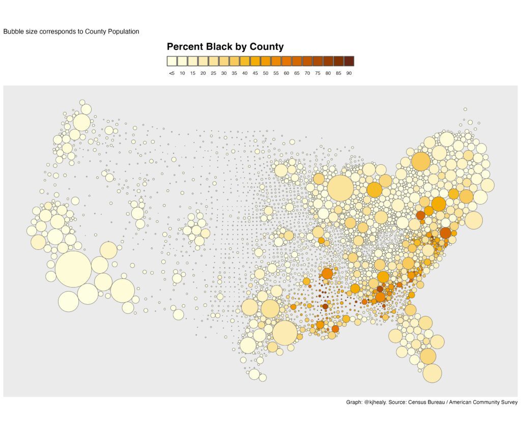
Not bad, though there issue becomes properly seeing the dark orange— especially smaller counties with very high pct Black. This would work better with one of the other palettes.


Interesting. Another win for ggplot.
Very nice plots! I agree that an unobtrusive but definite border on symbols is a good and helpful thing.
Can’t say I really approve, but Dorling’s viz book has some pretty trippy examples, https://www.dannydorling.org/books/visualisation/Graphics/Pages/Figures.html#156
I do like the bubbles, some geo folks don’t like when the bubbles overlap, hence the pushing around cartogram. I don’t mind the overlap so much though, so have done similar ideas, but just placed the bubble at the centroid of the geo area instead of distorting space.
Another technique I like sometimes is value-by-alpha. So you make areas with higher error more transparent. The final map on this page is one of my favorite examples, https://www.cartogrammar.com/blog/value-by-alpha-maps/. Re-skimming your paper on “All maps of parameter estimates are misleading” I am not sure your take on that though, whether you will appreciate showing the noisy underlying colors, or whether it just swaps one problem for another (instead of thresholding colors you threshold the alpha parameter).
I’d take the transparency idea in a different direction. Not encode any data to alpha but just make all bubbles on the map transparent. This is a (partial) solution to the overplotting problem here… the bubbles are all solid colors and so they obscure the ones below.
But none of these solve the fundamental problem of US maps… the concentration of small states and counties in the east coast relative to the sparsity in the middle.
I’m not sure why the variation in density or the modest geographic distortion is a problem. This map seems to be designed to show the variation across the country and although some bubbles overlap and the bubble margins create some distortion in the apparent shape of the borders, especially in the NE, I feel like it accomplishes it’s objective nicely. Using transparency would make the colors harder to dinstiguish, which compromises the primary objective. IMO the trade off is better as is.
I think it’s pretty cool how it shows the total population density across the country, even if the county borders in Nevada and Massechusettes aren’t 100% clear, and how the shapes of the counties change from a squarish grid pattern in the midwest to much more variable shapes in the west, which – although it’s not apparent in these maps – are related to geographic features.
I like all of the versions here. The change in background and whether or not the circles have borders is a small issue. Off hand if these were in a published paper I’d say they’re among the better maps I’ve seen.
For those who want to do more cartography/GIS (geographic information science/systems) type work, Maptitude is the best standalone (online version too) software there. There are thousands of cartographic combinations that can simplify information immensely! Not just cartography but complex GIS operations like overlays operations, heat maps, adjacency networks, k-means shortest paths, NP hard optimizations like median location allocations, redistricting, vehicle routing, 3D viewsheds etc. (& car simulation with visualization with sister program, Transmodeler). The reason for a comprehensive GIS, even though not open source (but full macro support using python C++ etc.,) is the ease of use. After a quarter century of doing mapping, spatial-stats and mathematical programming, I came to realize the power of point and clicking for graphical interactive visual analysis. After all, you can’t paint Mona Lisa with lines of code …
Thanks for the reference to Maptitude – it looks like something I’d like (I use JMP for my statistical work for similar reasons). Do they have any academic licensing?
Yes they in fact do! Free academic licensing https://www.caliper.com/maptitude/education-discount.htm#:~:text=The%20Academic%20License%20is%20a%20single%2Duser%20license,may%20not%20be%20used%20for%20commercial%20purposes.
There is also some support for R:
® https://www.caliper.com/learning/gis-development-kit/#t=dk%2FUsing_Caliper_Software_from_R.htm
Dorling proposed using uniform symbols for cartograms, in place of the bloated looking area cartograms where each areal unit keeps its borders but the shape gets distorted. Perceptual judgments across non-uniform shapes are more error-prone.
Another variant of this kind of map is to position the shape for each unit over the centroid of that region, but make the shapes transparent with borders only. That makes it easier to find the right shape if you know exactly where the region you care about is, but at the expense of some overplotting.
Thanks Andrew, this is really neat!
On another note: man-o-man, there are a lot of itty-bitty counties! This has to drive social, economic and political modelers bats… Also, have to take all the permutations in account – socio-economic, etc.